10,000 search results
(0.041 seconds)
- Hello Aster by madjack.font,
$13.00 Hello Aster is a new font brushed textured script which is also equipped with additional swashes. It is perfect for brand projects, logos, product packaging, posters, invitations, greeting cards, news, blogs, or anything to feature a persona charm.
 - Newsmaker JNL by Jeff Levine,
$29.00 A WPA (Works Progress Administration) poster from the 1940s saying "Behind the Headlines" presented the title hand-lettered in a bold, condensed slab serif. This became the model for Newsmaker JNL, available in both regular and oblique versions.
 - Poool by Drawwwn,
$15.00 Poool is a fun and wobbly display font. Perfect for pasta branding or spa posters, sweet factories or samba classes. It comes in four styles to help you get in Ibiza villa vibes. Just jump into the Poool!
 - Potlar by Maulana Creative,
$9.00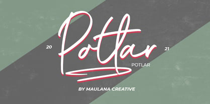 Give your designs an authentic handcrafted feel. "Potlar Signature Script Font" is perfectly suited to poster, stationery, logo, typography quotes, magazine or book cover, website header, clothing, branding, packaging design and more. Thanks for use this font ~ Maulana
 - King Rabbit by ahweproject,
$9.00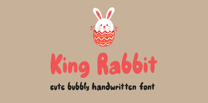 King Rabbit is a cute and bubbly display font, ready to make your designs look great and fun! Use it with confidence on your project designs such as quotes, greeting cards, invitations, posters, business cards, presentations, and more!
 - CLASSIC Line by WAP Type,
$25.00 frontline classic font Font a stylish Font. It’s useful for any Design project. Decal, card, e-card, Good for Logos & Headlines, Poster,Tag design, Newspaper & Magazine Ad Design and many more. True type and Open type font files
 - Albion Seventies by Greater Albion Typefounders,
$20.00 Albion Seventies is a display typeface from that fun era of psychedelic wallpaper, bright colours and bright orange everything! It's a splendid face for posters and banners, and did we mention, it works really well with orange backgrounds?
 - Bikambone by AZCRTV Studio,
$20.00 Bikambone is a modern and casual handwritten style font that is perfect for you to use in all kinds of designs such as invitation designs, posters, logos, flyers, and others. It includes 90 ligatures and multi-lingual support.
 - Shikatta by Grezline Studio,
$12.00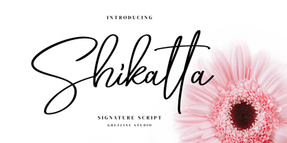 Shikatta is a beauty signature script font crafted very carefully. Shikatta is perfect use for a logo for branding, typography design, product packaging, invitation, quotes, t-shirt design, label poster, special events and anything that need handwriting taste.
 - ALT Lautus by ALT,
$5.00 Lautus is a 10 weight typeface and can be use in almost every graphic design application. It’s great for minimal design, logos, posters, and magazines Check out the whole presentation here http://www.behance.net/gallery/Alt-Lautus-Typeface/788079
 - The Cheese by Selvia Design,
$15.00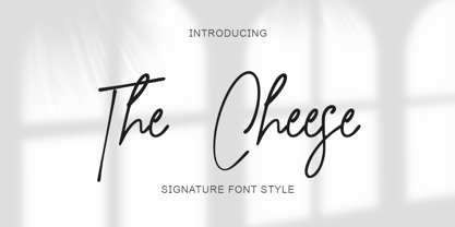 "The Cheese" is an elegant and beautiful signature font. This font is equipped with uppercase, lowercase, numerals, punctuation, and multilingual support. It is suitable for weddings, invitations, engagements, business branding, logos, banners, posters, promotions, social media, and others.
 - Handy Casual Condensed by My Creative Land,
$12.00 Handy Casual Condensed is an informal non-linking brush script that was inspired by hand lettering from 60's posters. This font combines a unique character with tons of Open Type features including ligatures, catchwords, stylistic alternates etc.
 - Ecentric by Redy Studio,
$21.00 Ecentric is a bold font inspired by the vintage style of letters on posters, bagde, packaging, labels from antiquity. The classic feel is really perfect you who needs a vintage typeface for logotype, apparel, branding, packaging, quote etc.
 - Nort Mono by ATK Studio,
$15.00 Nort Mono™ is a tech-monospaced typeface with inktrap experiment and diagonal edges by Atk Studio. Created for tech display poster, informational video display, ads, and more. Come with single weight. This font covers over 67 languages.
 - Tap Water JNL by Jeff Levine,
$29.00 A WPA (Works Progress Administration) poster for the Rural Electrification Administration’s promoting of running water for rural areas is the basis for Tap Water JNL. A condensed slab serif, it is available in both regular and oblique versions.
 - Sereno by Robert Corseanschi,
$19.99 This font family includes six very unique font styles & weights. The font styles are applicable for any type of graphic design - web, print, motion graphics, etc. and perfect for t-shirts and other items like posters and logos.
 - Bubblez by Almarkha Type,
$25.00 Bubblez – Fun Craft font that will make your designs look unique and fun. It’s perfect for labels, quotes, posters, DIY projects, branding, packaging, greeting cards, websites, photos, photography overlays, signs, window art, scrapbooking, tags and so much more!
 - Wild Summer by Epiclinez,
$18.00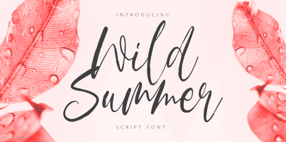 Wild Summer is a casual dry brush font that is suited for retro-style logos and posters. So what’s included: Basic Latin A-Z & a-z. Numbers, symbols, punctuations, and ligatures. Multilingual Support. Accented Characters : ÀÁÂÃÄÅÆÇÈÉÊËÌÍÎÏÑÒÓÔÕÖØŒŠÙÚÛÜŸÝŽàáâãäåæçèéêëìíîïñòóôõöøœšùúûüýÿžß Thank You.
 - Eneas Expanded by Antipixel,
$15.00 Eneas Expanded is a decorative artistic poster handwritten font. It's an sans serif, wide, rounded monoline font which will provide an informal, funny and fancy look to your work. It's recommended for display usage for its glyph quality.
 - Pylox Street by Garisman Studio,
$22.00 Introducing a new graffiti Pylox Street Inspired from street art born Pylox Street Suitable for many design project, branding, packaging, logo, wall art, headline, template, banner, poster, and many more projects. These include all caps, punctuation, and numerals.
 - Hauntress by Jadatype,
$15.00 Hauntess is a Serif Font that comes with a scary sharp-display's style. suitable for posters, logotype, branding, social media, book, movie and so on. contains standard English letters, numbers, punctuation, alternates, and several accents that support multilingualism.
 - Retro Mansion by Olivetype,
$18.00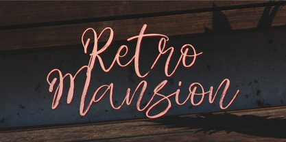 Retro Mansion is a casual dry brush font that is suited for retro style logo and poster. So what's included: Basic Latin A-Z & a-z. Numbers, symbols, punctuations and ligatures. Multilingual Support. Accented Characters : ÀÁÂÃÄÅÆÇÈÉÊËÌÍÎÏÑÒÓÔÕÖØŒŠÙÚÛÜŸÝŽàáâãäåæçèéêëìíîïñòóôõöøœšùúûüýÿžß Thank You.
 - Zombie Predator by Yoga Letter,
$18.00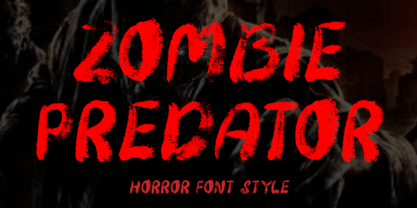 "Zombie Predator" is a scary horror display font. This font is very suitable for horror movie titles, Halloween, banners, posters, stickers, branding, book titles, and more. This font is equipped with uppercase, lowercase, numerals, punctuation, and multilingual support.
 - Blue Creek Rounded by ActiveSphere,
$30.00 BlueCreek Rounded is a extra condensed geometric typeface, and works best in text and display applications, such as headline, posters, signage, magazine, print, product branding, corporate branding, logos and titles. Several alternate characters are included in this typeface.
 - Faritta by AEN Creative Studio,
$12.00 Faritta is a great font for your projects. It's a beautiful, elegant, yet casual and simple font script featuring a natural look & feel. Faritta is perfect for logos, wedding invitations, posters, social media posts, signatures and much more!
 - Ceuphoria by Atasi Studio,
$18.00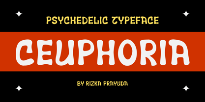 Ceuphoria is a display groovy font with a psychedelic look and trippy effect. Ceuphoria is ready and Perfectly fit for your logo designs, music projects & social media posts, event poster, brand imagery, product packaging, handwritten quotes, merchandise, etc.
 - GHEA Pastar by Edik Ghabuzyan,
$40.00 This Heavy weight Display font includes Basic Latin, Latin 1 Supplement, Latin extended A, Cyrillic, Armenian. May be used in titles, posters, labels, etc. The structure of glyphs does not require kerning for any pairs! Criation year: 2021
 - Benalla by AEN Creative Studio,
$12.00 Benalla is a beautiful, elegant, yet casual and simple font script featuring a natural look & feel. It has beautiful swashes and ligatures and it’s perfect for logos, wedding invitations, posters, social media posts, signatures, quotes and much more!
 - Crassified by Spareartist,
$6.66 Crassified is a modern display font inspired by blackletter typefaces. The typeface has a strong effect that adds a certain elegance and class to both digital and print designs. It’s ideal for crafting logos, posters, covers, and more.
 - Mandalika Indonesia Signature by Yoga Letter,
$18.00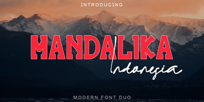 "Mandalika Indonesia" is an elegant and beautiful duo font. This font is equipped with uppercase, lowercase, ligatures, numerals, punctuation, and multilingual support. Very suitable for business branding, social media, logos, banners, posters, branding, stickers, summer, graduation, and others.
 - TXT Antique Italic by Illustration Ink,
$3.00Bring your scrapbook page to life with unique journaling and titles made possible with this cool italic font. It'll add instant flavor to posters, signs, bulletin boards, and word art that call for an old-fashioned, antiqued flair. - Poison Ivy by Hanoded,
$15.00 Poison Ivy is a messy, scrawled font. It looks like the glyphs have been etched by an unsteady hand. Poison Ivy is ideal for use in books, albums and posters. Comes with a witches' kettle full of diacritics.
 - Pitlines by Mevstory Studio,
$20.00 Pitlines is a display fonts collection. Pitlineswill perfect for many project: fashion, magazines, logo, branding, photography, quotes, blog header, poster, advertisements, etc. Files Includes: Pitliness Regular.otf Pitlines Italic.otf What's Included? Uppercase & alternate uppercase letters, numbers, punctuation Multilingual support
 - Wakerobin by Monotype,
$50.99 Wakerobin takes its charming swagger from the hand-painted billboard, poster and signage lettering of the mid-19th century. These showy styles did everything they could to stand out from the background cacophony of advertising, with signwriters using sharp and high contrast serif letters, squared block shapes, or art nouveau forms to grab the attention of passersby. Wakerobin embraces the spirit of these letterforms, bringing these various styles together in one typeface - as if users had their own sign painter on hand. Just as lettering artists had to adapt to a variety of sizes - from wide streetcar lettering to compressed forms that squeezed into narrow Victorian windows - the variable version of Wakerobin scales up and down in width to fit whatever environment the user’s working in. The static fonts come in three widths and five weights. As well as its adaptability, Wakerobin is bursting with vintage flavour, making it hard to ignore. Its distinctive, spiky serifs would be right at home on food and drinks packaging, as well as shop windows, adverts, and any other place that calls for some typographic showmanship. It performs particularly well in busy environments, or anywhere with a lot of visual noise - just as its historic predecessors did. And while Wakerobin is first and foremost a display typeface, it’s surprisingly elegant when used at text size, or in the lighter end of the weight spectrum.
 - BlincType Letterpress Fontpak by Chank,
$99.00 Add some old fashioned charm to your designs with the distressed alphabets in the new BLINCtype Letterpress Fontpak, a brand new font collection containing 8 letterpress-inspired fonts from the creative minds at Blinc Publishing in St. Paul, MN. The BLINCtype Letterpress Fontpak contains a handy concise assortment of old-school display fonts. From the old Western "WANTED" poster look of Prospect Modern, to the no-nonsense all-caps classic Goshen and its lowercase companion Gideon, these fonts are inspired by wooden letterpress blocks and other archaic technologies. It's like having your own letterpress print studio! Except it's all instantly downloadable right now as easy-to-use fonts! Designers love working with the Cheltenham-esque Gomorrah and its grittier, grungier counterpart, Sodom. The bouncy Golgotha has a rough and tumble readiness that exudes a hand-made charm, while Hamilton Offset has a cryptic, experimental look and feel that gives the impression of double-vision. You also get the newest member of the Blinc font family, Player Piano, which was based on punch-cut stencil letters on an old player piano paper song roll. Purchase the BLINCtype Letterpress Fontpak today and you'll be able to download and start using these 8 great fonts right away! The BLINCtype Letterpress Fontpak contains the fonts: Gideon, Golgotha, Gomorrah, Goshen, Hamilton Offset, Player Piano, Prospect Modern and Sodom.
 - Wakerobin Variable by Monotype,
$209.99Wakerobin takes its charming swagger from the hand-painted billboard, poster and signage lettering of the mid-19th century. These showy styles did everything they could to stand out from the background cacophony of advertising, with signwriters using sharp and high contrast serif letters, squared block shapes, or art nouveau forms to grab the attention of passersby. Wakerobin embraces the spirit of these letterforms, bringing these various styles together in one typeface - as if users had their own sign painter on hand. Just as lettering artists had to adapt to a variety of sizes - from wide streetcar lettering to compressed forms that squeezed into narrow Victorian windows - the variable version of Wakerobin scales up and down in width to fit whatever environment the user’s working in. The static fonts come in three widths and five weights. As well as its adaptability, Wakerobin is bursting with vintage flavour, making it hard to ignore. Its distinctive, spiky serifs would be right at home on food and drinks packaging, as well as shop windows, adverts, and any other place that calls for some typographic showmanship. It performs particularly well in busy environments, or anywhere with a lot of visual noise - just as its historic predecessors did. And while Wakerobin is first and foremost a display typeface, it’s surprisingly elegant when used at text size, or in the lighter end of the weight spectrum. - Schism One by Alias,
$55.00 Schism is a modulated sans-serif, originally developed from our Alias Didot typeface, as a serif-less version of the same design. It was expanded to three sub-families, with the thin stroke getting progressively heavier from Schism One to Schism Three. The different versions explore how this change in contrast between thick and thin strokes changes the character of the letterforms. The shape is maintained, but the emphasis shifts from rounded to angular, elegant to incised. Schism One has high contrast, and the same weight of thin stroke from Light to Black. Letter endings are at horizontal or vertical, giving a pinched, constricted shape for characters such as a, c, e and s. The h, m, n and u have a sharp connection between curve and vertical, and are high shouldered, giving a slightly square shape. The r and y have a thick stress at their horizontal endings, which makes them impactful and striking at bolder weights. Though derived from an elegant, classic form, Schism feels austere rather than flowery. It doesn’t have the flourishes of other modulated sans typefaces, its aesthetic more a kind of graphic-tinged utility. While in Schism Two and Three the thin stroke gets progressively heavier, the connections between vertical and curves — in a, b, n etc — remain cut to an incised point throughout. The effect is that Schism looks chiselled and textural across all weights. Forms maintain a clear, defined shape even in Bold and Black, and don’t have the bloated, wide and heavy appearance heavy weights can have. The change in the thickness of the thin stroke in different versions of the same weight of a typeface is called grading. This is often used when the types are to used in problematic print surfaces such as newsprint, or at small sizes — where thin strokes might bleed, and counters fill in and lose clarity, or detail might be lost or be too thin to register. The different gradings are incremental and can be quite subtle. In Schism it is extreme, and used as a design device, giving three connected but separate styles, from Sans-Didot to almost-Grotesk. The name Schism suggests the differences in shape and style in Schism One, Two and Three. Three styles with distinct differences, from the same start point.
 - Schism Three by Alias,
$55.00 Schism is a modulated sans-serif, originally developed from our Alias Didot typeface, as a serif-less version of the same design. It was expanded to three sub-families, with the thin stroke getting progressively heavier from Schism One to Schism Three. The different versions explore how this change in contrast between thick and thin strokes changes the character of the letterforms. The shape is maintained, but the emphasis shifts from rounded to angular, elegant to incised. Schism One has high contrast, and the same weight of thin stroke from Light to Black. Letter endings are at horizontal or vertical, giving a pinched, constricted shape for characters such as a, c, e and s. The h, m, n and u have a sharp connection between curve and vertical, and are high shouldered, giving a slightly square shape. The r and y have a thick stress at their horizontal endings, which makes them impactful and striking at bolder weights. Though derived from an elegant, classic form, Schism feels austere rather than flowery. It doesn’t have the flourishes of other modulated sans typefaces, its aesthetic more a kind of graphic-tinged utility. While in Schism Two and Three the thin stroke gets progressively heavier, the connections between vertical and curves — in a, b, n etc — remain cut to an incised point throughout. The effect is that Schism looks chiselled and textural across all weights. Forms maintain a clear, defined shape even in Bold and Black, and don’t have the bloated, wide and heavy appearance heavy weights can have. The change in the thickness of the thin stroke in different versions of the same weight of a typeface is called grading. This is often used when the types are to used in problematic print surfaces such as newsprint, or at small sizes — where thin strokes might bleed, and counters fill in and lose clarity, or detail might be lost or be too thin to register. The different gradings are incremental and can be quite subtle. In Schism it is extreme, and used as a design device, giving three connected but separate styles, from Sans-Didot to almost-Grotesk. The name Schism suggests the differences in shape and style in Schism One, Two and Three. Three styles with distinct differences, from the same start point.
 - Schism Two by Alias,
$55.00 Schism is a modulated sans-serif, originally developed from our Alias Didot typeface, as a serif-less version of the same design. It was expanded to three sub-families, with the thin stroke getting progressively heavier from Schism One to Schism Three. The different versions explore how this change in contrast between thick and thin strokes changes the character of the letterforms. The shape is maintained, but the emphasis shifts from rounded to angular, elegant to incised. Schism One has high contrast, and the same weight of thin stroke from Light to Black. Letter endings are at horizontal or vertical, giving a pinched, constricted shape for characters such as a, c, e and s. The h, m, n and u have a sharp connection between curve and vertical, and are high shouldered, giving a slightly square shape. The r and y have a thick stress at their horizontal endings, which makes them impactful and striking at bolder weights. Though derived from an elegant, classic form, Schism feels austere rather than flowery. It doesn’t have the flourishes of other modulated sans typefaces, its aesthetic more a kind of graphic-tinged utility. While in Schism Two and Three the thin stroke gets progressively heavier, the connections between vertical and curves — in a, b, n etc — remain cut to an incised point throughout. The effect is that Schism looks chiselled and textural across all weights. Forms maintain a clear, defined shape even in Bold and Black, and don’t have the bloated, wide and heavy appearance heavy weights can have. The change in the thickness of the thin stroke in different versions of the same weight of a typeface is called grading. This is often used when the types are to used in problematic print surfaces such as newsprint, or at small sizes — where thin strokes might bleed, and counters fill in and lose clarity, or detail might be lost or be too thin to register. The different gradings are incremental and can be quite subtle. In Schism it is extreme, and used as a design device, giving three connected but separate styles, from Sans-Didot to almost-Grotesk. The name Schism suggests the differences in shape and style in Schism One, Two and Three. Three styles with distinct differences, from the same start point.
 - Gevher by Hurufatfont,
$23.00 Gevher is a grotesque based font family that the product of a meticulous work that spread over 2 years. It differs from other grotesque fonts with its very soft angular turns to the rounded forms and its daring ink traps. The rigid and stable structure is balanced by deep ink traps and unusual opposite angle at the joints. Thus it has a more humanistic expression. It has 3 widths: Condensed, Narrow and Normal. It consists of 8 main weights and their compatible italics, totally has 48 styles. Therefore, it provides a wide range of usage practices. It offers creative "contextual alternates" for the best reading experience. Ideal for every editorial design, packaging, corporate identity, brand, application, web and desktop usages.