10,000 search results
(0.037 seconds)
- ITC Pino by ITC,
$29.99The ITC Pino™ typeface family is Slobodan Jelesijevic’s second suite of commercial fonts. Although a small family of three weights, it is remarkably versatile. Like many typefaces, Pino grew out of a desire for a particular kind of design. Jelesijevic was creating a series of illustrations for a children’s magazine and needed a typeface that was lighthearted, legible and would complement his illustrative style. Unable to find exactly what he needed, he decided to make his own font. “I spent the better part of a day looking for just the right typeface,” he recalls. “Of course, the hard part was finding something that would harmonize perfectly with my drawings. A custom font was not part of the project brief or budget, but I thought that perhaps I could use it again.” The regular weight of Pino became the solution to Jelesijevic’s problem. Jelesijevic did use the font again, but quickly realized that the single weight needed companion designs. Pino Bold and Black followed in quick succession. Before licensing the designs to ITC, the three-weight family provided headlines, book cover titles and even short blocks of text copy in several of Jelesijevic’s design projects. Born in Gornji Milanovac, Serbia, in 1951, Jelesijevic graduated with a degree in graphic communication and lettering from the Faculty of Applied Arts in the University of Arts in Belgrade. Currently, in addition to typeface design, he is sought out as a graphic designer and illustrator. When not working on design projects, he teaches graphic communications at the Faculty of Art in the University of Niš, Serbia. Pino is a stressed sans of slightly condensed proportions. Pino’s generous x-height, clearly defined counters and distinctive character shapes enable it to fulfill a wide variety of typographic applications. Friendly without being sanguine, the Pino type family will communicate with charm and vitality. - European Sans Pro Variable by Bülent Yüksel,
$99.00 EUROPEAN SANS PRO VARIABLE ABOUT FAMILY: What makes "European Sans Pro Variable" elegant, friendly and contemporary is its very rounded curves with very open terminals. "European Sans Pro Variable" has been designed with a higher "x-height" than other fonts in its class to make tiny readability more obvious in any use situation. It will be ideal for use in small sizes such as business cards or mobile applications. This typeface is also equipped with powerful OpenType features to satisfy the most demanding professionals. It has solid features like case sensitivity, small, true capitals, full ligatures, tabular figures for tables, old style figures to elegantly insert numbers into your sentences and more alternative characters to give personality to your projects. The extended, "European Sans Pro Variable" supports around 85 languages in the Latin, Cyrillic and Greek scripts, and its non-Latin components were developed with native consultants. With over 1200+ glyphs per style, "European Sans Pro" cares about localised letterforms and has the OpenType features to match. FEATURE SUMMARY: - 9 weights: Thin, ExtraLight, Light, Book, Regular, Medium, Bold, ExtraBold, and Black. - 4 widths: Normal, Narrow, Condensed, and Extra Condensed. - Matching italics (12º) for all weights and widths . - Matching small caps for all weights and widths. - Lining and old style figures (proportional and tabular). - Alternate characters (A, G, M, N, R, U, a, g, l, m, n, u, y). - Unlimeted fractions. - Automatic ordinals (1st, 2nd, 3rd, etc.). - 24 Dingbats + 19 Social Media and Block Chain icons. - Extended language support: Most Latin-based scripts (including Vietnamese), Cyrillic, and Greek. - Extended currency support. You can contact me at buyuksel@hotmail.com, pre-purchase and post-purchase with questions and for technical support. You can enjoy using it.
 - The Ekorre PERSONAL USE ONLY Black by Måns Grebäck is a distinctive font that stands out for its unique blend of whimsical charm and robust assertiveness. Designed by the renowned typeface artist Mån...
- Folks Dreaming by Prioritype,
$19.00 Introducing. Folks Dreaming: Comes in a fun groovy style. Great for t-shirt designs, social media posts, posters, covers and more. Features: Uppercase, Lowercase, Numeral, Punctuation, Swash, Multilingual & PUA Encoded. Thanks.
 - Bigfoot by K-Type,
$20.00 Bigfoot K-Type is a whole font based on the slab capitals used by Victor Moscoso in his 1960s psychedelic rock posters. Capital A alternatives can be found at keystrokes ± and §.
 - Quirkophonic by Tymime Fonts,
$35.00 Quirkophonic mimics hand-drawn letters and logos of the 1960s. Suitable for album covers, movie posters, rock concerts, or whimsical fantasy. From secret spy capers to magic mushrooms, it's all groovy.
 - P22 Aragon by IHOF,
$24.95 A whimsical font with robust curlicues. Designed for display lines on show programs, posters, print ads etc. Many—but not all—of the letters are based on rounded Lombardic medieval forms.
 - Plenti by MADType,
$19.00 Plenti is the fat font to add to your visual communication toolbox. Friendly, square, and quirky all at the same time. It is itching to get used on posters and websites.
 - Fidelity Caps by Jonahfonts,
$19.95 A tall upright CAP font with small caps. Now includes the Capital German double S (Eszett) ß. Applications include Captions, headlines, packaging, posters, ads, greeting cards, book jackets and/or covers.
 - Tant Britta by Cercurius,
$19.95 A bold condensed caps-only cross-stitch font, based on an embroidery pattern from the middle of the 20th century. Use it in large sizes for advertising, posters, greeting cards, etc.
 - Art Topic JNL by Jeff Levine,
$29.00 Art Topic JNL is a round-cornered square sans serif in the Art Deco style, and was modeled from a 1930 WPA (Works Progress Administration) poster for the Federal Arts Project.
 - Dark Mood by Seemly Fonts,
$12.00 A brush display font, Dark Mood. For stationery, logos, t-shirts, paper, print design, website headers, picture frames, flyers, album covers, posters, image sliders, and other things, this typeface is ideal.
 - Tant Gertrud by Cercurius,
$19.95 A cross-stitch font based on a classical pattern, including capital and lower-case letters. It is suitable for posters, signs, ads and greeting cards in the Thanksgiving and Christmas season.
 - Thing by Umka Type,
$19.00 Thing - A Display Font : Thing is a carefully crafted display font. It has Extended Latin characters. It created for poster, web, brand and social media designs. This is all Caps Fonts.
 - Bridgeriden by VzType,
$15.00 Thanks for checking out Bridgeriden is perfect for all your needs, such as a logo, printed quotes, badge, insignia, packaging, headline, poster, t-shirt/apparel, greeting card, and wedding invitation, & etc.
 - Cattle Call JNL by Jeff Levine,
$29.00 Cattle Call JNL is reminiscent of Old West posters and broadsides. The design is based on an extra condensed antique wood type and is available in both regular and oblique versions.
 - Shaking by La Boîte Graphique,
$17.00 Designed by Ewen Prigent, Shaking is a set of four expressive hand-crafted titling typefaces ideal for packaging, posters, children's books… and many other media! Shaking one, two, three and four!
 - Reto by Jonahfonts,
$35.00 A unique semi-sans-serif font specifically designed for all texts in a variety of applications. Recommended for posters, titles, book covers, greeting cards, signage, packaging, invitations, magazine articles and advertising.
 - Crypto by Vertigo,
$21.00 Crypto is a narrow, sans serif, geometric, display font with two weights. It works well for modern, contemporary projects, logotypes, films, posters, billboards, press advertisements, websites, packaging. It provides multilingual support.
 - Jully Julia by Romie Creative,
$12.00 Jully Julia ! Fresh modern handwritten font with decorative characters and dancing baseline. So beautiful on invitations such as crafts, greeting cards, branding materials, business cards, quotes, posters and other design concepts.
 - Bastian by Akifatype,
$14.00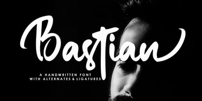 Bastian is a modern handwritten font, organic, dynamic and energetic sytle.Can used for various purposes. such as the title, signature, logo, correspondence, wedding invitations, letterhead, signage, labels, newsletters, posters, badges, etc.
 - Ghotana by LetterStock,
$12.00 Ghotana is an original hand writing font, give you a playful feel on your design. it's perfect for poster, logo and many more. Thank you for using this font, Guguh Gumantoro
 - Dabi by tafleh,
$10.00 Dabi is a bold sans serif type family of three weights plus matching italics. It is suitable for logos, titles, posters, etc. Made from a compilation of all his design projects.
 - Metal DD by Doffdog,
$14.00 METAL is a hand-lettered modern serif font. This all caps font includes punctuation and numerals. It is perfect for: Logos Posters Headlines Apparel & more Multilingual support Stay true! Stay metal!
 - Blanknot by 4RM Font,
$15.00 Made in bold style and wide, as well as consistent spacing between letters, this font has a distinctive aesthetic value, suitable for graphic design use such as logos, posters, and others.
 - Fibonacci Heap by ErlosDesign,
$15.00 Fibonacci Heap font is a decorative slab serif, inspired typeface in modern performance. This font includes 2 style Reguler and Outline. It is perfect for logos, posters, headlines, apparel and more.
 - Lord Spirit by Brithos Type,
$11.00 Lord Spirit is an assertive and bold brushed handwritten font. It is suitable for complementing any branding, product packaging, invitation, quote, t-shirt, label, poster, logo that you wish to develop.
 - Handshake by Seemly Fonts,
$14.00 Handshake is a striking display font. It is perfectly suited for stationery, logos, t-shirt, paper, print designs, website headers, photo frames, flyers, music covers, posters, image sliders, and much more.
 - Lagoena by San Studio,
$9.99 Lagoena Font was designed by Zainul Faozi from San Studio. This was inspired by road markings. This font fits on any project You make, on posters, logos, ads, banners, and more.
 - Filmmaker by Vertigo,
$20.00 The Filmmaker is a wide, slab serif, display font with four varieties. It works well for modern, dynamic projects, logotypes, films, posters, billboards, press advertisements, websites, packaging. It provides multilingual support.
 - MBF Neo Wave by Moonbandit,
$19.00 Neo wave is a futuristic scifi display font. Wide and rounded typeface design with a modern minimalist approach. Perfect usage includes logo, poster, display, headline, t-shirt design and many more.
 - Nugelo by Viswell,
$15.00 Nugelo is a retro modern serif font, comes with stylishtic alternates and ligatures Nugelo will be suitable for your various design needs such as branding, logo, poster, headlines and many others.
 - Tingle by Jonahfonts,
$14.95 Tingle has that quick pen look popular with many designs, I have also added the various discretionary ligatures. Usage recommendations: Captions, fliers, packaging, cards, posters, ads, book jackets, manuals, menus, bulletins.
 - Jusline by Letterafandi Studio,
$12.00 Jusline is a modern handwritten font. It can be used for various purposes such as logos, wedding invitations, headings, t-shirts, letterhead, signage, labels, news, posters, badges and so much more.
 - Spaxel by Pedro Teixeira,
$20.00 Retro futuristic design. Inspired in old concept futuristic designs and in pixels. This display font is great for logo design, posters and to make a "look forward" statement in your designs.
 - Bandoeng by HRDR,
$19.00 Bandoeng was inspired by the cover of the 1920 Nebiolo book. It is perfect for product logo, signage, branding projects, headlines, posters, packaging, clothing brand logos, Vintage design and much more.
 - Moderna Condensed by Los Andes,
$16.00 Moderna Condensed is a modern condensed Sans-serif font, simple and neutral, especially for short texts, headlines, and sub-headlines, logos, posters and branding, includes some alternate characters, arrows and labels.
 - Hyperbole by Dmitry Bogolyubov,
$10.00 Hyperbole is a condensed futuristic display typeface, suitable for writing headlines and drawing posters. This font is strict, cosmic, bewitching. It contains alternative styles for latin letters and extended latin letters.
 - Autoguard by Suby Studio,
$16.00 Autoguard is a monoline font with vintage looks. It is perfect to create beautiful vintage typography for your projects like t-shirts, merchandising, logo labels, posters, magazines, packaging, quotation and more.
 - MBF Future Voyage by Moonbandit,
$15.00 Future Voyage, a clean modern futuristic sans serif display font. This typeface is perfect for minimalist scifi theme. Perfect usage as logo, poster, display, headline, t-shirt design and many more.