10,000 search results
(0.013 seconds)
- Kommon Grotesk by TypeK,
$39.00 Introducing our foundry with the new Sans Serif typeface, Kommon™Grotesk, a super family with 96 styles. Different width from Extended to Compressed, variety of weights from Thin to Super, made Kommon™Grotesk suitable for multiple usage. The typeface was crafted till clean and simple. It has high legibility with modern and clear look to be use as text or display font. Kommon™Grotesk is effective displaying on many medias, both print and on screen.
 - Moire by Microsoft Corporation,
$39.00Moire™ Regular is a block-style sans serif font designed by Jim Ford in the spirit of typefaces popular during the 1950's. The Moire Regular font is slightly more streamlined for a more contemporary voice than its predecessors. Moire Regular is useful for all modern display settings in signs, publications, reports and presentations. The Moire Regular font will also reproduce well in on-screen uses from User Interfaces to web graphics. Character set: Latin 1. - Chiffon by SilkType,
$35.00 Chiffon is a serif, display typeface. With high contrast and elegant curves. Chiffon includes three different versions of ‘c’ and ‘e’, which are carefully placed throughout the typeface, paired seamlessly with the following glyph. However, OpenType features and stylistic sets make the alternate forms available for the user to choose from as they see fit. Velour is available in 5 weights, from Extra light to Semi Bold, and supports Western, Central, and South-Eastern European languages.
 - Yacqui by Jonahfonts,
$45.00 In designing a font that had a Mayan or Aztec quality to it without the usual "Mariachi" look, I decided to make it single weight with some open ends and offbeat rounded serifs to give it a more serious feel which will lend itself to other non ethnic uses. I have added a few discretionary ligatures, which also contain old-style numerals, titling caps and small caps. Usage recommendations: Captions, packaging, cards, posters, ads, book jackets, manuals, and menus.
 - Modesto by Parkinson,
$25.00 Modesto is a loose-knit family based on a signpainters lettering style popular in the late-19th and early-20th centuries. It evolved from the lettering I used for the Ringling Bros. and Barnum & Bailey Circus Logo. The Modesto family was not planned. It just happened, a few fonts at a time over about fifteen years. In 2014 four new Italic fonts were added. There is a downloadable MODESTO USER MANUAL PDF in the Gallery section for this family.
 - Isra by Linotype,
$187.99Isra, designed by Almamoun Ahmed in 2005, is a modern Kufi and a winner in Linotype’s first Arabic Typeface Design Competition. The highly geometric and condensed form make it ideal for magazine headlines, advertising, and general display usage, while the large body height and clear forms make it suitable for short text settings. The font includes a matching Latin design and support for Arabic, Persian, and Urdu. It also includes proportional and tabular numerals for the supported languages. - Abdo Egypt by Abdo Fonts,
$29.50 Abdo Egypt is a geometrical style. This is an OpenType Font supporting Arabic, Persian and Urdu and is compatible with the various operation systems and modern software. The combination of modern Kufi and Geometrical styles and the variation between straight and curved parts made it a beautiful typeface appropriate to titles and text and able to meet the desire of the user in the design of ads and modern designs of various types of audio and visual.
 - Tatype by Tural Alisoy,
$25.00 Tatype has a built-in support for Latin basic, Latin Extended, Cyrillic, Central Europe, Turkish, Baltic, Romanian, Euro, West European based languages. Alternative letterforms are ideal for customizing the overall appearance of a text, for usage in logos or they can even work as custom fonts for companies. OpenType features: Access All Alternates, Contextual Alternates, Case-Sensitive Forms, Discretionary Ligatures, Denominators, Fractions, Kerning, Standard Ligatures, Localized Forms, Numerators, Ordinals, Stylistic Alternates, Scientific Inferiors, Stylistic Set 1-11, Subscript, Superscript
 - Toms Finger by CozyFonts,
$20.00 Toms Finger Family fonts is a hand drawn sans serif series containing Regular weight (Toms Finger), Bold weight (Toms Thumb), and Light weight (Toms Pinky). Drawn entirely using his finger tip on a tablet Tom created this font to be user-friendly for Notes, Signs, Posters, Ads, Captions or anything where the writer wants to convey a casual, non invasive voice in the copy. Toms Finger Family is legible in a wide range of sizes in all weights.
 - Metropola by Tour De Force,
$25.00 Metropola is font family with 4 classic weights and variable version for those of you with specific visual appetite. Inspired with typefaces from Victorian era, Metropola carry out it's display characteristics and works equally well as typefaces for longer texts even it is not Metropola's main area of usage. Beside extended Latin character map, Metropola is equipped with Cyrillic set. Each weight contains dingbats and Open Type features such as Swashes, OldStyle numerals, Ligatures and Fractions.
 - Silo Soft by TypeUnion,
$25.00 Designed and built in London by TypeUnion, Silo soft is a fluid sans serif typeface embodying energetic curves and a clean, functional structure. The Silo Soft Family is made up of 6 weights, which range from a delicate Extra-Light, all the way through to a punchy, loud Extra-bold and each carry a versatility for multiple applications and uses. Silo soft features open type alternate characters, and extensive language support to provide a flexible, substantial user experience.
 - Bogart by Zetafonts,
$39.00 All the nine weights of Bogart, as well the matching true italics forms, feature an extended charset of over 1600 glyphs, covering 219 languages using latin, cyrillic and greek alphabets, and sporting a complete set of Open type features. To add flexibility for editorial usage, a text-oriented Bogart Alternate set of nine weights was added to the family keeping the design more similar to its modern old style model and allowing for a heavy readable mid-weight range.
 - Polate by Typesketchbook,
$55.00 Polate font is an extra large super family of 60 fonts! Polate has such a big abundance of contrast, styles, weights, X-Hight. Typesketchbook consists of a very usable, clean and modern sans typeface . The complete Polate type family includes 6 weights with italic and 5 X-Hights versions for each of them all in all 60 fonts for a multifunctional usage, especially for cooperative work, such as website, magazine, editorial, publishing , as well as packaging.
 - Alphacal JNL by Jeff Levine,
$29.00Alphacal JNL and Alphacal Black JNL are variants of the same lettering style found in Jeff Levine's Juneway JNL font... all based on water-applied decals once made by the Duro Decal Company (now Duro Art Industries) of Chicago, Illinois. Alphacal JNL can be used alone as an outline font (best at 18 pt. and above) or with Alphacal Black JNL as a backfill. Note: Perfect registration is not guaranteed. Some user adjustments may be necessary. - Ensenada by Wordshape,
$30.00 Ensenada is a typeface designed based on hand-cut lettering that adorns businesses throughout the city of Ensenada in Baja California in Mexico. - What was the inspiration for designing the font? Looking at the hand-cut lettering in Ensenada, Mexico. Variations on this type of lettering are often used by Mexican pop-techno acts. - What are its main characteristics and features? It is a geometric display face that works in both retro and futuristic settings. - Usage recommendations: Display type
 - Karlsen Round by TypeUnion,
$30.00 Designed and built in London by TypeUnion, Karlsen Round is a structured, functional typeface which embraces harmony, flow and versatility, but with a cheeky twist. The Karlsen Round Family is made up of 14 styles, which range from a delicate thin, all the way through to a substantial extra-bold and each carry a versatility for multiple applications and uses. Karlsen Round provides extensive language support to provide a flexible, substantial user experience. Please also see our Karlsen family.
 - Abdo Joody by Abdo Fonts,
$29.50 Abdo Joody is a straight style. This is an OpenType Font supporting Arabic, Persian and Urdu and compatible with the various operation systems and modern software. The combination of square Kufi and modern styles made it a beautiful typeface, appropriate to titles and text, and able to meet the desire of the user in the design of ads and modern designs of various types of audio and visual. I will add more weights of this font with Allah willing.
 - Kanyon by Hurufatfont,
$19.00 Kanyon is a family of typefaces created from basic geometric forms based on the equal width system. Its clean and neutral structure and 3 different widths provide ease of use in different design channels. With its rich OpenType features, multi-language support and small capital characters, it has a wider usage area than its counterparts. Ideal for packaging, labels, routing designs, mobile applications, brand designs, logos, all kinds of presentation and editorial designs, indoor and outdoor printing works.
 - Stonecrop by Andrew Harper Fonts,
$5.00 Stonecrop is a font unified by bold, imposing lines as well as its use of rounded rectangles as the central stylistic shape. Stonecrop loosely conforms to the monospaced font style, with near-equal widths for all letters and numbers (but not all symbols/punctuation), however it does incorporate kerning for all types of glyphs where appropriate to aid in legibility. A perfect font for usages that demand consistency and precision, while still maintaining a quirky and stylized handwritten effect.
 - Clydesdale by Red Rooster Collection,
$60.00 Clydesdale is a five-weight compressed sans serif font family. It was designed by Steve Jackaman over a several-year period, and was released in 2017. Clydesdale, much like its sister typefaces Coliseum and Torpedo, was inspired by authoritative Roman display typefaces. The font family excels in displays, but is a great performer in all text sizes. It is perfect for users who enjoy the impressiveness of Coliseum Pro and Torpedo, and need a complementary sans serif typeface.
 - Gingham by SilkType,
$47.50 Gingham is a modern sans serif typeface. The unaltered version of the font is clean and classic. However, the font has multiple different options for alteration. Each letter has up to 8 different versions, which the user can choose from to make connections between letters and words, creating a completely new shape. The font also includes two stylistic sets, nr. 01 gives the overall feel of the text a more modern look and nr. 02 a more traditional one.
 - Conica by Typogama,
$19.00 Conica is a bold, condensed typeface that aims to grab your attention. By playing with heavy, dark shapes and small counters, this single weight typeface explores the contrast between defined shapes and gentle curves to produce a surprising headline font. It equally includes a range of Opentype features, with a set of small capitals, stylistic alternates and ligatures, users can choose which forms best suit their needs. Conica includes an extended Latin glyph set covering most Latin based languages.
 - Salda Soft by Hurufatfont,
$19.00 Salda Soft; It is a modern sans serif family that blends old and new generation sans serif fonts in the same body. It has a wide usage area with its light narrow structure, soft and clean lines, humanist touches. It provides clean and smooth visuals in vertical screens, mobile applications and block texts. It consists of a total of 20 styles. Ideal for all kinds of editorial design, packaging, corporate identity, brand, application, web and desktop.
 - Danki by Twinletter,
$15.00 Danki, our newest font, is a display typeface created with natural hand strokes and a joyful and playful background. This typeface has two alternates for each character, making it simple to select the appropriate character for each of your unique projects. This font is ideal for usage in a variety of unusual graphic projects, including games, book titles, outdoor activities, posters, banners, quotes, branding, and other unique projects. So, what are you waiting for? Get this font now!
 - SF Handwriting by Sultan Fonts,
$40.00 The SF Handwriting font family is designed for educational and printing purposes. It is a carefully crafted font that supports Arabic, Latin, Persian, and Urdu. The font is characterized by its clarity, ease of reading, and visual appeal. It is also convenient to use in small sizes. The SF Handwriting font family includes three weights: Regular, Bold, and Black. The Dotted style is designed with a straight background for printing and overwriting by children or other users.
 - GUI Design Icons by upirTYPO,
$17.00 GUI Design Icons is pack of about 200 icons for every possible user interface (GUI). What makes this font special is combinations. There are background and foreground objects which you can combine any way you like. Imagine you have an icon of shopping cart. By just adding another symbol, you can make an icon for adding that item to shopping cart, removing the item, showing favorites or any other possible combination. See image example for some fresh ideas!
 - Eternity by Senekaligrafika,
$12.00 "Eternity" is a font with hard strokes and a signature style that instantly evokes a romantic sensation. With this font, you can take your creative projects to the next level. Whether it's for everyday use or special occasions such as weddings, Valentine's Day, greeting cards, headings, flyers, product packaging, book covers, printed quotes, logos, and more, "Eternity" will help you create unique and touching typographical designs. It's a versatile and modern font that offers endless possibilities to the user.
 - Bakewell by Kimmy Design,
$25.00 Bakewell is the 4th typeface of the Winslow Type System. It's a low contrast sans-serif with ball terminals and a sweet disposition. The typeface includes a wide range of styles, widths and weights that make it a great addition to any type collection. From Narrow to Wide and Hairline to Bold, the font family offers extended optionality. Packed with Opentype Features, users can create one-of-a-kind designs perfectly tailored to their specific needs!
 - Abdo Misr by Abdo Fonts,
$29.50 Abdo Misr is a geometrical style. This is an OpenType Font supporting Arabic, Persian, Urdu, abd English to and compatible with the various operation systems and modern software. The combination of modern Kufi and Geometrical styles and varying between straight and curved parts made it a beautiful typeface appropriate to the titles and slogans, and able to meet the desire of the user in the design of ads and modern designs of various types of audio and visual.
 - DEAD SECRETARY - Personal use only

- Dirt2 SoulStalker - Personal use only

- VVDS Pacifica by Vintage Voyage Design Supply,
$18.00 Pacifica – hand lettered elegant bold script for decorative typography inspired by American branding typography from end of XX century. Comes with different variates – filled, highlighted or pressed. Perfectly for headers, signs, logos, prints, etc. Comes with ending and some middle alternates and some standard ligatures.
 - Raimoo by Tama Putra,
$12.00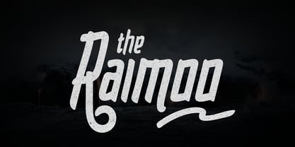 Raimoo is a handwritten typeface. It is suitable for any design needs, branding, cover title, t-shirts, posters and more. The Raimoo typeface includes multi-lingual and currency support, numerals, and punctuations. It comes comes with standard ligatures, stylistic alternates and 3 stylistic sets.
 - Kalpa by Octotypo,
$15.00 The early inspiration designs for Kalpa comes from some old wrist watches dials from an iconic diving watch company. The result is a sharp and sleek design that gives an extremely strong look to the font. Kalpa comes in 4 weights and italics to make it versatile and easy to use on all kinds of media. It is a wise choice for headlines, logos, branding, packaging, publications and websites. The design comes with some alternatives glyphs which enhanced the use of the font and let you customise your letter works. The name comes from a Sanskrit word meaning a relatively long period of time to connect with its early inspirations of wrist watches dials.
 - Prismatic Spirals by MMC-TypEngine,
$93.00 PRISMATIC SPIRALS FONT! The Prismatic Spirals Font is a decorative type-system and ‘Assembling Game’, itself. Settled in squared pieces modules or tiles, embedded by unprecedented Intertwined Prismatic Structures Design, or intricate interlaced bars that may seem quite “impossible” to shape. Although it originated from the ‘Penrose Square’, it may not look totally as an Impossible Figures Type of Optical Illusions. More an “improbable” Effect in its intertwined Design, that even static can seem like a source of Kinetical Sculptures, or drive eyes into a kind of hypnosis. Prismatic Spirals has two related families, its “bold” braided version Prismatic Interlaces and the Pro version. While the default is simpler or easier to use, as all piece’s spin in same way, PRO provides a more complex intricate Design which requires typing alternating caps. Instructions: Use the Map Font Reference PDF as a guide to learn the 'tiles' position on the keyboard, then easily type and compose puzzle designs with this font! All alphanumeric keys are intuitive or easy to induce, you may easily memorize it all! Plus, often also need to consult it! *Find the Prismatic Spirals Font Map Reference Interactive PDF Here! (!) Is recommended to Print it to have the Reference in handy or just open the PDF while composing a design with this typeface to also copy and paste, when consulting is required or when it may be difficult to access, depending on the keyboard script or language. As a Tiles Type-System, the line gap space value is 0, this means that tiles line gaps are invisibly grouted, so the user can compose designs, row by row, descending to each following row by clicking Enter, same as line break, while advances on assembling characters. Background History: The first sketches of my Prismatic Knots or Spirals Designs dates back then from 2010, while started developing hand-drawn Celtic Knots and Geometric Drawings in grid paper, while engage to Typography, Sacred Geometry and the “Impossible Figures” genre… I started doing modulation tests from 2013, until around 2018, I got to unravel it in square modules or tiles from the grid, then idealized it as fonts, along with other Type projects. This took 13 years to come out since the first sketches and 6 months in edition. During the production process some additional tiles or missing pieces were thought of and added to the basic set, which firstly had only the borders, corners, crossings, nets, Trivets connectors or T parts and ends, then added with nets and borders integrations. Usage Suggestions: This type-system enables the user to ornate and generate endless decorative patterns, borders, labyrinthine designs, Mosaics, motifs, etc. It can seem just like a puzzle, but a much greater tool instead for higher purposes as to compose Enigmas and use seriously. As like also to write Real Text by assembling the key characters or pieces, this way you can literarily reproduce any Pixel Design or font to its Prismatic Spirals correspondent form, as Kufic Arabic script and further languages and compose messages easily… This Typeface was made to be contemplated, applied, and manufactured on Infinite Decorative Designs as Pavements, Tapestry, Frames, Prints, Fabrics, Bookplates, Coloring Books, Cards, covers or architectonic frontispieces, storefronts, and Jewelry, for example. Usage Tips: Notice that the line-height must be fixed to 100% or 1,0. In some cases, as on Microsoft Word for example, the line-height default is set to 1,15. So you’ll need to change to 1,0 plus remove space after paragraph, in the same dropdown menu on Paragraph section. Considering Word files too, since the text used for mapping the Designs, won't make any literal orthographical sense, the user must select to ignore the Spellcheck underlined in red, by clicking over each misspelled error or in revision, so it can be better appreciated. Also unfolding environments as Adobe Software’s, the Designer will use the character menu to set body size and line gap to same value, as a calculator to fit a layout for example of 1,000 pts high with 9 tiles high, both body size and line gap will be 111.1111 pts. Further Tips: Whenever an architect picks this decorative system to design pavements floor or walls, a printed instruction version of the layout using the ‘map’ font may be helpful and required to the masons that will lay the tiles, to place the pieces and its directions in the right way. Regarding to export PNGs images in Software’s for layered Typesetting as Adobe Illustrator a final procedure may be required, once the designs are done and can be backup it, expanding and applying merge filter, will remove a few possible line glitches and be perfected. Technical Specifications: With 8 styles and 4 subfamilies with 2 complementary weights each (Regular and Bold) therefore, Original Contour, Filled, Decor, with reticle’s decorations and 2 Map fonts with key captions. *All fonts match perfectly when central pasted for layered typesetting. All fonts have 106 glyphs, in which 48 are different keys repeated twice in both caps and shift, plus few more that were repeated for facilitating. It was settled this way in order for exchanging with Prismatic Spirals Pro font which has 96 different keys or 2 versions of each. Concerning tiles manufacturing and Printed Products as stickers or Stencils, any of its repeated pieces was measured and just rotated in different directions in each key, so when sided by other pieces in any direction will fit perfectly without mispatching errors. Copyright Disclaimer: The Font Software’s are protected by Copyright and its licenses grant the user the right to design, apply contours, plus print and manufacture in flat 2D planes only. In case of the advent of the same structures and set of pieces built in 3D Solid form, Font licenses will not be valid or authorized for casting it. © 2023 André T. A. Corrêa “Dr. Andréground” & MMC-TypEngine.
 - Prismatic Interlaces by MMC-TypEngine,
$93.00 PRISMATIC INTERLACES TYPEFACE! Prismatic Interlaces is a decorative system and ‘Assembling Game’, itself. Settled in squared pieces modules or tiles, embedded by unprecedented Intertwined Prismatic Structures Design, or intricate interlaced bars that may seem quite “impossible” to shape. Although it originated from the ‘Penrose Square’, it may not look totally as an Impossible Figures Type of Optical Illusions. More an “improbable” Effect in its intertwined Design, that even static can seem like a source of Kinetical Sculptures, or drive eyes into a kind of hypnosis. Prismatic Interlaces has two related families, both as a kind of lighter weight versions Prismatic Spirals Default & Pro. While Default is simpler or easier to use, same way as Prismatic Interlaces, Pro provides a more complex intricate Design that requires typing alternating caps. Instructions: Use the Map Font Reference PDF as a guide to learn the 'tiles' position on the keyboard, then easily type and compose puzzle designs with this font! All alphanumeric keys are intuitive or easy to induce, you may easily memorize it all! Plus, often also need to consult it! *Find the Prismatic Interlaces Font Map Reference Interactive PDF Here! (!) Is recommended to Print it to have the Reference in handy or just open the PDF while composing a design with this typeface to also copy and paste, when consulting is required or when it may be difficult to access, depending on the keyboard script or language. As a Tiles Type-System, the line gap space value is 0, this means that tiles line gaps are invisibly grouted, so the user can compose designs, row by row, descending to each following row by clicking Enter, same as line break, while advances on assembling characters. Background History: The first sketches of my Prismatic Knots or Spirals Designs dates back then from 2010, while started developing hand-drawn Celtic Knots and Geometric Drawings in grid paper, while engage to Typography, Sacred Geometry and the “Impossible Figures” genre… I started doing modulation tests from 2013, until around 2018, I got to unravel it in square modules or tiles from the grid, then idealized it as fonts, along with other Type projects. This took 13 years to come out since the first sketches and 6 months in edition. During the production process some additional tiles or missing pieces were thought of and added to the basic set, which firstly had only the borders, corners, crossings, nets, Trivets connectors or T parts and ends, then added with nets and borders integrations. Usage Suggestions: This type-system enables the user to ornate and generate endless decorative patterns, borders, labyrinthine designs, Mosaics, motifs, etc. It can seem just like a puzzle, but a much greater tool instead for higher purposes as to compose Enigmas and use seriously. As like also to write Real Text by assembling the key characters or pieces, this way you can literarily reproduce any Pixel Design or font to its Prismatic Spirals correspondent form, as Kufic Arabic script and further languages and compose messages easily… This Typeface was made to be contemplated, applied, and manufactured on Infinite Decorative Designs as Pavements, Tapestry, Frames, Prints, Fabrics, Bookplates, Coloring Books, Cards, covers or architectonic frontispieces, storefronts, and Jewelry, for example. Usage Tips: Notice that the line-height must be fixed to 100% or 1,0. In some cases, as on Microsoft Word for example, the line-height default is set to 1,15. So you’ll need to change to 1,0 plus remove space after paragraph, in the same dropdown menu on Paragraph section. Considering Word files too, since the text used for mapping the Designs, won't make any literal orthographical sense, the user must select to ignore the Spellcheck underlined in red, by clicking over each misspelled error or in revision, so it can be better appreciated. Also unfolding environments as Adobe Software’s, the Designer will use the character menu to set body size and line gap to same value, as a calculator to fit a layout for example of 1,000 pts high with 9 tiles high, both body size and line gap will be 111.1111 pts. Further Tips: Whenever an architect picks this decorative system to design pavements floor or walls, a printed instruction version of the layout using the ‘map’ font may be helpful and required to the masons that will lay the tiles, to place the pieces and its directions in the right way. Regarding to export PNGs images in Software’s for layered Typesetting as Adobe Illustrator a final procedure may be required, once the designs are done and can be backup it, expanding and applying merge filter, will remove a few possible line glitches and be perfected. Technical Specifications: With 8 styles and 4 subfamilies with 2 complementary weights each (Regular and Bold) therefore, Original Contour, Filled, Decor, with reticle’s decorations and 2 Map fonts with key captions. *All fonts match perfectly when central pasted for layered typesetting. All fonts have 106 glyphs, in which 49 are different keys repeated twice in both caps and shift, plus few more that were repeated for facilitating. It was settled this way in order for exchanging with Prismatic Spirals Pro font which has 96 different keys or 2 versions of each. Concerning tiles manufacturing and Printed Products as stickers or Stencils, any of its repeated pieces was measured and just rotated in different directions in each key, so when sided by other pieces in any direction will fit perfectly without mispatching errors. Copyright Disclaimer: The Font Software’s are protected by Copyright and its licenses grant the user the right to design, apply contours, plus print and manufacture in flat 2D planes only. In case of the advent of the same structures and set of pieces built in 3D Solid form, Font licenses will not be valid or authorized for casting it. © 2023 André T. A. Corrêa “Dr. Andréground” & MMC-TypEngine.
 - Athoor Style by Suamzu Art,
$10.00 Athoor Style fonts are serif fonts that combine signature styles and retro textures, Athoor style fonts are very easy to use in a variety of your design work such as posters, company logos, company brochures, marketing on websites, magazines, book covers, business cards, clothes, resume and all design work, come up with your best ideas for coming up with the best style of this font. Athoor Style fonts comes with 3 kinds of fonts ligature swash alternate fonts. enjoy the best design work.
 - Fontanio by Ardyanatypes,
$15.00 Fontanio Font comes in a retro psychedelic style. Fontanio has 7 usable weights from thin to thick, making it suitable for any design style. Many designers use this type of font for projects with the theme of happiness and fun. Fontanio is perfect for any project that has a retro and classic style. Fontanio also comes with multiple languages, making it easy to use for any country and language use, and also comes with alternative styles to make your designs more attractive,
 - Hadesz PRO by JOEBOB graphics,
$28.00 Hadesz is a lusty and playful font with a rough, brushy texture. It comes with an abundance of opentype features, which make for the handwritten authenticity one looks for in a handwriting font. Hadesz comes in two versions: Basic (without ligatures) and PRO (the complete set).
 - Fragilly by Sarid Ezra,
$15.00 Fragilly is a modern calligraphic font that will make your project more stunning. It comes with cute and quirky vibes. There's also essential ligatures that will you often use! Also comes with multilingual support and PUA encoded! Sent me an email to saridezra@gmail.com for more information!

