10,000 search results
(0.025 seconds)
- Sentilum by Maulana Creative,
$15.00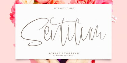 Give your designs an authentic handcrafted feel. Sentilum is perfectly suited to signature, stationery, logo, typography quotes, magazine or book cover, website header, clothing, branding, packaging design and more. This font includes: - Ligatures - Multi-lingual Support
 - Beard Canye by Fype Co,
$16.00 Beard Canye is perfect for delivering any message with confidence and style. This hand-lettered script is inspired by baseball. Beard Canye works well for logos, stationery, social media, branding, packaging, header, and so much more.
 - Esok Pagi by Maulana Creative,
$14.00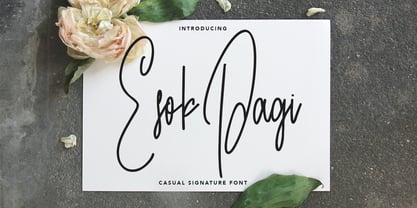 Give your designs an authentic handcrafted feel. "Esok Pagi" is perfectly suited to signature, stationery, logo, typography quotes, magazine or book cover, website header, clothing, branding, packaging design and more. Thanks for use this font. MaulanaCreative
 - Eu Alonira by Hishand Studio,
$15.00 Eu Alonira is elegant serif font that look aesthetic Perfect for Logo brand, advertisement, product packaging, social media post, clothing brand, magazine headers and many more complete with ligatures alternates regular italic icon kerning multilingual support
 - Mr Palker by Letterhead Studio-YG,
$35.00 A slab serif Mr Palker and grotesque Mr Palkerson build one superfamily together. These are blank types. In a way even the display ones. Typefaces for newspapers, announcements, cheap advertising and police posters. Mr Palker and Mr Palkerson will turn every language into a fence. And due to six types of faces one can choose what material should the fence be made from — from Thin steel rods to the Black stone blocks. In their simplest appearance Mrs P&P are intended for the solid blank composition in victorian or industrial style. They are quite decent, a bit old-fashioned slab serif and grotesque with closed aperture. All my types have layers. Walker and Palkerson also do. Besides the standard set of symbols, they have 4 add-ons. 1. Alternate glyphs, including unicase ones. 2. Ligatures with A letter. 3. Extra tall small caps. 4. Two-storey ligatures. All this options are intended for the complex composition. The additional letters are rather eccentric as their main function here is to imitate the victorian oddities. Imitate, parody, just not repeat. There are lower-case As and Es in the set in height of small caps and uppercases. They can turn every writing into the unicase. The lower-case A (as well as uppercase and small caps version of it) has deliberately by my taste grown a ludicrous tail. To compensate it I’ve built all the possible ligatures - ад, ал, ая. There are 35 of this ligatures all together. Take a closer look at the Russian letters D, L, K, Ya from the main set as well as their alternates. The additional glyphs are one more comic than the other — on purpose to imitate (not to repeat!) the victorian set. This sets have lowercase numbers. And small caps numbers as well. What a modern typeface without them. They also have an У-letter with a generously curvy tail. As if before the WWI. The Latin of course has alternates as well. It has letters to make the perfect French sound more like the russian provincial version of it. The tails of Js and Ts can be made a little bit more open — or a little bit closed. My favorite feature here, an invention of a kind - extra tall small caps. It allows to compose logos with the small caped uppercases directly from the keyboard. The small caps of this typefaces are usually much taller than the customary ones. This is the kind of small caps that Palker and Palkerson have. More to that, the strokes’ weight and the letters width are corresponded to the uppercases. Just a ready set for making a logo a la 1913 style. With a unicase, one has to mind! One more trick with the tall small caps is a possibility to make them work like lower uppercases. Their height is just in between of lower- and uppercases. Isn’t it great to have an additional set of uppercase working ponies in stock for the case of emergency. And finally — the trademark of Palkers family, two-storey ligatures. They are made in the height of uppercases and turn every writing into an ornament or a puzzle of a kind, while at the same time making them much shorter. Each face has 90 of them. Mainly those are twins: CC, BB, DD and so on. ll this things are for the unhasty compositing, even for lettering. Which means that for the things which are not there you always should have Command+Option+O and some patience. Also — among the two storey ligatures one also can find some belvedere villas. All my types are glasses from the one kaleidoscope. The P&Ps family was preliminary part of the victorian set, which already has 1 Cents and Clarendorf - optionally one can add Costro, Gordoni, Handy, Guardy, Surplus, Red Ring, Red Square, Babaev to the list. And also Sklad, Odessa, Dreamland, Romb, Platinum - here, at Letterhead’s, every second one is victorian. All together our typefaces can allow one to set advertisement of any kind, even the trickiest one, and compose everything, from the coffee place’s menu to the antiquarian magazine.
 - Mr Palkerson by Letterhead Studio-YG,
$35.00 A grotesque Mr Palkerson and slab serif Mr Palker build one superfamily together. These are blank types. In a way even the display ones. Typefaces for newspapers, announcements, cheap advertising and police posters. Mr Palker and Mr Palkerson will turn every language into a fence. And due to six types of faces one can choose what material should the fence be made from — from Thin steel rods to the Black stone blocks. In their simplest appearance Mrs P&P are intended for the solid blank composition in victorian or industrial style. They are quite decent, a bit old-fashioned slab serif and grotesque with closed aperture. All my types have layers. Walker and Palkerson also do. Besides the standard set of symbols, they have 4 add-ons. 1. Alternate glyphs, including unicase ones. 2. Ligatures with A letter. 3. Extra tall small caps. 4. Two-storey ligatures. All this options are intended for the complex composition. The additional letters are rather eccentric as their main function here is to imitate the victorian oddities. Imitate, parody, just not repeat. There are lower-case As and Es in the set in height of small caps and uppercases. They can turn every writing into the unicase. The lower-case A (as well as uppercase and small caps version of it) has deliberately by my taste grown a ludicrous tail. To compensate it I’ve built all the possible ligatures - ад, ал, ая. There are 35 of this ligatures all together. Take a closer look at the Russian letters D, L, K, Ya from the main set as well as their alternates. The additional glyphs are one more comic than the other — on purpose to imitate (not to repeat!) the victorian set. This sets have lowercase numbers. And small caps numbers as well. What a modern typeface without them. They also have an У-letter with a generously curvy tail. As if before the WWI. The Latin of course has alternates as well. It has letters to make the perfect French sound more like the russian provincial version of it. The tails of Js and Ts can be made a little bit more open — or a little bit closed. My favorite feature here, an invention of a kind - extra tall small caps. It allows to compose logos with the small caped uppercases directly from the keyboard. The small caps of this typefaces are usually much taller than the customary ones. This is the kind of small caps that Palker and Palkerson have. More to that, the strokes’ weight and the letters width are corresponded to the uppercases. Just a ready set for making a logo a la 1913 style. With a unicase, one has to mind! One more trick with the tall small caps is a possibility to make them work like lower uppercases. Their height is just in between of lower- and uppercases. Isn’t it great to have an additional set of uppercase working ponies in stock for the case of emergency. And finally — the trademark of Palkerson family, two-storey ligatures. They are made in the height of uppercases and turn every writing into an ornament or a puzzle of a kind, while at the same time making them much shorter. Each face has 90 of them. Mainly those are twins: CC, BB, DD and so on. ll this things are for the unhasty compositing, even for lettering. Which means that for the things which are not there you always should have Command+Option+O and some patience. Also — among the two storey ligatures one also can find some belvedere villas. All my types are glasses from the one kaleidoscope. The P&Ps family was preliminary part of the victorian set, which already has 21 Cents and Clarendorf - optionally one can add Costro, Gordoni, Handy, Guardy, Surplus, Red Ring, Red Square, Babaev to the list. And also Sklad, Odessa, Dreamland, Romb, Platinum - here, at Letterhead’s, every second one is victorian. All together our typefaces can allow one to set advertisement of any kind, even the trickiest one, and compose everything, from the coffee place’s menu to the antiquarian magazine.
 - Pleinair by Gaslight,
$15.00 Pleinair - all caps serif font with alternatives on lower case. Besides Pleinair have two Stylistic sets for two-tier typesetting. Also Pleinair have some decoratives and swashes characters.
 - Bunyan Pro by Canada Type,
$39.95 Bunyan Pro is the synthesis of Bunyan, the last face Eric Gill designed for hand setting in 1934 and Pilgrim, the machine face based on it, issued by British Linotype in the early 1950s — the most popular Gill text face in Britain from its release until well into the 1980s. Gill’s last face doesn't date itself anywhere near as obviously as Gill’s other serif faces, which were all really products of their time, heavily influenced by the richly ornamental and constantly changing aesthetic trends of the interwar period. When compared to Gill’s previous work, Bunyan seems like a revolution in the way he thought and drew. It’s as if he was shrugging off all heavy burden of what was popular, and going back to the basics of older standards. Bunyan had no bells and whistles, doesn't risk functionality with contrasts that are too high or too low, and didn't venture far outside the comfortable oldstyle rhythm Gill grew up with. By interbellum standards, this was utter austerity, a veritable denial of deco excess. Surprisingly, even without all the cloying trivialities, Bunyan still stood indisputably as an aesthetically pleasing, space saving design that could have been made only by Eric Gill. Bunyan Pro comes in three weights and their italics. The main font is intended for use between 8 and 14 points. The medium and the bold are great for emphasis but also have good merit in larger sizes, so can make effective display types as well. All six fonts include small caps, ligatures, alternates, six sets of figures, and three original Gill manicules. We tried to keep the best features of the handset (Bunyan) and machine (Pilgrim) versions while building a text face that can function in today’s immersive reading media. Deciding on which useful letterpress features to preserve for aesthetic importance was hell on our eyeballs — which lead to complex and painstaking ways of ironing out irregularities and inconsistencies related to metal technologies, in order to provide something with authenticity. The result is a unique typeface based on a Gill design that, to a much greater extent than any of his other faces, works well as a text face that can be used for entire books and magazines. For more information on Bunyan Pro’s character set, features, development process and some print tests, please consult the PDF in the gallery section of this page.
 - Amarga by Latinotype,
$29.00 The inspiration behind Amarga comes from the bitter taste of coffee. Amarga is a serif typeface with high contrast and pointed terminals, composed of 9 weights that range from a very heavy black version to a thin version plus italics, with a total of 18 fonts. Amarga has a great visual impact and is perfect for display uses in editorial design, web, branding, posters and many others.
 - Mymoon by Tour De Force,
$25.00 Mymoon is geometric modern sans serif family that comes in 22 weights. Aimed for universal use, in any size and in any media. It has slight retro characteristics and mostly neutral overall impression. With wide range of thickness, from Thin to Heavy, all weights are well synchronized to match ideally. Contains extended Latin character set with OT features such as OldStyle and Tabelar numerals and fractions.
 - Abdo Line by Abdo Fonts,
$49.50 Abdo Line is a simple Naskh font for books and magazines. Accurate design and clarity of reading and writing space-saving, it comes in sixth weights: Thin, Light, Regular, Bold, Heavy and Black. This is an OpenType Font supporting Arabic, Persian, Urdu Languages and compatible with the various operation systems and modern software. This font also contains many of Stylistic Sets, Ligatures and Justification Alternatives.
 - Mazot by Hurufatfont,
$29.00 Mazot is a modern sans serif with a compact and low contrast structure. Low contrast structure and terminals being flush with the body, gives it a raw effect. Perfect for Branding, Poster and Packaging designs. It has rich OpenType features. It consists of a total of 18 styles, from Light to Heavy with 9 weights and matching italics. It is available in 2-axes variable version.
 - Kotto Slab by Picador,
$29.00 Ultra Heavy Weight Font Champion – that's Kotto Slab. Bold curves and catchy endings. You can always count on Kotto – quirky posters, creative projects or long texts. That doesn't matter. Easy to use and easy to pair with other typefaces. Matching italics and opentype features will make your work faster. Try it with sans and serif fonts, especially with Praho Pro – you won't regret it.
 - Glodok by Sudtipos,
$39.00 Glodok is a single-weight display typeface. It is bold, heavy and fun to play around with. It’s eye catching but also blends well when in use. It is retro-inspired and strikes a nice balance between formal and playful. The name itself comes from the oldest Chinatown in Jakarta that is also considered the biggest in Indonesia, the place from where the designer took many inspirations.
 - India Ink by CounterPoint Type Studio,
$29.99 A heavy, bold font based on two hand lettered type specimens from the 1920s. Original designer unknown. The font has a unique combination of both Old World and Asian influences, while still maintaining a fun, upbeat casual feel. Contains a full set of Alternate Caps found under the "Stylistic Alternates" OpenType feature. Contains language support for both Latin-based and most Eastern European languages.
 - Didgeree Doodle NF by Nick's Fonts,
$10.00The pattern for this delightful little font was originally released as Bernhard Heavy Antique Cursive by the Bauersche Geißerei of Frankfurt am Main and designed, of course, by Lucien Bernhard. Dippy, trippy, under the radar and over the top. The Postscript and Truetype versions contain a complete Latin language character set (Unicode 1252); in addition, the Opentype version supports Unicode 1250 (Central European) languages as well. - Chill Script by Eclectotype,
$40.00 Looking for a break from modern calligraphy? Tired of skinny scripts? Here's something seriously relaxed. Chill Script is a totally new typeface, it eschews any brush influence, but maintains a warmth that comes from not being rigidly constructed. It's a sans serif script, with a nice top-heaviness that makes it friendly. As you expect from fonts today, it's loaded (but not pointlessly overloaded) with OpenType features.
 - BMF Brohan Black by BuyMyFonts,
$25.00Brohan Black is a monospaced font: each character has the width of the piece of paper from which it was cut with a pair of scissors. The loss is minimal, as the counters are as small as possible while still retaining maximum legibilty. To save ink, print negative. Recommended for cement companies, post-industrial record sleeves and heavy poetry. Also great for temporary signage. - Frozen Memory by Hanoded,
$15.00 Frozen Memory is a heavy-boned cartoon display font. Even though it was completely made by hand (using a roller ball pen and some quality paper), it has a clean look, crisp lines and generous curves. Frozen Memory comes in three distinct styles, helping you to create versatile designs. Frozen Memory urges you to eat more ice-cream, but just beware of that brain freeze!
 - Dassitzt by Linotype,
$29.99Dassitzt is a family of two typefaces, Dassitzt LT Typos and Dassitzt LT Pictos. Dassitzt LT Typos is a heavy industrial-grunge display face, with dark, even letters that appear cut out of black paper or iron. Dassitzt LT Pictos is a whimsical collection of pictograms. The figures in this font are black silhouettes that show a minimum amount of detail, but a maximum amount of expression. - PAG Sottoterra by Prop-a-ganda,
$19.99Prop-a-ganda offers retro-flavored fonts inspired by lettering on retro propaganda posters, retro advertising posters, retro packages all the world over. This is perfect font for your retrospective project. PAG Sottoterra is heavy and high-contrast font, and you can see triangles in some letters. This font reminds us of old posters of science fiction movie. It works best for for display or titling. - Milan In Paris by Mevstory Studio,
$25.00 Milan in Paris is a powerful and elegant display typeface, constructed to maximize use of horizontal space. Built from hand sketches drawn over several years, Milan in Paris eight weights span an elegant Thin to a vibrant Heavy, with accompanying obliques.Milan in Paris makes a strong impression in print, headlines, video, and social media – whether paired with a contrasting typeface or on its own.
 - Matria by Pedroglifos,
$12.00 Matria brings the feminine energy from a strong and heavy perspective. These letterforms are inspired by the balancing nature of the yin and yang forces, resulting in a dynamic stencil that evokes the qualities of a thorny rose. This decorative stencil-display typeface is meant to be used in combination with simpler fonts that let it stand out and spur a lot of energy into your project.
 - Punch Pro by Produce,
$29.00 Punch was born because we wanted to create a stencil font. At first glance, Punch gives out an audacious persona with its bold shape and form. It’s softer side is revealed in it’s carefully cut stencil lines. The balance of heavy and refined gives the font family its very own charm. Punch Pro comes in six different weights; Slab, Bracketed, Wedge, Deco, Hairline and Sans.
 - Gravity by Philatype,
$24.00 The Gravity family is a unique series of heavy square slab serifs intended mainly for display usage. Gravity Normal exhibits impact with legibility. Gravity Nova is fine-tuned to showcase brawn and beauty. Gravity Supernova, the most audacious of the family, commands attention with its extremely dense, mechanical design. Each weight includes diacritics for Western and Central European languages and is tightly spaced for maximum impact.
 - Remedios by ejhaa,
$20.00 Remedios, is a full-featured and elegant script font with many alternative characters and OpenType features. Handwritten in heavy italics, Remedios is perfect for invitations, branding, and editorial designs. Remedios comes with specific OpenType features including contextual changes, style changes, initial and final forms, several alternative glyphs for multiple letters (accessed via the glyph panel), multilingual support (including several currency symbols), and standard numbers.
 - Something Rounded by wearecolt,
$16.00 Something Rounded is a soft version of Something New and has been designed with logo designers and typographers firmly in mind. This feature-packed display font is a perfect addition to your design arsenal, ready for your next logo wordmark, heavy headings, or coffee labels. "A stylish mix of serif and blackletter" Great for; logos, branding materials, business cards, gift cards, t-shirts, prints, posters, quotes, etc.
 - PAG Marina by Prop-a-ganda,
$19.99Prop-a-ganda offers retro-flavored fonts inspired by lettering on retro propaganda posters, retro advertising posters, retro packages all the world over. This is perfect font for your retrospective project. PAG Maria is bold and heavy sans serif font with happy and sweet touch. It is certainly chubby, but in some ways it is also pointed. So PAG Maria is polished and friendly font. - Spur Wide JNL by Jeff Levine,
$29.00 Spur Wide JNL was modeled from an example of hand lettering from the antique French alphabet book L'Art du Tracé Rationnel de la Lettre. Heavy Roman style letters with spurs (often referred to as Latin) were most popular with sign painters and show card writers in the early part of the 20th century. Spur Wide JNL is available in both regular and oblique versions.
 - VLNL TpLlum by VetteLetters,
$35.00 TpLlum is a typeface designed by TwoPoints for a festival in Barcelona called ‘Montjuïc de Nit’. Llum means light in Catalan. In the Montjuïc de Nit project the font was used in white over a dark grey background, letting the light of a backlit poster shine through. For this purpose the typeface had to be very bright, which was made possible by its heavy cut.
 - Lord Rat AOE by Astigmatic,
$19.95 LordRat is a rugged unicase typestyle built for childish and off kilter purposes. A mix of heavy and light with quickcut appearance makes this typestyle offbeat and even festive. Put some dignified childish offbeat flavor into your designs today with LordRat. If you've been looking for a playful yet bold typestyle with papercut looks, LordRat is what you've been looking for. Get it today!
 - Bylander by Mans Greback,
$59.00 Bylander is a stateful serif typeface. With robust, heavy letterforms reminiscent of a foundry's hammer hitting molten metal, and an unpaired weight, Bylander's characters seem forged from the core of the Earth. Its rounded corners whisper tales of smoothened river stones, and its gentle curves combined with its industrial mass makes Bylander a paradox; both intimidating in its boldness and welcoming in its approach.
 - Stratham by insigne,
$21.99Stratham is vigorous sans-serif inspired by the slab serif Clarendon. It is a heavy display face, and has a tangible modern British feel to it. The italic is especially dynamic and forward moving. Stratham includes OpenType titling and swash alternates, old style figures and small caps. Stratham is useful for headlines, highly legible signage or posters and works well in conjunction with the always popular Clarendon. - Goth Chic by Comicraft,
$19.00 This pale face -- a Byronic offering from the disaffected youth section of our library -- will provide that slightly sad, sunken eyed feeling most closely associated with Doc Martins, heavy crosses and clothes as black as the blaquest heart... so if you're looking for tragic tramp stamp typography, we think our tattoo parlor maid to wear font will provide just the right amount of Goth Chic.
 - Yukas by Alex Camacho Studio,
$25.00 Yukas is a funky and sexy typeface where the proportions are based on the optical balance between black strokes and white shapes. Ideal to enjoy on a large scale. It takes its references from the psychedelic movement, old-school western movie posters, and mid-19th century American wood type with those big, heavy capital letters. Includes several Open Type alternatives to customize your design however you want.
 - Odisean SC - Personal use only

- DarkPix - Personal use only

- Wandering Pencil by Hanoded,
$15.00 I have a lot of pencils, but when I need one, they seem to have grown legs and have disappeared! When I decided I wanted to create a pencil font, it took me a long time to find the right pencil for the job! Wandering Pencil is a nice, handmade font. It is a bit shaky, a bit rough, but it does have class and will look nice on your designs! Comes with diacritics and double letter ligatures for the lower case.
 - Zombie Brush by Ditatype,
$29.00 Zombie Brush is a haunting script font that brings the undead to life with its eerie charm and brush-style appearance. Designed intentionally in large letters, this typeface commands attention and exudes a sense of horror and intrigue. Each letter is meticulously crafted with brush-like strokes, adding a touch of handcrafted artistry to the font. The brush-style appearance of this font evokes a sense of chaos and unpredictability, as if the letters were created by an unsteady hand under the influence of dark forces. The large size of the letters enhances the font's imposing presence, making it impossible to ignore. For the best legibility you can use this font in the bigger text sizes. Enjoy the available features here. Features: Multilingual Supports PUA Encoded Numerals and Punctuations Zombie Brush fits in headlines, logos, movie posters, flyers, branding materials, print media, editorial layouts, headers, and zombie-themed projects. Find out more ways to use this font by taking a look at the font preview. Thanks for purchasing our fonts. Hopefully, you have a great time using our font. Feel free to contact us anytime for further information or when you have trouble with the font. Thanks a lot and happy designing.
 - Brendisa by Jamalodin,
$20.00 Brendisa Script is modern calligraphy script font, every single letters has been carefully crafted to make your text looks beautiful. With modern script style this font will be perfect for many different project, examples: invitations, greeting cards, posters, name card, quotes, blog header, branding, logo, fashion, apparel, letter, stationery and more! Brendisa Script come with 540+ glyphs. The alternative characters were divided into several Open Type features such as Swash, Stylistic Sets, Stylistic Alternates, Contextual Alternates. The Open Type features can be accessed by using Open Type savvy programs such as Adobe Illustrator, Adobe InDesign, Adobe Photoshop Corel Draw X version, and Microsoft Word. And this Font has given PUA unicode (specially coded fonts) so that all the alternate characters can easily be accessed in full by a craftsman or designer. Brendisa Script : Uppercase & Lowercase International Language & Symbols Support Punctuation & Number PUA Unicode Range Standard Stylistic Alternates Stylistic Set 1-13 Character Variant Contextual If you don't have a program that supports OpenType features such as Adobe Illustrator and CorelDraw X Versions, you can access all the alternate glyphs using Font Book (Mac) or Character Map (Windows). If you have any question, don't hesitate to contact me by email: jamalodin11@gmail.com

