10,000 search results
(0.07 seconds)
- Beary by Balevgraph Studio,
$15.00 Beary is a stylish and modern sans serif font. You can use this font in a variety of projects to create a unique and distinctive look. The Beary font can be used anywhere without the need for opentype support. Beary fonts are available in regular, alternate, and oblique.
 - Allumi Std by Typofonderie,
$59.00 Technology in mind in 12 fonts Allumi is a different font. Different from anything Jean François Porchez has designed in the past. Allumi is a sleek typeface designed with technology in mind. It’s a perfect font family for any communication concerning design, robotics, or functionality. Pushed to its extreme limits, the Allumi shapes are neither perfectly round or geometrically square. It’s a human design with a high tech touch. Allumi can be described as the Eurostyle (designed by Aldo Novarese in 1964) of the new century, mixed with Frutiger. Allumi is a serious typeface because of the unique design and sturdy form. The pure shapes can create a global presence today with an eye on the world of tomorrow. Two widths The Allumi family has been built around two series of widths, standard and extended. Italics have been carefully designed as slanted roman with all necessary optical and human corrections to create a perfect and neat italic. I Love Typography 2009
 - Bilderberg by Almeera Studio,
$12.00 Bilderberg is a luxurious bold, serif, display typeface. It comes in 2 styles, Regular and Italic, and includes many alternates with swashes that can make your lettering / logotype become more interesting. The clean and neat of a serif combined with the swirl swashes makes this font very attractive. This font fits perfectly for logos and the other various formal forms such as invitations, labels, magazine headers, books, greeting/wedding cards, clothing, branding, product packaging, fashion, make up, quotes, stationery, novels, labels or any type of advertising purpose. Features : 2 styles (Regular and Italic) uppercase & lowercase numbers and punctuation multilingual ligatures stylistic alternates swashes PUA encoded We highly recommend using a program that supports OpenType features and Glyphs panels like many of Adobe apps and Corel Draw, so you can see and access all Glyph variations. How to Access Alternate Characters: Open glyphs panel: -In Adobe Photoshop go to Window - glyphs -In Adobe Illustrator go to Type - glyphs Thanks & Happy designing
 - Grafical by Halbfett,
$30.00 Grafical is a contemporary take on 19th-century sans serifs. In this family, the amount of geometry inherent within the letterforms has been amped up. Many shapes have received further streamlining, too. All the geometric forms you see have been optically corrected, ensuring their delivery of better legibility. Grafical ships in two different formats: depending on your preference, you can install the typeface as two Variable Fonts or use the family’s 16 static OpenType font files instead. The static fonts offer eight weights, running from Extralight through Black. Each weight has an upright and an italic font available. While the static-format fonts offer a good intermediary-step selection, users who install the Variable Fonts have vastly greater control over their text’s stroke width. The Grafical Variable and Grafical Variable Italic font’s weight axes allow users to differentiate between almost 1,000 possible font weights. That enables you to fine-tune your text’s exact appearance on-screen or in print. Grafical is the perfect tool for a range of design uses, including text on the web, text in print, and text in motion graphics. Its fonts are typographic workhorses – not just from their legibility perspective but also because of the amount of OpenType features they include. There are ligatures, for instance, as well as proportional and tabular lining and oldstyle figures, fractions, numbers placed inside circles, and even Roman numerals. Users can also substitute alternate versions of the “a”, “g”, “i”, “j”, “y”, “G”, and “Q” into their work.
 - Cassia by Hoftype,
$49.00 Cassia - a dynamic ‘Egyptienne’ with contrasting Italics and a classical appearance. More individual and agile and less cold than most Slab Serifs, it joins impetuosity with vitality. In display sizes it dazzles through its lusty appearance, and, even in the smallest sizes, it works superbly for large amounts of text. Cassia comes in ten styles, in OpenType format and with extended language support for more than 40 languages. All weights contain small caps, standard and discretional ligatures, proportional lining figures, tabular lining figures, proportional old style figures, lining old style figures, matching currency symbols, fraction- and scientific numerals.
 - Fenwick by Typodermic,
$11.95 Introducing Fenwick—a typeface that pays homage to Ontario’s rich heritage. With its unique take on late-nineteenth-century sans-serif typefaces, Fenwick is a perfect addition to any vintage-themed graphic design project. At first glance, Fenwick may resemble old-fashioned gothic typefaces, but upon closer inspection, you’ll notice its inspiration from once-popular serif display fonts and elegant clock digits. Fenwick’s unique design blends the best of both worlds, resulting in a timeless font that captures the essence of a bygone era. For added authenticity, Fenwick features proportional old-style numerals that can be easily accessed in OpenType-friendly applications. The typeface is available in Light, Light-Italic, Regular, Italic, Bold, Bold-Italic, and an engraved all-caps style, giving you the flexibility to use Fenwick in a variety of contexts. Whether you’re designing a vintage-inspired logo or creating a custom poster, Fenwick is the perfect typeface to add a touch of Ontario’s heritage to your project. So why not give Fenwick a try and see how it can elevate your designs to new heights? Most Latin-based European writing systems are supported, including the following languages. Afaan Oromo, Afar, Afrikaans, Albanian, Alsatian, Aromanian, Aymara, Bashkir (Latin), Basque, Belarusian (Latin), Bemba, Bikol, Bosnian, Breton, Cape Verdean, Creole, Catalan, Cebuano, Chamorro, Chavacano, Chichewa, Crimean Tatar (Latin), Croatian, Czech, Danish, Dawan, Dholuo, Dutch, English, Estonian, Faroese, Fijian, Filipino, Finnish, French, Frisian, Friulian, Gagauz (Latin), Galician, Ganda, Genoese, German, Greenlandic, Guadeloupean Creole, Haitian Creole, Hawaiian, Hiligaynon, Hungarian, Icelandic, Ilocano, Indonesian, Irish, Italian, Jamaican, Kaqchikel, Karakalpak (Latin), Kashubian, Kikongo, Kinyarwanda, Kirundi, Kurdish (Latin), Latvian, Lithuanian, Lombard, Low Saxon, Luxembourgish, Maasai, Makhuwa, Malay, Maltese, Māori, Moldovan, Montenegrin, Ndebele, Neapolitan, Norwegian, Novial, Occitan, Ossetian (Latin), Papiamento, Piedmontese, Polish, Portuguese, Quechua, Rarotongan, Romanian, Romansh, Sami, Sango, Saramaccan, Sardinian, Scottish Gaelic, Serbian (Latin), Shona, Sicilian, Silesian, Slovak, Slovenian, Somali, Sorbian, Sotho, Spanish, Swahili, Swazi, Swedish, Tagalog, Tahitian, Tetum, Tongan, Tshiluba, Tsonga, Tswana, Tumbuka, Turkish, Turkmen (Latin), Tuvaluan, Uzbek (Latin), Venetian, Vepsian, Võro, Walloon, Waray-Waray, Wayuu, Welsh, Wolof, Xhosa, Yapese, Zapotec Zulu and Zuni.
 - Verse Serif by Hubert Jocham Type,
$39.00 In 2006 the art director of Emotion, a women’s psychology magazine, asked me to design a copy typeface for them. Before I actually got the job I started to work on a serif. I wanted it to be feminine but still clear and modern. On one hand there are the floral round elements and on the other hand the angular serifs. In the composition I wanted the two extremes to work together. All the other elements had to be harmonized. The proportions needed to match the magazine’s requirements. The ascenders and descenders are short enough to work in narrow columns but long enough to work in small sizes. As you can imagine, the emotion-job never happened. Verse is now a serif and a san-serif with 7 weights with italics and smallcaps. In copy you should not get heavier than Heavy. Extrabold and Ultrabold work best in display.
 - Amrys by Monotype,
$65.00 There's an appealing quirkiness about Amrys, which offers a confidently unusual alternative to more conventional designs. Its charm lies in its tapering tips, flexing stems, and unexpected notches, which combine to suggest something of the chiseller's tool at work. As a modulated serif, its letter shapes live between serif and sans serif, lending the design a sense of pleasing irregularity – something that's really highlighted at larger sizes. However this is also a typeface that works for text, injecting rhythm and texture into reading. “It's distinctive, idiosyncratic, and weird,” says its designer, Ben Jones. He started designing Amrys while studying an MA at Reading University, creating it in response to a brief for a magazine typeface. Amrys features an extensive and impressive character set. In addition to Latin, Amrys covers several scripts including Cyrillic, Greek, Arabic and Armenian. The family consists of 8 weights, from Light to Black, with matching italics.
 - Snoofer by Cool Fonts,
$19.95 Snoofer is a modern font that works for both display and text. It comes in 4 weights(Regular, Italic, Bold, Bold Italic). Snoofer was inspired by a character in stories my dad told me as a kid. Somehow they always ended with "... and they never left home again." Enjoy!
 - Chauncy Pro by Chank,
$99.00 Chauncy Pro is a bouncy, artistic, childish handwriting font that comes in four practical weights: Regular, Italic, Bold and Bold Italic. The jaunty little font is based on the left-handed penmanship of an artist and it's ready to go play with some of your fanciful, light-hearted designs.
 - Metafiz by Java Pep,
$17.00 Hello, proudly present my newest serif font. Metafiz is an elegant typeface that presenting standout, classy, sophisticated, and outstanding purpose. Metafiz comes with 4 styles - regular, italic, bold, and bold italic. Don't worry about the features, Metafiz completed with uppercase & lowercase, numeral, punctuations, and multilingual that support 17 languages.
 - Tel Aviv by Yinon Ezra,
$1.00 Tel Aviv, Display San-serif typeface, 2 Widths, 4&5 Weights. Structured Shapes with familiar look, yet unique! Can be used for wide range of uses, also function well as short text.
 - Zipline by Device,
$39.00 Zipline is a geometric sans built from a folded line or ribbon. Contemporary and stylish, with a certain decorative flair. There are three variants that can can be freely mixed for effect - a solid version, a decorative lined version, and a half-solid version. Most effective used in short words or phrases at larger sizes, where the details can be appreciated.
 - Lasta by Tour De Force,
$25.00 Lasta is small serif font family with simple elegant shapes, refreshing Italics and poetic endings. Containing 2 weights and 2 italics, with lower x-height which brings more air (empty space, white space...) into paragraphs making text more graceful and legible. Thin serifs bring small touch of dynamic into letter forms, just enough to bring specific tone to paragraph. Beside being mainly imagined as fully text family, Lasta is suitable titles or decorative typography as well for, especially the Italics with fancy curvy endings.
 - Cartesian by Tyler Jamieson Moulton,
$33.00 Cartesian is a modular typeface that gets its namesake from Descartes’s cartesian coordinate plane and Conway’s Game of Life. Each character is composed of cells that each can be considered either on or off (alive or dead.) The Cartesian family includes Cartesian Serif and Cartesian Sans Serif. Furthermore, both Cartesian Serif and Sans Serif letterforms feature two-to-one stroke contrast.
 - Celestial Planet by Kufic Studio,
$15.00 Celestial Planet, a truly stylized and minimalist font. Perfect placements of glyphs and ascenders/descenders. This font includes all characters and glyph alternates (Included) to bring more charm and style into your designs. The idea of generating this font was for storytelling purposes, each character brings an individual impact in a story & posts. The complete font bucket includes; Regular, Italic, Light, Light Italic, Bold, Bold Italic, Ultra Bold & Ultra Bold Italic which will confidently bring a chic style touch to your designs and websites, the font is designed so easily be read & bring the minimalist effect to any kind of design. Kufic Studio is a platform that provides professional and high-quality designs & fonts to fill the gap that has been missing in the market.
 - Rooster Squad by Alexander Sharkov,
$9.00 Let me introduce our new handwritten font - the Rooster Squad! Our dangerous font is designed for completely different missions. Suitable for logo and package design, user interface design, online and print use, comics and more! The font contains letters from a huge number of languages. Contains Latin and Cyrillic alphabets. We also designed various ligatures and alternate letters to add variety to our cool and dangerous typeface. The font will be constantly updated and developed! Don't know what to do with your cool new project? Call the Rooster Squad!
 - Autoray by PizzaDude.dk,
$16.00 Usually fonts that are related to computers, space, future are not handmade, but rather digital made. Autoray is 100% handmade, and I am not sure which category it fits in. It has this futuristic and intergalactic look, but at the same time the handmade details are pointing in a more grafitti and comic way. I will let you decide where to go with Autoray! I have added 5 different versions of each letter, and they automatically changes as you type - and of course, there's multilingual support - and even intergalactic gravity! :)
 - RF Barbariska by Russian Fonts,
$19.00 Handcrafted typeface with a friendly character. Two weights in three styles. Weights: Regular and Oblique. Styles: normal, rough1, rough2. Weight and shape of the letters allows using the font to solve any graphical problems. Package design for food or cosmetic products. Posters or music cover. Logos. Prints on sweatshirts or t-shirts. Children’s books or comics. Barbariska could be used in all sorts of projects. Features: ligatures, contextual alternates, old style numbers, fina and init for capitals letters. Support: cyrillic, cyrillic extended, latin, latin extended (Western European, Central European, South-East).
 - Architect Small Block by Quiet Designs Inc.,
$20.00This hand-crafted font was designed for architect, blueprint and drawing use. Small font sizes have good contrast and are very easy to read. Larger font sizes create distinguished-looking headings. This font is also a good choice for adding a personal hand lettered touch, as opposed to fonts with perfectly formed lines and curves or other script fonts that are less formal and often difficult to read. The font resembles a cross between comic and VAG fonts. Architect Small Block started its life as small block letters on vellum ... hence its name. - Pagoda International by Poole,
$18.50Imagine there's an explosion in a comic book, the exclamation that follows is set in PAGODA INTERNATIONAL. This font is inspired by the graphics on one of Honolulu's 1950's skyscrapers - The Pagoda Hotel with the International Ballroom. Created by former wine label designer, Wesley Poole, Pagoda is the opposite of sophisticated elegance. "Big, fat, and horsy, that's what I was after. It's the wacky juxtaposition of these familiar shapes that makes it work. Just try a couple words. You'll be surprised! I'm glad this one's behind me. It's my first pancake." - Boola Boola NF by Nick's Fonts,
$10.00This typeface is a new and improved (really!) version of one of my most popular freeware fonts, Team Spirit, which has made appearances in the Tank McNamara comic strip and on Blue Collar TV. Add the “nose” at the front with an open parenthesis -(- and add the tail with a close parenthesis -). To continue the bar beneath between words, use the _underscore in place of a space. No math operators and limited punctuation, but complete accented characters for the Unicode 1252 (Latin) and Unicode 1250 (Central European) character sets, with localization for Romanian and Moldovan. - Random Notes by Gassstype,
$23.00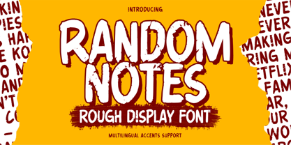 Hello Everyone,introduce our new product Random Notes is a Rough Display Font Handmade Font is a Strong Style and classy style, This font is great for your next creative project such as logos, printed quotes, invitations, cards, product packaging, headers, Logotype, Letterhead, Poster, Label, cartoon, and comic etc. This font is great for your creative projects such as watermark on photography, and perfect for logos & branding, photography, invitation. Random Notes a natural handwritten feel. This handmade font will make your design has a beautiful natural touch for each details.
 - Gorilazy by Scratch Design,
$10.00 Gorilazy is playful handful font, this font has a cute and unique shape and it's perfect for playful design like beautiful contrasting typography for a diversity of design projects, including; logos & branding, packaging design, social media posts, advertisements & product designs, poster, presentation, children's movie title, quotes, youtube title, novel cover, comic book design, and etc. This font also supports multi-languages and Cyrillic font type. Gorilazy font containing uppercase only characters, numerals, and a large range of punctuation. Creates a perfect pairing of beautiful contrast with Gorilazy fonts.
 - Bertram by ITC,
$29.00Bertram Plain is the perfect font for setting titles in comic strips and similar designs. UK designer Martin Wait created this font 1991, after he was inspired by the casual style of circus graphics. In fact, this jolly and lighthearted font was even named after one circus in particular: the Bertram Mills Circus. Bertram Plain is an all-caps font, with capital letters placed on both the upper and lowercase keyboard strokes. Additionally, Bertram Plain letters sport a 3D-like drop shadow, a distinctive feature when comparing this to many other display fonts. - Juicy Advice by PizzaDude.dk,
$15.00 To tell you the truth, I don’t know what a juicy advice is - other than I guess it’s something positive and maybe even helpful. Well, what I do know is that this Juicy Advice is positive, helpful and playful. It’s a handmade comic font, with an outline version to compliment the Regular version. The outline version is also handmade, but not entirely sticking to the boundaries of the shapes of the Regular version. This leaves the outline somewhat off, but deliberately in order to keep the authentic feeling.
 - Simpel by Letterhead Studio-IG,
$30.00 This font was made during testing of a neat little application, that traced hand-written letters on the fly. That application was later abandoned, and the font, named Simpel for it's obvious casual simplicity, was finished separately. This story goes up to the year 1998, and recently the font was returned from the archives. SImpel was completly remastered and some useful ligatures were added. It is nice, clean and really, quite simple. Which often comes very handy. It will work well in comic books, magazines and party flyers, for instance.
 - Dalek by K-Type,
$20.00 DALEK is a distressed, small caps typeface based on the lettering used in the Dalek Book of 1964 and in the Daleks strip in TV21 comic. The fonts have overtones of Greek, Phoenician and Runic alphabets. The updated Dalek fonts contain a full complement of Latin Extended-A characters, and also include Greek capitals and small caps. In addition to the original Regular font, Heavy and Light weights are available, and optically corrected obliques for each weight. Also check out Dalek Pinpoint, a clean and precise version of the Dalek typeface.
 - Toonerville NF by Nick's Fonts,
$10.00The original sheet music for Ted (Is Everybody Happy?) Lewis’ signature tune, When My Baby Smiles at Me, inspired this whimsical wonder. The sheet music was discovered in the Library of Congress American Memory Collection, an incredible online resource. The typeface gets its name from a slightly loony early 1900s comic strip by Fontaine Fox. This new and improved version has beefed-up outlines, so it renders well even at smaller sizes. Both versions contain the complete Unicode 1252 (Latin) and Unicode 1250 (Central European) character sets, with localization for Romanian and Moldovan. - Grand Guignol by Comicraft,
$19.00 A gruesome operatic drama is about to unfold, a tragic performance of the macabre! We offer for your entertainment a series of unfortunate events full of shocks and lugubrious revelations which will chill you to the bone! We also offer you this font, which may have similar effects, including nausea, migraine, heart palpitations and stomach upset. Pretty, though, isn't it? Art Deco & Art Nouveau posters, this font pair defined the look of John's MARVEL'S FINEST book designs in the early 2000s, and Richard's comic ASK FOR MERCY in the 2020s!
 - Vernacular Serif by jpFonts,
$19.95 The Vernacular trilogy was designed by Swiss designer Hans-Jürg Hunziker, who had worked for Adrian Frutiger in Paris for many years. Based on the concept of a transitional Linear Antiqua, he has developed a colorful bouquet of typefaces that contain the entire spectrum of typefaces for book design and corporate identity. Thanks to his "Swiss school" and his outstanding skills, he has succeeded in giving the typefaces a particularly noble and sympathetic expression. In addition to the Sans family, there is a Serif family and a Clarendon family, each of which, including the separately drawn italics, is equipped with 12 font weights that are finely tuned to one another. Each of the 3 font styles develops its own character, but thanks to a concept that brings the different font styles closer together, they also work well together and complement each other perfectly. Sans and Clarendon have a vertical axis and similar endings in contrast to the Serif, which has a traditional diagonal axis and horizontal endings. The straight stems and the proportions are used as an element to stress the closeness of the typeface-trilogy. They thus share a comon feature. All fonts contain tabular and proportional figures as well as old style figures. Small caps and small cap figures are also available in all fonts. In addition, some fonts have alternative characters available via style set, such as «g», which can be used to further vary the typeface. Vernacular offers all the options for well-kept typesetting for print and web - for small and large orders.
 - Vernacular Clarendon by jpFonts,
$19.95 The Vernacular trilogy was designed by Swiss designer Hans-Jürg Hunziker, who had worked for Adrian Frutiger in Paris for many years. Based on the concept of a transitional Linear Antiqua, he has developed a colorful bouquet of typefaces that contain the entire spectrum of typefaces for book design and corporate identity. Thanks to his "Swiss school" and his outstanding skills, he has succeeded in giving the typefaces a particularly noble and sympathetic expression. In addition to the Sans family, there is a Serif family and a Clarendon family, each of which, including the separately drawn italics, is equipped with 12 font weights that are finely tuned to one another. Each of the 3 font styles develops its own character, but thanks to a concept that brings the different font styles closer together, they also work well together and complement each other perfectly. Sans and Clarendon have a vertical axis and similar endings in contrast to the Serif, which has a traditional diagonal axis and horizontal endings. The straight stems and the proportions are used as an element to stress the closeness of the typeface-trilogy. They thus share a comon feature. All fonts contain tabular and proportional figures as well as old style figures. Small caps and small cap figures are also available in all fonts. In addition, some fonts have alternative characters available via style set, such as «g», which can be used to further vary the typeface. Vernacular offers all the options for well-kept typesetting for print and web - for small and large orders.
 - Klint by Linotype,
$40.99 Type designer Hannes von Döhren created Klint. A sans serif typeface with a technical appearance and humanistic streak. The family includes five weights; each weight ships in three widths: condensed, regular, and extended. All of the 15 Klint variants have a companion Italic, rounding out family at 30 fonts. Klint's large x-height makes the design especially legible at small point sizes. In today's day and age, appliance manufacturers and/or companies in the mobile phone, computer hardware and software or Internet sectors are becoming ever more important. Klint fills the rising need for superfamilies with a technical feeling that are also legible in both text and display settings. Through conspicuous letters like R, K, k, or g, as well as the independent nature of its Italic, Klint exudes an ethos that separates it from the competition. Longer text passages in brochures, catalogs, or magazines would be well served by Klint's Light, Regular, and Medium weights. The heavier cuts are optimized for poster settings and headlines."
 - Drystick Geo Grotesk by deFharo,
$14.00 Drystick is a Sans Serif typographic family of Geo-Grotesque style with 8 pesos plus the italic versions all include small capital letters the symbol of Bitcoin (b #) and other cryptocurrency symbols. It is a geometric typography, minimalist, with neo-grotesque modulations. The typeface has alternative letters and numbers, small caps and advanced OpenType functions. The Italic versions have some of their own characters (&, @, Q, a, g, y), these versions have many optical corrections to balance the deformations created in many curves by the mere inclination of the letters, which in the case of This typography is 9 °. The drawn of the vectors is careful to obtain smooth curves and elegant appearance, the thicker versions have ink traps in the joints of the joints to use in small sizes. The Metric and the Kerning of all the versions I have reviewed individually to obtain maximum readability in any type of text and size.
 - Pusia by ROHH,
$40.00 Pusia is a versatile font family with a lot of character and warmth. It is a professional, contemporary sans serif with original letter forms, friendly and dynamic feel. Its subtle curved shapes and attention to details give Pusia a very distinctive look. Its proportions and optimized kerning make it a very clean and legible in all sizes. Pusia is a great choice for all kinds of design work, both print and on-screen. It is perfect for display use in headlines, advertising, logo design and branding as well as long and short paragraphs of text. Pusia consists of 20 fonts - 10 weights and their corresponding italics. It has extended language support including cyrillic and true italics, as well as broad number of OpenType features, such as small caps, case sensitive forms, ligatures, stylistic alternates, contextual alternates, lining, oldstyle, tabular, small cap and circled figures, slashed zero, fractions, superscript and subscript, ordinals, currencies and symbols.
 - Tosia by ROHH,
$40.00 Tosia is a modern, geometric, clean, elegant and versatile font family designed with neutrality, beautiful proportion and excellent legibility in mind. This professional, contemporary sans serif has slightly condensed dimensions, which make it a great typeface for situations, where space saving is needed. Tosia’s broad variety of weights makes it suitable for headlines of all sizes, as well as for long and short paragraphs of text. It is excellent for on-screen use, for web applications, user interfaces, as well as for all kind of print purposes, like branding, packaging and editorial design. Tosia consists of 20 fonts - 10 weights and their corresponding italics. It has extended language support including cyrillic and true italics, as well as broad number of OpenType features, such as small caps, case sensitive forms, ligatures, stylistic alternates, contextual alternates, lining, oldstyle, tabular, small cap and circled figures, slashed zero, fractions, superscript and subscript, ordinals, currencies and symbols.
 - Lucida Grande Mono by Monotype,
$50.99 Lucida Grande Mono is a humanist, sans-serif, monospaced font with a large x-height, clear letterforms, and space-saving economy. Its easy reading qualities make it legible for printing and screen displays even down to small sizes. Lucida Grande Mono matches the weight, vertical proportions and look of Lucida Grande but with fixed-width functionality that has made its design popular in a wide range of practical applications, including programming, terminal emulation, and typewriter styling for business or personal correspondence on-line or print. Lucida Grande Mono is part of the Lucida superfamily of fonts from Bigelow & Holmes. Lucida is highly regarded for legibility and its extensive range of type styles. The Lucida Grande Mono has four fonts: Regular, Italic, Bold and Bold Italic. Each font has 685 glyphs and supports the W1G character set. This includes Latin, Greek and Cyrillic alphabets to support many languages in Europe, the Americas, and worldwide.
 - Cream by Monotype,
$30.00 Cream is a retro soft serif typeface comprising 12 fonts. It can handle most typographic applications from branding to body copy with its range of weights and inherent legibility. Whatever you type will have a friendly message, but it really comes into its own when you start applying some of the additional ligatures and alternates that are built into this type family. You’ll soon be creating distinctive typographic compositions that are pleasing to the eye. There are 12 fonts altogether, ranging from Light to Black weights in both roman and italic. It has an extensive character set that covers all Latin European languages. Key features: 6 weights in Roman and Italic 75 Alternates 37 Ligatures Full European character set (Latin only) 730 glyphs per font.
 - Scoundrel by Comicraft,
$19.00 Leathery and Loopy Letterer of Legend, Richard Starkings has pointed his Apple Pencil at Procreate on his iPad and proceeded to raise the bar on lower case for this scandalous series of squiggles we had to call Rendered in the style of ShoutOut, this jaunty new Comicraft offering features both upper and lower case and recreates a pen lettering style of which we honestly thought Old Man Starkings was no longer capable! Suitable for jolly journal entries, hand-written notes to loved ones and sundry laundry lists, SCOUNDREL does more than Shout, and it does it quite quietly too! Scoundrel includes four weights (Regular, Italic, Bold & Bold Italic) with upper and lower case alphabets plus Western and Central European international characters.
 - Guilin by Sensatype Studio,
$15.00 A Modern Luxury Font that we created special for elegant branding needs, with extra ligature and alternates in unique shape will be ready to add value of your brand. It so nice to leverage designer or product owner that need solutions to make their design look more classy and modern. And specially for Calista font, We prepared any ligatures, and any alternate characters to help you create unlimited variations for your creative needs. Guilin Modern Luxury Font Family ready with: Any options to get creative variations (combination of Alternate and Ligatures) Ready 4 Weights (Thin, Regular, Thin Italic, Italic) Preview as a inspirations that you can do with Guilin font Ready with Lowercase and Uppercase characters Wish you enjoy our font. :)