2,080 search results
(0.018 seconds)
- SF Groove Machine - Unknown license
- SF Synthonic Pop - Unknown license
- SF Baroquesque Extended - Unknown license
- SF Laundromatic Extended - Unknown license
- SF Zero Gravity - Unknown license
- SF Baroquesque Condensed - Unknown license
- SF Speedwaystar Condensed - Unknown license
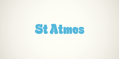
- St Atmos by Stereotypes,
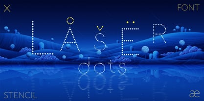
$29.00 - Laser Dots by Etewut,
$17.00 - Black Oak - Personal use only
- Ghoulish - 100% free
- Feathergraphy Decoration - Personal use only
- Lighthouse Personal Use - Personal use only
- SF Grandezza - Unknown license
- SF Beaverton - Unknown license
- SF Willamette - Unknown license
- SF Laundromatic - Unknown license
- Mailart - Unknown license
- Scienide - Unknown license
- SF DecoTechno - Unknown license
- SF Baroquesque - Unknown license
- SF Wasabi - Unknown license
- SF Wasabi - Unknown license
- SF Beaverton - Unknown license
- SF Speedwaystar - Unknown license
- SF Retroesque - Unknown license
- SF Beaverton - Unknown license
- SF Retroesque - Unknown license
- SF Laundromatic - Unknown license
- SF DecoTechno - Unknown license
- SF Speedwaystar - Unknown license
- Vienna by Solotype,
$19.95 - Yugoslavia - Personal use only
- Motion Picture Personal Use - Personal use only
- Ordinatum Medium - Personal use only
- Jacked Eleven Highlight - Personal use only
- Roskrift Clean - Personal use only
- Action Man Shaded - Personal use only
- OXIDISASTER - Personal use only
- Give You Glory - Personal use only


