10,000 search results
(0.074 seconds)
- Fillings Urban by Prioritype,
$69.00 The graffiti style that is favored by young people. Comes in 2 styles (Regular & Outline). Can be applied to clothing design, crafts, posters, hip hop music, children's book covers, comics, cartoons etc. See some of the previews above for reference. Features: -Uppercase -Numeral -Punctuation -Multilingual -PUA Encoded -Opentype Features
 - Black Apostle by Chekart,
$17.00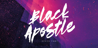 Black Apostle is a hand drawn brush font. It comes with uppercase and lowercase characters, set of punctuation glyphs, numerals, Cyrillic characters, some Cyrillic ligatures and multilingual support. Perfect for logos, quotes, posters, branding projects, product packaging, t-shirt, book cover, greeting cards and applicable for any graphic design.
 - Alien Spaceship by Gassstype,
$29.00 introducing : Alien Spaceship Font ,come with powerful themes. We wanted to create the most unique character. It matches applies in some designs such as the gaming logo, logotype, brand, packaging, quotes, cute poster, kids shirt, cover book, birthday invitation and more custom design. Alien Spaceship Font is 3 style.
 - Grante by PintassilgoPrints,
$19.00 As you can see above, Grante can smartly fit pretty different needs. While lowercase letters are bold-with-soft-edges, caps are magic: this font counts more than 100 ligatures for you to play in an OpenType-aware application. It is worth mentioning that even without OpenType tricks it is possible to use these ligatures, setting them "by hand". We hope you enjoy. Hey! Have we said that dingbats are included?
 - Irritation by Ingrimayne Type,
$12.95 Have you ever had to read text from a cheap dot-matrix printer which is not aligned quite right, so that the tops of the letters are either darker or lighter than the bottoms? Now with IrritationOne and IrritationTwo you can relive that experience even though you no longer use a dot-matrix printer. IrritationOne has dark tops and fading bottoms, while IrritationTwo has the opposite. Naturally both are monospaced.
 - Blob Control by Rachel McBride Creative,
$9.00 Blob Control is the perfect typeface to use for any project that needs a youthful or juvenile flair. It's inspired by the messy, eccentric nature of adolescence. It comes with seven fonts and weights, so it can work with any project it's needed in! It comes equipped with over 400 characters to support most western languages! Great for use on children's books, toys, handwritten projects, retro projects, websites, and animations/cartoons.
 - Mysterious by Hanoded,
$15.00 Mysterious is a bit of an unusual font. It looks old fashioned, but it comes with cool stylistic alternates, it could be a didone, but it is not (really), it looks formal, but it is rather scary. Mysterious was more or less based on the titling pages of 17th century atlases and my own twisted imagination. It comes with a whole bunch of ligatures and stylistic alternates, plus extensive language support.
 - Whiplash by 38-lineart,
$16.00 Whiplash is a natural handwritten font with firm strokes as the main character. All-caps and mixed-match are the main concepts of this font, where the uppercase and lowercase can be pair according to your taste. This font has a very strong and very prominent character that will distract the eyes. This is a great choice when used as a title on banners, posters, book titles and even magazine covers. Modern lifestyle brands such as fashion, cosmetics, and outdoor sports are also a trend to use this font style. You who like travelling can also try to write a caption or quote, people are increasingly curious about the mystery of your adventure and short notes. Besides being equipped with multi-language, we also equip ligature such as ee, ll, gg, oo, ss, tt, pp, rr. Enjoy our fonts, and make sure your brand will stand out and invite people to take a closer look.
 - Finador by Julien Fincker,
$24.00 Finador is a modern, soft geometric sans family. The functional style of a geometric sans has been soften by open apertures and rounded corners. This makes it functional and friendly. The default version has open, modern apertures. Stylistic Set 2 includes the whole set with closed, classic apertures. A slightly different look. It´s like having a second font in just one font. So it´s up to you to choose the right look for your projects. The Finador family includes 8 weights, from thin to heavy + their matching italics. With 900+ glyphs per style it supports over 200+ latin based languages, includes an extended currency symbol set and a lot of Open Type Features like small caps, ligatures, fractions, alternates and many more. The lightest and boldest weights are good for display usage, while the middle weights can be also used for body text. As a versatile allrounder Finador supports almost every of your needs. It has the ability to become your next favorite workhorse family.
 - Celari Titling by insigne,
$- Need for speed? Satisfy it with insigne’s Celari. Take it for a drive and watch how its simple curves, easy lines, and sturdy shapes handle the edges and corners of your projects with smooth and rapid execution. The negative space cuts through the rounded sans serif letterforms of Celari, giving this all-caps typeface a strong impression of dimension and speed. Celari’s organic stroke direction allows you to ease through its gentle turns, too, causing the font to hum around the lines of your project like a V8 engine on an open Nevada highway. The speed and agility of Celari is built for nothing less than a headline. Use the larger-than-life power of this face for any number of oversized applications--mastheads, posters, web headlines, flyers. It provides excellent performance for service-oriented ads where efficiency and quick buyer service are priorities. Customize your ride, too. The OpenType version of Celari includes some serious add-ons to make it your design. The font incorporates discretionary ligatures for some funky combinations and adds in stylistic and contextual alternates for virtually endless possibilities with the characters, ligatures, and composites. Make sure your setup allows for OpenType fonts (Adobe CS suite or Quark) before unleashing the fun of Celari, though. Be confident with your design. Be quick with your message. Again, take Celari for a drive and unleash the strength and velocity of its character in your design. You've been holding back long enough.
 - HU Noodle KR by Heummdesign,
$25.00 HU NoodleKR is a stencil-type font designed for drawing with one brush and writing in stroke order. It is composed of large grapheme for good visibility, and fine curves are added to the shape based on straight lines to create a soft feel. In particular, it is a full-bodied square font where personality is felt in double consonants. HU NoodleKR includes Korean.
 - Fairfield by Linotype,
$41.99 Rudolph Ruzicka designed his font Fairfield as a legible text font. His philosophy: The reader expects optical assistance with reading. He does not want to be distracted while interpreting and understanding the ideas of a text." Fairfield font is based on the forms of Venecian Old Face fonts as well as on the designs and details of Art Deco, giving the font a distinctive appearance"
 - bearerFond by JOEBOB graphics,
$9.00 BearerFond has been in my pen for years and I've used this way of writing a lot on cassette cases. Anyone still using cassettes? Me neither, so in order to keep it alive I have made a font out of it and named it bearerFond; as in bearer bond, since it looks like it could be used on official documents. Nothing too official though.
 - The Wickyfest by Colllab Studio,
$14.00 "Hi there, thank you for passing by. Colllab Studio is here. We crafted best collection of typefaces in a variety of styles to keep you covered for any project that comes your way! You want a playful serif font. Something elegant and charming, but still lighthearted , fun and cheerful with a dash of mischief? Introducing The Wickyfest, a playful serif font with a classic tone. If your next project requires a playful touch, you'll love this collection of special characters and features. The Wickyfest style is incredibly well-crafted, resulting in versatile characters that can present a dashing display for your branding designs and ads. For more extravagant projects, try The Wickyfest for children-related graphics, like book covers, movie titles, or posters. Download The Wickyfest Now and make your designs more memorable. String together words that spell out who you are - not just what you do. Sharpen the image of your company or give your online presence a touch of class and charm. Don’t be afraid to let your clients see there’s more to business than just that bottom line. A Million Thanks www.colllabstudio.com
 - Moku Brush by Deltatype,
$49.00 Moku Brush is a structural brush script inspired from handwriting with brush, with straight letterform you will get less formal but more sweet! Moku Brush come with nine weights, so you can use as body text or even better with headline. With nine variations, you can use this font in different sizes with different weights, you will get better balance when do type setup.
 - Kosumi by Thinkdust,
$10.00 Kosumi is an experimental display typeface. Its juxtaposition of thick and thin catches that gleam in your eye, and leads you by the hand out of your comfort zone with such ease that you'll never look back. Kosumi is comfortable in any of a thousand different places, looking brilliant on posters, and reigning supreme within magazine spreads. All you need to do is let is whisk you away. The eye-catching differences between thick and thin lines serve to capitalise your attention, ensuring your nicely laid out headline is truly the star of the show!
 - Great Squater Graffiti by Sipanji21,
$10.00 "Great Squater" is a graffiti font with two layers: solid and shadow. By using both of these layers in your design, you can create a three-dimensional (3D) effect on your text. Fonts like this are often used in street art, posters, or other designs that aim to add depth and dimension to their typography. With "Great Squater," you have the flexibility to make your text appear more dynamic and three-dimensional by using different layers. This allows you to customize the text's appearance to fit your design concept.
 - Urban Maxim 3d Graffiti by Sipanji21,
$15.00 Urban Maxim" is a graffiti font that features three different layers: solid, shadow, and inner shadow. By using this combination of layers in your design, you can create a three-dimensional (3D) effect on your text. Fonts like this are often used in street art, posters, or other designs that aim to add depth and dimension to their typography. With "Urban Maxim," you have the flexibility to create text that looks distinct and more pronounced by using the various layers. This allows you to customize the appearance of your text to fit your design aesthetics.
 - Revista by Latinotype,
$29.00 Revista is a typographic system that brings together all the features to undertake any fashion magazine-oriented project. The font harmoniously blends different styles into a single big family, which consists of a Didone uppercase and small caps family—including 4 variants ranging from a monolinear Thin to Black with matching italics—and an Inline Black variant that works as a decorative alternative to the Didone fonts. Revista Stencil, one of its versions, comes with the same number of variants. Revista also comes with a Script Family that includes 5 weights, ranging from Thin (monolinear) to Black, contrasting in a tidily untidy way with many ligatures and alternates. You can choose between using stylistic alternates—if you want to give your designs a different untidy look, in the style of the modern calligraphy—or switching between different options if you are looking for a hand-written style. We highly recommend using the default contextual alternates and discretionary ligatures in order to take more advantage of this great font family. Revista includes 2 sets of dingbats, varying from zodiac signs symbols to technology symbols, and complementary ornaments in 3 different weights: Thin (monolinear), Regular and Black. All these features make Revista an ideal typeface for users to design to their liking! Photo by Fervent-adepte-de-la-mode
 - Autumn Voyage by Hanoded,
$15.00 Autumn is my favourite time of the year: I love the colors in the forest, the colder temperature and the stormy winds. Autumn Voyage is a very nice set of hand made fonts: a fat one, a thin one and a lovely autumn leaves doodle pack. Comes with a heap of diacritics as well.
 - Premis by Fenotype,
$20.00 Do you often find yourself looking for a font that is universal and neutral on the one hand, and distinctive and special on the other? Here's one for you. Premis is a fairly broad font family that is suitable for versatile use, but still has plenty of original details, such as straight endings in the letters r, t and f. Equally current and timeless, Premis is available in three different widths. In terms of features, Premis is sensibly designed to meet demanding use, including, for example, capital letters and several different number styles. Make Premis your premise.
 - Rig Solid by Jamie Clarke Type,
$20.00 Rig Solid extends your typography toolkit with a range of energetic 3D fonts. Add dynamism to headlines and logos 13 styles across four weights Solid and gradient 3D designs Clean ‘unbreakable’ geometric shapes Rig Solid follows the award-winning design of its big brother, Rig Shaded. Each style can be used individually, making it even easy to achieve eye-catching 3D effects in print and on the web. The striking halftone styles add texture to your typography, while the hardy solid styles give your designs a visual punch and remain prominent when used over photography and patterned backgrounds. The family includes the unshaded style, ‘Bold Solo’, to perfectly compliment the shaded styles or be used on its own. Rig Solid does not require professional design software to use and is compatible with Microsoft Word.
 - Fibra by Los Andes,
$26.00 The font is actually not a revival of ‘Avant Garde’—by Herb Lubalin—but it takes its spirit. Fibra is a geometric sans serif, yet without the typical structural strictness of these kind of fonts, that represents experimental type design. This can be seen in the contrast between curves and straight lines in some characters such as ’n’ and ‘h’ unlike rounded ones such as ‘a’ and ‘d’; details of some display characters (e.g. three upper terminals in ‘W’ and projection off the stem in ‘A’); and exaggerated terminal in ‘R’. All these features give Fibra a strong personality—a sans serif typeface that ‘gives you the chills’. Fibra was specially designed for display use. The font has a very generous x-height that allows for use in corporate text, thanks to its good readability. Fibra comes with 2 subfamilies—a more ’normal’ Basic family, with a smaller amount of stylistic features, for use in subheadings or any other type of text that requires formality, and an Alt family that shows off the true potential of the font, making it the perfect choice for magazine headlines, posters and logotypes.
 - Holiday by alphArt,
$13.00 Introducing our UPDATE "Holiday - Script Handwritten Font" Two years ago we created a script handwritten font that we named Holiday, we didn't expect, hundreds of designers have use the Holiday font, this is really cool font. And today, we've been working hard to make this Holiday font even better, it's the best script handwritten font we've ever made, we've named it Holiday2. Holiday2 - Script Handwritten Font is a handwritten script font with a simple and classy style, this font is great for your next creative projects such as branding, watermark on photography, signature or signature logo design, quotes, album cover, business card, and many other design project. From business cards to photo watermarks, Holiday2 is here to elevate your work to the highest level. However, we still included our old Holiday font, we created Holiday2 to be easier to read and of course with a better design and clean. Holiday comes with uppercase letters, lowercase letters, lowercase alternative letters, numbers, punctuation, ligature and multi lingual support To use alternative end text is just block end letters and select alternative letters on glyphs option. it may be used in almost any program by using your Operating System’s utilities (CharacterMap for Windows and Font Book for Mac.), as well as Illustrator, Photoshop CC 2017 and several other applications. we hope you enjoy this font. If you have any questions please don't hesitate to drop me a message :) Thank you, Best regards alphArt
 - The Rangen by Shakira Studio,
$17.00 Say hello to new serif font, Rangen! Rangen is a serif font that incorporates boldness and uniqueness in each letter. With bold, bold characters, Rangen exudes classic serif elegance while still blending with refreshing modern and retro touches. Rangen is the ideal choice for a variety of design projects. This font is suitable for use in headlines, logos, branding, marketing materials, posters, and more. With modern and retro nuances presented in harmony, Rangen gives you the flexibility to create a look that suits your design vision. Let the Rangen letters speak with boldness and beauty, creating impressive and inspiring works. Here's what you get: Rangen Regular All Multilingual symbol Opentype features ( ligature, alternate ) Accessible in the Adobe Illustrator, Adobe Photoshop, Adobe InDesign, even work on Microsoft Word. PUA Encoded Characters - Fully accessible without additional design software. Multilingual character supports : (Afrikaans, Albanian, Catalan, Croatian, Czech, Danish, Dutch, English, Estonian, Finnish, French, German, Hungarian, Icelandic, Italian, Lithuanian, Maltese, Norwegian, Polish, Portuguese, Slovenian, Spanish, Swedish, Turkish, Zulu) Follow my shop for upcoming updates, and for more of my work, Thank you! shakirastudio.com
 - Montage by House Industries,
$33.00 Montage has played a weighty role in some of the most influential and enduring typography of the past few decades, from book jackets and album covers, to posters and logos…you name it. Exhibiting an uncommon ability to wield immense power while demonstrating extraordinary finesse, Montage’s commanding profile packs a hefty punch which is softened only by its lithe yet durable serifs. Originally designed for Photo-Lettering in the mid-1960s by type legend, Ed Benguiat, the fonts were given a jump start by Jess Collins before ultimately being shaped into five compatible widths by longtime House co-conspirator, Mitja Miklavčič. Under the guidance of Ben Kiel, along with some additional chin-stroking by Ken Barber, Montage has been fully developed into a robust family ready to tackle any challenge you can throw at it. FEATURES LIGATURES: In order to ensure that Montage maintains its bold presence in tricky text settings, we’ve added a handy set of pre-drawn letter combinations. When enabled, the Ligature feature identifies problem pairs like—fl, fi, ff, ffl, and of course, fyi—and substitutes them with glyphs optimized to enhance font performance. ALTERNATES: For fickle typographers, we’ve also added a handful of alternate characters to allow Montage to suit any number of mood Like all good subversives, House Industries hides in plain sight while amplifying the look, feel and style of the world’s most interesting brands, products and people. Based in Delaware, visually influencing the world.
 - Mr Palker by Letterhead Studio-YG,
$35.00 A slab serif Mr Palker and grotesque Mr Palkerson build one superfamily together. These are blank types. In a way even the display ones. Typefaces for newspapers, announcements, cheap advertising and police posters. Mr Palker and Mr Palkerson will turn every language into a fence. And due to six types of faces one can choose what material should the fence be made from — from Thin steel rods to the Black stone blocks. In their simplest appearance Mrs P&P are intended for the solid blank composition in victorian or industrial style. They are quite decent, a bit old-fashioned slab serif and grotesque with closed aperture. All my types have layers. Walker and Palkerson also do. Besides the standard set of symbols, they have 4 add-ons. 1. Alternate glyphs, including unicase ones. 2. Ligatures with A letter. 3. Extra tall small caps. 4. Two-storey ligatures. All this options are intended for the complex composition. The additional letters are rather eccentric as their main function here is to imitate the victorian oddities. Imitate, parody, just not repeat. There are lower-case As and Es in the set in height of small caps and uppercases. They can turn every writing into the unicase. The lower-case A (as well as uppercase and small caps version of it) has deliberately by my taste grown a ludicrous tail. To compensate it I’ve built all the possible ligatures - ад, ал, ая. There are 35 of this ligatures all together. Take a closer look at the Russian letters D, L, K, Ya from the main set as well as their alternates. The additional glyphs are one more comic than the other — on purpose to imitate (not to repeat!) the victorian set. This sets have lowercase numbers. And small caps numbers as well. What a modern typeface without them. They also have an У-letter with a generously curvy tail. As if before the WWI. The Latin of course has alternates as well. It has letters to make the perfect French sound more like the russian provincial version of it. The tails of Js and Ts can be made a little bit more open — or a little bit closed. My favorite feature here, an invention of a kind - extra tall small caps. It allows to compose logos with the small caped uppercases directly from the keyboard. The small caps of this typefaces are usually much taller than the customary ones. This is the kind of small caps that Palker and Palkerson have. More to that, the strokes’ weight and the letters width are corresponded to the uppercases. Just a ready set for making a logo a la 1913 style. With a unicase, one has to mind! One more trick with the tall small caps is a possibility to make them work like lower uppercases. Their height is just in between of lower- and uppercases. Isn’t it great to have an additional set of uppercase working ponies in stock for the case of emergency. And finally — the trademark of Palkers family, two-storey ligatures. They are made in the height of uppercases and turn every writing into an ornament or a puzzle of a kind, while at the same time making them much shorter. Each face has 90 of them. Mainly those are twins: CC, BB, DD and so on. ll this things are for the unhasty compositing, even for lettering. Which means that for the things which are not there you always should have Command+Option+O and some patience. Also — among the two storey ligatures one also can find some belvedere villas. All my types are glasses from the one kaleidoscope. The P&Ps family was preliminary part of the victorian set, which already has 1 Cents and Clarendorf - optionally one can add Costro, Gordoni, Handy, Guardy, Surplus, Red Ring, Red Square, Babaev to the list. And also Sklad, Odessa, Dreamland, Romb, Platinum - here, at Letterhead’s, every second one is victorian. All together our typefaces can allow one to set advertisement of any kind, even the trickiest one, and compose everything, from the coffee place’s menu to the antiquarian magazine.
 - Mr Palkerson by Letterhead Studio-YG,
$35.00 A grotesque Mr Palkerson and slab serif Mr Palker build one superfamily together. These are blank types. In a way even the display ones. Typefaces for newspapers, announcements, cheap advertising and police posters. Mr Palker and Mr Palkerson will turn every language into a fence. And due to six types of faces one can choose what material should the fence be made from — from Thin steel rods to the Black stone blocks. In their simplest appearance Mrs P&P are intended for the solid blank composition in victorian or industrial style. They are quite decent, a bit old-fashioned slab serif and grotesque with closed aperture. All my types have layers. Walker and Palkerson also do. Besides the standard set of symbols, they have 4 add-ons. 1. Alternate glyphs, including unicase ones. 2. Ligatures with A letter. 3. Extra tall small caps. 4. Two-storey ligatures. All this options are intended for the complex composition. The additional letters are rather eccentric as their main function here is to imitate the victorian oddities. Imitate, parody, just not repeat. There are lower-case As and Es in the set in height of small caps and uppercases. They can turn every writing into the unicase. The lower-case A (as well as uppercase and small caps version of it) has deliberately by my taste grown a ludicrous tail. To compensate it I’ve built all the possible ligatures - ад, ал, ая. There are 35 of this ligatures all together. Take a closer look at the Russian letters D, L, K, Ya from the main set as well as their alternates. The additional glyphs are one more comic than the other — on purpose to imitate (not to repeat!) the victorian set. This sets have lowercase numbers. And small caps numbers as well. What a modern typeface without them. They also have an У-letter with a generously curvy tail. As if before the WWI. The Latin of course has alternates as well. It has letters to make the perfect French sound more like the russian provincial version of it. The tails of Js and Ts can be made a little bit more open — or a little bit closed. My favorite feature here, an invention of a kind - extra tall small caps. It allows to compose logos with the small caped uppercases directly from the keyboard. The small caps of this typefaces are usually much taller than the customary ones. This is the kind of small caps that Palker and Palkerson have. More to that, the strokes’ weight and the letters width are corresponded to the uppercases. Just a ready set for making a logo a la 1913 style. With a unicase, one has to mind! One more trick with the tall small caps is a possibility to make them work like lower uppercases. Their height is just in between of lower- and uppercases. Isn’t it great to have an additional set of uppercase working ponies in stock for the case of emergency. And finally — the trademark of Palkerson family, two-storey ligatures. They are made in the height of uppercases and turn every writing into an ornament or a puzzle of a kind, while at the same time making them much shorter. Each face has 90 of them. Mainly those are twins: CC, BB, DD and so on. ll this things are for the unhasty compositing, even for lettering. Which means that for the things which are not there you always should have Command+Option+O and some patience. Also — among the two storey ligatures one also can find some belvedere villas. All my types are glasses from the one kaleidoscope. The P&Ps family was preliminary part of the victorian set, which already has 21 Cents and Clarendorf - optionally one can add Costro, Gordoni, Handy, Guardy, Surplus, Red Ring, Red Square, Babaev to the list. And also Sklad, Odessa, Dreamland, Romb, Platinum - here, at Letterhead’s, every second one is victorian. All together our typefaces can allow one to set advertisement of any kind, even the trickiest one, and compose everything, from the coffee place’s menu to the antiquarian magazine.
 - Straightler by Dikas Studio,
$15.00 Hello friend, let me introduce my product Straightler - Oldpress Font! Straightler is a display sans serif typeface inspired from letterpress in old signane, they have a verry rough and rust character. Straightler come with four fonts styles regular, press, oblique and oblique press. Straightler basicly is allcaps font but they have some alternate character, ligature and catchword to make your design more stunning. Suitable and applicable to create typography design, branding, logos, product packaging, invitation, qoutes, t-shirt, label badge poster etc.
 - Boarding House by Hanoded,
$15.00 I have never stayed at a boarding house myself, but I’ve heard some horror stories. When I have finished painting the three fonts (using Chinese ink and a small brush), I didn’t have to think long for a name. Boarding House family consists of three distinct hand painted fonts - the complement each other, but can be used separately as well. Use Boarding House for your halloween posters, mystery novels or websites. All fonts come with an attic full of diacritics.
 - Adieu Mon Ami by Hanoded,
$15.00 No, I am not leaving and none of my friends or relatives have packed up and left. I needed a more ‘letter-like’ name for this font and I found Adieu Mon Ami (farewell, my friend in French). Adieu Mon Ami is a handmade pencil font that will add that extra ‘je ne sais quoi’ to your designs. It comes with joie de vivre, un petit peu de vilain, but can be doux comme de la soie as well. Bonne chance!
 - Panoramind by FadeLine Studio,
$12.00 Panoramind a new display font with a style natural, sweet and simple. Made with great care to provide the natural and modern elements. The great thing about this font is you can find some style when you use it, examples such as natural handwriting style, unique, simple, elegant, and luxury. Very suitable to meet your various design needs that are trending now.
 - Scribbles AF by Andrew Foster,
$18.00 Updated October 2014. Scribbles AF is the perfect choice when you want to add a little personality to your design. The font comes in five weights and has been created using scans of real handwriting. The soft, rounded edges of each letter in Biro, Felt Tip, Marker and Chunky give it a very relaxed and friendly appearance, or for something a little more quirky why not try the Ink version? Ideal for notes, labels, packaging and child-friendly projects. What will you use it for?
 - Sobek by Thinkdust,
$10.00 Sobek, the Egyptian crocodile god, comes to life in this font as a striking and impressive set of characters. Somewhat alien and dangerous, Sobek uses sharp corners, excessive lines and geometrically circular curves to create a font that looks both organic and crafted at the same time. Use Sobek when you want your words to stand out from the crowd, and convey the feeling of something Other. Sobek even has support for numerous languages, so you can create interesting forms in many different dialects.
 - Jingland by Canden Meutuah,
$15.00 A new elegant serif font that will add a touch of luxury and style to your projects. This is a very versatile font that works well in both large and small sizes. This font is suitable for branding projects, logo design, clothing branding, packaging, magazine titles, advertisements, t-shirts, postcards, editorials, magazine headlines, product packaging, and displaying masculine and feminine qualities. it comes with full uppercase, lowercase, numbers and punctuation + multi-language support. if you want to have this font please click the link below. Thank You
 - Genilla by Fatamorkidd,
$11.00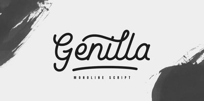 Genilla monoline script. It is perfect for branding, logo, invitation, stationery, wedding designs, social media post, handwritten quotes, product packaging etc. Comes with full set of gorgeous uppercase and lowercase letters, numerals, a large range of punctuation, ligatures and also swash. In order to use the beautiful swashes, you need a program that supports OpenType features such as Adobe Illustrator CS, Adobe Photoshop CC, Adobe Indesign and Corel Draw. but if your software doesn't have Glyphs panel, you can install additional swashes font files.
 - Hamocky by Canden Meutuah,
$15.00 A new elegant serif font that will add a touch of luxury and style to your projects. This is a very versatile font that works well in both large and small sizes. This font is suitable for branding projects, logo design, clothing branding, packaging, magazine titles, advertisements, t-shirts, postcards, editorials, magazine headlines, product packaging, and displaying masculine and feminine qualities. it comes with full uppercase, lowercase, numbers and punctuation + multi-language support. if you want to have this font please click the link below. Thank You
 - Frunch by Nasir Udin,
$22.00 Starve for tasty bold font? Say hello to Frunch! A delicious bold script font with a vintage vibe. Frunch comes to you with several alternate letters for you to play with and the complete set of lowercase-letter swashes that make your words look delicious and stand out. It's especially created for food & beverages branding as well as product packaging typography (e.g.: snack, honey, breakfast meal, milk, bread and cake). It's also perfect for poster, business cards, headline, restaurant menus, and much more. Have fun with Frunch!
 - Ebyra by Canden Meutuah,
$15.00 A new elegant serif font that will add a touch of luxury and style to your projects. This is a very versatile font that works well in both large and small sizes. This font is suitable for branding projects, logo design, clothing branding, packaging, magazine titles, advertisements, t-shirts, postcards, editorials, magazine headlines, product packaging, and displaying masculine and feminine qualities. it comes with full uppercase, lowercase, numbers and punctuation + multi-language support. if you want to have this font please click the link below. Thank You
 - Osande TXT by XdCreative,
$29.00 About Osande-TXT Neo-Grotesques Sans Osande TXT was created and inspired by Osande Pro (by. faldykudo), which carries a modern sans style with a touch of neo-grotesques / neo-gothic These include a large x-height, simpler forms and more static, low contrast, and often a condensed width. Osande TXT comes with enhancements characters and more complete language support, so you will be more flexible to use this font family for your various design, both for body text or displays. Thank you in advance _xdCreative