421 search results
(0.02 seconds)
- Brand by Lián Types,
$37.00 Jam jars; Warhol’s “Tomato Soup”; chalk lettering and baseball. Those were the triggers to make this soft chancery cursive turned into a script font. Brand is thought mainly for packaging but can be used in magazines and invitations also. It can be easily converted into a logo when using it and its features. Pro styles are loaded with the most complete sets of alternates, ligatures and ornaments; while Std styles are smaller versions of the font, with no decorative alternates.
 - Witthayakhom by Jipatype,
$27.00 วิทยาคม เป็นอักษรแบบคอนทราสเฉพาะส่วนเซอริฟเมื่อเปรียบเทียบกับเส้นแนวตั้งและแนวนอนที่มีขนาดใกล้เคียงกัน ดูกึ่งทางการ มั่นคง เรียบหรู มีเสน่ห์ เหมาะสำหรับการใช้ผาดหัว หรือรองผาดหัว มีทั้งหมด 9 น้ำหนักและตัวเอียงของแต่ละน้ำหนักรวมทั้งหมดมี 18 สไตล์ และมีฟีเจอร์อื่น ๆ อาทิเช่น Small Caps และฟีเจอร์อื่น ๆ พร้อมให้คุณได้เลือกใช้งาน รองรับหลากหลายภาษา Witthayakhom is a hight contrast only on serif compared to vertical and horizontal line which similar thickness. Semi-formal, stable, elegant, charming look. Suitable for headline and sub-headline. Comes with 9 weights and italics of each weight total 18 styles, and there are features such as Small Caps and many features available for you. Support multi-languages.
 - Plinc Goliath by House Industries,
$33.00 Vincent Pacella was a true giant of hand-lettering and typeface design. Of the dozens of styles he designed for Photo-Lettering and International Typeface Corporation, his dominant Goliath towers above the rest. The font is perhaps best known from Herb Lubalin’s American flag that the design legend created for Print magazine’s 40th anniversary cover. Pacella takes “slab” serif to heart with this colossally-proportioned font, using brawny stroke endings and minimal curves to create a powerful figure for maximum visual impact. Take advantage of Goliath’s superior stature to make viewers take notice in industrial settings, sports branding, and oversized outdoor media applications. For comparatively modest musings in accompanying running text, consider partnering it with a comparatively spartan slab serif like Municipal. Or, team up Goliath with a faceted fellow heavyweight like United Sans. Originally drawn in 1970, Goliath was digitized by Ben Kiel with Adam Cruz in 2011. GOLIATH CREDITS: Typeface Design: Vincent Pacella Typeface Digitization: Ben Kiel, Adam Cruz Typeface Production: Ben Kiel Like all good subversives, House Industries hides in plain sight while amplifying the look, feel and style of the world’s most interesting brands, products and people. Based in Delaware, visually influencing the world.
 - d puntillas A Lace - Personal use only

- Lets get crazy by Pedro Teixeira,
$14.00 Let's get crazy is a font inspired by modern lettering and calligraphy with pronounced swashes, ascending / descending and crazy ear in "r" (btw you have more ordinary alternates) and so on, challenging the boundaries of reasonable. This font is good for titles or short sentences in combo with Let's get crazy sans serif majuscule letters, giving you a nice pairing of the modern lettering.
 - Quiet Backyard by Invasi Studio,
$13.00 Quiet Backyard is a super playful combo pairing font. Combination with the concept rounded sans serif and hand-lettered font. From Fun, Playful handwriting and casual rounded san serif. This attractive combination with playful vibes special for your Display Design; is guaranteed to add an eye-catching suitable for your logo designs, brand imagery, quotes, product packaging, merchandise & social media posts. ?Features: Alternates Punctuation Ligature Multi-language
 - Red Amaretto by Paweł Burgiel,
$38.00 Red Amaretto is a script typeface influenced by different ancient writing styles. All characters are handwritten by use ink and flat nib pen on coarse paper, scanned, digitized and optimized for best quality without lost its handwritten visual appearance. Coarse glyphs edges are easy visible at medium and higher sizes. Character set support all official and semi-official languages in European Union writen in latin, cyrillic and greek scripts. Supported codepages: 1250 Central (Eastern) European, 1251 Cyrillic, 1252 Western (ANSI), 1253 Greek, 1254 Turkish, 1257 Baltic. Include also spacing characters (M/1, M/2, M/3, M/4, M/6, thin, hair, zero width space etc.) for professional text formatting. OpenType TrueType TTF (.ttf) font file include installed OpenType features: Access All Alternates, Localized Forms, Fractions, Alternative Fractions, Ordinals, Superscript, Tabular Figures, Proportional Figures, Case-Sensitive Forms, Stylistic Alternates, Contextual Alternates, Stylistic Set 1, Stylistic Set 2, Contextual Ligatures. Include also kerning as single 'kern' table for maximum possible backwards compatibility with older software.
 - Inversi by Hanken Design Co.,
$30.00 Inversi is a reverse-stress typeface that may be used as a display or text-face font for a wide range of subjects. Compared to other reverse-stress/reverse-contrast typefaces, Inversi's linear contrast is much lower which, at lower sizes, makes it a good options for text or captions. It has good language support, unique design, fractions, and three different widths. Inversi pairs well with HK Requisite. Use the narrow or condensed style when mixing with HK Requisite to give more contrast to the composition.
 - P22 Platten Neu by IHOF,
$39.95 The P22 Platten font family has been revisited and expanded by designer Colin Kahn. Platten is based on lettering found in German fountain pen practice books from the 1920s (you may have seen the similar Speedball books in the US). This round tip pen lettering is comparable to the basic forms used in grammar school teaching alphabets, but with a few original characteristics. The Italic version has even more of these unusual features. Geometric and simple yet casual and timeless. Perfect for many uses.
 - Pixeloza 02 by Fontsphere,
$12.00 Pixeloza 02 is a pixel-style, grid-based, display typeface. This is another version of Pixeloza type. Compared to Pixeloza 01, it is characterized by a more slender form, the letters are taller and narrower, which makes the font lighter. The font is characterized by its simplicity, attention to detail, and original form. You can use it in a wide variety of projects. It gives many possibilities for creating graphics. Pixeloza 02 is available in two options: Pixeloza 01 Regular and Pizeloza 01 Skewo Regular.
 - Callgest by Martype co,
$15.00 Introducing Callgest serif display. A brand new font with tapered serif, made with love to make it more versatile and stylish. This font also suitable for Branding Design, Logotype, Wedding Invitation, Headline, Posters, Business Card and etc. You can combine with Montserrat, Gotham, or Helvetica to make awful fusion combo font! What's inculded? - Callgest Tall - Callgest Regular - Callgest Wide Multilingual Support support many different languages 60+ Thanks & Happy Designing!
 - Old Claude LP by LetterPerfect,
$39.00 Old Claude was drawn by Paul Shaw to simulate an old cut of the classic (Claude) Garamond type designs of the 16th & 17th centuries. The pronounced rough edges and coarse letter shapes create the effect of letterpress printing with old foundry type onto handmade paper. The companion Old Claude Expert includes small caps and old-style figures. This "antiqued" design works equally well for both text and display.
 - Wouldkat by Joachim Frank,
$11.00 Inspired by an old house font of an anthroposophical hospital in Germany, this font was created: coarse, irregular, with corners and edges. In nature there are no right angles, no symmetries, no evenness: and so is this font. Tis is not a fine font, Like a woodcut this font roars: Look at me, I am here! Ideal for posters, leaflets, posters, billboards. Designed by Joachim Frank (Germany) in 2021
 - Party Lover by Sinfa,
$12.00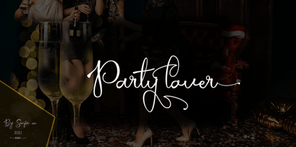 Party lover is a charming script font with a subtle and coarse signature font style, complemented by alternative fonts to make it look more charming, this font is perfect for completing your collection for logo, invitation, branding, label, trademark, and other needs. This font contains: Uppercase & Lowercase, and lowercase Alternative Symbols & Punctuation Marks OpenType Features attention ... that OpenType Features require software like Photoshop / Illustrator CC. Please try, thank you ...!
 - Peaceful Island by Invasi Studio,
$16.00 Peaceful Island is a handwritten combo pairing font. It combines script and handwritten sans. This font has a retro feel, playful handwritten sans, and a casual script. This attractive combination with retro vibes is perfect for your Display Design. You can use it for logo designs, title vloggers, brand imagery, quotes, merchandise, social media posts, and more. Features: - Uppercase & Lowercase - Numerals & Punctuation - Alternates and Ligatures - Multilanguage Supports 60+ Latin based languages
 - Linotype Paint It by Linotype,
$29.99Jochen Schuss designed Linotype Paint It in 1997 with exclusively capital letters and in two weights. The best way to describe the weight Paint It might be to compare it with a labyrinth in which the figures only become clear to the reader dedicated to finding them. The second weight, Paint It black, is almost the solution to this puzzle. The characters are black and stand out strikingly from the background. Linotype Paint It is particularly good for headlines in large point sizes or wherever a text should display a playful character. - Deca Serif by ParaType,
$30.00 Super family Deca consists of ten fonts. Six sans serif styles form the Deca Sans family and four styles of serif family named Deca Serif . These are low contrast fonts of pure design with ovals bent to rectangular shapes. They are nicely readable in small sizes and can be recommended for scientific, legal, official and business documents. Serif and sans serif fonts were designed in comparable proportions, they are balanced by color and have similar details in basic shapes. These features provide high compatibility and assume collective usage of the fonts in documents.
 - Deca Sans by ParaType,
$30.00 Super family Deca consists of ten fonts. Six sans serif styles form the Deca Sans family and four styles of serif family named Deca Serif . These are low contrast fonts of pure design with ovals bent to rectangular shapes. They are nicely readable in small sizes and can be recommended for scientific, legal, official and business documents. Serif and sans serif fonts were designed in comparable proportions, they are balanced by color and have similar details in basic shapes. These features provide high compatibility and assume collective usage of the fonts in documents.
 - Casual Deco JNL by Jeff Levine,
$29.00 The hand lettered sans serif title on the1931 sheet music for “(Potatoes are Cheaper-Tomatoes are Cheaper) Now’s the Time to Fall in Love” presented another opportunity to create a typeface from the wealth of unusual alphabets found on the covers of vintage and antique song sheets. However, it seems that even as late as the 1930s, song writers had the urge to pen long-worded titles for their musical compositions. This thirteen word verbal excursion became the model for Casual Deco JNL, which is available in both regular and oblique versions.
 - Boldstrom by Sharkshock,
$115.00 Boldstrom is a heavy-handed, all caps, display font available in 5 versions. Emphasis was put into strong line weight, minimal contrast, and tight curves. This family is defined by very broad stems with comparatively thinner cross strokes. Spacing was condensed to ensure the characters fit snug against one another. This was done in part to minimize negative space while also creating tension. The result is a powerful looking sans serif designed to command attention and make a statement. Boldstrom will be best used in large format print, titling, books, movie posters, or company logos.
 - Nerone by The Ampersand Forest,
$20.00 Nerone is a quasi-unicase display type family in four weights, from light to black. In its lighter versions, it's reminiscent of dignified flared serifs like Albertus. In its black version, it's comparable to display faces like Serif Gothic, with a hint of Mostra-like despotism... Inspired by ancient Roman capitals, Nerone takes a whimsical look at how they might turn into a black fatface, and how a matching lowercase might give the whole affair a whimsical feel — specifically when applied to fun branding and marketing uses. Part of The Ampersand Forest's Sondheim Series.
 - Bertram by ITC,
$29.00Bertram Plain is the perfect font for setting titles in comic strips and similar designs. UK designer Martin Wait created this font 1991, after he was inspired by the casual style of circus graphics. In fact, this jolly and lighthearted font was even named after one circus in particular: the Bertram Mills Circus. Bertram Plain is an all-caps font, with capital letters placed on both the upper and lowercase keyboard strokes. Additionally, Bertram Plain letters sport a 3D-like drop shadow, a distinctive feature when comparing this to many other display fonts. - Schuss Sans CG Poster Extrabold by typic schuss,
$33.00 Schuss Sans CG Poster Extrabold 1 upright OTF Font Latin extended, Cyrillic and Greek. Specially developed for headline poster display sizes. A Sans Serif Extrabold Headline-Font in addition to the Schuss superfamily. The heights are optimized for big sizes, different to the text fonts of the Superfamily Schuss. The character set is slightly different to the non poster styles too, but comparable to Schuss Sans CG Poster Black. No italic, no additional figures, no tabular figures, no small Caps. But with maximum manual kerning. Ligatures: fi, fl, ff, ffi, ffl. No special OpenType features.
 - PAG Revolucion by Prop-a-ganda,
$19.99Prop-a-ganda offers retro-flavored fonts inspired by lettering on retro propaganda posters, retro advertising posters, retro packages all the world over. This is perfect font for your retrospective project. PAG Revolucion has a boyish mood compared to other fonts of Prop-a-ganda series. It has short legs and large head, but because of its simplicity, it is legible font. Perfect for all of display. In 2012, Extended and optimized for multipurpose font family named Revolution Gothic which has lowercase, multi-language accents, five weights and italics can be available from Dharma Type. - Shareb Pro Arabic by FarahatDesign,
$60.00 Shareb font was initially designed with a different style compared to other Arabic typefaces. It was released as a free display typeface and went popular. Therefore, we decided to take it to the next level. Accordingly, we worked on the Arabic letters again, enhancing and fixing them. We also added new features like stylistic sets, ligatures, and a complete Latin set of letters so that the font can be used in the most needed languages. Now, we have a more professional, refined, and larger display typeface that can be used in more great projects.
 - Kyhota by Ingrimayne Type,
$14.95 The six typefaces of the Kyhota group all have an “Old West” look to them. KyhotaOne has very thick slab serifs compared to KyhotaTwo. KyhotaBarbed is more condensed than either and has little barbs on the verticals, something that was a feature of a number of nineteenth century typefaces in this style. KyhotaFezdaz is condensed, without barbs, and with the slab serifs replaced with a flare serif. KyhotaBigBottom and KyhotaBigTop play with the weighting of the serifs, with one (either top or bottom) very thin and the other very thick.
 - Doctrine Stencil by Barnbrook Fonts,
$75.00 A display typeface with a muscular character, Doctrine Stencil is the revolutionary comrade of the text typeface Doctrine. Doctrine Stencil was developed from the North Korean national airline livery and, while it retains the idiosyncratic spirit of the original, it has evolved into a more contemporary headline face. Doctrine Stencil draws on elements of neo-grotesque, humanist and geometric styles, and combines them with a playful approach to the stencil model. Doctrine Stencil includes four alternate character sets as well as an array of ligatures and figure styles.
 - Quandary by Winnie Tan,
$39.00 The Quandary Font is created for a horror theme in use with an illustrated book ‘The Predicament’ by Edgar Allan Poe. It is designed as a highly expressive face to accentuate a sense of mystery and the macabre. A comparatively more carefree and free-spirited face, it comes as a uni-case single weight family used exclusively as the main face for the book. The characters are developed from the numeric glyphs found on the astronomical clock-face at Prague Old Town Square, Czech Republic. http://www.behance.net/gallery/Quandary/383204
 - Tanguera by Sudtipos,
$59.00 While Bellas Artes, Koziupa and Paul's "other" look at intertwined classicism in calligraphy, can be compared to the repeated patterns of standardized dance steps, Tanguera is more like dancers engaged in a free form of the classic Argentine dance. Whether the embrace is open or closed, the walk parallel or crossed, it is still classical tango, with leader and follower blending together, sometimes in relaxed softness, sometimes in alert sharpness, yet never losing the clearest of communication. Tanguera provides essential rhythm to any packaging design that calls for clean and classical personalization.
 - Generic by More Etc,
$15.00 The Generic Typeface Collection is a series of sans-serif typefaces inspired by the craftsmanship of graphic design, typesetting, and printing in the analogue era – before Adobe, Macintosh computers and desktop publishing – when dinosaurs ruled the earth. With the use of various typesetting apparatuses or dry transfer type, photo copiers, and shooting layouts and paste-ups to film, the printed results was not as exact, precise and predictable as it is today. When examining old prints, it is difficult not to like the way that characters in over- or underexposed film have a special type of vibe to them that is often sadly lost in today’s pursuit of total perfection. Encouraged by this, I saw a need for a collection of typefaces that are non-clinical and non-conformist, and some that are coarse, rough and distorted – errors that might come from poor exposure when put on film, enlargements from small point texts, or maybe quality loss from successive generations of photocopies. Or all of the above. This is an attempt to incorporate spirit and personality into a set of typefaces without losing distinction. You might call it a homage to non-perfection. I call it human. The Generic Typeface Collection consists of 11 fonts divided into four series. The three standard series – the Formal Release series, the Coarse Copy series, and the Rough Display series – all contain three fonts each. The Extra Splendor series contains a couple of shadow fonts for that little extra sparkle. Formal Release – Handcrafted & Clean The Formal Release series features sans-serif typefaces for everyday use. They are handcrafted and clean, human and uncomplicated. The Formal Release series contains three typefaces that add tons of personality to any text. G10 FR ‘Slim’ – a slightly under-exposed and clean typeface in a regular weight (228 glyphs - 1 alternate) G20 FR ‘Classic’ – a properly exposed clean typeface in a bold weight (228 glyphs - 1 alternate) G30 FR ‘Bulky’ – a heavily over-exposed clean typeface in an ultra weight (228 glyphs - 1 alternate) Coarse Copy – Dirty & Rough The Coarse Copy series features non-conformist typefaces that are worn and rough, maybe after going through that bad copier a few times too much. The Coarse Copy series contains three sans-serif typefaces that add tons of spirit to any text without compromising too much on legibility. Try them on in poster-sizes and everyone will know that you mean business. G40 CC ‘Slender’ – an under-exposed coarse typeface in a regular weight (228 glyphs - 1 alternate) G50 CC ‘Typic’ – a properly exposed coarse typeface in a bold weight (228 glyphs - 1 alternate) G60 CC ‘Huge’ – a heavily over-exposed coarse typeface in an ultra weight (228 glyphs - 1 alternate) Rough Display – Faded & Decorative The Rough Display series features attention-seeking decorative typefaces in three feature-packed fonts. Faded and gritty like the image distortion and degradation from successive generations of photocopies, they are eye-catching typefaces intended to stand out in bigger point sizes. Use these typefaces for signage, headlines and similar situations were a strong typographic statement is desired. We have packed no less than 1,334 alternate characters and 212 discretionary ligatures into this series for a greater chance of not having characters that look exactly the same more than once. G70 RD ‘Slinky’ – an under-exposed rough and decorative typeface in a regular weight (741 glyphs – 448 alternates – 66 discretionary ligatures) G80 RD ‘Standard’ – a properly-exposed rough and decorative typeface in a bold weight (748 glyphs – 448 alternates – 73 discretionary ligatures) G90 RD ‘Swollen’ – a heavily over-exposed rough and decorative typeface in an ultra weight (748 glyphs – 448 alternates – 73 discretionary ligatures) Extra Splendor – Sparkling & Extraordinary The Extra Splendor series features two shadow typefaces for that little extra sparkle. One clean shadow to be used with G20 FR ‘Classic’, and one rough shadow to be used with G80 RD ‘Standard’. Having the shadows separate from the main typeface adds another layer of expressiveness in that you can try out color combinations for that extra splendor. Tips for matching (applies to both the base font and the shadow font): Set the kerning to Metric, not optical. Increase tracking to accommodate for the shadows extra width. G25 ES ‘Classic Shadow’ – a clean shadow to be used with G20 FR ‘Classic’ (228 glyphs – 1 alternate) G85 ES ‘Standard Shadow’ – a rough shadow to be used with 80 RD ‘Standard’ (227 glyphs) OpenType features – alternate characters and discretionary ligatures – can be accessed by using OpenType friendly professional design applications, such as Adobe Illustrator, Adobe InDesign, and Adobe Photoshop.
 - Together Whenever by Invasi Studio,
$17.00 The Together Whenever a sweet hand-lettered Font Duo. A casual handwriting marker style all-caps font and a matching Script make up this combo. It can be easily matched to an incredibly wide variety of projects, so try incorporating it into your creative ideas and see how it elevates them! This font is suitable for headlines, flyers, greeting cards, product packaging, book covers, printed quotes, logotype, and album covers, among other applications.
 - Golondrina by LFCF,
$25.00 Golondrina, spanish for swallow, a bird that cannot carry a coconut but migrates form north to south like the angles in this font. Also, like the bird, Golondrina can adaptate to different needs, going from a traditional blackletter with small lowcase characters and ornamental capitals, to a hardcore uppercase and sharp small caps. The right font for designs with a medieval, traditional spirit or a coarse lettering for a Heavy metal band.
 - Stormtrooper by Comicraft,
$19.00 We've gathered the old characters together, and added a bunch of young new hotshots, to create the long-anticipated sequel to our STORMTROOPER font! The digitally remastered Special Edition STORMTROOPER is now a trilogy, with two new weights -- outlined ARMOR and inlined BLASTER -- each containing more than 100 autoconnecting letter combos*. Yes, you'd have to be crazy to attempt a font like this; our man JG certainly has courage... * Hutts, dewbacks and point blank misfired laser shots not included
 - DEATHE MAACH by The Fontry,
$15.00 There's a war starting; you just didn't notice because you were too busy fighting to realize what was happening. Take your sides. Pick your battles. Choose a face that stands ready to defend, enforce and police. All who are ready to serve, please step forward. Deathe Maach is a six-font family of descending weights with the strength and stamina to face all comers in the approaching conflict. Armor on. Pistols out. Barrels forward. Enforce and serve.
 - Ferghaus Sans by Fontdation,
$15.00 Introducing Ferghaus Sans, a modern sans serif font. This all-caps font is crafted with high attention to the details, gives you a clean and sharp feeling using it on your designs. Packed with so many OpenType features (such as alternate chars, swashes, ligatures, etc), lets you play and explore every possibilities with the letters combo. Ferghaus Sans is highly versatile, suits best for almost everything, whether you're working on classic themed design, or the modern ones.
 - Royal Serif - Personal use only

- Sanseki by Hanoded,
$20.00 The term Sanseki (Japanese for Three [Brush] Traces) is used to describe three famous Heian period calligraphers: Yaseki, Gonseki and Saseki. Not that I would ever dream of comparing my messy brush-work with theirs, but the name stuck and I kind of liked it. I used Chinese ink and a high quality brush (which I got in a sale actually) to create this font. All glyphs were hand painted in one go! Sanseki is a very detailed brush font. Upper and lower case letters mingle and there’s even an alternate for every lower case glyph. Comes with an abundance of diacritics.
 - Gart Sans by Vitaliy Gotsanyuk,
$25.00 Gart Sans is a grotesque font that preserves the characteristics of early 20th-century grotesques, primarily used in advertising. The main features of this font include a pronounced contrast, narrow proportions, and light, smooth forms combined with modern design solutions. Compared to geometric or neo-grotesque fonts, Gart Sans distinguishes itself with its attention to detail. As the font weight increases, it acquires a more pronounced character, expanding its usability from headlines to extensive text settings. Gart Sans consists of 5 styles, 630 glyphs, encompassing an extended Latin character set, basic Cyrillic characters, ligatures, numeral sets, and much more.
 - Andron Corpus Publix by SIAS,
$49.90 The two fonts Andron Corpus Publix-General and Andron Corpus Publix-Transport offer a selection of most useful public orientation signs as occurring in public spaces as well as in digital and printed media. The unusual feature of these fonts is a thorough and fancyful typographical detailing, which makes the characters appear more sophisticated and less schematic. The ductus of these fonts matches the style of Andreas Stötzner’s Andron typeface family. Use these fonts for signage systems, marking, catalogues and brochures. Test the unusual high recognisability – with small sizes and at large distances – and compare to other, more template-like fonts!
 - TE New Sarah by Tharwat Emara,
$35.00 Its one of the NEW SARAH ( Arabic – LATIN – URDO) fonts, a spontaneous free line characterized by beauty and speed of reading. To be used in advertisements, writing titles, magazines, cartoons, films, serials, comics and plays. NEW SARAH font is one of the ( Arabic – LATIN – URDO) fonts. It is the most common font and is written in most Arab countries because it has the potential to be written in a narrow space when compared to other Arabic fonts. It is used in the titles of books, magazines, daily newspapers, commercials, banners, advertising, holiday cards, newspaper headlines, Introduction to students.

