2,024 search results
(0.014 seconds)
- Manuskript Antiqua by profonts,
$41.99 Monument is a titling version of Manuskript Antiqua, originally designed by Oldrich Menhart in 1952. Ralph M. Unger, who also redesigned Menhart's Manuskript Antiqua, redrew, completed and digitally remastered Monument for profonts. Monument is also available as part of URW's Manuskript Antiqua volume.
 - Advertisers Gothic by Monotype,
$29.99AdvertiserÆs Gothic Light, from a volume of headline fonts, was designed by Robert Wiebking in 1917. Wiebking was a skilled type engraver from Chicago who created his own pantographic machine, used to cut punches drawn by other successful type designers, including Frederic Goudy. - Monument by profonts,
$41.99 Monument is a titling version of Manuskript Antiqua, originally designed by Oldrich Menhart in 1952. Ralph M. Unger, who also redesigned Menhart's Manuskript Antiqua, redrew, completed and digitally remastered Monument for profonts. Monument is also available as part of URW's Manuskript Antiqua volume.
 - LTC Glamour by Lanston Type Co.,
$24.95 Glamour was originally released by Lanston Monotype in 1948. It is based on Corvinus designed by Imre Reiner. P22 Designer Colin Kahn has added some unusual variants to this family illustrating that Glamour can be taken too far and have somewhat unglamorous results.
 - Superstar by ITC,
$40.99Superstar was designed by Colin Brignall, who was inspired by American sportswear graphics during the process. The font is an inline sans serif that incorporates wedge-like cutouts instead of curves. Superstar is an excellent choice for design work related to sports activities. - French Forge by Anton Shlyonkin,
$- This is decorative typeface for large scale designs (like headers or so), inspired by french forged balcony decorations. This font has 2 dimensions in it (thin letters like a, o, e and ‘wide’ m, b etc.), to make it more vibrant and add volume.
 - PM Showman by Paper Moon Type & Graphic Supply,
$17.00 PM Showman is based on vintage hand-painted sign writing from the 1900s through the 1960s. Seen on everything from office signs to posters, it was a staple of business communication and entertainment advertising in the early 20th century. We meticulously hand-drew each font, modeling the spacing and quirkiness of the original letterforms to give PM Showman an authentic hand-painted look.
 - Bubpop by SAMUEL DESIGN,
$19.00 The name of this font is Bubpop. The features of the serif body are combined with the non-sans-serif body. Structuring and reconstructing the serif font, we get a very modern font effect. The font effect is not only rounded, but also has clever ideas and solemn details. This treatment makes this font more widely used and remains different.
 - DOORLEY HAND by John Doorley & Associates Pty. Ltd.,
$25.00Doorley Hand is a unique new font based on the handwriting of Australian advertising man and creatist John Doorley. The font's character and personality sits somewhere between charming child-like handwriting and classic contemporary calligraphy. It pays homage to simpler times when more organic and personalised forms of communication reigned. A perfect counterpoint to the fast-forward, hi-tech world today. - Archangelisia by Hikhcreative,
$19.00 Archangelisia is a beauty and modist script font. It offers support for all characters of the English languange. Standard punctuation glyphs are included. Archangelisia is perfectly suited for signature style, your logo, communicating your branding, inspirational wall poster, title, label or your wedding invitation. Great for crafters and grapich artist alike. Compatible with tools such as Photoshop or Illustrator, etc.
 - Sf Lang by S6 Foundry,
$15.00 Lang Sans is an elegant contemporary condensed typeface with strong stylistic geometric, authentic contrasts, drawing on the aesthetics and representing the shifting contemporary aesthetics. The distinctive stance gives the right visual consistency for branding and communications. Lang Sans is perfectly suited for headlines, large-format prints, brand identities, social media, advertising, editorial design, posters, magazines, logos, headings, body copy, digital and more.
 - Chollistio by Letterara,
$14.00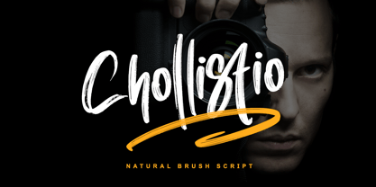 Chollistio is a handwritten font with a dry brush texture with rough details. This font has been designed to suit a variety of projects such as business branding, Instagram quotes, Christmas greeting, Poster, blog headers, Packaging, sports communities, film, photography, hobbies, and much more. This font is PUA encoded which means you can access all of the glyphs and swashes with ease!
 - Monesta by Showup! Typefoundry,
$39.00 Monesta® is a confident smooth serif font family. Designed by Aulia Rahman, Monesta® it creates a sense of softness and expressiveness. the concept into usability focused direction, to work as a bold tool and beautiful communicator. Monesta variable allows design across 9 weights, major Latin based languages, and Cyrillic. Monesta® bringing energy and making it suitable for modern design.
 - Princess by Komet & Flicker,
$10.00 Meet Princess – a loose and casual script font. This font has a whimsical fairy-tale feel and works great anywhere you want to communicate a little special design magic! The delicate hand-drawn forms also lend themselves to fashion or holiday themed designs. Princess includes a set of custom eleven ligatures as well as accented characters, numbers, punctuation, and symbols.
 - Brigitta Signature by Letterara,
$12.00 Brigitta Signature is a handwritten font with a dry brush texture with rough details. This font has been designed to suit a variety of projects such as business branding, Instagram quotes, Christmas greeting, Poster, blog headers, Packaging, sports communities, film, photography, hobbies, and much more. This font is PUA encoded which means you can access all of the glyphs and swashes with ease!
 - Tanseek Sans by Monotype,
$29.99The Tanseek™ Sans family provides interactive and print designers with a suite of powerful and versatile communication tools. Square shoulders, open counters and distinctive character shapes also ensure high levels of legibility. Designed by Dave Farey and Richard Dawson, the lower case has a subtle calligraphic emphasis, creating an inviting rhythm and typographic flow when letters combine into words and sentences. - Bucanera Soft by Corradine Fonts,
$24.95 Bucanera Soft is a clean modern blackletter designed especially considering its readability. Due to its soft edges, Bucanera Soft leaves the traditional look of aggressive and hard blackletters and allows to find a more friendly appearance in a wide range of applications. Bucanera Soft was selected as a winner in the 3rd Communication Arts Magazine Typography Contest in Typeface Design category, 2013 issue.
 - Soft Block by fontgeneration,
$19.00 The letters possess some of the most characteristic features of this type of font, used for communication and advertising in various mechanized and motor sports, as well as in the gaming industry. The technological-engineering constructiveness is achieved through the strict geometry of the forms, and the sporty competitive look is stylistically expressed through the slopes and contrasts of the beams.
 - Julietrose by Monotype,
$29.99Julietrose debuted in May of 2006 and was quickly embraced by members of the graphic design community, who found it as charming as its name. The playful, full-bodied script began to show up in all forms of graphic communication. However, it soon became apparent that a bold weight would add more versatility to the design. Martin Wait, Julietrose’s designer, happily obliged by drawing a new and more forceful weight of the typeface. Where Julietrose is vivacious and lighthearted, Julietrose Bold is assertive and speaks with authority. They are clearly sisters, though – both weights feature flamboyant swashes and elegantly long ascenders and descenders. Both designs also offer a suite of swash and alternate characters, and are available in OpenType format The Julietrose family is small but irresistible. This pair can easily charm their way into such diverse uses as posters, restaurant menus, social announcements and even product brochures. - Informative by Latinotype,
$39.00 Informative is a typeface consisting of a whole family of sans fonts and a collection of thematic pictograms. This combination of two different types of communication reflects the current need for using text and images as means of conveying information in a complementary way. The family comes with a text version of 7 weights (with matching italics)—Thin, Light, Regular, Medium, SemiBold, Bold and Black, and includes 7 thematic icons sets which allude to elements related to alimentation, city, energy, people, politics, sports and work. Each set contains 88 glyphs and includes both outline and black versions. The text font contains a set of 423 glyphs that support 207 different languages. Informative is a clean, simple and versatile typeface well-suited for a wide range of graphic design and visual communication projects. This font has especially been designed for infographics, maps and digital applications.
 - Promea by YXType,
$19.00 Promea is a Grotesk font meticulously designed with precise engineering in mind. Its amount of kerning, support for tabular/proportional figures, small caps, slashed zero, and fractions will make sure it performs well in all types of environments. Even the auto-centering colon among numbers will make your typography shine! The stylistic inktraps combined with low x-height and high contrast will surely bring you the sharpest typographic experience ever. The font is perfect for text environments like magazines, but it excels at displaying its full range of characteristics. Features: Smallcaps Tabular & proportional figures Small figures & fractions Slashed zero Double/single-story a & g Colon auto-centering vertically among figures (e.g. 10:00)
 - Fourteen64 by Grummedia,
$24.00Inspired by 15th century Venetian italic book texts and based on examples from volumes on the history of type. Fourteen64 has a rugged charm and lots of character featuring 'Roman' capitals with italic lowercase. Includes alternate characters, extra ligatures and a small selection of medieval ornaments. - Realtime Rounded by Juri Zaech,
$30.00 Information displays have an aesthetic of their own. Functional design where transmission of information is key — and best in real time. The Realtime Rounded typeface is not meant to recreate the appearance of those applications, instead it takes inspiration from them. The result is a technical yet friendly design with details that serve function and visual impact alike. Its soft edges apply warmth to the otherwise rather technical appearance. As a monospaced typeface it lends itself to tabular designs, sturdy columns and tidy layouts. Nevertheless Realtime comes with a feature for setting continuous text — a proportional design employable through OpenType — it further comes in five weights, from light to black, and with a character set that covers over 200 latin languages. Please see the Realtime Rounded Type Specimen PDF in the gallery. Realtime Rounded is the soft companion to the standard Realtime Typeface which is available separately. Thanks for visiting!
 - Larisch by HiH,
$8.00 Larisch is a hand-lettered design by the Austrian calligrapher and teacher, Rudolf von Larisch. The original was used for the title page of the 1903 edition of Beispiele Kunstlerischer Schrift (Examples of Artistic Writing). Larisch is an attractive, casual set of caps of even strokes with rounded terminals. Except for the terminals, it is similar in style to Kunstler Grotesk. The numerals are lining or ranging figures, meaning they line up with the baseline, unlike old-style text figures. All are of equal width for setting up columns of numbers. The letters are well formed and easy to read, as you would expect from a writing master. Ligatures includes CH (123), CK (125), FT (135), LA (137), LO (167), OO (172), CO (177) and TT (181. An alternative O with underscore is provided at position 111. Friendly, but not fancy -- a very useful all-cap font.
 - Athelas by TypeTogether,
$65.00 An attempt to go back towards the beauty of fine book printing, inspired in Britain's literary classics. Athelas takes full advantage of the typographic silence, that white space in the margins, between the columns, the lines, the words, the lettershapes and finally, within the characters themselves. It is also intended to take advantage of the great advances and technical developments made in offset printing. Athelas shows its best side in finely crafted book editions and good printing conditions. Athelas has a large character set that covers most of the languages that use the Latin script. Although inspired in British literature, this typeface respects the cultural values behind different languages, where diacritic marks have an utterly important role. Athelas features four weights and about 800 characters per weight, including small caps, discretionary ligatures, fractions, a complete range of numerals for every use and a set of ornaments and arrows.
 - Verse Serif by Hubert Jocham Type,
$39.00 In 2006 the art director of Emotion, a women’s psychology magazine, asked me to design a copy typeface for them. Before I actually got the job I started to work on a serif. I wanted it to be feminine but still clear and modern. On one hand there are the floral round elements and on the other hand the angular serifs. In the composition I wanted the two extremes to work together. All the other elements had to be harmonized. The proportions needed to match the magazine’s requirements. The ascenders and descenders are short enough to work in narrow columns but long enough to work in small sizes. As you can imagine, the emotion-job never happened. Verse is now a serif and a san-serif with 7 weights with italics and smallcaps. In copy you should not get heavier than Heavy. Extrabold and Ultrabold work best in display.
 - Monkton Book Condensed by Club Type,
$36.99 Packing more copy in a narrow space is the main reason for using a condensed type. Characters with a more ovular shape tend to be less wide than their circular counterparts and will allow for more letters per line. In narrow columns for example, this typeface can provide up to 25% more copy than the regular typeface in the same space. Another reason is when a larger type size is called for — used sparingly it is useful for headings or headlines. For emphasis, narrower letters can provide a stark contrast in the flow of reading, creating impact while retaining typographic character. Condensed types can specially useful in tables and charts because typically both use few words in each block. If space now allows, you may think about the luxury of a larger point size. This optimizes space while keeping your typography more easily legible.
 - Roc Grotesk by Kostic,
$40.00 Roc is a sans serif grotesk inspired by American wood types from the end of the 19th century. With nine weights in five widths, this family contains 45 fonts in total. The character set supports Western and Central European languages, as well as Turkish. Roc Grotesk comes in a range of five widths: Compressed, Condensed, Normal, Wide and ExtraWide, in order to cover a wide scope of applications. Although the styles at both ends of each range are made in their most pronounced form in terms of width and weight, they are not taken to such extremes as to become absurd, and are quite usable in display settings. The Normal width keeps all its nine styles in proportionally similar widths. The Compressed width, however, is deliberately made to be disproportionate, so that every style takes the least possible horizontal space. That is why the contrast between Compressed Thin and Compressed Heavy style is substantial. As the weights progress from Thin to Heavy, the stroke contrast becomes more prominent. It is intentionally exaggerated in heavier weights, which is particularly apparent in the uppercase E and R of the Black and Heavy style. Roc has a large x-height and relatively short descenders and ascenders. No uppercase letter descends below the baseline, so the lines of an all-caps text can be packed tightly on a poster or a headline. The Regular style is somewhat generously spaced, as it is most likely to be used for setting longer passages of text. Its Bold counterpart is spaced in such a way that the width of the text column will be similar to the text set in Regular. Tabular figures in these two styles have exact matching widths, so for example, you could emphasize one row of numbers in a data column without visually disrupting the vertical order of the table. The lowercase g and r have alternatives to accommodate what most designers expect from a typical Grotesk typeface. The single-story g and the cut-off r are accessible via the OpenType feature.
 - Maker by Wilton Foundry,
$29.00 Maker, the font, pays homage to the Maker constructivist culture. Especially the sparked community interaction, and exchange of ideas through social meetings in shared spaces. With Maker you have hints of a Gothic minuscule heritage and pixel components that is carefully constructed into a discreet stencil font. The result is a fresh, contemporary and well grounded font that will shine in any technology, or arts related environment.
 - Yekuana by Neo Type Foundry,
$28.50 Yekuana is a typeface whose design is based primarily on the study of certain geometric ethnic ancestral Venezuelan signs, visually rich and originally used in the enrichment of various utilitarian objects with high symbolic and cultural content. Yekuana is a family of two weights, stylistic alternates, fractions, ordinals and ligatures. Its use is recommended for titles or short phrases and elements of oversized visual communication.
 - Rumo Script by Bean & Morris,
$35.00 Rumo Script is a bright, breezy, free-flowing contemporary script to lighten the load when a change of pace is required to communicate freshness, fun, lifestyle and a general 'good feeling'. Designed so that some letters connect while others don't giving a spontaneous feel at the same time keeping it a 'considered' style. Rumo (pronounced Roo-mo) will enhance your graphics and give them that 'wow' look!
 - Suprala by S6 Foundry,
$19.00 Suprala is a contemporary delicate humanist serif typeface, with beautifully balanced forms, perfect for branding and communications projects. Suprala’s round, elegant, and classically elegant design, supports all major Latin-based languages in twelve styles. True italics advance the aesthetics, bringing energy and making it suitable for modern applications. The Suprala character set incorporates numerous OpenType features - additional symbols, stylistic alternates, and unique ligatures both standard and discretionary.
 - Chantal by Device,
$29.00 A loose, casual felt-pen script, Chantal comes in three weights plus italics, and a Cyrillic version too. Alternate versions are available in the upper and lower case keys, so settings can be customised according to taste. Chantal communicates a hand-drawn light touch with character. Originally designed to letter the RoboHunter series that Peter Hogan and Rian Hughes produced for the comic 2000AD.
 - NATRON Rough by Posterizer KG,
$25.00 NATRON Rough is the textured version of NATRON (rounded and condensed sans serif), in two weights, medium and bold. It features stylistic alternates and ligatures. Both fonts support Latin and Cyrillic codepages for Western, East and Central European, and Baltic countries. Designed for tight-fitting text, NATRON Rough is great for display, branding, labels, packaging, advertising, food, sports, titles, and any other type of visual communication projects.
 - Giacometti by Linotype,
$29.99Giacometti Letter is a fun design by Sine Bergmann and Leonore Poth. It has a rough, handwritten-looking style that is perfect for informal communications. The letters are light and narrow similar to her thin figures in the Pi font Giacometti." When combining Giacometti Letter with other fonts, try using "Jump" - another of Sine's designs - which contrasts well since is it wider and bolder." - Nobodi by Wilton Foundry,
$29.00This Bodoni-like font sets out to slightly square off rounded shapes, adding a very slight curve to the join from the square serif and stem, and minimizing and softening the pronounced bulbs found in Bodoni. There are hints of Walbaum and Melior but the overall effect is a more subtle, and interesting letterform that is friendly, fresh and contemporary. Ideal for corporate communications, ads and magazines. - P22 Monet by P22 Type Foundry,
$24.95 This font set was developed for the Albright-Knox Art Gallery and their 1999 Monet exhibition, Monet at Giverny: Masterpieces from the Musée Marmattan. Monet Regular is a fairly straightforward script font with an undulating thick and thin stroke. Monet Impressionist is a semi-legible script which can be used for decorative rather than communicative purposes. Monet Sketches features 26 icons related to Monet's imagery.
 - ITC Mattia by ITC,
$29.99ITC Mattia is a typeface with an edge. It's nervous, tense, and a little disquieting, with twisted characters that are more scrawls than lettering. Designer Giuseppe Errico does not confine Mattia to a traditional baseline. When set in short blocks of copy, the design creates a tone of passion and candor. Not just another pretty face," Mattia is a rare and commanding communication tool." - Pulchra SPF by S6 Foundry,
$25.00 Pulchra is a stylish Brutalist font. The font displays a playfulness personality, vitality, with a strong and elegant appearance. The typeface has the right visual consistency for branding communications. It comes with unique lower and uppercase plus numbers, punctuation & multilingual letters. Its thick curves give the 60s & 70s groovy vibe. What you get: - Letters, numbers, punctuation, multilingual support, alternate and ligature - Light, Regular, Medium, and Bold version.
 - Alskar Extended by S6 Foundry,
$15.00 Alskar sans is an elegant contemporary wide sans-serif typeface with strong stylistic geometric, authentic contrasts, drawing on the aesthetics and representing the shifting contemporary aesthetics. The distinctive stance gives the right visual consistency for branding and communications. Alskar sans is perfectly suited for headlines, large-format prints, brand identities, social media, advertising, editorial design, posters, magazines, logos, headings, body copy, digital and more.