10,000 search results
(0.038 seconds)
- Doncaster by Greater Albion Typefounders,
$8.50 Doncaster is a bold display face which emphasises legibility and clarity. The seven typefaces have a timeless quality, making them equally at home today or even in Victorian inspired design work. All of the faces are ideal for poster work, signage or for really eye-catching but not ostentatious headings and titles.
 - Baver Brush by Akifatype,
$14.00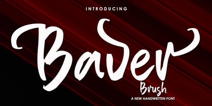 Baver Brush is a textured brush font, a contemporary approach to design, naturally handmade. It also has alternatives and ligatures that make your design more attractive. Suitable for use in title design such as clothing, invitations, book tittles, stationery designs, quotes, branding, logos, greeting cards, t-shirts, packaging designs, posters and more.
 - FF Metamorph by FontFont,
$41.99 Austrian type designer Markus Hanzer created this display FontFont in 1994. The font is ideally suited for advertising and packaging, music and nightlife as well as poster and billboards. FF Metamorph provides advanced typographical support with features such as ligatures, alternate characters, and case-sensitive forms. It comes with proportional oldstyle figures.
 - Dosty by Dhan Studio,
$18.00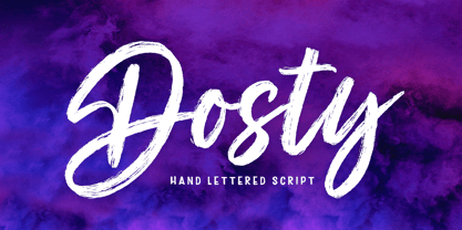 Dosty is a unique textured brush font because this brush font is made digitally. It's a contemporary approach to design, and has underlines and also several ligatures. Suitable for use in title designs such as book tittles, stationery designs, quotes, branding, logos, clothing, invitations, greeting cards, t-shirts, packaging designs, posters and more.
 - Chunky Nouveau JNL by Jeff Levine,
$29.00 Chunky Nouveau JNL was inspired by a circa-1928 water applied decal for the Top Most Insulated Jug. The plump, rounded hand lettering of the brand name was given a slightly thicker treatment to create a more poster-oriented display design. Chunky Nouveau JNL is available in both regular and oblique versions.
 - Old Friend by Eotype,
$14.00 OldFriend is multipurpose and unique display font. This font can give your designs a playful and friendly impression. You can use this font for retro, vintage and urban designs. This font comes with alternative style and ligature features which are suitable for various projects such as logos, product labels, posters and many more.
 - Xspace by Artyway,
$14.00 I'm thrilled to present you a new futuristic typeface. Smooth humanistic forms and elongated proportions, modern trends dictate a new fashion in type design. Perfect for science research posters, modern futuristic logos, automotive type design and more. Check how it works and let me know, I am always glad to hear your opinion.
 - Labyrinthus Rounded by Cerri Antonio,
$30.00 Labyrinthus Rounded is a multiline decorative font that works very well for identity logos, posters and 3D-works. It continues the tradition of the precedent Labyrinthus but with a softer rounded impact. It's interesting to note that with it it's possible to play with the multiline concept to create endless overlapping geometric creations.
 - Sugary Pancake by Hanoded,
$15.00 Sugary Pancakes - ahh, my kids love them. We don't make them too often, as they are 'energetic' enough as it is. This calorie-rich font is ideal for Children's Books and posters: it is fun, bouncy, very legible and full of character. Comes with a topping of diacritics and a stack of happiness.
 - Awesome Brush by Gatype,
$10.00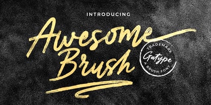 Awesome Brush is a unique textured brush font, because this brush font is made digitally. contemporary approach to design, and has underlines and also has several ligatures. Suitable for use in title designs such as tittle books, stationery designs, quotes, branding, logos, clothing, invitations, greeting cards, t-shirts, packaging designs, posters and more.
 - Celtiva Florance by GuseType,
$12.00 Celtiva Florance is a display serif font. This font is perfect for various designs especially classic, retro and vintage style. this font also good for your project like logotypes, magazine headlines, posters, cover albums and much more. Celtiva Florance provides a collection of glyphs include numeral & symbols, multilingual support, alternative glyphs & ligatures.
 - Raven Hell by Creativemedialab,
$20.00 Raven Hell is a simple and modern gothic font. What's unique about Raven hell is that it can be sans or blackletter, depending on your choice of design theme. Raven Hell can be used in many types of modern designs ranging from product labels to tattoos, badges, logos, poster titles, and much more.
 - Hello Jack by Sipanji21,
$15.00 Hallo Jack is a funny, bold and cute display font with a sharp corner. Get inspired by its unique feel, and turn to add a lovely charm to any crafts project, this font suitable for any project about kids, children, or Student, like, book Cover, kids shirt, baby shower poster, and etc.
 - Linford by Yoga Letter,
$15.00 "Linford" is a very professional and elegant serif font. This font is very easy to use for all your work. This font comes with 8 elegant and attractive ligatures. This font can be used to promote all your business (branding, banners, posters, social media, hotel promotions, villas, companies, products, invitations, and more).
 - Welanger Kesley by madeDeduk,
$16.00 Introducing Welanger Kesley is a Display Sans, use this font for any branding, product packaging, invitation, quotes, label, poster, logo etc. Feature Uppercase & Lowercase Number & Symbol International Glyphs Multilingual support Alternative Ligature Feel free to drop us a message any time and follow my shop for upcoming updates Hope you enjoy it.
 - Conundrum by Atom,
$14.00 Conundrum is a cool, rough brush font, quickly painted on paper, so it looks natural and organic. If you want a font character that is unique and different than others, Conundrum is worth a try. With this bold concept it would be suitable if used for movie titles, magazine titles, covers, posters, etc.
 - Cookie Treat by Tanincreate,
$18.00 Cookie Treat casual hand-lettered font. It is suitable for recipe and cook books, promotional, packaging designs, labels, greeting cards, cosmetic brands, posters, title, typography based branding, quotes, children's book, brochure, advertising, creative headers and so much more. Fun and casual, with uneven letters, this font brings a dynamic vibe to your projects.
 - MGN Humble by Morgana Studio,
$17.50 MGN Humble is a sans-serif type that provides room for users to express their experimental and playful side. The pixelated strokes engage venturously with the need to communicate excitement; a perfect set for clothing, gaming, technology, and experimental poster use. Currently available in a beta version and to be developed further.
 - Bugbear by Hanoded,
$15.00 A Bugbear is a kind of hobgoblin, comparable to the Bogeyman. No tablets or gizmos were involved in the creation of this font. It was made entirely by hand, using an old-fashioned roller ball pen and a sheet of paper. Use Bugbear for your children’s book covers, party posters and product packaging.
 - High Tea by Hanoded,
$15.00 High Tea is a handmade typeface, which was inspired by a 1930's menu from a classy restaurant. High Tea is a classy font, with some unique letters and an overall 'Upper Crust' feel to it. It is ideal for headlines and posters. Care for a spot of milk in your Oolong, darling?
 - Bollofora by Akifatype,
$14.00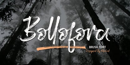 Bollofora is a textured brush font, a contemporary approach to design, naturally handmade and with underscores. It also has alternatives and ligatures that make your design more attractive.Suitable for use in title design such as clothing, invitations, tittle books, stationery designs, quotes, branding, logos, greeting cards, t-shirts, packaging designs, posters and more.
 - Fried Chicken by FontMesa,
$25.00 The name of this font brings back memories of an old fried chicken restaurant in Willow Springs Illinois circa 1960’s and 1970’s, my family would all get in the car and take a long drive down to an old country road Illionis Rt 171 through a forest preserve where we’d come upon the old Willowbrook motel with a bar and restaurant next door. The restaurant was called Kegal’s, when you entered the building you had to walk through the smoky bar first to get to the restaurant, I can still see the hard wood floors with all the finish worn off from decades of foot traffic. Up until the mid 1960’s Kegal’s used to raise their own chickens behind the restaurant, back then fried chicken in the Midwest was either coated in flour or bread crumbs, Kegal’s was covered in a beautiful layer of golden bread crumbs. Before your meal arrived they’d bring a basket of dinner rolls along with crackers, bread sticks and country butter, on the side they’d serve coleslaw with a vinegar sauce, which is very common in the Midwest, the first time you try it your face puckers up like you just sucked on a lemon but you get used it over time. After waiting for what seemed like forever to a child the waitress comes out of the kitchen with a huge tray of that golden deliciousness and your mouth begins to water, in her other hand was another tray filled to overflowing with crinkle cut french fries all made by hand, I’d eat a hole handful of those french fries first then take a bite of that tender juicy farm raised chicken. Today a fine Italian restaurant occupies the old Kegal’s building and the motel is long gone, only my fond memories remain. Fast forward to 2020 and FontMesa has just made some Fried Chicken as an eight weight type font family with alternates. With the Fried Chicken slab serif font family we’ve broken some rules by removing a few of the slabs on certain letters for a unique homemade look. Fried Chicken is perfect for your next product label, t-shirt design, logo, headline or cookbook cover. Treat yourself to some good ol’ Fried Chicken today.
 - Analogue Pro by Ingo,
$42.00 very traditional forms strongly slanted italic consistant proportions extraordinary ligatures swashes alternate letters alternate figures lower case l with a hooked “foot” Believe it or not, there are hardly any sans serif fonts in which the lower case letter l also has the hooked form of an l. Instead, we readers have to constantly distinguish whether we are seeing an uppercase I or a lower case l — just take a look at the word “Illinois”... The ingoFont Analogue was developed for exactly this reason. The intent: To create a pretty much »ordinary«, even classical font with its most striking characteristic being the inclusion of the “crooked l.” As a model, I used the »mother of all sans serifs«, Akzidenz Grotesk from Berthold, with its beginnings going back to the 19th century. Analogue is so to say a new interpretation of Akzidenz Grotesk from ingoFonts. All characters — following the model — have been newly designed. And if you want to emphasize the shape of the hooked foot even more, you can also activate the alternate styles for d, h, m, n (Style Set 1). Conversely, the alternate a somewhat softens the “hooked” impression (Style Set 2). The slanted versions — it isn’t truly a real cursive font — are noticeably stronger with 13° than the italics in comparable fonts, and were given a round e with a mind of its own which distinguishes itself considerably compared to the upright characters in the overall appearance of the font. More modern and formal solutions in detail were chosen for some of the characters, for example the M was given lightly slanted sides; the a reflects the curves of the s; the “feet” of a, l and t match; the flared legs of K and R became a “foot”, too. General proportions were carried over almost completely with no changes from Akzidenz Grotesk as well as the slanted trimming on the open forms of a, c, e, s; in comparison, C, G and S were given straight endings. Analogue contains many ligatures, even discretional ligatures, plus proportional, old style as well as tabular figures. All in all, at first sight Analogue brings back memories of the charm of its well-known predecessor; and yet, many small differences give Analogue an unmistakable certain something...
 - Nafigat Script by stiplinestudios,
$13.00 Nafigat Script goes with Romantic and Modern Calligraphy, ready to give your design project with Fresh and Fabulous Style. This font have an 264 Standard Glyph + 408 Glyph Alternate in Open Type Standard Format. Perfect for wedding, branding and romantic invitation and Also Suitable for various purpose such as digital lettering, headings, logos, wedding invitation, t-shirt, letterhead, signage, lable, news, posters, badges, branding materials, t-shirt, print, business cards, quotes, logo, poster, and suitable for any graphic design project. Nafigat Script comes as a single font file packed full of great features. It contains a full set of lower & uppercase letters, a large range of punctuation, numerals, and multilingual support. The font also contains several swashes and stylistic alternates for those who have open type capable software (e.g. Photoshop/Illustrator).
 - Todos Santos by Putracetol,
$24.00 Todos Santos - Slab Serif Font. The baseline of Todos Santos is also not the same, so it makes this font seem irregular, What makes Todos Santos unique is the difference in the height of each character. And Todos Santos is a slab serif inspired by 1970s posters but made flexible enough for everyday use. Todos Santos best uses for title, invitation, heading, cover, poster, logos, quotes, product packaging, merchandise, social media & greeting cards and many more The alternative characters were divided into several Open Type features such as Swash, Stylistic Sets, Stylistic Alternates, Contextual Alternates, and Ligature. The Open Type features can be accessed by using Open Type savvy programs such as Adobe Illustrator, Adobe InDesign, Adobe Photoshop Corel Draw X version, And Microsoft Word. Todos Santos is also support multi language.
 - Halloween Notes by PhoenixXWay,
$12.00 Every character in this font is meticulously crafted from eerie, yet beautifully haunting music notes. Here are some ways you can use this font to your benefit: Party Invitations: Create spine-chilling invitations for your Halloween party that resonates with the theme, setting the mood for a night of hauntingly good fun. Posters and Flyers: Craft attention-grabbing posters and flyers for haunted houses, Halloween events, or horror movie screenings that evoke the perfect blend of fear and fascination. Merchandise: Design eerie merchandise like t-shirts, mugs, or stickers that cater to Halloween enthusiasts and music lovers alike. Digital Media: Elevate your digital content, including social media graphics, banners, and web elements, to capture the essence of Halloween in a truly unique way. (This font only includes the 26 characters based on the English alphabet)
 - Woodshed by Putracetol,
$22.00 Woodshed - Decorative Serif Font. Woodshed have classic decorative, retro and trendy display. Woodshed font inspired by decorative serif of the vintage posters. But in Woodshed font I combine several variations such as the ligature. It makes Woodshed font even more unique and different. Woodshed is also great for any kind of display purpose from album, cover,poster, label, tshirt, apparel, signage, quote, logo, greeting card,logotype and many more. Woodshed is also support multi language. The alternative characters were divided into several Open Type features such as Swash, Stylistic Sets, Stylistic Alternates, Contextual Alternates, and Ligature. The Open Type features can be accessed by using Open Type savvy programs such as Adobe Illustrator, Adobe InDesign, Adobe Photoshop Corel Draw X version, And Microsoft Word. This font is also support multi language.
 - Nutshell Crew by IKIIKOWRK,
$19.00 Proudly present Nutshell Crew - Street Brush Type, created by ikiiko. Nutshell Crew is a rough handwriting type inspired by hand-drawn street brushes. A type of decorative font that features bold, brush-like strokes, often resembling calligraphy, graffiti, or hand-painted lettering. This font features a rough and edgy style, making it ideal for any urban-inspired design project with a blend of grungy and hand-drawn lines will give your words a distinctive and rebellious character, setting you apart from the crowd. The perfect one for the modern-day hipster! This type is very suitable for making a streetwear brand, poster or magazine layout, posters, album covers, quotes, or simply as a stylish text overlay to any background image. What's Included? Uppercase & Lowercase Numbers & Punctuation Alternates Multilingual Support Works on PC & Mac
 - Tatline by Groteskly Yours,
$15.00 Tatline was intended to be a fun side project that developed into something cool and rather unprecedented. It's bold, it's chunky —and it just looks good whether it's a mock movie poster or a key element in a brand identity for a business. With serifs thicker than stems, it looks more down to earth, solid, reliable and firm. And yet there's an almost imperceptible playfulness in the way it looks and behaved on the screen and paper. Tatline would look great on posters and flyers. We've tried creating a coffee brand identity with it —and surprise, looks great again. Maybe it's magic, but we like to think it's just a result of tough work put into creation of Tatline. Try it yourself and let us know what you think!
 - Gaga Highland by Putracetol,
$22.00 Gaga Highland - Quirky Slab Serif Font. Gaga Highland is a slab serif inspired by 1970s cowboy and sheriff posters but made flexible enough for everyday use. What makes this font unique is the difference in the height of each character. The baseline is also not the same, so it makes this font seem irregular Gaga Highland best uses for title, invitation, heading, cover, poster, logos, quotes, product packaging, merchandise, social media & greeting cards and many more The alternative characters were divided into several Open Type features such as Swash, Stylistic Sets, Stylistic Alternates, Contextual Alternates, and Ligature. The Open Type features can be accessed by using Open Type savvy programs such as Adobe Illustrator, Adobe InDesign, Adobe Photoshop Corel Draw X version, And Microsoft Word. This font is also support multi language.
 - Australia Script by Dhan Studio,
$16.00 Australia Script is an elegant style handwritten font with a slightly rough scratch, which has a signature style, this font is intentionally made with ligatures and unique alternatives to your various personal designs. Perfect for invitations, greeting cards, news, branding, logos, business cards, posters, product packaging, blog posters, etc. How to access all alternative characters, using Windows Character Map with Photoshop: https://www.youtube.com/watch?v=Go9vacoYmBw How to access all alternative characters using Adobe Illustrator: https://www.youtube.com/watch?v=XzwjMkbB-wQ Australia Script is coded with PUA Unicode, which allows full access to all the extra characters without having special designing software. Mac users can use Font Book , and Windows users can use Character Map to view and copy any of the extra characters to paste into your favourite text editor/app.
 - Slim Pickens by Dear Alison,
$19.00Have you ever seen lettering that you can connect with but have no clue where you've seen it before? It strikes a chord with certain feelings but you don't know why. Slim Pickens was inspired by the lobby card and poster titling from the 1949 Doris Day film "My Dream is Yours", and keys into the look and feel of vintage handwritten film poster titling. Something about that era in film made it easy to tie visuals with getting swept up in all sorts of emotions, good and bad. A narrow font, full of life and wonderfully hand-drawn, Slim Pickens is an accent font you'll want to have in your font collection for those tight fits, so buy it today and fill in the gaps of your designs with a little nostalgia! - Koufiya by Linotype,
$187.99 Koufiya is designed by Nadine Chahine in 2003 as part of her MA project at the University of Reading, UK and later released by Linotype in 2007. It is the first typeface to include a matching Arabic and Latin designed by the same designer at the same time with the intention of creating a harmonious balance between the two scripts. The Arabic part is based on the Early Kufi style popular in the 7th to 10th century AD. It is characterized by a strong horizontal baseline, horizontal stacking order, clear and open counters, and a general open feeling. Though based on the earliest styles on Arabic manuscript, the design paradoxically appears quite modern and fresh. The Latin part of Koufiya recalls a Dutch influence in its shallow top arches and rather squarish proportions. Both Arabic and Latin parts have been carefully designed to maintain the same optical size, weight, and rhythm. However, no sacrifices were made to make them appear closer to each other. They are designed so that they work well together on the printed page, and to make sure that the two scripts are harmonious when they are mixed together even if within the same paragraph. The font includes support for Arabic, Persian, and Urdu. It also includes proportional and tabular numerals for the supported languages.
 - The WC Wunderbach Bta font, designed by the illustrious WC Fonts, embodies the raw energy and gritty aesthetic reminiscent of urban culture and street art. This distinctive typeface marries the rebel...
- Imagine strapping on some roller skates, threading a floral headband through your hair, and gliding back into the era where disco and daisies ruled the world. That's the spirit captured within the wh...
- Pea Kristin, a font designed by Fonts For Peas, embodies the charm and playfulness often sought after in casual, handwritten typography. This font stands out due to its unique character shapes and th...
- The Air Conditioner font by Font Diner evokes a cool, retro vibe that seems to whisk you back to the golden era of the 1950s and 1960s, a time when diners, drive-ins, and Americana culture were at th...
- Tavern by FontMesa,
$25.00 Tavern is a super font family based on our Algerian Mesa design, with Tavern we've greatly expanded the usability by creating light and bold weights plus all new for 2020 with the introduction of extra bold and black weights Tavern is now a five weight family. The addition of the bold weight made it possible to go further with the design by adding open faced shadowed, outline and fill versions. Please note, the fill fonts are aligned to go with the open faced versions, they may work with the outline versions, however you will have to apply them one letter at a time. The Tavern Fill fonts may also be used a stand alone font, however, the spacing is much wider than the regular solid black weights of Tavern. In the old days of printing, fill fonts rarely lined up perfect with the open or outline font, this created a misprinted look that's much in style today. To create that misprinted look using two different colors, try layering the outline fonts offset over the top of the solid black versions. Next we come to the small caps and X versions, for a font that's mostly seen used in all caps we felt a small caps would come in handy. The X in Tavern X stands for higher X-height, we've taken our standard lowercase and raised it for greater visibility in small text and for signage where you want the look of a lowercase but it needs to be readable from the street. In August of 2016 I started the project of expanding this font into more weights after seeing the font in use where someone tried creating a bold version by adding a stroke fill around the letters. The result didn't look very good, the stroke fill also caused the shadow line to merge with the serifs on some letters. This lead me to experiment to see if a new bold weight was possible for this font and I'm pleased to say that it was. After the bold weight was finished I decided to type the regular and bold weights together in a first word thin second word bold combination, however the weight difference between the two wasn't enough contrast. This lead me to wonder if a lighter weight was possible for this font, as you can see yes it was, so now for the first time in the history of this old 1908 type design you can type a first word thin second word bold combination. So why the name change from Algerian to Tavern? Since the original font was designed in England by the Stephenson Blake type foundry I decided to give this font a name that reminded you of the country it came from, however, there were other more technical reasons. During the creation of the bold weight the engraved shadow line was sticking out too far horizontally on the bottom right of the serifs dramatically throwing the whole font off balance. The original font encountered this problem on the uppercase E, L and Z, their solution was a diagonal cut corner which was now needed across any glyph in the new bold weight with a serif on the bottom right side. In order to make the light and regular weights blend well with the bold weight diagonal cut offs were needed and added as well. This changed the look of the font from the original and why I decided to change the name, additional concerns were, if you're designing a period piece where the font needs to be authentic then this font would be too new. Regular vs. Alt version? The alternate version came about after seeing the regular version used as a logo and secondary text on a major product label. I felt that some of the features of the regular version didn't look good as smaller secondary text, this gave me the idea to create an alternate version that would work well for secondary text in an advertising layout. But don't stop there, the alternate version can be used as a logo too and feel free to exchange letters between both regular and alternate versions. Where are the original alternates from Algerian? Original alternates from Algerian are built into the regular versions of Tavern plus new alternates have been created. We're excited to introduce, for the first time, all new swash capitals for this classic font, you're going to love the way they look in your ad layout, sign or logo. The best way to access alternate letters in Tavern is with the glyph map in Adobe Illustrator and Adobe InDesign products, from Adobe Illustrator you can copy and paste into Photoshop as a smart object and take advantage of all the text layer style features Photoshop has to offer. There may be third party character maps available for accessing alternate glyphs but we can't advise you in that area. I know what you're thinking, will there be a Tavern Condensed? It takes a lot of hours to produce a large font family such as this, a future condensed version will depend on how popular this standard version is. If you love Tavern we're happy to introduce the first weathered edge version of this font called Bay Tavern available in February 2020.
 - Leyton by The Colour Grey,
$35.00 A bold, friendly, impactful typeface. Ideal for filling with graphics and textures and layering with other type. Named in reference to the generously proportioned Alfred Hitchcock (born in Leytonstone). Leyton was designed to be as fat and punchy as possible without losing legibility. Each character fills up the space – throwing away counters in the process. Discounts available for certain projects – particularly charities and students.
 - Dream Away by Resistenza,
$39.00 A handwritten font with long conections and small aperture and counter, a graceful and fresh rhythm to catch the eye attention. This script family is based on italian “bella scrittura”. The letterforms have been careful designed to grant this typeface with an effortless sense. Check the Opentype features window and discover an extended set of swashes to help you to give emphasis to the message.