3,850 search results
(0.027 seconds)
- Kapra Neue Pro by Typoforge Studio,
$39.00 Kapra Neue Pro is a younger sister of Kapra Neue – he was the #1 bestselling Grotesque Sans released in 2017 on MyFonts and grandson of Kapra. Now you really have a lot of options to choose! New family is full of everything – 96 weights contain a wide range of instances, from Condensed to Expanded, everything with rounded corners or with sharp ones. Now, font has also: small caps, cyrillic script, and old-style figures. Kapra Neue Pro is inspired by a “You And Me Monthly” magazine, published by National Magazines Publisher RSW "Prasa” in Poland, from May 1960 till December 1973.
 - Prospera by Alphabets,
$17.95Prospera was designed without reference to existing roman faces. In its initial form, development was partially supported by a grant from the National Endowment for the Arts (Design Project Grant), as a design for use on 'low-res' digital output devices. Early releases had simplified detail in cross-bars and serifs, and hand-tuned bitmaps. As an original design, Prospera draws on principles of letterform developed during my studies of lettercarving (in Wales with Ieuan Rees) and Roman proportion. The design is idiosyncratic, perhaps more akin to Gill's Perpetua than to the monotonous corporate flavors so prevalent today. - Humber by Fettle Foundry,
$10.00 Humber is a rational sans serif typeface designed with a large X-height to provide clarity at both text and display sizes – with subtle features that really shine at larger sizes. Inspired by 20th century typefaces and modern European designs, Humber is suitable for a wide range of projects and audiences looking for a typeface that feels professional – without being overly familiar. Featuring seven weights and matching italics, discretionary ligatures, lining, old-style, and tabular figures, and conditional kerning for accented characters, Humber is truly versatile. With over 738 glyphs, Humber supports over 339 latin-based languages.
 - Clip Joint JNL by Jeff Levine,
$29.00 According to Wikipedia, a "clip joint" is an establishment, usually a strip club or night club (often claiming to offer adult entertainment or bottle service) in which customers are tricked into paying excessive amounts of money, for surprisingly low-grade goods or services - or sometimes, nothing - in return. These establishments were rampant during the prohibition years. However, the inspiration for Clip Joint JNL comes from a more positive source - a WPA (Works Progress Administration) poster advertising "The Lure of the National Parks". A bold, classic Art Deco design, it typifies the modern and streamlined approach to lettering in the 1930s and 1940s.
 - Audela by Fontfabric,
$40.00 Surpassing traditional Antiqua, our new collaborative font family Audela emerges after overcoming time, national borders, language differences, cultural gaps, and professional challenges. Starting off as an exercise project of our very first intern Léa Bruneau in 2018, Audela slowly shaped into a full-fledged elegant serif typeface of 14 styles under the watchful eye of Plamen Motev, Fontfabric’s Type Director. Three years later, Audela is internally regarded as a breaker of limits earning its name from the French “au-delà,” meaning “beyond.” This new rising star features sharp serifs, flowing letterforms, advanced OpenType features, Extended Latin and Cyrillic support, to name a few.
 - Sydonia Atramentiqua by Wardziukiewicz,
$20.00 Sydonia Atramentiqua is a strange creation. The inspiration was the first releases of "Malleus Maleficarum" (actually the typography used there). I decided I wanted something strange, so Sydonia came into being. Like a blood of all witches who were being hunted down by Malleus Maleficarum's "fans" for their skills and beliefs. Why Sydonia? Sydonia von Borck was a witch from my area. It was probably the last woman executed for witchcraft. The genesis of the name. Sydonia was THE WITCH, and by the name I added "Atramentiqua". It is a combination of the words "Ink" (polish "ATRAMENT") + "Antiqua". The idea of spilling a font is historical. The former Zecer composition was not perfectly sharp. As it was a "wet job", there were always light exits behind the lines. Who supported me? The GENEALOGIA project has been carried out for several years in cooperation with the Academy of Art in Szczecin and the National Museum in Szczecin. The project's supervisors are prof. Waldemar Wojciechowski and MA Patrycja Makarewicz, who runs the Visual Communication Studio. Some information: Sydonia was like that! This is not an everyday font. It is a stylized font, used to imitate old prints made by Zecer. The first version of Sydonia Atramentiqua was created in 2018 for the purposes of the exhibition at the National Museum in Szczecin. Base inspiration: Malleus Maleficarum & Caslon.
 - Bfrika by Holland Fonts,
$30.00Bfrika is an 'Africa inspired' typeface and a contribution for the typographic issue 'National Typographica' of I-Juici Magazine, in South Africa. This geometrical decorative design represents bold simplicity, directness and rythm. The name evolved from text for the spread in the magazine. The B replaces the A. Africa be free. Bfrika. The concept behind Bfrika is to generate an unpredictable visual rhythm in an attractive decorative presentation. Filling up the white space around the letters accentuates form over function, thus creating an interference of visual impressions with its legibility. This visual rhythm is amplified by its redundancy in a text, only pausing at a break or a word space. Based on the concept of separate printing forms in letterpress, Bfrika Two Tone and Bfribat Two Tone separate the letter from the outside form in two fonts. Placing two text frames exactly on top of each other and assigning each part of these font to a frame in a different color, offers a quick way to add color. Originally Bfrika was designed for I-Jusi magazine #17, National Typografika, South Afrika 2001. Bfribat and both two tone fonts were created for Building Letters, a fund raiser for orphanages in Kenya and Uganda (www.buildingletters.org) and are also available for Mac and PC at www.hollandfonts.com and will be distributed in 2004 through associated foundries. - As of my last update in April 2023, the font "Vipertuism" by Statica Productions may not be widely recognized or it could be a new or less common typeface, hence there's limited specific information ...
- Anastasia - Unknown license

- ComixHeavy - Unknown license

- Dogwood - Unknown license

- SwissCheese - Unknown license

- Bruce 1490 by Intellecta Design,
$26.90 The ornamental ribbons come from our research at the 1490 font style of the 1882 George Bruce’s rare catalogue, from Intellecta’s collection of rare books and catalogues. The type here used to compound the work is the GrasVibertTwo from Intellecta.
 - PR Swirlies 08 by PR Fonts,
$10.80 This font is a collection of simple calligraphic ornaments suitable for invitations, gift tags, and anything that can benifit from a "spoonful of sugar" visually. This font includes fewer line fillers, and more "ferns and fans" than our previous swirlies.
 - Disans by SimpleType Studios,
$15.00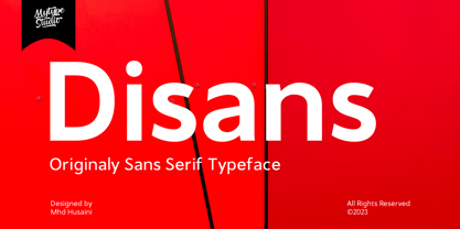 Disans is collection font with natural movement make looks elegant, classy and beauty for your project. Disans is perfect for branding projects, logo, wedding designs, social media posts, advertisements, product packaging, product designs, label, photography, watermark, invitation, stationery and any projects
 - Whipsnapper by Pink Broccoli,
$14.00 A wild at heart offbeat sansserif family inspired not by any single pulp or vintage source but a varied collection of influences. Just an all-around fun typeface with the widths and weights to offer a wide variety of uses.
 - Banquet by Solotype,
$19.95In our early days of type hunting, we considered this to be the prize of our collection. Fonts of this late Victorian period seem to have less ruffles and flourishes than the earlier ones, which makes them easier to read. - Catch Words JNL by Jeff Levine,
$29.00In the days of wood type, suppliers offered words such as 'and', 'at', 'for', 'each' and numerous others as stock cuts called "catch words". This collection of twenty-six were re-drawn using a vintage type catalog page as a model. - Bruce 1065 Soft Serifs by Intellecta Design,
$19.90Bruce 1065 is a beautiful victorian font by Chyrllene K, with two styles, a free interpretation off the "1065 font style" of the 1882 George Bruce's New York typefoundry extra-rare catalogue, from Intellecta’s collection of rare books and catalogues. - FSY Deko by FSY Creative Lab,
$29.00 Introducing FSY Deko, a typeface inspired by the art deco style that you might be able to use for design projects with classic, retro, vintage styles to make it even cooler. It can also be used with contemporary design styles.
 - Kondo by Surplus Type Co,
$18.00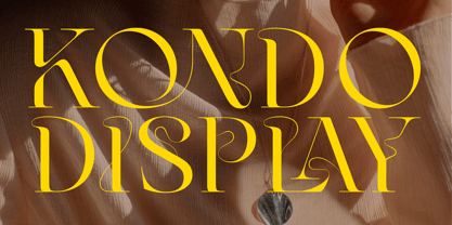 Kondo is a highly stylized serif font that features elegant looping details in the uppercase characters. This makes it a perfect choice for creating branding and logo designs with it's huge selection of custom ligatures. Add Kondo to your collection today!
 - Spring LP by LetterPerfect,
$39.00 Spring is a lively contemporary script that designer Garrett Boge modeled after his own brush lettering. It was released in 1988 at the launch of LetterPerfect's font collection, and has seen increasing use in advertising, packaging, and point-of-display promotions.
 - Woodland Doodles by Outside the Line,
$19.00 An eye-pleasing collection of 31 Woodland Doodles. Illustrations of 11 trees--traditional and contemporary. A branch, animals, cabin, acorn, flower, leaves, mushrooms, bird’s nest, pine cone and birds on a branch. Coordinating nicely with Lake Vacation Doodles or Farm Doodles .
 - Crimsons by Piñata,
$8.00 Fontfamily Crimsons unique and very unusual. It combines modern grotesque, medieval motifs and serif proportions. These fonts will be a useful part of a collection designers. Crimsons is ideal for short and emotional inscriptions. Titles, names, logotypes - this is his element.
 - Retrokia by Edignwn Type,
$16.00 The font collection is called "Retrokia", it is a display font for logotype. These collections contain script and sans serif font. Every font comes with 4 style typefaces (regular, rounded, rough and textured). This script font includes some alternates and ligatures. The Retrokia matches apply in some designs such as the logo, poster, label, badge, packaging, t-shirt, branding, quotes and more custom design. Retrokia features : 4 style typefaces (regular, rounded, rough and textured) Uppercase, lowercase, numeral, symbol, punctuation, alternate and ligature in script font All-caps, numeral, symbol and punctuation in sans serif font Multilingual PUA Encoded Thank you for your support and choosing us.
 - Mofita by Alit Design,
$15.00 Introducing Möfita font This time we launched a formal font that is unique with the others. This font looks simple and elegant, the font is also very easy to read and suitable to be applied anywhere. Möfita fonts are supported with multilingual characters, and in the future, they will always be updated for additional characters and alternatives. This font is perfect for your collection for making designs that are elegant, unique and slightly formal. Very good for logotype, header texts, quote design, menu design, etc. We are sure you will not be sorry if you choose the Möfita font to be your collection. Thank you Alit
 - Wolpe Tempest by Monotype,
$50.99 “It looks like it could have been designed last year,” says Toshi Omagari, the lead designer for The Wolpe Collection, about the original Tempest typeface. For Wolpe Tempest™, Omagari drew three weights and additional characters with flourishes that add more energy and movement to the original design. The new designs can take on just about any online or offline project that calls for typography that’s dynamic, flowing and powerful – everything from game branding to billboard sized posters. Available as set of fonts that support most Western European and many Eastern European languages, Wolpe Tempest is also one of the five typeface designs in The Wolpe Collection.
 - Muri by Nantia.co,
$12.00 This multilingual font, with Greek and Extended Latin character set, is a cute display font for your handwritten font collection. This quirky font is perfect for you if you are looking to expand your multilingual font collection. Muri Handcrafted Greek Font is handcrafted, but still is maintaining it’s legibility and balance so it can be used in packaging or logotypes and branding. Also, the latest version of the font supports both uppercase and lowercase characters, as requested by so many of you. Especially if you are looking for a font to use on Instagram quote posts or any other social media content, this typeface is for you!
 - LiebeFish by LiebeFonts,
$19.90 LiebeFish is a collection of 172 individually hand-drawn fish. Each has its very own personality; some are happy, some are sad. Some like company, some are bored, most are cute and a few are weird. If you look closely, some fish will surely look like people you know. LiebeFish probably is the most comprehensive collection of hand-drawn fish ever. They look great on almost any greeting card, birthday card or invitation. LiebeFish also serve as a perfect companion to any informal graphic design that needs a personal, handmade touch. If you like this font, have a look at our other cute fonts such as LiebeTweet and LiebeRobots.
 - Brush Hand New - Personal use only

- Ministry Script by Sudtipos,
$99.00 Ministry Script was designed to be “A time capsule that marks both the American ad art of the 1920s, and the current new-millennium acrobatics of digital type.” First letters of Ministry comes from a how-to lettering book but immediately turned on a complex and modern new digital typeface design with thousand glyphs. Ministry’s OpenType features include contextual and stylistic alternates, swash characters, and a galaxy of ligatures. A single face with over 1,000 characters to explore. The OpenType palette provides access to four different variants of each letter. For more info about the use of Ministry, its background, ligatures, alternates, please read The Ministry Script Guide in the Gallery section.
 - Pantsy Fance by melifonts,
$5.00 Pantsy Fance is a fun, yet structured typeface. It means business, but doesn't forget the frills. I use this lettering often on greeting card envelopes and the title section of my class notes. It is great for titling, labels, logos, and signs. This font fully supports the following languages: Bosnian, Bulgarian, Croatian, Czech, Danish, Dutch, English, Estonian, French, German, Hungarian, Italian, Norwegian, Polish, Portuguese, Romanian, Russian, Serbian, Spanish, Swedish, Turkish, Ukrainian. If your language is not listed, or if I've missed a character in a language I claim to support, please contact me! I will be happy to add characters as needed, and will consider supporting more languages if there is interest.
 - Genia by Akufadhl,
$40.00 Genia is a script typeface that carries roundhand calligraphy DNA. Instead of using pointed nib pen, Genia was created using a fine brush resulting in clean and wavy character. With the OpenType features, Genia creates the natural feel of calligraphy writing. This contextual feature makes the font 'smart'. It knows which letters are the initial and which one is the finial. The feature can be activated in the OpenType section under the names of CALT or Contextual Alternates. Genia also gives you old style and proportional number options. Our advice is always turn the contextual alternates, and don't use the OPTICAL kerning on Adobe softwares. The preview on this site does not support the contextual alternates.
 - Modesto Text by Parkinson,
$25.00 The Modesto Text Family is text in name only. It’s called Text because it has a Lower Case, and also to distinguish it from the rest of the Modesto clan. Modesto is a loose-knit family based on a signpainters lettering style popular in the late-19th and early-20th centuries. It evolved from the lettering I used for the Ringling Bros. and Barnum & Baily Circus Logo. The Modesto family was not planned. It just happened, a few fonts at a time over about fifteen years. In 2014 seven new Italic fonts and two Chromatic families were added. There is a downloadable MODESTO USER MANUAL PDF in the Gallery section for this family.
 - Bousni Ronde by Linotype,
$29.99The Bousni family's six faces display links unexpected by most readers of western alphabets. Inspired by both by Arabic calligraphy, and contemporary bitmap design, Bachir Soussi Chiadmi created this playful series of faces. Letters in each of the six typefaces link together, but not in the ways normally expected from script fonts. Suited for a wide array of fun functions, Bousni Carre and Bousni Ronde (each available in Light, Medium, and Bold weights) bring new a style and flavor to your collection. All six fonts in the Bousni family are included in the Take Type 5 collection from Linotype GmbH. The Bousni family espouses similar construction traits with other fonts from Linotype. Specifically, the straight lines and joints in the three Bousni Carre fonts are based off of a grid system similar to Anlinear, another member of the Take Type 5 collection from Linotype GmbH. The letter connections throughout the Bousni family are similar to Arabic kashidas, a typographic feature found recently in many non-Arabic typefaces, such as Linotype Atomatic." - Bousni Carre by Linotype,
$29.99The Bousni family's six faces display links unexpected by most readers of western alphabets. Inspired by both by Arabic calligraphy, and contemporary bitmap design, Bachir Soussi Chiadmi created this playful series of faces. Letters in each of the six typefaces link together, but not in the ways normally expected from script fonts. Suited for a wide array of fun functions, Bousni Carre and Bousni Ronde (each available in Light, Medium, and Bold weights) bring new a style and flavor to your collection. All six fonts in the Bousni family are included in the Take Type 5 collection from Linotype GmbH. The Bousni family espouses similar construction traits with other fonts from Linotype. Specifically, the straight lines and joints in the three Bousni Carre fonts are based off of a grid system similar to Anlinear, another member of the Take Type 5 collection from Linotype GmbH. The letter connections throughout the Bousni family are similar to Arabic kashidas, a typographic feature found recently in many non-Arabic typefaces, such as Linotype Atomatic." - Casagrande by Italiantype,
$39.00 Casagrande Collection has been designed in 2020 by the Italiantype Team (Manuel Alvaro, Valentino Coppi and Mario De Libero), working in close collaboration with Italian lettering artist, illustrator and calligrapher Alberto Casagrande, with help from the Zetafonts Team (Francesco Canovaro, Andrea Tartarelli and Cosimo Lorenzo Pancini). The goal of the project was to use as inspiration Alberto's colorful, vintage themed digital illustration style to develop a suite of closely related typefaces that, used together, would allow designers to replicate the nostalgic charme of Italian poster and product design from the thirties and the forties. Two color overprints, coarse dithering, handmade calligraphy, reminiscences of art deco, hints of modernism and pop culture references: all this and more mixed in a exuberant and playful collection, created with illustrators, poster artists and book cover designers in mind. The final product is 24-font package with six display families with styles varying from the thirties-inspired Antifascista (3 weights + 3 dithering weights) and Deco (3 weights + 3 inline weights), to the modernist Casabau (5 weights), to the geometric Grind (4 widths), to the vintage elegance of the two script families, Reclame and Casatiello. The collection is complemented by a two-color icon set font, Casagrande Ornaments, allowing any designer to easily explore the creative possibilities of this incredibly powerful creative collection. Please Note: Casagrande Antifascista Ombra simulates fine dithering and may be processor intensive for some older computers. Use Casagrande Antifascista if it slows down your system.
 - Automatic Typewriter by Ana's Fonts,
$16.00 Automatic Typewriter is a monospaced typewriter font in two styles: Upright and Oblique, and two weights: Regular and Bold, plus an Automatic Underline version of each font, for a total of 8 fonts. This makes it versatile and ready to use in modern and vintage designs alike. This font is also very legible at a wide range of sizes and looks great in both long or short texts, in digital collages, branding and packaging, social media posts, logotypes, etc.
 - LeKing by Misprinted Type,
$39.00 LeKing is a Frankenstein of vintage ornamental typefaces of the past centuries. Each character is a collage of different bits of different letters. The font has the classic elegant feel of the old ornamental typefaces, combined with a modern and edgy feel. It has 2 uppercase variations, so you can mix letters without repeating them or find the exact type that suits your needs. Le King also comes with an EPS file with 24 vector ornaments! Enjoy!
 - The College Block II font is a Display Slab-Serif typeface that is inherently associated with collegiate and sports themes, making it perfect for university sweaters or ...


