8,689 search results
(0.026 seconds)
- American Spirit STF by Altered Ego,
$30.00American Spirit STF is a glorious collection of contemporary patriotic symbols: US Flags (traditional and contemporary), a variety of stars, eagles, torches, and combinations of them all. Designed for print and web, this collection is useful for embellishing your designs with a subtle (or not-so-subtle) patriotic touch. The flags have been designed for easy ungrouping in a drawing program, in order to colorize the union and stripes. And as a special feature, American Spirit™ splits the flags into two characters (the union and the stripes) that can be separately colored and will kern together based on the character chosen. Suggestions for doing this are included in every package. This versatile collection also contains a special contemporary version of the US Flag, with rounded corners on the union and stripes, and a five-pointed asterisk-like shape as the stars. (This allows the stars to appear as stars at smaller sizes.) Show your American Spirit! Sign up today for this contemporary collection of patriotic symbols! - Spirit of 69 by Mysterylab,
$21.00 Here's a lively new take on the swirly psychedelic type we all know and love, Spirit of '69 brings in some subtle dimensions of waviness to the vertical strokes, upslanted horizontal strokes, and alluring paisley shapes formed out of the negative spaces. This is a unicase font, in the grand tradition of the Art Nouveau lettering of the early 20th century, and the melty groovy fonts of the 1960s. Lots of fun and beautiful too!
 - Christmas Spirit 2 by Alphabet Zoo,
$14.00 Christmas Spirit was designed to incorporate some of the most familiar icons of the Christmas season into a highly decorative font. Each letter is unique with its own design, and lends itself to a festive environment. From the A as a decorated Christmas tree, to a reindeer that translates into a Z, Christmas Spirit will liven up holiday greetings, invitations, and announcements.
 - Cologics by Allouse Studio,
$16.00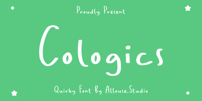 Cologics a Quirky Font which will give you mood impression.. Cologics wome along with Multi-Lingual Support to fulfill your need. We highly recommend using a program that supports OpenType features and Glyphs panels like many of Adobe apps and Corel Draw, so you can see and access all Glyph variations. Cologics is perfect for any tittle, lyrical video music, logo, product packaging, branding project, megazine, social media, wedding, or just used to express words above the background. Enjoy the font, feel free to comment or feedback, send me PM or email. Thank You!
 - Colagent by Great Studio,
$25.00 Colagent is a high-contrast typography inspired by transitional and contemporary typography. The font expands its usability by providing weights ranging from Light to black. Natural curves, swelling and slanting stems grow in characters as the font gets heavier. While the thinner weights have reduced contrast and optical corrections to create a warm and soft appearance. Featuring charming italic letters, exceptional bold weights, and full character support for over 200 Latin-based languages. Colagent excels in display settings such as editorial design, titles, branding projects, logo design, packaging, magazine headings, advertising, short or long text. Colagent also comes with four Variable font versions: Regular, Italic, Condensed, and Condensed Italic to make it easier for designers to explore and perfect beautiful designs, uncovering many visual tones and hidden secrets.
 - Blue Spiris by HansCo,
$17.00 Blue Spiris is a Vintage typeface font. This collection of font is perfect for everything your project with vintage, retro, wild or organic style. It was made with the intention of being used for product Logo like a pomade, coffe, barber or packaging label. It’s great also for branding, logo designs, lettering, logotype, craft, posters and much more. Comes with a full uppercase, lowercase, numbers and punctuation + standard multilingual support. We recommend using Adobe Illustrator or Photoshop. Enjoy!
 - Pyrite - Unknown license

- Shirt - Unknown license

- Pirate - Unknown license

- Sport by Bogusky 2,
$40.00The most watched and celebrated sports are A-Z, with the lower case showing the same sports flopped. The numbers 1-0 are an assortment of Olympic sports. - Sports by Monotype,
$29.99 - Skirt by Typodermic,
$11.95 Step into the world of Skirt—the rounded sans-serif typeface that exudes style and sophistication. Skirt’s fluid forms will elevate your text with a playful yet elegant rhythm, while its cute strokes and delightful letterforms will add a unique touch to your message that is sure to turn heads. With three weights and italics to choose from, Skirt is versatile enough to be used for anything from fashion editorials to high-end branding. Its rounded ends give it a softness that’s perfect for creating a welcoming and approachable vibe, while its bold strokes make it stand out with a confident and modern appeal. Whether you’re crafting a brand identity for a boutique fashion label or creating eye-catching graphics for your latest editorial spread, Skirt will help you make a statement. This is not your average font—Skirt is an individualist with a lot of character, and it’s ready to add some serious style to your next design project. Most Latin-based European writing systems are supported, including the following languages. Afaan Oromo, Afar, Afrikaans, Albanian, Alsatian, Aromanian, Aymara, Bashkir (Latin), Basque, Belarusian (Latin), Bemba, Bikol, Bosnian, Breton, Cape Verdean, Creole, Catalan, Cebuano, Chamorro, Chavacano, Chichewa, Crimean Tatar (Latin), Croatian, Czech, Danish, Dawan, Dholuo, Dutch, English, Estonian, Faroese, Fijian, Filipino, Finnish, French, Frisian, Friulian, Gagauz (Latin), Galician, Ganda, Genoese, German, Greenlandic, Guadeloupean Creole, Haitian Creole, Hawaiian, Hiligaynon, Hungarian, Icelandic, Ilocano, Indonesian, Irish, Italian, Jamaican, Kaqchikel, Karakalpak (Latin), Kashubian, Kikongo, Kinyarwanda, Kirundi, Kurdish (Latin), Latvian, Lithuanian, Lombard, Low Saxon, Luxembourgish, Maasai, Makhuwa, Malay, Maltese, Māori, Moldovan, Montenegrin, Ndebele, Neapolitan, Norwegian, Novial, Occitan, Ossetian (Latin), Papiamento, Piedmontese, Polish, Portuguese, Quechua, Rarotongan, Romanian, Romansh, Sami, Sango, Saramaccan, Sardinian, Scottish Gaelic, Serbian (Latin), Shona, Sicilian, Silesian, Slovak, Slovenian, Somali, Sorbian, Sotho, Spanish, Swahili, Swazi, Swedish, Tagalog, Tahitian, Tetum, Tongan, Tshiluba, Tsonga, Tswana, Tumbuka, Turkish, Turkmen (Latin), Tuvaluan, Uzbek (Latin), Venetian, Vepsian, Võro, Walloon, Waray-Waray, Wayuu, Welsh, Wolof, Xhosa, Yapese, Zapotec Zulu and Zuni.
 - Spiky by Aah Yes,
$3.95Spiky is an unusual font with spiky characters (which must come as a surprise) that provides a graphical solution where a monster, spooky or unusual typeface is required. The zip files contain both OTF and TTF versions of the font - install one version only. - Sprig by Scholtz Fonts,
$19.00 Sprig is a dynamic font that combines in-your-face chutzpah with contemporary brushstrokes. The character shapes are contained, yet give a feeling of casual, off the cuff ease. In some, subtle ways it pays its respects to the sign painters of the 30s and 40s The font comes in three styles: - Display, with extravagant upper case characters and some opentype features - Text, with more contained upper case characters (suitable for "all caps" use) and some opentype features - Professional, where OpenType features include alternative upper case characters (both the TEXT the DISPLAY caps), as well as a number of ligatures. (For use in applications that access OpenType features.) What this means is that Sprig Pro combines all the characters of Sprig Text and Sprig Display in one font and it also has additional ligatures. Sprig Pro contains over 283 characters, while all styles of Sprig contain a full upper and lower case character set, punctuation, numerals, symbols and accented characters for both all characters that they contain. It has all the accented characters used in the major European languages. The Sprig User Guide provides you with more information on how to use Sprig Pro.
 - Spire by GroupType,
$19.00 Originally designed by Sol Hess for the Lanston Monotype Foundry in 1938, this revival was designed by Ann Pomeroy in the early 90s. Spire is a condensed serif with a very 1930s retro look. PLEASE NOTE: Each Spire font (Regular, Extra Light and Monoline) include a companion Expert font in the download. The Experts feature several alternate glyphs. The Family includes three Styles and three Expert styles. 6 fonts all together.
 - Sirin by Nikita Kanarev,
$25.00 Modern display font Sirin. The font contains more than 8000 ligatures. Based on the aesthetics of the Ligature.
 - Sporting by OKSHUtypeCO,
$14.00 Sporting- a new fresh handmade calligraphy font. Very suitable for greeting cards, branding materials, business cards, quotes, posters, and more!This font are perfect for wedding postcard. Or you can create perfect and unique design of your logo, blog, stationery, marketing, magazines and more :) Features : UpperCase & Lowercase Numerals & Punctuations Multilingualcharacters(AÀÁÂÃÄÅCÇDÐEÈÉÊËIÌÍÎÏNÑOØÒÓÔÕÖUÙÜÚÛWYÝŸŸ ÆŒßÞàáâãäåæçèéêëìíîïðñòóôõöøùúûüýÿ)
 - Sirius by URW Type Foundry,
$39.99
- Scripps College Old Style by Monotype,
$49.00The story of Scripps College Old Style is a heart-warming and inspiring chronicle about a young librarian, a handful of students, a wealthy grandmother, a dedicated educator -- and two eminent American type designers. The story begins in 1938, when Dorothy Drake, the newly hired librarian at Scripps College, a small women's college in southern California, became an impromptu dinner companion of the American type designer Fred Goudy. By the 1990s, the original fonts that Goudy had created for Scripps College in the 1940s had become prized -- but they were seldom-used antiques. Scripps needed digital versions of the metal fonts. This goal posed two immediate challenges: finding a designer familiar with letterpress printing who was skilled at creating digital fonts, and locating the money to commission the designer's services. The first challenge was the easiest to conquer. Sumner Stone was my first and only choice," recalls Kitty Maryatt, the current curator of the Scripps College Press. "I knew he had letterpress experience, was an accomplished calligrapher, and that his typeface designs were simply exquisite. The choice was easy."The second challenge was more difficult. It took the dedication, hard work and tenacity of Maryatt to bring the beautiful Goudy designs into the twenty-first century. While Stone was eager to begin work on the project, the college had no more money for new typeface designs in the 1990s than it did in the1930s. Years of lobbying, cajoling and letter writing were necessary to obtain the college's approval for the design project. Once she had the necessary funding, the design brief posed yet a third challenge. Goudy had provided two sizes of type to the Press: 14 point and 16 point. Which would serve as the foundation for Stone's work? In addition, the Goudy fonts were quite worn. Should Stone use printed samples as his design master, or base his work on the original Goudy renderings? The 14-point master drawings were the ultimate choice, with the stipulation that the finished fonts would provide both a seamless transition from the worn metal versions and a faithful representation of the original Goudy designs. Once the budget and design brief were established, the process of converting the original Goudy drawings into digital fonts took just a little over two months. Stone delivered finished products to Scripps in the fall of 1997. The first official use of the fonts was to set an announcement for a lecture by Stone at Scripps in February of 1998. But the story is not quite finished. Maryatt was so pleased with the new digital fonts, she wanted to share them with the graphic design community. At Stone's suggestion, she contacted Monotype Imaging with the hope that the company would add the new designs to its library. An easy decision! Now Monotype Imaging is part of the story. We are proud to announce the release of Scripps College Old Style as a Monotype Classic font. The once exclusive font of metal type is now available in digital form for designers around the world. " - SF Collegiate Solid - Unknown license

- SF Collegiate Solid - Unknown license

- SF Collegiate Solid - Unknown license

- SF Collegiate Solid - Unknown license

- Ongunkan Anglo Saxon Spirit by Runic World Tamgacı,
$45.00 I present it to you as a hollow-style transparent design of the Anglo-Saxon Runic inscription. Use it with pleasure.
 - Roller Coaster - Unknown license

- Gentleman Caller - Unknown license

- Roller Poster by HiH,
$12.00 Roller Poster is named after Alfred Roller. In 1902, Roller created a poster to advertise the 16th exhibit of Austrian Artists and Sculptures Association, representing the Vienna Secession movement. The exhibit was to take place in Vienna during January & February 1903. The location is not mentioned because everyone in Vienna knew it would be held at the exhibit hall in the Secession Building at Friedrichstraþe 12, a few blocks south of the Opernring, near the Naschmarkt. Designed by Joseph Maria Olbrich in 1897, the buiilding has been restored and stands today as one finest of the many fine examples of Art Nouveau architecture in Vienna (see vienna_secession_bldg.jpg). Because of its dome, it is called “the golden cabbage.” The poster itself is unique. The word “secession” is in one type style and takes up two-thirds of the elongated poster. At the bottom of the poster are the details in a different lettering style. It is this second style at the bottom that is the basis for the font Roller Poster. In keeping with our regular naming conventions, we were going to call it Roller Gezeichnete (hand-drawn), but the wonderful play on both words and the shape of the three S’s in secession was too compelling. In November 1965 there was an exhibit of Jugendstil and Expressionist art at the University of California. Alfred Roller’s Secession Poster was part of that exhibit. Wes Wilson was designing promotional material at Contact Printing in San Francisco. Among their clients was a rock promoter named Bill Graham, staging dance-concerts at Fillmore Auditorium. Wilson saw the catalog from the UC exhibit and Roller’s lettering. Wilson adapted Roller’s letter forms to his own fluid style. The result was the poster for the August 12-13, 1966 Jefferson Airplane/Grateful Dead concert at Fillmore put on by Graham (BG23-1). Wilson continued to use Roller’s letter forms on most of the posters he did for Graham through May 1967, when he stopped working for Graham. The posters were extremely successful and the lettering style along with Roller’s letter forms were picked up by other artists, including Bonnie MacLean, Clifford Charles Seeley, James Gardner, and others. The Secession poster and the Fillmore posters have inspired a number of fonts in addition to ours. Among them are JONAH BLACK (& WHITE) by Rececca Alaccari, LOVE SOLID by Leslie Carbarga and MOJO by Jim Parkinson. Each is different and yet each clearly shows its bloodlines. Our font differs in two ways: 1) the general differences in the interpretation of the letter forms and 2) the modification of the basic letter form to incorporate the diacriticals within the implied frame of the letter, after the manner of the original design by Roller. We borrowed Carbarga’s solution to the slashed O and used it, in a modified form, for other characters as well to accomplish the same purpose. We recommend that you buy ours and at least one of the other three. According to Alaccari, a version called URBAN was released by Franklin Lettering in the 70’s (and is shown on page 51 of The Solotype Catalog). For comparison of our font to original design, see image files roller_poster_2s.jpg of original poster and roller_poster_2sx.jpg showing reconstruction using our font for the lower portion (recontructed area indicated by blue bar). Please note the consistency of character width. In the lower case, 23 of the basic 26 letters are 1/2 EM Square wide. The ‘i’ is an eighth narrower, while the ‘m’& ‘w’ are one quarter wider. All the Upper Case letters are 1/8 EM wider than the lower case. This is to make it easier to fill a geometrical shape like a rectangle, allowing you to capture a little of the flavor of Wes Wilson’s Fillmore West poster using only a word processor. We have also included a number of shapes for use as spacers and endcaps. If you have a drawing program that allows you to edit an ‘envelope’ around the letters to distort their shape, you can really get creative. I used Corel Draw for the gallary images, but there are other programs that can accomplish the same thing. The image file “roller_poster_keys.jpg” shows the complete character set with the keystrokes required for each character (see “HiH_Font_readme.txt” for instruction on inserting the non-keyboard characters). The file “roller_poster_widths.jpg” shows the exact width of each character in EM units (based on 1000 units per EM square). You will notice that the font is set wide for readability. However, most programs will allow you to tighten up on the character spacing after the manner of Roller & Wilson. In MS Word, for example, go to the FORMAT menu > FONT > CHARACTER SPACING. Go to the second Drop-Down Menu, labeled ‘Spacing’ and select "condensed' and then set the amount that you want to condense ‘by’ (key on the little arrows); two points (2.0) is a godd place to start. Let your motto be EXPLORE & EXPERIMENT. Art Nouveau has always been one of my favorite movements in art -- I grew up in a home with a couple of Mucha prints hanging on the living room wall. Perhaps because of that and because I lived through the sixties, I have enjoyed researching and designing this font more than any other I have worked on. Let’s face it (pardon the pun), Roller Poster is a FUN font. You owe it to yourself to have fun using it.
 - Suburban Collier by Paula Minelgaite,
$80.00 Suburban Collier is a dreamy, humanist demi-serif sister of Romford Stencil typeface. It was created during the COVID-19 pandemic and its name is inspired by Collier Row, a suburban area of Romford, East London (UK). Suburban Collier features subtle ligatures, an alternative ‘a’ and supports Western, Central, Southern, and Eastern European as well as Pinyin. Use it to add character to your body copy or as fancy display text.
 - Best collections by Gie Studio,
$11.00 Hi Everyone's,... Design and introduce your business products with modern typography and full of natural impression. Best collection fonts will give all these impressions to help your product look more memorable in everyone's hearts. Best Collections fonts will be a wonderful asset to your font library and perfect for many projects such as logos & branding, stationery, logo designs, social media posts, advertisements, product packaging, product designs, label, watermark, product branding and others. Features: Multilingual Support for 83 Country Special Underline Collection PUA Encoded Numeral and Punctuation Language Support : Afrikaans, Albanian, Asu, Basque, Bemba, Bena, Breton, Catalan, Chiga, Colognian, Cornish, Croatian, Czech, Danish, Dutch, Embu, English, Esperanto, Estonian, Faroese, Filipino, Finnish, French, Friulian, Galician, Ganda, German, Gusii, Hungarian, Inari Sami, Indonesian, Irish, Italian, Jola-Fonyi, Kabuverdianu, Kalaallisut, Kalenjin, Kamba, Kikuyu, Kinyarwanda, Latvian, Lithuanian, Lower Sorbian, Luo, Luxembourgish, Luyia, Machame, Makhuwa-Meetto, Makonde, Malagasy, Maltese, Manx, Meru, Morisyen, Northern Sami, North Ndebele, Norwegian Bokmål, Norwegian Nynorsk, Nyankole, Oromo, Polish, Portuguese, Quechua, Romansh, Rombo, Rundi, Rwa, Samburu, Sango, Sangu, Scottish Gaelic, Sena, Serbian, Shambala, Shona, Slovak, Soga, Somali, Spanish, Swahili, Swedish, Swiss German, Tait, Teso, Turkish, Upper Sorbian, Uzbek (Latin), Volapük, Vunjo, Walser, Zulu. Thank you for everything and happy design .
 - Roller Cores by Sarid Ezra,
$15.00 Introducing, Roller Cores - a paint roller typeface! Roller Cores is a paint roller inspired font. This font will give you roller and dry brush vibes. Suitable for any project. With unique characters make this font more special! Caps Only Fonts. Happy Creating!
 - Fd Moller by Fortunes Co,
$10.00 Moller has a strong but soft character, with a cheerful and fresh theme, supported by 2 Style. Moller is able to answer your current needs who are designing something great. Moller is a bold and unique display font. Masterfully designed to become a true favorite character, moller is able to answer your current needs who are designing something great Its weight is superior in posters, social media, headlines, magazine titles, clothing, large print formats.
 - Cullens Shoes by Aboutype,
$24.99Decorative three-dimensional display font with cap and lowercase. Originally designed for a shoe company. Works with colors, gradients and filters. Cullens Shoes was designed for all media and works best at 30 point and above. Cullens Shoes requires subjective display kerning and compensation. - Bull Roller by Device,
$29.00
- JT Collect by OGJ Type Design,
$35.00 JT Collect is a hybrid sans-serif typeface for the 21st century that takes a playful approach to the type design heritages of Germany and Switzerland. Confidently built on a geometric structure and infused with elements from traditional grotesque typefaces, it hits the sweet spot between geo and grot. I developed JT Collect purely digitally, drawing from years of experience with analog type design. The letters aren’t based on one particular source but seek to merge different type genres from the first half of the 20th century and lift them to a contemporary quality level. JT Collect is less reserved than strictly geometric designs and brings some industrial workmanship and honesty into the game. The six weights plus three optical sizes of JT Collect offer what you need to make an impact. While cool and elegant in the Light weight, the fonts show more presence on the page as they grow bolder. To this end, I drew the letterforms with a slightly unrefined, brawny air in the bolder weights. This sets them apart from the perceived purity of more geometric designs. The Book weight is ideal for short texts and medium-length copy, and the forceful Bold makes wordmarks look crisp and lets headlines radiate cosmopolitan self-confidence. JT Collect is suitable as a primary typeface for branding, advertising, packaging, stationery, posters, documents, and websites from trades and industries as diverse as food & fashion, media & makers, culture & creators, games & gems, sports & startups. Use JT Collect for film titles or watch faces, for leaflets or store signs, for business cards or billboards: this font family is as adaptable as a chameleon (and like a chameleon, it’s never boring). Try it in different contexts. You won’t be disappointed. Its adaptability also makes JT Collect a great starting point for poised and persuasive font combinations. Even a sans/sans pairing is possible due to hybrid nature of JT Collect—something that’d be hard to achieve with most other sans-serif typefaces on the market. You can add to it a heavy slab from the OGJ library, like Temper Wide. You might go for a geometric or a grotesque typeface as secondary (text) typeface. Or you could set your body copy in a classic serif typeface such as Caslon, Sabon, or Plantin. That’s right: JT Collect is a true team player. Whether you need a grotesque or a geometric sans: try JT Collect. You can get the best of both worlds.
 - Easy Callig by Intellecta Design,
$17.90Note: The Italic style is no longer available due its complexity and the resulting memory and performance issues. - Soul Collections by Fikryal,
$18.00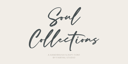 Soul Collections is a hand brush font perfect for crafting, branding, invitation, stationery, wedding designs, social media posts, advertisements, product packaging, product designs, label, photography, watermark, special events, or anything. Soul Collections comes with a full set of uppercase and lowercase letters, ligatures, multilingual symbols, numerals, and punctuation.
 - Holy Roller by GRIN3 (Nowak),
$19.00Holy Roller is a fun, hand-drawn font inspired by typewriter fonts. It can be used for invitations, greeting cards, posters, advertising, weddings, books, menus etc. Language support includes Western, Central and Eastern European character sets, as well as Baltic and Turkish languages. - Jimmy Collins by Allouse Studio,
$16.00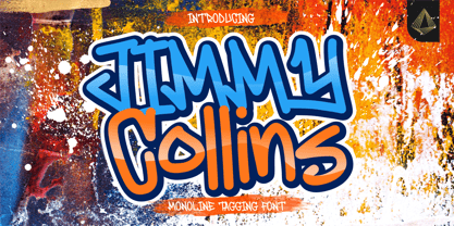 Proudly Presenting, Jimmy Collins a Monoline Tagging Font. Jimmy Collins is perfect for any tittles, logo, product packaging, branding project, megazine, social media, wedding, or just used to express words above the background. Jimmy Collins come with lowercase ending swash and Multi-Lingual Support. Enjoy the font, feel free to comment or feedback, send me PM or email. Thank You!
 - Hysteria Rollers by Din Studio,
$20.00 Hi, Everyone! Looking for a font that will make your branding stand out? Do you sometimes have an appetite for a bit more wholesome typography? Looking for a fabulous, stylish, and adventure font? We've got what you want. Hysteria Rollers - A Sans Script Font Duo Hysteria Rollers is a fantastic font duo. An uppercase sans serif font is accompanied by a gorgeous handcrafted script brush font that works together in perfect harmony. Designed primarily as a captivating font to add the right amount of modernity and style, This font duo is an excellent choice to ensure a great font match for your designs and projects! Our font always includes Multilingual Support to make your branding reach a global audience. Features: Ligatures Alternates Stylistic Set Swashes PUA Encoded Numerals and Punctuation Thank you for downloading premium fonts from Din Studio
 - Stuart Collins by Goodigital13,
$20.00 It looks stunning on wedding invitations, thank you cards, quotes, greeting cards, logos, business cards and every other design which needs a handwritten touch. add an eye-catching appeal to your logo designs, brand imagery, handwritten quotes, product packaging, merchandise & social media posts


