10,000 search results
(0.053 seconds)
- Boostnia by Twinletter,
$14.00 Introducing our newest font called Boostnia, a bold signature font written with abstract curves but still looking modern and elegant, This font in addition to having a charming and unique shape is also equipped with various options that support good results when you use it in your project. This font is perfect for business cards, photography studios, autographs, interior designs, model names, coffee late, travel, weddings, cosmetics, jewelry, social media posts, product packaging, watermarks, special events, or anything else. Start using this font to add an authentic and heartfelt vibe to any design project.
 - Kinship Sans by wearecolt,
$9.00 Introducing Kinship, a Grotesque 9 weight font family by We Are Colt. Kinship has been created to be your all-round go-to grotesque font that works well for copy and titles. With nine standard weights, this font is more flexible than a bungee rope. Kinship is a sans serif modern classic grotesque font, perfect for adding personality to logos and brochures. Pairs well with script and brush fonts: I recommend Stroom . Features: 9 separate font weights Western European, Central, South-eastern Upper and lowercase Numerals Free 300 font weight
 - Harmonie Glamour by Tropical Sunlight Co.,
$16.00 Harmonie Glamour - Modern Font Duo The font is called "Harmonie Glamour", it is font duo with fashionable themes. The font comes with two pairing typefaces (script and serif). Script font contains set alternates and some ligatures. Harmonie Glamour matches apply in some designs such as the logotype, quotes, wedding invitation, business card, packaging, branding, and more custom design. Harmonie Glamour includes : - Uppercase, lowercase, numeral, symbol and punctuation, alternate, ligature in script font - All-caps, numeral, symbol, punctuation and ligature in serif font - Multilingual - PUA Encoded If you have any questions, please contact : tropicalsunlight.co@gmail.com
 - Puddy Gum by Agny Hasya Studio,
$9.00 Introducing Puddy Gum a Playful, Groovy, and Bubbly Display Typeface, Fluffy, and Fun. This Font Family Comes in 3 Styles (Regular, Bubble, and Outline 3D Extrude) and Includes Italics. Featured With Pua Unicode, Uppercase and Lowercase, Numeral and Punctuation, Multilingual Support, Created With Alternate and Ligature. You Can Experiment With All 3 Styles Since the Characters Overlap and Align Perfectly, Resulting in Visually Interesting and Cool Typography. It’s Perfect for Your Design Projects Such as Logos, Advertising, Branding, Posters, Banners, Product Designs, Art Quotes, Special Events, Product Packaging, and More.
 - Billy Coaster by HIRO.std,
$20.00 Billy Coaster is a Modern Retro Typeface. This font describes about stylist, modern retro, modern vintage, cool, and easy to use. Billy Coaster Typeface inspired from the modern retro typography and designs in late 80's untill 90's. FEATURES - Uppercase and Lowercase letters - Support Opentype Features - Stylistic Alternates - Numbering and Punctuations - PUA Encoded Characters - Multilingual Support - Works on PC or Mac - Simple Installation USE Billy Coaster Typeface works great in Logotype, Branding, Apparel, Poster, Magazine and any projects that need Modern Retro taste. Enjoy using! Thanks. HIRO.std
 - ST Agitaciya by ShimanovTypes,
$9.00 Introducing a retro narrow grotesque called "Agitaciya" (Agitation). Bring back to the Soviet Era Agitation inspired by Soviet posters, movie titles and book covers. The letterforms are straight and condensed and come in 2 styles: uppercase and small caps alternatives. It has Extended LATIN and Extended CYRILLIC letters. "Agitaciya"created for titles, poster design, web design, branding and packaging works, illustrations, badges and other typography works. *ST Agitaciya supports 15+ languages: English, German, Spanish, Belarusian, Bosnian, Bulgarian, Croatian, Dutch, Norsk, Dannish, Macedonian, Polish, Russian, Serbian, Slovenian, Swedish, Ukrainian, Kazakh, and probably others )
 - CANNABIS Company by Fat Hamster,
$20.00 CANNABIS company is a vintage display typeface, it has an old American feel. CANNABIS company typeface includes 5 font styles: serif, sans serif, rough, outline, round. CANNABIS company font with bonus cannabis leaf, hemp, CBD, pre-roll, joint illustrations are great for CBD company logo design; label for cannabis products and CBD packaging design; badges, clothing and t-shirts; posters and headings; distillery and brewery branding design; spirits label design (such as rum, gin, whiskey, bourbon, vodka, tequila, mezcal, beer); coffee and tea; supplements and cosmetics design and much much more.
 - Menalde by Edignwn Type,
$12.00 The font is called "Menalde", it is slab serif display with vintage themes. The font comes with 4 style typefaces (regular, rounded, rough and textured). Uppercase and lowercase have different unique stamp textures, so you can combine the same 2 letters and not be boring . The Menalde matches applies in some designs such as the logotype, poster, label, badge, packaging, branding, and more custom design. Menalde includes : 4 style typefaces (regular, rounded, rough and textured) All-caps, numeral, symbol and punctuation Multilingual PUA Encoded Thank you for your support and choosing us.
 - Backhand by Scratch Design,
$10.00 Introducing Backhand! It's a modern script font with texture brushed ink style. It's highly recommended for you who want to make some designs with texture in font style. This font will work for invitation design, logos, badge design, poster, packaging, book cover title, quote, social media post, etc. Just open your Opentype features while using the script font to use the ligatures and swashes. Also, this font includes alternates for uppercase and lowercase characteristics. Features: Accents (Multilingual characters) Ligatures Swashes Numerals Punctuations So, enjoy the Backhand script and make some cool stuff!
 - Omiwa by Orenari,
$14.00 Omiwa is a playful Display font with a unique character that is perfect for all design purposes. With unique alternate characters you can combine it into awesome waves! - This font is semi-ALL-Caps font, because some characters have lowercase (f, g, i, j, r). - The characters with Stylistic Alternates : A, H, K, M, N, R, U, V, W, X, Y I really hope your projects will be cool with this font, and please don't hesitate to drop me a message if you have any questions or you wanna share some jokes!
 - Longle by Canden Meutuah,
$15.00 Longle is a beautiful handwritten font. this font is so simple that i write very carefully. Even though it looks simple, this font still looks cool and stylish. This Fonts are perfect for: logos, branding, wedding invitations, business cards, greeting cards, posters, magazines, social media, proliferate fonts, planner prints and websites. Get creative with their unique fun, and use them to brighten up any craft project! Get this font now and boost your creativity with it! If you have any questions, before or after your purchase, don't hesitate to contact us. Thank You
 - Ampmosphere by Joey Maul,
$22.00 Ampmosphere, a picture font, contains instruments and components from a 60's rock and roll band. After a friend's request to create a guitar graphic, I decided to start a set. Over time, more instruments were added along with amps, tubes, lights, etc. The glyphs are great to use individually or combined. 65 detailed glyphs in all... A - Z upper and lower case; 0 - 9; comma, period and forward slash. Upper case A, B, C and D are the separate strings for the stringed instruments a, b, c and d.
 - Brannboll Connect by Mans Greback,
$59.00 Brannboll Connect is a script sport typeface. The baseball-style lettering was drawn by Måns Grebäck in 2020. It is a specialist connected typeface: Each character and all their parts are physically connected, making it a lettering perfect for laser cutting, signs, jewelry, woodworking and embroidery. It also comes with the additional, decorative style Brannboll Connect Swash, which contains ten cool swashes to give the graphic extra expression. It has a very extensive lingual support, covering all European Latin scripts. The font contains all characters you'll ever need, including all punctuation and numbers.
 - Creative Signature by Scratch Design,
$9.00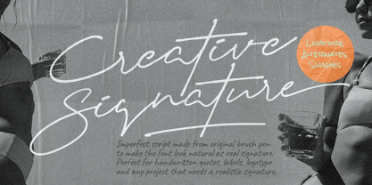 Introducing Creative Signature! It's a modern script font with a signature-style look. It's highly recommended for you who want to make some designs with a realistic signature style. This font will work for invitation design, wedding design, fashion design, advertising design, posters, packaging, book cover title, quote, social media post, etc. Open your Opentype features using the script font to use the ligatures, alternates, and swashes. As you type, your text will look like a natural signature or handwriting. So, enjoy the Creative Signature and make some cool stuff!
 - Executive Boss by Letterara,
$14.00 Executive Boss is a cool and versatile duo font (serif and script). The beautiful signature monoline-style font perfectly complements the elegant serif font. Combining these two fonts in your next design will give a modern and sophisticated feel, and it makes it a perfect addition to your font collection. Fall for its ravishing style and use it to create gorgeous wedding invitations, beautiful stationary art, eye-catching social media posts, logos, packaging, advertising, and much more! This font is PUA encoded which means you can access all the glyphs and swashes easily!
 - Delighted Atmosphere by Java Pep,
$15.00 Proudly present a pretty bouncy font called Delighted. As the name suggests, this font will make your project more enjoyable because it will make your project more beautiful and stand out. Delighted font comes with several alternates, so you can switch on for the alternate, stylistic alternate, and terminal form. This font is perfect for logo font, branding, greeting cards, cut files for quotes, silhouette font design, monogram font, etc. The packages and features Delighted font PUA encoded Multilingual support in more than 30 languages Thanks, and have a nice day
 - Undersong by PintassilgoPrints,
$19.00 Undersong brings 13 fancy hand-drawn stackable fonts which can be combined in many, many tasty ways. Layered or not, you'll see that these little ones work together scrumptiously well. For added flavor and freshness, each font brings at least 3 variations for each letter, making it for a cool natural handmade look. T-shirts, posters, book covers, packaging projects, Undersong will nicely fit many design applications. Some great font families out there are said to be workhorses. Figure this one like a work-unicorn: perfect for fantastic designs. Enjoy the ride!
 - Play Kids by Canden Meutuah,
$20.00 is a beautiful handwritten font. this font is so simple that i write very carefully. Even though it looks simple, this font still looks cool and stylish. Handwritten script font. This Fonts are perfect for: logos, branding, wedding invitations, business cards, greeting cards, posters, magazines, social media, proliferate fonts, planner prints and websites. Get creative with their unique fun, and use them to brighten up any craft project! Get this font now and boost your creativity with it! If you have any questions, before or after your purchase, don't hesitate to contact us. Thank You
 - Qonqueror by Wacaksara co,
$18.00 Qonqueror Typeface is a font inspired by writing on a blackboard. This font is very cool and can be mixed and matched with any ornament you like. this font is great for your next creative project such as blackboard menu design, book menus, sign boards, logos, printed quotes, invitations, cards, product packaging, headers, Logotype, Letterhead, Poster, Apparel Design, Label, and etc. Qonqueror Typeface comes with uppercase, lowercase, numerals, punctuations and so many variations on each characters include opentype alternates, and also ligatures to let you customise your designs.
 - VanderHand by JOEBOB graphics,
$29.00 The 'VanderHand' font is a friendly and easy to use handwritten font. It is so loaded with ligatures it could easily pass for actual handwriting. The font was created with a felt-tip brush pen and so there are natural thick and thin parts in the characters. All writing was done upright with tightly fit characters. As a result this font has a unique 'instant logo' quality. But you should really try this out for yourself. O, and the font was written by Jeroen van der Ham. It's his handwriting. That's why it's called VanderHand.
 - Smashing by PintassilgoPrints,
$26.00 Smashing is a stout typeface, with a twist. It’s a massive all-caps font with bouncing glyphs, positively bold yet quite good-humored. Its upper and lower case slots stores different lettershapes, providing handy options to choose from. When working with OpenType savvy applications you can turn on the contextual alternates feature to instantly get alternating glyphs, which add spontaneity to your artwork and prevent neighbor double letters from using the same glyph. Also try the discretionary ligatures feature to get some cool interlocking pairs. A smashing font for truly smashing designs!
 - Nimbus Sans by URW Type Foundry,
$35.00 The first versions of Nimbus Sans have been designed and digitized in the 1980s for the URW SIGNUS sign-making system. Highest precision of all characters (1/100 mm accuracy) as well as spacing and kerning were required because the fonts should be cut in any size in vinyl or other material used for sign-making. During this period three size ranges were created for text (T), the display (D) and poster (P) for small, medium and very large font sizes. In addition, we produced a so-called L-version that was compatible to Adobe’s PostScript version of Helvetica. Nimbus was also the product name of a URW-proprietary renderer for high quality and fast rasterization of outline fonts, a software provided to the developers of PostScript clone RIPs (Hyphen, Harlequin, etc.) back then. Also in the 80s, a new, improved version of the Nimbus Sans, namely Nimbus Sans Novus was designed. Nimbus Sans Novus was conceptually developed entirely with URW’s IKARUS system, i.e. all styles harmonize perfectly with each other in terms of line width, weight, proportions, etc. On top of that, Nimbus Sans Novus contains more styles than Nimbus Sans. Now, Nimbus Sans is also available as Round (like the popular URW fonts Futura Round and Eurostile Round). The Round versions are intended to facilitate the work of designers and typographers. The fonts can be used directly, without further preparatory work in graphic programs as finished, high-quality Rounds.
 - Nimbus Sans Round by URW Type Foundry,
$35.99 The first versions of Nimbus Sans have been designed and digitized in the 1980s for the URW SIGNUS sign-making system. Highest precision of all characters (1/100 mm accuracy) as well as spacing and kerning were required because the fonts should be cut in any size in vinyl or other material used for sign-making. During this period three size ranges were created for text (T), the display (D) and poster (P) for small, medium and very large font sizes. In addition, we produced a so-called L-version that was compatible to Adobe’s PostScript version of Helvetica. Nimbus was also the product name of a URW-proprietary renderer for high quality and fast rasterization of outline fonts, a software provided to the developers of PostScript clone RIPs (Hyphen, Harlequin, etc.) back then. Also in the 80s, a new, improved version of the Nimbus Sans, namely Nimbus Sans Novus was designed. Nimbus Sans Novus was conceptually developed entirely with URW’s IKARUS system, i.e. all styles harmonize perfectly with each other in terms of line width, weight, proportions, etc. On top of that, Nimbus Sans Novus contains more styles than Nimbus Sans. Now, Nimbus Sans is also available as Round (like the popular URW fonts Futura Round and Eurostile Round). The Round versions are intended to facilitate the work of designers and typographers. The fonts can be used directly, without further preparatory work in graphic programs as finished, high-quality Rounds.
 - P22 Brass Script by IHOF,
$39.95 P22 Brass Script is a new font from an old source. This script font was discovered in a booklet from Dornemann & Co. of Magdeburg Germany, circa 1910. The book was titled Messingschriften fur Handvergoldung, which roughly translates to “Brass types for hand foil stamping.” The mini catalog called this type simply “Script.” It has not been previously digitized or seen in standard metal type form. The antique specimen book featured most of the characters needed for a full alphabet, but a number of letters were not shown. Since no other examples of this style could be found, P22 enlisted the assistance of master calligrapher Michael Clark to draw the missing characters in the same style as the original. The style is very loosely based on the secretarial hands and reminiscent of “French Hand” with a very early 20th century, pre-modern feel. It has an unusual flow that is neither too casual nor too formal. The font would be useful for wedding invitations or packaging and advertising. P22 Brass Script Pro features include: automatic ligatures for common pairs such as ll, tt, qu and a variety of f ligatures, full CE language support including Turkish and Romanian and a variety of swash underscores for different length words that can be added manually in OpenType ready applications with the glyph palette or with the contextual alternates. The length of the word will automatically select the best length of swash for the work.
 - Ah, Lelim 200, a typographic enigma birthed from the creative chambers of Stefan Motzigemba's mind! If fonts were people, Lelim 200 would be that effortlessly cool friend who knows all the best coffe...
- Address Sans Pro by Sudtipos,
$39.00 History is always in sight; it is constantly being reconsidered and reformulated in the context of now. We see approaches to art, fashion, textiles, homewares, furnishings … not to mention music, graphics and everything else that culturally enriches our daily lives, revisited and made anew for today. Address Sans indulges in the spirit and aesthetics of mid-century Modern – Italian industrial design, sleek coffee makers, stylish cars, seductive jazz pressed on vinyl – with a charm and charisma that defies time. It evokes history but is decisively created for today. Its design, in reality, is rooted in the condensed structure and block modulation of early 1950s German lettering intended for use in street signage, but when we started to work on the various weights and widths, the result was a set of fonts in a style similar to the typographic work developed by Butti and Novarese in the 60s. The multitude of potential applications for Address Sans then became clear. In a range of 3 widths and 8 weights each, Address Sans includes little verses, true italics, small caps and numerous alternative signs for a total of 48 fonts. The result is a functional typeface that is effortlessly seductive, with geometric features and design details that ooze cool, and take it away from mere reinterpretation towards typographic forms that adapt perfectly for contemporary use.
 - Brinca by In-House International,
$7.50 Brinca is an intrepid ‘full spectrum’ typeface with emotional range and a dynamic heart. Morphing sharp tight pleats that relax into office ready neutral sans, then plump into joyful bouncy letters with mesmerizing fluency, Brinca is ready to adapt to a wide variety of expressive needs. Named after its jumping extremes of the type’s styles; from coiled spring to stuffed and bouncy, Brinca is also a leap into new possibilities for display type design. Because of its chameleon-like range of styles, Brinca is a versatile workhorse. It’s a great choice for brand identities ready to embrace expressive range, and it’s perfect for fine-tuned packaging, events promotions, merch, product lines, and much more. WIth its very wide spectrum of options, It’s a single typeface that can be used to design a library’s worth of book covers. (We put it to the test!) About Brinca was designed by Alexander Wright and Rodrigo Fuenzalida with Michu Benaim Steiner for In-House Int’l foundry, the type foundry of brand consultancy In-House International. It was developed by Rodrigo Fuenzalida at FragType, and available through YouWorkForThem. In-House foundry offers bold, fearless, and expressive, display typefaces that tell a story. Its previous releases have been featured on Design Milk, DesignBoom, Slanted, PAGE. They’ve also been used to create standout work by designers around the world, and even won some awards.
 - Rusty Forest by Mans Greback,
$69.00 Rusty Forest is a typeface that takes you back to the days of golden design, when travel and adventure were celebrated in striking posters. This font's rustic appearance, created by its brush-style strokes, evokes images of a cabin in the woods, surrounded by the beauty of nature. It's as if you can smell the campfire smoke and hear the rustling of leaves in the wind. This font is perfect for designers looking to add a touch of vintage charm to their projects, whether it be a poster for a national park or a logo for a wilderness-themed brand. Its 1950s-inspired style will transport viewers back in time to a simpler era, where the call of the wild was all one needed to feel free. The Rusty Forest family includes Bold, Italic, Bold Italic, and Regular, offer a range of options to suit different design needs. The font is built with advanced OpenType functionality and has a guaranteed top-notch quality, containing stylistic and contextual alternates, ligatures and more features; all to give you full control and customizability. It has extensive lingual support, covering all Latin-based languages, from Northern Europe to South Africa, from America to South-East Asia. It contains all characters and symbols you'll ever need, including all punctuation and numbers.
 - Dan Panosian by Comicraft,
$29.00 It’s true -- having your own font IS The Secret Of Happiness! At times suave and sophisticated, at other times rough and ready for anything, superstar comics artist Dan Panosian has worked on the likes of CAPTAIN AMERICA, SPAWN, THE FLASH,, SPIDER-MAN, X-THE X-MEN and GREEN LANTERN, as well as the movie, HARRY POTTER AND THE SORCERER'S STONE and games like DUKE NUKEM. He hasn't been seen in comics for some time, but he’s back, baby, working on a series of JOHN TIFFANY bandes desinée, and he’s brought his own font with him, courtesy of that awfully nice John JG Roshell at Comicraft. John Tiffany is one of the best bounty hunters in the world and he has no illusions about the world that employs him. Tiffany relies exclusively on four people: the Reverend Lovejoy, who taught him to love his money; Wan Chao, of the geek underworld who serves as an interface with the outside world; Dorothy, his partner, and Magdalena, the ‘call girl in his life.’ But in Mexico, the hunter has become prey, his head has a price. And if his rivals know his location, it means that John Tiffany was betrayed by one of four people he thought he could trust...and now he can rely on only ONE thing, his secret weapon. His FONT. See the families related to Dan Panosian: Urban Barbarian.
 - Petals BF by Bomparte's Fonts,
$39.00 Ooh so soft, so curvaceous, so voluptuous and so swash-buckling. Hey, I'm talking ’bout Petals BF! Here’s a design inspired by the work of Dave West and infused with a plethora of pleasingly plump letterforms, with swashes reminiscent of 60s and 70s types. But here’s the twist: where you might typically expect to find ball terminals, you'll experience some sensuous curls; and some playful letterforms such as lowercase h, k, m, and n, may even call to mind that groovy look of ’60s bell-bottoms. Spread across its capitals and lowercase are swash variants for beginning, middle and ending letterforms —candy for your eyes. Petals BF is where Didone style happily marries the organic and curvaceous forms of Art Nouveau. Strange I know, but so is a duckbill platypus —and somehow they all seem to work surprisingly well. Among the many typographic niceties you'll discover, are such Opentype features as Contextual and Stylistic alternates, Ligatures, Case-sensitive forms and Fractions. Please note: these magical features demand the use of opentype-savvy applications such as Adobe Creative Suite, QuarkXPress and etc. Petals BF is multilingual, and speaks the languages of Western, Eastern and Central Europe, in addition to Turkish and Baltic. It gets around. So let your creativity blossom with Petals in projects that involve headlines, magazine layouts, product packaging, logos, signage, branding and etc.
 - Typist Slab Mono by VanderKeur,
$25.00 The typeface Typist originated during an extensive research on the origin and development of typewriter typestyles. The first commercially manufactured typewriter came on the market in 1878 by Remington. The typestyles on these machines were only possible in capitals, the combination of capitals and lowercase came available around the end of the nineteenth century. Apart from a few exceptions, most typestyles had a fixed letter width and a more or less unambiguous design that resembled a thread-like structure. A lot of this mechanical structure was due to the method the typestyles were produced. Looking at type-specimens for print before the first typewriters were good enough to came on the market we can see that in 1853 and in 1882 Bruce’s Type Foundry already had printing type that had a structure of the typewriter typestyles. Of course printing types were proportional designed as typewriter typestyles had a fixed width. So it is possible that except from the method of production for typewriter typestyles, the design of printing types were copied. In the design of the Typist, the purpose was – next to the monospace feature – to include some of the features of the early typewriter typestyles. Features such as the ball terminals and the remarkable design of the letter Q. This new typeface lacks the mechanical and cold look of the early typewriter typestyles. The Typist comes in six weights with matching italics in two versions. One that resembled the early typewriter typestyles (Typist Slab) and a version designed with coding programmers in mind (Typist Code).
 - Typist Code Mono by VanderKeur,
$25.00 The typeface Typist originated during an extensive research on the origin and development of typewriter typestyles. The first commercially manufactured typewriter came on the market in 1878 by Remington. The typestyles on these machines were only possible in capitals, the combination of capitals and lowercase came available around the end of the nineteenth century. Apart from a few exceptions, most typestyles had a fixed letter width and a more or less unambiguous design that resembled a thread-like structure. A lot of this mechanical structure was due to the method the typestyles were produced. Looking at type-specimens for print before the first typewriters were good enough to came on the market we can see that in 1853 and in 1882 Bruce’s Type Foundry already had printing type that had a structure of the typewriter typestyles. Of course printing types were proportional designed as typewriter typestyles had a fixed width. So it is possible that except from the method of production for typewriter typestyles, the design of printing types were copied. In the design of the Typist, the purpose was – next to the monospace feature – to include some of the features of the early typewriter typestyles. Features such as the ball terminals and the remarkable design of the letter Q. This new typeface laks the mechanical and cold look of the early typewriter typestyles. The Typist comes in six weights with matching italics in two versions. One that resembled the early typewriter typestyles (Typist Slab) and a version designed with coding programmers in mind (Typist Code).
 - Raylig by Khaiuns,
$16.00 Raylig is a graceful serif but full of energy, Raylig is an experimental project full of selfishness in it, this project was designed by khaiuns in May 2021, he made it himself so it took about 4 months. Raylig is a desire to present the perfect font for your wide variety of projects so that this type of font can be selected for branding, especially in the UI / UX industry, also suitable for typographic layout for magazines, posters, books, etc. With hard work and spending a lot of time, comes the Raylig Serif font that has interesting things, such as: 10 styles: 5 Original, 5 Alternative 650 glyphs in each style Support for more than 190+ languages: Expanded Latin, and many other languages Each style has 33 really cool alternatives, and find something interesting Raylig also has classic characters, but it is also perfect for your modern design, you can see it on display, such as in thin body size (light), Raylig makes a neutral impression, but when the size is getting bigger (Bold), users are taken on a fun search to find interesting movements, graphic peculiarities, and unusual solutions. All letter patterns are perfectly adjusted. I hope you have a blast using Raylig. Thanks for use this font ~ Khaiuns X zelowtype
 - Scholz Secession by HiH,
$8.00 We named this font Scholz Secession. Fin-de-siecle Vienna, Austria is the source of this Jugendstil design from Schriftgiesserei Eduard Scholz. The original release was under the name Reklameschrift Secession. Most of the curve strokes look like commas to me. The letters are as soft and plump as the comforter on the bed I slept on in a Salzburg B&B many years ago. I was traveling with a college buddy and our next stop was Vienna. There a kind, young student named Hanna and her boyfriend took us under their wing. One of the places Hanna proudly showed us was Otto Wagner’s Majolika Haus, built in 1898, and only about 8 blocks from Secession Hall. Hanna explained to us that the style was called Jugendstil and represented Art Nouveau as interpreted within the framework of their culture. I even took a picture. After all, memories are part of who we are. Figures are old-style for text use. This font would not be my first choice for a spread sheet. Included are German ligatures ch (alt-0123) & ck (125), two period ornaments (135, 175) and lower case o and u with Hungarian long umlaut (215, 247)). A very likeable and easy-to-use font.
 - Carlton by ITC,
$29.99Carlton is based on a typeface designed by Prof. F. H. Ehmcke. In 1908, Ehmcke released his Ehmcke-Antiqua design through the Flinsch typefoundry in Germany. Ehmcke-Antiqua was later distributed by the Bauer typefoundry in Frankfurt am Main. The Caslon Letter Foundry in England discovered the design and released their own typeface based upon the model, which they named Carlton. Carlton entered the Stephenson Blake program after they acquired the Caslon Letter Foundry in the late 1930s. As hot and cold metal typesetting became outdated technologies, Carlton and Ehmcke-Antiqua fell out of general use. In the 1990s, Letraset revived this classic design, distributing it under its English name, Carlton. Carlton's clean and generous capitals, as well as its understated yet detailed lower case, have found popularity again in recent years. The elegance of Carlton is best used for displays with large letter and word spacing. Carlton shows all of the hallmarks of a delicate serif typeface design; its forms capture a distinct moment that was common within Central European type design during the first third of the 20th Century. Carlton is similar to several other expressive typefaces from the early 1900s, including Bernhard Modern, Koch Antiqua, Locarno, and Nicolas Cochin." - Kunhety by Twinletter,
$18.00 Introducing Kunhety, a groovy retro font display perfect for bringing a vintage touch to your designs. This font features bold and quirky letters that will make your projects stand out and evoke a feeling of nostalgia. Whether you’re working on a poster, or an album cover, or want to add some retro vibes to your latest project, Kunhety is the perfect font for you. With a range of alternative characters and multilingual support, this font is versatile and ready to add some groovy flavor to your work. Don’t miss out on the opportunity to elevate your designs with Kunhety. Furthermore, Kunhety is user-friendly and easy to use. Making it compatible with a wide range of software and devices. And with its clear and distinct letterforms, it’s sure to grab the attention of your audience and leave a lasting impression. So, add a touch of retro cool to your next project with Kunhety today! What’s Included : - File font - All glyphs Iso Latin 1 - Alternate, Ligature - Simple installations - We highly recommend using a program that supports OpenType features and Glyphs panels like many Adobe apps and Corel Draw so that you can see and access all Glyph variations. - PUA Encoded Characters – Fully accessible without additional design software. - Fonts include Multilingual support
 - Leo by Canada Type,
$29.95 Leo is an economic magazine and book face meant for use in sizes suitable for immersive reading, with different cuts optimized for different body copy size ranges, like footnotes and legal text. Designed with the explicit intent of relaying information without calling attention to itself, this typeface places itself squarely on the "function" side of the eternal debate about form versus content. The roman Leo fonts were built with as little ornamentation as possible, with wedge serifs, a high x-height and a skeleton somehwat rooted in the designers' reflections on the modern, post-war Dutch archetype. Rather than follow traditional models with entirely different forms, contracted widths and steep slants, the Leo italics deliver naturally subtle emphasis in reading by closely relating to the forms, stance and rhythm of their roman counterparts. The 12 Leo fonts contain over 700 glyphs each, and include support for the vast majority of Latin languages. Included OpenType features are built-in small caps, lining and oldstyle figures in both proportional and tabular sets, superiors, numerators, denominators inferiors, ordinals, automatic fractions, ligatures, and optional long descenders for optimal counterspace management in book and magazine text layout. For more information on Leo's character set, features and some print tests, please consult the PDF in the gallery section of this page.
 - Sleeve Notes by Wing's Art Studio,
$12.00 Sleeve Notes: A font from the analogue age. Inspired by album covers and hand-written song lyrics. Sleeve Notes is an experimental script font and all-caps pair with a loose hand-written style that explores the golden-age of record stores, vinyl albums, cassettes and CDs. It imagines our teenage selves kicking back with a coke (oversized headphones on) discovering a new band and studying the notes on their latest album. Besides production credits, the best sleeves (otherwise known as liner notes) included photos, cool artwork and hand-written song lyrics that gave the listener a human connection to the mind of the artist. This font embraces it's subtle ink blotches and rough edges; all imperfections that build to create a sense of a hastily written lyric, set-list or just a fun little scribble. The package includes six fonts in total; the regular script with two complete sets of alternatives, then two sets of all-caps, and finally the special characters font that features a decorative alphabet plus symbols and underlines. For authentically retro, hand-made looking lettering, it's a great choice and offers the flexibility few other fonts can match. Check out all the visuals to see it action!
 - Gianduja by Resistenza,
$39.00 This delicious font family takes its name from the tastiest of Piemonte’s specialities. It has been designed in collaboration with Turin-based calligrapher and artisan Andrea Tardivo. Piemonte soil provides the most delectable hazelnuts, which are the key to creating a mouth-watering chocolate spread called Gianduja. This popular delicacy has a rich graphic history, with lavishly designed packaging. We sought to infuse the sweetness and tradition of Turin’s confectionary into a new font family, reinterpreting Italian models from the first quarter of the last century. All fonts were crafted by hand on paper first and then digitised in a way that retains the handmade quality and aesthetic. This family blends the Turinese touch from the old chocolatiers and the beautifully printed foils they use to wrap each exquisite creation. The extensive display family contains; Gianduja Sans a geometric font based on examples found in Italian art deco era artworks. Gianduja Script has been handwritten with a speedball pen following the standards of “Bella Scrittura” and Gianduja Capitals is a decorative font inspired by the “liberty” lettering signs from Piemonte. To complete the suite we developed an inline Capitals version, a set of icons and decorative elements all with the same handmade characters to perfect partner with each character set.
 - Mr Orange by Hipopotam Studio,
$28.00 Mr Orange is a typeface based on our handwritten letters which we used in some of our books H.O.U.S.E, D.E.S.I.G.N and Who Eats Whom. It has up to three alternate glyphs for each character, even for every diacritic letter. We do use our fonts in our books so we know that switching alternate glyphs can be a pain in the ass. Thats why we’ve created a very cool Contextual Alternates feature. It automatically sets alternate glyphs depending on frequency of appearance of the same character. The script doesn’t throw random glyphs. It’s checks if lets say letter “A” appears more then once in a sequence of characters. For example in the word “ANAKONDA”, the third “A” and the second “N” would be changed to glyphs from first stylistic set, the second “A” would also be changed but to glyph from second stylistic set. We’ve designed different rules for basic characters and different for diacritics and punctation. It really works great but of course you can always fine tune it by hand. This option has one obvious advantage for web fonts. Browsers that support OpenType calt feature will be able to display alternate characters. And since you can’t put by hand alternate glyphs on your website this is the only way to use them.