10,000 search results
(0.019 seconds)
- Chester Font Layer by Storictype,
$10.00 Introducing new layered font family it's call Chester , inspired from combine old postcard stamp and rustic sign painting with have unique decorative shapes. This is collection of type with a layered type system, many possibilities combination and options with 5 font system that can be layered to create different effect ( Basic , Inline, Inner dot, Gradient Inline, Shadow outline & Drop Shade ). You can use this font for various purposes.such as logo, product packaging, labeling, logo, classic shop, badges, quote, sign ,movie title, t-shirt, posters, lable, greetingcard, letterhead, book cover, any artwork.
 - Qiuba by Twinletter,
$15.00 Fonts can make or break a design, so why not use the best? The ideal Gothic font is QIUBA! You should use this professional-grade font to create labels, retro, stamps, badges, Oktoberfest posters, and other things. It’s ideal for any project that calls for a little gothic flair. Plus, it comes in a variety of beautiful, harmonious forms so you can use the perfect word for your project. This Blackletter font is the way to go whether you’re looking for a font for your logo, label, badge, or your newest music video or movie!
 - The August by Allouse Studio,
$16.00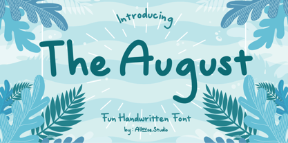 Proudly Presenting The August a Fun Handwritten Font. The August come with Ligatures and Multi-Lingual Support which will add cool impression to your need. We highly recommend using a program that supports OpenType features and Glyphs panels like many of Adobe apps and Corel Draw, so you can see and access all Glyph variations. The August is perfect for product packaging, branding project, megazine, social media, wedding, or just used to express words above the background. Enjoy the font, feel free to comment or feedback, send me PM or email. Thank You!
 - Cloud Bread by Orenari,
$15.00 Cloud Bread is a sweet and friendly display font. This font has bold and cute shape. It's unique style makes it incredibly fitting to a large pool of designs. Be inspired by Cloud Bread and create something fun and memorable! Language Support: Afrikaans, Albanian, Catalan, Danish, Dutch, English, French, German, Icelandic, Italian, Norwegian, Portugese, Spanisch, Swedish, Zulu I really hope your projects will be cool with this font, and please don't hesitate to drop me a message if you have any questions or you wanna share some jokes! :)
 - Pleasure Point by Comicraft,
$39.00 Slocals! Check out the action of our radical new font, PLEASURE POINT! It's Bananas, Totally Tubular, Stoked and ready to ride some waves. Back in his grom days, Comicraftsman John JG Roshell could be found down at Pleasure Point, waiting for The Big One, and this is IT! Don't be a criddler, paddle hard and rip this font to your motherboard to keep it real every time you gun, rail or tail. And if you get rag dolled, dude, don't blow out your squeaker. Pleasure Point will hang loose and chillax you to the max.
 - Elfen Fraktur by FDI,
$25.00 Elfen-Fraktur is monolinear blackletter typeface, that was originally designed by M. Beck and published in 1919. This revival comes in two extended versions with a complete Latin 1 character set: Elfen-Fraktur A uses the original blackletter skeletons and is suitable for setting texts with traditional German typesetting and orthography rules. Elfen-Fraktur B includes modernized letter designs for a broader and more legible use in various languages. A free bonus is the set of 22 border elements called Elfen-Schmuck. Check out the type specimen PDF for more details and instructions.
 - Melon Honey by Alit Design,
$19.00 Introducing Melon Honey Typeface Melon Honey Typeface is inspired by the classic victorian font style combined with western style which makes the Melon Honey font look cool and unique. This font is perfect for a bold and vintage Victorian concept design. Can be used for the design of alcoholic beverage packaging, pomade designs, barbershops and so on with the Victorian classic concept. Apart from that this font is very easy to use in both design and non-design programs because all alternates and glyphs are supported by Unicode (PUA).
 - MFC Zulu Monogram by Monogram Fonts Co.,
$69.00 The inspiration source for Zulu Monogram is a vintage publication called “Bibliotheque D.M.C: Alphabets et Monogrammes 2nd Series”. This wonderful design is an alternative to the diamond shape monogram that dominated monogram at the time. A Zulu shield-like form, this monogram style is now digitally recreated and revived for modern use in Zulu Monogram, with two letter monograms and a selection of additional frame styles for a final classy touch! Download and view the MFC Zulu Monogram Guidebook if you would like to learn a little more.
 - Recording Artist JNL by Jeff Levine,
$29.00 When 45 RPM records were the norm for a teenager’s music collection in the 1950s and 1960s, many discs had their labels printed by letterpress. Some record companies utilized a bold, condensed typeface set in all caps for the song’s title and other pertinent information. The digital version of this font is called Recording Artist JNL, and is available in both regular and oblique versions. A companion font loosely based on this type design [but with more original characters and a slightly lighter weight] is Promotional Copy JNL.
 - Skid Rock by HansCo,
$12.00 Skid Rock is a modern, bold and clean font that will be perfect for multipurpose projects. This font looks cool in any design and is very recommended for craft, posters, books, branding, quotes, print templates, packaging, invitations, music labels or anything else that needs a touch of something bold and clean. Skid Rock comes in uppercase and lowercase, with punctuation, symbols, numerals, swashes and it also has multilingual support. Swashes is alternate from numeral 0 - 9. You can access swashes from your OpenType panel in your design software.
 - Tropika Island by Aiyari,
$30.00 Introducing a new Tropical Display Font Family called Tropika Island, inspired from my previous typeface (Dreadful Font Family & Saturday Night Font Family) combined with Midcentury Tiki Art Signage. The special features on Tropika Island is Tropika Interlock that comes with 3224 pair of ligatures, Stylistic Alternate, & Stylistic Set 01-03. Tropika Casual is complementary and contains OpenType features as ligatures, Terminal forms, Initial forms, Stylistic Alternates. Tropika Island Font Family is best used for headings, logo types, apparel design, invitations, posters, flyers, greeting cards, packaging, book covers, printed quotes, cover album, movie, and more.
 - Julienne by Wiescher Design,
$39.50 Cooks call thinly cut - like matchsticks - vegetables "Julienne". I found that was a fitting name for this very narrow typeface. Julienne Slim is the extreme cut of the two. Personally I do not use narrow typefaces very often, but from time to time they come in handy if there is much text to be crammed into little space. I could make a typeface that was even narrower, but I will not do it. This is as narrow as my typefaces get. Enjoy what I cut for you, Gert Wiescher.
 - Ollivette Elite by Chank,
$59.00Fly your inner geek flag with this cool new "Eleet" typewriter font. It's kinda like a wonky internet translator that converts normal text into leet-speak, so you can exchange encoded love notes with cyber-hackers and goofy-gamers. The actual glyphs in this font are interchangeable with the more logical Ollivette typewriter font, but here the characters have all been moved around to create stylized interpretation of similar glyphs. So "ELEET" could also be typed "31337". Except you don't have to think about it. Get it? Got it? Good! 3NJ0¥ TH15 ƒØÑ+ & U53 !† 0FT3N. - Glagio by Ergibi Studio,
$19.00 Glagio is a Signature font for handwritten logotype with alternative characters. perfect font for creating photography studios or personal photography logos, best for initial logo or brand signatures. Glagio includes a full set of beautiful handwritten upper and lower case letters, numbers, assorted punctuation marks. All lowercase letters include end strokes, providing a cool handwriting style. What's Included : Standard glyphs Ligatures International Accent Works on PC & Mac Simple installations If there is a problem, question, or anything about my fonts, don't hesitate to ask! Big Thanks ~ Ergibi Studio
 - Al Badlooking Brush by Aluyeah Studio,
$90.00 Badlooking Brush, the ugly duckling modern script font. Coming with 52 alternates, 9 stunning swash and super easy to use alternates. Very suitable for magazine, headline, website, ads, product package and all type of design project you have. Features: OpenType support Multilingual support (15 languages) PUA Encoded Super Easy to Use alternates - It's OpenType support but you can easily call alternates character using special combination like A.2 R.2 a.2 h.2 etc so you don't need a special software. To get results like the preview just type Badloo.2king B.2ru.2sh
 - Crazy Fever by PizzaDude.dk,
$18.00 Is it snow? Is it water? Is it slime? Is it from this earth? The questions are many - one thing is certain - with this font you can create cool effects by mixing the layers - and in the end, you decide whether the result is going to be scary, delicious or somewhere in between! Use the different layers and your favourite color scheme and just type ahead - the contextual alternates (with 4 different versions of each letter) automatically cycles the letters and make your text look more lively - or maybe even scary!
 - Snippity Snap by Hanoded,
$15.00 Snippity Snap is a font made up of glyphs I cut out from black paper with some household scissors, then pasted onto white paper. When I was cutting out the shapes, my children asked me what I was doing, and when I told them, they thought it was pretty cool and started cutting out shapes from paper themselves. The result is a house filled with paper cuttings, which I keep finding everywhere - even in my bed. Snippity Snap is a very nice font for ads, book covers, packaging and children's books. Enjoy!
 - Fortuna by Linotype,
$29.99Fortuna has some resemblance with handtexted characters based, loosely, on the classic italic. But, like Ad Hoc, Fortuna is drawn on a monitor in every detail. The name is Latin and means fate, luck. The composer Carl Orff was actual at the time when I worked with Fortuna, because he had been born 100 years earlier. Orff's Carmina Burana were being introduced on the radio when I was wondering what to call my most recent creation. The song cycle begins with a song to Fortuna: a fated choice of name. Fortuna was released in 1995. - Getih West by Twinletter,
$15.00 Getih West It’s a Halloween font, but there’s no need to fear. It’s not just for Halloween fans; You can use it to create cool designs and logos for everything from snowboarding gear to new products at work. Or, if you’re in a hurry, use it to make a fun invitation for your next party — because everyone loves an invitation that screams “Boo!” Of course with this font your various design projects will be perfect and amazing, get a beautiful title and start using our font for your special project.
 - Sunmori Party by Gassstype,
$23.00 Here comes a New font, Sunmori Party is Unique Display Font this is strong Font and cool, that is written casually and quickly amazing. Then crafted carefully drawn into vector format. This font is great for your next creative project such as logos, printed quotes, invitations, cards, product packaging, headers, Logotype, Letterhead, Poster, Label, and etc.It is perfect for any design project as Invitation,logo, book cover, craft or any design purposes.this font is great for your creative projects such as watermark on photography, and perfect for logos & branding, invitation,advertisements,product designs, stationery, wedding designs,label ,product packaging, special events or anything that need handwritting taste. That is Font Sunmori Party has Stylish,Cool and Unique characteristic more natural look to your text with a more modern look to your text.
 - Tribal Warfare by Gassstype,
$23.00 Here comes a New font, Tribal Warfare is Unique Display Font this is strong Font and cool, that is written casually and quickly amazing. Then crafted carefully drawn into vector format. This font is great for your next creative project such as logos, printed quotes, invitations, cards, product packaging, headers, Logotype, Letterhead, Poster, Label, and etc.It is perfect for any design project as Invitation,logo, book cover, craft or any design purposes.this font is great for your creative projects such as watermark on photography, and perfect for logos & branding, invitation,advertisements,product designs, stationery, wedding designs,label ,product packaging, special events or anything that need handwritting taste. That is Font Tribal Warfare has Stylish,Cool and Unique characteristic more natural look to your text with a more modern look to your text.
 - ITC Tabula by ITC,
$29.99 ITC Tabula is meant to be read. The design grew out of a study to create a font to set film subtitles. According to Julien Janiszewski, the face's Paris-based designer, “I set parameters for the design whereby the letters had to be able to hold up at very small sizes when set on film and yet must be able to be enlarged 2000 times to be read on a theatre screen.” The subtitle font was not completed, but several months later Janiszewski revisited the design and made a discovery. “I realized that the constraints I had established for the subtitling font was not that far from those people could have in creating typographic signage. Many time this calls for a font that can be used easily in very large sizes for headlines on highway billboards and quite small for text copy.” Work proceeded for two more years before Janiszewski was satisfied with the results. The final design is a somewhat squared sans serif family of four weighs with corresponding italics. Janiszewski also wanted to create what he calls a “sensitive sans-one that is not restricted to geometric shapes but has a subtle calligraphic, foundation.” ITC Tabula is not only easy to read, it is also a distinctive and handsome design.
 - Porkshop by Chank,
$99.00 Porkshop is a font of retro vintage flavor with a hefty dose of immigrant-influenced naive typography. It's fundamentally inspired by an old-but-still-prominent "Pork Shop" sign in Manhattan. I like to think that this font was made by a signmaker's apprentice who didn't yet have a grasp on the subtleties of elegant letterforms, but put his gusto into perfectly sharp serifs. While pointy little serifs are cool, the real shine of this font comes from the imaginative combination of uppercase and lowercase shapes. This unique mixture in the lowercase reminds me of an indeterminate European accent in the big city. Big and strong and easy to understand. Best rendered in 3-foot tall metal type, Porkshop works well in print and on screens, too. The Bolds and Italics are brand new in 2011.
 - Genre by Storm Type Foundry,
$26.00The official terseness and grey of Neo-Classical type faces will stand out when we narrow them. The consistently vertical shading of the letters suppresses one's desire for eccentricity, just like tea with bromine. It would, however, be wrong to consider Bodoni as the originator of this - vertically shaded - trend in type face production. In his Manual we can also find type faces with a slanted axis of shade, picturesque italics and a number of normal, more human type faces. It remains a mystery why his name is connected only with one of his many works. Genre's basic design is fairly light in colour, which is why it looks good in illustrated magazines and short texts and directly calls for graphically striking, contrasting headings. It shows off beautifully next to photographs, on diplomas and on printed materials connected with a person's death. - Paradise Lost by Hanoded,
$15.00 Paradise Lost is a 1667 poem by John Milton which mostly concerns the Biblical story of the Fall of Man, Eve's temptation by the devil and the expulsion of Adam and Eve from Eden. It's quite a hefty read, as the poem consists of ten books with over 10.000 lines of verse. Needless to say, I didn't read it all. But, it did give me inspiration for a font, which I called Paradise Lost. It's a good name, even though there is nothing Biblical about this font. Paradise Lost was created (pun intended) using a broken bamboo satay skewer and Chinese ink. It is all caps, but upper and lower case differ and like to mingle. I also included several ligatures for double lower case letters (aa, ee, jj, kk, etc.). Paradise Lost comes with an eternity of diacritics.
 - Metro New Two by JAB'M,
$15.00The main inspiration is from Art Nouveau which flourished in Europe at the end of the 19th and beginning of the 20th centuries. This design included furniture (Majorelle, Lalique) and architecture (Victor Horta, Henry Van de Velde, Gaudi, Alfons Mucha). But Hector Guimard remains the favorite for all aspects of its art and, of course, its typefaces used on the Parisian Metropolitan posters. In particular, the various kerning of the various letters he used to make the poster a whole design from singular designs, leading to numerous variations. As a designer, I initially worked a first version, called Metro New One, which is more geometric and traditional. This design "Two" has more flexible shapes and long vertical hooks. It can be used to enhance specific parts in letters and books in the context of Art, specially Art Nouveau and Art Deco of course, posters of any kind. - Privilege Sign Two JNL by Jeff Levine,
$29.00 Unique and decorative signage for many drive-ins, motels, food stores and other businesses of the 1940s had what was referred to as “privilege signs” provided by one of the major cola brands. Consisting of the brand’s emblem on a decorative panel, the remainder of the sign would carry the desired message of the storekeeper (such as “Drive-In”) in prismatic, embossed metal letters. Inspired by the Art Deco sans serif style of those vintage signs, Privilege Sign Two JNL recreates the type design in both regular and oblique versions. The typefaces are solid black, but adding a selected color and a prismatic effect from your favorite graphics program can reproduce the look and feel of those old businesses. This is a companion font to Privilege Sign JNL, which recreates the condensed sans serif lettering of other privilege signs from the 1950s and early 1960s.
 - TV Western JNL by Jeff Levine,
$29.00 In the 1889 Franklin Type Foundry specimen book is a type face called “Armenian”. With lighter weight horizontal slab serifs than more traditional Western fonts, it could be pictured as being used as copy on wanted posters or town notices. This is now available as TV Western JNL in both regular and oblique versions.
 - Fox Wizard by Fox7,
$12.00 Fox Wizard is a vintage and cool slab serif font. this font is perfect for publications, logos, business cards, or printed on t-shirts, this font will look outstanding on everything, no matter the topic. This font will be an incredible asset to your fonts’ library, as it has the potential to elevate any creation.
 - Clamiroe by Holis.Mjd,
$10.00 Introducing new display vintage typeface with 2 style clean and textured called “Clamiroe”. This font inpired by old vintage packaging design, vintage flyer headlines, and vintage sign. Clamiroe is all caps font is good for your branding, poster design, packaging, book cover, flyer, t-shirt design, and more. This typeface include 38 Ligatures and Alternates.
 - Morta by Michael Rafailyk,
$15.00 Morta is a handwritten unicase typeface with a slight calligraphic influence. Its design, like a centuries-old cold dark stones, has carved edges and polished corners, and represented by two styles: more legible “Brute” for general use, and more contrast “Grace” for large text size. Scripts: Latin, Greek, Cyrillic Languages: 480+ Hinting: Manual PostScript
 - Avenida by ITC,
$29.00Avenida was created by architect and designer John Chippindale in 1994 and is a constructed typeface that leaves a cool, sophisticated impression. An Art Deco typeface inspired lettering found on buildings constructed in Spain's Andalucian region in the 1930's and 1940's. Avenida is best suited to headlines and short to middle length texts. - Pedrita by PintassilgoPrints,
$24.00 Sometimes you want to go unnoticed, sometimes you don't. This font is definitely for the second option. Pedrita is a generous type, a bit bold, somewhat showy, quite authentic. When you need that extra-something, go with caps and turn on the stylish interlocking pairs: added eye-catchingness guaranteed. And let the good times roll!
 - Doublewide by Betatype,
$40.00There are many wide types that look sci-fi or super chic, but where is the personality? Doublewide brings its loud and fun loving character to the wide types party. Featuring light to black weights and a true italic, Doublewide can bring a boring page to life with lively headlines and compelling call-outs. - Vandal Lineros by Sipanji21,
$17.00 Vandal Linerous sounds like a cool graffiti typeface. Graffiti fonts often have a unique and artistic style that can add an edgy and urban feel to various design projects. If you have any specific questions or if there's anything specific you'd like to know or discuss about graffiti fonts or design, feel free to ask!
 - Grava by Positype,
$35.00 Grava is Neil Summerour’s injection of warmth within the geometric sans font category. Historically, geometric sans families have been based on primal shapes — triangle, circle, square — and the more closely they held to those rigid rules, the more internal inconsistencies they showed. Angles won’t match up correctly, letters will lean, overshoots complicate clean typesetting, and idealized circles become grotesque and unwieldy in some weights. Because of issues like these, geometric sans fonts have a reputation of being cold, austere, even a bit “off”. Grava was made to hold a T-square and triangle in one hand while giving a welcoming handshake with the other. The Grava font family comes in two styles (a normal and a Display), each with 20 weights (Thin to Ultra) and paired with italics. Its design allowed the three scripts of Latin, Cyrillic, and Greek to emerge seamlessly, ensuring Grava will find its home in multilingual publications. Even better, each character in the three scripts is spaced with every other character for a beautifully matched fit, and it’s a buy-one-get-all-three deal since they are all packaged together. The normal style’s large x-height won’t let you down in paragraphs, headings, and any call-out text. And have you seen the angles on those numerals? Pairing Grava’s numerals on a jersey is sure to catch some eyes, just sayin'. Grava Display is purposefully quirky and sharp, and made for poster sizes, book and album covers, and those websites with a well-defined character — somewhere between playfully self-aware and overtly vintage. Flat edges are abandoned to make way for sharp points and conspicuousness, for geometrical attitude and respectful expressiveness. Corporate reports use Grava Display to take on a professional and current look. The optional ligatures (N–T, L–L, G–A, C–O, almost anywhere an ‘A’ is placed, and more) in both the normal and Display styles invoke a midcentury modernist and high art feel. Now that introductions are done, you can let go of Grava’s hand and put it to work for you.
 - ITC Adderville by ITC,
$29.99On a cold winter's night, George Ryan, of Galápagos Design Group, began musing on the possibilities for a “truly original” sans serif typeface. What came out of his musing, and his always-present sketchpad, was ITC Adderville, a typeface whose visual impact is immediate and strong. Ryan explains how he did it: “The rounded ends of its strokes and their skewed baseline contact create an illusion of dancing feet. The tops of lowercase stems emit serif buds, suggesting transition into or out of the serifed form. The spear-like lowercase stroke terminators, along with other distinctive elements such as the stylized reticulation of the lowercase 'g' segments, the salute of that same character's spur, and the bold, non-self-conscious 'i' and 'j' dots, all contribute to the playful and unique nature of this design.” The result is a friendly, lively type family whose graduated weights -- book, medium, and heavy -- lend themselves especially well to use at small display sizes and in short blocks of text. - Mati by Sudtipos,
$19.00 Father's Day, or June 17 of this year, is in the middle of Argentinian winter. And like people do on wintery Sunday mornings, I was bundled up in bed with too many covers, pillows and comforters. Feeling good and not thinking about anything in particular, Father's Day was nowhere in the vicinity of my mind. My eleven year old son, Matías, came into the room with a handmade present for me. Up to this point, my Father's Day gift history was nothing unusual. Books, socks, hand-painted wooden spoons, the kind of thing any father would expect from his pre-teen son. So you can understand when I say I was bracing myself to fake excitement at my son's present. But this Father's Day was special. I didn't have to fake excitement. I was in fact excited beyond my own belief. Matí's handmade present was a complete alphabet drawn on an A4 paper. Grungy, childish, and sweeter than a ton of honey. He'd spent days making it, three-dimensioning the letters, wiggle-shadowing them. Incredible. A common annoyance for graphic designers is explaining to people, even those close to them, what they do for a living. You have to somehow make it understandable that you are a visual communicator, not an artist. Part of the problem is the fact that "graphic designer" and "visual communicator" are just not in the dictionary of standard professions out there. If you're a plumber, you can wrap all the duties of your job with 3.5 words: I'm a plumber. If you're a graphic designer, no wrapper, 3.5 or 300 words, will ever cover it. I've spent many hours throughout the years explaining to my own family and friends what I do for a living, but most of them still come back and ask what it is exactly that I do for dough. When you're a type designer, that problem magnifies itself considerably. When someone asks you what you do for a living, you start looking for the nearest exit, but none of the ones you can find is any good. All the one-line descriptions are vague, and every single one of them queues a long, one-sided conversation that usually ends with someone getting too drunk listening, or too tired of talking. Now imagine being a type designer, with a curious eleven year old son. The kid is curious as to why daddy keeps writing huge letters on the computer screen. Let's go play some ball, dad. As soon as I finish working, son. He looks over my shoulder and sees a big twirly H on the screen. To him it looks like a game, like I'm not working. And I have to explain it to him again. This Father's Day, my son gave me the one present that tells me he finally understands what I do for a living. Perhaps he is even comfortable with it, or curious enough about that he wants to try it out himself. Either way, it was the happiest Father's Day I've ever had, and I'm prouder of my son than of everything else I've done in my life. This is Matí's font. I hope you find it useful.
 - Spaghetti Western NF by Nick's Fonts,
$10.00One in the series of fonts called Whiz-Bang Wood Type, intended to be set large and tight. Spaghetti Western is a based on an Italian interpretation of a classic ultrabold Western-style face; so, fittingly, the font is named for the genre of “cowboy” film pioneered by Sergio Leone. Both versions of this font contain the complete Unicode Latin A character complement, with support for the Afrikaans, Albanian, Basque, Bosnian, Breton, Catalan, Croatian, Czech, Danish, Dutch, English, Esperanto, Estonian, Faroese, Fijian, Finnish, Flemish, French, Frisian, German, Greenlandic, Hawaiian, Hungarian, Icelandic, Indonesian, Irish, Italian, Latin, Latvian, Lithuanian, Malay, Maltese, Maori, Moldavan, Norwegian, Polish, Portuguese, Provençal, Rhaeto-Romanic, Romanian, Romany, Sámi, Samoan, Scottish Gaelic, Serbian, Slovak, Slovenian, Spanish, Swahili, Swedish, Tagalog, Turkish and Welsh languages, as well as discretionary ligatures and extended fractions. - Wood Bonnet Grotesque No.4 by astype,
$46.00 After release of Wood Bonnet Antique No.7 some of my clients asked for a sans serif version. So I printed my second batch of old wood type. I transferred these wood type into a digital font and tried to preserve the warm vintage look. » pdf specimen « The font offers up to four glyph variations of all the Latin base letters, figures and some additional letters - It has an build in letter randomizer. Please check you have turned on contextual alternates in your application. If you prefer a more common look and need more weights or to use the font in smaller text sizes I have done clean and sharp font family called Bonnet Grotesque Nr. It’s the preferred version for all the usages on websites, apps or ebooks. Have fun!