10,000 search results
(0.016 seconds)
- Sweet Aloha by Stefani Letter,
$14.00 Sweet Aloha is a cool and fashionable handwritten font. It is defined by smooth curves and is perfect for packaging or editorial designs. but also It’s ideal for branding and decorate your projects. Add this chunky lettered font to your designs and notice how it makes them come alive!. This font is PUA encoded which means you can access all of the cute glyphs with ease! It also features a wealth of including ligatures.
 - Limoen by Hanoded,
$15.00 Limoen means 'lemon' in Dutch. Why did I call this font Limoen? Well, I guess I ran out of meaningful names, so I had to work with whatever popped in my head - which happened to be Limoen. Don't ask… Limoen is a very cute, very threedee-ish typeface. It works great in poster ads and as a display font. It comes with upper and lower case letters and a whole bunch of diacritics. Enjoy!
 - Ollives by Olivetype,
$18.00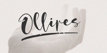 Introducing Ollives, a stylish modern calligraphy-styled script font. This beautiful font is perfect for adding a touch of elegance to any project. With its flowing lines, cool textures and graceful curves, Ollives is sure to add a touch of class to your work. So what’s included : Basic Latin Uppercase and Lowercase Numbers, symbols, and punctuations Multilingual Support. PUA Encoded and fully accessible without additional design software Simple Installations works on PC & Mac Thank You.
 - Ring Soft by Ochakov,
$9.00 Ring Soft, soft as cashmere... Cute set of the Ring font family! It probably won't get any softer than this. Ring Soft is a cool, varied, and trendy-looking display font. No matter the topic, this font will be an incredible asset to your fonts’ library, as it has the potential to elevate any creation. Cuter than ever and much prettier. Ring Soft and other fonts of Ring family is still very cozy and comfortable.
 - Whiskey State by Mans Greback,
$59.00 Whiskey State strides onto the canvas like a cowboy entering a saloon: Tall, confident, and impossible to ignore. The font boasts an impressive height, stretching upwards with the same vigor as plumes of smoke rising from a smoldering campfire. Every letter stands upright and proud, imbued with the spirit of the Old West, yet exuding a contemporary coolness and innovativity. Its serifs aren't just appendages; they are expressions, giving the typeface its unique, assertive character.
 - Bestfriend Monkey by Mvmet,
$12.00 Bestfriend Monkey is a fun and playful hand-lettered font, mixing modern calligraphy and contemporary art in the process of creation. It will elevate a wide range of design projects to the highest level. You can use this font for many design ideas such as stickers, t-shirt designs, amazing logo designs, magazine or book covers, comics, cartoon drawings, and many more. This font will add a super cool touch to your designs!
 - Shooting Star by Stefani Letter,
$10.00 Shooting star is a cool and playful handwritten font. It is defined by smooth curves and is perfect for kids theme or cheerful designs. but also It’s ideal for book, packaging and logo projects. Add this lettered font to your designs and notice how it makes them come alive!. This font is PUA encoded which means you can access all of the cute glyphs with ease! It also features a wealth of including ligatures.
 - Bigwogs GT by Gartype Studio,
$15.00 Bigwogs is a Street Arts inspiration typeface with a touch of street artistic typeface with graffiti vibes. Bigwogs is an urban inspired typeface from us, that more come with touch of graffiti urban vibes and also comes with multilingual features and extra graffiti swashes to make graffiti vibes. This font look so cool when you using it for projects like text headlines, product packaging, poster, music purpose, game logo title, brands, and mascot logo designs.
 - Obschepit by Zaporozhan Dmitriy,
$15.00 When did it start. One day I was designing some stuff for a fast food café. By style the Café was made as an old Soviet canteen. So I had to do a special accent on this in menu, advertising posters and other print products. I decided to do this by interesting old school font. There are many cool retro fonts on the Internet, but not one of them satisfied me on 100%. The next step was to look at the old posters and find some inspiration. So I found some cool pictures with exact letters that I needed, but there were no typefaces to buy so that I can print some text with this exact letters. That's why I decided to do such typeface for my own. You can use this typeface in the field of nutrition, and it also will suit for cinema posters.
 - Informational Gothic JNL by Jeff Levine,
$29.00 The Wood-Regan Instruments Company (Wrico) of New Jersey manufactured for decades a line of lettering kits called the Wrico Sign Maker. With only special ink pens, plastic templates and a template guide anyone could letter clean, clear signs, posters and notices. Based on the same principles of architectural templates, the lettering was [for the most part] utilitarian and functional. Few templates were of stylized or decorative lettering. Informational Gothic JNL and its oblique version are based on the four inch high lettering templates from one of those kits.
 - Terrified AOE by Astigmatic,
$19.00 Terrified AOE was inspired by vintage horror movie poster titling from the 1960's. It is a Capitals and smallcaps typeface, that really feels like a mix of three typefaces in one. While the Capitals and Smallcaps typesetting works to the effect of the original inspirations, each case also works well amongst itself independently, and having very different vibes. I've always been a huge fan of horror movies, and some of the lettering from vintage horror movie posters are so cool and alive, I only wish there were more of them recreated as display fonts.
 - ITC Mister Chuckles by ITC,
$29.99Round, firm, and bursting at the seams with good humor, ITC Mister Chuckles is based on the premise that barrel shapes have pleasant associations. Think: beer-barrel polkas, a barrel of fun, or a barrel of laughs, and you'll get the idea. Designer Nick Curtis has combined sans serif sturdiness, a hint of 1930s deco and a handful of giggles in this remarkably versatile all-cap face. If the typographic occasion calls for mirth and merriment, invite Mister Chuckles to the party. You'll have more fun than a barrel of monkeys! - Linotype Octane by Linotype,
$29.99Linotype Octane is part of the Take Type Library, selected from the contestants of Linotype’s International Digital Type Design Contests of 1994 and 1997. The font was designed by German artist Norbert Reiners, a tall, thin font with a narrow line width and marked stroke contrast. The regular and bold weights seem somewhat static while the italic cuts make a dynamic impression. Linotype Octane is available in four weights, each of which contains a number of ligatures. The cool and reserved Octane is best used for shorter texts and headlines in larger point sizes. - Bike Decals JNL by Jeff Levine,
$29.00Bike Decals JNL captures the fun and nostalgia of the 1950s and 1960s when kids all around the country ran to their local five and dime or hobby store to purchase water applied decals. The "cool" thing would be to customize your bike, little red wagon or anything that would be fair game with various racing symbols, weird space creatures or other unusual images. In this font, Jeff Levine has put his own spin on some of the classic designs of yesteryear, drawing from scratch some of the most popular of their day. - TXT Delicate Script by Illustration Ink,
$3.00Go back in time by downloading this calligraphy style script font. The elegant letters are charming additions to any lettering project that needs calls for fancy, stylish, and graceful embellishments. - Cruisader by ARToni,
$14.00 Cruisader is a cool, fresh and modern display font. This font would be ideal for writing web designs, business cards, or pretty much anything else that requires a unique touch.
 - Not Your Droids by Thomas Käding,
$5.00 A clean and easy to read Aurebesh font, in the style used at the Droid Depot at Disney's Hollywood Studios. This style is also called Droidebesh. Have fun with it.
 - Stencil Edition JNL by Jeff Levine,
$29.00 The cover title for a 1950s British glamour magazine called “Beauty Parade” was the inspiration and model for Stencil Edition JNL, which is available in both regular and oblique versions.
 - TXT Jubulation by Illustration Ink,
$3.00Download this cool "Jubilation" font when you want to express a happy feeling. Its curly, handwritten character is perfect for light-hearted scrapbook pages, journaling, greeting cards, and other publications. - Excelsius by Comicraft,
$19.00 Once upon a midnight dreary, this Comicraftsman pondered, weak and weary, For a name synonymous with Mighty and Marvelous comics lore. Solid, Outline, Inline was the nameless font I'd crafted, I nodded, nearly napping o'er the work I'd grafted When suddenly came a tapping, As of someone gently rapping, rapping at my cubicle door. "'Tis some visitor," I muttered, "tapping at my cubicle door-- Calling out "EXCELSIOR!" Then an Amazing Vision beguiled my sad fancy into smilin', By the Spectacular decorum of the countenance it wore, "Though thy crest be shorn and shaven," he said, "thou art sure no craven, And thy font should not remain nameless here forevermore!" Eagerly I wished the morrow; vainly I had sought to borrow From comic books surcease of sorrow, letters that called out "EXCELSIOR!" Then, upon the velvet sinking, I betook myself to linking Fancy unto fancy, thinking of the nominative neuter singular thing Like Some Silvered Surfer wandering from the Nightly shore-- The Vision shrieked, upstarting--"Tell me what thy lordly name is thus!" Quoth the Craftsman: "EXCELSIUS!"
 - Bell Centennial by Bitstream,
$29.99 Designed specifically for AT&T by Matthew Carter at Mergenthaler to replace Bell Gothic with a typeface that made effective use of digital typesetting technology, Bell Centennial gets several more lines per page than Bell Gothic, reduces calls to information because of its significantly higher legibility under adverse printing conditions, saving AT&T many millions of dollars per year. Although intended for use at small sizes, Mazda UK used Bell Centennial at huge sizes to striking effect in a mid-1990s ad campaign.
 - ITC Zapf Dingbats by ITC,
$40.99 The Zapf Dingbats originally had been a selection of 360 symbols, ornaments and typographic elements from over 1200 designs. (For the first time a lady's hand is shown for the index symbol, the fist). The exisiting Zapf Dingbats offers a small selection out of this great offer. Therefore Hermann Zapf created new symbols for the set of the Zapf Dingbats, which are available today from Linotype as "Zapf Essentials?" 6 fonts with new and fresh symbols like fax, cell phone and internet symbols.
 - Bohemio by Wiescher Design,
$39.50 Bohemio was designed in memory of Gunter Böhmer, an artist famous for his many book covers of the 1950s in Germany. The cover I took as an inspiration for this font is that of a book called Stiller (by Max Frisch). Bohemio sounds similar to "Böhmer" (which means the one from Bohemia) and it is also an alliteration to artisty. I thought "Bohemio" to be a nice name for this very strong, almost expressionist design. Yours very artsy craftsy Gert Wiescher
 - Positive Feature by PizzaDude.dk,
$15.00 Positive Feature is a handmade, layered font. All layers come with contextual alternates, which means you have 4 different versions of each lowercase letter to play around with. What's cool about the two layer versions is that they mix in a lovely way! Try typing your text with layer 1, copy/paste layer 2 on top in a different color - perhaps even alter the transparency a bit...and all of a sudden a nice effect sees the light of day!
 - Million Smiles by Subectype,
$17.00 Introducing our newest font, "Million Smiles", a casual bold script font with hand-letterred style. Million Smiles is an upgraded version of our previous font, "Billion Dreams". In this new version, we've rounded the edges a bit for a softer look, compared to the sharp edges of the old one. This enchanting font is the perfect choice for design projects that aim for a fun, urban, and classy vibe. It adds a touch of cool to your creativity without losing its elegant charm.
 - Syltica GT by Gartype Studio,
$15.00 A good sign certainly requires a good identity to be a good sign, as well as your signature. Of course, with our font named Syltica GT, you can make your signature or watermark on the work or product that you issue interesting and of course cool with the addition of swashes. Syltica GT is very suitable to be applied to media such as books, signatures, logos, logotypes, ads on digital or printed products too, or whatever it can complement your needs
 - RB Monsters by RockBee,
$15.00 This typeface was drawn to create short headlines (quickly) for one of my projects (a set of illustrations featuring The Evil Rat, imagined character). Each character (here I mean "glyph") has it's own personality, mostly evil one (jokingly) — that is why the font is called "The Monsters". The font was drawn on paper, then scanned and traced. It has both Latin and Cyrillic sets, since it was used with both. Monsters are good for short notes of comic or ironic style.
 - Kundalini by Hanoded,
$20.00 Kundalini means 'coiled'. In yoga it is used to describe an energy or force which lies at the base of the spine and, when awakened, results in deep meditation or even enlightenment. Aaahhh… Now zoom back to earth: Kundalini font is a great curly typeface with a bit of rough here and there. It is feminine, happy, kind of esoteric, unusual but very useful. Kundalini will even enlighten those who speak tongues other than English, as it comes with Nirvanic language support.
 - Warp Three NF by Nick's Fonts,
$10.00This face is a bit of a time traveler. It combines the lowercase from a font called simply Square Gothic from the 1888 James Conner’s Sons specimen book with the uppercase of Morris Fuller Benton’s 1932 monocase masterwork Agency Gothic, resulting in a high-tech typeface right at home in the twenty-first Century. Available in three weights. All versions of this font include the Unicode 1250 Central European character set in addition to the standard Unicode 1252 Latin set - When Suddenly by Comicraft,
$49.00 From completely OUT OF THE BLUE, here’s a font you'll need when, unexpectedly -- with a sense of immediate urgency -- your characters abruptly call out without warning and on the spur of the moment! When Suddenly ’s prompt! It’s abrupt! It responds in a flash! Now you can put all the words you need in your comic book in such a way that they'll come as a complete surprise to all your readers! When Suddenly is BOLD! It’s ITALIC! It’s anything but REGULAR!
 - Two Step Nouveau JNL by Jeff Levine,
$29.00 Popular music of the early 1900s included a genre called two step; round dances utilizing a sliding step with a tempo in either march or polka time. 1911's "Daughters of the American Revolution" was one such march/two step. The cover of the sheet music had the title hand lettered in a slightly rounded sans serif type design in the Art Nouveau style popular during that era. It is now available as Two Step Nouveau JNL, in both regular and oblique versions.
 - Template Moderne JNL by Jeff Levine,
$29.00 The A.B. Dick Company was a manufacturer of mimeograph duplicating machines which produced copies by the process of transferring ink through an etched wax stencil onto paper. Customers had the option of purchasing various size and style lettering guides in order to create eye-catching headlines or announcements on their print projects. One such guide called ‘Modern Display’ featured a lettering style resembling Futura Black with added serifs. This is now available as Template Moderne JNL, in both regular and oblique versions.
 - Dress Rehearsal JNL by Jeff Levine,
$29.00 In a career spanning the early 1900s through 1940, George M. Cohan wrote and produced over 50 plays, 300 songs and was also an actor, singer and dancer. Many of his works honored his Irish roots, and the cover of one piece of sheet music called “The Irish American” (1905) had its title hand lettered in a condensed Art Nouveau type design with tiny spurred serifs. This is now available digitally as Dress Rehearsal JNL, in both regular and oblique versions.
 - Happy Fingers by PizzaDude.dk,
$14.00 Happy Fingers are a truly mad font! The font contains 10 different versions of each letter - and no two letters are the same - it's a lovely mix of upper- and lowercase, serfifs and sans, grunge, comic, sci-fi, fantasy, computer ... everything you can imagine. And they are all handmade! Of course there is multilingual support and I have even added a black version, for you to use as massive fill, or perhaps a cool shadow! Go crazy, go Happy Fingers!
 - Wood Heinz No. 4 by astype,
$50.00 Just Wood Heinz No.4 - the cool display font. Wood Heinz No.4 offering up to four "printed look" variations of all the Latin base letters and figures. An OpenType letter rotator is programmed into the fonts to emulate the randomness of wood type printing. You can switch manually to the alternate letters by using the Stylistic Sets 1 – 4. Stylistic Set 5 will activate the more common look of the capital letter R with a straight leg. PDF Specimen
 - MapleOaks by Ingrimayne Type,
$14.95 In the early days of PostScript fonts, I designed a font of leaves called XLeafMeAlone. In 2006 I decided to revisit this topic and the result was two sets of new leaf fonts: MapleOaks and MoreLeaves. MapleOaks contains almost 100 images of maple, oak, and sycamore leaves, and MoreLeaves has almost 100 images of leaves of various other species. There are four MapleOak fonts. They have identical images; only the orientation of the images is different. In MapleOaksUR the tips of the leaves point to the upper right, in MapleOaksDR the tips point down to the right, etc.
 - Starlikes by Say Studio,
$15.00 Starlikes - classic duo typeface with stencil serif and regular typeface, which can be adapted to your needs and desires Starlikes is a beautiful, nostalgic lowercase and uppercase typeface that works best as focus display text (think logos, headers, pretty quotes, calls to action, etc.) think logos, headers, pretty quotes, calls to action, etc.). Upper and lower case give it great versatility, but I honestly can't get over all the crumpled uppercase letters. This is too good. Including: Numbers & punctuation Foreign language support Have a wonderful day SayStudio :-)
 - Jenson Old Style by ITC,
$29.00In 1458, Charles VII sent the Frenchman Nicolas Jenson to learn the craft of movable type in Mainz, the city where Gutenberg was working. Jenson was supposed to return to France with his newly learned skills, but instead he traveled to Italy, as did other itinerant printers of the time. From 1468 on, he was in Venice, where he flourished as a punchcutter, printer and publisher. He was probably the first non-German printer of movable type, and he produced about 150 editions. Though his punches have vanished, his books have not, and those produced from about 1470 until his death in 1480 have served as a source of inspiration for type designers over centuries. His Roman type is often called the first true Roman." Notable in almost all Jensonian Romans is the angled crossbar on the lowercase e, which is known as the "Venetian Oldstyle e." Jenson Old Style™ was designed by Freda Sack and Colin Brignall for Letraset in 1982. Because of its darkness, this version is best used for display designs that call for a sense of old-world elegance and solidity." - Chopper by Canada Type,
$24.95 In 1972, VGC released two typefaces by designer friends Dick Jensen and Harry Villhardt. Jensen’s was called Serpentine, and Villhardt’s was called Venture. Even though both faces had the same elements and a somewhat similar construct, one of them became very popular and chased the other away from the spotlight. Serpentine went on to become the James Bond font, the Pepsi and every other soda pop font, the everything font, all the way through the glories of digital lala-land where it was hacked, imitated and overused by hundreds of designers. But the only advantage it really had over Venture was being a 4-style family, including the bold italic that made it all the rage, as opposed to Venture’s lone upright style. One must wonder how differently things would have played if a Venture Italic was around back then. Chopper is Canada Type’s revival of Venture, that underdog of 1972. This time around it comes with a roman, an italic, and corresponding biform styles to make it a much more attractive and refreshing alternative to Serpentine. Chopper comes in all popular formats, boasts extended language support, and contains a ton of alternate characters sprinkled throughout the character map.
 - Gator by Canada Type,
$24.95 Cooper Black's second coming to American design in the mid-sixties, after almost four decades of slumber, can arguably be credited with (or, depending on design ideology, blamed for) the domino effect that triggered the whole art nouveau pop poster jam of the 1960s and 1970s. By the early 1970s, though Cooper Black still held its popular status (and, for better or for worse, still does), countless so-called hippie and funk faces were competing for packaging and paper space. The American evolution of the genre would trip deeper into psychedelia, drawing on a rich history of flared, flourished and rounded design until it all dwindled and came to a halt a few years into the 1980s. But the European (particularly German) response to that whole display type trend remained for the most part cool and reserved, drawing more on traditional art nouveau and art deco sources rather than the bottomless jug of new ideas being poured on the other side of the pond. One of the humorous responses to the "hamburgering" of typography was Friedrich Poppl's Poppl Heavy, done in 1972, when Cooper Black was celebrating its 50th anniversary. It is presented here in a fresh digitization under the name Gator (a tongue-in-cheek reference to Ray Kroc, the father of the fast food chain). To borrow the title of a classic rock album, Gator is meaty, beaty, big and bouncy. It is one of the finest examples of how expressively animated a thick brush can be, and one of the better substitutes to the much overused Cooper Black. Gator comes in all popular font formats, and sports an extended character set covering the majority of Latin-based languages. Many alternates and ligatures are included in the font.