10,000 search results
(0.021 seconds)
- Primitivus by PizzaDude.dk,
$18.00 It all started with making of a simple all-caps font. I drew the whole alphabet, numbers all else needed - but something wasn't quite right...the lettershapes were fine, but quite boring. Then I took a drastic decision: I started all over again ... meaning, I printed the whole thing, messed it up using a wet cloth and wrinkled the paper - then scanned it all again, and imported all the graphics yet again. A lot of work, yes - but personally I think it was worth it! But anyway, that's the story of how Primitivus was made ... well, almost, but not quite ... but that's another story! Use Primitivus for anything that needs that special kind of look were handdrawn letters meets grunge! Play around with the 4 different versions of each letter to make your text look even more random and natural!
 - Blackhawk by Set Sail Studios,
$14.00 Blackhawk is a supercharged, street-wise brush font bursting with energy. With extra attention to quick strokes and sharp details, Blackhawk is guaranteed to deliver an unapologetically loud & fast-paced message; ideal for logos, apparel, quotes, product packaging, or anything which needs a typographic turbo-boost. Blackhawk Consists of; Blackhawk ~ A hand-made, all-capitals brush font which has a complete set of alternate A-Z characters. Simply switch between upper & lower case to access the alternates. (Tip: Try mixing up both upper and lowercase characters in a word to achieve the best text layout). Blackhawk Italic ~ A slanted version of the regular font, creating faster movement in the characters. Blackhawk Swashes ~ A bonus set of 11 swashes and 4 paint-splatters. Simply select this font and type any A-O character to create one of the bonus elements.
 - Bal Harbour JNL by Jeff Levine,
$29.00Inspired by hand lettering on a 1940s toy game spotted on ebay called "Let's Go Shopping", Jeff Levine created "Bal Harbour JNL" and named it after a South Florida community famous for its luxury homes and trendy stores. - Dual Line Roman JNL by Jeff Levine,
$29.00 Spotted amongst the online page scans from a vintage lettering book, the typeface originally called “Didot Moderne” served as the basis for Dual Line Roman JNL, which is available in both regular and oblique versions. Caps Only Fonts.
 - Spooky Adventure by AEN Creative Studio,
$15.00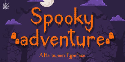 Spooky Adventure is a cool-lettered and spooky decorative font. It is perfectly suitable for any Halloween-related project or crafty idea. Add it confidently to your favorite creations and let yourself be amazed by the outcome generated!
 - Jerky by Noir Typo,
$15.00 Jerky is a strange and vibrant titling typeface.Drawn with a ruling pen, this typeface work with capital and small capital only by default. Inspired by calligraphy it emanates an Rock&Roll visual atmosphere or an horror movie ambiance.
 - Tagline by Robert Petrick,
$19.95 Tagline is a Fun, Bold casual font that was born from the New York graffiti style. Good for all your entertainment projects. Though "Tagline" is radical in style it's still very readable and calls attention to your message.
 - Darkspear by Rometheme,
$25.00 Darkspear is handwritten script font. It has vintage, elegant, old school, classy, and cool. It’s a great font for fashion, apparel projects, signature, album cover, logo, branding, magazine, social media, & advertisements, but also works great for other projects.
 - Breakfast by PizzaDude.dk,
$15.00 This is close to insane! My Breakfast font has got 8 (yes EIGHT!) different versions using contextual alternates! They cycle nice and easy AS you type! How cool is that?! Ofcourse, the font is also loaded with diacritics!
 - Hupper Nush by madeDeduk,
$16.00 Really excited to introduce Hupper Nush is a bold handwriting font with cool character! Hupper Nush will be perfect for all your designs project. Hupper Nush Included: Uppercase Lowercase Number & Symbol International Glyphs Ligature Hope you enjoy it.
 - Cattle Town JNL by Jeff Levine,
$29.00 In the 1946 French lettering book “100 Alphabets Publicitaires” (“100 Advertising Alphabets”) is a hand-lettered “Western” font called “Italian". This served as the basis for Cattle Town JNL, which is available in both regular and oblique versions.
 - Chico by Type-Ø-Tones,
$49.00 Chico was by designed by Javier Mariscal and Josema Urós specifically for the final roll of credits in the animated film Chico y Rita. The goal was to design a typeface with a good readability but that conveyed a strong script character and, in some way, tuned to the style of line used throughout the film. Using a modular sans-serif as a template, Javier Mariscal reinterpreted the forms freely, while maintaining gridlike proportions. Chico can be useful for comic-book lettering, editorial work and display applications.
 - Copperplate Script by CastleType,
$39.00 One of the more elegant script fonts available, this design is based on calligraphic handwriting called "Copperplate" because of the copper plates that it was etched into for reproduction. This face is not related to Copperplate [Gothic] by the American type designer, F.W. Goudy. The name Copperplate comes from the fact that writing masters used to hand-write their books and then send them to an engraver who recreated all the subtle details onto copper plates, which where then used to print the handwriting books.
 - Spiced Pumpkin by Hanoded,
$15.00 I don’t know about the weather on your side of the globe, but here it is mighty cold! I was trying out a new technique of font-making AND I was craving a pumpkin spice latte, so I named this font Spiced Pumpkin. Spiced Pumpkin is a rounded, thin, all caps typeface with a heart warming, ice melting attitude. It looks good on product packaging, book covers and postcards, so (in other words) give it a whirl and see what you’ll end up with!
 - Pilot Point NF by Nick's Fonts,
$10.00One in the series of fonts called Whiz-Bang Wood Type, intended to be set large and tight. Pilot Point is based on an older font found in Dan X. Solo’s book on Circus Type; the designation fits perfectly. The font gets its name from a small town in Northeast Texas, where several scenes from Arthur Penn’s Bonnie and Clyde were filmed. Both versions of this font contain the Unicode 1252 Latin and Unicode 1250 Central European character sets, with localization for Romanian and Moldovan. - Juviya by RagamKata,
$14.00 Juviya is a Elegant Serif Typeface , unique & nostalgic typeface I like so much that I wanted to make it super personal, so that is why the Juviya is in the name. The main font is a serif, which in regular and italic looks cool, chic & fashionably elegant. Each font version comes with over 24 alternates of uppercase character set. It also includes full language support, punctuation, numerals and detailed instructions how to use alternate letters most of the apps on your computer, as well as in Canva.
 - Flat10 Fraktur by Dharma Type,
$14.99 The pixelated blackletter which called Fraktur, the most famous calligraphic letter in Germany. This 8-bit pixel font is designed with respect for 80s game designers and the pixel font pioneers in middle 90s. Use at size 10 pixels or multiples of 10 and anti-alias off is recommended. List of our Pixel Font Project. ·Flat10 Antique ·Flat10 Artdeco ·Flat10 Arts&Crafts ·Flat10 fraktur ·Flat10 Holy ·Flat10 Holly ·Flat10 Segments ·Flat10 Stencil ·Flat20 Gothic ·Flat20 Headline ·Flat20 Hippies ·Flat20 Streamer ·Behrensmeyer Vigesimals ·Civilite Vigesimals
 - Horseboy Boots by Alit Design,
$14.00 Introducing Horse Boy Typeface The Horsebow typeface is inspired by the vintage cowboy western style. The Horseboy font family consists of 6 very cool fonts when combined to create western and cowboy themed designs. Can be used for the design of alcoholic beverage packaging, tattoo, poster, pomade designs, barbershops and so on with the western American concept. Apart from that this font is very easy to use in both design and non-design programs because all alternates and glyphs are supported by Unicode (PUA).
 - Dinosaur Cake by Hanoded,
$10.00 My son Sam’s birthday is coming up and we need to think of a cake. He’s old enough not to want a themed cake, but I suddenly remembered that we gave him a dinosaur cake for his second birthday! Dinosaur Cake? That’s a totally cool name for a font! So here it is: Dinosaur Cake - The Font. It’s a cute little handmade font, which looks like it was cut out of paper, but I have to disappoint you this time: it was not cut out.
 - Agaste by Letterara,
$16.00 Agaste is a stylish and elegant serif font. It is suitable for a wide variety of designs due to its unique and cool style. Comes with some alternates and ligatures, so you can combine them to make a perfect typography design. It is ideal for your upcoming projects. Such as luxury logo and branding, classy editorial design, magazines, Packaging, poster, movie, cosmetic brand, fashion promotions, weddings, fashion, art gallery branding, and more. This font is PUA encoded, meaning you can access all of the glyphs.
 - Fabrica by Fenotype,
$40.00 Fábrica is an exquisite display letter with flair. Its delicate curves have been carefully honed; yet its beauty is seemingly effortless. To add to its appeal, Fábrica is equipped with several handy features such as ligatures (there are plenty of them), old style figures and fractions. Its true crown jewel, however, is the finely tuned hairline accents – no longer will a diacritical mark ruin your heading. Find those under a feature called Thin accents. Use Fábrica to turn your communication into statements of divine elegance.
 - ITC Zinzinnati by ITC,
$29.99ITC Zinzinnati is based on a font called Ohio, released in 1924 by Die Schriftguss A.G. Typical of the Plakatstil letterforms of the time, the original font had a rough outline, as if drawn with a brush. Nick Curtis has smoothed the rough edges, which enhances the design's playful curves and engaging charm. As for the name: it's the punchline to an old vaudeville routine that starts with the question, Name a city in Ohio that begins with a 'Z.'" Pie in the face, comin' atcha!" - Gumdrop by PintassilgoPrints,
$22.00 Gumdrop is a soft sans. Stylish, original and a little bit retro, it’s an all caps font with two options for each letter and number for added spontaneity. Contextual alternates feature is included and manage the instant cycling of these alternates with the click of a button. The regular cut itself is already quite a versatile one, and the family counts yet with a cool halftone cut and a pencil-like outlined version. Is this just another damn handsome font? Hell, yes. Keep it handy!
 - Craved Story by Java Pep,
$17.00 Proudly present the newest product called Craved Story Font. In the design process added engraving to every detail of the font character to create a stylish and elegant impression so your design project can make more outstanding. Craved Story Font is also perfect for use in vintage-style projects. In the package of this product, you'll get engraved and solid font so you can mix and match for your project. f you have a technical issue don't hesitate to contact me. Thanks and have a nice day.
 - Serpentine by Image Club,
$29.99Dick Jensen (USA) designed Serpentine, is a contemporary-looking display font, for the Visual Graphics Corporation in 1972. With the rise of digital typesetting and desktop publishing, this typeface quickly became both popular and ubiquitous. This dynamic, wide, boxy design is identifiable via tiny triangular swellings at the stroke endings - what might be called semi-serifs. Serpentine is available in six different font styles: Light, Light Oblique, Medium, Medium Oblique, Bold, and Bold Oblique. Serpentine" is a greenish rock that sometimes resembles a serpent's skin, and is often used as a decorative stone in architecture. Though this font doesn't seem at all snaky or sinuous, it does have an architectural, stone-like solidity. The subtle, almost non-existent curves and semi-serifs keep it from being too stern or cold. Although the underlying strokes of each weight are similar, the six members of the Serpentine font family all present their own individual personalities. Serpentine Light lends itself well to text for onscreen displays, for instance, while the numbers from typeface's heavier weights are seen around the world on soccer jerseys! Additionally, the oblique styles convey a streamlined sense of speed, furthermore lending Serpentine well to sport and athletic applications (especially the faster, high-speed varieties). Because of its 1970s pedigree, Serpentine has come to be known as a genuine "retro" face. This makes the typeface even more appropriate for display usage, in applications such as logo design, magazine headlines, and party flyers. If you like Serpentine, check out the following similar fonts in the Linotype portfolio: Copperplate Gothic (similar serifs) Eurostile (similar width) Princetown (another "athletic" font) Insignia (similar "techno" feeling)" - Serpentine by Linotype,
$29.00Dick Jensen (USA) designed Serpentine, is a contemporary-looking display font, for the Visual Graphics Corporation in 1972. With the rise of digital typesetting and desktop publishing, this typeface quickly became both popular and ubiquitous. This dynamic, wide, boxy design is identifiable via tiny triangular swellings at the stroke endings - what might be called semi-serifs. Serpentine is available in six different font styles: Light, Light Oblique, Medium, Medium Oblique, Bold, and Bold Oblique. Serpentine" is a greenish rock that sometimes resembles a serpent's skin, and is often used as a decorative stone in architecture. Though this font doesn't seem at all snaky or sinuous, it does have an architectural, stone-like solidity. The subtle, almost non-existent curves and semi-serifs keep it from being too stern or cold. Although the underlying strokes of each weight are similar, the six members of the Serpentine font family all present their own individual personalities. Serpentine Light lends itself well to text for onscreen displays, for instance, while the numbers from typeface's heavier weights are seen around the world on soccer jerseys! Additionally, the oblique styles convey a streamlined sense of speed, furthermore lending Serpentine well to sport and athletic applications (especially the faster, high-speed varieties). Because of its 1970s pedigree, Serpentine has come to be known as a genuine "retro" face. This makes the typeface even more appropriate for display usage, in applications such as logo design, magazine headlines, and party flyers. If you like Serpentine, check out the following similar fonts in the Linotype portfolio: Copperplate Gothic (similar serifs) Eurostile (similar width) Princetown (another "athletic" font) Insignia (similar "techno" feeling)" - VLNL Thueringer by VetteLetters,
$30.00 We cannot imagine anyone not liking beer. Especially on a warm summer night there is simply little that can top an ice cold brewski. And with the current wave of home-brewed ales and lagers, Vette Letters decided to not stay behind and brew its own brand. Just so we can design our own beer bottle label using our own font. VLNL Thueringer comes from the drawing board of Jacques Le Bailly (a.k.a. Baron von Fonthausen), the German-French specialist in the fields of both beer and type design. One day Jacques got inspired by Albrecht Dürers 15th century Fraktur (blackletter) alphabet, and decided to design a contemporary rounded version of it. Although the historic context is clearly visible, Thueringer definitely stands its own ground. It's a modern techno-style blackletter with a (beer)truckload of interesting design details. Thueringer contains a number of ligatures and an alternate set of numbers. Apart from the regular uses like logos, posters, flyers and headlines we definitely would like to see our Thueringer used on beer bottle labels and crates, but also cafés and hipster bars would do well with this modern-day blackletter. Hell, even wine or liquor labels, football team jerseys, Oktoberfest flyers, it's just too much to mention. As long as it is accompanied by a cold beer.
 - Biscotti by Letritas,
$30.00 The concept of Biscotti rised from a personal research into a system of styles that we commonly consider “vintage”. One above all, the Victorian typography that has been rediscovered and widely re-studied during the 70s. Today, thanks to the technology innovation in digital typography fields, Biscotti is certainly an interesting subject which expresses an appassionate and nostalgic homage to a vintage font, seen from the perspective of a technical inspiration. Biscotti is composed of two styles: the “default” and the alternative one. The first is of course more conservative and formal, while the alternative formally chooses a change of the diagonal lines into curves, so it creates a much more friendlier reading. Biscotti consists of 4 styles that can be combined by layers in order to form different ways of reading. This renewed effect increases exponentially the potential use range of this typography. Biscotti has 517 characters; and are composed for 220 latin languages.
 - AW Conqueror Std Slab by Typofonderie,
$59.00 Slab serif with a 70’s aesthetic A version of AW Conqueror Sans, AW Conqueror Slab draws inspiration from geometrical slab serifs of the 1930s, of which Rockwell is a perfect example. Lubalin Graph, a reworking of the genre, came out in the wake of the Avant Garde wave of the early 70s. In recent years, ‘slabs’ have made a comeback in the graphic design world. AW Conqueror Slab advances the cause quite happily. AW Conqueror superfamily AW Conqueror Didot is part of a larger family, who include 4 others subfamilies with great potential: They’re but based on same structure, with some connection between them (width for example), to offer a great & easy titling toolbox to any designers, from skillful to beginner. Each of the members try their best to be different from the others because of their features. They should work harmoniously in contrast. Club des directeurs artistiques Prix 2010 European Design Awards 2011
 - Ghitta Bodoni Cancellaresca by Spurnej Type Foundry,
$39.00 Giambattista Bodoni was an Italian engraver, printer, and publisher who was one of the best typographers of the 18th century and became known worldwide for his iconic serif typeface. In the posthumous edition of Bodoni’s “Manual of Typography” published in 1818 by his widow Margherita “Ghitta” Dall’Aglio may also be found, among the other treasures, the Cancellaresca (Chancery). Ghitta is a redesign of this typeface in its finest form. With strong stroke contrast in 4 optical grades, 850 glyphs with wide range of language support, accented ligatures, oldstyle figures, 8 stylistic sets, and unique way of letter connection, Ghitta Bodoni Cancellaresca follows and builds on the best of Bodoni’s historical prototype and shifts further to a contemporary script typeface full of grace, neatness, and beauty. *** This font is powered by OpenType feature “Ligatures”, so it is necessary to have this function turned on. If you need support or more information, please kindly contact me: spurnej@email.cz
 - MVB Celestia Antiqua by MVB,
$39.00Mark van Bronkhorst designed MVB Celestia Antiqua at a time when font choice was limited. Design was characterized by overuse of the few fonts that came with laser printers. A rustic typeface, recalling the roughness and irregularity of pre-digital printing, was a response to the cold crispness of DTP. MVB Celestia Antiqua holds its own among a large group of other “weathered” serif fonts, in part due to the size of the family: three weights, small caps, italics, and two titling styles. But it's also successful because it's simply drawn well, the contours only as rough as they need to be, enabling text at any size, large or small. - Intermediate JNL by Jeff Levine,
$29.00 The letters and numbers of a home movie titling kit from circa the 1950s or 1960s called the Magna Tech Titler Number 312 were die-cut from cardboard with a magnetic backing and were styled after Futura Bold. The user of this set composed the desired title or phrase onto a metalized board and the result was photographed with their 8 or 16mm camera. Because the dies of the characters were handmade, very slight variations in the shape and stroke width of the lettering would occasionally occur. These variations were incorporated into the design of the digital type face. Intermediate JNL is available in both regular and oblique versions.
 - Carnaby Street by Mysterylab,
$19.00 Carnaby Street is a vintage style bold font that pairs strong rectangular framing with softer rounded elements. It has a cool, funky, and groovy vibe, while still retaining a strong sense of linearity and geometry. This lettering style conjures up the retro vibes of the 1960s swinging London scene, or the psychedelic poster art of posters and handbills for the Fillmore Auditorium and Avalon Ballroom in San Francisco in the mid to late '60s. It represents a new take on a classic array of hand lettered stylings that have their roots both in the Art Nouveau Movement and the hippie counterculture movement of the 1960s and early 1970s.
 - Blossom Lovely by Romie Creative,
$13.00 blossom lovely is an elegant monoline script font that works just fine. I've always dreamed of designing a font that feels welcoming, Smooth lines, single weight lines and charming variations of blossom lovely achieve the ideal balance of humanity and clarity. This font is perfect for branding and marketing campaigns that call for personality and friendliness. My goal with this font is to create a readable script font that will serve a variety of purposes. This font maintains personality in creating a consistent character set. It has a handmade taste and provides a hint of authenticity; perfect for your upcoming project. Do not miss!
 - Banco by ITC,
$29.00Banco was the first typeface work of French designer Roger Excoffon and was released in 1952. The strong forms look as though they were rolled out of sheet metal and feature upright, tapering strokes. The slight slant, the varying heights of stroke ends, and the relationships between line and curve give Banco font its sense of liveliness and dynamism. Excoffon did not design a matching lower case alphabet for his capitals, but this was accomplished later by Phill Grimshaw, who also designed the light weight. He deliberately 'underdesigned' the lower case forms, producing a more reserved alphabet based on the design ideas of the original. - Along Sans Grande by Brenners Template,
$19.00 Along Sans Grande is an ultra condensed sans serif font family developed based on the typeface styles of the Along Sans Geometric Font Family. In the case of the black weight with the largest change in the size of the stem, the size is 180:140:100, respectively. And, the thin weight style has the same proportion of stem size. Some Glyphs that need to support the stem alone remain a size 222 for Black Weight. These interpolation rules are sufficient to complement the rhythm and readability of the whole family. This family is perfect for special titling works, logo designs, and cool showcases.
 - Laire Sans by Jolicia Type,
$15.00 Laire sans that we created at the end of 2021, we made visual communication more Friendly, bold with a geometric touch in our sans category called Laire, has a good level of legibility when applied as body text because we really consider the optical in each letter. Laire Sans has 40 Styles of Normal, Condensed, Oblique fonts with Weight from thin to extra Black, has a total of 693 glyps, Cyrillic is also available to meet the needs of several languages. Designed with Opentype features to help make using fonts easier We also include variable fonts to make it easier for users to set their own according to their desired needs
 - Basel Neue by Isaco Type,
$30.00 Basel Neue is the complete redesign of BaselSans ITD font, the first typeface of Isaco Type foundry, launched in 2009. As with the predecessor version, Basel Neue is a legible and discrete typeface, a sans serif with thickness variation and humanistic touch. The family consists of 8 styles, 4 weights plus their respective italic versions. Download the “OT Features” pdf to know and take advantage of all font features as best as possible (in OpenType-savvy applications)! You can also view all symbols in the glyph panel of your program, or in Character Map tool (Win) or Character Viewer/Palette (Mac). 1) Basel Neue has ligatures strategically chosen. Herbert S. Zim, in the book “Codes and secret writing”, elected the most common letter pairs of English, that in the Basel Neue became discretionary ligatures. And, of course, it also has standard ligatures. 2) It’s a fun typeface. Basel Neue has a set of emoticons and fun symbols that can be activated by discretionary ligatures. Type “:-)” and a smileface appears. Type “8-)” and a smiley with glasses appears. Type “ ”, “ ” and “ ” and a telephone, star and heart appears. Or “ ”... and a graceful corresponding symbol will appear. 3) Basel Neue contains lots of useful glyphs and features. All versions have 12 recycling symbols, 7 to different types of plastic, and over 30 currency symbols. It also has fractions, old style-, lining-, tabular numbers and other OpenType features. 4) It has an organized and large character set. The fonts have extended character set to support CE, Baltic, Turkish as well as Western European languages. If you work with languages like Catalan, German, Croatian, Romanian, Dutch, Turkish, for example, the font will use the correct ligatures or characters used in these languages. 5) It’s rigorously tested. Basel Neue is available in OpenType PS e TT flavors and each version undergoes a battery of tests, with a systematic review of nodes, curves, spacing and internal data. This eliminates the possibility of errors in the font.
 - Graduating Class JNL by Jeff Levine,
$29.00 Graduating Class JNL was inspired by the hand lettered titles found on a 1934 high school yearbook from Richmond Hill, NY called "The Senior Dome". This Art Deco era type design is available in both regular and oblique versions.
 - Amebo & Oboni by Volcano Type,
$19.00 Oboni, how are you. I am fine, thank you! This little song is what you will hear in Ghana and Togo. The white people are called Oboni and the black people are the Amebo. We'll bring both cultures together!