10,000 search results
(0.018 seconds)
- Blank Manuscript by Aah Yes,
$14.95Blank Manuscript allows you to produce sophisticated musical scoresheets even on basic Word Processors - anything from simple plain staves to complex full-page orchestral scores of your own design, to write in the notation yourself. The basic stuff is really easy and straightforward, but there's some quite advanced things you can do as well. So Copy and Save these Instructions. • The main stuff is simple and tends to follow the initial letter. Treble, Bass and Alto clefs are on upper case T B A (there are more clefs, below). The 5 Lines for the clefs are on L or l. • A small v will give a small vertical line (like a bar line) and a Big U will give a Big Upright - these can start or end a line or piece. • Time Signatures - type the following letters: Think of W for Waltz and it's easy to remember that 3/4 time is on W. Then from that they go up or down together like this: V=2/4 W=3/4 X=4/4 Y=5/4 Z=6/4 Compound Times are on H I J K like this: H=3/8 I=6/8 J=9/8 K=12/8 Common Time and Cut Common symbols can be found on semi-colon and colon respectively (all begin with Co- ). 2/2 3/2 are on lower case a and b, 7/4 and 7/8 are on lower case c and d, 5/8 is on small k (think POL-k-A) • Flat signs are on the numbers. Flat signs on LINES 1 to 5 are on numbers 1 to 5. Flat signs on SPACES 1 to 5 are on numbers 6 to 0 (space 1 being above line 1, space 5 being above the top line of the stave). Sharp signs are on the letters BELOW the long-row numbers. Which is q w e r t for the sharp signs on Lines 1 to 5, and y u i o p for sharp signs on spaces 1 to 5. Doing it this way means it works the same for all clefs, whether Treble, Bass, Alto, Tenor or any other. Sharp and Flat Signs always go in this order, depending on how many sharps or flats your key signature requires: Treble Clef Sharps t i p r u o e Flats 3 9 7 4 2 8 6 Bass Clef Sharps r u o e t i w Flats 2 8 6 3 1 7 = Alto Clef Sharps o e t i w r u Flats 7 4 2 8 6 3 1 • Guitar Chord Boxes are on G and g (G for Guitar) Upper Case G has a thick line across the top Lower case g has an open top, for chords up the fretboard TAB symbols are available: Six-string Tablature is on s & S for Six. Four-string Tablature is on f & F for Four. (Lower case has the "TAB" symbol on it, Upper Case has just the lines to continue.) Five-string tablature, is on lower case "j" (as in BAN-j-O) and of course L or l will continue the 5 lines. •RARE CLEF SIGNS including Tenor Clef, are on various punctuation marks, i.e. dollar, percent, circumflex, ampersand & asterisk, above the numbers 4 to 8. NOTE: The important symbols were kept on the letter and number keys, which are fairly standard all over, but some of the less important symbols are on various punctuation keys, which in different countries are not the same as on my keyboard. If it comes out wrong on your system, all I can say is it's right on the systems we've tried, and they'll be in here somewhere, probably on a different key. CLOSING THE ENDS OF THE LINES and BAR-LINES is done with the 3 varieties of brackets - brackets, brace and parentheses - Left/Right for the Left/Right end of the line. Parentheses L/R () which are above 9, 0 give a clef with a small vertical upright (the same as a bar line). Brace L/R and Brackets L/R (both on the 2 keys to the right of P on my keyboard) will close off a staff line with tall upright bars. Brace gives a double upright - one thick, one thin. Brackets give a single tall upright. A Big Upright is on Big U, (Big U for Big Upright) and a small vertical line is on small v (small v for small vertical). The Big Upright is the maximum height, and the small vertical is exactly the same height as a stave. And there's a tall upright Bar, on Bar (which is to the left of z on my keyboard, with Shift,) which is the same height as the bar on upper case U but twice as broad. • There's a staff intended for writing melodies, which is a little bit higher up than an ordinary treble clef giving a space underneath to put lyrics in - on m and M for Melody line. Lower case has the Treble Clef on, Upper case M has just the higher-up staff lines with no clef. (Use mMMMMMMM etc.) However this clef will be in the wrong place to put in sharp and flat signs, key signatures and so on, so if you use this clef you'll have to write the sharps, flats and key signature yourself. There's also a clef that's smaller (less tall) than the ordinary clef, but with the same horizontal spacing so it will align with other standard-sized clefs - on slash (a plain clef) and backslash (with a Treble Clef). • There are some large brackets for enclosing groups of staves, such as you'd use on large orchestral scores, on Upper Case N O P Q R, which can aid clarity. N and O on the left, Q and R on the right. P is a Perpendicular line to be used on both sides to increase the height of the enclosure, in this way but with the staff lines in between: N Q P P P P P P O R OTHERS —————————————— • Repeat marks are on comma (left) and period/full stop (right). • Hyphen is left as a sort of hyphen - it's a thin line like a single staff line, with the same horizontal spacing as ordinary staff lines - in case you want to draw a line across for a Percussion Instrument, or a Title or Lyric Line. • Space is a Space, but with HALF the width or horizontal spacing as ordinary staff lines, so 2 space symbols will be the same width as a clef symbol or line. • Grave (to the left of 1 on the long row, or hold down Alt and type 0096 then let go) gives a staff line that is one eighth the width of an ordinary staff line. • If you want manuscript in a clef and key which requires a flat or sharp sign in the space underneath the 5 lines, they’re on = equals and + plus . SYMBOLS • Many of these symbols will only be useful if you have worked out in advance which bars will need them, but they are here in case you've done that and wish to include them. • Symbols for p and f (piano and forte) are on 'less than' and 'greater than' < > (above comma and full stop) and m for mezzo is on Question, next to them. They can be combined to make mp, mf, ff, pp, etc. These signs -- and other signs and symbols like Pedal Sign, Coda Sign and so on -- can be found on various punctuation mark keys, including above 1, 2, 3 in the long row, and others around the keyboard. There's a sort of logic to their layout, but in different countries the keys are likely to give different results to what is stated here, so it's probably best to just try the punctuation and see if there's any you might want to use. (But on my keyboard a Coda sign is on circumflex - because of the visual similarity. Pedal sign is on underscore. A "Sign" symbol is on exclamation mark.) They were only included in case you really need them to be printed rather than handwritten. • However, a Copyright symbol is deemed necessary, and also included are a "Registered" symbol and a TradeMark symbol. They are found in the conventional places, and can be accessed by holding down ALT and typing 0169, 0174 or 0153 respectively in the numberpad section and letting go. • Staff lines with arco and pizz. above are on capital C and D respectively ---C for ar-C-o. • An empty circle above a staff line (to indicate sections by writing letters A, B, C or 1,2,3 inside for rehearsal marks) is on n. The actual signs for an A, B, C and D in a circle above the staff line can be produced by holding down ALT and typing 0188, 0189, 0190 and 0191 respectively and letting go. • The word "Page", for indicating page numbers, is on the numbersign key. • The two quotes keys, (quote single and quote double) have symbols representing "Tempo is", and "play as triplets", respectively. • INSTRUMENT NAMES There's a whole lot of Instrument Names built in (over a hundred) which can be printed out above the clef, and you do it like this. Hold down Alt and type in the given number in the numberpad section, then let go. For Piccolo it's 0130, for Flute it's 0131, Cornet is on 0154, Violin is on 0193, and the numbers go up to over 0250, it's a fairly complete set. There's also a blank which is used to align un-named clefs on 0096. Put them at the very beginning of the line for the best results. Here they are: WOODWIND Piccolo 0130 Flute 0131 Oboe 0132 Clarinet 0133 Eng Horn 0134 Bassoon 0135 Soprano Sax 0137 Alto Sax 0138 Tenor Sax 0139 Baritone Sax 0140 Saxophone 0142 Contrabassoon 0145 Recorder 0146 Alto Flute 0147 Bass Flute 0148 Oboe d'Amore 0149 Cor anglais 0152 Pipes 0241 Whistle 0242 BRASS Cornet 0154 Trumpet 0155 Flugelhorn 0156 Trombone 0158 Euphonium 0159 Tuba 0161 French Horn 0162 Horn 0163 Tenor Trombone 0164 Bass Trombone 0165 Alto Trombone 0166 Piccolo Cornet 0167 Piccolo Trumpet 0168 Bass Trumpet 0170 Bass Tuba 0171 Brass 0172 VOICES Vocal 0175 Melody 0176 Solo 0177 Harmony 0178 Soprano 0179 Alto 0180 Tenor 0181 Baritone 0182 Treble 0183 Bass 0197 (see also PLUCKED STRINGS) Descant 0184 Mezzo Soprano 0185 Contralto 0186 Counter Tenor 0187 Lead 0206 BOWED STRINGS Strings 0192 Violin 0193 Viola 0194 Cello 0195 Contrabass 0196 Bass 0197 Double Bass 0198 Violoncello 0199 Violin 1 0200 Violin 2 0201 Fiddle 0252 PLUCKED STRINGS Harp 0202 Guitar 0203 Ac. Gtr 0204 El. Gtr 0205 Lead 0206 Bass 0197 Ac. Bass 0207 El. Bass 0208 Slide Gtr 0209 Mandolin 0210 Banjo 0211 Ukelele 0212 Zither 0213 Sitar 0214 Lute 0215 Pedal Steel 0216 Nylon Gtr. 0238 Koto 0239 Fretless 0244 KEYBOARDS + ORGAN Piano 0217 El. Piano 0218 Organ 0219 El. Organ 0220 Harpsichord 0221 Celesta 0222 Accordion 0223 Clavinet 0224 Harmonium 0225 Synth 0226 Synth Bass 0227 Keyboards 0228 Sampler 0249 PERCUSSION and TUNED PERCUSSION Percussion 0229 Drums 0230 Vibes 0231 Marimba 0232 Glockenspiel 0233 Xylophone 0234 Bass marimba 0235 Tubular Bells 0236 Steel Drums 0237 Kalimba 0240 OTHERS Harmonica 0246 Mouth Organ 0247 FX 0251 Intro 0243 Verse 0245 Refrain 0248 Chorus 0250 un-named 0096 (this is a small spacer stave for aligning clefs without a name) ALSO copyright 0169 registered 0174 TradeMark 0153 Rehearsal marks 0188-0191 (giving A, B, C, D in a circle, an empty circle is on n ) Clef signs for Treble Bass Alto without any staff lines 0253-0255 An Alphabetic List of all signs: a 2/2 time b 3/2 time c 7/4 time d 7/8 time e sharp sign, centre line f Tab sign for 4-string tab g Guitar Chord Box, no nut h half-width stave I sharp sign, third space up j Tab sign for 5-string tab k 5/8 time l Lines - 5 horizontal lines for a stave m Melody Clef - a standard clef but placed higher up, with Treble sign n Stave with an empty circle above o sharp sign, fourth space up p sharp sign, space above stave q sharp sign, bottom line r sharp sign, fourth line up s Tab sign for 6-string tab t sharp sign, top line (fifth line up) u sharp sign, second space up v vertical line (bar-line) w sharp sign, second line up x Fretboard, four strings y sharp sign, first space up z Fretboard, five strings A Alto Clef B Bass Clef C “arco” above stave D “pizz.” above stave E Double Vertical Lines F Four Horizontal lines (for 4-string tab) G Guitar Chord Box with nut H 3/8 time I 6/8 time J 9/8 time K 12/8 time L Lines - 5 horizontal lines for a stave M Melody Clef - a standard clef but placed higher up, plain N Bounding Line for grouping clefs - top left O Bounding Line for grouping clefs - bottom left P Bounding Line for grouping clefs - Perpendicular Q Bounding Line for grouping clefs - top right R Bounding Line for grouping clefs - bottom right S Six Horizontal lines (for 6-string tab) T Treble Clef U tall, thin Upright line V 2/4 time W 3 / 4 time X 4/4 time Y 5/4 time Z 6/4 time 1 flat sign, first line up (the lowest line) 2 flat sign, second line up 3 flat sign, third line up 4 flat sign, fourth line up 5 flat sign, fifth line up (the top line) 6 flat sign, first space up (the lowest space) 7 flat sign, second space up 8 flat sign, third space up 9 flat sign, fourth space up 0 flat sign, space above stave - Uncanny Cat PB by Pink Broccoli,
$16.00 Inspired by the 1977 anthology horror film called "Uncanny", Uncanny Cat PB captures all the awkward fun of the film's titling sequence. Feline revenge has never looked so good. This typeface was oodles of fun to flesh out, and is true to that purposefully awkward appeal that a lot of Pink Broccoli fonts are imbued with. Loaded with a collection of ligatures that combine and nest letters against each other, lending to the unique typesetting of this "uncanny" font.
 - Template Sans by Jeff Levine,
$29.00 The Wright-Regan Instrument Company (Wrico) was one of the leading manufacturers of lettering templates for many years. Aside from their own line of products, they also did custom manufacturing. A series of lettering guides called “Mimeostyle” for the A. B. Dick Company of Chicago (produced for use in making mimeograph machine printing stencils) featured an art Deco squared letter design with rounded corners. This is now available digitally as Template Sans JNL, in both regular and oblique versions.
 - Downward Fall by Hanoded,
$15.00 Downward Fall owes its name to one of my favorite Opeth songs, called The Funeral Portrait. The song itself is an uptempo metal composition with rather dark lyrics. This peculiar combination, a mix of good and evil if you will, is what characterizes Downward Fall font: the brushwork is quick, giving the impression of speed. The undertone is darker, scarier - lots of jaggedness and decay. Downward Fall font comes with a 20.000 foot drop of diacritics.
 - Cream Cake - Personal use only

- Abaddon™ - Unknown license

- Gallagher by Surplus Type Co,
$9.00 Gallagher is a handcrafted vintage font, available in 4 styles - Regular, Rough, Stamp & Outline. That makes Gallagher perfect for any vintage or industrial project as you can combine styles as needed. All fonts feature large & small caps plus multilingual characters. Included: Gallagher Regular Gallagher Rough Gallagher Stamp Gallagher Outline
 - ALS Tongyin by Art. Lebedev Studio,
$63.00 ALS Tongyin is a bit rough and square-built with a pronounced oriental touch (Chinese word "tongyin" means "bronze molding"). Tongyin declares its ties to Russian constructivism and has 4 font styles. It matches well the rustic accident type frequently used for ads and announcements in Russian newspapers.
 - Booked by Gassstype,
$27.00 Hello Everyone, introduce our new product Font Booked This Is Rough Display Font.This is a Textured Natural Style and classy style with a clear style and dramatic movement. That is has charming, authentic and relaxed characteristic more natural look to your text. You can activate 4 Ligatures OpenType panel.
 - Snoofer by Cool Fonts,
$19.95 Snoofer is a modern font that works for both display and text. It comes in 4 weights(Regular, Italic, Bold, Bold Italic). Snoofer was inspired by a character in stories my dad told me as a kid. Somehow they always ended with "... and they never left home again." Enjoy!
 - Bombalurina by Sarid Ezra,
$15.00 Bombalurina Script Family contains 4 styles including alternates, Ligatures, Swash, and also Underline. It comes in Regular, Italic, Bold, and Bold Italic. Bombalurina Script is a signature font that you can use to make a logo for branding, beautiful fashion design, or a handwritten quote. Also already PUA Encoded.
 - Sweet Mango Italic by Letterafandi Studio,
$18.00 Sweet Mango is a modern sans serif font. This font is perfect for logos, greeting cards, package design, brand identity, craft designs, any DIY projects, book titles, wedding invitations, packaging, and more. Include 4 style font : Sweet Mango Regular Sweet Mango Italic Sweet Mango Bold Sweet Mango Italic Bold
 - Glowing Bubble by Crumphand,
$10.00 Introducing the new fonts, Glowing Bubble. Glowing Bubble is a Pop, Bold and Retro fonts. Good for your brand cute brand. as long as you can matching your layout. Glowing bubble comes with 4 style : Regular Outline Shadows/Extrude Hightlights The font has include Multilingual Language. Thank You, Regards.
 - Aranekie by Differentialtype,
$10.00 Aranekie is a modern sans serif font inspired by the bold and thin serif fonts. Aranekie comes in 4 styles, regular and italic styles that are perfect for documents, and Aranekie Dxy which can be used for display fonts such as logos, pamphlets, book covers and many other projects.
 - Thornton by Arendxstudio,
$18.00 Thornton is a bold script that looks elegant when used for your design. It's also elegant and modern and works well with your design interests, be it for logos, branding names, posters, podcasts and so on. Features 1.Uppercase & Lowercase 2.Numbers & Punctuation 3.Multilingual Support 4.Ligatures
 - Metafiz by Java Pep,
$17.00 Hello, proudly present my newest serif font. Metafiz is an elegant typeface that presenting standout, classy, sophisticated, and outstanding purpose. Metafiz comes with 4 styles - regular, italic, bold, and bold italic. Don't worry about the features, Metafiz completed with uppercase & lowercase, numeral, punctuations, and multilingual that support 17 languages.
 - Polyspring by PintassilgoPrints,
$29.00 Polyspring is a handcrafted serif display font, with a cool flowery flair. It was hand-drawn based on Italia Condensed typeface from Keystone Foundry from circa 1906. Loaded with stylish ornaments and flourishing alternates for all its letters and numbers, this font is a terrific toolbox for display purposes. Yet, it has the superpower of changing the first and last letters in words to its germinated alternates at the click of a button, thanks to the smart OpenType programming. Please note that this feature will only work in OpenType savvy applications. Check it performing live on the sample text below: just click on the Advanced Typography option, located next to the sample colors options (look for an icon showing “ff”), and check the option “swash”. Very cool, isn't it? Happy blooming!
 - Stack Braille by Echopraxium,
$5.00 This is a monospace font for the Braille alphabet. The idea came while exploring new ways to display the regular braille glyph ( 3 rows of 2 dots ). The glyph design is inspired by "stackable multiple board" games like the famous Vulcan chess (from Star Trek series) and the Qubic (3D tic-tac-toe). The stack is made from 3 levels, each level is a 3x3 grid with 2 "playable" cells (South-West and North-East). Each cell can be either empty, filled by a white square token or a black square token. The 3D effect is obtained by means of the classic isometric perspective. Lowercase letters use black tokens, while uppercase letters use white tokens. Most special characters (e.g. digits, *$#@, []{}() etc.. ) are also provided for special usages like program source code (see poster 5).
 - Caustics by Sohel Studio,
$10.00 Say hi to “Caustics” A serif modern and classic typeface that has own unique style & modern look. there are 4 different styles that you can apply in your design projects. This typeface is perfect for an elegant & luxury logo, book or movie title design, fashion brand, magazine, clothes, lettering, quotes, social media posts and so much more. Caustics Features: · 4 Weights font (Regular,Italic,Bold,Outline) · Uppercase And Lowercase · Numerals & Punctuation · Accented characters · Multilingual Support · Ligature & Alternate While using this product, if you encounter any problem or spot something we may have missed, please don't hesitate to drop us a message. We'd love to hear your feedback in order to further fine-tune our products. Thanks and have a wonderful day
 - Derpache by Edignwn Type,
$18.00 The Derpache Font is inspired by authentic typefaces in old labels. This font collections contain script and serif font. Every font comes with 4 style typefaces (regular, rounded, rough and stamp). Derpache gives more extras nautical and pirate in one pack illustrations. This script font includes some alternates. The Derpache matches apply in some designs such as the logo, poster, label, badge, packaging, t-shirt, branding, quotes and more custom design. Derpache features : 4 style typefaces (regular, rounded, rough and stamp) Uppercase, lowercase, numeral, symbol, punctuation and alternate in script font All-caps, numeral, symbol and punctuation in serif font Multilingual PUA Encoded Derpache includes : 9 fonts (script, serif and dingbat) 26 hand-drawn illustrations in dingbat Check out Duhline which is a great pair for Derpache.
 - Touch Tone by Jeff Kahn,
$29.00 Touch Tone introduces a condensed lowercase and oblique italics to the uppercase font inspired by the "Dr. Strangelove" movie titles – designed by Pablo Ferro. Touch Tone's naive hand-drawn strokes rely on a quirky variable width-brush. They are looser, more textured, tactile, more informal, with quirky nervous lines. A family of four fonts: it includes two weights, light and medium, and both with roman and italics. All the fonts include the same patterns and ornaments. However, many of the “medium” font weight ornaments are beefed up to visually match. Touch Tone utilizes OpenType features. It imitates handcrafted lettering by including 2 glyphs for each U&lc letter (4 sets) – all kerned with care. This medley avoids a repetitious appearance so each sentence looks original and hand-drawn. The uppercase includes two widths – extra condensed and extended. Add whimsy and eccentricity by mixing the extra condensed caps with extended caps and the lowercase alphabet. Use the Contextual Alternates, or Stylistic Alternates features panel, or select the alternates in the Glyphs palette. Touch Tone includes oldstyle numerals, a variety of retro patterns, dingbats, speech bubbles, icons, banners, graphic arrows and ornaments. Each font includes 403 glyphs. Suitable for display or text and many European alphabets. Purchase both weights, roman and oblique italics to emphasize words. Touch Tone combines cool graphics and patterns with OpenType. Generously apply Touch Tone for added warmth and a "Rat Pack" groovin' message.
 - Berimbau by PintassilgoPrints,
$29.00 Berimbau is a whimsical narrow hand-drawn typeface. It’s stylish, versatile and loaded with amazing OpenType features that do their magic in OpenType savvy applications. Its sprightly swashes and twisting stylistic alternates (say that 3 times fast!) play together to deliver a really cool contextual feature that, in a push-button way, substitutes the first letter in a word with its left swash version and the last letter with its right swash version (please type a space before and after the words).The feature also applies stylistic variants to some of the intermediate letters. Which button to push? The Contextual Alternates one! If you're not a one-click-way-person you can pick your preferred glyphs through the glyphs palette. There you’ll find at least 4 variations for each letter: left swash, right swash and 2 regular forms that correspond to the upper and lower case keys. Some letters also have a 5th variation that acts as stylistic alternate. This font is conveniently packed with the ‘access all alternates’ functionality, so when you click on a glyph at the glyphs palette you’ll see all variations available for it, making it easier to choose the one that will fit better. A bold weight was made to provide that extra-strength when a bit of… boldness is needed. Please note that it doesn’t have the advanced OpenType features (but is still very charming!). Yet, both weights have a handy set of ornaments for added yumminess.
 - Butti by RMU,
$25.00 In 1951 Alessandro Butti cut a fontfamily for Nebiolo which he called Fluidum. Both weights, light and bold, were now revived and named Butti.
 - Rany by Haiku Monkey,
$10.00Rany is a fun, legible handwriting font with a childlike twist. Great for posters, packaging, logos, or anywhere a fun font is called for. - DoctorBob by JOEBOB graphics,
$- DoctorBob is a so-called stencil font. Notice the difference between upper- and lowercase; the lowercase has incomplete shapes to vary your text with.
 - ITC Belter by ITC,
$29.99ITC Belter was designed by Andreu Balius in 1996. Out of a purposely limited form repertoire Balius created a constructed typeface with a cool and technical character. A distinguishing characteristic of this font is the cross at the ends of many strokes. The figures seem to be products of mass production, which heightens the mechanical feel of the font. Belter is meant for point sizes of 10 and larger in headlines and shorter texts and must be set with generous spacing. - Ring Eyes by Ochakov,
$11.00 Now you can see... the new direction of the big family called Ring - Ring Eyes! That's a very unique Ring & truly devoted. There are only four styles, but they are all very important. Ring Eyes font like our eyes held a million stories. Ring Eyes font like other of the Ring Family is the perfect choice for headlines, logos, branding, packaging, publications, and much more.
 - Emona by Linotype,
$29.99I began my work on Emona while still struggling with Birka. I took the superellyptic form as the basic shape, and that gives the typeface some of its characteristics. It is strictly vertical. It is easy to classify it in the same section as Bodoni & Company. Emona is what Ljubljana, the capital of Slovenia, was called in the Roman days. Emona was released in 1992. - Scrawny Cat by Hanoded,
$15.00 Scrawny Cat is a bit of an unusual font: it was made with a brush and some China ink and has no real baseline. It is messy yet legible and in a strange way beautiful. The font is all caps, but upper and lower case differ and can be freely interchanged. Comes with a litter of diacritics and some cool end-ligatures to boot.
 - My Love Letter by Putracetol,
$24.00 Introducing a quirky monoline love font called "My Love Letter", a quirky playful font with 3 different versions of the font, the difference between each version is in the shape of the heart. This font best uses for valentine, wedding, invitation, heading, cover, poster, logos, quotes, product packaging, header, merchandise, social media & greeting cards and many more. This font is also support multi language.
 - Magedon by Ronny Studio,
$99.00 Magedon Font is a cool alternative for you to easily create a logo for your Underground band or whatever. Using alternate front and ending letters brings the font to life, It comes with a basic character set and a small group of symbols and signs often used in the extreme music sector – the classics of Death- and Blackmetal like pentagram drops, roots, spikes and more.
 - Hametts by Olivetype,
$18.00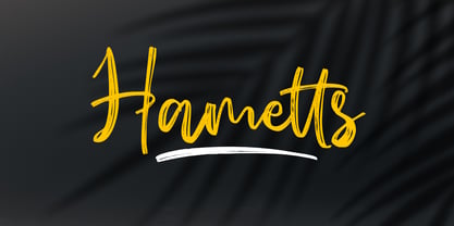 Hametts is a dazzling brush script font. This font is nearly crafted and highly detailed. The texture looks cool and authentic, suitable to enhance the quality of each of your posters, flyers, or print Features : Basic Latin A-Z, a-z, numbers, symbols, and punctuations Hametts is supporting 66 Languages: from Afrikaans Albanian Catalan Danish to Dutch English Spanish Swedish Zulu. Accented Characters : ÀÁÂÃÄÅÆÇÈÉÊËÌÍÎÏÑÒÓÔÕÖØŒŠÙÚÛÜŸÝŽàáâãäåæçèéêëìíîïñòóôõöøœšùúûüýÿžß Thank you
 - Rigrofe by Rvandtype,
$9.00 Rigrofe is a slab serif font designed to add a touch of nostalgia to any project. It has a cool and playful look that can be used for logos, branding, invitations, stationery, wedding designs, social media posts, and so much more. Featuring the perfect amount of trendiness, this font will make your designs come to life. Features : uppercase & lowercase numbers and punctuation multilingual Alternate Characters PUA encoded
 - English 157 by ParaType,
$30.00 The Bitstream version of Englische Schreibschrift by H. Berthold, 1970–72. An unconnected copperplate script of the English nineteenth-century fashion, so-called Spencerian. Based on pressure pointed quill calligraphy. Unlike other copperplate scripts, the letters in this face do not link up. For use in advertising and display typography in relatively small sizes. Cyrillic version was developed at ParaType in 2000 by Vladimir Yefimov.
 - Popty Ping by Hanoded,
$15.00 Popty Ping is Welsh slang for microwave oven. It literally means ‘oven that goes ping’. Popty Ping was sort of based on an older font of mine called Jambo. It is a very happy cartoon font, ideal for children’s book covers, ice cream packaging and microwave popcorn (preferably the non GM kind). Comes in two great styles and more diacritics than you can pop in an oven!
 - Full Moon BT by Bitstream,
$50.99A collaboration based on lettering by Vermont illustrator/artist Mary Trafton and brought to typographic life by Charles Gibbons, the Full Moon Suite is a collection of casual typefaces called after folk names for full moons. A winner of the TDC2 2003 Type Design Competition. Family members include: Falling Leaves, Rustling Branches, Black Cherry, Black Cherry Alternate, Black Cherry Ligatures and Black Cherry Doubles. - Battlexoid by PizzaDude.dk,
$20.00Get ready for a battle - a battle of punk and grunge! This surely is a messy font...it looks like it has been run over by a VERY bad copy machine! Comes with a bunch of cool features such as: - Different lower/caps letters - Unique accented charaters - Ligatures for double letters/numbers - Alternative letters You will need to use OpenType supporting applications to use the autoligatures - Sign Kit JNL by Jeff Levine,
$29.00During trips to the Miami Beach Public Library as a youth, Jeff Levine first caught sight of the signs made with a product called the Webway Sign Cabinet, manufactured by the Holes- Webway company of St. Cloud, MN. Having purchased an old set, Jeff has carefully re-drawn the alphabet and unique contrasting numbers from the original assortment, adding in an extended character set to his font. - Dime Box NF by Nick's Fonts,
$10.00One in the series of fonts called Whiz-Bang Wood Type, intended to be set large and tight. Dime Box is bold and boxy, and creates an interesting visual flow with its notched serifs. Named after a small town in Texas. Both versions of this font contain the Unicode 1252 Latin and Unicode 1250 Central European character sets, with localization for Romanian and Moldovan. - Contraption by Pink Broccoli,
$14.00 Slightly off-kilter to give this rigid geometric a little personality, Contraption started as a digitization of a film typeface called Intrigue by Lettergraphics. From there, this mechanical typeface was expanded into a giant family of useful widths, weights, and obliques: from spindly thin and light weights, to chunky bold and blacks. An additional Inline style has been developed to further enhance the family dynamic.

