8,603 search results
(0.03 seconds)
- Bloody Nose by Mabry Creative,
$35.00 Bloody Nose, from Mabry Creative, is an original decorative font with embedded OpenType features. Consisting of hand-scrawled characters, the font is set in all caps and features ninety-eight glyphs with six alternate versions of each. The alternates automatically and randomly cycle through for a more authentic handwritten effect. Bloody Nose was created using an eyedropper to apply red ink to Bristol board. The natural running and pooling of the ink as it absorbed into the board inspired the font’s title.
 - Clasica Sans by Latinotype,
$26.00 Clasica Sans is a fresh and contemporary typeface, consisting of 7 standard fonts plus italics. It is perfect for publishing and print design. Clasica Sans comes in various weights, working well into paragraphs with small and large text sizes. Regardless of its use, size or alignment, the family keeps a solid look, thanks to its balanced contrast. In short, it is a font based on classical proportions, but with a fresh and contemporary look, ideal for the most versatile designs.
 - Benjammin' by SavoringSurprises,
$10.00 Benjammin' is a handwritten sans-serif font. My 12 year old brother wrote this font himself, and it would be great for any kid's design or project! - Contains over 200 accented characters for language support. Some of the languages supported are: English, Spanish, Portuguese, German, Italian, French, Polish, Catalan, Irish, Norwegian, Croatian, Gaelic, and more! If you would like to know if a certain language is supported, please contact me with the language and/or any special characters you wanted to know about.
 - Scratch That by Matthias Luh,
$25.00 “Scratch That” is a decorative font available in 16 different styles. All subfamilies are consistent in width, position and spacing, so multiple fonts can be layered to create even more variety - have a look at our Family Pack offers! We designed “Scratch That” with layered design in mind and for both good legibility at smaller sizes and perfect look at large dimensions. This allows widespread use: for fashion, headlines, flyers, food, packaging, posters, souvenirs, web design, invitations and many more...
 - Colby by J Foundry,
$20.00 Colby is a hand-drawn workhorse sans serif family. It consists of a wide range of weights and widths for a variety of applications. Colby balances the quirkiness of hand-drawn letters with the legibility of a clean sans serif. This combination provides authentic warmth with functional benefits. The fonts feature plenty of alternates, icons and arrows to add character and customization. Colby is perfect for packaging, restaurant menus, children’s books, digital applications, but will be comfortable in any situation.
 - Colon by TipografiaRamis,
$30.00 COLÓN is a Slab Serif type family of three weights with matching italics. The typeface design was influenced by the nostalgia for the aesthetic of a typewriter. Colón extended family consists of two sub-families: Colón Mono with monospaced glyphs sets, and Colón (proportional glyphs sets) which is presented in these specimen pages. Colón is released in OpenType format with extended support for most Latin languages, and includes some opentype features – such as proportional/tabular figures, slashed zero, ligatures, fractions, etc.
 - Joules et Jacques by Nicky Laatz,
$18.00 Say hello to Joules et Jacques! A stylish modern font duo consisting of a natural handwritten script and a refined, elegant serif font. Perfect for making bold stylish statments - or adding a touch of class to your designs. The script has a multitude of natural looking ligatures in its OpenType features - making the font look as close to natural handwriting as possible. The Serif includes two weights - regular and bold - and built-in OpenType kerning features for a professional touch.
 - Jim Holly by Maulana Creative,
$12.00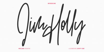 Jim Holly is a tall signature script font. With regular mono-line consist stroke, fun character with a bit of ligatures and alternates. To give you an extra creative work. Jim Holly font support multilingual more than 100+ language. This font is good for logo design, Social media, Movie Titles, Books Titles, a short text even a long text letter and good for your secondary text font with sans or serif. Make a stunning work with Jim Holly font. Cheers, Maulana Creative
 - Archopada by Wildan Type,
$17.00 Archopada is a modern, humanist, strong statement typeface with clean lines. Inspired by classic geometric and fun typefaces. This font perfect for adding a title to your portfolio or website, magazine, branding, id card or you can use for body text in long paragraph. This set includes 6 weight humanist with oblique. If you need fun taste, We also prepared rounded style plus 6 weight and oblique style. Archopada consists of upper and lowercase, numerals, ligatures plus some stylistic alternative characters.
 - Lateman by Dumadi,
$25.00 Lateman is a casual font built with apps. with freestyle and natural make this font look friendly to the project you are working on. Lateman only consists of uppercase letters, but if it collaborates with other fonts, it will feel more striking like the preview example above. This font was created for superhero movie titles and is perfect for movie titles, superheroes, action, animation, war, and more. You can see the sample preview above for comparison, stay the center of attention and classy!
 - Kaylie Diary by Reyrey Blue Std,
$16.00 Introducing, Kaylie Diary. It is the new serif typeface with classy, playful, cute and feminine look. It consisting of several kinds of alternative variations that can make your design more unique and trendy. Kaylie Diary is perfect for an elegant & luxury logo, book or movie title design, fashion brand, magazine, clothes, lettering, quotes, poster designs, branding, magazines, merchandise, logos and so much more. Features : · All Uppercase and Lowercase · Number & Symbol · Supported Languages · Alternates and Ligatures · PUA Encoded Hope you enjoy with our font!
 - FRIESKA by Unitype Studio,
$19.00 FRIESKA is a modern serif typeface. It is consist two styles : Regular and Slant. This gorgeous font will engage your audience and make your promotions and projects stand out. Bring your branding to life and add a touch of modernity and style with this font. It’s the perfect fit for all luxury projects, such as wedding invitation, signatures, luxury logos, printed quotes, grettings cards, social media headers, product packaging and many more! Thanks for downloading, and I hope you enjoy it!
 - Growing Boy by Brenners Template,
$19.00 Growing Boy Display Font Family is designed with a rather high x-height and consists of cute and creative glyphs. Nine weights include regular and rounded styles, the rounded styles are designed for soft edge. The really uniquely drawn glyphs can work well with any composition to create the layout you want. In addition, rounded styles increase readability and simplicity, so they can be applied in a variety of ways, including editorial publishing, logo design, brand identity, and on-screen channels.
 - Foro Sans by Hoftype,
$49.00 Foro Sans is the matching friend of the popular Foro family (Foro and Foro Rounded). It comes with the same number of styles and the form displays the same characteristic features. Foro Sans consists of 16 styles and is well suited for ambitious typography. It comes in OpenType format with extended language support. All weights contain ligatures, superior characters, proportional lining figures, tabular lining figures, proportional old style figures, lining old style figures, matching currency symbols, fraction- and scientific numerals and matching arrows.
 - Linotype Abstract by Linotype,
$29.99American designer Frank Marciuliano created the Linotype Abstract display font in 1997. Abstract's letters are made up of collaged elements: a single letter can contain several different textures. Instead of an upper and lowercase, Linotype Abstract offers two different uppercase alphabets, each with different patterns. Text set in Linotype Abstract takes on the appearance of a cubist painting, making it the perfect font for all of your funky type needs. Linotype Abstract is included in the Take Type 4 collection from Linotype GmbH." - Boarding House by Hanoded,
$15.00 I have never stayed at a boarding house myself, but I’ve heard some horror stories. When I have finished painting the three fonts (using Chinese ink and a small brush), I didn’t have to think long for a name. Boarding House family consists of three distinct hand painted fonts - the complement each other, but can be used separately as well. Use Boarding House for your halloween posters, mystery novels or websites. All fonts come with an attic full of diacritics.
 - Resola by Ironbird Creative,
$15.00 Resola is a hand drawn vintage display typeface. This item consist of 12 FONTS in various styles which you can play around with it. This typefaces is perfect for people looking for vintage aesthetic and organic feel. What Will You Get : Resola Vintage Serif (OTF and TTF) Resola Sans Serif (OTF and TTF) We hope you enjoy the font, please feel free to comment if you have any thoughts or feedback. Thanks for purchasing and have fun! Regards, Ironbird Creative
 - Tsubu by Takehiko Ono,
$5.00 “Tsubu” (つぶ) means something small and round, like a fruit seed or a grain of rice in Japanese. All characters are completely geometric, consisting of no more than 5 x 12 dots, with a few exceptions. And proportional and monospace styles are available. It is recommended that letter spacing be set to 0 to maintain dot pitch. When the line height is set to 100%, the dot pitch is aligned horizontally and vertically, resulting in a beautiful geometric display.
 - Boldina by DSType,
$19.00Boldina consists of 18 fonts with a lot of personality. This is a font to be mixed. That’s its purpose and that’s why it's designed as one single weight in so many different styles. My intent was to give designers a chance to use the same typeface in many different ways, putting together sans and serif, lots of italics and even Greek, Cyrillic and CE characters. The Ligatures and the Script versions give a more poetic and more accurate feeling to the text. - Vin Mono Pro by Mint Type,
$35.00 Vin (translated from Ukrainian as “he”) is a superfamily consisting of three robust typefaces with pronounced vertical stems and rounded corners. All three typefaces feature very large x-height for even more expression and assertiveness. Vin Mono Pro is a squarish monospaced font family with extra-large x-height and rounded corners. It is characterized by evident straight elements even in horizontal stems. Be sure to check other two typefaces of Vin superfamily: Vin Sans Pro and Vin Slab Pro .
 - Six Sided Monogram by MonogramBros,
$12.00 Six Sided Monogram Font is a perfect shaped monogram font consisting of 78 letters and 1 basic frame. With just a single font file you will be able to create beautiful monograms in just a matter of minutes after the purchase! Six Sided Monogram Font comes with font file in OTF format. It features all the modern advanced font features such as Contextual Alternates, effectively eliminating the need to use multiple separate font files for left, center and right letters.
 - School Type by STARSsoft,
$10.90 The decorative font "SchoolType" came straight from our school notebooks. We painted these letters in our notebooks, but now they can be printed on a computer. All uppercase Latin letters have the same width, which is ideal for designers. As always, we offer you a font with support for many languages. Standard and Latin Extended support such languages - English, Danish, Spanish, German, Norwegian, Polish, Portuguese, French, Swedish. Standard and extended Cyrillic are supported by languages - Russian, Belarusian, Bulgarian, Macedonian, Serbian, Ukrainian, Kazakh, Kyrgyz.
 - Prime Century by Letterhend,
$14.00 Prime Century is an organic hand drawn font duo consist of a script paired with a sans serif with a touch of classic look and feel. This type of font perfectly made to be applied especially in logo, headline, signage and the other various formal forms such as invitations, labels, logos, magazines, books, greeting / wedding cards, packaging, fashion, make up, stationery, novels, labels or any type of advertising purpose. Features : Uppercase & lowercase Numbers and punctuation Alternates & Ligatures Multilingual PUA encoded
 - Tomkin by Typesketchbook,
$55.00 Tomkin font is an extra large super family of 54 fonts! Tomkin have such a big abundance of contrast, styles, weights, width. Typesketchbook consists of a very usable, clean and modern sans typeface with Semi-square struture. The complete Tomkin type family includes 9 weights with italic and 3 width (normal, narrow, condense) versions for each of them all in all 54 fonts for a multifunctional usage, especially for cooperative work, such as website, magazine, editorial, publishing , as well as packaging.
 - Kartell by ParaType,
$25.00 Kartell type family was designed by Oleg Karpinsky for ParaType in 2006. Design features: lower contrast between strokes and slim serifs. It consists of three weight styles with corresponding Italics. The Open Type version contains a lot of alternate characters and additional ligatures. Italic styles contain some alternate letterforms and lots of swash characters. Kartell is recommended for long text passages at magazines, books and booklets, as well as for headlines, logos, billboards, visit cards, newspaper adds and so on.
 - TR Reqnad Display by Tondi Republk,
$17.00 Reqnad Display is part of a series of typefaces by Tondi Republk, inspired by modern industrial design and architecture. The Reqnad Display type system consists of seven typefaces with varying visual styles and weights which can be used interchangeably to create harmonious, versatile and impactful visual communication systems. Used alongside well curated imagery and grid based layouts it adds a modern appeal to written sentiments. To view more examples of layouts created with Reqnad Display search for the #ReqnadDisplay hashtag on social media.
 - Cooper Nouveau by House Industries,
$33.00 Few fonts reach cult status. Despite its ubiquity—and perhaps because of its lack of subtlety—for a hundred years Cooper continues to draw the faithful. It’s even come to define an entire typographic genre and recently starred in its own documentary. Cooper Nouveau is Dave West’s imaginative contribution to the Cooper oeuvre. Drawn in 1966, Nouveau refreshes Oswald Cooper’s original italic with an energetic pitch, simplified contours, and a plump friendly figure. Uniform strokes and generous curves push the font’s playful personality and springy silhouette even further. A selection of swashed characters and ligatures offers options for lively logos and strong captions. While Cooper Nouveau looks laid-back and easy-going, it’s more than capable of pulling it’s own typographic weight. Put it to work where relaxed needs to project confident. Set Nouveau large for eye-magnet posters, packaging, and advertisements. Maximize its youthful energy for kids’ themes, craft action, and apparel bounce. Or set it alongside a master like Benguiat Buffalo or Chalet to show how Cooper Nouveau can communicate on paper and screens with an inherent ability to speak the language of style in many tongues. But like any cult icon: beware! Cooper has a way of setting the needle, and Nouveau just may become your go-to design fix. FEATURES ALTERNATES: Cooper Nouveau contains several alternate characters, which add flair to your designs and can help solve spacing issues LIGATURES: Many letter combinations in Cooper Nouveau form a ligature to solve spacing issues and produce more pleasing designs. COOPER NOUVEAU CREDITS Typeface Design: Dave West Digitization: Dave Foster Typeface Direction: Ben Kiel, with Ken Barber Like all good subversives, House Industries hides in plain sight while amplifying the look, feel and style of the world’s most interesting brands, products and people. Based in Delaware, visually influencing the world.
 - The Great Wall by Gie Studio,
$9.00 The Great Wall, as the name of this font is created and inspired by a legendary world masterpiece, with a special uniqueness in a style that is very firm but looks elegant, so it is suitable for you to use for a variety of designs that accentuate the professional and charming. Various advantages of this font : This font consists of four (4) very interesting styles, please choose ! With a rather thick but consistent style line, accentuating the firmness and professionalism of the users of this font. This font is complete with Uppercase, Lowercase, Numeral, Punctuation, Multilingual support and ligature letters in each style. Can be applied in various software, such as Ms.office, Photoshop, Coreldraw, Adobe Illustrator, Inkscape and others. There are many purposes that are very suitable to use this font, among others: writing the name of a professional profession, for book covers, fashion branding, watches, jewelry, marketing products, magazines and more. With you using this font for any purpose, I hope your business will be more successful and known to the world as the name of this font. Thank you, I say for your visit and purchase.
 - Canilari by W Type Foundry,
$35.00 Canilari is a post-modern type family inspired by Diaguita pottery and contemporary serif typefaces. The Diaguita culture—developed from 10th century A.D. until 16th century A.D.—settled in the area of the present-day north Chile and northwest Argentina. Surviving cultural expressions of the Diaguita people are reduced to just a few pieces of beautifully decorated pottery of high technical quality. Canilari itself is a scream of identity with an incomparable tone that borrows elements from native America and proudly show them to the world. The intense and consistent personality of Canilari makes it a functional font for a wide range of uses: from continuous text in the most challenging environments to pithy, high-impact headlines. Canilari is well-suited for publishing: newspapers, magazines, books, etc. Its flashy look and angular shapes also make it an excellent choice for posters, logotypes, and advertising. The family consists of 2 sets: one standard and one pro, each in 4 weights plus italics. Canilari also includes a set of ornaments and illuminated caps. Together, the Std set (369 characters) and Pro (710 characters) support 219 different languages. This typeface was selected at the Bienal Tipos Latinos 2014.
 - Temeraire by TypeTogether,
$49.00 Quentin Schmerber’s Temeraire serif font family was not designed to be invisible. It is a typographic exploration meant to be seen — with its beauty, one could even say beheld. While some fonts aim to be as easily ignored as possible, Temeraire is offered as a gift to wide-eyed readers with its anything-but-boring character and its conspicuous inconsistency in styles. Most type families increase the weight of each character to expand the family. Instead, research into 17th century sources produced Temeraire’s wide range of letterforms, from the predictable to the odd and loosely related through time. Each style is designed to work alongside the others but are also standalone homages to specific parts of English lettering tradition: gravestone cutting, writing masters’ copperplates, Italiennes, and others. Temeraire’s Regular style is a contrast-loving Transitional Serif with vertical stress, making it great for period and classic works, ironic pieces, and modern throwbacks. The weight of the Bold squares off the ends of each glyph to give it stability, and the italic style rings true: flowing, contrasting, and purposefully inconsistent. Temeraire’s Display Black style is one salvaged from expressive gravestone artistry. The details most easily noticed are the ‘g’ with its descending bowl that has been pressed back up in the centre, and the additional serif on the ‘t’ crossbar that holds its neighbouring character at bay. (The ‘g’ and ‘Q’ have loopless alternates.) The final style is the Italienne, the horizontally stressed counterpoint to the family. By design its characters flow and bend in ways not in step with the rest of the family. All the weight has been pushed to either hemisphere within each glyph, resulting in a display style that demands space and peacefulness around it so its presence can impress. As with all TypeTogether families, Temeraire meets the current designer’s needs. Not only does its five styles shine in print work, it includes alternates for when the defaults are too boisterous and has been expertly crafted for screens. The Temeraire serif font family is resurrected from echoes in time and finds its family relation through impeccable taste.
 - Mariage by Linotype,
$40.99Morris Fuller Benton, the principal designer of the American Type Founders, designed Mariage in 1901. Mariage, which has been sold under a plethora of different names during the last century, is a blackletter typeface belonging to the Old English category. The term blackletter refers to typefaces that stem out of the historical printing traditions of northern Europe. These letters, called gebrochene Schriften, or "broken type" in German, are normally elaborately bent and distorted. Their forms often print large amounts of ink upon the page, creating text that leaves a heavy, black impression. The Old English style is a subset of blackletter type that dates back to 1498, when Wynken de Worde introduced textura style printing to England. Continental printers had been printing with textura style letters since Gutenberg's invention of the printing press fifty years earlier. Italian printers stopped using them around 1470. For northern Europeans, texturas remained the most popular form of typeface design until the invention of the fraktur style in Nuremberg. Mariage is heavily classicized sort of Old English type. During the Victorian era, designers admired the Middle Ages for its chivalric, community-based values and its pre-industrial lifestyle. Yet they also found the basic medieval textura letterform too difficult to read by present standards. They desired to modernize this old style. Today, this sort of update is often referred to not as "modernization" but as classicism. Benton's design for ATF builds upon earlier Victorian classicist interpretations of Old English/textura letters. For an example of what these Victorian designs looked like, check out the popular 1990 revival of the genre, Old English . Old English style types often appear drastically different from other blackletters. For contrast, compare Mariage to a classical German fraktur design, Fette Fraktur , a schwabacher style face, or the popular early 20th Century calligraphic gothic from Linotype, Wilhelm Klingspor Gotisch . Especially in the United States, classicist Old English typefaces are thought to espouse tradition and journalistic integrity. These features, together with the inherent, complex beauty of Mariage's forms, make this typeface a perfect choice for certificates, awards, and newsletter mastheads. - Rainier by Kimmy Design,
$10.00 I was inspired to create the Rainier type family during my summer back home in the Pacific Northwest. The concept behind it may be simple - a hand crafted font family - but what it delivers is quite complex! Here is a breakdown of everything you get: FONT FAMILIES: Two sub-families with unique styles - Rainier North and Rainier West WEIGHTS: 4 weights per family, broken down numerically - 100 (light), 300 (regular), 500 (bold), 700 (black) OPENTYPE: In each family, there are tons of OpenType options, offering lots of customizable opportunities (in order to access all these goodies, you must be using Illustrator, Photoshop, Indesign or Publisher). Because Rainier is 100% handmade, contextual alternatives allow each letter has three subtle variations, this way it keeps that authentic hand-drawn look. Additionally, a full alphabet with special descending swashes, as well as start and end swashes for capitals and small caps. Titling alternatives offer a full character set just to help with readability! Meant for captions or smaller text, these letterforms are easy on the eye and a great complement to the regular alphabet. Stylistic Alternatives add a little fun, providing a unified cap height, no matter what case you are using (all caps, small caps or lowercase.) Discretionary Ligatures are created only for capitals, and takes specific letter pairs and creates a unique ligature between them To get a better understanding of everything, please check out the quicker user guide (http://bit.ly/1W0Bfma) and print if you so desire (http://bit.ly/23W9ZV6) that helps you navigate your way around and get the most out of Rainier! Unfortunately those links aren't working right now and soon I will have them fixed. So sorry! ORNAMENTS: In addition to the font, you get a set of awesomely rustic ornaments designed and drawn to go specifically with Rainier! - Rustic Northwest Illustrations - Banners & Flags - Frames - Flourishes - Lines & Line Breaks - Arrows There are a lot of extras packed in this set, so make sure you check out the Ornaments User Guide to get the most out of it! Check it out here: http://bit.ly/1rRVJRx And that’s all folks! Hope you enjoy Rainier!
 - VVDS Ginsburg by Vintage Voyage Design Supply,
$10.00 Ginsburg it's a modern display all-caps font-family based on geometric forms and abstract wavy lines with an old school constructivism look. Inspired by Moses Ginsburg architecture projects. Playful, modern, suitable for many typography projects as headers, logos, block texts, etc. You may be more strict in your typography or you may be more groovy or playful with alternates characters. Use this family in vintage spirit for TV series, Podcasts titles, exhibition posters or design a modern extreme sport brochure, . Flexible, Catchy and Brazen — it's all about Ginsburg! Six widths: Thin / Light / Normal / Medium / Semi Bold / Bold. Opentype Features as Stylistic alternates, Oldstyle figures / Fractions. Multilingual
 - Marista by Zephyris,
$- Marista is a bit of an unusual design, a cursive monospaced font inspired by the classic cursive typewriter fonts used in the 1960s-70s. It is designed to feel 'real', and captures some of the light irregularities in line weight which characterise real typewritten text rather than their computer equivalents. Marista is distinctive but easily readable, even in block text where some monospaced fonts suffer. Marista is best used at small to medium sizes, and at a uniform size throughout a document or design to capture the typewritten feel. The italic is more similar to authentic typewriter cursive fonts. Try it for your next letter or invitation!
 - Alto Adige by Fenotype,
$25.00 Named after Italy’s northernmost region, Alto Adige is a high-contrast display serif typeface. With its condensed width and bold contrast it is excellent for headlines, packaging, magazines, posters and advertising, among any other display use. Alto Adige has large x-height making it a steady choice for sturdy text blocks with tight leading. In large sizes, you can also try tighter tracking for maximum impact. Alto Adige comes with a set of OpenType features: Contextual Alternates and Standard Ligatures are automatically on for certain character pairs. In addition it has over 50 alternates for display capital initials, set in Swash, Stylistic and Titling Alternates.
 - Indoo BT by Bitstream,
$50.99Indoo is a modular geometric design that owes much to the typeface designs of Theo van Doesburg (1883-1931) and the De Stijl principles of abstraction, simplicity, clarity and harmony. That inspiration, combined with the lettering of signage often found in the Indian quarter of Paris, led to the connecting block letter motif of Indoo. The text fonts are joined by a common horizontal stroke positioned at the baseline. There is an accompanying Ornament font for building borders that includes various stylized fleurons and the like. Each font has a drop shadow companion that allows you to build three-dimensional and multi-colored lettering. - Garuspik by Dima Pole,
$27.00 Garuspik is an original ulra condensed, narrow, tall font with 3 styles: display, round and square. It is particularly well suited to create text blocks, advertising slogans, headlines, and other original and interesting text compositions. For convenience and variation the Uppercase are very tall, lowercase are moderately tall. Garuspik looks especially good when set in all uppercase. So, for convenience and simplicity, the smcp feature changes all characters to uppercase only. In addition, another OpenType feature changes the form of some uppercase, if they stand before to lowercase. And of course, there are all the necessary and popular features such as frac, ordn, locl and others.
 - MetroBots by Our House Graphics,
$- MetroBots is a fun loving, non-traditional but very functional family of 6 fonts made of big city skies, the long tropical morning shadows of ancient ziggurats and entire pueblo villages, nestled into the steep cliff-sides of sage-topped mesas in south western deserts. This is a good solid, but kind of whacky looking display type family borrowing from the heft of good old-fashioned children�s wooden building blocks and the look and feel of both modern and ancient pueblo architecture. With a bit of the not-so-subtle expressiveness of a comical robot on a WD-40 high on the side.
 - Solomon by Fontfabric,
$40.00 The new Solomon type family includes 12 very unique design styles. These twelve designs are divided into two main style groups—text family and display (or decorative) family. The Solomon text pack is characterized by excellent legibility, well-finished geometric designs, optimized kerning etc. Solomon is most suitable for headlines of all sizes, as well as for text blocks that come in both maximum and minimum variations. The Solomon deco pack is created using ornamental work with organic forms at the heart of the design base. The use and combination of both groups - deco and text family, is highly recommended in order to attain maximum desired effects.
 - New Millennium Sans by Three Islands Press,
$24.00New Millennium Sans is one of three font families that share a common name, a common design philosophy, a common x-height, and basic character shapes. (The others are New Millennium and New Millennium Linear; all three work well together.) New Millennium Sans is a "humanist sans" in the Optima vein -- but without certain quirks (e.g., the "waisted" strokes) of the latter. It has proportional lining numerals whose height comes midway between the lower- and uppercases. (The bold styles are identical to those of New Millennium.) New Millennium Sans might be used in books, periodicals, or any large text blocks where a legible sans is desired.