8,603 search results
(0.027 seconds)
- Mousse Script by Sudtipos,
$79.00 Mousse Script is based on Glenmoy, a 1932 Stephenson Blake typeface. Glenmoy a prime example of what display typography was in pre-WWII American ad art. It graced the pages of magazines, sold numerous products and services, then simply died out when the typographic trends shifted towards the more personalized, stylized and handwritten types of calligraphy. The current trend in typography is a revivalism that brings all of the distinctive display typography of the 20th century, without chronological discrimination, back in the name of ‘retro’. Who are we to deny the masses what they want? Mousse Script doesn’t just bring Glenmoy back from the ashes of the 20th century. It expands upon the limited metal character set nearly twice over and takes advantage of the latest type technologies. This makes Mousse Script a striking typeface, both functionally and visually. A simple, attractive display font on the surface, Mousse Script is unique in its bold upright calligraphy, something rarely found these days. The OpenType version of Mousse Script combines both the regular and alternate character sets into a single, cross-platform package that takes advantage of the extended typographic features of the OpenType format.
 - Neue Haas Unica Paneuropean by Linotype,
$65.00Neue Haas Unica by Toshi Omagari: The original purpose behind the creation of the typeface Haas Unica was to provide a sympathetic update of Helvetica. But now the font designer Toshi Omagari has decided to make this typeface his own and has thus significantly supplemented and extended it. In the late 1970s, at the same time at which hot metal typesetting was being replaced by phototypesetting, the Haas Type Foundry commissioned a group of specialists known as "Team '77" consists of Andre Gurtler, Christian Mengelt and Erich Gschwind to adapt Max Miedinger's font The characters of Haas Unica are somewhat narrower than those of Helvetica so that the larger bowls, such as those of the "b" and "d", appear more delicate and have a slightly more pleasing effect. In general, the spacing of Haas Unica was increased to provide for improved kerning and thus enhance the legibility of the typeface in smaller point sizes. Major changes were made to the lowercase "a", in that the curve of the upper bowl became rounder and its spur was eliminated. The form of the "k" was additionally modified to remove the offset leg so that both diagonals originate from the main stem. The outstroke of the uppercase "J" was also significantly curtailed. In addition to many minor alterations, such as to the length of the horizontal bars of the "E", "F" and "G" and to the angle of the tail of the "Q", the leg of the "R" was extended and made more diagonal. In the case of the numerals, the upper curve of the "2" was reduced and the lower loops of the "5" and "6" were correspondingly adapted. The sweep of the diagonal of the "7" was also reduced. Several decades later, Toshi Omagari returned to the original sketches with the objective of reinvigorating this almost totally forgotten typeface. First, however, he needed to revise the drafts prepared by Team '77 to adapt them for digital typesetting. So Omagari carefully adjusted the proportions of the glyphs, achieving a more uniform overall effect across all line weights and removed details that had become redundant for contemporary typefaces. It was also apparent from the old drafts that it had been the case that the original plan was to create more than the four weights that were published. Omagari has added five additional styles, giving his Neue Haas Unica? a total of nine weights, from Ultra Light to Extra Black. He has also greatly extended the range of glyphs. Providing as it does typographic support for Central and European languages, Greek and Cyrillic texts, Neue Haas Unica is now ready to be used for major international projects. In addition, it has been supplied with small caps and various sets of numerals. With its resolute clarity and excellent typographic support, Neue Haas Unica is suitable for use in a wide range of new contexts. The light and elegant characters can be employed in the large point sizes to create, for example, titling and logos while the very bold styles come into their own where the typography needs to be powerful and expressive. The medium weights can be used anywhere, for setting block text and headlines. - PF DIN Stencil by Parachute,
$39.00 DIN Stencil on Behance. DIN Stencil: Specimen Manual PDF. Despite the fact that over the years several designers have manually created stencil lettering based on DIN for various projects, there has never been a professional digital stencil version of a DIN-based typeface. After the successful introduction of DIN Monospace a few months earlier, PF DIN Stencil now completes Parachute’s extensive library of DIN superfamilies. It was based on its original counterpart DIN Text Pro and was particularly designed to address contemporary projects, by incorporating elements and weights which are akin to industries such as fashion, music, video, architecture, sports and communications. Traditionally, stencils have been used extensively for military equipment, goods packaging, transportation, shop signs, seed sacks and prison uniforms. In the old days, stencilled markings of ownership were printed on personal possessions, while stencilled signatures on shirts were typical of 19th century stencilling. Two companies dominated the market in the mid-twentieth century: the Marsh Stencil Machine Company in the United States and the Sächsische Metall Schablonen Fabrik in Germany. Ever since the late 1930s, it was the German Sächsische Metall Schablonen Fabrik which used heavily the new DIN 1451 standard font (introduced in 1936), attempting to overthrow the reign of the Didot-style modern roman which was at the time the most common stencil letter in Germany. These letters were manufactured mainly as individual zinc stencils which could be ordered in sizes between 10 and 100mm. The DIN Stencil family manages to preserve several traditional stencil features, but introduces additional modernities which enhance its pleasing characteristics and make it an ideal choice for a large number of contemporary projects. Furthermore, the spacing attributes of the glyphs were redefined and legibility was improved by revising the shape of the letterforms. The DIN Stencil family consists of 8 diverse weights from the elegant Hairline to the muscular Black. Currently, it supports Latin, Eastern European, Turkish and Baltic.
 - Odile by Kontour Type,
$50.00 Odile is a text typeface with bracketed head and bracket-free bottom lower case serifs, a quality that counters rigidness most traditional slab serif typefaces possess. This contemporary design draws inspiration from an experimental typeface named Charter originally designed by the American book and type designer William Addision Dwiggins. It consisted of an informal lowercase alphabet, a narrow seemingly non-inclined vertical letter with script attributes, featuring non-joining letterforms. Dwiggins’ contemplated Charter as the italic companion to Arcadia, Experimental No. 221. The Charter project progressed sporadic stalled during the Second World War and came to a halt in 1955. Charter remained incomplete and was never commercially released. Assessing Charter’s whimsical design, its fragments were rethought and developed into a comprehensive text family. Odile Upright Italic reveals recognizable similarities shared by Dwiggin’s Charter and defines the design approach for the family. The steep calligraphic outstroke and low junctions off the stem as in the upright italic “n” or “r”, for example, are gradually lessened in the italic and moved up for the roman weights. The six optically balanced weights range from the delicate Light to stark Black, accompanied by display variants with feminine flair and ardent Ornaments. Two sorts of Initials, one amplified with interweaving swashes, the other more restrained, both are clearly derived from the Upright Italic. This mid-contrast serif offers a wide range of tools for text and display typographies with a palette of strict to playful. This family shines in magazine, book and display use. The graceful serifed type harmonizes perfectly with Elido, Odile’s sans companion. Sans and serif share the family array and OpenType features in perfect tune. Odile offers an extensive character set, numerous OT features including roman and italic Small Caps, five sets of numerals, alluring ligatures, and many more. OT stylistic variants (with accents) offer a one-story “a” for the roman weights, alternate “g” and “s” designs for the italics, and a variant “s” for the Upright Italic.
 - URLOP by Mikołaj Grabowski,
$9.00 Colour is more fun than black, but multicolour is even better. Let me introduce URLOP, a wide type family suitable for your fancy posters, headlines, covers, illustrations, websites, initials, blackmails, chronicles, signboards, poems and many others. Twelve basic styles, which make the overall construction, give a wide range of opportunities. All of them, being able to mix with each other, vary from a thin INSIDE, through a medium FILL, to a double-stem PLUS styles. And then comes a range of colour fonts, so you don’t have to waste any of your precious time for experiments, because I’ve already done it for you! URLOP is an all-caps display collection consisting of three sub-families of fonts, divided by the usage they are designed for. First of all, there is a wide range of alphabets made in the new OpenType-SVG colour fonts format. This is quite a novelty and a very promising technology at the same time. It allows designers to store colour information inside the font. Due to my experience with layered colour thinking that I explored in my first family - Epilepsja , I decided to make several preset layer combinations in this auspicious format. This sub-group is tagged RGB. Make sure that your field of usage and software support OT-SVG format. However, if you feel a need to experiment in the old-fashioned way, you may buy separate layers under the DIY tag. The last group is very similar to the DIY, but it was optimized to look better when standing without other layers. It’s called PRO*. All styles cover Latin alphabets of Europe, basic Cyrillic and Greek sets. Have fun! Before using the font, read the instructions and specimen attached to font files in the purchased package or download them from the Gallery tab on this site. This will help you avoid making unexpected mistakes when combining layers. *PRO subfamily release planned in 2019.
 - Cinema Macabre by Wing's Art Studio,
$10.00 Cinema Macabre: Horror Fonts Torn from the Pages of Giallo A Hand-drawn Display Font for Creating the Most Diabolical Horror Titles This loose and inky brush font takes its inspiration from the classic Giallo film posters of the 1960s to 1980s - a cult cinematic subgenre beloved for its stylish visuals, haunting soundtracks and exploitation led marketing. It's a devilishly drawn design that aims to capture the feeling of vintage horror, preserving analogue details of old print while remaining versatile enough to work across a variety of digital designs. The Cinema Macabre font family boasts six fonts, each containing a unique set of uppercase and lowercase characters, as well as numerals, punctuation and language support. Add to this a host of custom ligatures, underlines and graphic elements and you have an essential toolbox for creating truly hand-made looking title designs. Cinema Macabre if a font that rewards experimentation by mixing all the various upper and lowercase alternatives, with interesting combinations waiting to be found and inspire terror across your own movie posters, book covers, albums and editorials. Few other fonts offer the versatility to create such diabolical designs! A Brief Introduction to Giallo: In popular cinema, Giallo is a genre of mystery fiction and thrillers often containing slasher, psychological horror, exploitation, supernatural and erotic elements. The term giallo (meaning yellow) derives from a series of pulp novels published by Mondadori from 1929 taking the name from its trademark yellow covers. The series consisted of Italian translations of mystery novels by well-known authors such as Agatha Christie, Edgar Allan Poe and Raymond Chandler. The popularity of these cheap paperbacks eventually established the word Giallo as a synonym in Italian for a mystery novel. The cinematic Giallo subgenre developed during the 1960-80s and are noted for their vivid cinematography, memorable soundtracks and inventive gore-filled scenarios. Key examples include Dario Argento's Suspiria, Tenebrae and Deep Red - stylish films that at once influenced the American slasher (see Black Christmas and Friday 13th) up to todays horror in Censor and Last Night In Soho.
 - Vintage Glamour by Ardyanatypes,
$15.00 Vintage Glamour comes with an aesthetic style, and its serif-type tagline is Vintage and elegant. This font comes in eighteen thickness levels, from thin to black, to suit your needs. Vintage Glamour is also equipped with the latest professional characteristics that can present an elegant and attractive identity for your company or project for business purposes. It goes well with modern serifs and scripts that depict or stand firm as titles and brand representatives for an elegant look. Vintage Glamour has 18 font styles ranging from thin to regular and italic. This will go a long way in creating the perfect impression, giving you many options you'll want to use in each design. Vintage Glamour also comes with multiple languages, making any country and language easy to use. It also comes with alternative Ligatures and styles to make your designs more attractive. Vintage Glamour is suitable for branding projects and various design purposes such as business cards, name tags, and uniforms as a brand enhancement. Advertisements, posters, invitations, branding, logos, magazines, merchandise, presentations, etc. Supports languages: Afrikaans, Albanian, Asturian, Asu, Azerbaijani, Basque, Bemba, Bena, Bosnian, Breton, Catalan, Chiga, Colognian, Cornish, Croatian, Czech, Danish, Dutch, Embu, English, Esperanto, Estonian, Faroese, Filipino, Finnish, French, Friulian, Galician, German, Gusii, Hungarian, Icelandic, Igbo, Indonesian, Irish, Italian, Kabuverdianu, Kalaallisut, Kalenjin, Kamba, Kikuyu, Kinyarwanda, Latvian, Lithuanian, Low German, Lower Sorbian, Luo, Luxembourgish, Luyia, Machame, Makhuwa-Meetto, Makonde, Malagasy, Malay, Maltese, Manx, Meru, Morisyen, North Ndebele, Norwegian Bokmål, Norwegian Nynorsk, Nyankole, Oromo, Polish, Portuguese, Quechua, Romanian, Romansh, Rombo, Rundi, Rwa, Samburu, Sango, Sangu, Scottish Gaelic, Sena, Shambala, Shona, Slovak, Slovenian, Soga, Somali, Spanish, Swahili, Swedish, Swiss German, Taita, Teso, Turkish, Turkmen, Upper Sorbian, Vietnamese, Vunjo, Walser, Welsh, Western Frisian, Yoruba, Zulu A guide to accessing all alternatives can be read at http://adobe.ly/1m1fn4Y Adobe Photoshop go to Window - glyphs Adobe Illustrator go to Type - glyphs Features: A – Z Character Set a – z Characters set Numerals & Punctuations (OpenType Standard) Multilingual Thank you and have a nice day
 - Offense by Reserves,
$49.00 Offense is an unyielding rectangular slab-serif face designed with consistently balanced letterforms and a refined finish. It’s extremely angular geometric form commands attention in display settings, yet is also legible in short text blocks. Numerous alternate character sets allow room for customization, while the expanded ligatures push letter combinations to the limit. Stylistically, Offense’s almost crude, sharp-cornered construction is balanced by it’s sophisticated finish and attention to detail, often unrealized in similar faces of this genre. The upright weights are complimented by pairings of true italics, completely rebuilt, slightly narrower in width with modified letterforms, increasing their contrast and flow. Features include: Precision kerning Standard Ligatures set including 'f' ligatures (fi, fl, ff, fh, fj, ffl, ffi, ffj) Discretionary Ligatures set including (ft, rt, ae, oe, st, ft, ct, oc, oo, ry, AE, OE, AL, TH, HE, AK, AN, TT, HD, AM, AP, AR, NF, NE, NH, NL, NB, FL, ND, FE, AB, OB, OD, OF, OG, OH, OK, OL, OM, ON, OO, OP, OQ, OR, OU, AH, UE, UF, UB, UD, UH, UK, UL, UM, UN, UP, UR, UU, MP, XY, YX, KY, WY, VY, AF, FF, FI) Alternate characters (O, o, S, s, a, h circumflex, @, ®, ¶, $, &, _, and various ligature alternates) Case forms (shifts various punctuation marks up to a position that works better with all-capital sequences) Capital Spacing (globally adjusts inter-glyph spacing for all-capital text) Slashed zero Full set of numerators/denominators Automatic fraction feature (supports any fraction combination) Extended language support (Latin-1 and Latin Extended-A) *Requires an application with OpenType and/or Unicode support.
 - Compass TRF by TipografiaRamis,
$29.00 Compass TRF is a reevaluation of an existing Compass typeface dated 2002. Compass is a geometric contrast serif typeface - "contemporary Didone". New Compass consists of four styles—regular, italic, alternate and flourish initials with small caps. Compass TRF is recommended for use as display typeface. It is suggested that flourish initials font to be used for decorative purpose only, not basic typesetting. Compass TRF generated as OpenType single master format with Western CP1252 character set.
 - Laureen pro Arabic by Zaza type,
$29.00 Laureen pro typeface Laureen pro is an Arabic typeface that has a very particular appearance. It combines the characteristics of different genres; most notably the contrast of serif faces. While its design is influenced by Kufic and the Naskh style. Laureen pro consists of two typefaces, text and display, and 4-weights. It’s a perfect choice for bold headlines, oversize typography, fashion logos, branding, identity, website design, album art, covers, posters, advertising, etc.
 - Bosk Hand by Andrew Footit,
$12.00 Bosk Hand is a vintage inspired handmade display font family that consists of 4 fonts and 4 font elements. It has a raw and authentic look and feel about it and is great for those vintage, hand drawn typographic pieces. Use the elements to add a unique hand lettered touch to your layouts. This font family is versatile for use in desktop publications, packaging, logotypes that need that hand made authentic feel.
 - Oval Monogram by MonogramBros,
$12.00 Oval Monogram is a perfect oval shaped monogram font consisting of 78 letters. With just a single font file you will be able to create beautiful monograms in just a matter of minutes after the purchase! Oval Monogram Font comes with font file in OTF format. It features all the modern advanced font features such as Contextual Alternates, effectively eliminating the need to use multiple separate font files for left, center and right letters.
 - ED Olancha by Emyself Design,
$14.00 Olancha is a display serif font with a unique rounded style. This font consists of uppercase letters, the characters A-Z are serif letters with a rounded appearance and a-z are standard serif letters. Olancha is also equipped with features such as Ligature, Stylistic set, and multi language support. This font is perfect for your creative projects such as Logotype, printed quotes, invitations, cards, product packaging, headers, Letterhead, Apparel , Web design, Magazine, Book, etc.
 - Javar by Arterfak Project,
$19.00 Javar is an all-caps display font. This font is designed in a colossal Middle Eastern style, with dynamic strokes using a flat pen which produces a magnificent and authoritative letterform. This font has a high historical taste, so it is perfect to be applied to specific themes such as culture, history, religion, kingdom, and battles. Equipped with accented characters, and special characters to boost your design. Thank you for your support!
 - Manas Pro by Fontuma,
$24.00 Manas is the name of the epic of the Kyrgyz Turks. The font family is also designed with serifs to reflect the characteristics of the epic from which it is named. This typeface, which is a serif, consists of three families: ▪ Manas: Font family containing Latin letters ▪ Manas Pro: Font family including Latin, Arabic and Hebrew alphabets ▪ Manas World: A family of typefaces including Latin, Cyrillic, Greek, Arabic and Hebrew alphabets
 - Core Narae by S-Core,
$59.00 CoreNarae is an upright, casual handwriting style font and all glyphs have been hand-crafted. This typeface is live and friendly because of its bending strokes and rhythmic feeling, so it is good for fun text for posters, headers or cards. Supported codepages are MS Windows 1252 Latin1 and MS Windows 949 Korean consisting of 11,172 Korean letters and Symbols except Chinese. This font will make your works more friendly and emotional.
 - Orden by ParaType,
$30.00 PT Orden™ was designed by Oleg Karpinsky in 2000-2001 and licensed by ParaType. Orden is a genuine Cyrillic typeface, it contains antique Cyrillic letter forms such as d, z, N with a diagonal stroke, symmetrical Y ,× and Ù, rare in modern typography. Another specialties: one alphabet and old style figures. Lower case consists of upper case letters except for some alternative variants of the capitals. For use in advertising and display typography.
 - Marclane by Ironbird Creative,
$10.00 Marclane is a hand drawn slab serif typeface. This item consist of 4 fonts in various styles which you can play around with it and also come with MARCLANE DINGBAT to make better design. This typefaces is perfect for people looking for vintage aesthetic and organic feel or design needs with a touch of classic western. What Will You Get : Marclane Slab Serif Marclane Dingbat If you have any questions, please contact (ironbirdcreative@gmail.com)
 - Molika by Khaiuns,
$13.00 ay hello to "molika" :) molika has two types of fonts namely sans serif and handwritten, both have a firm character and also elegant-lettered font - perfect for casual type in greeting cards, illustrations, quotes, quaint branding, book covers, social media posts, packaging and so much more :) The duo fonts consist of all uppercase letters and remain elegant for your project. I hope you have a blast using Molika. Thanks for use this font ~ Khaiuns
 - Macing by Issam Type,
$19.00 Macing is a gorgeous sans-serif typeface consisting of 8 weights that is both classically elegant and inherently modern. Macing is perfect to create beautiful wedding invitations, use it as an elegant solution for your next magazine layout, branding projects, Logo design, product packaging, and more! Features: 8 Weights font Uppercase & Lowercase Numerals & Punctuation Accented characters If you have any questions, before or after purchase, please feel free to get in touch. Thank you
 - Orev by Typesketchbook,
$39.00 Chatnarong Jingsuphatada is a Thailand based typeface designer of foundry Typesketchbook. In 2014, he has created Orev, a type family that consists of 18 fonts, including 9 weights available as normal and oblique style. It’s a unique and modern sans typeface, which is well suited for a variety of typographic applications such as headlines and small texts. The Orev font family supports multiple languages and is available as both webfont and desktop font.
 - Quan by Typesketchbook,
$40.00 The complete Quan font family designed by Chatnarong Jingsuphatada of Bangkok-based Typesketchbook consists of a very usable, clean and modern sans typeface and a rounded sub-family. The font looks clean and geometric but it’s designed with unusual stylistic features to give the Quan font a special and unique touch. The complete Quan type family includes eight weights with obliques and rounded versions for each of them all in all 32 fonts.
 - Nexus Serif Pro by Martin Majoor,
$49.00 Nexus (2004) consists of 3 matching variants – a serif, a sans and a slab – which makes it a highly versatile typeface. There is also a monospaced version called Nexus Typewriter. The Nexus family is a workhorse typeface with extensive OpenType features. Free bonus: there are more than 100 elegant Swash italics and dozens of arrows and other icons. Nexus was awarded the First Prize at the Creative Review Type Design Awards 2006.
 - Hipnouma by Arterfak Project,
$19.00 Introducing Hipnouma, an experimental condensed font that draws inspiration from psychedelic and brutalist styles. This unique typeface is designed with a consistent wavy effect, creating an elegant and attention-grabbing aesthetic, making it perfect for your design projects. Hipnouma comes with special characters that enable you to create typography variations effortlessly, and it also supports multiple languages. It's the ideal choice for headlines, posters, logos, websites, social media, apparel, quotes, packaging, and more.
 - Alaca by Plasebo Studio,
$10.00 Alaca typeface was designed, based on its octagonal form, as contemporary, dynamic and modern font family. While designing Alaca typeface each glyph was given a form to link with other glyphs. As such, the harmony between the letters was carried to an advanced level. Alaca font family consists of 6 weights and italics matching those weights. It can be used typographically as a logo, title and text font up to certain sizes.
 - Calling Code by Dharma Type,
$- Calling Code — very nice monospaced font — 1. is a monospaced font family for coding and tabular layout. 2. simply consists of 4 style, Regular, Italic, Bold and Bold Italic. 3. is ready in both OpenType and TrueType formats. 4. has slightly condensed width for more useful space. 5. has good distinguishability and legibility and cute curly tails. 6. brings a fresh sensitivity to boring old existing monospaced fonts. You can try Regular style for free.
 - Gloomy Saturday by Almeera Studio,
$10.00 Introducing our new font Gloomy Saturday Font Duo. Gloomy Saturday is a luxurious paired typography, consisting of an elegant script & stylish Sans that is equipped with ligature.this is perfect for branding, logos, invitation, signature and more. Gloomy Saturday Features : Uppercase Lowercase Number Punctuation Multilingual PUA Encoded Opentype Ligatures Alternates PUA Encoded I really hope you enjoy it, and please don't hesitate to drop me a message if you have any issues or queries. Thank You
 - Yaro by VladB,
$24.00 Yaro is a modern sans serif geometric font, includes upper and lower case characters, Latin, Cyrillic, Latin Extended symbols and other. The Yaro family consists of 20 fonts, divided into 4 subgroups (according to the type of style - St, Op, Rg, Cut, Bl), and have the 4 types of thickness in each subgroup. Yaro fonts will be useful in developing a brand, creating posters and other graphic products, and for word processing.
 - AZ Varsity Brush by Artist of Design,
$20.00 AZ Varsity Brushed font was inspired from a combination of typical collegiate t-shirts designs and also the current wave of Hollister t-shirt designs (rough painted look). This font utilizes an "old look" to the line work which is designed to have a "worn feel" to it. It is designed to compliment it's sister font; AZ Vintage. This font is designed for use as a worn and antiqued headline or subheadline.
 - Pivnaya-Cyrillic Greek by Roman Type,
$35.00 This is the Latin+Cyrillic+Greek version of poster/display font Pivnaya designed and published by Roman Type. It works for Afrikaans, Albanian, Azerbaijani, Belarusian, Bosnian, Bulgarian, Catalan, Croatian, Czech, Danish, Dutch, English, Estonian, Finnish, French, German, Greek, Hungarian, Icelandic, Italian, Latvian, Lithuanian, Macedonian, Maltese, Norwegian, Ossetic, Polish, Portugese, Romanian, Russian, Serbian, Slovak, Slovenian, Spanisch, Swedish, Turkish, Ukrainian, Uzbek, Vietnamese, Zulu. The International Phonetic Alphabet (IPA) makes it fit for a wider range of purposes.
 - UT Marmalade by Uniontype,
$20.00 Marmalade Script by Uniontype is a modern multilingual type family inspired by vintage monoline fonts. The family consists of light, regular, bold and printed styles. Choose сolor and offset according to your taste. Marmalade Script provides advanced typographical support with contextual alternates, ligatures and swashes. That way, you’ll have automatic access to the dozens extra glyphs in each of the fonts. Marmalade Script is good for menu, signs, packaging, posters, letterings and logos.
 - Brittany Signature by Creatype Studio,
$25.00 Brittany Signature Script consists of a fashionable sophisticated signature-style script with its own unique curves and an elegant inky flow. This font is perfect for photography, watermark, social media posts, advertisements, logos & branding, invitation, product designs, label, stationery, wedding designs, product packaging, special events, or anything that needs handwriting taste. Thanks for checking it out, and feel free to message me if you have any questions! say hello by e-mail: creatypestudioco@gmail.com
 - Signatra by Fontdation,
$18.00 Introducing Signatra; a clean and playful yet trendy script typeface. Mouse-crafted with high attention to the details; Signatra offers you a natural hand-lettering/signpainting experience. Suits best for logotype, poster/t-shirt designs, food/beverage labels, greeting cards, wedding invitations, etc. Consists of +400 glyphs (includes some OpenType Features like ligatures, special-alternate characters, swashes, initial-terminal forms, multingual characters, etc), Signatra is a great addition for your designing arsenal.
 - Core Dodam by S-Core,
$59.00 CoreDodam is a geometric shaped title font with unique structure. The shape of each character is very simple and modern. Depending on shape, some characters have different heights. It makes the line of text rhythmically. Supported codepages are MS Windows 1252 Latin1 and MS Windows 949 Korean consisting of 11,172 Korean letters and Symbols except Chinese. We recommend to use for the title or short sentence on posters and especially useful for design works.
 - Taruno Wide by Locomotype,
$18.00 Taruno Wide is an expanded display font that effortlessly evokes an aggressive yet elegant vibe with a modern twist. Choosing this font is a stellar solution for classy design projects that demand to leave a strong and professional impression. Consisting of 6 beautiful weights and an outline version plus matching italics, this minimalist sans serif will fit wherever you put it. Use this for headlines, apparel designs, posters, packaging, branding, movie titles and more!
 - Candide by Hoftype,
$49.00 Candide is a neoclassical face for editorial, magazine and newspaper applications. It reflects classical archetypes and is distinguished by its elegant and sophisticated appearance. The Candide family consists of 16 styles. It comes in OpenType format and provides an extended language support. All weights contain standard and discretionary ligatures, proportional lining figures, tabular lining figures, proportional old style figures, lining old style figures, matching currency symbols, fraction- and scientific numerals, matching arrows and alternative characters.
 - Venture Point by Maulana Creative,
$14.00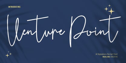 Venture Point is a modern signature script font. With upright consist mono-line stroke, fun character. To give you an extra creative work. Venture Point font support multilingual more than 100+ language. This font is good for logo design, Social media, Movie Titles, Books Titles, a short text even a long text letter and good for your secondary text font with sans or serif. Make a stunning work with Venture Point font. Cheers, Maulana Creative
 - Adget Sans by wearecolt,
$14.00 Adget Sans is a modern, strong statement typeface with clean lines and big curves. Inspired by classic geometric grotesque typefaces, this sans serif typeface is perfect for adding a striking title to your portfolio or website. This set includes ten individual weight fonts plus a variable weight font, Adget Sans consists of 328 glyphs across upper and lowercase, numerals, all European characters, linked letters and ligatures plus some bouns stylistic alternative characters.
 - Otterco by Adam Ladd,
$24.00 Otterco is a geometric sans serif with varied round and narrow characters. Blending a touch of retro and modern qualities, this typeface is clean and neutral but not boring. It’s professional yet unique and fun. The contrast in character widths creates a distinct visual rhythm and the vertical cut terminals keep it consistent, strong, and sharp looking. Constructed with a large x-height and low stroke contrast, it can fit a variety of applications.
 - Mensura by Graviton,
$20.00 Mensura font family has been designed for Graviton Font Foundry by Pablo Balcells in 2012. It is a modular, geometric typeface with subtle rounded angles that provides a soft, pleasent appearence. It has been conceived to be primarily a display typeface, but given its clarity it can also be used for composing short and intermediate length texts. Mensura consists of 8 styles and 4 weights plus italics. Each containing small caps and several alternate characters.