7,934 search results
(0.015 seconds)
- Binario by Tarallo Design,
$14.99 Binario is a simple and friendly font with three weights and matching obliques. The geometric and modular characteristics of this typeface subtly reference the Art Deco and early modernist periods. It is an ideal choice for achieving a clean, distinctive, and contemporary aesthetic, making it suitable for branding, posters, and screen-based designs. The light weight of Binario is good for body text. The regular weight exudes confidence, making it suitable for both body and heading text. For impactful headlines, the bold weight is superb. The clear weight distinction of this family make it easy to create organized text. Binario was designed in Siena, Italy taking some inspiration from train stations and shop signage. The name Binario means train platform in Italian. Other aspects that informed the design of this font are modularity and efficiency. The interior rounded forms of the letters (counterforms) are based on shape of the Roman arch. Binario has a sibling, Binario Soft. This version has gently rounded stroke ends, which make a softer impression on the page.
 - Europa Grotesk No. 2 SH by Scangraphic Digital Type Collection,
$26.00 Since the release of these fonts most typefaces in the Scangraphic Type Collection appear in two versions. One is designed specifically for headline typesetting (SH: Scangraphic Headline Types) and one specifically for text typesetting (SB Scangraphic Bodytypes). The most obvious differentiation can be found in the spacing. That of the Bodytypes is adjusted for readability. That of the Headline Types is decidedly more narrow in order to do justice to the requirements of headline typesetting. The kerning tables, as well, have been individualized for each of these type varieties. In addition to the adjustment of spacing, there are also adjustments in the design. For the Bodytypes, fine spaces were created which prevented the smear effect on acute angles in small typesizes. For a number of Bodytypes, hairlines and serifs were thickened or the whole typeface was adjusted to meet the optical requirements for setting type in small sizes. For the German lower-case diacritical marks, all Headline Types complements contain alternative integrated accents which allow the compact setting of lower-case headlines.
 - Croftler by LetterStock,
$23.00 Croftler This pair was inspired by old motorcycle poster design that i saw on some gellery, It was crafted by hand specially to add natural handmade feeling in its brand identity than i make it clean with pentool. We add some rough to make it retro feel, this font is bold so it can look strong if you use it for branding or even title for your retro poster design. Opentype features Croftler font has 201 character set included Walkingblue Font is very good looking in retro rough logotype, labels, t-shirt prints, product packaging, invitations, advertising and others. This fonts works with folowing languages: Afrikaans, Albanian, Asu, Basque, Bemba, Bena, Chiga, Cornish, Danish, English, Estonian, Filipino, Finnish, French, Friulian, Galician, German, Gusii, Indonesian, Irish, Italian, Kabuverdianu, Kalenjin, Kinyarwanda, Low German, Luo, Luxembourgish, Luyia, Machame, Makhuwa-Meetto, Makonde, Malagasy, Malay, Manx, Morisyen, North Ndebele, Norwegian Bokmål, Norwegian Nynorsk, Nyankole, Oromo, Portuguese, Romansh, Rombo, Rundi, Rwa, Samburu, Sango, Sangu, Scottish Gaelic, Sena, Shambala, Shona, Soga, Somali, Spanish, Swahili, Swedish, Swiss German, Taita, Teso, Vunjo, Zulu Thank you for using this font. LS
 - Data 70 SH by Scangraphic Digital Type Collection,
$26.00 Since the release of these fonts most typefaces in the Scangraphic Type Collection appear in two versions. One is designed specifically for headline typesetting (SH: Scangraphic Headline Types) and one specifically for text typesetting (SB Scangraphic Bodytypes). The most obvious differentiation can be found in the spacing. That of the Bodytypes is adjusted for readability. That of the Headline Types is decidedly more narrow in order to do justice to the requirements of headline typesetting. The kerning tables, as well, have been individualized for each of these type varieties. In addition to the adjustment of spacing, there are also adjustments in the design. For the Bodytypes, fine spaces were created which prevented the smear effect on acute angles in small typesizes. For a number of Bodytypes, hairlines and serifs were thickened or the whole typeface was adjusted to meet the optical requirements for setting type in small sizes. For the German lower-case diacritical marks, all Headline Types complements contain alternative integrated accents which allow the compact setting of lower-case headlines.
 - Inbadge by Blankids,
$30.00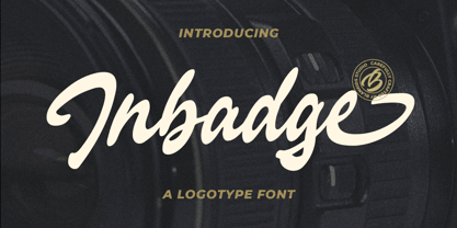 Hello, Are you looking for a modern trandy script font? Do you want of creating Something that stand out and inspire creativity, imagination, and endless fun? Wait no more, we will give you the best choice. Inbadge a Branding Logotype Font Inbadge a Branding Logotype Font, Inspiring from brush lettering style typography. This font is perfect for a design that makes it more attractive and playful. made with a very good level of aesthetics making this font suitable for book cover, poster, packging, merchandise, logotype and much more. Inbadge font includes Multilingual Support, among others : Afrikaans, Albanian, Asu, Basque, Bemba, Bena, Breton, Catalan, Chiga, Cornish, Danish, Dutch, English, Estonian, Faroese, Filipino, Finnish, French, Friulian, Galician, German, Gusii, Indonesian, Irish, Italian, Kabuverdianu, Kalenjin, Kinyarwanda, Luo, Luxembourgish, Luyia, Machame, Makhuwa, Meetto, Makonde, Malagasy, Manx, Morisyen, North Ndebele, Norwegian Bokmål, Norwegian Nynorsk, Nyankole, Oromo, Portuguese, Quechua, Romansh, Rombo, Rundi, Rwa, Samburu, Sango, Sangu, Scottish Gaelic, Sena, Shambala, Shona, Soga, Somali, Spanish, Swahili, Swedish, Swiss German, Taita, Teso, Uzbek (Latin), Volapük, Vunjo, Zulu FEATURES : Uppercase Lowercase Number Punctuation Multilingual PUA Encode Opentype
 - P22 Folkwang Pro by IHOF,
$29.95 Folkwang is an unusual roman type with a lowercase that resembles an upright italic. Unusual top serifs are contrasted by almost no foot serifs. Originally released by the Klingspor foundry in 1955, this face originated from Hermann Schardt while he was the director of the Folkwang Werkkunstschule in Essen Germany circa 1949. According to British book designer and printing historian John Dreyfus in the 1955 Penrose Annual: Folkwang “…is a lovingly made piece of work which could have easily have been little more than an act of awe-struck reverence for the calligraphic techniques rediscovered by Edward Johnston and spread abroad in Germany by Anna Simons. Of special interest is the serif treatment of the lower-case letters: at the feet the terminals are mostly left bare, but the ascenders and the cross-strokes of the f and t are given elaborate curving serifs which in the mass create an effect unusual in a page of letters made as movable types, resembling rather more a piece of intaglio engraving. The ligatures ch and ck are original and successful.”
 - Sloopy Joe by LetterStock,
$20.00 Sloopy Joe Sloopy Joe font is a decorative font that was inspired by logo design from my son toy's cardbox, and was crafted by hand to add a natural handmade feeling and i make it clean with pentool. If you looking for a new style decorative font for your title or even branding and logotype, this font is a great choice for that purpose. Opentype features Sloopy Joe font is very good looking in logotype, labels, decorative lettering, playful design, product packaging, invitation titled, advertising and others. This decorative font works with folowing languages: Afrikaans, Albanian, Asu, Basque, Bemba, Bena, Chiga, Cornish, Danish, English, Estonian, Filipino, Finnish, French, Friulian, Galician, Gusii, Indonesian, Irish, Italian, Kabuverdianu, Kalenjin, Kinyarwanda, Low German, Luo, Luxembourgish, Luyia, Machame, Makhuwa-Meetto, Makonde, Malagasy, Malay, Manx, Morisyen, North Ndebele, Norwegian Bokmål, Norwegian Nynorsk, Nyankole, Oromo, Portuguese, Romansh, Rombo, Rundi, Rwa, Samburu, Sango, Sangu, Scottish Gaelic, Sena, Shambala, Shona, Soga, Somali, Spanish, Swahili, Swedish, Swiss German, Taita, Teso, Vunjo, Zulu. Thank you for using this font. LS
 - Garamond Simoncini SB by Scangraphic Digital Type Collection,
$26.00Since the release of these fonts most typefaces in the Scangraphic Type Collection appear in two versions. One is designed specifically for headline typesetting (SH: Scangraphic Headline Types) and one specifically for text typesetting (SB Scangraphic Bodytypes). The most obvious differentiation can be found in the spacing. That of the Bodytypes is adjusted for readability. That of the Headline Types is decidedly more narrow in order to do justice to the requirements of headline typesetting. The kerning tables, as well, have been individualized for each of these type varieties. In addition to the adjustment of spacing, there are also adjustments in the design. For the Bodytypes, fine spaces were created which prevented the smear effect on acute angles in small typesizes. For a number of Bodytypes, hairlines and serifs were thickened or the whole typeface was adjusted to meet the optical requirements for setting type in small sizes. For the German lower-case diacritical marks, all Headline Types complements contain alternative integrated accents which allow the compact setting of lower-case headlines. - Caxton SH by Scangraphic Digital Type Collection,
$26.00Since the release of these fonts most typefaces in the Scangraphic Type Collection appear in two versions. One is designed specifically for headline typesetting (SH: Scangraphic Headline Types) and one specifically for text typesetting (SB Scangraphic Bodytypes). The most obvious differentiation can be found in the spacing. That of the Bodytypes is adjusted for readability. That of the Headline Types is decidedly more narrow in order to do justice to the requirements of headline typesetting. The kerning tables, as well, have been individualized for each of these type varieties. In addition to the adjustment of spacing, there are also adjustments in the design. For the Bodytypes, fine spaces were created which prevented the smear effect on acute angles in small typesizes. For a number of Bodytypes, hairlines and serifs were thickened or the whole typeface was adjusted to meet the optical requirements for setting type in small sizes. For the German lower-case diacritical marks, all Headline Types complements contain alternative integrated accents which allow the compact setting of lower-case headlines. - American Brush by Blankids,
$20.00 Hello, Are you looking for a brush font? Do you want of creating Something that stand out and inspire creativity, imagination, and endless fun? Wait no more, we will give you the best choice. American Brush a Modern Brush Font, Inspiring from lettering brush style typography. This font is perfect for a design that makes it more attractive and playful. made with a very good level of aesthetics making this font suitable for book cover, poster, packging, merchandise, logotype and much more. American Brush font includes Multilingual Support, among others : Afrikaans, Albanian, Asu, Basque, Bemba, Bena, Breton, Catalan, Chiga, Cornish, Danish, Dutch, English, Estonian, Faroese, Filipino, Finnish, French, Friulian, Galician, German, Gusii, Indonesian, Irish, Italian, Kabuverdianu, Kalenjin, Kinyarwanda, Luo, Luxembourgish, Luyia, Machame, Makhuwa, Meetto, Makonde, Malagasy, Manx, Morisyen, North Ndebele, Norwegian Bokmål, Norwegian Nynorsk, Nyankole, Oromo, Portuguese, Quechua, Romansh, Rombo, Rundi, Rwa, Samburu, Sango, Sangu, Scottish Gaelic, Sena, Shambala, Shona, Soga, Somali, Spanish, Swahili, Swedish, Swiss German, Taita, Teso, Uzbek (Latin), Volapük, Vunjo, Zulu FEATURES : Uppercase Lowercase Number Punctuation Multilingual PUA Encode Opentype
 - Nevison Casual SB by Scangraphic Digital Type Collection,
$26.00Since the release of these fonts most typefaces in the Scangraphic Type Collection appear in two versions. One is designed specifically for headline typesetting (SH: Scangraphic Headline Types) and one specifically for text typesetting (SB Scangraphic Bodytypes). The most obvious differentiation can be found in the spacing. That of the Bodytypes is adjusted for readability. That of the Headline Types is decidedly more narrow in order to do justice to the requirements of headline typesetting. The kerning tables, as well, have been individualized for each of these type varieties. In addition to the adjustment of spacing, there are also adjustments in the design. For the Bodytypes, fine spaces were created which prevented the smear effect on acute angles in small typesizes. For a number of Bodytypes, hairlines and serifs were thickened or the whole typeface was adjusted to meet the optical requirements for setting type in small sizes. For the German lower-case diacritical marks, all Headline Types complements contain alternative integrated accents which allow the compact setting of lower-case headlines. - Scribonius GTSLB by Intellecta Design,
$30.00 Blackletter typefaces, also known as Gothic, Fraktur, or Old English, have been used in the headings and initial chapters of books. This style of typeface is recognizable by its dramatic thin and thick strokes, and in some fonts, the elaborate swirls on the serifs. Blackletter typefaces are based on early manuscript lettering and evolved in Western Europe from the mid twelfth century. They are best used for headings, logos, posters, and signs, as they are not easy to read in body texts. Blackletter was type that emulated the most common handwritten scripts of the era and was used for books of hours and initial chapters of books Brazilian type designer Paulo W created this font ideally suited for advertising and packaging, festive occasions, editorial and publishing, logo, branding and creative industries as well as poster and billboards. An elegant and clean typeface, with two harmonic blackletters styles, the bold lowercases with beaufitul ornamented initials. A classic decorative design around an antique theme: The headings of gothic texts, this font works great in display purposes. ENJOY
 - Tooth & Nail by Set Sail Studios,
$12.00 Introducing Tooth & Nail; a rustic & hearty hand-painted dry brush font, designed to work in both all-caps as well as lowercase. It also includes a bonus vector pack, featuring 24 elements designed to boost your text and reaffirm it's hand-made style. With rough bold strokes and high quality textures throughout, Tooth & Nail is the perfect workhorse font for product packaging, promotional messages, handwritten quotes, home decor and branding projects. Tooth & Nail is reliable and familiar, like meeting someone for the first time and feeling like you've been reunited with an old friend. Tooth & Nail consists of 2 styles: 1. Tooth & Nail • A handwritten brush font containing upper & lowercase characters, numerals and a large range of punctuation. 2. Tooth & Nail Alt • This is a second version of Tooth & Nail, with a completely new set of lowercase characters. If you wanted to avoid letters looking the same each time to recreate a custom-made style, or try a different word shape, simply switch to this font for an additional layout option.
 - Beauty Thalita by Rastype Studio,
$20.00 Beauty Thalita and Extras are beautiful and modern fonts. Looks amazing on wedding invitations, thank you cards, birthday, tshirt desain, mothers day card, quotes, greeting cards, logos, business cards and any other design. This font is PUA encoded which means you can access all glyphs and swashes with ease! The font includes OpenType features with alternative styles, ligatures, and multiple language support. To enable OpenType Stylistic alternates, you need a program that supports OpenType features such as Adobe Illustrator CS, Adobe Indesign & CorelDraw X6-X7, Microsoft Word 2010 or a later version. There are additional ways to alternate / swash, using the Character Map (Windows), Nexus Font (Windows), Font Book (Mac) or a software program like PopChar (for Windows and Mac). How to access all alternative characters, using Windows Character Map with Photoshop: https://www.youtube.com/watch?v=Go9vacoYmBw How to access all alternative characters using Adobe Illustrator: http://youtu.be/iptSFA7feQ0 How to use a style font set in Microsoft Word 2010 or later versions: https://youtu.be/x1A_ilsBsGs Happy Designing!
 - Janson SB by Scangraphic Digital Type Collection,
$26.00Since the release of these fonts most typefaces in the Scangraphic Type Collection appear in two versions. One is designed specifically for headline typesetting (SH: Scangraphic Headline Types) and one specifically for text typesetting (SB Scangraphic Bodytypes). The most obvious differentiation can be found in the spacing. That of the Bodytypes is adjusted for readability. That of the Headline Types is decidedly more narrow in order to do justice to the requirements of headline typesetting. The kerning tables, as well, have been individualized for each of these type varieties. In addition to the adjustment of spacing, there are also adjustments in the design. For the Bodytypes, fine spaces were created which prevented the smear effect on acute angles in small typesizes. For a number of Bodytypes, hairlines and serifs were thickened or the whole typeface was adjusted to meet the optical requirements for setting type in small sizes. For the German lower-case diacritical marks, all Headline Types complements contain alternative integrated accents which allow the compact setting of lower-case headlines. - Caslon Black SH by Scangraphic Digital Type Collection,
$26.00 Since the release of these fonts most typefaces in the Scangraphic Type Collection appear in two versions. One is designed specifically for headline typesetting (SH: Scangraphic Headline Types) and one specifically for text typesetting (SB Scangraphic Bodytypes). The most obvious differentiation can be found in the spacing. That of the Bodytypes is adjusted for readability. That of the Headline Types is decidedly more narrow in order to do justice to the requirements of headline typesetting. The kerning tables, as well, have been individualized for each of these type varieties. In addition to the adjustment of spacing, there are also adjustments in the design. For the Bodytypes, fine spaces were created which prevented the smear effect on acute angles in small typesizes. For a number of Bodytypes, hairlines and serifs were thickened or the whole typeface was adjusted to meet the optical requirements for setting type in small sizes. For the German lower-case diacritical marks, all Headline Types complements contain alternative integrated accents which allow the compact setting of lower-case headlines.
 - Harlow SB by Scangraphic Digital Type Collection,
$26.00Since the release of these fonts most typefaces in the Scangraphic Type Collection appear in two versions. One is designed specifically for headline typesetting (SH: Scangraphic Headline Types) and one specifically for text typesetting (SB Scangraphic Bodytypes). The most obvious differentiation can be found in the spacing. That of the Bodytypes is adjusted for readability. That of the Headline Types is decidedly more narrow in order to do justice to the requirements of headline typesetting. The kerning tables, as well, have been individualized for each of these type varieties. In addition to the adjustment of spacing, there are also adjustments in the design. For the Bodytypes, fine spaces were created which prevented the smear effect on acute angles in small typesizes. For a number of Bodytypes, hairlines and serifs were thickened or the whole typeface was adjusted to meet the optical requirements for setting type in small sizes. For the German lower-case diacritical marks, all Headline Types complements contain alternative integrated accents which allow the compact setting of lower-case headlines. - Kindly by Up Up Creative,
$16.00 Introducing Kindly, a friendly, hand-drawn, all-caps font with tons of symbols, wingdings, and word art. I’ve been developing this style of lettering for years in my custom design and lettering work, and now I’ve taken the time to turn it into something anyone can use to design with authentic, hand-drawn typography. Kindly is perfect for invitations, design for children, branding, and editorial design and comes with more than 100 extra elements to bring some fun to your layouts. Kindly comes with 504 glyphs and a smattering of OpenType features, including stylistic sets, character variants, and multilingual support (including multiple currency symbols). The OpenType features can be very easily accessed by using OpenType-savvy programs such as Adobe Illustrator and Adobe InDesign. (To access these awesome features in Microsoft Word, you'll need to get comfortable with the advanced tab of Word's font menu. If you need help with this, ask me!) The wingdings, word art, and other fun elements are all PUA-encoded so you can easily use them in OpenType-savvy software or with a character map.
 - Kiester by Adam Fathony,
$23.00 Kiester, A Display Typefaces with Variable Weight. Kiester is a modern elegant variable font. Basically this is a Sans with a small touch of serif on every letters. A Simplicity yet very legible with various width and weight that you can explore, combine, create and help you designing something such as Poster, Headlines, Logotype, Branding, and etc. In a Total of 5 Style Font even more if you are using the Single Files Variable, you can slide the weight on the sweetest spot of Kiester. Language Support : Afrikaans, Albanian, Asu, Basque, Bemba, Bena, Catalan, Chiga, Cornish, Danish, Dutch, English, Estonian, Faroese, Filipino, Finnish, French, Friulian, Galician, Ganda, German, Greek, Gusii, Icelandic, Indonesian, Irish, Italian, Jola-Fonyi, Kabuverdianu, Kalenjin, Kinyarwanda, Low German, Luo, Luxembourgish, Luyia, Machame, Makhuwa-Meetto, Makonde, Malagasy, Malay, Manx, Morisyen, North Ndebele, Norwegian Bokmål, Norwegian Nynorsk, Nyankole, Oromo, Portuguese, Romansh, Rombo, Rundi, Rwa, Samburu, Sango, Sangu, Scottish Gaelic, Sena, Shambala, Shona, Soga, Somali, Spanish, Swahili, Swedish, Swiss German, Taita, Teso, Vunjo, Welsh, Western Frisian, Wolof, Zulu
 - Candida SB by Scangraphic Digital Type Collection,
$26.00Since the release of these fonts most typefaces in the Scangraphic Type Collection appear in two versions. One is designed specifically for headline typesetting (SH: Scangraphic Headline Types) and one specifically for text typesetting (SB Scangraphic Bodytypes). The most obvious differentiation can be found in the spacing. That of the Bodytypes is adjusted for readability. That of the Headline Types is decidedly more narrow in order to do justice to the requirements of headline typesetting. The kerning tables, as well, have been individualized for each of these type varieties. In addition to the adjustment of spacing, there are also adjustments in the design. For the Bodytypes, fine spaces were created which prevented the smear effect on acute angles in small typesizes. For a number of Bodytypes, hairlines and serifs were thickened or the whole typeface was adjusted to meet the optical requirements for setting type in small sizes. For the German lower-case diacritical marks, all Headline Types complements contain alternative integrated accents which allow the compact setting of lower-case headlines. - NewTel SB by Scangraphic Digital Type Collection,
$26.00Since the release of these fonts most typefaces in the Scangraphic Type Collection appear in two versions. One is designed specifically for headline typesetting (SH: Scangraphic Headline Types) and one specifically for text typesetting (SB Scangraphic Bodytypes). The most obvious differentiation can be found in the spacing. That of the Bodytypes is adjusted for readability. That of the Headline Types is decidedly more narrow in order to do justice to the requirements of headline typesetting. The kerning tables, as well, have been individualized for each of these type varieties. In addition to the adjustment of spacing, there are also adjustments in the design. For the Bodytypes, fine spaces were created which prevented the smear effect on acute angles in small typesizes. For a number of Bodytypes, hairlines and serifs were thickened or the whole typeface was adjusted to meet the optical requirements for setting type in small sizes. For the German lower-case diacritical marks, all Headline Types complements contain alternative integrated accents which allow the compact setting of lower-case headlines. - DIN Next Rounded by Monotype,
$56.99 The name DIN refers to the Deutsches Institut für Normung (in English, the German Institute for Standardization). The typeface began life as the DIN Institute's standard no. DIN 1451, published in 1931. It contained several models of standard alphabets for mechanically engraved lettering, hand-lettering, lettering stencils and printing types. These were to be used in the areas of signage, traffic signs, wayfinding, lettering on technical drawings and technical documentation. Rooted in earlier designs for Germany's railway companies, the alphabets were based on geometric shapes in order to be easily reproducible using compass and ruler. In post-1945 West Germany, the DIN alphabets were widely used, for instance on most road signs. They became available as fonts that were appreciated by designers for their industrial, somewhat quirky and “non-typographic” look and feel. From the 1990s onwards, more refined versions became available for use in book and magazine typography. DIN Next is a typographically corrected and expanded version of this quintessential 20th-century design. DIN Next Rounded is its softer, friendlier version.
 - Vermors by Blankids,
$25.00 Hello, Are you looking for a vintage playful font? Do you want of creating Something that stand out and inspire creativity, imagination, and endless fun? Wait no more, we will give you the best choice. Vermors a Vintage Serif Font Vermors a Vintage Serif Font a Vintage Display Font, Inspiring from vintage style typography. This font is perfect for a design that makes it more attractive and playful. made with a very good level of aesthetics making this font suitable for book cover, poster, packging, merchandise, logotype and much more. Vermors font includes Multilingual Support, among others : Afrikaans, Albanian, Asu, Basque, Bemba, Bena, Breton, Catalan, Chiga, Cornish, Danish, Dutch, English, Estonian, Faroese, Filipino, Finnish, French, Friulian, Galician, German, Gusii, Indonesian, Irish, Italian, Kabuverdianu, Kalenjin, Kinyarwanda, Luo, Luxembourgish, Luyia, Machame, Makhuwa, Meetto, Makonde, Malagasy, Manx, Morisyen, North Ndebele, Norwegian Bokmål, Norwegian Nynorsk, Nyankole, Oromo, Portuguese, Quechua, Romansh, Rombo, Rundi, Rwa, Samburu, Sango, Sangu, Scottish Gaelic, Sena, Shambala, Shona, Soga, Somali, Spanish, Swahili, Swedish, Swiss German, Taita, Teso, Uzbek (Latin), Volapük, Vunjo, Zulu FEATURES : Uppercase Lowercase Number Punctuation Multilingual PUA Encode Opentype
 - Uni Neue by Fontfabric,
$29.00 Uni Neue is the whole new redesigned version (remake) of Uni Sans – one of the most recognizable and signature font families of Fontfabric type foundry. From major changes like proportions, widths and thickness (weights) to the smaller details, this new family enables us to feel and understand the font at a completely new level. Uni Neue is а modern sans serif with a distinctive character and geometric feel. The rounded corners give the typeface a friendly look, yet it retains a professional quality suitable for branding even the most serious corporate identities. The attention to detail paid during its development means that this typeface offers a vast range of design possibilities – it helps users create eye-catching designs and brands that really stand out. It is perfect for TV, screen, editorial and publishing, logos, branding, advertising and packaging. It supports a wide range of languages, including Extended Latin, Cyrillic and Greek. The family has seven weights, ranging from Thin to Black, with corresponding italics. The font was manually hinted to ensure great web and desktop performance.
 - Tweed SG by Spiece Graphics,
$39.00 Tweed is a journey into the 1930s world of hand-lettering. The design looks very much like the personal scribblings of an old-fashioned cartoon animator. It’s the sort of sketch-style you might find describing a goofy caterpillar or laughing willyworm. Tweed is fun and light-hearted with open and rounded letters of a somewhat musical quality. Derived from old letterforms popularized by Carl Holmes in his wonderful book on the subject, Tweed is basically friendly in nature. This typeface is great for personal greeting cards and stationery - any kind of casual correspondence. It works well in display situations, too. And yes, there is an alternate to the funny-looking “w” character. Just press option l (el) on Mac. Or Alt 0172 on Windows. Tweed is now available in the OpenType Std format. Some new stylistic alternates have been added to this OpenType version. Advanced features work in current versions of Adobe Creative Suite InDesign, Creative Suite Illustrator, and Quark XPress. Check for OpenType advanced feature support in other applications as it gradually becomes available with upgrades.
 - Futura SB by Scangraphic Digital Type Collection,
$26.00Since the release of these fonts most typefaces in the Scangraphic Type Collection appear in two versions. One is designed specifically for headline typesetting (SH: Scangraphic Headline Types) and one specifically for text typesetting (SB Scangraphic Bodytypes). The most obvious differentiation can be found in the spacing. That of the Bodytypes is adjusted for readability. That of the Headline Types is decidedly more narrow in order to do justice to the requirements of headline typesetting. The kerning tables, as well, have been individualized for each of these type varieties. In addition to the adjustment of spacing, there are also adjustments in the design. For the Bodytypes, fine spaces were created which prevented the smear effect on acute angles in small typesizes. For a number of Bodytypes, hairlines and serifs were thickened or the whole typeface was adjusted to meet the optical requirements for setting type in small sizes. For the German lower-case diacritical marks, all Headline Types complements contain alternative integrated accents which allow the compact setting of lower-case headlines. - Xylo Macloud by LetterStock,
$23.00 Xylo Macloud This pair was inspired by wallpaper design that i saw at my friend's garage, it was crafted by hand specially to add natural handmade feeling in its brand identity than i make it clean with pentool. Opentype features Xylo Macloud font has 204 character set included. This font is very good for design logo, labels, packaging product, invitations, advertising and others. This font will make your design authentic, unique and good looking with modern calligraphy style. If you're looking for authentic decorative serif font, this item is a great choice to make your design looks great, unique and authentic. This fonts works with following languages: Afrikaans, Albanian, Asu, Basque, Bemba, Bena, Chiga, Cornish, Danish, English, Estonian, Filipino, Finnish, French, Friulian, Galician, German, Gusii, Indonesian, Irish, Italian, Kabuverdianu, Kalenjin, Kinyarwanda, Low German, Luo, Luxembourgish, Luyia, Machame, Makhuwa-Meetto, Makonde, Malagasy, Malay, Manx, Morisyen, North Ndebele, Norwegian Bokmål, Norwegian Nynorsk, Nyankole, Oromo, Portuguese, Romansh, Rombo, Rundi, Rwa, Samburu, Sango, Sangu, Scottish Gaelic, Sena, Shambala, Shona, Soga, Somali, Spanish, Swahili, Swedish, Swiss German, Taita, Teso, Vunjo, Zulu Thank you for using this font. LS
 - Bellamind by LetterStock,
$23.00 Bellamind This pair was inspired by vintage poster at music store that i saw few weeks ago, it was crafted by hand specially to add natural handmade feeling in its brand identity than i make it clean with pentool. Opentype features Bellamind font has 219 character set included. This font is very good for design logo, labels, packaging product, invitations, advertising and others. This font will make your design authentic, unique and good looking with modern calligraphy style. If you're looking for unique serif decorative font, this item is a great choice to make your design looks great and unique. This fonts works with following languages: Afrikaans, Albanian, Asu, Basque, Bemba, Bena, Chiga, Cornish, Danish, English, Estonian, Filipino, Finnish, French, Friulian, Galician, German, Gusii, Indonesian, Irish, Italian, Kabuverdianu, Kalenjin, Kinyarwanda, Low German, Luo, Luxembourgish, Luyia, Machame, Makhuwa-Meetto, Makonde, Malagasy, Malay, Manx, Morisyen, North Ndebele, Norwegian Bokmål, Norwegian Nynorsk, Nyankole, Oromo, Portuguese, Romansh, Rombo, Rundi, Rwa, Samburu, Sango, Sangu, Scottish Gaelic, Sena, Shambala, Shona, Soga, Somali, Spanish, Swahili, Swedish, Swiss German, Taita, Teso, Vunjo, Zulu Thank you for using this font. LS
 - Crillee SB by Scangraphic Digital Type Collection,
$26.00Since the release of these fonts most typefaces in the Scangraphic Type Collection appear in two versions. One is designed specifically for headline typesetting (SH: Scangraphic Headline Types) and one specifically for text typesetting (SB Scangraphic Bodytypes). The most obvious differentiation can be found in the spacing. That of the Bodytypes is adjusted for readability. That of the Headline Types is decidedly more narrow in order to do justice to the requirements of headline typesetting. The kerning tables, as well, have been individualized for each of these type varieties. In addition to the adjustment of spacing, there are also adjustments in the design. For the Bodytypes, fine spaces were created which prevented the smear effect on acute angles in small typesizes. For a number of Bodytypes, hairlines and serifs were thickened or the whole typeface was adjusted to meet the optical requirements for setting type in small sizes. For the German lower-case diacritical marks, all Headline Types complements contain alternative integrated accents which allow the compact setting of lower-case headlines. - Fearlessly Authentic by Ahmad Jamaludin,
$19.00 Say hello to the new classic nineties retro font, Fearlessly Authentic! The trend is to make thin serif fonts that made the 80s and 90s style, so we wanted to make them too but with a different touch. Make it slightly rounded for a retro look and make your design look great! Fearlessly Authentic - A classic nineties retro with a complementary italic version. In the italic family, we make it different from the regular and make a shape with a unique uppercase so it looks more classic, retro but a little modern We've also been loving combining the regular and italic, especially for logos (see the "Symphatize logo, image #3) Included : Regular and Italic Letters, numbers, symbols, and punctuation Use in many programs even in Canva Multilingual Support Language Support: Danish, English, Estonian, Filipino, Finnish, French, Friulian, Galician, German, Gusii, Indonesian, Irish, Italian, Luxembourgish, Norwegian Bokmål, Norwegian Nynorsk, Nyankole, Oromo, Portuguese, Romansh, Rombo, Spanish, Swedish, Swiss-German, Uzbek (Latin) Come and say hello over on Instagram! https://www.instagram.com/dharmas.studio/ Dharmas Studio
 - Ansage by Sudtipos,
$49.00 Ansage does not claim to be neutral; it escapes from the rationalist sans of closed strokes and regular forms. Meaning Announcement in German, Ansage is versatile and communicates effectively across a broad range of media and formats such as branding, posters, websites, apps, titles and compositions with little spacing). Ansage is a sans serif font with a strong personality that emerges from an interest in and the study of a wide variety of typographic specimens of Gothic fonts from the nineteenth century. The design process behind Ansage brought about constant transformations in form; the result is a compact and robust font, with a large x-height, small ascenders and descenders, and open terminals that grow in expressiveness as it increases in weight. It is available in 10 weights, ranging from Hairline to Black, and 3 widths – Condensed, Regular and Expanded – plus italics, which make a total of 60 perfect variables to combine and contrast with each other. In addition, it also includes multiple open-type functions such as alternative styles, Old Style Figures, Tabular Forms, fractions, case sensitive, ligatures and more.
 - Garamont Amsterdam SH by Scangraphic Digital Type Collection,
$26.00Since the release of these fonts most typefaces in the Scangraphic Type Collection appear in two versions. One is designed specifically for headline typesetting (SH: Scangraphic Headline Types) and one specifically for text typesetting (SB Scangraphic Bodytypes). The most obvious differentiation can be found in the spacing. That of the Bodytypes is adjusted for readability. That of the Headline Types is decidedly more narrow in order to do justice to the requirements of headline typesetting. The kerning tables, as well, have been individualized for each of these type varieties. In addition to the adjustment of spacing, there are also adjustments in the design. For the Bodytypes, fine spaces were created which prevented the smear effect on acute angles in small typesizes. For a number of Bodytypes, hairlines and serifs were thickened or the whole typeface was adjusted to meet the optical requirements for setting type in small sizes. For the German lower-case diacritical marks, all Headline Types complements contain alternative integrated accents which allow the compact setting of lower-case headlines. - Boldsky by Blankids,
$15.00 Hello, Are you looking for a bold playful font? Do you want of creating Something that stand out and inspire creativity, imagination, and endless fun? Wait no more, we will give you the best choice. Boldsky a Playful Font Boldsky a Playful Font, Inspiring from Playful typography. This font is perfect for a design that makes it more attractive and playful. made with a very good level of aesthetics making this font suitable for book cover, poster, packging, merchandise, logotype and much more. Boldsky font includes Multilingual Support, among others : Afrikaans, Albanian, Asu, Basque, Bemba, Bena, Breton, Catalan, Chiga, Cornish, Danish, Dutch, English, Estonian, Faroese, Filipino, Finnish, French, Friulian, Galician, German, Gusii, Indonesian, Irish, Italian, Kabuverdianu, Kalenjin, Kinyarwanda, Luo, Luxembourgish, Luyia, Machame, Makhuwa, Meetto, Makonde, Malagasy, Manx, Morisyen, North Ndebele, Norwegian Bokmål, Norwegian Nynorsk, Nyankole, Oromo, Portuguese, Quechua, Romansh, Rombo, Rundi, Rwa, Samburu, Sango, Sangu, Scottish Gaelic, Sena, Shambala, Shona, Soga, Somali, Spanish, Swahili, Swedish, Swiss German, Taita, Teso, Uzbek (Latin), Volapük, Vunjo, Zulu FEATURES : Uppercase Lowercase Number Punctuation Multilingual PUA Encode Opentype
 - Relato Sans by Emtype Foundry,
$69.00 Relato Sans is the other face of Relato Serif (a typeface with much idiosyncrasy) nevertheless, the sans version of this typeface is more austere and aseptic. A humanistic type, with a contemporary cut, created for general use in texts and holders and with a great variety of weights, which allow enough flexibility for projects of great magnitude. Although leading with an independent family it maintains many of the characteristics of its homologous such as proportions, the “x” height, the construction based on air lines of the italic, ornaments and so on. These details show coherence with the serif version, and at the same time reinforce its personality. Being a multifunctional type, the “kerning” has been worked to function in small sizes as well as in larger ones such as holders. The contrast between weights, was optimized to be used in pairs (Light with Semibold, Regular with Bold and Medium with Black). Relato Sans is presented in 6 different weights, in Roman, Italic, Small Caps and Small Caps Italic with three different styles of numerals, Old style figures, Lining figures and Small Caps figures.
 - Belwe SH by Scangraphic Digital Type Collection,
$26.00Since the release of these fonts most typefaces in the Scangraphic Type Collection appear in two versions. One is designed specifically for headline typesetting (SH: Scangraphic Headline Types) and one specifically for text typesetting (SB Scangraphic Bodytypes). The most obvious differentiation can be found in the spacing. That of the Bodytypes is adjusted for readability. That of the Headline Types is decidedly more narrow in order to do justice to the requirements of headline typesetting. The kerning tables, as well, have been individualized for each of these type varieties. In addition to the adjustment of spacing, there are also adjustments in the design. For the Bodytypes, fine spaces were created which prevented the smear effect on acute angles in small typesizes. For a number of Bodytypes, hairlines and serifs were thickened or the whole typeface was adjusted to meet the optical requirements for setting type in small sizes. For the German lower-case diacritical marks, all Headline Types complements contain alternative integrated accents which allow the compact setting of lower-case headlines. - Vega SB by Scangraphic Digital Type Collection,
$26.00Since the release of these fonts most typefaces in the Scangraphic Type Collection appear in two versions. One is designed specifically for headline typesetting (SH: Scangraphic Headline Types) and one specifically for text typesetting (SB Scangraphic Bodytypes). The most obvious differentiation can be found in the spacing. That of the Bodytypes is adjusted for readability. That of the Headline Types is decidedly more narrow in order to do justice to the requirements of headline typesetting. The kerning tables, as well, have been individualized for each of these type varieties. In addition to the adjustment of spacing, there are also adjustments in the design. For the Bodytypes, fine spaces were created which prevented the smear effect on acute angles in small typesizes. For a number of Bodytypes, hairlines and serifs were thickened or the whole typeface was adjusted to meet the optical requirements for setting type in small sizes. For the German lower-case diacritical marks, all Headline Types complements contain alternative integrated accents which allow the compact setting of lower-case headlines. - Ahattom Script by Creative Lafont,
$10.00 Ahattom is modern script font, every single letters have been carefully crafted to make your text looks beautiful. With modern script style this font will perfect for many different project, e.g : quotes, blog header, poster, wedding, branding, logo, fashion, apparel, letter, invitation, stationery, etc. Ahattom including alternate glyphs and beautiful swirl in a font including stylistic sets, Ligatures etc. The Open Type features can be accessed by using Open Type savvy programs such as Adobe Illustrator CS, Adobe Indesign & CorelDraw X6-X7 and Microsoft Word. And this Font has given PUA unicode (specially coded fonts). so that all the alternate characters can easily be accessed in full by a craftsman or designer. Files Include : - Ahattom Script Features: - Basic Latin A-Z and a-z - Numbers & Symbols - Stylistic Set &Ligature - PUA Encode - Latin Pro Support Character In order to use the beautiful swashes, you need a program that supports OpenType features such as Adobe Illustrator CS, Adobe Photoshop CC, Adobe Indesign and Corel Draw. Thanks for looking and happy designing :-)
 - Eurotypo BKL by Eurotypo,
$28.00 Eurotypo BKL is a family of fonts inspired in on one of the most beautiful British Typography ever done. This version of Baskerville tries to reflect the taste of his fine style, compatible with the bluntness of the digital present. As many other designers and foundries, our intention has been to represent the atmosphere of Baskerville's style, than simply relive the shapes of its letters. Actually, capitals fits almost to a square proportions, lowercases are more open, ascenders and descenders are shorter, offering more space for enlarge the "x" high. The beauty of his letterforms can enrich headlines; this font can also be used as body text for its good legibility and accurate kerning. John Baskerville (1706-1775) was born 1706 in Wolverley, England. He was a great typographer and printer who published a remarkable edition of Virgil in 1757. His typefaces were greatly admired by Benjamin Franklin; He also has improved and developed many innovations in printing, paper and ink production. Baskerville’s typefaces are regarded as transitional types that represents the link between Old Roman Style and Modern Roman typography.
 - DT Meman by DT Foundry,
$25.00 Meman is a practical sans serif that was enthusiastic about adding details to have more personality compared to a neo-grotesque typeface. The typeface was crafted between the concepts of mechanical oval forms and serpentine curves, with the help from open terminals, contrast joints. These 2 concepts are very different, but they balanced each other to help remain the neutral feeling as a whole. Many details are optimized so that on small scales, Meman has nothing special. But when use on bigger scales, letters are revealed to have been dived in visual flourishes, such as the "e". Also, to avoid broken fragments and remain neutral, some details were converted to alternatives. Meman has 9 upright weights (from Thin to Black), and some OpenType features like fractions, ligatures, custom decorative icons, and alternatives for "A", "E", "V", "Z", ... or "a". There are more than 660 glyphs, which support a wide range of Latin languages, including Vietnamese. For usability, the typeface was balanced and versatile, it can be pinned up as a headline or logo, and can still blend in a small paragraph.
 - Belwe SB by Scangraphic Digital Type Collection,
$26.00 Since the release of these fonts most typefaces in the Scangraphic Type Collection appear in two versions. One is designed specifically for headline typesetting (SH: Scangraphic Headline Types) and one specifically for text typesetting (SB Scangraphic Bodytypes). The most obvious differentiation can be found in the spacing. That of the Bodytypes is adjusted for readability. That of the Headline Types is decidedly more narrow in order to do justice to the requirements of headline typesetting. The kerning tables, as well, have been individualized for each of these type varieties. In addition to the adjustment of spacing, there are also adjustments in the design. For the Bodytypes, fine spaces were created which prevented the smear effect on acute angles in small typesizes. For a number of Bodytypes, hairlines and serifs were thickened or the whole typeface was adjusted to meet the optical requirements for setting type in small sizes. For the German lower-case diacritical marks, all Headline Types complements contain alternative integrated accents which allow the compact setting of lower-case headlines.