7,934 search results
(0.023 seconds)
- Mundbind NL by Hanoded,
$15.00 I just visited my good friend Jakob Fischer from Pizzadude.dk in Denmark. As always we talked fonts, drank coffee and walked endlessly through Copenhagen, the city where he lives. We thought it would be a fun idea to each create a font from a handmade sign we saw in the city. We only had like 7 glyphs to work with, so the rest was up to our imagination. We also thought it would be nice to give the fonts a similar name. Mundbind means mask in Danish. When you Google translate it, it will give you the wrong translation (it will say 'mouth piece'), so trust me on this one! My font is called Mundbind NL - where the NL stands for Netherlands. Jakob will hopefully call his finished font Mundbind DK - where the DK stands for Denmark. Mundbind NL comes with a monster load of diacritics (including Vietnamese) and two alternate glyphs for the lower case letters that will cycle as you type.
 - Mercurial by Grype,
$16.00 Geometric/Technical style logotypes have been developed for car chrome labels since the early 1980’s, but automobile companies don't monopolize the style by any means. During the 80’s and 90’s, a lot of these logos leaned towards the geometric sans styles and the swiss styling of fonts like Handel Gothic, while playing with varying degrees of squared rounds and varying expanded widths per logotype. Mercurial has this flavor, but it wasn’t derived from logotypes. Instead, it began as a digitization of a film typeface from LetterGraphics in the early 70's known as "Sam". It visual ties to this genre of automotive logotypes and fonts like Handel Gothic lend a familiarity to it, yet it has an identity all its own. As with so many automotive logotypes, this singular style film typeface, lacked an expansive family which shows off all potential the logotypes have and what they "could" be and do. And that's where we come in. What originally began as this family’s Regular Width - Bold Style has been expanded into a collection of 3 Width Families, each containing 5 Weights. Here’s what’s included with the Mercurial Complete bundle: 396 glyphs per style - including Capitals, Lowercase, Numerals, Punctuation and an extensive character set that covers multilingual support of latin based languages. (see the final poster graphics for a preview of the characters included) 3 widths in the collection: Narrow, Regular, & Wide 5 weights in each width family: Light, Book, Regular, Medium & Bold. Here’s why the Mercurial Family is for you: - You’re in need of stylish sans font family with a range of widths and weights. - You’re love those 80’s automotive logos, but want more range of use. - You’re looking for an alternative to Handel Gothic. - You’re looking for a clean techno typeface for your rave poster designs. - You just like to collect quality fonts to add to your design arsenal.
 - TE Banner by Tharwat Emara,
$49.00 This font may be conservative and classic, but also may be more playful and modern. It is good for theater or art posters and for modern music, web-pictures or vinyl covers. Of course it also will be good for coffee shops, cafe's, restaurants, magazine's headers, signs or gift/post cards and weddings. Try to use it in your beauty or travel blogs, you will see how many options you will have with stylish Banner Font.
 - Snuggle Punk by PizzaDude.dk,
$17.00 To snuggle is "settle or move into a warm, comfortable position" - that is exactly what I did with making this chunky seriffed font. Well, maybe not a position, but a comfortable mood! I tried to mix some gentle grafitti moves and comic letters, and then a touch of the classic goofy pizzadude style - and the result is this cheeky font called Snuggle Punk. Full of round corners and fat lines - sounds like a nice cup of coffee! :)
 - CoffeeMug by Ingrimayne Type,
$10.00 CoffeeMug has letters on coffee mugs. Upper-case letters have the handles to the left and lower-case characters have the handles to the right. The letters on the mugs are from the typeface InsideLetters. The typeface contains characters that will add color to letters. There are two ways to do this. One uses layers and the other a combination of characters, some with zero-width. A file in the gallery explains the ways that this can be done.
 - Bokar by Pelavin Fonts,
$25.00 I am inspired by imagery that technology has rendered obsolete. I treasure anachronistic packaging and design which has somehow evaded obliteration by focus groups.I especially admire the packaging for A&P coffee brands Eight O'Clock, Red Circle and Bokar whose eccentric yet elegant typography harkens back to an earlier, less complicated era. The font Bokar is my nod of appreciation to those robust and full-bodied blends spared from the bland, tasteless scourge of corporate branding.
 - Gazella by Raditya Type,
$14.00 GAZELLA Displays Fonts. This font has a unique and bold typeface, making it suitable for unique design themes. The unique binding of the serifs makes this typeface cool and stands out from the usual serif fonts, perfect for headlines, logos, posters, packaging, T-shirts, coffee shops, restaurants, magazine headers, signs or gift/post cards, cafes and weddings or any kind of advertising purposes. GAZELLA comes with uppercase, lowercase, Numbers, Punctuation, Ligatures and also Multi Language Support.
 - CompassOne by Ingrimayne Type,
$9.00 CompassOne was a design I began in 1990 or so, but did not bother to finish until five years later. Its name comes from the fact that all the letters could have been drawn with a compass (which draws circles) and a straight edge. The typeface Demotte was a further development of this design idea.
 - Payload by Device,
$29.00 Payload began as an early concept for Loaded magazine, and here is developed into a clean outline and rough splattery spraycan version. In this font, the upper and lower case characters are subtly different enabling a more realistic appearance to be achieved by ßipping between cases whenever characters occur together in pairs. Wide and Narrow styles of this popular font have been subsequently been added. This font is reminicent of military stencilling, urban graffiti and freight packaging. The "Outline" version, as before, is a carefully weighted addition where the thickness of the stroke is identical to the stencil gap. It has also been respaced and rekerned to allow for the additional character spread.
 - Bazaruto by Stiggy & Sands,
$29.00 Our Bazaruto family was inspired by an old fashioned specimen from “Letters and Lettering” by Carlyle & Oring, but you'll find the inspiration has been greatly expounded upon. What began as an all Capitals specimen has been fleshed out to an extended full character set with many features and variants from the original design. Bazaruto has been an exercise in typographic evolution. The original Art Deco style spawned an Engraved version, then a Bodoni-esque text style, and then a monoline version of that text style (both of the latter complete with Obliques). But after that is when the real interpretations of form began with the development of the Iron fonts, playing off the original specimen having a visual flavor of wrought ironwork in them, and blending that into the Bodoni-esque typestyles. Lastly, a fast and loose hand drawn version of the Iron fonts and an ornaments font were created to add more variety and spunk to the family. The Bazaruto family is a visual grab bag of styles which all have an underlying harmony.
 - F2F Whale Tree by Linotype,
$29.99Heavy techno music, a personal computer, a font creation program and some inspiration had been the sources to the Face 2 Face font series. Thomas Nagel and his friends had the demand to create new unusual faces that should be used in the leading german techno magazine Frontpage" Even typeset in 6 point to nearly unreadability it was a pleasure for the kids to read and decrypt the messages. WhaleTree is a hommage to Walbaum. The word is a gemanized translation where Wal means Whale and Baum means Tree. :-)" - F2F Al Retto by Linotype,
$29.99The Techno sound of the 1990s, a personal computer, a font creation software and some inspiration had been the sources to the F2F (Face2Face) font series. Alessio Leonardi and his friends had the demand to create new unusual faces that should be used in the leading german techno magazine "Frontpage". Even typeset in 6 point to nearly unreadability it was a pleasure for the kids to read and decrypt the messages. About Al Retto: "Al" means "Alessio Leonardi" and Retto "straight", but if you read it as an italian world means "in the a**". - CoffeeBreak by Andinistas,
$36.00 The coffee made typography. CoffeeBreak is a typefamily designed by Carlos Fabian Camargo G. Its purpose is to communicate similar feelings to the ones you get when you first try the best roasted Colombian coffee early in the morning. That is the reason of the waiting, accompanied, or when you only want to be, nuances your design with its fonts full of flavor, texture and passion. For each time, every time, it gives you hints of flavor to design your day. It unleashes your artistic streak mixing possibilities as you wish, to your taste or the taste of your friends or that special someone. From handwriting to every warm drop of your first mug of the morning, we've always got something for you. Eye catching, modern, beautiful, cool and adventurous styles in the CoffeeBrwak shop ready for you to purchase. - CoffeeBreak A & B: 2 typographic tools with countless swashes and ligatures ideal for use at the beginning, in the middle or end of words that need italics, flavored dancers and rhythm masterfully expressed in gestural strokes for his calligraphic experimental logic. - Coffee Break Script 1 & 2: write them you can easily with decorative letters advocating a return to the artisan product ingenuity of the primacy of man over machine so your upper and lower case letters travel in a single line. - CoffeeBreak Words & WordsBold: It contains words specially designed to attract attention. - CoffeeBreak Dingbats: They are figurative silhouettes with textures that add warmth and a highly communicative environment. All are easily activated glyphs using the Glyphs panel in Illustrator, InDesign and Photoshop. Special thanks: Ilustrations: Eduardo Gomes. Photos: Karen Salvatierra. Texts: Javier Lineares- Description: Ernesto Googolplex. French translation: Marta Cano
 - Hatmaker by ITC,
$29.99Jean Evans' interest in type design dates back to her third-grade fascination with fancy script writing. Years later, work at a sign-painting school she found in the Yellow Pages® cemented her relationship with letterforms. Evans went on to study with master calligraphers and type designers, including the likes of Donald Jackson, Hermann Zapf and Matthew Carter. Evans' designs have been exhibited and collected around the globe, and her distinctive calligraphic style has been lauded by leading trade organizations, annuals and publications. Hatmaker, one of Evans' more popular typefaces, was originally developed for the Boston-based broadcast design firm of the same name. Inspiration for the design came from Ben Shahn's famous hand-constructed alphabet. Shahn's alphabet, however, was limited to capital letters. Daunted by the idea of designing a lowercase that would measure up to Shahn's capitals, I developed a second set of caps-simple, quirky, yet almost classic-to work as 'lowercase' with the Shahn-like caps," explains Evans. Mixing the two in Hatmaker, creates a lively interplay of light and dark." - Fierro by Los Andes,
$16.00 Fierro is a heavy-geometric-retrofuturistic typographic construction that, without any curve, still retains good legibility. These shapes are based on great bended metal pieces, which represent its name, meaning "hardware store". It has been designed to be used in large sizes and for designs with character that look to create a strong visual block. Designed by Jko Contreras.
 - Sasparillo Fizz by Greater Albion Typefounders,
$16.00 Sasparillo is an "extreme" Tuscan face, with reversed emphasis, by which we mean the horizontals are far heavier than the verticals. Saspirillo Fizz has been put through our (not quite) patented "fizzing" process, in order to give it that weathered look of heavily used type. Recreate the spirit of the "Wild West" with a sense of fun!
 - Phat Boi by Comicraft,
$19.00 Word up! DJ Dongboi and triple threat "JG" Roshell has been bustin' out for all the young font gunnahs out there. He bein' crazy, givin' out the love and non-stop dope moves... You feel it? Be showin' ya respect and holla at the Phat Boi an' y'all be cool. Aiiiigggghhht?! Phatboi is Da Next Big Thang! Stay bent.
 - Utshani by Scholtz Fonts,
$21.00 Utshani means "grass" in the African language: Zulu. Grass has softness but it also has great strength and many African craft implements are made from it. When we describe someone as being "like the grass", it is meant as a compliment for it means that they can be tender and strong. The fluid African font, Utshani, was designed to suggest the flexibility and strength of grass. In this way it contrasts with the majority of other "African-inspired" fonts, which tend to be heavy and hard-edged. It can be used in a wide variety of situations, in adverts and on posters and invitations. The font includes all upper and lower case letters, all numerals and punctuation as well as all special and accented characters. The font has been professionally letterspaced and kerned, and the inter-line gap has been carefully checked.
 - Enn'agrammaton by Proportional Lime,
$1.99 Trithemius, a 15th century Abbott, and influential counselor to Emperor Maximilian I, was also an author who wrote both histories and the first printed work on cryptography which gained him much adverse notoriety. He has been long regarded as a mystic and some of his works were therefore banned. However, it may have been his intention to cloak his cryptology essays in mystical writing to keep people from easily grasping the subject matter, which it has been recently demonstrated, at heart was really cryptological methodology. This font is based on a printed version of the Polygraphiae a text that included many methods of encryption.
 - Butter Cookie by Bogstav,
$15.00 Did you ever taste a Butter Cookie that you didn't like? I bet the answer is no. It hasn't happened to me yet. Actually I did have a butter cookie and a cup of coffee while finishing this font - and it was great! :) The font, Butter Cookie, is a playful and whimsical comic font. Like magic, the letters change as you type - but that is really not magic, but the contextual alternates...they automatically cycles through the 3 different versions as you type!
 - Royal Stencil JNL by Jeff Levine,
$29.00 An image spotted on the internet of a brass shipping stencil for the Royal Quality Brand (for the John H. Fitch Company of Youngstown, Ohio – a coffee and spice merchant). The lettering style for “Royal Quality” was a hand-cut, condensed, slightly flared sans serif with various character flourishes, giving the letters a stylish, somewhat regal look. Expanding on this idea, a full character set was developed and redrawn digitally as Royal Stencil JNL, which is available in both regular and oblique versions.
 - Oakleaf by LetterStock,
$21.00 Oakleaf Font This pair was inspired by the retro poster design that i saw on some coffee shop, It was crafted by hand specially to add natural handmade feeling in its brand identity than i make it clean with pentool. Opentype features Oakleaf font has 156 character set included Cricket Font is very good looking in logo, labels, t-shirt prints, product packaging, invitations, advertising and others. What includes Multilingual support (Western European characters). Thank you for using this font. LS
 - Aesthetic by Figuree Studio,
$12.00 Aesthetic Typeface is a handmade vintage lettering, which is combining modern and classic typography with some awesome features. Aesthetic Features - Uppercase - Lowercase - Numerals & Punctuations - Accents (Multilingual characters) OpenType features -Ligatures - Stylistic Alternates - ss01 - ss02 - ss03 - swosh There are more than 310 glyphs in the font including Stylistic Alternates, Ligatures, Stylistic sets etc. OpenType features with Stylistic Alternates, Contextual Alternate in some characters that allow making an awesome vintage look. this is suit for: labeling, logo, classic shop, coffee shop, movie title, etc
 - Hardcore Hipsta by Arterfak Project,
$18.00 Hardcore Hipsta is a vintage display font. Comes in regular and rough styles which are perfect for your next project. It's strong, bold, tough, and has confident looks. Designed with block-based, curveless, and sharp edges that give a brave approach. A great choice to apply to many purposes such as sports, posters, jerseys, labels, storefronts, coffee, sticker, logos, badges, headlines, and many more! Hardcore Hipsta is an all-caps font that consists of uppercase, extra alternate characters, and multilingual support.
 - Roothinkyu by Twinletter,
$12.00 Roothinkyu is a signature font with modern and elegant styled writing, with a natural and aesthetic flow. This font has a dazzling shape when applied to your various projects, both for branding and your various creative needs. This font is perfect for business cards, photography studios, autographs, interior design, model names, coffee late, traveling, weddings, cosmetics, jewelry, social media posts, product packaging, watermarks, special events, or anything else. Start using this font to add an authentic and heartfelt vibe to any design project.
 - Martini at Joe's by steve mehallo,
$19.56 Googie Architecture, also known as "Midcentury Coffee Shop Modern," was born in California during the Atomic Age. Martini at Joe's is based on lettering from several historic Googie sources - many of which no longer exist. The futuristic Martini at Joe's collection was named for Northern California's famous Italian-themed "Joe's" restaurants, some of which are still serving up large portions of charbroiled beef steak, canned buttered veggies and pretty decent martinis. Martini at Joe's contains many fabulous typographic extras – and is available in single font packages or as a 15 font interchangeable Megaset (with "italic-esque" obliques and "retro obliques"). Martini at Joe's is perfect for use as commercial signage, on the menu for your coffee shop, supper club, tiki bar, fish grotto, smorgy, space port or destination casino. It also holds its own in any vintage store, on greeting cards, t-shirts, hi-brow gallery announcements, product skins, your 'zine masthead, on the faceplate of your futuristic microwave oven, tv dinner packaging, at millionaire's conferences or even embellishing the fuselage of your latest jet airline venture. Martini at Joe's: there's no better way to say, "Hold the olive, I'm having a moment."
 - Stylized Deco JNL by Jeff Levine,
$29.00 In their book "Lettering of Today" by W. Ben and Ed C. Hunt, an Art Deco "thick and thin" alphabet with some stylized characters (which leaned a lot toward a calligraphic style) stood out from the rest. This is now available as Stylized Deco JNL, in both regular and oblique versions.
 - Stempel Garamond LT by Linotype,
$29.99 Opinion varies regarding the role of Claude Garamond (ca. 1480–1561) in the development of the Old Face font Garamond. What is accepted is the influence this font had on other typeface developments from the time of its creation to the present. Garamond, or Garamont, is related to the alphabet of Claude Garamond (1480–1561) as well as to the work of Jean Jannon (1580–1635 or 1658), much of which was attributed to Garamond. In comparison to the earlier Italian font forms, Garamond has finer serif and a generally more elegant image. The Garamond of Jean Jannon was introduced at the Paris World’s Fair in 1900 as Original Garamond, whereafter many font foundries began to cast similar types. The famous Stempel Garamond interpretation of the 1920s remains true to the original Garamond font with its typical Old Face characteristics. The bold italic was a modern addition at the end of the 1920s and the small caps provided an alternative to the standard capital letters. In the mid 1980s, a light version was added to Stempel Garamond. Since its appearance, Stempel Garamond has been one of the most frequently used text fonts.
 - Chollistio by Letterara,
$14.00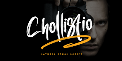 Chollistio is a handwritten font with a dry brush texture with rough details. This font has been designed to suit a variety of projects such as business branding, Instagram quotes, Christmas greeting, Poster, blog headers, Packaging, sports communities, film, photography, hobbies, and much more. This font is PUA encoded which means you can access all of the glyphs and swashes with ease!
 - Brigitta Signature by Letterara,
$12.00 Brigitta Signature is a handwritten font with a dry brush texture with rough details. This font has been designed to suit a variety of projects such as business branding, Instagram quotes, Christmas greeting, Poster, blog headers, Packaging, sports communities, film, photography, hobbies, and much more. This font is PUA encoded which means you can access all of the glyphs and swashes with ease!
 - Progelud by Beary,
$13.00 Hello guys Proudly presents our font Progelud. Progelud is mazing sans-serif look attractive and natural! Every single letters have been carefully crafted to make your text looks beautiful. It has beautiful and well-balanced characters and as a result, it matches a wide pool of designs. Progelud is PUA encoded, which means you can access all of the glyphs!
 - Grafiker by Hanoded,
$15.00 Grafiker means 'Graphic Designer' in German. This fat, colored, uneven font with a 1001 uses was loosely based on the work of designers Oskar Kokoschka (1886 - 1980) and Jean Carlu (1900 - 1997). The glyphs were hand-drawn with a 0.5 roller ball and colored in with Chinese ink, using a stiff brush. The result is a lively, rather unusual font.
 - Humeira by Arterfak Project,
$12.00 Humeira is a playfully font, inspired by handwriting lettering and doodle art movement. Designed with a manual brush and carefully vectorized with many alternates that you can apply to give handwritten looks! Humeira is perfect for headlines or body text. You have a regular and a bold weight that you can combine well. Humeira also has an Outline Shadow style with bolder contrast, funny and childish looks. Humeira font family is suitable for T-shirts, mugs, coffee cups, flyers, brochures, quotes, branding and more.
 - Bhiver by Maculinc,
$14.00 Bhiver is a san serif font with an angled and curved style in every corner, we made it with a display style that is perfect for making product packaging such as: Coffee Packaging, Ice Cream Packaging, Beauty Packaging, and for Brochures, Templates, Social Media Post, and etc. Bhiver is also equipped with Swash which you can access according to what we have provided, form sentences as you like by combining Swashes to make it look more attractive like the example that I have previewed.
 - Kaffemoster by Hanoded,
$16.00 Kaffemoster is a Swedish slang word for a lady, usually a bit older, who likes to drink coffee and gossip while she’s drinking it. I have decided to study a bit of Swedish, so I downloaded an app and I am practising my Swedish vocabulary every night! Det går långsamt, men jag klarar det! Kaffemoster is a nice, handmade pencil font. It comes with extensive language support (including Swedish) and a nice set of alternates for the lower case letters. Kaffemoster är ett riktigt bra typsnitt!
 - Loopkin by Ben Burford Fonts,
$25.00 Loopkin is a new display font from Ben Burford Fonts. It's a stylistic take on the classic modern serif font that has been a staple in high fashion publications for decades. This OpenType font comes with a full set of characters as well as ligatures and alternative characters using the stylistic sets.
 - Gobsmacked by Hanoded,
$15.00 Gobsmacked is a rather new English word. It has been around since 1959 and was used mostly around Liverpool at that time. The word means: ’astounded’, ‘flabbergasted’ (another nice word!) or ‘speechless’. Gob could be of French or Scottish Gaelic origin and means ‘mouth’. Gobsmacked font was created using a brush and black gouache. The result is a very eroded, very legible and quite unique brush font. I have created alternates for the lower case letters, plus two double letter ligatures (oo and ss). Use it for any design that needs a little brushwork; I am sure the result will leave you gobsmacked!
 - Pennyroyal by Stiggy & Sands,
$29.00 A Historic Revival with a Sophisticated Rustic Edge Pennyroyal began as a Barnhart Brothers & Spindler typeface called Plymouth Bold, first cut in 1900. What began as a straightforward rustic typestyle has been revived to include a more extensive character set. But this font wasn’t just revived, it has come alive with character and personality. Pennyroyal includes 564 characters. The expanded SmallCaps option for gives the typestyle a more sophisticated look, expanding on the original typeface inspiration. Opentype features include: A collection of ligatures. Smallcaps. Full set of Inferiors and Superiors. Proportional figures and Oldstyle figure sets
 - Shorelly by LetterStock,
$23.00 Shorelly This pair was inspired by beutiful lettering design that i saw on some coffee shop, It was crafted by hand specially to add natural handmade feeling in its brand identity than i make it clean with pentool. If you need a serif decorative font style, Shorelly font is grat choice for you to make your design authentic and unique. Opentype features Shorelly font has 201 character set included Shorelly Font is very good looking in logo, movie poster design, youtube tumbnail, labels, product packaging, invitations, advertising and others. This serif decorative fonts works with folowing languages: Afrikaans, Albanian, Asu, Basque, Bemba, Bena, Chiga, Cornish, Danish, English, Estonian, Filipino, Finnish, French, Friulian, Galician, German, Gusii, Indonesian, Irish, Italian, Kabuverdianu, Kalenjin, Kinyarwanda, Low German, Luo, Luxembourgish, Luyia, Machame, Makhuwa-Meetto, Makonde, Malagasy, Malay, Manx, Morisyen, North Ndebele, Norwegian Bokmål, Norwegian Nynorsk, Nyankole, Oromo, Portuguese, Romansh, Rombo, Rundi, Rwa, Samburu, Sango, Sangu, Scottish Gaelic, Sena, Shambala, Shona, Soga, Somali, Spanish, Swahili, Swedish, Swiss German, Taita, Teso, Vunjo, Zulu Thank you for using this font. LS
 - Magicjar by Beary,
$13.00 Are you looking for a unique elegant font? You came to the right product. Magicjar is an elegant hand lettering look attractive and natural! Every single letters have been carefully crafted to make your text looks beautiful. Magicjar is PUA encoded, which means you could access all of the glyphs! Every letter has a unique and beautiful touch, which will make your design come alive! Thanks