10,000 search results
(0.064 seconds)
- Instance by preussTYPE,
$55.00 German type designer Ingo Preuss created this family between 2014 and 2016. Instance is a new classic built on the foundation of over two centuries of history. Fresh and contemporary, while feeling familiar. This typeface is a high contrast sans serif typeface family and was designed for contemporary typography, especially for use in headlines and on posters, but also for reading purposes. A flexible, medium to high contrast, sans serif less about designing a stylish decorative design and more about applying contrast onto a neo-grotesk skeleton. Instance is more than just chopping off the serifs. The classical proportions of the capitals and x-heights were maintained, but the letterforms were rebalanced for use without serifs. Contemporary modifications were made to some widths, as well as an all new Light weight was created. Please note: Instance STD Office Packages is only as TrueType (* .ttf) and Standard-Version. Also, the character set has been reduced to Standard (without OpenType-Features, SmallCaps, old style figures, etc.). Ideal for testing and for Microsoft Office applications.
 - Zentral by Wilton Foundry,
$29.00 My goal in designing Zentral was to create a distinctive sculptural font intentionally in Regular and Italic only. I believe Zentral Regular and Italic has the latitude and flexibility needed in most type scenarios without having to resort to multiple weights. Zentral Regular upper/lowercase provides a very pleasant contrast and can be varied by using Zentral Regular capitals. Zentral Italic is ideal for creating emphasis of words, quotes or phrases. This combination provides maximum impact and readability. Zentral is a contemporary font ideal for branding, packaging, advertising, editorial in print and e-print applications.
 - Thanks by Monotype,
$15.99 Designed by Romanian lettering artist Andrea Stan, Thanks is a contemporary script packed full of quirky shapes, bouncy baselines and uneven letter heights. This makes Thanks a truly fun and friendly design (Oh and also very polite!). This off-beat font is Bold, monolinear and has a subtle inline twist.
 - Destroyer by Comicraft,
$19.00 You wanted the best and you got the best - the hottest fonts in the world jumping off the pages of the hottest comic in the world -- KISS: PSYCHO CIRCUS. Now you can all journey into the void with the KissAndTell and Destroyer fonts handcrafted by headbangin' John Roshell. Lick it up!
 - Aiguille by Hanoded,
$15.00 An "Aiguille" is a sharp pinnacle of rock in a mountain range. Aiguille font is a beautiful handwritten connected script font. I thought it was a good way to start off the new year! Aiguille comes with a whole bunch of alternate glyphs, ligatures and even ‘end-of-word’ alternates.
 - Telegraph by Solotype,
$19.95Charles Beeler Jr. designed this in 1895 for Mackellar, Smiths and Jordan, which was part of the American Type Founders combine. The font had a short life because five years later ATF began an "off with the old, on with the new" program, and this font was an early victim. - Storyboard by Atlantic Fonts,
$26.00 Storyboard is expressive, rough, partly connected and full of painterly, brushed energy like the sketches of a storyboard. It's bold and kind of edgy, but can be friendly too. There are tons of ligatures you can turn on or off depending on the look you're after. So what's your story?
 - Mister B by Bogstav,
$17.00 Mister B is my go on a handmade organic font. The letters are clumsy, with the width and height somewhat off here and there. Nevertheless, the result is a naive and charming font, which is suitable for most things that has to do with kids toys, organic products or comics.
 - Mono Polz by Four Lines Std,
$15.00 "Mono Polz" takes its inspiration from the zany and eccentric world of cartoons. Every letter is an explosion of creativity, with bold lines and playful shapes that'll make your designs pop right off the page. It's the perfect font to add a touch of comic mischief to your projects. - Uppercase
 - Aviano Sans by insigne,
$24.99 insigne returns to Aviano’s classically inspired forms with this sans serif variant. Wide and geometric, Aviano Sans is perfect for any job that calls for a chic and dignified sans serif as seen in this demonstration video. Aviano Sans has consistently topped insigne’s best-seller chart for more than seven years, earning its stripes as an expressive and versatile typeface that belongs in any designer’s tool chest. Aviano Sans' five weights of Regular, Thin, Light, Bold, and Black include 42 Art Deco-inspired alternate characters that can turn you and your project into a force to be reckoned with. The typeface family also includes 40 unique ligatures that add a bit of swagger to this serious sans. insigne released the first Aviano in early 2007. Its beautifully drawn extended letterforms were a hit with designers, and Aviano quickly became one of insigne’s most popular offerings. The simplified variant of Aviano Sans followed soon after, paring down the structure around the core concept. The Aviano series continues to develop further today with new variants on this classic form. Be sure to check out the rest of the Aviano series, including Aviano, Aviano Serif, Aviano Flare, and Aviano Contrast.
 - Hexatype by Linotype,
$29.99Hexatype is part of a series of typographic experiments from the young Swiss designer Michael Parson. In this font, Parson has created an intriguing system of lines that form into letters, all based off of a hexagonal grid. Text set in Hexatype takes on an interesting honeycomb-like appearance. For a different effect, try overlapping individual letters, or use a few of Hexatype's letters together as elements in a logo. A good companion to Hexatype is Linotype's Ned Std. These two fonts, as well as eight more experimental designs by Parson, are included in the Take Type 5 collection." - Mr Eaves Modern by Emigre,
$59.00 Mr Eaves is the often requested and finally finished sans-serif companion to Mrs Eaves, one of Emigre’s classic typeface designs. Created by Zuzana Licko, this 2009 addition to the Emigre Type Library expands the versatility of the original Mrs Eaves with two complimentary families: Mr Eaves Sans and Mr Eaves Modern. Mr Eaves was based on the proportions of Mrs Eaves, but Licko took some liberty with its design. One of the main concerns was to avoid creating a typeface that looked like it simply had its serifs cut off. And while it matches Mrs Eaves in weight, color, and armature, Mr Eaves stands as its own typeface with many unique characteristics. The Sans version relates most directly to the original serif version, noticeably in the roman lower case letters a, e, and g, as well as in subtle details such as the angled lead in strokes, the counter forms of the b, d, p, and q, and the flared leg of the capital R, the tail of the Q. The distinctly loose-fitting letter spacing of Mrs Eaves was applied also to the Sans version. This, together with generous built-in line spacing due to a small x-height and extended ascenders and descenders, renders the same kind of lightness and airiness when setting text that is so characteristic of Mrs Eaves. Deviations from the original Mrs Eaves are evident in the overall decrease of contrast, as well as in details such as the flag and tail of the f and j, and the finial of the t, which were shortened to maintain a cleaner, sans serif look. And the lower case c had to be balanced out differently after it lost its top ball terminal. And with the loss of serifs, Mr Eaves set width is slightly narrower. Mr Eaves Italic also carries over many forms from its Mrs Eaves model, most notably the v, w, and z, which are unusually flamboyant for a sans italic design. It also utilizes lead in and terminal tails that are reminiscent of the serif italic. The biggest departure here is the width of the characters. The extra narrow gauge and delicate features seemed more appropriate for the Serif than the Sans. To allow for a comfortable fit, Mr Eaves Italic has a more robust design and wider character width. Meanwhile, the Modern family provides an overall less humanistic look, with simpler and more geometric-looking shapes, most noticeably in the squared-off terminals and symmetric lower case counters. This family has moved furthest from its roots, yet still contains some of Mrs Eaves’ DNA. The Modern Italic is free of tails, and overall the Modern exhibits more repetition of forms, projecting a cleaner look. This provides stronger differentiation from the serif version whenever a more contrasting look is desired. Each version (Sans and Modern) contains its own set of alternates providing unique options for applications such as headlines, word logos, letterheads, pull quotes, and other short text settings. Both the Sans and Modern come in six weights. The simpler forms of a sans-serif provide the opportunity of more weights than do serif letter forms, which are more complex in structure, making it difficult to accommodate additional weight without distortions. Regular and Bold match the original Mrs Eaves weights, while the Heavy provides an additional weight for extra emphasis.
 - Mr Eaves Sans by Emigre,
$59.00 Mr Eaves is the sans-serif companion to Mrs Eaves, one of Emigre’s classic typeface designs. Created by Zuzana Licko, this 2009 addition to the Emigre Type Library expands the versatility of the original Mrs Eaves with two complementary families: Mr Eaves Sans and Mr Eaves Modern. Mr Eaves was based on the proportions of Mrs Eaves, but Licko took some liberty with its design. One of the main concerns was to avoid creating a typeface that looked like it simply had its serifs cut off. And while it matches Mrs Eaves in weight, color, and armature, Mr Eaves stands as its own typeface with many unique characteristics. The Sans version relates most directly to the original serif version, noticeably in the roman lower case letters a, e, and g, as well as in subtle details such as the angled lead in strokes, the counter forms of the b, d, p, and q, and the flared leg of the capital R, the tail of the Q. The distinctly loose-fitting letter spacing of Mrs Eaves was applied also to the Sans version. This, together with generous built-in line spacing due to a small x-height and extended ascenders and descenders, renders the same kind of lightness and airiness when setting text that is so characteristic of Mrs Eaves. Deviations from the original Mrs Eaves are evident in the overall decrease of contrast, as well as in details such as the flag and tail of the f and j, and the finial of the t, which were shortened to maintain a cleaner, sans serif look. And the lower case c had to be balanced out differently after it lost its top ball terminal. And with the loss of serifs, Mr Eaves set width is slightly narrower. Mr Eaves Italic also carries over many forms from its Mrs Eaves model, most notably the v, w, and z, which are unusually flamboyant for a sans italic design. It also utilizes lead in and terminal tails that are reminiscent of the serif italic. The biggest departure here is the width of the characters. The extra narrow gauge and delicate features seemed more appropriate for the Serif than the Sans. To allow for a comfortable fit, Mr Eaves Italic has a more robust design and wider character width. Meanwhile, the Modern family provides an overall less humanistic look, with simpler and more geometric-looking shapes, most noticeably in the squared-off terminals and symmetric lower case counters. This family has moved furthest from its roots, yet still contains some of Mrs Eaves' DNA. The Modern Italic is free of tails, and overall the Modern exhibits more repetition of forms, projecting a cleaner look. This provides stronger differentiation from the serif version whenever a more contrasting look is desired. Each version (Sans and Modern) contains its own set of alternates providing unique options for applications such as headlines, word logos, letterheads, pull quotes, and other short text settings. Both the Sans and Modern come in three weights. The simpler forms of a sans-serif provide the opportunity of more weights than do serif letter forms, which are more complex in structure, making it difficult to accommodate additional weight without distortions. Regular and Bold match the original Mrs Eaves weights, while the Heavy provides an additional weight for extra emphasis.
 - Tavern by FontMesa,
$25.00 Tavern is a super font family based on our Algerian Mesa design, with Tavern we've greatly expanded the usability by creating light and bold weights plus all new for 2020 with the introduction of extra bold and black weights Tavern is now a five weight family. The addition of the bold weight made it possible to go further with the design by adding open faced shadowed, outline and fill versions. Please note, the fill fonts are aligned to go with the open faced versions, they may work with the outline versions, however you will have to apply them one letter at a time. The Tavern Fill fonts may also be used a stand alone font, however, the spacing is much wider than the regular solid black weights of Tavern. In the old days of printing, fill fonts rarely lined up perfect with the open or outline font, this created a misprinted look that's much in style today. To create that misprinted look using two different colors, try layering the outline fonts offset over the top of the solid black versions. Next we come to the small caps and X versions, for a font that's mostly seen used in all caps we felt a small caps would come in handy. The X in Tavern X stands for higher X-height, we've taken our standard lowercase and raised it for greater visibility in small text and for signage where you want the look of a lowercase but it needs to be readable from the street. In August of 2016 I started the project of expanding this font into more weights after seeing the font in use where someone tried creating a bold version by adding a stroke fill around the letters. The result didn't look very good, the stroke fill also caused the shadow line to merge with the serifs on some letters. This lead me to experiment to see if a new bold weight was possible for this font and I'm pleased to say that it was. After the bold weight was finished I decided to type the regular and bold weights together in a first word thin second word bold combination, however the weight difference between the two wasn't enough contrast. This lead me to wonder if a lighter weight was possible for this font, as you can see yes it was, so now for the first time in the history of this old 1908 type design you can type a first word thin second word bold combination. So why the name change from Algerian to Tavern? Since the original font was designed in England by the Stephenson Blake type foundry I decided to give this font a name that reminded you of the country it came from, however, there were other more technical reasons. During the creation of the bold weight the engraved shadow line was sticking out too far horizontally on the bottom right of the serifs dramatically throwing the whole font off balance. The original font encountered this problem on the uppercase E, L and Z, their solution was a diagonal cut corner which was now needed across any glyph in the new bold weight with a serif on the bottom right side. In order to make the light and regular weights blend well with the bold weight diagonal cut offs were needed and added as well. This changed the look of the font from the original and why I decided to change the name, additional concerns were, if you're designing a period piece where the font needs to be authentic then this font would be too new. Regular vs. Alt version? The alternate version came about after seeing the regular version used as a logo and secondary text on a major product label. I felt that some of the features of the regular version didn't look good as smaller secondary text, this gave me the idea to create an alternate version that would work well for secondary text in an advertising layout. But don't stop there, the alternate version can be used as a logo too and feel free to exchange letters between both regular and alternate versions. Where are the original alternates from Algerian? Original alternates from Algerian are built into the regular versions of Tavern plus new alternates have been created. We're excited to introduce, for the first time, all new swash capitals for this classic font, you're going to love the way they look in your ad layout, sign or logo. The best way to access alternate letters in Tavern is with the glyph map in Adobe Illustrator and Adobe InDesign products, from Adobe Illustrator you can copy and paste into Photoshop as a smart object and take advantage of all the text layer style features Photoshop has to offer. There may be third party character maps available for accessing alternate glyphs but we can't advise you in that area. I know what you're thinking, will there be a Tavern Condensed? It takes a lot of hours to produce a large font family such as this, a future condensed version will depend on how popular this standard version is. If you love Tavern we're happy to introduce the first weathered edge version of this font called Bay Tavern available in February 2020.
 - Lougra by Creativemedialab,
$22.00 Monograms or connected letters are very popular; apart from looking elegant, the monogram will also present an impression that sticks in the eyes of the audience. Lougra has more than 100 monograms or ligatures, making designing an initial or logo easier. Lougra is elegant and minimal modern sans serif. It has three contrast options which are display, regular and text.
 - Blackfire by Fype Co,
$13.00 Blackfire is a classic sans serif font that features beautiful alternates and ligatures, with regular and rounded edges in favor of a smooth and clean look. Blackfire features beautiful alternates and ligatures, allowing you to experiment with and create a multitude of stunning results. You can also use Blackfire for design projects like logotype, poster, promotional design, header, and many more.
 - Maxwell Sans by Kimmy Design,
$12.00 Maxwell is a clean condensed san serif typeface inspired by similar retro fonts from the 1950's. It comes in regular and small caps versions, includes stylistic alternatives and via the glyph panel you can access scientific inferiors, fractions, oldstyle numerals, Cyrillic, Greek, Latin and other Western and Central European languages. It can be used as a headline font or paragraph text.
 - Jazz Trumpeter JNL by Jeff Levine,
$29.00 Jazz Trumpeter JNL is an unusual type design modeled after the title card for the 1945 movie comedy “The Horn Blows at Midnight” starring Jack Benny and is available in both regular and oblique versions. This Art Deco sans serif font has the distinction of being somewhat calligraphic, yet futuristic in its visual appearance… and even has some subtle hints of Blackletter influences.
 - Quartz Grotesque by Hustle Supply Co,
$18.00 Quartz was originally published on the shop Font Forestry, but they are planning on closing - So now Quartz will live on Hustle Supply Co. Quartz is a minimalist All-Caps Sans Serif typeface that comes in 7 different weights. It's perfect for projects looking for that minimalist / clean aesthetic. Quartz includes regular, oblique, thin, bold & outlined versions. Western European Characters are included. Thanks!
 - Film Event JNL by Jeff Levine,
$29.00 The August 11, 1929 issue of “The Film Daily” carried an ad for Tiffany-Stahl Productions’ presentation of a special film release featuring a wrestling match between “Strangler” Lewis and Gus Sonnenburg. The hand lettering for the ad was rendered in an Art Deco sans serif style, and is now available digitally as Film Event JNL in both regular and oblique versions.
 - Magide by Issam Type,
$20.00 Magide is a retro and bold serif font typeface. This font perfect for branding, Headlines, Retro designs, logos, invitation, watermark and so much more. Magide typeface comes with Regular, Thin, bold, Black and 2 Outline font styles. Uppercase & lowercase letters, numbers, punctuation, ligatures, alternates and multilingual support. If you have any questions, please feel free to get in touch. Thank you
 - Import Stencil JNL by Jeff Levine,
$29.00 Dollar Tree Stores imports a number of items from China, and many times these are limited-run products only available until the existing supplies run out. One such item was a sans serif stencil lettering guide with rounded ends that takes on the look of 1980s-influenced techno lettering. This is now available as Import Stencil JNL, in both regular and oblique versions.
 - Dorige by Issam Type,
$20.00 Dorige is a modern retro serif typeface for branding, logo design and retro designs, This font comes with joining ligatures that give it a fancy and unique style. Dorige typeface comes with regular, italic, bold and bold italic font styles. Uppercase & lowercase letters, numbers, punctuation, ligatures, alternates Multilingual support. If you have any questions, please feel free to get in touch. Thank you
 - Rashela by Agny Hasya Studio,
$9.00 Rashela is a Decorative Serif Display Font, Modern, Luxury, and Elegant Come with 2 (two) styles (regular & italic) and is created with glyph variations like alternates and ligatures. Perfect for your design projects like logos, branding, advertising, product designs, stationery, photography, art quotes, wedding designs, fashion designs, and more. Featured with Uppercase and Lowercase, Numeral and Punctuation, Multilingual Support, and Opentype Features.
 - Hennepin by Josh Grzybowski,
$24.99 Hennepin derives from a bridge, a street and a county that share the same name in Minneapolis, MN. It is a serif font comprised of three agile weights: regular, light, and extra light. The character set contains typical OpenType features in addition to small caps, and old style numbers, but most importantly, it embraces stylistic alternatives that unite and complete this font.
 - Segina by Creativemedialab,
$22.00 Segina combines a high-contrast serif with a modern psychedelic font that is slightly wavy unique, and attractive. Segina consists of two Regular and Display options, each containing six weights from thin to Black. And also variable format with two axes, weight, and optical size. Segina has alternative characters that can be combined to create a beautiful heading, title or logotype.
 - Student Council JNL by Jeff Levine,
$29.00 While Student Council JNL was not influenced by any school activities, the design is based on a lithographed cardboard sign (circa 1930s) for Spizz Sparkling Water, a bottled seltzer from the Dr. Pepper Bottling Company of Lexington, Kentucky. A squared letterform with angled semi-serifs, this Art Deco typeface grabs attention. Student Council JNL is available in both regular and oblique versions.
 - Overland Trail JNL by Jeff Levine,
$29.00 Overland Trail JNL is Jeff Levine Fonts’ interpretation of “Italian”, first introduced in 1821 by the Caslon & Catherwood Type Foundry. Unique and somewhat similar to Faux Pas JNL with its eccentric stroke weights (opposite what is considered normal for serif fonts), the typeface features a design most associated with the Old West. Overland Trail JNL is available in both regular and oblique versions.
 - Bernadetta by Agny Hasya Studio,
$9.00 Bernadetta is a Modern Classic & Beautiful Display Serif Font Come with 2 (two) styles (regular & italic) and is created with glyph variations like alternates and ligatures. Perfect for your design projects like logos, branding, advertising, product designs, stationery, photography, art quotes, wedding designs, fashion designs, and more. Featured with Uppercase and Lowercase, Numeral and Punctuation, Multilingual Support, and Opentype Features.
 - Bit Part JNL by Jeff Levine,
$29.00 Bit Part JNL is an extra condensed monoline sans serif typeface that's well suited for movie credits, disclaimers and other forms of tight-fit word copy. Inspired by just the numbers "65" on the cover of a 1965 high school yearbook, this retro font will fit a lot of copy into a small area. The typeface is available in regular and oblique versions.
 - Libran by Bean & Morris,
$35.00 The Libran font family consists of Libran Regular, Libran Italic, Libran Antique and Libran Small Caps. The broad open counters make for easy reading with a touch of classic roman clarity. The diminutive serifs add a suggestion of the hand crafted origins without obstructing Its clean, contemporary lines. Libran’s generous x-height and short ascenders have been carefully proportioned to maximise reproduction qualities.
 - Chic Chalk by Kustomtype,
$25.00 Kustomtype’s “Chick Chalk” font is a sans serif font family with a regular & oblique version. It contains all upper & lower cases. The “Chick Chalk” family is coordinated into letterforms, metrics, and weights to work better together. Why still looking for old school types for your posters, advertising, text, design, artwork, headtext, editoral design, magazines, etc... ‘Chic Chalk is Perfectly Imperfect’
 - The Voyager by Ana's Fonts,
$15.00 The Voyager is a sans serif display font with a retro look. With over 100 ligatures, small caps, and swashes, The Voyager is perfect for logotype design, magazine layouts, in titles and short texts. It includes: Three weights: Light, Regular and Bold & Italics 100+ ligatures for both the lowercase characters and the caps Small caps Swashes A set of frames
 - Unnerving JNL by Jeff Levine,
$29.00 Unnerving JNL is a distorted/distressed version of Adhesive Serif Letters JNL (of which the original design was modeled after some vintage gummed letters used for signage). This new variant evokes a feeling of apprehension, dread or fear and can be applied to any project with a spooky or sinister theme. Unnerving JNL is available in both regular and oblique versions.
 - Gevenda by Agny Hasya Studio,
$12.00 Gevenda is a Modern Classic Display Serif Font, Luxury, Elegant, and versatile. Come in 2 (two) styles (regular & italic) and is created with glyph variations like alternates and ligatures. Perfect for your design projects like logos, branding, advertising, product designs, stationery, photography, art quotes, wedding designs, fashion designs, and more. Featured with Uppercase and Lowercase, Numeral and Punctuation, Multilingual Support, and Opentype Features.
 - Merzalina by Agny Hasya Studio,
$9.00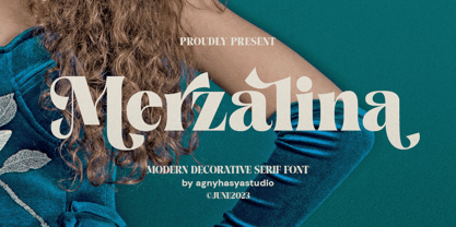 Merzalina is a Decorative Stylish Serif Display Font, Elegant, Classic yet Modern. Come in 2 (two) weights (regular & bold) including slants, and is created with Stylistic Alternates and Ligatures. Perfect for your design projects like logos, branding, advertising, product designs, stationery, photography, art quotes, wedding designs, fashion designs, and more. Featured with Uppercase and Lowercase, Numeral and Punctuation, Multilingual Support, and Opentype Features.
 - Angelle by Top Type,
$9.00 Angelle is a serif type. Inside there are two options, namely Regular and Bold. In addition, this font also comes with Ligature and Stylistic Alternates features. The font has an elegant, delicate and luxurious character. Very lucky for those of you who can have it. This font can be used to create wedding invitations, presentations, web, magazines, covers, and various other designs.
 - Trade Paper JNL by Jeff Levine,
$29.00 In the March 16, 1936 edition of “The Film Daily” (a trade publication for the film industry) the magazine ran an ad for its Year Book. The ad was set in a slab serif typeface similar to popular designs such as Karnak, Stymie, Beton and the like. Redrawn digitally as Trade Paper JNL, it is available in both regular and oblique versions.
 - Tarim by Sultan Fonts,
$19.99 Tarim is an active contemporary variable font, complete with a flexible range of cases tailored to responsive layouts designed by Sultan Maqtari. Tarim is serif style typeface for desktop applications, websites and digital apps. The font family contains 4 weights: regular , medium, bold and black.and includes a design that supports Latin & Arabic languages. Tarim typeface comes with many OpenType features.
 - Agenor Neue by Graphite,
$20.00 Agenor Neue is a geometric sans serif with a slight twist. The selective use of rounded edges gives it a unique and distinct character. Agenor Neue family comes in 7 weights and works great for logotype, headers, titles and any other display usage. The Regular weight is available for free and can be used for any commercial or personal project.