10,000 search results
(0.036 seconds)
- Hellya by Arkrist Letter,
$14.00 Hellya is an elegant script font with a contemporary atmosphere and impeccable form, inspired by timeless classic calligraphy. This font is PUA encoded which means you can access all glyphs and swashes with ease!
 - Oboe by Graviton,
$4.00 Oboe font family has been designed for Graviton Font Foundry by Pablo Balcells in 2012. It is display typeface with a geometric rounded look. Oboe consists of 6 styles, 2 of which are free.
 - Eloquence by Monotype,
$31.99 Eloquence has a modern aesthetic with a strong classical influence – this is the “Renaissance Remixed”. While being inspired by the first printed texts of the Renaissance period, this typeface has contemporary features such as a high x-height, open bowls and counters, along with razor-sharp serifs and terminals. It has been designed specifically for creating a pleasant reading experience. With a comprehensive character set, Eloquence can comfortably handle printed documents such as novels, magazines, annual reports, along with their equivalent online/digital formats. This 14-font family also has a few tricks up its sleeve by means of some neat, complementing discretionary ligatures and alternates that will prove to be useful embellishments to your typography. Small Caps are included too, along with corresponding diacritics meeting the Latin Extended specification. You can view more details, design examples, and a specimen PDF at eloquence-font.com Key Features: • 14 font family – 7 weights in Roman and Italic • Small Caps, Alternates, Ligatures, with Proportional, Old Style, Small Cap, Fractions, Numerators, Denominators, Superior, and Inferior Figures • Full European character set (Latin Extended) • 900+ glyphs per font.
 - Le Monde Courrier Std by Typofonderie,
$59.00 A rounded slab in 4 styles In our age, since the arrival of microcomputing, the majority of professional letters have been composed in quality typefaces. Typewriters & the typestyles they used have become antiques. A letter set in Times or Helvetica & printed with a laser printer at 600 dpi or more are of such quality that one can no longer distinguish it with a document produced by offset printing. But letters composed in this way appear overly institutional when a bit of informality is needed. Le Monde Courrier, designed by Jean François Porchez, attempts to re-establish a style halfway between writing and printing. Informal neo-tech style This rounded slab serif returns the informal character of “typewritten” fonts to letters and suit well all bad conditions, from inkjet printed memos to webfonts use. With a unique typographic colour, it integrate itself with the rest of the Le Monde family with effective contrast. The verticals metrics and proportions of Le Monde Courrier are calibrated to match perfectly others Typofonderie families. Bukva:raz 2001 Type Directors Club .44 1998 European Design Awards 1998
 - Greek by Scholtz Fonts,
$8.95The Greek font started from an experiment with designing fonts based on a geometric grid. I joined the points on the grid with straight lines to form the various characters and found that this resulted in a font that closely resembled Greek writing (derived from inscriptions carved in stone) of ancient times. I continued to develop this theme but I now accentuated the look and feel of Greek writing. The three styles shown are the results of this development. I did not kern or letterspace the individual letters since this would have been out of character with the orignal Greek writing. This means that the font is mono-spaced. At a later stage I may produce more refined and "modern" versions of these fonts. Surprisingly, the Greek SCF styles are very readable. The font is fully professional in terms of its character set. It contains over 235 characters - (upper and lower case characters, punctuation, numerals, symbols and accented characters are present). In fact, it has all the accented characters used in the major European languages. - Brokve by MKGD,
$13.00 Brokve is a Croatian word used along the Dalmatian coast. It means “nails", as in the; hammer and nails, variety. It’s tall thin strokes and jutting points give it a very spike-like appearance; suitable for any uses that are intense, jarring or just plain edgy. There is no lower case for Brokve as it is a display font. The upper case serves as both the upper and lower case letters. Brokve has a glyph count of 392 and supports the following languages; Afrikaans, Albanian, Asu, Basque, Bemba, Bena, Bosnian, Catalan, Chiga, Colognian, Cornish, Croatian, Czech, Danish, Embu, English, Esperanto, Estonian, Faroese, Filipino, Finnish, French, Friulian, Galician, German, Gusii, Hungarian, Icelandic, Indonesian, Irish, Italian, Kabuverdianu, Kalaallisut, Kalenjin, Kamba, Kikuyu, Kinyarwanda, Latvian, Lithuanian, Low German, Lower Sorbian, Luo, Luxembourgish, Luyia, Machame, Makhuwa-Meetto, Makonde, Malagasy, Malay, Maltese, Manx, Meru, Morisyen, North Ndebele, Norwegian Bokmål, Norwegian Nynorsk, Nyankole, Oromo, Polish, Portuguese, Romanian, Romansh, Rombo, Rundi, Rwa, Samburu, Sango, Sangu, Scottish Gaelic, Sena, Shambala, Shona, Slovak, Slovenian, Soga, Somali, Spanish, Swahili, Swedish, Swiss German, Taita, Teso, Turkmen, Upper Sorbian, Vunjo, Walser, and Zulu.
 - Ouido by Hanken Design Co.,
$30.00 The Ouido typeface has tastefully narrow characters with enough default spacing for comfortable reading at small sizes. Equipped with features like letter-spaced small caps and conservatively drawn italics for emphasizing words that maintain the reading speed—providing the reader a pleasant overall experience. Ouido (pronounced as “widow”) is derived from the Portuguese word OUVIR which means to hear or to listen. Ouido refers to the ability to play a song on any musical instrument after listening to it a couple of times and without reading the notes. The Ouido typeface is a modernized nostalgia for music enthusiasts, a whimsical revamp of the classic serif font. It bears resemblance with printed classical music scores, characterized by each letter’s rounded strokes like how one drew clefs with passion. Each dot is a twin of the quarter note minus the stem, so weaving sentences together could feel like composing a melody. Inspired by the astounding phenomenon of absolute pitch, the visual appeal of this typeface may hone your imaginative ability to embellish your creation without needing a reference.
 - Ragazza Script by Latinotype,
$79.00 Ragazza Script isn’t just another display typeface. It honors the greatest handwriting skills but in a different way. Although It doesn't represent any traditional calligraphy style, it is still part of that expressive world. With more than 1000 glyphs, and taking advantage of the Opentype features, Ragazza is full of personality. When in use, it gives a feel very close to ornamental Copperplate mixed with some kind of modern 'high-contrast' typeface. Lots of alternates, swashes and initial capitals are the spine of this face, assuring almost infinite combination possibilities. The early forms that would eventually lead to what Ragazza is today, began as a college project –around 2006– in the context of the 'Hyperfuente' exercise developed during Typography 2, chair E. Longinotti, at the University of Buenos Aires. But that seed would never stop growing. Since then a lot of work had been made to take that initial project to a professional quality level. Ragazza Script is perfect for headlines and short phrases. It is the brand new modern script, designed by Guille Vizzari and published by Latinotype.
 - IMAN RG by LGF Fonts,
$10.00 This type of Richard Gans, has always seemed very striking, despite having the complexity of the sources extrusion, has its own personality, and readability unusual for this type of letters. Use it for composing posters, programs or logos was very common at the time. My father, Antonio Lage Parapar, typographer by profession, who composed the texts, which not only had it for profession, but he liked to do, always he spoke of sources and decorative elements of the type foundry Richard Gans, as well as other foundries, especially those that required the mender of them, exercised creator, many of these types they have already been recovered by professionals and companies with excellent results. I've been surrounded by these movable type, and the occasional catalog unfortunately lost. One of those guys that has always struck me visually speaking was the type IMAN Richard Gans, the typographer and more of German origin arrived in Spain, back in 1874, also a pioneer. This work to revive the type mentioned, as well as create non existing glyphs between documents and parts I've been finding, is and has been a personal pleasure all I want serve as a tribute to my father (of aopodo curiously "Richard"), the only sadness it has not been completed. Richard Gans, arrived in Spain in 1874 as a representative of several European factories. then liaised with journalistic and publishing companies, which led him knowledge required of the first sector art. In 1878 he created a center importer gadgets graphic arts and three years later he created his own type foundry. The first rotary newspaper ABC, very famous and the most advanced of the time, the brand manufactured Richard Gans.
 - England squad 2006 - Unknown license

- Black Puma by Gergely Soós,
$20.00 The Black Puma typeface was inspired by the rock beats and the honest spirit of today's indie music scene. Just as evolving garage bands', Black Puma’s strength lies in its fresh and brave approach: to playfully experiment and proudly take its imperfections as long as they are needed to stay real and honest. Black Puma's aim is to entertain, while expressing a strong human touch through its handmade and creatively assembled characters. Black Puma's varying rounded and edgy shapes create a vibrating yet coherent visual, which carries a positive, playful atmosphere. Its irregularities and extra bold characters empower Black Puma to have great and touching visual impact, which make it stand out of the mass flow of information delivered in the information society we live today. Black Puma font - with its 370 glyphs - includes all the accented characters of the Latin alphabet, and also comes with a couple of alternate characters (stylistic and contextual) to play around with. And, above all - as mentioned before - it includes its essence: the young spirit. So come, play around and have fun with Black Puma. Use it to create expressive, passionate posters, flyers and art work full of spirit for the awaiting young-minded public. You can find more artwork using Black Puma under the "Gallery" tab above.
 - Codelia by Tabular Type Foundry,
$- No matter if you're professional or beginner, your work should be fun. And if you are a coder/programmer, your coding font should be something you enjoy looking for very long time. Square and crisp coding fonts might be easy on the pixels, but are they easy on your eyes? Do they keep you entertained at work? Codelia is a monospaced humanistic typeface designed for coding with focus on comfort and fun without sacrificing legibility or coding functionality. It's fun but not a joke. Its round shapes are easier on the eyes and make the code look less intimidating. It is not designed to make maximum use of every pixel on screen, but to make you forget about pixels. The italic is full of personality but sober enough to not draw unnecessary attention. Codelia works great for coding, but also in presentation, education as well as packaging and branding. Codelia is available in two families, one with coding ligatures and one without; ligatures in the latter are still present in Diescretionary Ligatures feature (dlig).
 - Rugklacht J - Unknown license

- Sorvid - Unknown license

- Woodblock by Monotype,
$29.99The Woodblock font is a heavy face with angled counters and wedge serifs. The angles of the terminals and non-vertical strokes have been carefully drawn to add emphasis to the shapes of the letters. - Trivia Serif 10 by Storm Type Foundry,
$41.00 It’s an extension to the Trivia font system. Serif 10 has been meticulously adapted for sizes of about 10 points, to be used for all kinds of literature: magazines, newspapers, books, including large scientific volumes.
 - Christmas Booster by Creaditive Design,
$12.00 Christmas Booster is a flowing handwritten font, described by an elegant touch, perfect for your favorite projects. This font is PUA encoded which means you can access all of the glyphs and swashes with ease!
 - Khayma by NamelaType,
$27.00 Khayma is an arabic display font with the Kufi style. Khayma is an arabic with mean is tent or flexible shelter, as the name suggests, this font is very flexible for all your design needs
 - Beautica Dreaming by Letterena Studios,
$9.00 Beautica Dreaming is an elegant script font with a contemporary atmosphere and impeccable form, inspired by timeless classic calligraphy. This font is PUA encoded which means you can access all glyphs and swashes with ease!
 - Corelia by Hurufatfont,
$24.00 Corelia; It has a compact, lean, industrial and neutral body structure. Text and Display versions provide a very wide usage area. Ideal for modern brand designs. It includes rich OpenType features with custom number styles.
 - Valentines Vermouth by Aldedesign,
$25.00 Valentine’s Vermouth is a beautiful and light handwritten font with a unique feel and a stunning impact. This font is PUA encoded, which means you can access all of the glyphs and swashes with ease!
 - Lustig by Juraj Chrastina,
$39.00 In german lustig means funny. Furthermore Mr. Lustig is a character in one of Karel Čapek's miraculous fairy tales. In addition it's also a lively hand-lettered font equipped with playful interlocking ligatures. Have fun!
 - Merriment JNL by Jeff Levine,
$29.00 Within the pages of the 10th edition of the Speedball Lettering Book (1927) is an alphabet called “Vanitie”. This had been redrawn digitally as Merriment JNL, and is available in both regular and oblique versions.
 - Richard Starkings by Comicraft,
$39.00 A NEW HOPE! You begged with us..! You pleaded with us..! But we decided to release the official Richard Starkings font anyway! Huh? WHAT? You heard that line before? Where? Hmm... on this very site...? Well, yes, the Hedge Backwards font is all fine and dandy and does resemble the lettering legerdemain of comic book lettering robot, Richard Starkings... but has it been tweaked over the years to better suit the writing stylings of ELEPHANTMEN creator and writer, Richard Starkings? Has it been refurbished and digitally remastered by ELEPHANTMEN designer and Comicraft Secret Weapon, John JG Roshell? Hmm? No? Well then... here it is, retooled, reimagined and reStarkingsed...ah, what the hell, we started from scratch! This ain't no Greedo Shoots First -- you won't have to keep your pasty '70s VHS recordings of previous Richard Starkings Fonts inside a concrete bunker. Because any other font that claimed to be the official Richard Starkings font would have been called The Official Richard Starkings Font, would it not?
 - Alien Alphabet by ParaType,
$25.00Alien Alphabet is inspired by the ideas of change, transformation, creative deconstruction and mutual penetration of various cultures, languages, and opposing cognitive systems, which seem to be prevalent in our 'globalized' civilization. It appears as various visual constructs -- archetypal symbolism, pieces of the world alphabets, socio-cultural icons, mathematical formulae, etc., -- broke down into pieces and were reassembled in a way that carried traces of previous meanings. However, this contradictory mutation invokes enigmatic meanings and emotions begging for further definition and interpretation. Alien Alphabet shapes arranged in linear sequential manner tend to evoke a sense of written language. The fact that a message cannot be understood does not really change its emotional appeal. Moreover, the less message can be deciphered, the more seems to be the appeal -- for it triggers our imagination. In fact, we may not want to know the actual meaning because deep inside we are afraid that this might be just another alien dry-cleaning receipt. - Benjamin Franklin - Personal use only

- Snacky Prank by PizzaDude.dk,
$17.00 If you need some authentic, organic and lively scribbled letters, you've come to the right place! Snacky Prank is all that! Comes with 8 different versions of each lowercase letter, and multilingual support!
 - IRONGATE - Unknown license

- ConsoleRemix - Unknown license

- fragments of eter - Unknown license

- Huron by Solotype,
$19.95A Barnhart Bros. & Spindler type from the late victorian period. We have been faithful to the spirit of the original buy "calmed down" a few of the lowercase letters to make the lines read more smoothly. - Balinda by TM Type,
$12.00 Balinda is a distinct and graceful script font. Fall for its ravishing style and use it to create gorgeous designs. This font is PUA encoded which means you can access all glyphs and swashes with ease!
 - Balina by Fanart Studio,
$15.00 Balina is a distinct and graceful script font. Fall for its ravishing style and use it to create gorgeous designs. This font is PUA encoded which means you can access all glyphs and swashes with ease
 - Punavuori by Fenotype,
$14.95 Punavuori is a clean geometric unicase font. It's best for display use in magazines, books & posters. Punavuori font was originally designed in 2002. Now it's been remade with the complete character set and five different versions.
 - Early Christmas by Letterafandi Studio,
$12.00 Early Christmas is a lovely script font featuring charming, playful characters that seem to dance along the baseline. This font is PUA encoded which means you can access all of the glyphs and swashes with ease!
 - Manga Master Pro BB by Blambot,
$10.00 Manga Master, the classic Blambot font, is now Manga Master Pro! It has been updated with new spacing, kerning, and hinting as well as new autoligs, manga translation glyphs, CAlts, fractions, barred-I correction and more!
 - Orange Pumpkin by Letterafandi Studio,
$14.00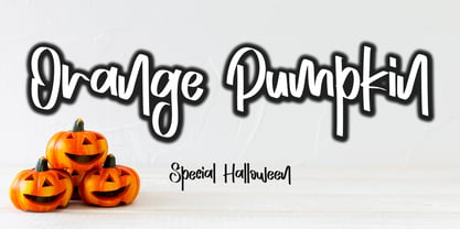 Orange Pumpkin is a handwritten display font. It is perfectly suitable for any Halloween-related project or crafty idea! This font is PUA encoded, which means that you can access all of the glyphs with ease!
 - Linja by Fenotype,
$14.95 Linja is an elegant ultra condensed font. It's best for display use in magazines, books & posters. Linja font was originally designed in 2002. Now it's been remade with the complete character set and six different versions.
 - Independence Script by Alan Meeks,
$50.00 Independence Script, designed by Alan Meeks and top British calligrapher Satwinder Sehmi, is an old style calligraphic handwritten script. The name is derived from the Declaration of Independence of which the font bears a slight resemblance.
 - Aqille by Creaditive Design,
$12.00 Aqille is an elegant script font with a contemporary atmosphere and impeccable form, inspired by timeless classic calligraphy. This font is PUA encoded which means you can access all of the glyphs and swashes with ease!


