10,000 search results
(0.014 seconds)
- Endgame by Hanoded,
$15.00 Endgame font was made using a very, VERY bad brush and Chinese ink. I had bought a bunch of brushes some time ago and I discovered that the hairs had been treated with some goo to keep them from sticking out. The goo didn’t really come off, so when I started to draw the glyphs for this font, the brush strokes were kind of wild. In the end, I really liked it (even though I will never again buy that particular brand of brushes). Endgame is a wild brush font. Comes with the works: diacritics, ligatures and alternates.
 - Suco De Laranja by Hanoded,
$20.00 I like orange juice. Come on, who doesn't? Orange juice is the drink of heroes; it's the elixir of life; it's the gods' own ambrosia. Suco De Laranja means orange juice in Portuguese and I named this font thus, just because I love the stuff! Suco De Laranja is a very narrow, very gentle typeface with a rough edge. It comes in a variety of languages and guess what? I have added Cyrillic as well. Just to be complete. So there you have it: a font named after a juice. Take a sip and enjoy! На здоровье!
 - Bloemgracht by Hanoded,
$15.00 In the old Amsterdam neighborhood of 'De Jordaan', you will find a canal called Bloemgracht (Flower Canal). For many years, a coffee store called Schildmeijer could be found here. Their paper coffee bags and advertisements sported a hand made font which I have tried to recreate and the result is Bloemgracht typeface. It is an all caps art deco font, quite angular, but very legible and distinct. Bloemgracht comes with extensive language support.
 - Pigeon Wing by PizzaDude.dk,
$20.00 Crayon fonts are fantastic! I've always thought it looked so cool with fonts that simulate writing with crayons...but the fonts has always been limited in letters! But that’s where my Pigeon Wing font stands out! Using the smart techniques of the OpenType thing called “Stylistic alternates”, you get 8 different versions of each letter! Yes EIGHT different versions that cycle as you write! That means words with the same letter appearing several times, cycles through the different versions! Besides that, the font is loaded with multi language support! What’s not to like! :)
 - New Alphabet by The Foundry,
$50.00 New Alphabet was created as a four weight family in close collaboration with Wim Crouwel. His response in the late 1960s to the first device for electronic typesetting was a radical experiment designed to follow the underlying dot-matrix system. With his strong interest in grids, Crouwel worked within the constraints of existing electronic technology, to produce characters that worked with the mechanical means that conveyed them. His original New Alphabet experiments have now been further developed by The Foundry into a typeface family that also includes the dot version.
 - Caslon 540 by URW Type Foundry,
$89.99 William Caslon (1692-1766) laid the foundation for English typefounding, when he cut his first roman face in London in 1722. He modeled his designs on late seventeenth-century Dutch types; thus his typefaces are classified as Old Styles. The original Caslon punches have been preserved, enabling a perfect recutting of his faces. Notice the hollow in the apex of A and the two full serifs or beaks in the C. The italic capitals are irregular in their inclination. The Caslon font family is distinctive for use in subheadings or continuous text.
 - Fortuna by Linotype,
$29.99Fortuna has some resemblance with handtexted characters based, loosely, on the classic italic. But, like Ad Hoc, Fortuna is drawn on a monitor in every detail. The name is Latin and means fate, luck. The composer Carl Orff was actual at the time when I worked with Fortuna, because he had been born 100 years earlier. Orff's Carmina Burana were being introduced on the radio when I was wondering what to call my most recent creation. The song cycle begins with a song to Fortuna: a fated choice of name. Fortuna was released in 1995. - Seashore Pro by Sudtipos,
$59.00 A feminine, graceful script whose thicker horizontals create a wave-like rhythm — hence the name. Seashore is loosely based on an "eccentric" (left-leaning) penmanship style of the late 19th century. Used mainly by professional "engrossers" in certificates and tributes, or by society ladies in their stationery and invitations, it sent a message of true refinement, as the style would have been only been mastered after the more common business, Spencerian, and standard ornamental styles. In fact, unusual script styles were in such demand that type foundries of the era exploded with metal-type knockoffs of increasing fanciness. Seashore includes a wide variety of swash capitals, alternate endings, and contextual ligatures, over 900 glyphs in all. Seashore is best used in short display settings — in names and addresses on formal invitations, in menus and food packaging, or fashion and beauty contexts.
 - Batoswash by T4 Foundry,
$21.00Avantgarde fonts Batory and Batoswash are monoline sansserifs designed by Bo Berndal. The futuristic Batory (think Bladerunner and Total Recall) and the spicier relative Batoswash come in three versions: Narrow, Middle and Wide. The font family is available in Truetype and Postscript for Mac and PC. Bo Berndal, born 1924, has been designing typefaces over 56 years, for Monotype, Linotype and other foundries. "Batory is a monoline reaction to my many calligraphic fonts", says Bo Berndal. "That is also the reason I did several widths instead of weights. Batory has short stems and high x-height. Batoswash is a Batory gone wild!" The successful Batory has already been used for logotypes, vignettes in magazines and as headline type. - Barn Party by Missy Meyer,
$15.00 I'll admit right off the bat here -- I've never been to a party in a barn. I don't even know if they still do barn dances and parties, or if that's something out of the musical Oklahoma! or something. But this font gave me kind of a homey, rustic feel, so the name felt right! Like many of my fonts, this one has been refined with crafters in mind -- smoothed curves and reduced nodes, for easy cutting and printing. It's also packed with over 600 characters total! The usual alphabet, numbers, and punctuation, plus 30 double-letter ligatures, over 300 diacritics, and a full second alphabet coded in as Stylistic Alternates. Enjoy!
 - Batory by T4 Foundry,
$21.00Avantgarde fonts Batory and Batoswash are monoline sansserifs designed by Bo Berndal. The futuristic Batory (think Bladerunner and Total Recall) and the spicier relative Batoswash come in three versions: Narrow, Middle and Wide. The font family is available in Truetype and Postscript for Mac and PC. Bo Berndal, born 1924, has been designing typefaces over 56 years, for Monotype, Linotype and other foundries. “Batory is a monoline reaction to my many calligraphic fonts”, says Bo Berndal. "That is also the reason I did several widths instead of weights. Batory has short stems and high x-height. Batoswash is a Batory gone wild!" The successful Batory has already been used for logotypes, vignettes in magazines and as headline type. - Arista Pro by Zetafonts,
$39.00 Arista Pro is the definitive version of the successful Arista typeface, designed by Francesco Canovaro, first released in 2007 as Arista Z and then reissued as Arista 2.0 in 2010. The pro version of Arista features the geometric and soft approach of the original typeface but comes in a full range of weights and two alternate versions (Arista Pro Regular and Arista Pro alternate version). The typeface has been expanded with the inclusion of Greek and Cyrillic alphabets as well as an extended range of latin characters. A companion icon typeface, Arista Pro Icon, has been developed, allowing for variable-width monoline icons that can be used to faultlessly match the typeface line width, up to semibold weight.
 - Fatimurgeno by Greentrik6789,
$21.00 Sans serif fonts, hundreds, or maybe thousands. There have been a lot of sans serif fonts that have been created and circulated on the internet. This font is here to increase the number of sans serif fonts circulating on the internet to be even more. Fatimurgeno comes with variable font. You can adjust the size of the weight which is suitable for the needs you want. Fatimurgeno is a various sized, clean and modern looking sans serif font. Whether you’re using it for crafting, digital designing, presentations or greeting cards making, it’s perfect! The Thick version will be perfect for a clean and strong look, and the slim version will be perfect for a soft and seductive look.
 - Zeebonk by Hanoded,
$15.00 Zeebonk (literally 'Sea Chunk') is Dutch for a sailor - in particular, a large, pickled and brined, seven-seas-been-there-done-that specimen. The font itself brings back memories of the outrageous tattoos those same 'zeebonken' used to have. Zeebonk comes with extensive language support, alternates for the upper case (and some lower case letters as well) and a healthy dose of good old fashioned sea dog humor!
 - Hostey Script by Letterfreshstudio,
$15.00 Hostey is a stylish and very modern script font. It looks amazing on wedding invitations, thank you cards, quotes, greeting cards, logos, business cards and any other design that calls for a handwritten touch. Features : Ligatures Stylistic sets Basic Latin A-Z and a-z Numbers International Symbols included Punctuation Ligature This font is PUA coded which means you can access all the glyphs and replace them easily! Thank You.
 - Michael Signature by Stefani Letter,
$14.00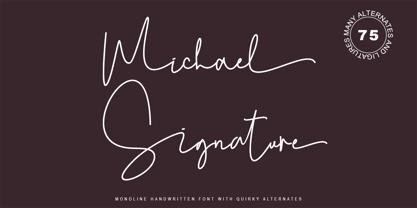 Michael Signature feels just as charming and elegant. This stunning Monoline script font is a stylish homage to classic handwriting. It features a varied baseline, smooth lines, gorgeous glyphs, and stunning alternatives. This font is PUA-coded which means you can access all the amazing glyphs and swashes with ease! It also features many special features including glyphs and alternate ligatures so that it displays natural and original handwriting.
 - Houseplant by PizzaDude.dk,
$20.00 Houseplants are commonly grown for decorative purposes, positive psychological effects, keeping fresh or health reasons such as indoor air purification. Actually, just like this font has a positive effect on your artwork! This font comes with a heavy load of diacritics! On top of that, it has contextual alternates, which means your text cycles through 6 different versions of each letter! Hard to tell that this is actually a font!
 - Pusekatt by Hanoded,
$15.00 Pusekatt means Pussycat in Norwegian. It was finished on a rather gloomy monday, which reminded me of Norway and I just like cats. There you have it: the naming of fonts explained. It ain't rocket science for sure! There is nothing gloomy about Pusekatt font: it is a very lively, happy and useful poster face. It comes with extensive language support, one alternative (yes, one) and a lot of feline grace.
 - HardTimes Roman by Wiescher Design,
$39.50 HardTimes has been hard work, designing a handmade typeface must always have the right balance between rough and smooth, specially with this Times-like face. It has the big European glyph-set, so that it can be used all over the continent I come from. I gave this font extensive kerning. Times are too hard for boring typefaces, so try this one for a change. -Your hardworking type designer, Gert Wiescher
 - Rennie Mackintosh Scotland St by CRMFontCo,
$20.00Derived from the world famous Rennie Mackintosh Font, the Scotland St. version gives an outline form of the genius of Charles Rennie Mackintosh. The "Scotland St." name comes from one of Mackintosh's most famous architectural works - the Scotland St. School in Glasgow, Scotland. This wonderful legacy of Mackintosh's genius can be visited daily FREE OF CHARGE, as it has been classed as a museum by Glasgow City Council. - Epistula by JOEBOB graphics,
$30.00 Containing over 100 ligatures, Epistula is a loosely written font, resembling my own natural way of writing. It has a nice flow and the pointy tail-ends give it a certain speed. Creating Epistula has been a long process, but returning to the drawing board a few times has – in my humble opinion – paid off. This font comes in two weights: regular and medium. Because sometimes one flavour just isn’t enough…
 - Dead Mans by Comicraft,
$19.00 Shiver me Timbers and Splice me Mainbrace! There's strange goings on in Smugglers' Cove... A gathering of thieves, brigands, piratefolk and back-stabbing blackguards the likes of which have not been seen since the days of Redbeard! Someone'll be swinging from the yardarm or walking the plank if the map identifying the location of the fonts created for Grim Todd McFarlane's SPAWN: THE DARK AGES doesn't turn up soon!
 - P22 Komusubi by IHOF,
$24.95 Komusubi is a new font family from Hajime Kawakami. It features Latin as well as Katakana and Hiragana. This lively display font comes in regular and bold for all three alphabets. In Japanese, Komusubi means to tie up a string or ribbon lightly. The Nipponian lyrical atmosphere of the word "Komusubi" reflects the casual tone of the font itself. There is also a "Komusubi" rank of the Japanese SUMO.
 - Bogeyman by Hanoded,
$15.00 I haven’t been sleeping well lately: I wake up every night around 5 and I don’t know why. Maybe it’s the Bogeyman! Wait… Bogeyman? Excellent name for a new font! Bogeyman is a handmade display font. It comes in two varieties: regular and eroded, both with their Italics. Use it for your posters, book covers and packaging, but you’ll have to promise not to scare your kids with it!
 - Main Event by FontMesa,
$29.00 Main Event is a revival of a very old Italian font that you may have seen in the past under the original name of Tuscan Ornate or Bracelet. Dating back to 1860 or earlier it has never been known to have a lower case set of letters. Previously only in upper case, this font comes alive again with the addition of a newly designed lower case set of letters.
 - Punten by LucasFonts,
$19.00 Type designer Luc(as) de Groot has a large archive of lettering he drew by hand, often to accompany the quirky cartoons which he made in his visual diaries. Only a few of these alpahabets have been digitized into full-fledged typefaces. Punten (Dutch for "points" or "spikes") is one of them. It comes in three styles of varying legibility: Punten Straight, Punten Extremo, and Punten Rondom (Dutch for "all around").
 - Mestizo by Volcano Type,
$35.00 Mestizo is a term traditionally used in Latin America and Spain for people of mixed heritage or descent. In some countries it has come to mean a mixture of European and Amerindian. The font Mestizo is based on a strict grid system – but combines it with ethnic symbolism. Six weights can be combined in various ways. Accius, Alerio & Amias display the basic geometric shapes, Balbo, Belus & Borba represent the playful icons.
 - Blossom Dahlia by HRDR,
$16.00 Dahlia Blossom is a new modern signature font. This stunning signature script font is a elegant, classy, stylish and perfect for any awesome projects that needs a handwritten touch. This font is PUA-coded which means you can access all the amazing glyphs and swashes with ease! Blossom Dahlia Signature is great for wedding invitation card designs, logotypes, business card designs, advertisements, product designs, stationery, product packaging, quotes and so on.
 - Santanelli by Pisto Casero,
$19.00 Santanelli is a rounded all caps display typeface. It is intended to be used in posters, editorial headlines and logotypes. It comes in three weights: Thin, Medium and Bold. Each letter has been designed with two different styles or flavors: decorative and clean. You can access each of them by typing uppercase and lowercase respectively. These two styles fit perfectly when combined within the same word or message.
 - Honey Valentine by Yoga Letter,
$15.00 "Honey Valentine" is a modern handwritten font. This font can be used for all your work and needs, especially related to Valentine's Day, wedding, winter, photography, engagement, promotions and more. This font is very easy to use because it has been specially designed, and there is also a guide for using letter decorations in the preview. This font comes with swashes, alternatives, basic characters, multilingual support, numbers, and punctuation.
 - Dufour by Scholtz Fonts,
$19.00 Dufour was named in honor of an art deco font called "Independent" designed in the 1930s by Collette and Dufour. "Dufour" is influenced by the original font, however, there are substantial differences: instead of small caps, a true lower case was created, the upper case character proportions and shapes have been greatly modified, and all missing characters have been created to make a truly modern font which nevertheless has all of the panache of the original. A related font is Collette, designed by Anton Scholtz, however, Dufour has a softer feel that is more true to the original art deco period. Dufour comes in four styles: Dufour Regular, Dufour Regular Outline, Dufour Condensed, and Dufour Condensed Outline. The font has been carefully kerned and best results are obtained if kerning is switched on. (All-caps passages work well.) It is best used to create a retro feel and in headings, subheads and in short passages of text. Very effective in marketing for products for children.
 - If This Be Doomsday by Comicraft,
$19.00 THE END IS NIGH! Judgment Day has come and this planet has been CONDEMNED! Do not conspire to hide what remains of your paltry world from my eyes! Know you not that NONE may thwart my will? Of what import are brief, nameless lives -- to DOOMSDAY?? Death is Certain! Apocalypse is UNAVOIDABLE. At last, my cosmic hunger will be sated, if only briefly! This planet shall SUSTAIN me until it has been drained of all elemental life! SO SPEAKS DOOMSDAY! But do not fret. Even if the Domesday Book has been closed on your planet... your utter destruction is being made available in Font form, I call it IF THIS BE DOOMSDAY, and I will deliver it to you via comicbookfonts.com in Regular, (Roach) Chew and Outline weights. Never let it be said that DOOMSDAY is without mercy. Features: Three weights (Regular, Chew & Outline) with small cap characters and Western & Central European international characters.
 - Rijk by Wilton Foundry,
$39.00 The font name comes from the Dutch word "Rijk" meaning "rich". I'd like you to consider Rijk as a good Pinot Noir: medium bodied, offering succulent juicy berry flavors, accentuated by delicate aromas of coffee and vanilla oak. Ruby red in color, it boasts of velvety tannins and a long fulfilling fruity aftertaste. Rijk has a structure that is delicate and fresh. The aromatics are very fruity like cherry, strawberry, and plum, often with notes of tea-leaf, damp earth, or worn leather… My intent was to create a script that is rich, while not overbearing. It will serve many noble and useful purposes because of its fresh and lively texture. It is also very legible because it has a slightly more upright angle. Use Rijk for headlines, packaging, identities, advertising and online. Available in OpenType, it includes a range of ligatures as well as a full range of class kerning.
 - Dash Wisher by PizzaDude.dk,
$15.00 The name Dash Wisher is a wordplay. The letters of the font are also quite playful - you never know what comes next, when typing. There is no exact x-heigh, the baseline is jumpy, the descender and ascender are messed up...there are no real rules for Dash Wisher! But with all that in mind, it comes out surprisingly legible, which means it does have a wide range of use. Let your fantasy and imagination break the boundaries and Dash Wisher do the rest - or maybe the other way around! :) I've added both ligatures to substitute double letters and a set of alternate letters as well.
 - Southwark by Hanoded,
$15.00 London is one of my favourite cities, so it was about time I named a font after it. Well, technically, I named a font after one of London’s districts. Southwark comes from the Anglo-Saxon word Suthriganaweorc, which means ‘Fort of the men of Surrey’. The font Southwork is a handmade Clarendon. I used a Japanese brush pen to create the outlines. I gave the glyphs texture by filling them in with a brush and Chinese ink. Southwark, therefore, has an uneven look and a brushy texture. It looks good on just about anything, but posters, greeting cards and product packaging come to mind.
 - PF Hellenica Pro by Parachute,
$69.00 The Golden Age of the Greek Civilization. The world’s history carved on stone. Hellenica Pro was created based on numerous photos from archaeological sites and several other historical references dating back to 1100 B.C. In order to capture the essence of this writing, there are a few alternate forms used at lowercase, uppercase and/or accented positions. These alternates come from different regions in Greece. For instance, uppercase Theta was used by the Cretans and the Korinthians, whereas uppercase Delta by the Ionians. PF Hellenica Pro comes in 3 versions: Light, regular and bold. The new ‘Pro’ version has been expanded to include 3 major scripts: Latin, Greek and Cyrillic.
 - Let's Jazz by Unio Creative Solutions,
$9.00 Introducing “Let’s Jazz” - a playful typeface which is inspired by iconic mid-century American advertising and lettering. With this project we wanted to homage the dazzling graphics of those booming years and the result is a jazzy typeface that provides a condensed aspect with a bouncy rhythm. As previously said, Let’s Jazz gives the spontaneous vibe of this sensational music genre but it has been also designed with a strong focus to the very distinct look of Saul Bass graphics, which are honestly still fresh and convincing, even nowadays. Let’s Jazz offers two versions, Regular and Stamp. Each version contains more than 450 glyphs and covers several languages based on the Latin alphabet; the jazzy experience is enhanced with OpenType (OTF) support for small caps and includes some neat ligatures and alternates plus the oldstyle bouncy numerals*. This package is a powerful tool in a wide variety of design purposes: headlines, packaging, logotypes, badges, posters and much more. *Let’s Jazz has built-in OpenType features enabled for Adobe® Creative Suite® and any other opentype capable software. All the extra characters has been additionally coded with “PUA Unicode”, which basically means that this font duo is totally accessible without any additional design software. All the extra characters can now be copied straight out the FontBook (Mac) or CharacterMap (Win) and pasted into your favorite text editor. Official mini-tutorials available here: - How to access alternates, ligatures and swashes in Font Book®: https://youtu.be/mGKlvKr0ReI - How to use alternates, ligatures and swashes in Photoshop®: https://youtu.be/46ZtDbHwUAc Specifications: - Multi-language Support (Central, Eastern, Western European languages) - OpenType features (Standard and Discretionary Ligatures, Alternates, Small Caps, OldStyle Numerals) - PUA Coded Extra Characters Thanks for viewing, Unio.
 - Coarse Grind by Hanoded,
$15.00 I bought a new coffee machine - the piston variety. It is shiny, made in Italy and I can make a killer espresso or latte with it. I usually start off the day with a pour over coffee and save my milky coffee for later. I also have two grinders: one for a coarse grind (pour over) and one for a finer grind (espresso and latte). Yes, you will probably say that it’s quite extravagant to have two grinders, but I do like my coffee! Anyways, this is what I thought of when I worked on Coarse Grind. Coarse Grind is a well balanced all caps display font. It comes with extensive language support and a set of alternates for the lower case letters.
 - Daitengu by Hanoded,
$15.00 I have always been fascinated by Tengu - a mythical creature from Japan. Tengu are usually depicted with a red face, a very long nose, white moustaches and a funny hat. They used to be regarded as harbingers of war, but over the centuries, their image softened and they became the protective spirits of mountains and forests. Daitengu means ‘greater tengu’ and stems from the Genpei Jōsuiki - an extended version of the ‘The Tale of the Heike’ - an epic account of the struggle between the Taira and Minamoto clans for control of Japan. So, now you know about tengu, end of the history lesson! Daitengu is an epic brush font. I made it with a soft brush and China ink (like most of my brush fonts), but instead of forming the glyphs I saw in my head, I let the brush do the work. A more ‘zen’ approach to brushwork if you will! The result is a messy, organic brush font with a lot of spirit. Comes with diacritics and double letter ligatures.
 - Odisseia by Plau,
$20.00 Odisseia: Monospaced Typeface Made on Earth by Plau. Plau presents Odisseia, a monospace type family in 8 styles designed with simplicity of shapes and a humanist touch. We’ve ventured into monospace territory, where all letters must occupy the same amount of space. This style is usually associated with typewriters and computer terminal fonts. Like all monospaced fonts, every letter align vertically in a multi-line setting. The rhythm created is peculiar, since large letters such as m and w occupy the same space as narrow ones like i. Because we have 4 different weights: light, regular, bold and black the design of some characters have to be adapted to fit the same width and achieve a constant light/dark value throughout. These features make Odisseia suitable for a specific yet considerable range of uses, from computer coding to systemized communication such as brand identities. This style has been used from high-end brand identity to cutting edge digital applications. Odisseia sets a little shorter in comparison with other monospaced fonts, and bears a large x-height.