10,000 search results
(0.038 seconds)
- Denne Angel - Personal use only

- pf_zappa - Unknown license

- Dwarven Runes - Unknown license

- Eldar Runes - Unknown license

- Zierde Grotesk by Lewis McGuffie Type,
$35.00 Zierde is a take on early advertising, small-copy grotesks of the late 19th/early 20th century, and is largely inspired by Miller & Richard’s own range of Grotesques. More importantly, Zierde is accompanied by a large set of ornaments (+200) which hark back to the look-and-feel of the early-modernist arts and crafts movement. The ornaments in, and presentation of, Zierde owe much credit to J.G Schelter & Giesecke’s 1913 type specimen book ‘Die Zierde’. The strong functional uppercase sans-serifs alongside luscious, beautiful patterns in ‘Die Zierde’ make for beautiful combinations. This early-modernist use of grotesk alongside ornament looks bizarre in the eyes of us used to seeing sans-serifs in more formal, sterile settings. The face itself retains some historical flourishes such as the eccentric leaning angle of the italics, the long cross-bar on the ‘G’, the gammy-leg of the ‘R’, a strange ampersand and some irregular terminals across the weights. Zierde is display face meant for headlines, titles, short-copy, labels and logos. It comes in caps and small caps, Latin and Cyrillic.
 - Cybrox JNL by Jeff Levine,
$29.00 Cybrox JNL takes a simple bitmap font and regenerates it into its most distressed form. The design is perfect for "technology-gone-bad" messages, radical headlines and anything with an electronic, techno or digital theme.
 - Sea of Japan JNL by Jeff Levine,
$29.00 A 1922 piece of sheet music entitled “Japanese Sailor” had its title hand lettered in a Far Eastern motif. This design is now available as Sea of Japan JNL, in both regular and oblique versions.
 - Gumbo by Hanoded,
$17.00Lately I have been experimenting with different foods. At home, we eat a lot of Asian food, but I thought it would be nice to broaden my culinary horizon a bit. So far I have (successfully) added Georgian beef and walnut soup, Tacos (after a suggestion by my friend Stuart), Surinam Roti and various vegetarian dishes to our menu. When I created this font, I had to think of Gumbo - a dish I have never made. Gumbo is a handmade display font that comes in a rotund regular and an obese bold (with Italics). Use it for your book covers, product packaging and sticky notes. Gumbo comes with cute ‘end of word’ ligatures - just type the glyph + space and presto: you have a little swash. As for the dish Gumbo, well, I will make that this weekend! - Blushring by Sibelumpagi,
$16.00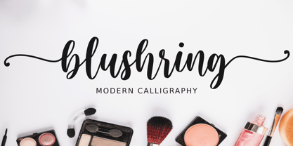 Blushring is a beautiful modern calligraphy font. It comes with some alternates that make the font look beautiful and elegant. It’s perfect for logos, product packaging, wedding invitations, branding, headlines, signage, labels, signature, book covers, posters, quotes and more. And this Font has given PUA Unicode (specially coded fonts). so that all the alternate characters can easily be accessed.
 - Regio Mono by Degarism Studio,
$30.00 Regio Mono is a monospaced typeface designed with industrial-strength, sturdy columns and tidy layouts. contrasting geometric shapes and sharp terminals. Whether used in design or in a code editor, Design proposal, Ads, Packaging and more. Regio Mono comes in six weights, from Ultra Light to Bold, and with a character set that covers over 200 Latin languages.
 - FS Split Sans by Fontsmith,
$80.00 Quirky and irregular FS Split is no ordinary typeface. Its irregular proportions make it unique, with round letters appearing wide, and straight letters narrow. Other quirks include its eclectic crossbars – the uppercase ‘A’ has an unusually low bar, while the bar on ‘G’ is particularly long. The uppercase has many interesting features in fact, including large counters, closed terminals on certain letters like ‘J’, and a cap-height that lines up with ascenders. The lowercase also holds surprises – the dots on ‘i’ and ‘j’ are unusually large, and some characters, such as ‘g’, feature double-storey counters. An extreme but stylish italic The italic versions of FS Split Sans and Serif are particularly striking. While similar in style to their upright, Roman versions, they take on a larger-than-usual 18-degree angle, making the forward-slant more dramatic. Although the main purpose of any italic is to help words and phrases stand out, this unique execution helps to make the italic variants of FS Split stylish fonts in their own right – they would work brilliantly on magazine covers, in titles and headlines, pull quotes, and even used commercially in logos and corporate branding. Serif and sans: a split personality FS Split Sans and Serif have their differences but also their similarities, contrasting and complementing each other perfectly. This ‘love hate’ relationship inspired the name of the typeface family, and means the two variants provide a versatile, typographic palette for use in graphics and branding. While its proportions are similar to the sans, the serif has a bigger contrast between its weights of bold, regular and light, bracketed serifs, and different styles of terminals, some being straight and others ball-shaped. FS Split Sans has more subtlety and simplicity, with a smaller weight contrast, less flamboyant terminals, and more consistent counter sizes. The two variants are distinct yet alike, so can be used successfully either in isolation or together.
 - FS Split Serif by Fontsmith,
$80.00 Quirky and irregular FS Split is no ordinary typeface. Its irregular proportions make it unique, with round letters appearing wide, and straight letters narrow. Other quirks include its eclectic crossbars – the uppercase ‘A’ has an unusually low bar, while the bar on ‘G’ is particularly long. The uppercase has many interesting features in fact, including large counters, closed terminals on certain letters like ‘J’, and a cap-height that lines up with ascenders. The lowercase also holds surprises – the dots on ‘i’ and ‘j’ are unusually large, and some characters, such as ‘g’, feature double-storey counters. An extreme but stylish italic The italic versions of FS Split Sans and Serif are particularly striking. While similar in style to their upright, Roman versions, they take on a larger-than-usual 18-degree angle, making the forward-slant more dramatic. Although the main purpose of any italic is to help words and phrases stand out, this unique execution helps to make the italic variants of FS Split stylish fonts in their own right – they would work brilliantly on magazine covers, in titles and headlines, pull quotes, and even used commercially in logos and corporate branding. Serif and sans: a split personality FS Split Sans and Serif have their differences but also their similarities, contrasting and complementing each other perfectly. This ‘love hate’ relationship inspired the name of the typeface family, and means the two variants provide a versatile, typographic palette for use in graphics and branding. While its proportions are similar to the sans, the serif has a bigger contrast between its weights of bold, regular and light, bracketed serifs, and different styles of terminals, some being straight and others ball-shaped. FS Split Sans has more subtlety and simplicity, with a smaller weight contrast, less flamboyant terminals, and more consistent counter sizes. The two variants are distinct yet alike, so can be used successfully either in isolation or together.
 - Spade - Unknown license

- Clerica - Unknown license

- Marborn by OCSstudio,
$14.00 Marborn Bold Script Typeface modern suitable for your design needs. This font is suitable for designs such as logo designs, t-shirts, branding, social media posts, thumbnails, mugs, tupperware, tote bags, and various other design purposes.
 - Independence Script by Alan Meeks,
$50.00 Independence Script, designed by Alan Meeks and top British calligrapher Satwinder Sehmi, is an old style calligraphic handwritten script. The name is derived from the Declaration of Independence of which the font bears a slight resemblance.
 - Dona by Harbor Type,
$30.00 🏆 Selected for Tipos Latinos 9. Dona is a non-boring sans serif. While very legible in text sizes, its friendly details really come to life on headlines, packaging and visual identities. To make it even more interesting, Dona Alt brings a different feeling with just a few different glyphs. The Dona type family comes in 5 weights, from Regular to Black, matching italics and an Alt version, totalling 20 fonts. If you need even more control, variable fonts are also available. Each font contains 528 glyphs and supports over 200 languages.
 - EFCO Osbert by Ilham Herry,
$19.00 Meet Osbert, the font that effortlessly marries vintage charm with a contemporary flair. Imagine the nostalgic allure of old tin labels, now reimagined with a fresh twist. With its playful flared serifs and diagonal bars, Osbert brings a touch of modern to classic aesthetics. Boasting a whopping 15 static styles and a variable font, Osbert offers a playground of possibilities for designers. And with three distinct sub-families - text, regular, and display - finding that perfect balance in your designs has never been easier, whether you're crafting some typographic badges, editorial, logo, branding, poster, print, signage, etc. So go ahead, let Osbert add a touch of timeless coolness to your next project!
 - Fun Signs JNL by Jeff Levine,
$29.00 Fun Signs JNL comprises twenty-six humorous signs from a 1930s-era sales list of products manufactured by the Koehler Sign Company of St. Louis, Missouri. Koehler manufactured a large line of stock cardboard "Blue Signs" (presumably blue backgrounds with white lettering) and alongside the many standard phrases used by various businesses was a list of funny sayings. Such placards were bought by merchants to either evoke interest in their services (such as in a bar or restaurant, or jokingly comment on their business policies (as in credit billing). These novelty signs are a fun addition to a flier, ad, web page or announcement and will leave your readers smiling.
 - ITC Malstock by ITC,
$29.99ITC Malstock is the work of Czech designer Frantisek Storm. The idea is based on a sign painting technique that uses a flat brush and a Maalstok, a long bar with soft padding which is used as a rest for the painter's hand and a guide for vertical lines. The strokes of this font end with a split stem which recalls the traces of the writer's brush. ITC Malstock is a narrow typeface which is ideal for headlines, invitations and advertisements. The designer recommends combining his typeface with others, to create harmony with sans serif typefaces in text sizes or contrast with serif typefaces. - Seabright Monument by Device,
$39.00 During a ‘type walk’ at the 2007 AtypI conference in Brighton, typographer Phil Baines pointed out what he considered to be a particularly egregious example of over-decorative art nouveau lettering on a war memorial. This made me determined to use it as the basis for a font. Released in Opentype, it now features ligatures, swashes and alternates. It’s not certain if the curved top bars on the E and F are a feature of the original design or due to climbers using them as footholds, but I incorporated them anyway. It has recently been used for invitations and supporting print material for formal charity dinners at the House of Lords.
 - Mailbox Letters JNL by Jeff Levine,
$29.00Many items we use in our day-to-day lives offer wonderful source material for font designs. Mailbox Letters JNL was inspired by a set of self-stick adhesive letters used on mailboxes, doors and other areas of identification at home or in business. Each letter, number and punctuation mark is centered on a black rectangle - just as the actual model for this font. Use it as spaced, or hand set it tighter to form a ribbon with white-on-black text. To provide continuity for the ribbon effect, a blank rectangle is provided on the vertical bar key (the shift position of the backslash key). Limited character set. - Nurnberg by Vintage Voyage Design Supply,
$20.00 Nürnberg (Nuremberg in eng.) New blackletter-sans font family in modern look with contrasts elements in six widths. Impressive style with non-typical Blackletter uppercases as alternates and normal Sans as standard. In the company with good-looking lowercases and their alternates you can get outstanding result for your project. Six widths give you wide range of use. Massive Bold or Black will be really good in none-long magazine headlines, some logos or cafe/bar signs, menu's or coffeeshops. Medium or Regular is for normally (not giant) text blocks or any of accented texts. Light and Thin are good in big pt. Short word forms or numerals is just awesome.
 - Monod by Resident,
$40.00 Created in 2009 by V.H. Fleisher, Monod is a geometric sans-serif typeface. The font has OpenType features that can be accessed in programs like the Adobe Creative Suite. These features include titling caps which are heavier & more tightly spaced than the regular caps, alternative punctuation marks, and arbitrary nut fractions (for single digit numerators & denominators). By clicking on the "gallery" tab above, you can see an illustration of the OpenType features. The "ff" tab on the "Sample Text" bar below allows you to test the OpenType features with your own text. Supported languages include: Albanian, Czech, Danish, Dutch, English, Faroese, Finnish, French, German, Icelandic, Italian, Norwegian, Portuguese, Spanish & Swedish.
 - Apéro by Resistenza,
$39.00 A cheerful handwritten font family composed by 8 fonts. 5 slab weights, 2 slab effects and a sans serif. Handmade, friendly and classy, this family is inspired in one of our favorite traditions in Torino, “ L'Aperitivo ”. The social event every afternoon! Before dinner friends meet in the local bar and spend the time together eating, drinking, talking, laughing and eating and drinking again. Handwritten to get a friendly and human feeling. Letterforms specially designed to take the charming mood of this event. The sans serif has been inspired in some letterings found in old local liquor labels. Check out also ‘Modern Love Slanted’ Turquoise Nautica
 - Pitcher by Fenotype,
$35.00 Pitcher is a bold brush with roots in 1940s and 1950s Americana. Pitcher is great for sports team or bar logos, beer labels or anything where you need a strong sturdy script with lots of character. Pitcher is equipped with several OpenType features - keep on Standard Ligatures and Contextual Alternates for smooth connections between letters. Try Swash or Titling Alternates when you need more customised headlines or when designing a logo and look for Glyph Palette for even more alternates. Pitcher Printed is the same font with a worn-out texture and a bit softer corners. Combine Pitcher Ornaments with the script to complete your designs!
 - Johnson Black by BBA Key,
$10.00 Jonhson Black Script New fresh & modern style with handmade calligraphy, decorative characters and dancing lineage! It's so wonderful for invitations, greeting cards, branding material, business cards, quotes, posters, and more. Jonhson Black Script comes with 330 glyphs. Alternate characters are divided into several OpenType features such as Swash, Stylistic Sets, Stylistic Alternate, Contextual Alternate. OpenType features are accessible by using OpenType savvy programs such as Adobe Illustrator, Adobe InDesign, Adobe Photoshop Corel Draw X versions, and Microsoft Word. And this font has code PUA unicode (font with special code), so that all alternative characters can be easily accessed by craftsmen or designers.
 - Michela by BBA Key,
$15.00 Michela Script New fresh & modern style with handmade calligraphy, decorative characters and dancing lineage! So wonderful are invitations like greeting cards, branding material, business cards, quotes, posters, and more. Michela Script comes with 612 glyphs. Alternate characters are divided into several Open Type features such as Swash, Stylistic Sets, Stylistic Alternate, Contextual Alternate. Open Type features are accessible by using Open Type savvy programs such as Adobe Illustrator, Adobe InDesign, Adobe Photoshop Corel Draw X versions, and Microsoft Word. And this font has code PUA unicode (font with special code). So that all alternative characters can be easily accessed by craftsmen or designers.
 - Mellinde by BBA Key,
$14.00 Mellinde is new, fresh, & modern with handmade calligraphy, decorative characters and dancing lineage! Wonderful for invitations like greeting cards, branding material, business cards, quotes, posters, and more!! It comes with 472 glyphs. Alternate characters are divided into several Open Type features such as Swash, Stylistic Sets, Stylistic Alternate, Contextual Alternate. Open Type features are accessible by using Open Type savvy programs such as Adobe Illustrator, Adobe InDesign, Adobe Photoshop Corel Draw X versions, and Microsoft Word. And this font has code PUA unicode (font with special code) so that all alternative characters can be easily accessed by craftsmen or designers.
 - Linotype Scott by Linotype,
$29.99Linotype Scott Mars, from German designer Hellmut Bomm, is part of the TakeType Library, chosen from the entries of the Linotype-sponsored International Digital Type Design Contest 1999 for inclusion on the TakeType 3 CD. Bomm constructed this typeface from a consciously limited repertoire of forms, producing a strictly constructed font with a cool, technical look. Worthy of note are also the exalted numeral forms and the unusual size relation of the lower case and capital letters. Scott Mars is best used for headlines and short to middle length texts in point sizes of 10 or larger. - Dreamworld by Hanoded,
$10.00 The last couple of years felt like I was living in a bad dream: I witnessed crazy leaders, climate change and now Covid. I usually name my fonts after things that affect me and this one is not different. Dreamworld is a font I made with a cheap marker pen I liberated from my kids’ pencil box (I will put it back, pinky promise…). It is a bit rough, but also very easy to read and distinctive enough to make your work stand out. Of course it comes with extensive language support (let me mention Vietnamese again…) and two sets of alternate glyphs, that cycle as you type.
 - ITC Ludwig by ITC,
$29.99ITC Ludwig has an edge. It's nervous, tense - maybe even a little scary. Drawn by Italian designer Giuseppe Errico, ITC Ludwig refuses to be confined to a traditional baseline. Its twisted lowercase g" and an "e" that could double as an upside-down "a" both add to the design's spooky personality. As a young man, Errico studied to be a fine artist. He became a graphic designer only after a “long reflection period,” he says. His early training is evident in many of ITC Ludwig's suggestive qualities. There is far more to this face than cranking up the “distort” knob in Fontographer. Reflection and personal expression are at its core." - Hello Agatha by Zeenesia Studio,
$12.00 "Hello Agatha" - a delightful font pair with a handy set of illustrations This font duo consists of a beautiful script and a playful caps serif font. Together or separate they are perfect for tshirt design, quotes, mug, bag canvas, greeting cards, branding, stationery design, social media, packaging, prints and many more! If you combine them with the illustrations - you can create even more typographic designs, logos, labels and seasonal cards Hello Agatha script comes with tons of alternates for each lower case letter and a selection of standard ligatures so the possibilities are endless. It supports multiple languages and offers PUA encoding. The doodles make this font so perfect.
 - James Harden by Lucky Type,
$15.00 hello designers, meet my newest font James Harden Script. This is a classic thin font in italic style. This font comes with modern ligatures that can make your work look elegant, sweet, and perfect. With this style, this font will be suitable for logos, branding projects, product packaging, mugs, quotes, posters, shopping bags, logos, t-shirts, book covers, business cards, invitation cards, greeting cards and all your other projects. The James Harden Script font includes multiple language support. You can use this font for your work very easily because it contains many features. Contains a full set of uppercase and lowercase letters, punctuation, numbers, and multilingual support.
 - Royale by Resistenza,
$39.00 With Royale, Resistenza reinvents the bifurcated Tuscan genre in a contemporary, warm and playful form. Royale Basic doesn't include ligatures or alternates. Rounded terminals, fabulous fancy fun spurs with elegant and extravagant flourishing - Royale comes in 8 weights and 4 widths which can also be layered to create polychromatic effects in another nod to the Victorian era these styles were popularised. While inspired by days gone past this Royale is far from a revival as unlike the classic Tuscans which inspired its structure Royale is monoline and sophisticated in its simplicity. Perfect for display and emphasis, Royale will command attention and leave a memorable impression wherever it is used.
 - Redcurrant by Hanoded,
$15.00 My family and I recently moved to a ‘fixer upper’ farm from the 1930’s. It came with a slightly run down barn, 4000 square metres of land and a LOT of redcurrant bushes. I can’t really say that I am overly fond of them. I find them a bit too tart. As a kid, I used to smother them in sugar, but I can’t do that any longer, since I am a responsible dad… ;-) Redcurrant is a slightly wonky, slightly crazy handmade font. It can be used for book covers or post cards, but feel free to use it for whatever. Comes with cute little swashes as well.
 - Rocka by Gassstype,
$25.00 Here comes a New font, Introducing ROCKA It's Bad Hand Drawn Font is a Natural Brush Style and Authentic classy style, this font is great for your creative projects such as watermark on photography, and perfect for logos & branding, invitation,advertisements,product designs, stationery, wedding designs,label ,product packaging, special events or anything that need handwritting taste. ROCKA is a natural Hand Drawn feel. It is perfect for any design project as Invitation,logo, book cover, craft or any design purposes,photos, photography overlays, signs, window art, scrapbooking, tags and so much more! It is perfect for any design project as Invitation,logo, book cover, craft or any design purposes.
 - Devoid by Dropper,
$35.00 Devoid is a sans serif typeface with a no frills stripped down design. The design has all the features of the neo grotesk typeface, horizontally cut endings, modern capitals, oval counters, with a bare bones appearance. The typeface comes in three subtle widths, Devoid Slim, which is spaced most narrowly, Devoid and Devoid Set, which have a wider letterspacing. There are regular, medium and bold weights with accompanying italics. The vertical metrics align across weights and widths, this allows for optical size adjustment as well as adjusting for same size text fit. Dutch designer Pier Taylor designed the typeface in 2020 for use in catalogs, lists and registers.
 - Pellony Kind by FadeLine Studio,
$17.00 This is a cute handwritten script. This font is created with a semibold handwriting style. Made with careful consideration, in order to create a comfortable impression when using it. And with available various types of ligatures make this font look natural. There are 572 glyphs in it and 368 of them are ligatures like is the current trend, it's just that this font comes with a semibold style. With a style like this, this font will be suitable in use for logo's, branding projects, homeware designs, product packaging, mugs, quotes, posters, shopping bags, logo's, t-shirts, book covers, name card, invitation cards, greeting cards, and all your other lovely projects.
 - Dequindre by Alex Jacque,
$30.00 Dequindre is a monolinear blackletter typeface, and was drawn as if grade school handwriting practice sheets came in a blackletter variety. Dropping the thin/thick calligraphic contrast of traditional blackletter glyph construction and instead sticking to the bare skeleton of the typeface, Dequindre manages to bring forth a delicate, contemporary aesthetic that plays off of a core blackletter form. Overall portrayed with a softer, more friendly take on the angular, severe forms of 16th century blackletter style, and through pulling some of the curvier, smoother stroke qualities of Antiqua while still maintaining the overall construction and flourish of Fraktur, Dequindre sits in a unique space in the pantheon of blackletter typefaces.


