193 search results
(0.025 seconds)
- Milk Cocoa (sRB) - Unknown license

- Robu Choco Script by Typeverything,
$38.00 Choco is a new upright script family designed by Andrei Robu. It has four different weights with lots of alternate characters which makes this typeface perfect for logotypes and cool packaging.
 - MC Choco Caramel by Maulana Creative,
$14.00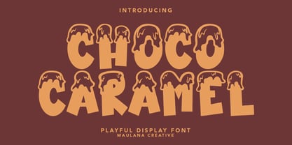 Choco Caramel playful display font. Bold stroke, fun character with a bit of ligatures and alternates. To give you an extra creative work. Choco Caramel playful display font support multilingual more than 100+ language. This font is good for logo design, Social media, Movie Titles, Books Titles, a short text even a long text letter and good for your secondary text font with script or serif. Make a stunning work with Choco Caramel playful display font. Cheers, Maulana Creative
 - Superbaquero by M#RM#N,
$9.00 Superbaquero es una tipografía simple que representa un estilo muy poco común en el estilo vaquero, una simple idea basada en un cuadro. Cómo siempre, buscando la inspiración al estilo ranchero.
 - Aragones - Unknown license

- Cocomat Pro by Zetafonts,
$39.00 Cocomat has been designed by Francesco Canovaro and Debora Manetti as a development of the Coco Gothic typeface system created by Cosimo Lorenzo Pancini. It shares with all the other subfamilies in the Coco Gothic system a geometric skeleton with open, more humanistic proportions, a sans serif design with slightly rounded corners and low contrast proportions, without optical compensation on the horizontal lines, resulting in a quasi-inverted contrast look in the boldest weights. What differentiates Cocomat from the other subfamilies in Coco Gothic are some slight design touches in the uppercase letters, with a vertical unbalancing reminiscent of art deco design, notably evident in uppercase "E", "A","F","P" and "R" - while lowercase letters have been given some optical compensation on the stems, like in "n","m", "p" and "q". These design choices, evoking the second and third decade of the last century (Cocomat is also referred as Coco 1920 in the Coco Gothic Family) all give Cocomat a slight vintage feeling, making it a perfect choice every time you need to add a period vibe or an historical flair to your design, like in food or luxury branding. The typeface, first published in 2014, has been completely redesigned by the original authors in 2019 as Cocomat PRO to include eight extra weights (thin, medium, black and heavy in both roman and italic form), extra open type features (including alternate forms, positional numerals), and extra glyphs making Cocomat cover over two hundred languages using latin, cyrillic and greek alphabets.
 - Binggo Wood Display by Genesislab,
$20.00 Bingo Wood Display in totality and elegance. One of my newest first releases, hand drawn with pinpoint accuracy. Bingo Wood has the perfect amount of simplicity and subtlety for your next project. It perfectly represents retro and vintage aesthetics. I recommend this font for logos, invitations, and your next home decor project that requires a touch of compact alternative combinations! Include Format: - Bingo Wood Display. otf Bingo Wood appears with a total of 593 Glyph characters available: Basic Latin, Extended Latin A, Punctuation, Open & Close Punctuation, Dashes & Quotes, Super Script & Sub Script, Currency, Numbers, Math Symbol, Designer Favorites Case Sensitive Forms, Discretionary Ligature, Denominators, Standard Ligature, Numerators Stylistic Alternates Set, 1, 2, 3, Sup Script, Super Script, Swash Get inspired by the images above and feel free to share with me what you get using this font.
 - Oo Boodlio Doo NF by Nick's Fonts,
$10.00Bongo drums at the ready! Freeman Craw's archetypal beatnik typeface Ad Lib provided the inspiration for this indubitably eccentric excursion in coolsville typography. Both versions of the font include complete Latin 1252, Central European 1250 and Turkish 1524 character sets, with localization for Moldovan, Romanian and Turkish. - Partitura1941 by Idoia de Luxan,
$37.50 Tipograf�a caligr�fica inspirada nos t�tulos das canci�ns dun caderno familiar de partituras de 1941. � unha fonte creada da maneira m�is fidel posible a como se debuxar�a cunha pluma estilogr�fica do momento. Axeitada para t�tulos ou letras capitais. Non se recomenda empregar para textos longos, de non ser que se pretenda simular un arquivo antigo dun estilo manuscrito semellante. Tipograf�a caligr�fica inspirada en los t�tulos de las canciones de un cuaderno familiar de partituras de 1941. Es una fuente creada de la manera m�s fiel posible a como se dibujar�a con una pluma estilogr�fica del momento. Adecuada para t�tulos o letras capitales. No se recomienda utilizar pata textos largos, a no ser que se pretenda simular un archivo antiguo de un estilo manuscrito semejante. Calligraphic typography inspired by the titles of the songs of a family notebook of 1941. It is a source created in the most faithful way possible to how it would be drawn with a stylus pen of that moment. Suitable for titles or capital letters. It is not recommended to use for long text, unless you pretend to simulate an old archive with a similar manuscript style.
 - Cacao by Wiescher Design,
$39.50 Cacao is another one of my "found fonts". I found this one in an old advertising for a French cocoa drink. Since I am a vervent lover of cocoa, I will give you my recipe for a normal coffee mug full of delicious hot cocoa. Mix three heaped teaspoons of sugar with one and a half to two teaspoons of finest cocoa powder. Then add a little cold milk, stir, add a little cold milk, stir, and so on until you have a mushy creamy consistency. Now slowly add - always stirring - boiling hot water til the cup is almost full. Top with a little liquid cream and enjoy! If you have a package design job, use my Cacao font and stir in some creativity. Your sweet-tooth designer, Gert Wiescher.
 - Colagraph - 100% free

- Bagunsa by Turto Studio,
$10.00 Bagunsa is a multilayer fun party play sans font. It intend to be an ongoing family with maybe infinite possible styles.
 - Cool Beans by Comicraft,
$19.00 Can you dig it, man? Comicraft's Jazzy "JG" Roshell, just swung by after playing bongos down at the coffee bar in his black turtleneck sweater, stove-pipe trousers, dark glasses and beret. Check out the rad Tiki corners on our freshest font, COOL BEANS and you'll want to snap your fingers, put on some Miles Davis and take the next train out of Squaresville, um, Daddio.
 - Brazzaville NF by Nick's Fonts,
$10.00Barnhard Brothers and Spindler called this typeface Congo when it appeared in their circa-1910 type catalog. The design is characterized by strong Art Nouveau influences, tight spacing and a large x-height. - Cocogoose Classic by Zetafonts,
$39.00 Download PDF Specimen Created as a display typeface in 2012 by Cosimo Lorenzo Pancini, Cocogoose is one of Zetafonts most loved typefaces. A sans serif typeface of geometric proportions, with very low contrast and slightly rounded corners, it was the first typeface to be produced in the Coco series, an ongoing research on the design variation in gothic typefaces through the ages. Cocogoose extreme x-height and ultrabold weight (with regular being comparable to heavy weights of other typefaces), have since then made it very popular for effective display and logo use, also thanks to decorative versions like Cocogoose Letterpress. Since 2016, Andrea Tartarelli has been improving the typeface expanding the original glyph set to include cyrillic and greek and adding extra weights, widths, and italics to the original family range, and bringing Cocogoose to an impressive count of 52 variants. In 2019, Francesco Canovaro has teamed with Andrea Tartarelli and Cosimo Lorenzo Pancini to create a new variant subfamily: Cocogoose Classic, featuring 8 weights and matching italics. Cocogoose Classic keeps the original design for uppercase characters while developing a new design for lowercase, with a smaller x-height, round dots and expanded open-type features, including positional numerals, alternate forms, and extended ligatures and bringing the glyph count to over 1000 characters.
 - Pacifica by Solotype,
$19.95This is really Congo from Barnhart Bros. & Spindler, but we felt it would be improved if we smoothed out some of the curves slightly. Conjures up visions of Pacific Islands and other exotic ports of call. - Huevo by Burghal Design,
$29.00Versatile egg-shaped Huevo, like all Burghal Design fonts, includes upper and lower case letters, as well as numbers, symbols, punctuation, and accented foreign characters. Huevo is the head of the household known as Los Huevos. Tequila-guzzling, cerveza-swilling Huevo Loco is the boldest of Los Huevos and includes cocktail glass, olive, and eight ball dingbats. Huevo Loco can drink any other font under the table. Like most red-blooded American fonts, the favorite pastimes of Huevo Gordo are eating and couch warming, and boy, does it show! - OregonDry - Unknown license

- OregonDry - Unknown license

- Felt - Unknown license

- FeltMark - Unknown license

- Oregon - Unknown license

- Comics - Unknown license

- MarkerFinePoint-Plain - Unknown license

- NeedlePointSew-Plain - Unknown license

- OregonDry-Plain - Unknown license

- Kremlin Grand Duke - Unknown license

- John Handy by ITC,
$29.99John Handy is the work of British designer Timothy Donaldson and based on his own handwriting. Part of the ongoing trend for casual letterforms in display typography, John Handy is an excellent choice for letters, greeting cards, menus, wherever an elegant yet personal look is desired. - Tarpon Springs JNL by Jeff Levine,
$29.00 An early-1960s Canadian magazine ad for a brand of birth control pills featured the least likely spokesperson – Annette Funicello (“starring in “Beach Blanket Bingo” and “How to Stuff A Wild Bikini”). The text was hand lettered in an Art Deco-inspired sans serif type design. Tarpon Spring JNL is available in both regular and oblique versions.
 - Levato by Linotype,
$29.99 Levato, the first font designed by Felix Bonge, is an Antiqua that is full of character and is refined but by no means sterile. This typeface provides for a wide range of options for creating individual designs. It was not really Felix Bonge's intention to create a whole font family when, as a second year student, he began several exercises in contrast and proportion as part of the typeface design course of Professor Veljovi? at Hamburg University of Applied Sciences. However, these initial studies developed into a project that Bonge persisted with over the following years while working towards his degree. He continually had new insights and ideas that he was able to exploit for his font. Of particular importance, he claims, was a calligraphy seminar, which prompted him to completely rework his concept. It took him several years before his extensive font Levato™ was ready. Although the forms of Levato are ultimately derived from Renaissance Antiqua, Bonge has slightly increased the relative contrast in his version. This gives the font a graceful appearance that is further emphasized by the reduced x-height and the associated prominence of the ascenders. And, in addition, the relatively fine serifs, which are almost linear at their ends, infuse Levato with a hint of classical Antiqua á la Bodoni. At the same time, Bonge cleverly compensates for the sterilising tendency of this font form. Soft and rounded serif attachments and rounded line apexes offset the severe nature of the font and provide it with an aura of vivacity. This effect is promoted by the calligraphic-like foot of the lowercase h, n and m and the not quite horizontal bars of the uppercase E and F. Overall, Bonge has succeeded in creating a refined and yet very dynamic typeface. Levato is available in five weights; Light, Regular, Medium, Bold and Black, in each case with the corresponding italic versions. Bonge treats Levato Italic as a genuine cursive typeface. Its letters are thus slightly narrower than the analogous upright letters and their forms are considerably more curvilinear. All the versions of Levato boast an enormous range of characters to meet all possible requirements. In addition to four sets of minuscule and majuscule numerals for tabular and proportional typesetting, there are also small caps, numerous ligatures, ornamental characters and even swash variants of letters. With their generous, sweeping curves, the swash variants (available as OpenType versions) can be used for striking titling effects or as initials.
 - Ziboulateur by Kitchen Table Type Foundry,
$15.00 Ziboulateur is French slang for bottle opener. The word consists of two parts: Zibula (a word from Congo-Brazzaville meaning: ‘to decork’) and the French suffix -ateur. I thought this rather creative word would be a good name for this particular font! Ziboulateur is a handmade, all caps display font. It comes with extensive language support, including Sami and Vietnamese.
 - Film Critic JNL by Jeff Levine,
$29.00 An ongoing movie review column known as the "Critic's Forum" (such as was found in the May 23, 1936 issue of The Film Daily) had a simple Art Deco monoline hand lettering of the column's name. Redrawn digitally as Film Critic JNL, this typeface is now available in both regular and oblique versions.
 - Loki Cola - Unknown license

- Railway Point by Melissa Lapadula,
$11.95This typeface has been influenced by the ongoing traffic congestion in Melbourne, and its lack of functional and reliable public transport as a possible solution. The font shapes are square-edged constrained angles, reflecting the way the Melbourne population feels when using the public transport system or roads. Use as headings and body copy in any graphic situation. - Camila by Latinotype,
$39.00 Camila is a delicate and smooth Didone typeface designed by Paula Nazal. The family is inspired by concepts such as elegance, simplicity, femininity, and primarily based on Coco Chanel. A remarkable feature of this font is that it lacks teardrop terminals, characteristic of Didone typefaces. This font of thin serifs and soft finishes also includes italics, strengthening the concept of its design. A great variety of shapes makes Camila an ideal font for both display and small sizes. Camila is the perfect choice for branding and publishing projects.. This font family comes in 7 weights, ranging from Thin to Black, each with matching italics and includes a set of 426 characters that support 206 different languages.
 - Alpha by CTR,
$30.00 The initial designs for this font first came from the idea of creating a dynamic and visually appealing typeface just by using squares so throughout the development stages I had restricted myself to just the use of squared paper. The hardest thing that I found was overcoming the problems regarding letter forms that have diagonal lines and therefore defer from the ongoing style of the typeface.
 - Dans Le Toilette by Latinotype,
$25.00 Dans le toilette is a fun dingbat inspired by things that happen fast in the bathroom every morning. You can use them on posters, covers, patterns, brands and all kind of image with a vintage touch. Dans le toilette is part of the dingbats series designed by Coto Mendoza including Dans le cuisine, Dans le jardin and Dans le Noël. Make your day with a fun morning Dans le toilette!
 - Christmas Doodles by Outside the Line,
$19.00 The newest addition to the Outside the Line collection of picture Doodle fonts... Christmas Doodles. The perfect font for that quickie Christmas party flyer. It includes gifts, gift tags, gingerbread man, gingerbread house, candy canes, hot cocoa, bow, crackers, 2 kinds of trees, poinsettia, jingle bell, ornaments, snowflakes and a star. This font works well with Holiday Doodles and Holiday Doodles Too which have some Christmas icons in them.
 - Ice Creamery by FontMesa,
$29.00Ice Creamery is a new variation of our Saloon Girl font family complete with italics and fill fonts which may be used to layer different colors into the open parts of each glyph. We don’t recommend using the fill fonts for Ice Creamery as stand alone solid fonts, Ice Creamery Chocolate was designed as a the stand alone solid font for this font family. Fill fonts go back to the 1850's where they would design matched sets of printing blocks and the layering of colors took place on the printing press, they would print a page in black then on a second printing they would print a solid letter in red or blue over the letters with open spaces to fill them in. Most of the time the second printing didn't line up exactly to the open faced font and it created a misprinted look. With the fill fonts in Ice Creamery and other FontMesa fonts you have the option to perfectly align the fill fonts with the open faced fonts or shift it a little to create a misprinted look which looks pretty cool in some projects such as t-shirt designs. I have some ice cream making history in my family, my Grandfather Fred Hagemann was the manager of the ice cream plant for thirty years at Cock Robin Ice Cream and Burgers in Naperville IL. In the images above I've included an old 1960's photo of the Cock Robin Naperville location, the ice cream plant was behind the restaurant as seen by the chimney stack which was part of the plant. If you were to travel 2000 feet directly behind the Cock Robin sign in the photo, that's where I started the FontMesa type foundry at my home in Naperville. My favorite ice cream flavor was their green pistachio ice cream with black cherries, they called it Spumoni even though it wasn't a true Spumoni recipe. Their butter pecan ice cream was also incredibly good, the pecans were super fresh, their Tin Roof Sundae ice cream was chocolate fudge, caramel and peanuts swirled into vanilla ice cream. One unique thing about Cock Robin and Prince Castle was they used a square ice cream scoop for their sundaes. - Beaucoup PB by Pink Broccoli,
$14.00 A totally off the wall crazy sans serif display type, Beaucoup started as a digitization of a film typeface called “Bippie” by Facsimile Fonts. From there, it was taken and built out to an extensive character set ready to take you for a wild ride. Completely loco, yet somehow still easily legible, this typographic wildchild is dying for you to get your grubby little hands on it and take it for a spin!


