10,000 search results
(0.04 seconds)
- Archie by Canada Type,
$39.95 Archie is a wide attention-grabber based on a simple geometric alphabet drawn in the early 1930s by Dutch calligrapher and lettering artist Martin Meijer. This digital family expands considerably on the original letters, adding biform shapes, small caps, italics across the board, and support for many Latin-based languages. Archie's eye-catching forms are meant for clear, seamless and strong message delivery. In its upright styles, strong vertical strokes emphasize the sense of confidence and importance, and in its italics, that emphasis is further affirmed by a natural sense of urgency. This kind of alphabet is perfect for display typography aiming at the glance-and-go crowd. When used properly and placed prominently, no eye can escape it. The basic Archie family is comprised of six basic fonts, while the Pro set combines all three uprights in one font and all three italics in another.
 - Ongunkan Karamanli Turkic Scrip by Runic World Tamgacı,
$50.00 The font I made based on the Greek alphabet used by the Karamanlı Turks, who are Orthodox Christians, by adapting it to Turkish, which I deduced by looking at the inscriptions and translations. In order to write in Turkish, Turkish special characters are loaded with letter combinations and sounds. But it can still be easily written in Greek.
 - MGT Vallery Hills by Magetype,
$15.00 When I was surfing the internet, with rock n 'roll music. I accidentally found a picture of a hotel sign with a very unique style, namely: Mid-century Modern (MCM). It looks very pretty and charming to me. And inspired me to create Font Family. And I am proud to present the Vallery Hills Font Family. This font is in the Retro style of the 50s to 60s. Okay, here are the specifications. 1. Vallery Hills Schrift There is one unique thing about this font. Usually, script fonts with Retro style always have an angled anatomical shape, but I made this font upright. The goal is to make a difference with other script fonts I've seen. By the way, this font comes in two styles, namely: Regular and Bouncy. Why do I make it like that? Because I want to make this font into two different functions, namely: If you want to make it a Display Font, which is usually used for Headings, then use the Bouncy style. And if you want to use it as Bodytext, then use Regular. 2. Vallery Hills Sherift This second font is a font that is very synonymous with the Mid-century Modern (MCM) era. A very distinctive form of the serif font of that era. Similar to the first font, this font also has 2 styles, namely: Regular and Bouncy. You can combine this font with the other two fonts in Vallery Hills. It could be Title, or Bodytext. And you can also combine two styles, namely: Regular and Bouncy. Try! 3. Vallery Hills Suns Sherift This last font is Sans Serif. Also has 2 styles like his two brothers, namely: Regular and Bouncy. The goal is actually the same. I am sure you are cooler to create a design that uses this font family. Well, there is one advantage of this font from its two siblings, which is that it has a feature, namely: SMALLCAPS. Which will be an option when you are bored with the mediocre shape or style of Lowercase. Try combining the Smallcaps with Uppercase or Lowercase. Must be cool! : D Oops, almost forgot. This font consists of several font formats, namely: OTF, TTF, and Webfonts. And of course everything is MULTILANGUAGE. OK, friends. That's all I can describe about the Vallery Hills Family. Hopefully it will please all of you. Cheers!
 - Technotyp by URW Type Foundry,
$39.99 The digital font Technotyp is based on the hot metal typeface created by the German typographer and type designer Herbert Thannhaeuser (1898-1963) for the former East German type foundry Typoart in Dresden. In the typography book ‘Der Schriftsetzer’ (Fachbuchverlag, Leipzig, 1952), by Paul Fritzsche, this absolutely beautiful slab serif design is presented in all its variations. Fritzsche remarked that – because of its rather condensed form and its relatively long ascenders – the 'Werkschrift' of the Technotyp (comparable with our 'Regular') seemed to be very well suited to serve as a text face, and recommended for this purpose that the face be cut for the composing machine. However, this never happened and the entire Technotyp family was made available for hand composition only. This is finally changing and being remedied for good now: URW++ proudly presents the new digital version of this really charming font family with its distinct flavor of the 1950s, adding it to the other digital renditions of Herbert Thannhaeuser fonts at URW++, namely Garamond No. 4 and Magna. The original Typoart family had an italic style for the light version only. The new digital version of Technotyp includes italic styles for the regular, medium and bold weights as well, enhancing the family to meet today’s standards and requirements for professional type setting. To further increase its usefulness, Cyrillic faces were created, too. True to the standard for all digital fonts at URW++, the character set for Technotyp covers all West- and East European languages.
 - Fushar Arabic by Mikołaj Grabowski,
$19.00 Fushar Arabic is a bold comic color font family which comes in 5 layer-styles easy to compose in a multicolor manner and 3 OpenType-SVG color styles to make the work faster and easier. Character set covers Latin A-Z all caps, Arabic, Persian and Urdu with 230 ligatures, European, Arabic and Persian / Urdu localized digits, punctuation, currencies and other symbols - the total of 729 glyphs. The idea came from a custom logotype I made several years ago for a local charity organisation that helps children. The logotype was based on bold letters with light that make the "balloon" effect visible in "Holes" style. Later I expanded the family with "Cuts" and all the derivative fonts that make the whole color family. The purpose was to create a funny, friendly and playful script that would embrace the beauty of the Arabic alphabet. Solid, Cuts and Holes are classic one-color styles which can be used separately to compose a simple text. With Shadows and Lights they can produce a multicolour design, as shown on the images above. To save the time, there are three already prepared combinations in the new OpenType-SVG color format. The features include required ligatures, discretionary ligatures, proper mark attachment, contextual alternates, case-sensitive forms, ordinals, localised Persian/Urdu numerals, superscript (1, 2, 3) & fractions. Now you can buy Extended Latin character set (uppercase and lowercase) at Fushar font family page on MyFonts. European languages, Vietnamese and Pinyin included.
 - Massel by Intellecta Design,
$26.90victorian family of fonts - Baker ST by Etewut,
$29.00 Baker ST is all caps type family. The family includes 5 styles, from regular to decorative, and includes multi-language support. The decorative uppercase is a bit different to the lowercase.
 - Kole by NicolassFonts,
$25.00 The complete family contains 18 weights. Kole family is ideally suited for signage, packaging, brand identity, software, editorial design, as well as web and screen design. Perfectly for headlines and logotypes.
 - Bipolar Poster by VersusTwin,
$39.00 The Bipolar Poster family of fonts adds extra weight and width to the Bipolar family to fonts. A mechanical blackletter enhancing readability while retaining ornamentation elements of the historical blackletter form.
 - Segaon Soft by cretype,
$20.00 This family is the rounded version of Segaon family. Segaon Soft Family is a humanist sans-serif typeface that is clean, simple and highly readable. The spaces between individual letter forms are precisely adjusted to create the perfect typesetting. Segaon is versatile type family of 18 fonts. Segaon family consists of 9 weights (Thin, ExtraLight, Light, Regular, Medium, Bold, ExtraBold, Heavy & Black) with their corresponding italics. The Open Type fonts contain complete Latin 1252, Cyrillic, Central European 1250, Turkish 1254 character sets. Each font includes old-style figures, proportional figures, tabular figures, numerators, denominators, superscript, scientific inferiors, subscript, fractions and case features. We highly recommend it for use in books, web pages, screen displays, and so on.
 - Cosmopolitan by Fenotype,
$35.00 Cosmopolitan is a monoline font family with script and sans versions that both work great together or alone. It comes with five weights and “printed” versions. For extra swashes, swirls and pictograms there is Cosmopolitan Extras. Cosmopolitan Script is packed with OpenType alternates: turn on Swash, Stylistic or Titling Alternates in any OpenType savvy program or find even more alternates from the Glyph Palette. Cosmopolitan Sans has different Swash Alternates for both upper and lowercase characters. Cosmopolitan Family gives an elegant look for any project from print to digital. For the very best price purchase the whole family! Cosmopolitan Family is inspired by two other great monoline font families: Selfie and Beloved.
 - FF Meta Variable by FontFont,
$344.99The FF Meta® design is a sans serif, humanist-style typeface that was designed by Erik Spiekermann for the West German Post Office (Deutsche Bundespost). It was subsequently released in 1991 by Spiekermann's company FontFont The FF Meta family, initially released as a commercial font in 1991, now comprises over sixty fonts. The FF Meta 2 family was released in 1992, the FF Meta Plus family in 1993, and in 1998 a facelift of the complete font family reclassified the FF Meta series and combined them into family-sets named FF Meta Normal, FF Meta Book, FF Meta Medium, FF Meta Bold and FF Meta Black. These are all available in Roman, italic, small caps and italic small caps. Between 1998 and 2005, further light stroke weights and a condensed family were introduced by Tagir Safayev and Olga Chayeva and were named: FF Meta Light and FF Meta Hairline. The last addition to the growing FF Meta font family is FF Meta Serif released by FSI in 2007. FF Meta Variable Roman is a single font file that features two axes: Weight and Width. For your convenience, the Weight and Width axes have preset instances. The Weight axis has a range from Hairline to Black. The Width axis provides a range of condensed values. This Roman (upright) font is provided as an option to customers who do not need Italics, and want to keep file sizes to a minimum. FF Meta Variable Italic is a single font file that features an italic design with two axes: Weight and Width. For your convenience, the Weight and Width axes have preset instances. The Weight axis has a range from Hairline to Black. The Width axis provides a range of condensed values. This Italic font is provided as an option to customers who do not need Roman (uprights), and want to keep file sizes to a minimum. FF Meta Variable Set is a single font file that features three axes: Weight, Width and Italic. For your convenience, the Weight and Width axes have preset instances. The Weight axis has a range from Hairline to Black. The Width axis provides a range of condensed values. The Italic axis is a switch between upright and italic - Elyzabeth Pro by moriztype,
$15.00 Elyzabeth Pro is a very elegant and practical sans serif font family and precise in its creation. clean fonts that stand upright elegantly that are soft and familiar and easy to read, Not boring to the reader. This type of font is great to use for very large writing purposes, ranging from notes on daily activities, magazines, newspapers, logos, posters, product compositions, product descriptions to be sold and indications of any product composition that requires writing shadows. Elizabeth Pro contains eight fonts. Broadly speaking, this font has two models, namely Regular and Italic. (Thin, Thin Italic, Regular, Regular Italic, Semi Bold, Semi Bold Italic, Bold and Bold Italic. They all support Latin, Greek, and Cryillic characters. This font will be a great asset to your font library, as it has the potential to enhance your next project creation.
 - Flexible by Art Grootfontein,
$40.00 Inspired by late 19th century’s gothic typefaces from broadsides, Flexible uses the latest font technology to allow designers to play with each letter height and width easily. This versatile uppercase typeface is available in 8 widths and 8 heights, and as a variable font which gives you unlimited font possibilities! By using the variable version you only need to install one font file instead of the entire family and you take full advantage of the tremendous scope for design. Flexible was also developed with animation in mind to create amazing kinetic typography videos. Please have a look at this video to see animation examples. This family is a perfect choice for standout headlines, displays, packaging, flyers, logos, and works well in both print and digital environments like sophisticated web design or kinetic typography. The complete family pack includes the variable font. Language support : Afrikaans, Albanian, Azerbaijani, Basque, Bosnian, Catalan, Croatian, Czech, Danish, Dutch, English, Estonian, Faroese, Filipino, Finnish, French, Galician, German, Hungarian, Icelandic, Indonesian, Irish, Italian, Latvian, Lithuanian, Malay, Norwegian Bokmål, Polish, Portuguese, Romanian, Slovak, Slovenian, Spanish, Swahili, Swedish, Turkish, Welsh, Zulu
 - Beret by Linotype,
$29.99Brazilian designer Eduardo Omine designed his Beret family of typefaces in an attempt to create a warm counterpart to the clean, minimalist sans serif of the 20th Century. The most individual characteristics of Beret are the terminals at the ends of its vertical strokes. They are slightly bent", simulating a subtle flare. Like many classic sans-serif typefaces (e.g., the original Syntax and Univers), this family does not include true (calligraphic) italics. Instead, a masterful set of obliques has been created. As Stanley Morison articulated in the early 1920s and 30s, these slanted versions of the regular "roman" faces may even work better when one wishes to emphasize certain words or passages within a text. The Beret family of typefaces is suitable for numerous applications, in both text and display sizes. The following nine fonts make up the family's design: Beret Light, Beret Light Italic, Beret Book, Beret Book Italic, Beret Regular, Beret Medium, Beret Medium Italic, Beret Bold, and Beret Bold Italic. Beret was awarded an Honorable Mention in the 2003 International Type Design Contest, sponsored by the Linotype GmbH." - Bousni Ronde by Linotype,
$29.99The Bousni family's six faces display links unexpected by most readers of western alphabets. Inspired by both by Arabic calligraphy, and contemporary bitmap design, Bachir Soussi Chiadmi created this playful series of faces. Letters in each of the six typefaces link together, but not in the ways normally expected from script fonts. Suited for a wide array of fun functions, Bousni Carre and Bousni Ronde (each available in Light, Medium, and Bold weights) bring new a style and flavor to your collection. All six fonts in the Bousni family are included in the Take Type 5 collection from Linotype GmbH. The Bousni family espouses similar construction traits with other fonts from Linotype. Specifically, the straight lines and joints in the three Bousni Carre fonts are based off of a grid system similar to Anlinear, another member of the Take Type 5 collection from Linotype GmbH. The letter connections throughout the Bousni family are similar to Arabic kashidas, a typographic feature found recently in many non-Arabic typefaces, such as Linotype Atomatic." - Bousni Carre by Linotype,
$29.99The Bousni family's six faces display links unexpected by most readers of western alphabets. Inspired by both by Arabic calligraphy, and contemporary bitmap design, Bachir Soussi Chiadmi created this playful series of faces. Letters in each of the six typefaces link together, but not in the ways normally expected from script fonts. Suited for a wide array of fun functions, Bousni Carre and Bousni Ronde (each available in Light, Medium, and Bold weights) bring new a style and flavor to your collection. All six fonts in the Bousni family are included in the Take Type 5 collection from Linotype GmbH. The Bousni family espouses similar construction traits with other fonts from Linotype. Specifically, the straight lines and joints in the three Bousni Carre fonts are based off of a grid system similar to Anlinear, another member of the Take Type 5 collection from Linotype GmbH. The letter connections throughout the Bousni family are similar to Arabic kashidas, a typographic feature found recently in many non-Arabic typefaces, such as Linotype Atomatic." - Queulat Soft by Latinotype,
$- The font is the soft version of the Queulat basic and condensed families, but keeping the same features as the original typeface. Queulat Soft is a hybrid font that combines different styles, reflecting charm, freshness and, especially, a strong personality. The font is inspired by Modern and Grotesk styles. The former is shown in some characteristic features such as teardrop terminals, which give the typeface an attractive unique look, making it an ideal choice for logotypes and labelling. The latter, with its rationality, makes Queulat Soft a stable and strong face for headings and subheadings. The combination of styles can be clearly seen by comparing the Regular with the Alt version. The Regular version is more simple than the Alt one. Differently, the alternative version possesses more features of the Modern style, like teardrop terminals in ‘k’ and ‘v’.
 - Graphique Next by profonts,
$41.99 The original Graphique Pro was designed by the famous Swiss designer Hermann Eidenbenz in 1945 and included one outline shadow style. His idea of a very narrow, very economic headline font became increasingly more popular over the last decades and since the recent trend of layered fonts his idea is more up-to-date than ever. profonts studio now took the idea of the Graphique Pro to its next level: Graphique Pro Next. This layered type family consists of 8 styles which can be combined in plenty of ways to create unique designs. The fonts thereby preserve the outstanding and timeless drawings of the original Graphique Pro font and will add an aesthetic and fresh look to every project. Please have a look at the Graphique Pro Next Type Specimen for more details about the language support and font layer combinations.
 - Gluck by Etewut,
$30.00 Gluck family is based on sans serif font. It fits to product design, any commercial and decorations. Glück family supports european languages. It includes 5 styles: • regular • stroked • bold • bold stroked • stripes
 - Riipale by Morganismi,
$15.00 Riipale is a font family with two sets of hand-drawn characters. Quality picture fonts are also included in the family of Riipale. Riipale Lined and Riipale Black support most European languages.
 - Tilda Script by Roman Polishchuk,
$25.00 Tilda Script Family is a clean and lining script with regular and non-connect versions in four weights. With this family you can craft solid logotypes with a unique look, set posters and ads, and even run longer lines of copy on packaging. Tilda Script is a versatile family with extensive language support and advanced typographic features including:Ligatures, Stylistic Alternates, Stylistic Sets.
 - Matita Informal by Trine Rask,
$30.00 Matita Informal is part of a larger type family developed from 2005-2019 with handwriting in mind. A humanistic informal sans serif in five weights containing swashes, alternative characters, old style, lining, tabular & proportional figures. The family share proportions and weights to ensure all fonts (family members) work together well. Matita Informal is a very friendly typeface suitable for many purposes.
 - Alexer Pro by NicolassFonts,
$35.00 Alexer Pro is a modern font family based on Alexer font family. Language support: Latin (including Vietnamese), Cyrillic, and Greek. It comes in 12 weights, 6 uprights, and matching italics. Each weight includes 1300 glyphs, alternates (G,I,t), and OpenType features. This family is ideally suited for packaging, headlines, advertising, and corporate identities. Perfectly for web, signage, and editorial design.
 - Mimic by Dmitri Moruz,
$19.00 Mimic is a font family of several typefaces, that are based upon the physical structure of the mouth, depicted while speaking of corresponding letters occurred. It is primarily created as an accidental font family, and thus contains the very basic glyph set, which includes: punctuation, numbers, and letters. Mimic font family is made up of: Mimic Regular, Mimic Medium, and Mimic Bold.
 - Nura by Sabrcreative,
$12.00 Introducing the Nura Font Family is the modern Display sans serif family. The Nura Font family comes in various sizes from Thin to Black, giving you the freedom to get creative with this font. With strong characters in the size of Black, it is very suitable for use for sign displays. and other sizes you can use as needed for your project
 - Phola Slab by RainBomb Studio,
$16.00 This modern slab serif typeface expands on the phola type family and complements it's siblings with style. Phola is a geometric san-serif display type family. It consists of 64 fonts and includes an extensive character set and multilingual support. Crafted with love this font family offers a numerous styles (Regular, Solid, Square, Diablo, Oblique, Outline, Clean) the family allows for extensive use cases. This OpenType font offer a fantastic options for users to create some unique artwork. Perfect for branding, Logos, displays, posters and other related projects.
 - InsideLetters by Ingrimayne Type,
$9.00 These letters were developed to decorate the font Bowling and then were also used in the fonts Coffeemug and Teapot. For many years the InsideLetters family had only one family member, InsideLetters. An upgrade in early 2019 added two more family members, InsideLettersHalloween and InsideLettersXmas. The first puts the letters from InsideLetters on pumpkins and the second puts them on Christmas tree ornaments. In 2022 and oblique stye was added to the family. Inside letters is caps-only. It is a casual and playful handwritten sans-serif font.
 - Phola by RainBomb Studio,
$16.00 Phola is a brand new geometric san-serif display type family. It consists of 64 fonts and includes an extensive character set and multilingual support. Crafted with love this font family offers a numerous styles (Regular, Solid, Square, Diablo, Oblique, Outline, Clean) the family allows for extensive use cases. This OpenType font offer a fantastic options for users to create some unique artwork. Perfect for branding, Logos, web design, headers, titles, displays, posters and other related projects. Family is mostly rectangular in shaped with either sharp or diagonal corners.
 - Girard by House Industries,
$33.00 Whatever the medium, Girard’s love for typography was the common thread that wove his work together. We are honored that the Girard family has entrusted us to celebrate and expand upon the legacy of this design icon with this collection of fonts. The Girard Slab family gracefully synthesizes illustrative sensibilities into a practical typographic framework. Slab’s three widths and four weights ensure versatility in a modern editorial setting while its gentle curves transcend the sterility of traditional typography to add an unprecedented warmth and personality. From boutique chocolate packaging to the titling sequence for an indie vegan superhero cartoon, Girard Script deftly adds a contemporary sophistication to text and display settings. Inspired by a workhorse lettering style that helped Alexander Girard implement thousands of design elements in his overhaul of the Braniff identity system, Girard Sky pulls its weight in any contemporary application. In Girard Sansusie, each character stands alone as an illustrative element while coming together with its counterparts as a whimsical yet functional typeface. FEATURES: The ligatures feature substitutes specially-drawn letter combinations that combine two, three or even four characters to create smoother transitions and simulate lettering sensibilities. Girard Slab’s three widths and four weights ensure versatility in a modern editorial setting while its gentle curves transcend the sterility of traditional typography to add an unprecedented warmth and personality. Copious alternate characters and “smart” OpenType programming allow Sansusie to escape the rigid confines of typography to come alive as if flowing from Girard’s sketchpad. This animation shows a sampling of the swash characters available in the font. GIRARD CREDITS: Typeface Design: Alexander Girard, Ben Kiel, Ken Barber, Laura Meseguer Typeface Production: Ben Kiel Typeface Direction: Christian Schwartz, Andy Cruz, Ken Barber Like all good subversives, House Industries hides in plain sight while amplifying the look, feel and style of the world’s most interesting brands, products and people. Based in Delaware, visually influencing the world.
 - Baltimore Typewriter by Intellecta Design,
$20.90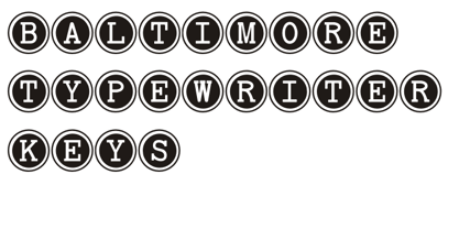 a comprehensive family of fonts
 - Annuario by Resistenza,
$39.00 Annuario is a sans serif multi-weight font family initially designed for a calendar. 48 fonts with 2 axes, a flexible family for many purposes. More About Opentype Features: https://bit.ly/opentype-rsz
 - P22 Platten Neu by IHOF,
$39.95 The P22 Platten font family has been revisited and expanded by designer Colin Kahn. Platten is based on lettering found in German fountain pen practice books from the 1920s (you may have seen the similar Speedball books in the US). This round tip pen lettering is comparable to the basic forms used in grammar school teaching alphabets, but with a few original characteristics. The Italic version has even more of these unusual features. Geometric and simple yet casual and timeless. Perfect for many uses.
 - Insigne Fleurons by insigne,
$21.99 Insigne Fleurons offers a wide range of diverse text ornaments to enhance your designs. These 52 ornaments can be used as components of a logo, background patterns or elements, border patterns or to add flourishes and refinement to your designs. Insigne Fleurons can be resized and rotated easily without any loss of quality and can easily be converted to outlines and modified. Combine them to form unique compositions or insert them into text to draw attention. Please see the sample .pdf to see all 52 ornaments in action.
 - Vista Slab by Emigre,
$69.00 The Sans Narrow and Slab versions were added to the Vista family in 2008, extending this super-family to a total of 108 fonts. For more information, see the original Vista Sans Design Information.
 - Catavalo by Creativemedialab,
$20.00 Catavalo is another stylish family from our collection, this unique family is perfect for headers, display or any fashion branding related concept. Contains 6 weights with tons of alternates and ligatures to play with.
 - Vista Sans Narrow by Emigre,
$69.00 The Sans Narrow and Slab versions were added to the Vista family in 2008, extending this super-family to a total of 108 fonts. For more information, see the original Vista Sans Design Information.
 - Mehdi Mutamathil by Arabetics,
$32.00 The Mehdi Mutamathil type family follows the guidelines of the Mutamathil type style. It has only one glyph for every basic Arabic Unicode character or letter. The Mehdi Mutamathil family includes all required Lam-Alif ligatures and selected marks positioning so it does use limited glyph substitutions or forming. Mehdi Mutamathil employs variable x-height values. Text strings composed using typefaces of this family are non-cursive with stand-alone isolated glyphs. The Mehdi Mutamathil family includes both Arabic and Arabic-Indic numerals, all required diacritic marks, Allah ligature, in addition to all standard English keyboard punctuations and major currency symbols. The fonts in this family support the following scripts: Arabic, Persian, Urdu, Pashtu, Kurdish, Baluchi, Kashmiri, Kazakh, Sindhi, Uyghur, Turkic, and all extended Arabic scripts.
 - Midnight Edition by Up Up Creative,
$15.00 Midnight Edition is a stylish, modern serif font family that gives traditional serif design elements a modern feel, making it ideal for body text, headlines, and calls to action. Its clean lines, generous curves, and crisp details make it suitable for a wide range of design projects. The Midnight Edition complete font family includes 14 fonts (7 weights, each with an upright and an italic version). Each weight and style includes over 400 glyphs — including 10 standard ligatures and a smattering of character variants — and supports over 200 languages. The OpenType features can be very easily accessed by using OpenType-savvy programs such as Adobe Illustrator and Adobe InDesign. (To access these features in Microsoft Word, you'll need to get comfortable with the advanced tab of Word's font menu.)
 - Ciutadella by Emtype Foundry,
$69.00 Ciutadella was originally commissioned by Mario Eskenazi’s studio. It is a versatile geometric sans serif, a simple, clean and direct family. Its power resides in an overhaul simplicity that reflects an “open” personality, easily suitable to be used across a wide range of applications, from identity systems to publications. Although it has been conceived to be used as a display typeface, it performs well in intermediate length texts mostly because of some specific characteristics such as the alternate two-story ‘a’. It is available in Open Type format and includes Alternate Characters, Ligatures, Tabular Figures, Fractions, Numerators, Denominators, Superiors and Inferiors. It supports Central and Eastern European languages. The type family consists of 10 styles, 5 weights (Light, Regular, Medium, SemiBold and Bold) plus italics. See also Ciutadella Rounded and Ciutadella Slab. Ciutadella PDF.