10,000 search results
(0.269 seconds)
- Kovanov by Subqi Studio,
$22.00 Introducing Kovanov, a clean latin serif family with swash alternates for more fun purposes. Contains 420+ Glyphs this font also come up with 7 different weights. Our first display 'swashy' font with different weights to be honest. Because we knew in some cases sometimes need either thinner or thicker font or maybe both as companion as a whole. This font will suitable for your any projects such as branding, printing, social media, quotes and whatnot. We give you some glympse with our display preview there.
 - Heptal by deFharo,
$11.00 - Heptal is a typeface family with five weights including true italics. The geometry of the characters is neo-gothic and the serifs are polygonal concave or inverted Tuscan. - Heptal fonts offer a complete set of lowercase alternatives and advanced open type functions. - The proportions, the metrics and the Kerning are meticulously configured so that the texts are shown fluid and the graphic stain is compensated. - These fonts have a wide table of characters (530 glyphs) with support for all the languages derived from Latin.
 - FF Engine by FontFont,
$47.99 Dutch type designer Alex Scholing created this display and sans FontFont in 1995. The family has 6 weights, ranging from Light to Bold (including italics) and is ideally suited for book text, editorial and publishing as well as software and gaming. FF Engine provides advanced typographical support with features such as small capitals, alternate characters, case-sensitive forms, fractions, super- and subscript characters, and stylistic alternates. It comes with a complete range of figure set options – oldstyle and lining figures, each in tabular and proportional widths.
 - Violant by Eurotypo,
$60.00 Violant fonts are designed as a tribute to Queen Violant, wife of Jaume 1st, king of Aragon, a woman of strong character, who supported her husband in the conquest of Valencia in 1238. Probably, Violant read texts in Gothic letters, which at that time were subjected to a stylization process in Castile and Aragon. Violant family comes with 736 glyphs, with OpenType features, swashes for all glyphs, stylistics sets, stylistics alternates, a lot of ligatures and a generous set of ornaments to play with your texts.
 - Aspasia by Mikus Vanags,
$18.00 The Aspasia is a decorative low contrast sans serif type family suited both for editorial and corporate design, available in five weights, ranging from Thin to Black. It was designed by Mikus Vanags in 2009 influenced by art-deco geometric typefaces and mastered for the needs of today. The Aspasia OpenType fonts have and extended character set to support Central/Eastern European languages like Polish, Czech and Latvian. The font includes old style and lining figures, regular and discretionary ligatures and multiple stylistic alternates.
 - Black Thone by Attype Studio,
$12.00 Introducing Black Thone - Inspired by typeface on 70s era, Black Thone has the vintage font & retro font style. with 3 font style, It's super easy to use 3D effect wint Black Thone family font. Three style Font: Regular, Display & Extruded Black Thone is perfect for children product, branding, logo, invitation, stationery, product packaging, merchandise, monogram, blog design, game titles, cute style design, Book/Cover Title and more. Features : - Black Thone.otf - Black Thone Extruded.otf - Black Thone Display.otf - Multilingual Support --- Hope you enjoy with our font! Attype Studio
 - Linotype Zootype by Linotype,
$29.99Zootype –the first original single font– was designed in 1997 by Victor Garcia of Argentina and as a winner of Linotype's Second International Type Design Contest is included in the TakeType Library. The three additional family styles –Zootype Air, Zootype Land, Zootype Water– were added in 1999. In the words of the designer, the design concept is meant to display the funny, happy joy of animal nature.’ Animal heads peek into the block forms of the letters, giving the font a unique whimsical character. - Jules by DSType,
$45.00 At first glance, Jules, appears to be just one more Didonic variation, but a closer look starts revealing all the extraordinary features of this type family, specially designed for use in extremely big sizes. Jules reflect the last of the late 18th century and was inspired by several plates from a portuguese calligrapher named Antonio Jacintho de Araujo. Available in three different optical sizes: Big, Colossal and Epic, Jules has a plethora of ligatures and stylistic alternates, plus refined Italics and a super elegant Swashes version.
 - Mencken Std by Typofonderie,
$59.00 An American Scotch remixed in 27 fonts Mencken has twenty seven styles, divided into three widths, three optical sizes, romans and italics. Generally, optical size typeface families belong to a same common construction. It falls into the same category of type classification, while presenting different x-heights or contrasts. Mencken is unique because it is designed according to different axis and optical sizes. Firstly, Mencken Text is a low-contrast transitional typeface, designed on an oblique axis, asserting horizontal with featuring open counters. Its capitals follow Didots to better harmonize the rest of the family. On the other side of the spectrum, Mencken Head (and narrow variations) is designed on a vertical axis, high contrast, in a contemporary Didot style. The Mencken is therefore a typeface answering to different sorts of uses, whose design is different according to its uses: from oblique axis in small size to vertical axis in large sizes. Vertical proportions (x-height, capitals height, etc.) were calibrated to be compatible with many Typofonderie typeface families. Lucie Lacava and I followed the idea launched by Matthew Carter few years ago for some of his typefaces intended for publications. From Baltimore Sun’s project to Typofonderie’s Mencken It is a bespoke typeface for American newspaper The Baltimore Sun started at the end of 2004 which marks the beginning of this project. The story started with a simple email exchange with Lucie Lacava then in charge of redesigning the American East Coast newspaper. As usual, she was looking for new typeface options in order to distinguish the redesign that she had started. At the time of its implementation, a survey of the newspaper’s readers has revealed that its previous typeface, drawn in the mid-1990s, was unsatisfactory. The Mencken was well received, some reader responses was particularly enjoyable: “It’s easier to read with the new type even though the type is designed by a French.” Why it is called Mencken? The name Mencken is a tribute to H. L. Mencken’s journalistic contributions to The Sun. According to the London Daily Mail, Mencken ventured beyond the typewriter into the world of typography. Because he felt Americans did not recognize irony when they read it, he proposed the creation of a special typeface to be called Ironics, with the text slanting in the opposite direction from italic types, to indicate the author’s humour. Affirming his irreverence, the Mencken typeface does not offer these typographic gadgets. Henry Louis Mencken (1880 — 1956) was an American journalist, satirist, cultural critic and scholar of American English. Known as the “Sage of Baltimore”, he is regarded as one of the most influential American writers and prose stylists of the first half of the twentieth century. He commented widely on the social scene, literature, music, prominent politicians and contemporary movements. Creative Review Type Annual 2006 Tokyo TDC 2018
 - Who - Unknown license

- Blushbutter Fae by Blushbutter,
$45.00I've always loved drawing faeries and I love using them in my scrapbooking pages. So after hunting around for a unique decorative fairy font for my crafts I couldn't quite find what I wanted to use, so I decided to create a whimiscal set of fairy drawings and characters that would suffice. I was influenced in the drawing of the fairies by my love of the 3D poser graphics art,several awesome comics, Alphonse Mucha and several Masters of Art. These decorative Fairy dingbats would be great to use in fabric crafts,textiles, embroidery patterns, scrapbooking, greeting cards, Rubber stamps, name titles, Calligraphy, the possiblities I feel are endless when thinking of craft applications. - Palmona Plus by Ingo,
$46.00 A rustic black letter from the 1930ies — with stylistic alternates. The high degree of abstraction of this typeface allows it to appear modern, even though its shapes clearly show an origin from Fraktur and Gothic. The letters present the effect of woodcarving or silhouette cuttings as they are defined exclusively with straight lines and sharp corners. By doing without any bowls, the typeface becomes a stylistic entity with a decorative effect. Palmona is especially appealing in combination with bold illustrations. Some of the characters of Palmona are available in one or more alternate forms which can be accessed manually or automatically. Use of these alternates is most easily operated with OpenType-Functions Standard-Ligatures and Discretional Ligatures in the user program. With Standard Ligatures activated, problematic letter compositions are substituted with appropriate ligatures. Likewise, in certain letter combinations the alternates are inserted. The Discretional Ligatures include additional alternatives. Configuration of the characters of the Palmona font is according to Unicode ISO 8859-1 (Latin1). Consequently all characters for all European languages with Latin type are covered — including Turkish, the Baltic languages, East European and Scandinavian languages. Congruent with the time of its origin and typical for black letter typefaces, Palmona also includes a long s as well as — uncommon but definitely reasonable — a capital ß. Both characters are automatically applied with the activation of Discretional Ligatures, and the associated ligatures appear automatically as well. When using ”long s,“ you must ensure the correct use of the rules for the Fraktur font: ”round s“ is always at the end of the word, also in compound words. For those of you who want to be even more correct, read the corresponding >> article in Wikipedia.
 - Kayto by Majestype,
$20.00 Kayto Script is the second collaboration of Erwin Indrawan as the calligrapher and Dexsar Harry Anugrah of Majestype as the typeface designer. Today the resurgence of calligraphy has reached the summit, with social media as the vehicle, we are now familiar with many styles of calligraphy. One of the popular styles is brush lettering, especially the pointed brush calligraphy. Kayto Script is an exploration in pointed brush calligraphy. It’s an interpretation of modern brush calligraphy that combines cursive writing with the East Asian calligraphy flair. Kayto is made with a real brush and held perpendicular to the paper so the brush can twist and turn freely to follow the movement of the hand. This technique gives a natural gesture and energetic look to the strokes. Kayto has a unique rhythm of brush pressure to generate the thick-and-thin strokes... the beating heart of brush calligraphy. Instead of the mechanical thick-and-thin strokes like the regular calligraphy, Kayto is written with a lot of variety of pressure that is somewhat melodic but still conform with the discipline. The result is a script that feels personal and characterized with lively energy. And just like handwriting, every letter in Kayto script is crafted with many varieties of glyphs and ligatures to make an unlimited combination of personalized lettering. Because of its natural letterforms, Kayto Script is best suited to complement anything that is earthy or has nature as the ground. Erwin, the calligrapher, has used Kayto in many of his watercolor illustrations. Another ideas are wedding names on invitations or place cards, logo for any natural products, inspirational quotes, business cards and the list goes on... but in the end, if you wish for something personal and truly one of a kind then Kayto script the one you want. Also, Kayto offer a free version called "Kayto Doodles" designed by Adiet Pramudya.
 - Bebel - 100% free

- Nascent, a font created by The Type Fetish, stands out as a remarkable addition to the diverse world of typography. This typeface exudes a unique blend of modernity and functionality, making it a ver...
- Arialic Hollow is a distinctive typeface designed by GemFonts | Graham Meade, a creation that stands out for its unique approach to the visualization of letters and words. This font is part of the br...
- TT Supermolot Neue by TypeType,
$35.00 Useful links: TT Supermolot Neue PDF Type Specimen TT Supermolot Neue graphic presentation at Behance Looking for a custom version of TT Supermolot Neue? TT Supermolot Neue is a redesigned, extended and greatly enhanced reincarnation of the popular TT Supermolot and TT Supermolot Condensed font families. During its existence, the hammers (‘molot’ in Russian) managed to get into the spotlight in a huge number of projects, for example, in popular video games, films, and branding. Despite its popularity, the limited composition of old families put boundaries their development, which prompted us to release a completely redesigned and greatly extended version. And while the old families could offer designers only a limited number of tools, in the new version you can already find 54 fonts, and each individual font now consists of more than 620 glyphs. First, we have added a completely new subfamily, TT Supermolot Neue Extended. But this is only the tip of the iceberg—in order to achieve visual harmony between the three subfamilies, we completely revised the distribution of widths among them. As a result of this work, the width of the TT Supermolot Neue Basic subfamily became a bit narrower, and the width of the TT Supermolot Neue Condensed subfamily became even narrower than it was in the old version. Secondly, we’ve increased the number of weights. While in the old versions there were only 5 weights, in the new ones there are 9 in each of the subfamilies. In addition, we gave a facelift to the lowercase and uppercase letters. In TT Supermolot Neue, the design of all controversial grapheme forms was soothed and now the family can also be used in the text set. We have completely redrawn italics. It took us half a year to compensate for all the circles, to transform italic strokes, to work out the position of the diacritics, to make right the spacing, and to finish kerning. Following a good tradition, in the TT Supermolot Neue extensive support for useful OpenType features was added, and hinting was also improved. If we talk about visual features, we recommend paying closer attention to two stylistic sets: the first set (ss01) is designed to make the typeface more humanist, and when you turn on the second set (ss02), the typeface becomes even more technological. In addition, the typeface has more than 26 items of standard and discretionary ligatures. We also have not forgotten about the figures and we added a set of old-style figures to the standard version. In addition, the typeface has case, ordn, frac, sups, sinf, numr, dnom, onum, tnum, lnum, pnum, calt, liga, dlig, salt, ss01, ss02.
 - Paneuropa 1931 by ROHH,
$19.00 Paneuropa 1931™ is a faithful recreation of XX-century Polish classic, made by Idzikowski foundry in Warsaw, 1931. Original Paneuropa was a renowned and highly popular typeface in XX-century Poland, and was widely used in all kinds of design, editorial use and printed materials for decades. Paneuropa is a geometric, clean and versatile font family inspired by Paul Renner's famous Futura - it is a bit narrower, with different proportions and details in drawing, completely different figures and punctuation shapes than Futura. It is an interesting and refreshing alternative to Futura with its own distinct personality and a subtle authentic vintage flavour. Paneuropa 1931 contains separate styles for display and large sizes as well as styles for small text sizes - differing in spacing and the softness of letterforms. The family features an original Paneuropa Double font - a beautiful inline style for headlines and display use. The whole family is completed with added missing inbetween styles as well as italics. The original subfamily set is available for purchase and it contains solely the original Paneuropa styles (Thin, Regular, Bold, Text Regular, Text Italic, Double). Paneuropa 1931 characteristics: letter shapes and proportions are very faithful to the original, keeping its idiosycrasies and inconsistencies spacing and kerning are carefully adjusted in order to achieve the colour of the original fonts, keeping maximum possible consistency - a compromise between authentic vintage feel and legible consistent text colour (for hardcore users: just turn off the kerning) weights precisely matching the original (Thin, Regular, Bold, Text Regular, Text Italic, Double), inbetween weights were added (Light, Demi Bold, as well as missing italic styles) italic angle faithful to the original (8 degrees) softened corners help achieving the character of old imprecise printed display styles for big sizes are sharper and have tight spacing, text styles have softer shapes (recreating small print imperfect print) and broader spacing for use in paragraph text (spacing in both display and text styles matches the original as well) original style names in Polish for devices with Polish set as their primary language The family is very versatile. The Inline style as well as bold and thin weights are perfect for headlines and display use, other styles works wonderfully as paragraph text. Paneuropa 1931 consists of 18 fonts - 5 display weights with corresponding italics + 3 text weights with corresponding italics + 2 inline styles (for big and small print sizes). It has extended support for latin languages, as well as broad number of OpenType features, such as case sensitive forms, fractions, superscript and subscript, ordinals, currencies and symbols.
 - Short Message by Arendxstudio,
$14.00 Short Message is a 3 font combination that is suitable for all your design projects that aim to convey your message to your loved ones, with the font packages offered will definitely satisfy you Short Message came with opentype features such stylist ligatures good for logotype, poster, badge, book cover, tshirt design, packaging and any more.
 - We Love Nature Leaves by kapitza,
$79.00 We Love Nature Leaves is an extensive and versatile collection of foliage illustrations. This font consists of 52 highly detailed drawings of twigs and leaves which can be used on their own or in combination with the other illustrations in the ‘We Love Nature’ font collection. All illustrations are drawn by hand and of the highest quality.
 - Baraquiel by Scriptorium,
$18.00Baraquiel is based on an interesting style of calligraphic script we found in a turn-of-the-century magazine ad. It is much more acutely slanted than most scripts, and has pretty dramatic variations in weight. Nonetheless it has high readability and works well in combination with many of our text fonts, particularly Evadare and Albemarle. - BR Sonoma by Brink,
$30.00 BR Sonoma is a new geometric grotesque built for the 21st century with a finely tuned modern aesthetic. BR Sonoma builds on the foundations laid by the classic Swiss grotesques such as Helvetica and Univers but combines their features with a stronger geometric base usually found in other early classics such as Avant Garde, Futura and Avenir.
 - Stove Plate JNL by Jeff Levine,
$29.00 An old printer's advertising cut for Red Star Oil Stoves yielded a typeface that was both vintage and somewhat techno at the same time. Originally drawn as a slanted logo, the individual letters had an array of chamfered, angled and flat sides combined with a bold outline. This font is available in both vertical and oblique versions.
 - Bodynote by Balpirick,
$15.00 Proudly Present, BODYNOTE Font. BODYNOTE is a Fun Handbrushed Font. Bodynote is a fun and playful display font. This font is perfect for children themed designs, especially when combined with bright colors. This font includes TTF and OTF, BODYNOTE also multilingual support. Enjoy the font, feel free to comment or feedback, send me PM or email. Thank you!
 - Fine And Dandy JNL by Jeff Levine,
$29.00 Fine and Dandy JNL comes from the hand lettered title of the 1929 movie "Isle of Escape"; found on the sheet music for its theme song "My Kalua Rose". An engraved and fancy Roman, the style combines elements of Western, Art Nouveau and Art Deco into one attractive type design; available in both regular and oblique versions.
 - Dans Le Noël by Latinotype,
$29.00 Dans Le Noël is a Christmas dingbat. Perfect for use as ornament greeting cards, patterns, posters, websites and visual compositions that need Christmas show in a language full of personality, inspired by vintage illustrations. Dans Le Noël is part of the serie Dans, with Dans Le Cuisine and Dans Le Jardin. You can combine them as you like. Enjoy!
 - Hypercrack by Invasi Studio,
$19.00 Introduction of our new collection of playful doodle font styles. The Hypercrack Handwritten all-caps Font with scribbles styles font. Also, Hypercrack has a unique stylistic alternates character. So you can create a combination of whatever you want! This font is perfect for your display project for headlines, quotes, editorial design, print posters, and much more.
 - Serid by Samuel Vicente Types,
$22.00 SERID is a display font condensed and regular designed for editorial applications. Inverted contrast, features a serif hybrid that gives a decorative character and personality to the font. Being a display type, intended for use in titles or in small blocks of text, from 24pt. The name SERID comes from the combination of words “SERif” and “hybrID”, resulting SERID.
 - Engel Stabenschrift NF by Nick's Fonts,
$10.00This elegant unicase uncial face is based on a work by German type designer Ernst Engel from 1927.This typeface masterfully combines Art Deco sensibilities with medieval letterforms, and is suitable for both text and headline use. Both versions of the font include 1252 Latin and 1250 CE (with localization for Romanian and Moldovan) character sets. - Krays by Pesotsky Victor,
$10.00 «KRAYS» is an ultra-thin font display. Simple structure and fine uniform strokes contrast with bold squares in the structural units. The combination of gravity and lightness. Krays supports Basic Latin and Extended Latin, Cyrillic — in total about 90 languages are supported. The font has one Regular weight. All uppercase. Krays font was designed by Viktor Pesotsky.
 - Bright Rainbow by Din Studio,
$29.00 Bright Rainbow is a classy brush font. The brush combined with handwritten font will make your design project more beautiful. Made for any professional project branding. It is the best for logos, branding and quotes. Every letter has a unique and beautiful touch. Features: Multilingual Support PUA Encoded Numerals and Punctuation Thank you for downloading from Din Studio.
 - ITC Temble by ITC,
$29.99ITC Temble was designed by Andreu Balius and draws influences from the European mediaeval period of King Arthur. The characters combine the angular qualities of mediaeval metallurgy with a modern tempo and the symbols included in the font exhibit the same stylistic forms. ITC Temble is perfect for work which should have a mediaeval or mystical appearance. - Rozza by Serebryakov,
$49.00 Rozza is a single weight stencil cursive fat face font for extremal display use. Looking at this font the story of beauty and the beast comes to mind. That is how I would describe it. On the one hand prickly and dangerous, and on the other - pulsating beauty and passion. Try to combine Rozza together with Displace — great pair!
 - WIP Macho Man by WIP Fonts,
$49.00WIP Macho Man depicts the handwriting of man with a strong need for independence combined with spontaneity and high potential. The (lower case) characters are joined as it is usual in German speaking countries. Originally designed in 1995 the font has been extended by a lot of new characters such as accented characters, punctuation, symbols and currency symbols. - Hambut by Gatype,
$14.00 Hambut is a handwritten font that includes lots of cute dingbats to decorate your quotes, social media posts, greeting cards, etc. Make a combination of uppercase sans and lowercase scripts and design beautiful projects! Hair is available for various uses. You can use it for commercial projects, monetized social media posts, blogs, digital publications and branding.
 - Olivia Bloom by Attype Studio,
$16.00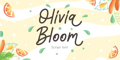 Olivia Bloom is a Summer font monoline style, combine with alternates to make spectacular design Olivia Bloom is perfect for summer event, summer party, branding, logo, invitation, quotes, apparel design, product packaging, merchandise, game titles, cute style design, Book/Cover Title and more. What's Included : - Olivia Bloom.otf - Multilingual Support --- Hope you enjoy with our font! Attype Studio
 - Horsefeathers by Patricia Lillie,
$29.00Play a while with Horsefeathers, and you'll find yourself feeling kind of a combination of giddy and up. a lively, animated font that draws attention in short bursts yet has remarkable balance in longer text blocks, even at smallish point sizes. And that can be said for all three styles: Regular, Bold, and the aptly-named Horsefeathers Buzzsaw. - Layla pro Arabic by Zaza type,
$29.00 Layla pro Arabic typeface is a modern Arabic typeface designed by Ahmed Zaza. the design is inspired by the Kufi calligraphic style and influenced by the Naskh style. The result is a hybrid that combines modern proportions with Classic Arabic scripts it’s suitable for branding, editorial, packaging, and advertising. Layla pro Arabic Features five weights from Light to Bold,
 - Caesar Pro by RMU,
$35.00 In 1913, Leipzig-based foundry C. F. Ruehl released a hot-metal font called Caesar-Schrift which was cut by the engraver and medalist Georg Schiller (1858-1937). This humanist sans combines successfully traditional classic forms with the flowing lines of the Art Nouveau period. Now revived as Caesar Pro, this font was carefully extended and made multilingual.
 - Dittanila by Ditatype,
$29.00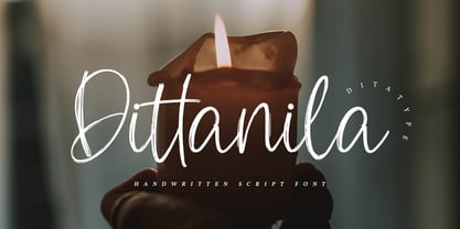 Dittanila is a beautiful handwritten font. The handwritten combined with brush font will make your design project modern and attractive. Made for any professional project branding. Dittanila is best used for branding logotype, and quotes. Features: Standart Ligatures Stylistic Set Multilingual Support PUA Encoded Numerals and Punctuation Thank you for downloading premium fonts from Dita Type

