10,000 search results
(0.771 seconds)
- Klutz AOE Pro by Astigmatic,
$19.00 The Klutz AOE Pro Family was inspired by the plethora of naive hand drawn lettering becoming commonplace in modern advertising. What I hadn't seen was a family of hand drawn typefaces, in a range of widths and weights, with both alternate capitals as well as small caps character sets...and so Klutz Pro was born. The letterforms started with a few letters my daughter had drawn which I expanded on from there. Pulling from inspirations in retro cartoon titling and modern hand lettering playfulness, the full font was born, with weights and width to follow. Quirky, eclectic, and just a bit ridiculous, it lends itself to a range of design typesetting - although I must confess, even though it all began with the Regular width, the Extra Condensed styles are my personal favorites. What's your favorite?
 - Elioth by Soerat Company,
$20.00 Elioth is a humanist font with angled terminals as a identity of this product. Comes with a modern look, this font suitable for display and body text. Elioth is perfect for advertising, packaging, logo, editorial and publishing, branding and other creative industries. This family of 9 weights from Thin to Heavy along with italics contain several OpenType features: Stylistic Alternates and Figures Variation (circled number, fraction, tabular lining, numerator, denominator). With over 752 glyphs per style, Elioth supports around 150+ languages in Latin and Cyrillic script. Family overview: 9 weights (from Thin to Heavy) + italics Extended Latin Cyrillic 752 glyphs Variable Font 150+ languages OpenType Features: Localized Forms Subscript and scientific inferiors Superscript (Superiors) Numerators and Denominators Fractions Lining Figures Tabular Figures Oldstyle Figures Circled Number Case-Sensitive Forms Standard and Discretionary Ligatures Stylistic Alternates
 - Thole by Twinletter,
$12.00 Introducing the Thole font, a very elegant and clean san serif family, with a characteristic width and graceful impression, for designs with feminine or masculine themes, this font will look strong and strong in your design projects. There is a strong impression in this font, both from the width of the letters, the corners in this font are also equipped with ligatures and alternates to complement your needs. This font is perfect for games, sporting events, branding, banners, posters, movie titles, book titles, quotes, clothing, logotypes, and more. of course, your various design projects will be perfect and extraordinary if you use this font because this font is equipped with a complimentary font family, both for titles and subtitles and sentence text. start using our fonts for your amazing projects.
 - Migura Sans by Andrey Sharonov,
$15.00 Migura Sans Serif Family Migura is a high contrast Sans Serif family inspired by fashion and beauty world. Geometrically clean letterforms give elegant and luxury look when creating designs. There is different font styles from Light to Bold (+Italic version) what give enable wide use. In addition, Migura has several alternative characters, ligatures and more decorative Titling Alternates. You can see many examples how this font can be used. Migura is very good looking in Big Tittles, Magazine design, Branding, Logotypes, Posters, Wedding invitations, Romantic cards and others. Multilingual Support Migura support Western European characters and works with following languages: English, Danish, Dutch, Estonian, Faroese, Filipino, Finnish, French, German, Hungarian, Icelandic, Irish, Italian, Norwegian, Polish, Portuguese, Spanish, Swedish, Turkish. Opentype features doesn't work in Microsoft Word. Recommended to use in Adobe Illustratior or Photoshop.
 - Narrow Way by Ingrimayne Type,
$9.00 NarrowWay is a family of 18 condensed and ultra-condensed sans-serif typefaces. The family started with the ultra-condensed widths, then the condensed and regular widths (the regular is still quite condensed) were added. All widths have three weights and each weight has an italics style. These 18 styles lack a true lowercase but rather have a set of alternative characters, some based on lower-case forms, on the lower-case keys. Some alternative letters can be reached with the OpenType feature of stylistic sets. The character spacing in most of the styles is quite loose and it can be tightened with an application's character spacing if needed. These typefaces are display faces that can be useful for squeezing tall lettering into tight spaces. They are not readable at small point sizes.
 - Chalet by House Industries,
$33.00 Experience the precision, elegance and history of the Chalet font family. This collection of ten typefaces in three unique styles is the creative genius of acclaimed clothing designer René Albert Chalet. Originally used in his early advertising campaigns, Chalet appropriately echoes the attitude of its creator: function with flair. Modest and unpretentious yet bold and daring, Chalet’s distinctive air allows for a variety of uses ranging from text to display applications. Add modern panache to any design with the Chalet font family. CHALET CREDITS: Typeface Design: Ken Barber, René Albert Chalet Typeface Production: Rich Roat Typeface Direction: Ken Barber, Andy Cruz Like all good subversives, House Industries hides in plain sight while amplifying the look, feel and style of the world’s most interesting brands, products and people. Based in Delaware, visually influencing the world.
 - Megatropolis by Just My Type,
$35.00 Introducing Megatropolis : intellectual, architectural, urban and urbane. What started as an idea where the counters would be letters (3 scribbled glyphs on a piece of scrap paper), has grown into a mighty font family of eight stackable fonts. First came Megatropolis itself, a Deco font within a Deco font; Double Deco, you might say. In Illustrator, you can deconstruct it to make solid letters, outline letters or just the inset letters on their own, and you can stack them how you wish. Or you can get the whole Megatropolis family with Black , Outline , Inset , Smog , Shade and Shade with Inset and keep them all separate stackable, editable fonts. In addition, there’s Megatropolis Benday (available in TT only), with its fabulous stackable comic dots. Megatropolis is a typographer’s playground.
 - FF Info Display by FontFont,
$72.99 German type designers Erik Spiekermann and Ole Schäfer, and German design agency MetaDesign created this sans FontFont between 1996 and 2000. The family has 18 weights, ranging from Regular to Bold (including italics) and is ideally suited for advertising and packaging, book text, editorial and publishing, logo, branding and creative industries, small text, wayfinding and signage as well as web and screen design. FF Info Display provides advanced typographical support with features such as ligatures, alternate characters, case-sensitive forms, fractions, super- and subscript characters, and stylistic alternates. It comes with proportional lining, proportional oldstyle, and tabular lining figures. In 1998, FF Info Display received the The Big Crit award. This FontFont is a member of the FF Info super family, which also includes FF Info Correspondence and FF Info Text.
 - Marlon Pro by Mostardesign,
$25.00 Marlon Pro is a soft sans serif font family characterized by its contemporary aspect and its warm touch. It provides advanced typographical support with features such as case sensitive forms, small caps, ligatures, alternate characters, fractions, slashed zero, circled gures, pro kerning...It comes with a complete range of gure set options – oldstyle and lining gures, each in tabular and proportional widths. It comes in 9 weights with corresponding italics and it's suited for multiple purposes including editorial use, web font, apps, digital ads, ebook, and also for advertising, long text, packaging and branding. As a modern sans serif font family, Marlon Pro Sans has true italics to give more style in long texts. It has also an extended character set to support Central and Eastern European as well as Western European languages.
 - Simah pro Arabic by Zaza type,
$29.00 Simah pro Arabic is an Arabic typeface from simah family type family It has a warm and humane feeling. It's legible, soft, clear, flexible, simple, and contemporary. With a handful set of OpenType features and alternatives. It has an expressive character with its friendly shapes. It's legible, Clear, Flexible, Simple, Modern. With a handful set of Open Type features and alternatives. The design is inspired by the Kufic calligraphic style and influenced by the Naskh style. Simah is highly crafted in order to perform well both on screen and in print. it functions well even on small font sizes. It has a wide range of use possibilities headlines, logotypes, branding, books, magazines, motion graphics, and use on the web and Tv. Simah Simah pro Arabic consists of five weights
 - MV Bombay by ManVsType,
$40.00 Bombay is serif type family by ManVsType. It is ideal to use at larger sizes as a display font. The family comes in 5 weights in 2 styles (normal stem height and low stem height). This font is variable in its weight and "connection" heights in the letters a, b, d, h, m, n, p, q, r and u. The typeface has a number of ligature including an R+s ligature that automatically turns into the ₹ (rupee symbol) to solve a major problem in the Indian subcontinent where people don't know how to type it. Bombay is inspired by the colonial version of the city. The city being a melting pot of all kinds of people. Poets, writers, filmmakers enjoyed the city and it quickly became the cultural hub of the entire country.
 - Halloween Pumpkins by Voysla,
$9.00 Hey! Happy Halloween Pumpkins! 🎃🎃🎃 This is a family of colored fonts "Halloween Pumpkins" in four styles (regular, glowing with and without Halloween pumpkins). PLEASE NOTE that in order to work with color fonts, you will need one of the listed applications - Photoshop CC 2017, Illustrator CC 2018, or Procreate 4.3 or later. It is also supported by some web browsers and text editors. You can read more about color fonts at the link - http://www.colorfonts.wtf The font supports Latin letters, all the necessary symbols, numbers and a set of multilingual characters. There are also additional glyphs of various pumpkins, a knife and decorative elements. They are great for Halloween designs. In addition to the color font family, the set includes a monochrome font "Halloween Carved" without Halloween pumpkins in two styles.
 - Vendura by Marc Lohner,
$- Meet Vendura, an elegant serif-family with a modern touch. While being a homage to the beloved high-contrast didone typefaces from the 18th and 19th century, Vendura comes up with some unique design details, giving this family a modern twist. It adds a lot of personality to any Editorial Design, Branding Project or User Interface. The seven weights of Vendura have lots of crisp sharp edges, while its matching italics create a slightly softer and warmer look. Vendura has an extensive character set to offer, covering more than 200 languages. Plus, there are ligatures, stylistic alternates, numerical variations, automatic arrows and so much more to find, making sure it can catch up with all your typographic demands. Offering 625 glyphs per font, Vendura is a truly versatile companion for your next design project.
 - Tusker Grotesk by Lewis McGuffie Type,
$35.00 Tusker Grotesk is a headline typeface designed for robust and high-impact use. The initial inspiration for Tusker came from postwar typefaces like Haettenschweiler, Impact and Helvetica Inserat which use very high x-heights. Other influences in the condensed end of the Tusker family are old grotesques like Folio Extra Condensed and Stephenson Blake Elongated Sans No.1 with their flat terminals and closed-up apertures. Then as the widths in Tusker grow, the lettering takes some more inspiration from gothic style sans such as Inland Type's Title Gothic No.8, while maintaining the optical weight established in the narrow end of the family. Each width set is duplexed, stackable and is ideal for headlines, logos and bold attention-grabbing editorial design. Tusker has extended latin coverage ideal for western, central and eastern European languages.
 - Vista Sans by Emigre,
$69.00 The concept for Vista began when I sketched a few characters in a notebook while staying in Sumatra on a one month holiday. I wanted to design a typeface for text and display that would retain some of the characteristics of the idiosyncratic shop signs that surrounded me in Sumatra. - Xavier Dupré The result is a comprehensive family spanning six weights, complete with small caps and lively alternate forms, striking a healthy balance between functionality and expressiveness. Each of the six weights includes alternate, small cap and italic variants for a total of 36 fonts in the family. They are available in a full volume of 36 fonts, or in four packages. The packages are grouped into two sets of contrasting weights, with the alternates and small caps divided into separate packages.
 - Du by sugargliderz,
$20.00 Du is a self hommage to Uncertain Felttip. Uncertain, made in 2008, is a typeface which reproduced faithfully the style in which I am writing on copy paper, usually using the felt-tip pen. This time, I wrote the new family by the same method but using the tablet PC and the touch pen. Although, as for some characters, Uncertain differs in a form, it is the result of reflecting my hand writing. I wrote all the characters. If it is original, all the characters diverted and composed, for example, characters, such as Aacute and Agrave, are written. Different specification from Uncertain is family composition. Although Uncertain had only 3 weight, 7 weight were designed for Du. This way a user can choose his favorite weight because the variation of weights increased.
 - Adventures Unlimited by My Creative Land,
$29.99 Please welcome a new contemporary font family: an adventurous pair of ultra condensed sans serif and a monoline signature script. Both fonts are charged with ligatures and swashes and will make your design journey even more enjoyable! The ultra condensed sans serif comes in three weights while the script font - in two. You can mix-n-match all five to enhance your design and to invigorate your ideas. The font family is perfect for all kind of designs: quotes, t-shirt, branding, social media, magazines, cards, packaging etc. All fonts are fully unicode mapped and can be used in any software - either using OpenType panel of the application in use or your OS default Font management software - Character Map or FontBook - by copy-pasting the glyphs you need. Enjoy!
 - Lina Round by Zaza type,
$25.00 Lina round is an Arabic typeface from Lina type family, it has an expressive character with its round and friendly shapes. It's Round, legible, Clear, Flexible, Simple, Modern. With a handful set of OpenType features and alternatives. Lina type family consists of Lina soft, Lina sans, Lina round. the design is inspired by the Kufic calligraphic style and influenced by the Naskh style. Lina round was highly crafted in order to perform well both on screen and in print. The large x-height and open counters make it function well even on small font sizes. It has a wide range of use possibilities headlines, logotypes, branding, books, magazines, motion graphics, and use on the web and Tv. Lina round consists of 7-weight versions from thin to bold.
 - Benedictus Brush by Ben Hodosi,
$29.00 Benedictus Brush is a stylish, fresh new layered brush script font family. With lots of alternate characters (415+) and more than 340 realistically created standard ligatures. The letters are made with brush pen and scanned thereafter carefully drawn into vector format. Benedict Brush is a versatile multilungual font family and comes with several of OpenType features: - 340+ Standard Ligatures - Stylistic Set - Character Variant - Terminal Forms - Proportional Figures - Tabular Figures - More than 1140 Glyphs - Multilingual To make you more better eye-catching and colorful designs, Benedictus Brush is a layered font! There are 7 variants of Benedictus Brush, to add even more flexibility to your designs: Solid Base, Shine Solo, Shadow Solo, Combo One, Combo Two, Combo Three and Complex. These are features that offers virtually endless variation. Enjoy!
 - Razom Script by DizajnDesign,
$39.00 Razom Script is a typeface with deep roots in pointed brush calligraphy that takes advantage of current font technology to go beyond handwriting and reach new limits. A successful blend between printed and handwritten letterforms is visible when comparing upper and lowercase. The weight of the typeface evolve in a way that pushes the limits of a script typeface to suggest new uses. Normally, families are developed in weights, not proportions. Also, having several weights in a script family is rather rare. But in Razon Script, as the fonts gain weight, big differences show up in the font outlines: the thin weight looks soft and delicate but as we examine darker variables, they also seem to get broken. The counters of the letters rotate from vertical to horizontal during this process.
 - TT Tsars by TypeType,
$39.00 TT Tsars useful links: Specimen | Graphic presentation | Customization options The TT Tsars font family is a collection of serif display titling fonts that are stylized to resemble the fonts of the beginning, the middle and the end of the XVIII century. The project is based on title fonts, that is, the fonts that were used to design book title pages. The idea for the project TT Tsars was born after a small study of the historical development of the Cyrillic type and is also based on Abram Shchitsgal’s book "Russian Civil Type". At the very beginning of the project, we had developed a basic universal skeleton for the forms of all characters in all subfamilies of the family, and later on, we added styles, visual features, artifacts and other nuances typical of the given period onto the skeleton. Yes, from the historical accuracy point of view it might be that such an approach is not always justified, but we have achieved our goal and as a result, we have created perfectly combinable serifs that can be used to style an inscription for a certain time period. The TT Tsars font family consists of 20 fonts: 5 separate subfamilies, each of which consists of 4 fonts. Each font contains 580 glyphs, except for the TT Tsars E subfamily, in which each font consists of 464 characters. Instead of lowercase characters in the typeface, small capitals are used, which also suggests that the typeface is rather a display than text one. In TT Tsars you can find a large number of ligatures (for Latin and Cyrillic alphabets), arrows and many useful OpenType features, such as: frac, ordn, sinf, sups, numr, dnom, case, onum, tnum, pnum, lnum, salt (ss01), dlig. Time-related characteristics of the subfamilies are distributed as follows: • TT Tsars A—the beginning of the 18th century (Latin and Cyrillic) • TT Tsars B—the beginning of the 18th century (Latin and Cyrillic) • TT Tsars C—the middle of the 18th century (Latin and Cyrillic) • TT Tsars D—the end of the 18th century (Latin and Cyrillic) • TT Tsars E—conditionally the beginning of the 18th century (only Latin) TT Tsars A and TT Tsars B families (both the beginning of the 18th century) have different starting points: for TT Tsars A it is Latin, for TT Tsars B it is Cyrillic. The development of the TT Tsars A family began in Latin, the font is based on the royal serif Romain du Roi. The Cyrillic alphabet is harmoniously matched to the Latin. The development of the TT Tsars B family began in Cyrillic, which is based on a Russian civil type. Characteristic elements are the curved one-sided serifs of triangular characters (A, X, Y), drops appear in the letter ?, the middle strokes ? and P are adjacent to the main stroke. Latin was drawn to pair with Cyrillic. It is still based on the royal serif, but somewhat changed: the letters B and P are closed and the upper bar of the letter A rose. This was done for the visual combination of Cyrillic and Latin and at the same time to make a distinction between TT Tsars A and TT Tsars B. TT Tsars C is now the middle of the 18th century. Cyrillic alphabet itself did not stand still and evolved, and by the middle of the 18th century, its forms have changed and become to look the way they are shown in this font family. Latin forms are following the Cyrillic. The figures are also slightly modified and adapted to the type design. In TT Tsars C, Cyrillic and Latin characters are created in parallel. A distinctive feature of the Cyrillic alphabet in TT Tsars C is the residual influence of the flat pen. This is noticeable in such signs as ?, ?, K. The shape of the letters ?, ?, ?, ? is very characteristic of the period. In the Latin alphabet, a characteristic leg appears at the letter R. For both languages, there is a typical C characterized by an upper serif and the appearance of large, even somewhat bolding serifs on horizontals (T, E, ?, L). TT Tsars D is already the end of the 18th century when with the development of printing, the forms of some Cyrillic characters had changed and turned into new skeletons of letters that we transposed into Latin. The figures were also stylized. In this font, both Cyrillic and Latin are stylistically executed with different serifs and are thus logically separated. The end of the century is characterized by the reduction of decorative elements. Straight, blueprint-like legs of the letters ?, R, K, ?. Serifs are very pronounced and triangular. E and ? are one-sided on the middle horizontal line. A very characteristic C with two serifs appears in the Latin alphabet. TT Tsars E is a steampunk fantasy typeface, its theme is a Latinized Russian ?ivil type (also referred to as Grazhdansky type which emerged after Peter the Great’s language reform), which includes only the Latin alphabet. There is no historical analog to this typeface, it is exclusively our reflections on the topic of what would have happened if the civil font had developed further and received a Latin counterpart. We imagined such a situation in which the civil type was exported to Europe and began to live its own life.
 - Miser by Saint Mislav,
$22.22 Smooth with the roughness and made from scratch, Miser sans serif font family was designed by Mislav Serdarušić and it's name is derived from designers name. Miser typeface blueprints were somewhere in the subconsciousness of the designer but have seen first light of the day in September, 2021. during the Covid pandemic. Inspiration comes from handwritten technical letters of designers parents and graffiti explorations. It comes in 12 styles (6 weights with pairing Italics) with all Latin European language characters which are in daily use(without Greek or Cyrillic). Designed in contemporary appearance with innovations on some letters. Basic ligature set is included. It is suitable for magazines, books and websites, various graphics and paragraphs. Miser has a taste of science, technology, design & architecture, sports and more, yet contemporary boldness but distinctive to regular and oval modern typeface shapes. A must have on your system.
 - Eclectic Medley by Altered Ego,
$65.00STF Eclectic Medley is the budget-concious answer to your dingbat blues! This "best of" collection from the Eclectic One, Two and Three fonts is the ultimate grab-bag dingbat resource. Every slot in the font is filled (over 200 characters!), and includes the form-making glyphs from Eclectic Three. The Eclectic family is legendary, with a cult-like following among the inititated. You'll find yourself using Eclectic Medley almost daily to add spice to your otherwise san-serif typographic existence. This font is essentially a soap opera of typographic image elements, created for projects when I couldn't find the "thingbat" I needed. Almost more of a collection of illustrations, there are many characters which connect to form patterns, and of course it's like a "small neutral European country" army knife for the creative community. Available in Mac and PC formats. License it today! - Archemy by Sonic Savior,
$90.00Archemy is a restricted and obscure branch of Alchemy that deals specifically with the life, generation and transmutation of Metals. The Archemy font is primarily a magical and alchemical alphabet. It was created on initiative of Senior Zadith, in order to properly quote older alchemical manuscripts, without the need to insert handwritten symbols. The font combines a unique and elegant Roman alphabet with a set of the most frequently used planetary and alchemical symbols that are common in the Western Mystery Tradition, and as used by those involved in the Royal Art. The Archemy font contains a selection of symbols that are still used by practitioners of the Art today, and for the sake of completeness, a selection of less used and more arcane symbols that can be found in older alchemical texts. In addition a Hebrew Alphabet is included, which will supply practitioners of the Art with the glyphs related to Cabalistic studies. The Hebrew Alphabet in this font does not include vowel points, since they have no place in ancient Hebrew, nor in the Western Mystery Tradition. A selection of the most distinct glyphs as used in the Antediluvian font family - the Alphabet of the Ancients - is included for those that wish to include the archetypal and arcane quality of these glyphs from the dawn of history. By our knowledge there exists at this time no font that includes a selection of Alchemical symbols, let alone combines all of the above mentioned archetypal symbols of occult language in a single package. In that respect Archemy can be considered to be an “Arch” font. - Camy by Scholtz Fonts,
$9.50 I wanted to create a "handwriting" font which could be used professionally. I have often needed such a font with a variety of weights and styles for a particular project and have had to resort to mixing fonts, creating a rather messy, amateur job. Camy is named for a little village in South West France where I did much of the initial work on this font. Camy is ideal for contemporary display work, comes in ten styles, and has a contemporary appeal with its casual, easy to read letters. Camy was designed as a total professional package for designers looking for a handwritten font suitable for all kinds of contemporary display work: the idea being that once you have the Camy Professional Pack you don't have to waste time searching for other handwritten fonts. The Family: LIGHT -- NARROW - light weight, condensed width, delicate line -- MEDIUM - light weight, delicate line -- WIDE - light weight, expanded width, delicate line NORMAL WEIGHT -- NARROW - of medium weight and condensed width - perfect for limited space -- MEDIUM - of medium weight -- WIDE - of medium weight and expanded width BLACK - for best readability -- NARROW - condensed width for bolder statements in small areas without losing legibility -- MEDIUM - for bolder statements -- WIDE - expanded width for bolder statements FAT -- WIDE - for maximum impact Use a combination of styles for product branding, book covers, invitations, greeting cards. The Camy combination works well for both headings and body text. Camy contains over 250 characters - (upper and lower case characters, punctuation, numerals, symbols and accented characters are present). It has all the accented characters used in the major European languages.
 - ITC Pino by ITC,
$29.99The ITC Pino™ typeface family is Slobodan Jelesijevic’s second suite of commercial fonts. Although a small family of three weights, it is remarkably versatile. Like many typefaces, Pino grew out of a desire for a particular kind of design. Jelesijevic was creating a series of illustrations for a children’s magazine and needed a typeface that was lighthearted, legible and would complement his illustrative style. Unable to find exactly what he needed, he decided to make his own font. “I spent the better part of a day looking for just the right typeface,” he recalls. “Of course, the hard part was finding something that would harmonize perfectly with my drawings. A custom font was not part of the project brief or budget, but I thought that perhaps I could use it again.” The regular weight of Pino became the solution to Jelesijevic’s problem. Jelesijevic did use the font again, but quickly realized that the single weight needed companion designs. Pino Bold and Black followed in quick succession. Before licensing the designs to ITC, the three-weight family provided headlines, book cover titles and even short blocks of text copy in several of Jelesijevic’s design projects. Born in Gornji Milanovac, Serbia, in 1951, Jelesijevic graduated with a degree in graphic communication and lettering from the Faculty of Applied Arts in the University of Arts in Belgrade. Currently, in addition to typeface design, he is sought out as a graphic designer and illustrator. When not working on design projects, he teaches graphic communications at the Faculty of Art in the University of Niš, Serbia. Pino is a stressed sans of slightly condensed proportions. Pino’s generous x-height, clearly defined counters and distinctive character shapes enable it to fulfill a wide variety of typographic applications. Friendly without being sanguine, the Pino type family will communicate with charm and vitality. - P22 Stickley Pro by IHOF,
$39.95 Stickley Optical Family is an expansion of P22 Stickley Text, a humanist, Oldstyle-rooted design with a contemporary execution and full OpenType abilities. The font contains ten distinct cuts across four optical masters—in addition to Text for page content, the optical family includes Display for titling; Headline for emphasis; and Caption for footnotes and small sizes. Typefaces were originally designed for the physical size at which they were to be printed, with subtle variations in proportion, detail, contrast, and visual weight to ensure they were as clear at 6 pt. as they were elegant at 68 pt. This created a unified design as the various sizes were set together on a page. Text is the foundation of this typeface family and is built for use in extended reading. Its proportions are carefully balanced for visual clarity while retaining its character; designed for use at 9 to 13 pt. Caption is a sturdy, simplified interpretation of the Text letterforms, with ink traps, generous letters and spacing, and hefty proportions to give balance to the smallest content on a page; designed for use at 5 to 8pt. Headline is a complement to the Text master size. It is a gently modified version with larger small caps to add visual strength and has a greater delicacy; designed for use at 14 to 26 pt. Display is an elegant refinement with stylized details. It harmonizes with the smaller optical masters as a more intricate manifestation of the typeface. Designed for use at 34 pt. and above. Opentype features include ligatures, oldstyle and lining figures, alternates, Central European characters and diacritics, and Swash Caps for the Italics. Stickley Optical Family is a feature-rich workhorse with international functionality.
 - Teramo by ROHH,
$29.00 Teramo™ is daring, sharp and dynamic. Its personality is derived from asymmetry and movement. It is a contemporary serif family full of modern design elements playing with proportions of works of XV and XVI century masters such as Francesco Griffo or Claude Garamond. The family features four optical sizes. Display sizes feature extreme stroke contrast and are intended for fashion, lifestyle, cosmetics, magazine, business, hi-tech and advertising use. Text styles are created for all kinds of body copy — long and short paragraphs, books and websites in any modern design context. They are crafted to be elegant and legible, featuring more generous spacing and scrupulous kerning. Display weights are designed as modern, extraordinary variations on didone style. Teramo’s letterforms are merging classical proportions and precise, contemporary details such as asymmetric serifs, sharp edges and unconventional glyph shapes. Another important factor constituating Teramo’s personality is an angled axis, unusual for didone families and giving the typeface much more organic and dynamic feel. Teramo features a lively true italics strongly related to cursive handwriting. The italic styles imply movement, energy and fluency, introducing a new color to paragraph text, as well as being a powerful and interesting standalone display type. The family introduces additional titling letter variations for headlines and display uses, such as sharp and modern lowercase “y” or uppercase alternates for better all caps typography. Teramo consists of 56 fonts in 4 optical sizes - 28 uprights and their corresponding true italics + 2 variable fonts. It has extended language support as well as broad number of OpenType features, such as case sensitive forms, standard and discretionary ligatures, titling alternates, contextual alternates, lining, oldstyle figures, slashed zero, fractions, superscript and subscript, ordinals, currencies and symbols.
 - PG Gothique by Paulo Goode,
$30.00 This is my addition to a long line of traditional gothic typefaces. As you can probably tell, PG Gothique is inspired by classics such as Trade Gothic, News Gothic, Franklin Gothic, Alternate Gothic, and Gothic Gothic. Well, maybe not the last one... But Paulo, we have all those already, why would we want to add PG Gothique to our collection? This typeface has many subtle design nuances that differentiates itself from its historical influences. Also, this is possibly the most comprehensive Latin gothic font family released to date. It has 99 fonts that cover pretty much every style you could ever need, and if you do require more, this family is available as a single variable font that covers all the weights and widths in between. PG Gothique is designed to handle a multitude of applications, from branding projects, to titles, body text, user interfaces, and film poster credits. This type family has a style that will suit the purpose. There are 99 fonts in this family, ranging from Thin to Ultra weights across six widths in both roman and italic*. Activate Stylistic Set 1 and you will get the alternate slab serif-style capital “I” that offers improved legibility when placed adjacent to a lowercase “l”. PG Gothique has an extensive character set that covers every Latin European language. If you would prefer PG Gothique as a single variable font, please choose PG Gothique Variable. Test drive PG Gothique today – both the Regular and Italic fonts are offered as a free download. See full details and hi-res examples at https://paulogoode.com/pg-gothique Key features: 9 Weights 6 Widths 99 Fonts Small Caps Old Style Figures European Language Support (Latin) 600+ Glyphs per font *Compressed weights do not include italics.
 - Lina Serif by Caroline Herr,
$18.00 Lina Serif is an antiqua balanced between classic and modern. The design focused on the combination of flowing shapes and partially edged transitions, that give Lina her character. The font plays with a high line contrast in combination with dynamic shapes. This makes Lina a casually elegant display font. The terminals remind on floral shapes. Lina gives your design a human, natural touch. Lina Serif is available in 4 weights or as variable font with infinitely variable interpolation of weight.
 - Welfords by eyetype,
$20.00 Welfords is another lovely modern calligraphy typefaces, which is combining the style of classic calligraphy with an modern style. combines from copperplate to contemporary typeface with a dancing baseline, modern and elegant touch. Welfords features 500 glyphs and alternate characters Include . The Features of this fonts is; Standart ligatures Swash Alternates Stylistic Alternates Stylistic sets PUA Unicode (Private Use Areas) Programs that support in this font is a Adobe Photo Shop, Adobe Illustrator, Adobe Indesign, Corel Draw and Microsoft Office.
 - PF Baseline Pro by Parachute,
$79.00 An ultra modern typeface which combined with the proper text font can revive any dull-looking document. The wide simple forms combined with the selective application of a few distinct characteristics has resulted a stylish typeface which shines in the top 10 of our most wanted list. The powerful new “Pro” version comes complete with Greek and Cyrillic and includes a number of stylistic alternates as well as 2 groups of stylistic alternate sets, the last group being unicase characters.
 - Porosya by NREY,
$19.00 Introducing new typeface - Porosya. Porosya has multilingual support includes cyrillic. Many ligatures make your typography most variable. Porosya Typeface was inspired by ethnic slavonic style which combining classic typography with awesome features bring classic touch on this culture. It works well with normal size text and for large displays or short words. You may combine uppercase and smallcase in the text body, as alternates symbols. The Porosya typeface is suitable for : product packaging, labeling, logo, classic shop, ethnic shop, titles, etc
 - Foliart by Struvictory.art,
$14.00 Foliart is thin line uppercase font with floral motives. The typeface includes Decorative and Symbol styles. To get an elegant and unique design, combine letters with symbols. Foliart is suitable for feminine business branding, eco-friendly and minimalistic art, social media design. The font works great for craft products branding and packaging (organic cosmetics and food, jewelry, floristics, handmade soap ect.) Also use individual letters and symbols to create logos and monograms. Foliart combines well with modern graphics: abstract shapes and line art.
 - Apolline Std by Typofonderie,
$59.00 A Venetian serif in 6 styles The Apolline typeface family was created by Jean François Porchez as a means to study the transition from Renaissance writing into the first printing types. Rather than sticking to the method commonly used these days for the creation of revivals of Jenson or Bembo types, it seemed more interesting to try and get in the same mindset as those exceptional designers during this pivotal period in the history of typography. Thus Apolline is an exploration of the design methods used by people like Nicolas Jenson and his contemporaries for adapting handwriting with its multiple occurrences (a, a, a, b, b, b…) into single, unique signs (a, b…). Initially Jean François made drawings modelled after his own calligraphy. They were done at a very small size on tracing paper (2 cm high for the capitals) to preserve the irregularity of human handwriting. Besides emphasising the horizontal parts of the letter forms, the serifs were designed asymmetrically to reinforce the rhythm of the writing. The final drawings were produced at a large size (10 cm high for the capitals) to allow for subtle optimisation of specific details. The very narrow and fluid Apolline italic Influenced by various concepts for an ideal italic by Van Krimpen, Gill, etc. Apolline italic was designed at 8° degrees. Although the structure of the letterforms were informed by chancery scripts, the italic has full serifs like the roman. Very narrow and fluid, its unique design creates a good contrast when used in combination with its upright counterparts. Thanks to the presence of the serifs similar to roman typefaces it sets very neatly in large sizes. The next step was digitising the drawings with Ikarus (the pre-Bézier-curves era) to create the final roman and italic fonts. Two years later, when the family was expanded to six series the same method was used, this time with Fontographer. This was necessary for correcting a few problems caused by the conversion to Bézier outlines, and to add intermediate weights. Before the advent of feature-rich OpenType, quality type families consisted of several separate fonts for each weight to provide users with various sets of numerals, an extended ligature set and alternates, ornaments, and so on. Introducing Apolline Morisawa Awards 1993
 - OCR-A AI by Apply Interactive,
$90.00OCR-A AI Text is the version for normal use when the text will be read by humans. OCR-A AI is the version to use for machine reading. - The Classic Signature by Rockboys Studio,
$23.00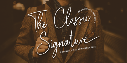 The Classic Signature is a modern signature font which is combining classic calligraphy with a modern style. Its dancing baseline will give your design an elegant and modern touch.
 - Ovalive by Heyfonts,
$15.00 ovalive is a versatile, bold and unique serif font. Combination between high contrast and Brutalism style, ovalive has a unique style with stylistic, alternates, ligatures and supports multilingual languages.
 - ITC Serif Gothic by ITC,
$29.99 ITC Serif Gothic font is the joint effort of Herb Lubalin and Antonio DiSpigna. Its distinguishing feature is its uniquely designed serifs, combining gothic simplicity with traditional roman elegance.
 - ABC Zoo English by Intellecta Design,
$21.90 ABC Zoo is a collection of two typefaces where the alphabet letters are combined to create a design of animal using the letters in the name of each animal.