10,000 search results
(0.036 seconds)
- Shadow Lands NF by Nick's Fonts,
$10.00The 1992 edition of The Solotype Catalog called this singularly strange typeface "Wilcox Initials". In case you're interested, this version features ducking accented lowercase characters. Both versions of this font contain the Unicode 1252 (Latin) and Unicode 1250 (Central European) character sets, with localization for Romanian and Moldovan. - Pinsher by Abbasy Studio,
$15.00Pinsher, is a font inspired by Signs Painting, This font is based on retro hand-painted paper signs primarily seen in grocery stores from the 1940s through today. With additional shadow font you will be able to create the beautiful combination and bring retro touch to your artworks! - Oh Livey by Angele Kamp,
$28.00 Oh Livey is a casual brush script that has a fun, modern vibe. Put it on everything from quotes and websites, and use the extra clipart to make designing so much easier and fun. Oh Livey contains lots of ligatures which will give it that authentic handwritten feel.
 - FF Stargate by FontFont,
$41.99 Dutch type designer Donald Beekman created this display FontFont in 1999. The family contains 2 weights: Regular and Italic and is ideally suited for music and nightlife. FF Stargate provides advanced typographical support with features such as ligatures and case-sensitive forms. It comes with proportional lining figures.
 - Naveid Arabic by NamelaType,
$29.00 Naveid Arabic is new version of Naveid with the addition of Arabic glyphs, for Arabic, Urdu, and Farsi. Basic form for arabic font is refers to the arabic kufi style, with combining the cuppped serif on top and the tinny Subtle Flaring on the terminal, to harmony with Latin.
 - Oscarios by Attractype,
$13.00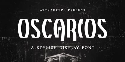 Oscarios fonts is a stylish display font. You can use it in a modern, clean and professional design. This font is perfect for your various projects such as brand identity, technology, business cards, web, stationery, displays, sports and more. Oscarios font contains uppercase, lowercase, numbers, punctuation and multilingual support.
 - Diegeometrische by Michael Browers,
$25.00Diegeometrische is an all uppercase geometric-based serif typeface featuring Latin, Extended Latin and Cyrillic character sets. - Latin, Extended Latin and Cyrillic character sets offer multilingual support. - Over 1000 kerning pairs for optimal letter spacing. - Unique combination of serif, geometric, and stencil design elements provides a distinct design. - Punctured Bicycle by PizzaDude.dk,
$20.00Punctured Bicycle is a true grunge font. It comes with more than 200 ligatures - to be precise 235! That includes both double letters, double numbers, unique accented characters and a huge number of common letter combinations! You will need to use OpenType supporting applications to use the autoligatures. - Analogue Pro by Ingo,
$42.00 very traditional forms strongly slanted italic consistant proportions extraordinary ligatures swashes alternate letters alternate figures lower case l with a hooked “foot” Believe it or not, there are hardly any sans serif fonts in which the lower case letter l also has the hooked form of an l. Instead, we readers have to constantly distinguish whether we are seeing an uppercase I or a lower case l — just take a look at the word “Illinois”... The ingoFont Analogue was developed for exactly this reason. The intent: To create a pretty much »ordinary«, even classical font with its most striking characteristic being the inclusion of the “crooked l.” As a model, I used the »mother of all sans serifs«, Akzidenz Grotesk from Berthold, with its beginnings going back to the 19th century. Analogue is so to say a new interpretation of Akzidenz Grotesk from ingoFonts. All characters — following the model — have been newly designed. And if you want to emphasize the shape of the hooked foot even more, you can also activate the alternate styles for d, h, m, n (Style Set 1). Conversely, the alternate a somewhat softens the “hooked” impression (Style Set 2). The slanted versions — it isn’t truly a real cursive font — are noticeably stronger with 13° than the italics in comparable fonts, and were given a round e with a mind of its own which distinguishes itself considerably compared to the upright characters in the overall appearance of the font. More modern and formal solutions in detail were chosen for some of the characters, for example the M was given lightly slanted sides; the a reflects the curves of the s; the “feet” of a, l and t match; the flared legs of K and R became a “foot”, too. General proportions were carried over almost completely with no changes from Akzidenz Grotesk as well as the slanted trimming on the open forms of a, c, e, s; in comparison, C, G and S were given straight endings. Analogue contains many ligatures, even discretional ligatures, plus proportional, old style as well as tabular figures. All in all, at first sight Analogue brings back memories of the charm of its well-known predecessor; and yet, many small differences give Analogue an unmistakable certain something...
 - Lemon Grass - Personal use only

- Cherry Blue - Personal use only

- Crossell by Emboss,
$35.00 Crossell is a display typeface inspired by linoleum cuts and old comic strips. It comes in three weights and can be purchased solo or as a family. Take it home and give it a spin today.
 - RMU Magnet by RMU,
$35.00 Based upon remnants of the Ludwig & Mayer font Magnet, first released in 1951, this Italian-style design was completely redrawn and extended for most main European languages, West and Central, plus a character set for Turkish.
 - Grandesign Roman - Unknown license

- Brawnie by Gerald Gallo,
$20.00 Brawnie is a very bold, contemporary, sans serif font. It is ideal for headlines, titles, branding, and small blocks of text.
 - Canapa by Serebryakov,
$29.00 Canapa it a simple humanistic sans serif font family. Canapa's 10 styles are good for friendly oriented package design layouts. Try!
 - Gothic Narrow by Wooden Type Fonts,
$15.00 A revival of one of the popular sans serif wooden type fonts of the 19th century, narrow, short ascenders and descenders.
 - Bagunsa by Turto Studio,
$10.00 Bagunsa is a multilayer fun party play sans font. It intend to be an ongoing family with maybe infinite possible styles.
 - Luxerie by MlkWsn,
$15.00 Luxerie is an elegant display sans with unique letter shapes to complete any design, especially in fashion, branding, and for logos.
 - Itzkarl by Hanken Design Co.,
$25.00 ItzKarl is a unique hybrid typeface with serif and sans serif features that is suitable for headline, logo and poster use.
 - Excess Baggage JNL by Jeff Levine,
$29.00Excess Baggage JNL is a clean sans serif typeface, and one of a number of stencil fonts offered by Jeff Levine. - Zaius by The Northern Block,
$12.80 A bold sans serif typeface influenced by Ed Benguiat 's work for the 1968 movie poster for Planet of the Apes .
 - Illustrious by Gerald Gallo,
$20.00 Illustrious is an all caps, bold, sans serif font. It is ideal for headlines, titles, branding, and small blocks of text.
 - Hollywood MF by Masterfont,
$59.00 High legibility at small sizes. An extended sans serif typeface with rounded endings that provides unique softness appearance without losing legibility.
 - Shakeout by PizzaDude.dk,
$20.00 A legible sans serif, with bouncy edges. A little loose but not too jumpy! Comes with a fi and fl ligature.
 - Nighthawk JNL by Jeff Levine,
$29.00Nighthawk JNL is a clean, bold headline sans serif with a slight touch of Art Deco added for a nostalgic look. - Ekistra by Dharma Type,
$14.99 Crazy sans for happy, fun time. There are two other fonts designed by in the same concept. -Deluta Black -Xesy -Ekistra
 - Novia by VladB,
$12.00 Novia is a modern sans serif geometric font, includes upper and lower case characters, Latin, Cyrillic, Latin Extended symbols and other.
 - Sturdie by Gerald Gallo,
$20.00 Sturdie is an all caps condensed sans serif font. It is ideal for headlines, titles, branding, and small blocks of text.
 - Clinch by Gerald Gallo,
$20.00 Clinch is a clean, contemporary, condensed sans serif font. It is ideal for headlines, titles, branding, and small blocks of text.
 - Pudgie by Gerald Gallo,
$20.00 Pudgie is an all caps, bold, sans serif font. It is ideal for headlines, titles, branding, and small blocks of text.
 - Molor by Sons Of Baidlowi Typefoundry,
$8.00 Molor Font is a sans serif font with an amazing feel. It will turn any design idea into a stand out.
 - Compasso by Plau,
$30.00 The idea that mathematical precision and the supposed "purity" of geometric forms are part of the discourse of us graphic designers is not new. Studying typography for some time now and learning about all the small alterations and adjustments that this geometry undergoes to better adapt to the imperfect human eye, I found myself with a new way of seeing things. Compasso is, in a way, a result of my growth as a designer. Established and recognized fonts like Futura, Avenir, and their predecessors (including Tempo - published by the Ludlow foundry in the early 20th century) informed the result of Compasso at some level. Others opened my mind to possibilities. Mallory, Azo Sans, the font designed for Audi by Bold Monday, and many other contemporary sans-serif fonts that left me speechless are also responsible for details present in this font. From the first sketch, the family grew on both sides, gaining condensed and extended counterparts. From there - and from a brilliant insight from designer Nicole Rauen - I learned that Compasso was not about geometry. Compasso is about rhythm. It's about the rhythmic movement that provides a foundation, supports, and also makes you dance and swing. My musical taste is too eclectic, I can go from classical to funk in less than two songs on Spotify. Compasso is also eclectic. It's a font to take your project anywhere, a record to listen to on any occasion.
 - Unigeo by Zetafonts,
$39.00 Designed by Cosimo Lorenzo Pancini with the help of Francesco Canovaro, Unigeo is an eulogy to the design style of vintage computing, with its obsession for geometric modularity, ultra-tight tracking and striped rainbow overload. It aims at giving a new perspective to the ever-useful geometric sans genre, by adding a vintage flair to selected letters while keeping optical adjustments to the minimum, to prioritize the modular, constructed look aspect of the typeface. Furthermore, like every vintage gaming system, Unigeo has been developed with different "memory versions":32, 64 and 128. The main family, Unigeo 64, is display and logo-design oriented, featuring tight tracking and iconic signature letterforms, and referencing vintage design and typefaces from the photo-lettering era. These letterforms are substituted in the Unigeo 32 variant with more contemporary shapes, resulting in a workhorse geometric sans, highly optimized for text use but still suited for logo design and display use thanks to its wide weight range. Last but not least, the Unigeo 128 subfamily gives the same skeleton a striped treatment reminescent of optical art and modernist computer logos. All Unigeo families are developed in eight weights, ranging from Thin to Extrabold, for a total of 40 styles, each provided with an extended character set covering languages using latin, cyrillic and greek glyphs. Full Open Type Features are provided, including positional numbers, legatures and alternate glyphs, as well as a variable font version for each subfamily.
 - Vertigirl - Unknown license

- Geographica by Three Islands Press,
$29.00 Thomas Jefferys (ca. 1710–1771) was the best-known map maker in 18th-century England, chiefly because he won (and hyped) the title “Geographer to King George III.” Jefferys was really more an engraver/publisher than a geographer, since he mostly relied on the cartographic materials of others. Still, his maps of the North American colonies were well known. Geographica is a legible, four-style serif family modeled after the neat hand-lettered place names and peripheral text on Jefferys’s maps. With its long serifs, tall x-height, and robust curves, Geographica somehow combines classic elegance with a whiff of coastline and sea. The italic styles have the slant and warmth of the hand-drawn source materials. And the typeface comes with a slew of distinctive map-based ornaments—including compass wheels and sailing ships. This evocative serif works well in both display situations and long blocks of text, whether on paper or screen. OpenType features include small capitals, numerous ligatures, and two stylistic sets of titling caps. Geographica offers full support for Central and Eastern European languages—more than 1,200 glyphs in all.
 - Dealova by HKL Studio,
$19.00 Dealova Script is the font of choice for writing things beyond words. This typeface is designed with great detail to convey stylish elegance. So, it can be said, the character of the transformation is very beautiful, a kind of classic ornamental copper script. Dealova Script provides alternative variants of most fonts, binders and many calligraphy tips, ideal for elegant labels, high-end packaging, stationery and composition for specific brands, beautiful titles, paragraphs, fonts and short text intended for read only with the eye or intended to be whispered into someone's ear. Dealova Script has 691+ glyphs and 440 alternate characters, including multiple language support. It features OpenType with alternate styles and elegant binding. The OpenType features don't work automatically, but you can access them manually and for best results your creativity will be required in combining variations of these Glyphs. And also a touch of ornament makes this font look elegant. To enable the OpenType Stylistic alternative, you need a program that supports OpenType features such as Adobe Illustrator CS, Adobe Indesign & CorelDraw X6-X7, Microsoft Word 2010 or later. (Windows), Font Book (Mac) or a software program such as PopChar (for Windows and Mac).
 - Expreso by JVB Fonts,
$19.00 EXPRESO was inspired by the extinct art and craft of urban Lettering applied to buses and other kind of cars for public service of transportation. Since the mid of last century, main cities of Colombia - as Bogotá, Medellín and others - were growing in population and brought urban area expansion with it and serious traffic problems due to the lack of political will and urban planning. The problem of urban transport in Colombia's largest cities has not yet been resolved, despite adopting some examples of mass transit system in other cities in the region. Before these actions, public transport in cities such as Bogotá was quite varied, leaving space for popular culture that survived for a couple of decades, until the massive dieback of these old buses early this decade, either by practices associated with Lettering it was displaced by some technological, some expressions of art street and city that evolved or disappeared. EXPRESO can be used mainly in titles and display texts. You have a multitude of options using combination of layers from the basics of the font family to the various textures and shades. Supports East Europe languages.
 - Sutro Shaded by Parkinson,
$25.00 My affection for Slab Serifs began in the early 1960s in Kansas City when Rob Roy Kelly was at the Kansas City Art Institute, teaching and writing his book on American Wood Type. I got to know him just well enough to gain access to his fabulous collection of wood type and wood type catalogs. Later, in the1970s, I tried to re-create a Nebiolo Egiziano for Roger Black at New West magazine. And again for Roger, in the 1980s, I designed a Slab Serif logo for Newsweek Magazine. Finally, in 2003, designed the Sutro Family. There were things I didn't like about it, so, over time, I’ve been adding some things and dressing it up a little. Sutro Shaded has existed for a few years as a one color, outlined, drop-shadowed display font. It seemed like it was just dying for a little color. I added five more fonts: Fill, Gradient, Hatching, Rules and HiLite. These fonts can be used in different combinations to achieve various effects. There is a downloadable SUTRO SHADED USER MANUAL PDF in the Gallery section for this family.
 - Wakcaho by Twinletter,
$17.00 Wakcaho is a traditional serif typeface that is ideal for classic or retro modernist projects. With an exquisite and outstanding personality, this font will provide a memorable traditional touch to your designs. Wakcaho’s particular characteristics, like ligatures and alternatives, provide you the freedom to create unique text display variations. These typographic components can be simply combined to create distinctive and eye-catching compositions. Furthermore, Wakcaho is bilingual, allowing you to display your messages in a variety of languages all across the world. This allows you to reach an international audience while maintaining consistency in your designs regardless of language barriers. By using Wakcaho as the main font for your project, you will achieve an attractive style with a traditional vibe. Use Wakcaho right away to give your ideas a remarkable appeal and a unique visual experience. What’s Included : - File font - All glyphs Iso Latin 1 - Alternate, Ligature - Simple installations - We highly recommend using a program that supports OpenType features and Glyphs panels like many Adobe apps and Corel Draw so that you can see and access all Glyph variations. - PUA Encoded Characters – Fully accessible without additional design software. - Fonts include Multilingual support


