955 search results
(0.016 seconds)
- Fabrikat Normal by HVD Fonts,
$40.00 Fabrikat Normal is a geometric typeface which is based on 20th century German engineers’ typefaces. It is optimised for small sizes and long texts, but due to its constructed architecture it also works in headlines or display use. You can combine Fabrikat Normal with the more straight and space saving Fabrikat Kompakt or the reduced to the max Fabrikat Mono.
 - Battleslab by Kostic,
$40.00 Battleslab is a slab serif made for setting few words in large sizes. Two heavily contrasted weights work well when combined, with its mono-line wide light and heavy black it is perfect for making that "one-two punch" in headlines or logotypes. Display oriented Battleslab derived from Battlefin Family (which is much more comprehensive with its ligatures, italics and SC).
 - Bix Metric by S6 Foundry,
$20.00 Bix Metric is a stylistic display font developed within a set grid. The mono-spaced first set of the family comes in 3 styles in both upper and lowercase glyphs allowing mixing of infinite combinations. Perfectly suited for headlines, large-format prints, brand identities, social media, advertising, editorial design, posters, magazines, logos, headings, digital and more. With multi-language support.
 - Quota by Ryan Williamson,
$- Quota is an investigation into the modularity of the Cyrillic alphabet. Unlike Latin and Greek, the Cyrillic alphabet owes much of its form to its development in early industrious printing and movable type. This lead the Cyrillic alphabet to be dominated by hard edge and straight lines, giving it a much more modular overall construction. The forms within the Cyrillic alphabet therefor allow for all the characters themselves to have somewhat unified side bearings without compromising ease of reading. Within Quota the default character set has only unified side bearing, giving a more relaxed mono-spaced appearance. While the first stylistic set unifies the entire character set with the same character width, creating a true mono-spaced typeface. Quota was initially designed in Cyrillic, catering to all languages using the alphabet. While the Latin was designed after, and is loosely based of the forms present within the Cyrillic alphabet.
 - Thought by Scholtz Fonts,
$15.00 Thought, with its versatile five styles, is ideal for contemporary display work. It has style, flair, legibility, and interesting, flowing letter shapes. The Family: -- REGULAR - of medium weight - clear and legible; -- BLACK - for bolder statements and best readabilty; -- LINEAR 25 - light weight, mono width line -- LINEAR 45 - medium weight, mono width line -- ZEST - variable line, casual, exaggerated appearance Use a combination of styles for product branding, book covers, invitations, greeting cards. Thought has not been designed to be used in "ALL CAPS". The best effects for headings and subheads are obtained with an initial upper case letter followed by lower case characters. If you are using upper and lower case then it is not necessary to use kerning. Thought contains over 250 characters - (upper and lower case characters, punctuation, numerals, symbols and accented characters are present). It has all the accented characters used in most European languages.
 - Once upon a time in the vast, colorful world of typography, Shanghai arose, a font that whispers tales of the Orient with a flirtatious wink to the Art Deco era. Crafted by the dynamic duo known as M...
- Prima Sans by Bitstream,
$29.99Prima is a series of fonts designed at Bitstream by Jim Lyles (Sans and Serif) and Sue Zafarana (Sans Mono), released in 1998. The fonts have been tuned to give exceptionally good quality at low screen resolutions. The fonts are therefore suitable for sustained use in browsers and other applications where users read for long periods from the screen. Of course, Prima looks great printed out too. - Prima Serif by Bitstream,
$29.99Prima is a series of fonts designed at Bitstream by Jim Lyles (Sans and Serif) and Sue Zafarana (Sans Mono), released in 1998. The fonts have been tuned to give exceptionally good quality at low screen resolutions. The fonts are therefore suitable for sustained use in browsers and other applications where users read for long periods from the screen. Of course, Prima looks great printed out too. - Munichley by Maulana Creative,
$14.00 Munichley is an expressive casual signature script font. With mono-line consist stroke, fun character with a bit of ligatures and alternates. To give you an extra creative work. Portuis GingerMunichleylogo design, Social media, Movie Titles, Books Titles, a short text even a long text letter and good for your secondary text font with sans or serif. Make a stunning work with Munichley font. Cheers, Maulana Creative
 - Voix by Wilton Foundry,
$9.00 VOIX Regular and Italic is a stylish, modern & monospaced font ready to make your work hard for you! It has several unique glyphs that create a unique style. VOIX is not your typical monospaced boring font - from the outset the goal was to develop an exuberant, dynamic and contemporary mono-spaced font. Ideal for coding, writing and has plenty of attitude to stretch into display formats!
 - Broiter by Abbasy Studio,
$15.00 Introducing Broiter, 2 font mono weight family with plenty of alternative long stemmed characters. These 2 fonts make it effortless to create hand made lettering, and perfectly suitable for made to be applied in logo, and the other various formal forms such as invitations, labels, logos, magazines, books, greeting / wedding cards, packaging, fashion, make up, stationery, novels, labels or any type of advertising purpose.
 - JetJaneButton by Ingrimayne Type,
$15.00 JetJaneButton has letters on a design that looks like a computer button. Its letters are from JetJane Mono, a sans-serif monospaced font. The typeface contains characters that can add color to letters. There are two ways to do this. One uses layers and the other a combination of characters, some with zero width. This pdf file explains the how this can be done.
 - Mesclo by DSType,
$40.00 Mesclo is our personal take on the geometric typefaces genre. With mono-linear appearance, humanistic elements and subtle hints of Art Deco, Mesclo is a timeless typeface with dramatic oblique terminals and a welcoming, friendly roundness. The outstanding dynamic rhythm and legibility of the text contrasts with the inflexible geometry of the unusual complementary caps-only typefaces, specially developed to fulfil and enrich this type family.
 - VV Neonica by Vintage Voyage Design Supply,
$15.00 The Neonica Toolbox - a complete collection to creating awesome neon designs! This is a complete collection which included the fonts, decorations, illustrations, Adobe Photoshop styles and HQ background textures as brick or rusty grunge walls. Create awesome graphics for few simple steps! VV Neonica contains mono lined sans, volumetric sans with inline font option and mono lined script. Also, you'll get the decoration and illustration fonts. Create your own neon signs or add the decoration to your neon graphic. The illustration font has one color or up to three color options. That mean you'll be able to create a full color neon illustration graphic for few seconds! Also, the Neonica Collection comes with Adobe Photoshop styles file (.ASL). Just add it into your Photoshop and get 19 neon colour realistic effects. This file works with any Photoshop versions. As a desert you'll get 6 HQ JPG (4000x4000 pix; 300 dpi) background textures. All the additional materials (Photoshop styles, PDF Guide and Textures) you'll can get here Enjoy!
 - Fadista by Alex Beck,
$19.99 Fadista is an eccentric experimental typeface, inspired by the Portuguese fado music and letterings by the artist Stuart Carvalhais (1887–1961), created throughout the 1920ies and 1930ies. A strong and clean presence with a touch of quirky gives the typeface its overall character. Fadista includes various OpenType features that allow tailoring the type to custom needs, encouraging graphical exploration. Fadista is the result of meticulous research, graphic reinterpretation and systematization of the glyph palette, taking into account modern font standards. Balancing between a historic heritage and „hipster“ contemporary looks, Fadista represents a discourse about aesthetics, trends and currentness in graphic design. The stylistic variations of the glyphs in fadista work in an additive fashion, rather than completely altering the look of the typeface. This means that a basic framework of glyphs remains unaltered, while certain subgroups of characters are affected by the style choices. Through this behavior, stylesets in fadista work as a switch for the type of contrast you’d like entwined in the overall look of the typeface. Other unique features include stylistic alternates for specific glyph combinations, ligatures that allow internal character spacing and tiny diacritics that flow within cap height along normal height glyphs. Please note the lowercase characters within Fadista are uppercase alternates. Math operators are fully supported, as well as a wide range of symbols and punctuation. Supported Languages: Albanian, Danish, Dutch, English, Finnish, French, German, Icelandic, Italian, Malagasy, Norwegian, Portuguese, Romansh, Spanish, Swedish and Turkish. For further language support don‘t hesitate to get in touch. Fadista was awarded the Art Directors Club Bronze in the junior competition 2014 and the DDC Award 2014 in the category "Future“.
 - Monarky by YXType,
$22.00 Monark family is designed with legibility and wide language support in mind. Rooted in Fyodor Dostoevsky's Crime and Punishment, it captures the anguish & distortion atmosphere and suppresses them into ruthless letterforms. Top-heavy stems, heavy serifs, and low-contrast forms are all extractions of Dostoevsky's dilemma. Rest assure this typeface would bring you all the needs for advanced typography with true small caps with symbols, 4 styles of figures, support for inferior/superiors, and more than 200 Latin languages. Features: • Support for 200+ Latin languages • Low contrast with unique details • Unique Italic letterforms • Small caps with symbols • Arbitrary and pre-defined fractions • Support for superscript & subscript in normal & scientific alignments • Proportional lining, proportional old-style, tabular lining, tabular old-style
 - The "Discotech" font by Fontalicious is a vivid embodiment of the lively and energetic spirit of disco culture. This font captures the essence of an era defined by vibrant nightclubs, sparkling disco...
- Franciscan Caps NF by Nick's Fonts,
$10.00The majority of the letterforms in this mono-case font are based on a little-seen titling typeface designed by Frederic Goudy. The lowercase positions contain alternate letterforms, so you can mix and match to obtain just the right look. Both the OpenType and Truetype versions of this font contain the complete Latin language character set (Unicode 1252) plus support for Central European (Unicode 1250) languages as well. - Batternotch by Maulana Creative,
$13.00 Batternotch is a casual modern fun font. With regular mono-line stroke, fun character. To give you an extra creative work. Batternotch font support multilingual more than 100+ language. This font is good for logo design, Social media, Movie Titles, Books Titles, a short text even a long text letter and good for your secondary text font with sans or serif. Make a stunning work with Batternotch font. Cheers, Maulana Creative
 - Mr Porter by Pelavin Fonts,
$20.00 A robust, mono-weight typeface with gently rounded slab serifs, Mr. Porter harkens back to celebrated roots in late 17th Century England. Not for the meek or faint-of-heart, it lends a nutty, chocolaty, toffee flavor to both a stout and pale variety, with lots of malty goodness. Rich and full-flavored with notes of coffee, licorice and molasses, it promises delightful pairings for an infinite variety of typographic solutions.
 - MGT Fugiat by Magetype,
$15.00 MGT Fugiat is a Neo-grotesque font inspired by the 1900s.Apart from that, there is also monospaced.This super clean sans serif is perfect for bodytext, in magazines, websites, and books.Also suitable for book titles and posters. MGT Fugiat Neo-grotesque, there are 20 styles, hairline to heavy.Uprights and Italics.Meanwhile, MGT Fugiat Mono has 18 styles, hairline to black.Uprights and Italic too.Both fonts are also included in Variable Fonts.
 - Mona Lisa Recut is an intriguing and artistically designed font that captivates both designers and admirers of typographic art. Its creation was inspired by the timeless beauty and mystery of Leonard...
- Hyperdrive by Comicraft,
$19.00 If you're about to make the jump into hyperspace, buckle up and engage your R2 unit with our new font release, HYPERDRIVE! Ten years in the making, we've spent almost as much time developing these characters as George Lucas spent developing his! Co-created by Starkings & Roshell (HYPERDRIVE, not George), this font is guaranteed to keep TIE fighters off your tail and will always come in useful if you get menaced by phantoms or attacked by clones. So sit back, relax and enjoy the flight -- but don't forget; let the Wookiee win! Remastered Hyperdrive includes new letter shapes, 200+ connecting letter combos, improved spacing & kerning and support for Western & Central Europe.
 - Foxes Storm by Sipanji21,
$25.00 "Foxes Storm" is a black metal-themed font with a menacing and scary look, making it perfect for a wide range of dark and horror-themed design projects. Whether you're designing a metal band's album cover, a horror movie poster or logo, or any other project that requires a dark and edgy aesthetic, "Foxes Storm" is the font you need. Its sharp and jagged letterforms, combined with the bold and intense appearance, make this font perfect for designs that require a powerful and impactful look. With "Foxes Storm," you can create designs that are both memorable and terrifying, bringing your dark and metal-inspired visions to life.
 - Ah, Louvaine by Paul Lloyd Fonts – the typographic equivalent of that one friend who insists on wearing a monocle and top hat to every casual brunch. In the grand garden party of fonts, where Helveti...
- Bramante LP by LetterPerfect,
$39.00 Bramante™ is an original display font by LetterPerfect Fonts, designed by Garrett Boge in 2020. It is modeled after a fifteenth-century inscription in the church of Santa Cecilia in Trastevere, Rome. The name is a tribute to the pre-eminent Renaissance architect Donato Bramante, whose Tempietto (1502, San Pietro in Montorio) marked the beginning of the High Renaissance in Rome. In 1503 he was named lead architect for the new St. Peter's Basilica, which was completed by Michelangelo, Maderno and Bernini a century later. Based on the pervasive use of Adobe Trajan as a classical-inspired titling face, LetterPerfect offers this Renaissance revival of imperial Roman capitals as an alternative with additional refinement and personality. (The full size capitals are complemented with small capitals in the lowercase positions.)
 - P22 Kelly by IHOF,
$39.95 P22 Kelly is a Celtic-styled uncial font with a medieval gothic flavor and an overall contemporary feel. The font is an addition to Ted Staunton’s collection of historical and period-based fonts. It is ideal for uses that need to evoke the Celtic spirit or the medieval period. Based on half-uncial Irish monastic handwriting of the 8th to 10th centuries, but instead of having a traditional upright stress, has an italic slant. Some Gothic influence is evident—like the thorn-like tick-marks decorating the capitals—but the rounded forms of h, m, n, u emphasize a wide, open, horizontal visual texture. The font is named in honor of the Book of Kells, the 8th-century masterpiece of Celtic calligraphic art, which is kept in Trinity College, Dublin.
 - Ah, Bou College, the font that decided it was time to put its varsity jacket on and strut through the halls of typographical academia with a sporty swagger. Picture this: the letters, muscular and fi...
- Morphine Jack is a font that isn't just a typography choice; it's an attitude, a character, a whisper from the early 20th century speakeasies, jazz clubs, and the underground writer's circles. Its de...
- Elektrogothik is a typeface that encapsulates the spirit of two seemingly disparate worlds: the dark allure of gothic culture and the energized pulse of electronic music. This font is designed to bri...
- Anisette Std by Typofonderie,
$59.00 A geometric Art Déco multi-widths type family Anisette has sprouted as a way to test some ideas of designs. It has started with a simple line construction (not outlines as usual) that can be easily expanded and condensed in its width in Illustrator. Subsequently, this principle of multiple widths and extreme weights permitted to Jean François Porchez to have a better understanding with the limitations associated with the use of MultipleMaster to create intermediate font weights. Anisette is built around the idea of two widths capitals can be described as a geometric sanserif typeface influenced by the 30s and the Art Deco movement. Its design relies on multiple sources, from Banjo through Cassandre posters, but especially lettering of Paul Iribe. In France, at that time, the Art Déco spirit is mainly capitals. Gérard Blanchard has pointed to Jean François that Art Nouveau typefaces designed by Bellery-Desfontaines was featured before the Banjo with this principle of two widths capitals. A simple sentence will be as diverse in its representations, as the number of Anisette variables available to the user. With Anisette, typography becomes a game, as to design any title page as flamboyant as if it has been specially drawn for it. Two typefaces, many possibilities The complementarity between the two typefaces are these wide capitals mixed with narrow capitals for the Anisette while the Anisette Petite – in its latest version proposes capitals on a square proportions, intermediate between the two others sets. Anisette Petite proposes capitals in a square proportion, intermediate between the two other sets, all of which are interchangeable. In addition, Anisette Petite also includes a set of lowercase letters. Its style references shop signs present in our cities throughout the twentieth century. Anisette, an Art Déco typeface Anisette: Reveal your typographic expertise Club des directeurs artistiques, 46e palmarès Bukva:raz 2001 Slanted: Contemporary Typefaces #24
 - Bigfoot by Canada Type,
$24.95 Bigfoot is the fattest font ever made. It began as a simple exercise given to students in a design course: Most people don't appreciate type because they don't really know what it actually is. One way to understand it is looking at it like a combination of sculptures that have to work together to achieve a certain harmony, where each letter form is one of those sculptures. Most people understand and appreciate that a sculpture starts from a rock of an incomprehensible form, which is manipulated by someone into becoming the recognizable or abstract work of art it eventually is. Consider type design a kind of two-dimensional sculpting. You have a rectangle. Take away as a little as possible from it until it is recognizable as the letter A. Repeat to get the letter B, and so on. After all 26 minimal letters are made, do they actually function as an alphabet to build words and sentences that are recognizable to the human eye? This exercise can trigger thoughts and theories about the overall subjective nature of identifying abstract yet somewhat familiar shapes. It can go into the psyche of art in general. But one thing for certain, this exercise has so far helped a few people find a new appreciation for finely crafted typefaces. If you are a design educator, your students' typographical perspective and arguments would benefit from it. And if you are a designer, well, fat faces are all the rage these days, and this is as fat as it can get. Please note that that this typeface, due to its minimalistic nature, does not include accented characters. It does however support the full C0 Controls and Basic Latin Unicode set. All proceeds from this font go to support the Type Club of Toronto.
 - Navaja by Andinistas,
$39.95 Very few letter types with the context of grunge style fonts offer hierarchies to differentiate words in sentences or paragraphs. With Navaja I developed a font family that meets this need. This family is useful to organize the information into a hierarchy with an eroded look. Its central idea mixes grotesque, geometric and humanistic letter conventions. This way, Navaja is a grunge-sans with dense proportions to make graphic design with eroded character. Its main purpose appeared when one of my customers asked me for a t-shirt design for a fan club of an important football player. For this reason its starting point were stained and muddy letters characterizing the toughness and coldness of the sport. Over time their glyphs began to imitate the robustness of "wood type & Tuscan Type" widely used in posters in the late nineteenth century. Its purpose was strengthened in a family with 6 members that when mixed they produce mind catching contrast levels ideal for designing T-shirts, stickers, flyers, brochures, posters, billboards, cinema or TV. Therefore its variants are short up and down height X combined with different widths that by working together produce information that radiates outstanding apparently destroyed controlled violence. Navaja Dingbats consists of 52 illustrations useful for frames and textures. In that vein, the origin of each member comes from skeletons of Roman and Italic calligraphy. The low amount of contrast between thick and thin lines matching the contours apparently gnawed but strictly regulated by optical adjustments equating the sum between full and empty areas. Factors such as finishes, shapes and counter internal and external forms are meticulously planned although its scruffy look which strategic arrangements are offset to provide color typographical homogeneous. And in conclusion, I have plans to continue expanding the family with more complete versions in the future.
 - Cinque Donne by Debi Sementelli Type Foundry,
$44.99 Cinque Donne means “Five Women” in Italian. It was inspired by the five sisters in my family as well as a group of five high school friends I have known for 46 years, aka “The Club Girls”. The Pro version has 3370 glyphs with all the bells and whistles! Women are connectors, encouragers and supporters. Young, old, shy, extroverted, when you put us together, somehow we make a beautiful impact on each other’s lives. This is what Cinque Donne does in a visual way. Some letters are simple and prefer to sit quietly. Others are flourished and proud and like the limelight in the middle of a word. And then there are alternates that are flexible and work in any number of surprising places. Stylistic sets can add a vivacious feel while contextual alternates bring better understanding. Classic or contemporary, subdued or flamboyant, these letters represent the variety of women that make life interesting for us all. Within the varied glyphs, I hope you find characters that remind you of the special women in your life. Let Cinque Donne salute them on the page! The Cinque Donne Family includes: Cinque Donne, Cinque Donne Bold, Cinque Donne Swash and Cinque Donne Pro. Check out the Buying Choices tab to see special discounted combinations! Crafters: All of my fonts have been specially coded for PUA (Private Use Area) so you can access all of the swashes and alternates using Character Map (PC) or Character Viewer (Mac) or with any number of apps including PopChar. If you would like to purchase PopChar at a special discount email me and I will send you the link. Cinque Donne Pro and Cinque Donne Swash include Swash, Stylistic and Titling Alternates, Contextual Alternates, Standard and Discretionary Ligatures, Roman Numerals & Fractions.
 - Adelle by TypeTogether,
$52.00 While Adelle is a slab serif typeface conceived by Veronika Burian and José Scaglione specifically for intensive editorial use, mainly in newspapers, magazines, and online, its personality and flexibility make it a true multipurpose typeface. Adelle’s superior screen rendering and cross-platform consistency has also made it one of our most popular webfonts. The intermediate weights deliver a neutral look when used in text sizes, providing the usual robustness expected in a newspaper font. The unobtrusive appearance, excellent texture, and slightly dark colour allow it to behave flawlessly in continuous text, even in the most unforgiving editorial applications. As it becomes larger in print, Adelle shows its personality through a series of measured particularities which make it easy to remember and identify. Its energetic character, so inherent to slab serif fonts, becomes evident when used for subheadings and headlines. A condensed series of seven weights with matching italics expand Adelle’s possibilities. This extension provides flexible solutions in situations where saving space is vital but losing legibility is not an option. The new condensed series shares the same personality, proportions, and skeleton of the Adelle family, creating an harmonious texture when combined. Be sure to check out the companion to Adelle, Adelle Sans, to complete the look of your design with the intended personality and flexibility. Awards – Third prize for Latin text typeface in the 2009 Granshan Type Design Competition – Won Gold for Original Typeface in the 2010 European Design Awards – Selected in the first Ukrainian typeface competition in 2010 – Exhibited at the Rutenia Calligraphy & Typography Festival (http://rutenia.org.ua/en/index_u.html) in Kyiv, 2010 – Selected in the 2011 Type Directors Club Tokyo Exhibition – Selected in Communication Arts 2011 Typography Annual – Selected in Yearbook of Type I, 2013 – Part of the exhibition «Call for Type» and subsequent book Neue Schriften (New Typefaces)
 - Monarda by Monotype,
$29.99 Monarda™ is Terrance Weinzierl’s take on the loud and splashy brush scripts of the 1950s. It’s energetic, playful, and equally at home in hardcopy headlines as it is in interactive banners. In addition to the basic alphabet, OpenType® fonts of Monarda are also awash in super-sized swash caps, contextual alternate characters and ligatures. Pair Monarda with a mid-century structural sans like Trade Gothic® or a sturdy slab serif like Egyptian Slate™ to create typographic counterpoint that’s confident, compelling and memorable! Named for a riotous bright red flower that attracts butterflies and humming birds, Monarda is a rare combination of flamboyance and effortless beauty. Weinzierl describes it as “casual yet precise: a stiff denim jacket or perfectly white sneakers at a formal event.” Monarda clearly stands out – and always fits in. Well, almost always. Drawn for print, the design’s robust x-height, open counters and wide apertures also make Monarda screen-friendly. Monarda can be perfect for a wide variety of food and lifestyle applications as well as travel, stationery and packaging projects. Advertising campaigns and product branding are also well within its reach. Monarda works best when used large – but economically. Two or three words are its sweet spot. Think: product name, print headline or the lettering on the side of a truck. It could easily become your go-to design for projects that call for a script with a bright personality and fearless demeanor. The excellence of Weinzierl’s work has been recognized by the Type Directors Club and Print Magazine. When not working on creating new typefaces, he augments his professional practice through calligraphy, lettering, and letterpress printing. Monarda is another winner from Weinzierl’s creative mind and talented hand.
 - Antrophys by Maulana Creative,
$14.00 Antrophys is a casual signature script font. With regular mono-line stroke, fun character with a bit of ligatures. To give you an extra creative work. Antrophys font support multilingual more than 100+ language. This font is good for logo design, Social media, Movie Titles, Books Titles, a short text even a long text letter and good for your secondary text font with sans or serif. Make a stunning work with Antrophys font. Cheers, MaulanaCreative
 - Rito by Wilton Foundry,
$19.00 Rito Regular and Italic is a clean, crisp and modern monospaced font ready to make your work shine. Its distinctive ink-trap inspired chiseled glyphs create a unique flavor that is more pronounced in the italics. Rito is not your typical monospaced boring font - from the outset the goal was to develop an exuberant, dynamic and contemporary mono-spaced font. Ideal for coding, writing and has plenty of attitude to stretch into display formats!
 - Coflocks by Maulana Creative,
$13.00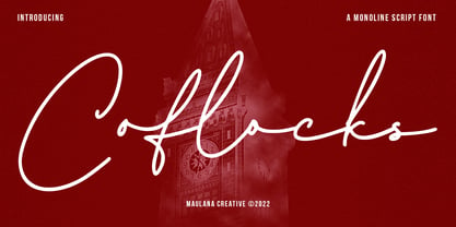 Coflocks is an signature script font. With mono-line stroke, fun character with a bit of ligatures and alternates. To give you an extra creative work. Coflocks font support multilingual more than 100+ language. This font is good for logo design, Social media, Movie Titles, Books Titles, a short text even a long text letter and good for your secondary text font with sans or serif. Make a stunning work with Coflocks font. Cheers, MaulanaCreative
 - Betsyclove by Maulana Creative,
$12.00 Betsyclove is a modern romantic signature script font. With regular mono-line stroke, fun character with some of ligatures. To give you an extra creative work. Betsyclove font support multilingual more than 100+ language. This font is good for logo design, Social media, Movie Titles, Books Titles, a short text even a long text letter and good for your secondary text font with sans or serif. Make a stunning work with Betsyclove font. Cheers, MaulanaCreative