4,092 search results
(0.012 seconds)
- TA Bankslab by Tural Alisoy,
$33.00 The building of the Northern Bank of St. Petersburg's Baku branch was built in 1903-1905. It was the first Art Nouveau-style building in Baku, Azerbaijan. Later the bank was transformed into the Russian-Asian Bank. After the oil boom in Baku in the 19th century, branches of many banks and new banks were opened in the city. The branch of the Northern Bank of St. Petersburg was among the first banks that was opened in Baku. N.Bayev was the architect of the building for the branch of the Northern Bank of St. Petersburg located at Gorchakovskaya 3 in 1903-1905. The building currently houses the Central Branch of the International Bank of Azerbaijan. My purpose in writing this is not to copy and paste the information from Wikipedia. What attracted me to the building was the word "Банкъ" (Bank) written in Cyrillic letters, which was also used in Azerbaijan during the Soviet era. The exact date of the writing is not known. Every time I pass by this building, I always thought of creating a font of this writing someday. I had taken a photo of the building and saved it on my phone. I did a lot of research on the font and asked a lot of people. However, some did not provide information at all and some said they did not have any information. I was interested in the history of this font but I do not know if this font really existed or it was created by the architect out of nowhere. If there was such a history of this font, I wanted to recreate this font and make it available. If not, I had to create it from scratch in the same way, using only existing letters on the building. Finally, I made up my mind and decided to develop the font with all letters I have got. It was difficult to create a font based on the word, Банкъ. Because in the appearance of the letters, the midline of the letters on A, H, K was very distinct, both in the form of inclination and in more precise degrees. The serif part of the letters, the height of the upper and lower sides, differed from each other. I don't know whether it was done this way when the building was constructed or it happened over time. I prepared and kept the initial version of the font. I took a break for a while. I started digging on the story of the font again. Meanwhile, I was researching and got inspired by similar fonts. Unfortunately, my research on the font's history did not yield any results. I decided to continue finishing up the font. After developing the demo, I created the font by keeping certain parts of these differences in the letters. In addition, I had to consider the development of letters in the Cyrillic, as well as the Latin alphabet, over the past period. Thus, I began to look at the appearance of slab-serif or serif fonts of that time. In general, as I gain more experience in developing fonts, I try to focus on the precision of the design for each font. In recent years, I specifically paid attention to this matter. YouTube channel and articles by Alexandra K.'s of ParaType, as well as, information and samples from TypeType and Fontfabric studios on the Cyrillic alphabet were quite useful. I gathered data regarding the Latin alphabet from various credible sources. I do not know if I could accomplish what I aimed at but I know one thing that I could develop the font. Maybe someday I'll have to revise this font. For now, I share it with you. I created the font in 10 styles. 7 weight from Thin to Extra Black, an Outline, Shadow, and Art Nouveau. The Art Nouveau style was inspired by the texture in the background used for the text on the building. The texture I applied to capital letters adds beauty to the font. If you like the font feel free to use it or simply let me know if your current alphabet doesn't support this font.
 - TA Bankslab Art Nouveau by Tural Alisoy,
$40.00 TA Bankslab graphic presentation at Behance The building of the Northern Bank of St. Petersburg's Baku branch was built in 1903-1905. It was the first Art Nouveau-style building in Baku, Azerbaijan. Later the bank was transformed into the Russian-Asian Bank. After the oil boom in Baku in the 19th century, branches of many banks and new banks were opened in the city. The branch of the Northern Bank of St. Petersburg was among the first banks that was opened in Baku. N.Bayev was the architect of the building for the branch of the Northern Bank of St. Petersburg located at Gorchakovskaya 3 in 1903-1905. The building currently houses the Central Branch of the International Bank of Azerbaijan. My purpose in writing this is not to copy and paste the information from Wikipedia. What attracted me to the building was the word "Банкъ" (Bank) written in Cyrillic letters, which was also used in Azerbaijan during the Soviet era. The exact date of the writing is not known. Every time I pass by this building, I always thought of creating a font of this writing someday. I had taken a photo of the building and saved it on my phone. I did a lot of research on the font and asked a lot of people. However, some did not provide information at all and some said they did not have any information. I was interested in the history of this font but I do not know if this font really existed or it was created by the architect out of nowhere. If there was such a history of this font, I wanted to recreate this font and make it available. If not, I had to create it from scratch in the same way, using only existing letters on the building. Finally, I made up my mind and decided to develop the font with all letters I have got. It was difficult to create a font based on the word, Банкъ. Because in the appearance of the letters, the midline of the letters on A, H, K was very distinct, both in the form of inclination and in more precise degrees. The serif part of the letters, the height of the upper and lower sides, differed from each other. I don't know whether it was done this way when the building was constructed or it happened over time. I prepared and kept the initial version of the font. I took a break for a while. I started digging on the story of the font again. Meanwhile, I was researching and got inspired by similar fonts. Unfortunately, my research on the font's history did not yield any results. I decided to continue finishing up the font. After developing the demo, I created the font by keeping certain parts of these differences in the letters. In addition, I had to consider the development of letters in the Cyrillic, as well as the Latin alphabet, over the past period. Thus, I began to look at the appearance of slab-serif or serif fonts of that time. In general, as I gain more experience in developing fonts, I try to focus on the precision of the design for each font. In recent years, I specifically paid attention to this matter. YouTube channel and articles by Alexandra K.'s of ParaType, as well as, information and samples from TypeType and Fontfabric studios on the Cyrillic alphabet were quite useful. I gathered data regarding the Latin alphabet from various credible sources. I do not know if I could accomplish what I aimed at but I know one thing that I could develop the font. Maybe someday I'll have to revise this font. For now, I share it with you. I created the font in 10 styles. 7 weight from Thin to Extra Black, an Outline, Shadow, and Art Nouveau. The Art Nouveau style was inspired by the texture in the background used for the text on the building. The texture I applied to capital letters adds beauty to the font. If you like the font feel free to use it or simply let me know if your current alphabet doesn't support this font.
 - a sogra Ruth - Personal use only

- Foundry Dat by The Foundry,
$50.00 Foundry Dat is created with a common horizontal dash grid structure for accurate layering when characters are superimposed. Foundry Dat’s integrated background aligns vertically and horizontally, when set solid, forming a continuous pattern. Foundry Dat’s companion family Foundry Dit functions as a legible correspondence font, with a ‘typewriter’ feel. Each family contains: light, regular, medium and bold weights. Foundry Dat comes with a series of dashes to extend the background grid. Characters can also be offset to make different patterns – in the process becoming images – a graphic language with total integration of form and function.
 - Love Said by CBRTEXT Studio,
$16.00Love Said is a beautiful and clean calligraphic script font. This font is suitable for wedding invitations, logos, and branding. Love Said has complete uppercase and lowercase letters. This font also has many alternative letters for more than 670 glyphs. Multilingual support is also available in this font. The following features are available: - Uppercase - Lowercase - Standard Ligatures - Alternates (ss01,ss02,ss03,ss04,ss05,ss06,ss07,ss08) - Contextual Alternates - Contextual Ligatures - Kerning Have this font now and make your project look beautiful and elegant. Thank you and have a nice day. - Streetcar JNL by Jeff Levine,
$29.00 An ebay purchase of a vintage Speedball lettering pen set yielded an extra bonus… numerous alphabets on paper rendered in both pen and ink and via pencil sketches. One such design in rough pencil layout is a classic serif typeface often found on many passenger and freight trains, trolley cars and busses. This “Railroad Roman” was scanned from the original sketches and then re-drawn digitally, all along retaining the charm and attractiveness often found in hand lettering. The end result is Streetcar JNL, which is available in both regular and oblique versions.
 - De Luxious by Java Pep,
$13.00 Give a touch your project to make it look classy and outstanding with De Luxious font. This font is perfect for logo, personal branding, branding identity, signature, etc, and can make today awesome. De Luxious includes uppercase, lowercase, numeral, and punctuations, as well as multi-lingual support for 15 languages (Afrikaans, Albanian, Catalan, Danish, Dutch, English, French, German, Icelandic, Italian, Norwegian, Portuguese, Spanish, Swedish, Zulu ) Thanks for using this font. If you have any problem, don't hesitate to give me a message java.indonesian@yahoo.com. Have nice a day.
 - Elbflorenz by RMU,
$35.00 Another jewel of the vast treasure of historical font designs was digged out and brought to life again. Due to the courtesy of the Quay Brothers, London, who yielded to me an age-old brochure of Albert Auspurg’s ‚Miami‘, released by Schriftguss in 1934, I was able to redesign this elegant font. This font which I called ‚Elbflorenz‘, a cognomen for Dresden, contains West and Central European type faces as well as those for Romanian and Turkish. To get access to the historical number sign please use either the OT feature additional ligatures or ordinals.
 - Katenila by Arterfak Project,
$16.00 Katenila is a cute handwriting font with a joyful taste. Inspired by marker handwriting and modern calligraphy, Katenila offers the flexibility of the upper & lowercase that you can mix and match and get your typographic mood. Katenila equipped with alternates and swash to give you more variants. This font is suitable for any design themes such as summer, bright, minimalist, holiday, feminine, and etc. Also featured with multilingual supports in 350+ glyphs total, Katenila is perfect for branding, apparel, editorial, poster, quotes, menu, and more! Thank you for visiting, and have a nice day! Ramz.
 - Kumba by AukimVisuel,
$9.00 Kumba is inspired by classic typography and brings its own unique style to any design project. This fantastic sans serif font is best suited for headlines of all sizes, as well as for blocks of text that have both maximum and minimum variations. Whether it’s for web, print, moving images or anything else – Kumba will look spectacular. It is a great sans serif font. Whether you’re looking for fonts for Instagram or calligraphy scripts for DIY projects, Kumba will turn any creative idea into a true piece of art!
 - Yashie by pentagonistudio,
$17.00 Yashie Is A Modern Arabic Typeface Inspired By Ramadhan and Islamic Style. Font Features : SOFTWARE REQUIREMENTS : Fonts and alternate: No special software is required they may be used in any basic program /website app that allows standard fonts That's it, folks! You can go ahead and get cracking :) Follow My Shop For Upcoming Updates Including Additional Glyphs And Language Support. And Please Message Me If You Want Your Language Included or If There Are Any Features or Glyph Requests, Feel Free to Send me A Message. Have a Good Day !
 - Break Love by pentagonistudio,
$19.00 Break Love Is An Classy Retro Font Inspired By Stylish and Vintage Character. SOFTWARE REQUIREMENTS : Fonts and alternate : No special software required they may be used in any basic program /website apps that allows standard fonts That's it folks! You can go ahead and get cracking :) Follow My Shop For Upcoming Updates Including Additional Glyphs And Language Support. And Please Message Me If You Want Your Language Included or If There Are Any Features or Glyph Requests, Feel Free to Send me A Message. Have a Good Day !
 - ITC Musclehead by ITC,
$29.99ITC Musclehead is the work of type designer Timothy Donaldson, a robust, densely packed handwriting typeface. It almost looks like brushwork but was in fact made with a ruling pen which Donaldson had bought from a company in Salem, Massachusetts. He says, The world's gone ruling-pen mad at the moment [late 1990s] and I was beginning to tire of all the skinny splashiness of the letters that most people were making with them. I wanted to do something heavy and robust with the tool, so that's what I did."" - Pain de Mie by PintassilgoPrints,
$24.00 Pain de Mie is a soft font, friendly and sweet, kinda creamy, kinda bubbly. It's an all caps font with 2 different glyphs for each letter: easily access these through the keyboard upper or lower cases keys. Make them cycle with OpenType Contextual Alternates. There's also a handful of drawings to add an extra charm here and there. Reach these via OpenType Ornaments or pick your choices through a glyphs palette. Like a fresh loaf of bread, Pain de Mie goes well in so many ways. Give it a try!
 - Rollanda by Subectype,
$18.00 Rollanda is a textured signature font. This is stylish signature font with a modern touch. With swift strokes and authentic dry textures, it's an irresistibly charismatic & confident font choice for a range of design projects. Rollanda is perfect for branding projects, homeware designs, product packaging, Signature, Clothing - or simply as a stylish text overlay to any background image. Ligatures are also available for several lowercase characters (double-letters which flow more naturally). These are only accessible via software with opentype capability or a glyphs panel, e.g. Photoshop/Illustrator.
 - Beaumaris by Roland Hüse Design,
$30.00 Beaumaris is a serif typeface named after a nice bay area in Australia which I would like to visit one day. A modern bold serif with an art deco touch, this font is great choice for fashion brands, jewellery and magazine headlines. It contains stylistic alternates, discretional and standard ligatures, small caps and fractions (see image gallery for details). The character set covers all Latin accented characters (including Schwa) and Russian cyrillic alphabet. For additional customization please message me at: contact@rolandhuse.com Thank you & I hope you like this font!
 - Afiche Script by Mysterylab,
$19.00 Afiche Script is an engaging vintage-flavored script font that features excellent legibility and versatility. It's equally suited for large logo and headline applications as it is for longer text passages, being very readable even at small sizes. The appealing curves and rounded finials give it a casual and fun vibe, and the subtle reverse stroke contrast makes it a standout choice to catch the eye as being something new and different. The capitals dip below the baseline, providing a lively bounce to each line of upper and lowercase type.
 - Neoncity by PandAE86,
$10.00 Neoncity is a bold and fresh display font with a vintage feel. Inspired by the flashing 80’s, it will add a distinct look to any design project. This font is perfectly used in larger type sizes, above 48 pt. Neoncity is perfect for a design that wants to imitate neon—use it in Photoshop, InDesign, Illustrator or Corel with color & blend effects, and its geometry also lends itself for signage, packaging, posters, branding, event invites, quote, blog posts, social media, and more! Thanks and have a wonderful day, Dedi T
 - NuOrder by The Northern Block,
$29.00 NuOrder is a modern-day sans-serif typeface with humanist bones. The design incorporates a dynamic structure with minimal contrast and a natural stroke path to promote easy reading—resulting in a warm well-balanced typeface best suited for a wide range of applications in a hi-tech era. Details include nine weights with matching italics and over 550 characters per style. Opentype features consist of five variations of numerals, including inferiors, superiors, fractions, alternate lowercase a and g, and language support covering Western, South, and Central Europe.
 - CA No Dr. by Cape Arcona Type Foundry,
$30.00 No Dr. was inspired by an old movieposter lettering for the 1962 movie "James Bond: Dr. No". Just like the original Dr. No, No Dr. has a diabolical charm. It was developed into a font family that combines distinctiveness with versatility. It has a good readibility as a textfont but also looks great as a Headline. The two widths and the two weights give you a big choice. Intended to become an interesting alternative to the much used DIN Schrift, it has now developed into a highly functional family of it's own.
 - QuickType by Wiescher Design,
$39.50 QuickType is a typeface I designed for demonstration purposes. I used it to illustrate my first book about type design. It has crooked slab serifs and looks very much like a typewriter font. But in order to make things clear I had to overdo some curves and so QuickType turned out a very distinct typewriter typeface. Since those days I worked on the shapes from time to time, so it got better and I extended it to include several neccessary cuts. Now it is a full fledged very usable font. Yours very quick Gert Wiescher.
 - Problem Solver by Gassstype,
$23.00 Problem Solver is a Playful Display Font that will make your designs look modern, unique and fun. It’s perfect for labels, quotes, posters, DIY projects, branding, packaging, greeting cards, websites, photos, photography overlays, signs, window art, scrapbooking, tags and so much more! That is why Problem Solver has a charming, authentic, and relaxed characteristic more natural look to your text with a more natural look to your text. You can activate Ligature OpenType panel to make these two styles. It also has many and underlines that make your text and design more interesting.
 - Watford by madjack.font,
$15.00 Watford is a textured brush font, a contemporary approach to design, handmade with irregular base lines. Suitable for use in title designs such as clothing, invitations, booklets, stationery designs, quotes, branding, logos, greeting cards, t-shirts, packaging designs, posters and more. Watford includes a complete set of upper and lower case letters, as well as multi-language support, numbers, punctuation, binders, alternatives and additional swash. If you have questions, feel free to contact me via email: madjack.font@gmail, com Thank you very much for finding and enjoying it! Muhammad Zaki
 - Thima by Rosario Nocera,
$14.00 Thima is a display font inspired by the liberty style revisited to the present day, hence it is free from the canonical compositional standards that make up the majority of fonts. Its elegant shapes are available in two versions: solid and outline. Thima’s unique features are enhanced by the perfect fusion between irregular and fluid shapes that coexist with right angles. Despite being a display font, the lowercase version is suitable for short and long paragraphs of text, while for large titles the uppercase shows off all its potential.
 - Too Much by Comicraft,
$19.00If you've had too much coffee but not enough of Too Much Coffee Man you can now indulge in an excess of characters created by the hand of Too Much Coffee Man's creator, Mister Shannon Wheeler. Don't worry, in our efforts to ensure clean and confident lettering samples, we kept Shannon on decaf until he was done. Dip this font in your system folder and your hard drive will get a caffeine and sugar rush guaranteed to increase its memory partition and bring the images on your monitor into sharper focus. - Mighty Mouth by Comicraft,
$39.00 Trouble never hangs around, when it hears this Mighty sound, These letters come to save the day -- Mighty Mouth is on the way! When there's Danger, never Despair; The Sound of Mighty Mouth is in the air! Now YOU TOO can shoot your mouth off with the Mouth Almighty of Mighty Mouth. Comicraft’s latest offering utilizes variable type technology, for user-adjustable bold, italic and BOUNCE in illustrator (or any other program that handles variable fonts)! CAUTION: You may wish you’d never opened it, this font has no control over your tongue!
 - Lindsey by Ascender,
$29.99 Lindsey Pro is a new handwriting style font with advanced OpenType features including alternative characters and ligatures. Lindsey Pro was created by Steve Matteson based on a teenager’s handwriting. It is a casual typeface design with irregular alignments and occasional connections. Lindsey is a fun font to use in a wide range of documents, from Valentine’s Day cards to invitations, memos, greeting cards, signs and correspondence. Lindsey Pro was developed to take advantage of the rich typographic OpenType features of applications Adobe Creative Suite, QuarkXPress 7, and Microsoft Expression.
 - Addressotype by Midwest Type,
$19.00 Addressotype is based on lettering from a vintage ad for the Addressograph-Multigraph Corporation, manufacturers of the Addressograph addressing machine. In days when the U.S. postal service delivered everything, mailing addresses were as important as email addresses are today. The Addressograph machines stamped out dog-tag-like plates that were used to print mailing labels at high volume. Embodying the company’s work ethic and durability, Addressotype recalls the gaspipe form of lettering popular in the 30s and 40s, updated to reflect the “streamlining” trend popular during the period.
 - Grazel PS by pentagonistudio,
$19.00 Grazel Is A Modern Display Serif Character Inspired By Retro and Vintage Style. SOFTWARE REQUIREMENTS : Fonts and alternate : No special software required they may be used in any basic program /website apps that allows standard fonts That's it folks! You can go ahead and get cracking :) Follow My Shop For Upcoming Updates Including Additional Glyphs And Language Support. And Please Message Me If You Want Your Language Included or If There Are Any Features or Glyph Requests, Feel Free to Send me A Message. Have a Good Day !
 - Brock Pro by Stawix,
$49.00 Brock Pro celebrate the essence of the famous 19th century wooden letterpress type, Block Berthold by bringing out its remarkable features and explicate them in relation to the modern day trend. Brock Pro is a conventional font with a twist, fun, easy to use and has a very particular tone of voice that suits numerous design purposes. Brock pro comes in 10 weights and 20 styles to support a wide range of usage, every needs and great building brands, Brock Pro also available in both ttf. and otf.
 - Drowsy Lunch by PizzaDude.dk,
$15.00 The inspiration for this font (as well as the name!) comes from a London cafe I visited years ago. I was fascinated with the handwritten menu - irregular and awkward, yet refreshingly charming. I did my best to recall that particular look by adding 4 slightly different versions of each lowercase letter. The name of the font comes from the speed of the waiter...or the lack of it! But luckily he took his time, otherwise I wouldn't have had the time to really look at the handwritten menu! :)
 - Puzzle Face by Jonahfonts,
$15.00 Puzzle Face is a novelty six-tiered overlay font with a range of possibilities. With the use of your graphic application* your artwork can have special color effects. Ideal for concepts involving problems such as solutions, mysteries and of course puzzles. Ideal for a range of logos, posters, headings and bookjackets using ALL or SOME of the six layers. For Layer-info there is a pdf file in the graphics section for you to download and print. Have fun! *Each layer contains Opentype ‘Contextual Alternates’ and may only be accessible via Opentype-aware applications.
 - Argithea by pentagonistudio,
$19.00 Argithea Is An Modern Stylish Font Inspired By Bold Modern Stylish Serif and Vintage Curves. SOFTWARE REQUIREMENTS : Fonts and alternate : No special software required they may be used in any basic program /website apps that allows standard fonts That's it folks! You can go ahead and get cracking :) Follow My Shop For Upcoming Updates Including Additional Glyphs And Language Support. And Please Message Me If You Want Your Language Included or If There Are Any Features or Glyph Requests, Feel Free to Send me A Message. Have a Good Day !
 - Classroom Stencil JNL by Jeff Levine,
$29.00 Roman-style stencil fonts have been around for much longer than most people realize - from the interlocking brass stencils of the 1880s to the laser-cut plastic stencils of today. A 1 inch Roman lettering guide [die-cut from oil board with spacing holes for correct alignment] made by the now-defunct Zipatone Corporation in the 1970s was a clone of an existing design of another company; but with variations in certain character shapes. This then became the working model for Classroom Stencil JNL, which is available in both regular and oblique versions.
 - The Dough by pentagonistudio,
$19.00 The Dough Is An Luxury Stylish Serif Font Inspired By Expensive Serif Typeface. SOFTWARE REQUIREMENTS : Fonts and alternate : No special software required they may be used in any basic program /website apps that allows standard fonts That's it folks! You can go ahead and get cracking :) Follow My Shop For Upcoming Updates Including Additional Glyphs And Language Support. And Please Message Me If You Want Your Language Included or If There Are Any Features or Glyph Requests, Feel Free to Send me A Message. Have a Good Day !
 - Qestero PS by pentagonistudio,
$14.00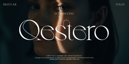 Qestero Is A Modern Display Font Inspired By Sleek and Exotic Style. SOFTWARE REQUIREMENTS : Fonts and alternate: No special software is required they may be used in any basic program /website app that allows standard fonts That's it, folks! You can go ahead and get cracking :) Follow My Shop For Upcoming Updates Including Additional Glyphs And Language Support. And Please Message Me If You Want Your Language Included or If There Are Any Features or Glyph Requests, Feel Free to Send me A Message. Have a Good Day!
 - Twirrewyn by Hanoded,
$15.00 Twirrewyn is Frisian for ‘Whirlwind’. I have always liked the Frisian language; it’s like a crossover between English and Dutch. When I studied journalism in Zwolle (a city close to Fryslân) there were a lot of Frisian students and I did pick up a few words! Twirrewyn is a handmade font family: the fat version was made using a brush and ink; the light version was made using that same ink, but with a broken satay skewer instead of a brush. And yes, you have guessed right, we eat a lot of Satay! ;-)
 - Bassidle by Josstype,
$24.00 Bassidle Font is a sans serif font family that is simple but strong, defined by sharp edges with a modern touch. It is designed to exude a sense of strength and toughness as well as optimal readability. t’s a perfect choice for branding, magazines, posters, advertising, packaging, headlines, logos, web, print etc. 14 styles: 7 uprights and matching italics. 222 glyphs. Latin based languages. OpenType features, including ligatures. OTF, TTF files. Variable Font Includes. Thank you for your purchase! and please let me know if you have any questions. via email: joelpopon@gmail.com
 - Blog Cube by Say Studio,
$17.00 Blog Cube - Display Typeface Blog Cube is a bold and strong display typeface from rectangle shape that is perfect for your work such as posters, logos, branding, covers, banners, t-shirts and headers, or even large-scale artwork. Creative & Decorative Typography Web Design, Try this font on any surface it will look Stunning!. happy creating. hope you like it! well, Blog Cube also has an Outline style, is a strong and bold typeface, it has multilingual language, it is useful for your coolest and coolest project up next. Thanks, Have a wonderful day Say Studio
 - Special Charisma by Say Studio,
$17.00 Special Charisma is a stylish vintage font inspired by 70’s groovy vibe with a touch of modernity. It looks amazing at display sizes and is easily readable in text size. Olive Village comes with access to your OpenType features, large selection of alternate glyphs and ligatures. There are three versions of this font : REGULAR, ITALIC, and OUTLINE. WHAT'S INCLUDED : Multilingual Support For access to Stylistic Alternates is required software with glyphs panel like Photoshop and lllustrator. No special software is required to use Ligatures. Have a wonderful day, Saystudio
