4,092 search results
(0.22 seconds)
- Chokana by NREY,
$19.00 Introducing Chokana, a nostalgic multi-line font inspired by the 70's aesthetic. Font looks amazing as alone words and as full text blocks. Also it good for bright captions and unforgettable logos. This font could be the perfect solution if you want to give a lovely retro touch to your designs. If you have any questions, please let me know. Thank you and have a great day!
 - Soul Leo by Otto Maurer,
$16.00 Soul Leo ist a special Version of my font „Soul“ (soul ultra black). For a long Time i want to make a Font like this. Before FL6 that was impossible. I know it is a big File Size for a Font with all the Graphics but i need a Font like this for a LadyProjekt. And so i did it myself. I hope you like it as i do!
 - Elsewhere by Comicraft,
$29.00 Someday, a long time from now, in a galaxy not so very far away, you'll find yourself Suddenly transported to the nether-realms of Elsewhere, bathed in the light of the mystic moons of Meanwhile... While you're waiting for that day, check out this font by John "JG" Roshell. It may not provide you with the same transcendental experience, but JG assures us that it really is the next best thing.
 - Honey Valentine by Yoga Letter,
$15.00 "Honey Valentine" is a modern handwritten font. This font can be used for all your work and needs, especially related to Valentine's Day, wedding, winter, photography, engagement, promotions and more. This font is very easy to use because it has been specially designed, and there is also a guide for using letter decorations in the preview. This font comes with swashes, alternatives, basic characters, multilingual support, numbers, and punctuation.
 - Scriptys by Atom,
$14.00 Scriptys is a beautiful and light handwritten font with a romantic twist. Use it to add an authentic spark to any design project. It includes 1-10 amazing alternates, which gives you the opportunity to create multiple unique designs with just this one download. It is suitable for logos, web, stationary kits, banners, greeting cards, quotes and every other design which needs an elegant touch. Have a great day! Thanks :)
 - Leafing by Illushvara,
$15.00 Leafing is a modern script font mix featuring leaf and florals with a natural vibe. The script is suitable for a wide range of products, including headlines, logotype, wedding invitations, Valentine’s Day, branding, packaging, advertising, watermark, and much more! This font is PUA encoded which means you can access all of the magical glyphs and swashes with ease! It also features a wealth of special features including alternate glyphs and ligatures.
 - The "Discotech" font by Fontalicious is a vivid embodiment of the lively and energetic spirit of disco culture. This font captures the essence of an era defined by vibrant nightclubs, sparkling disco...
- Vianova Serif Pro by Elsner+Flake,
$59.00 The font superfamily Vianova contains each 12 weights of Sans and Slab and 8 weights of the Serif style. The design from Jürgen Adolph dates back into the 1990s, when he studied Communication Design with Werner Schneider as a professor at the Fachhochschule Stuttgart. Adolph started his carrier 1995 at Michael Conrad & Leo Burnett. He was responsible for trade marks as Adidas, BMW, Germanwings and Merz. He has been honored as a member of the Art Directors Club (ADC) with more than 100 awards. On February 26, 2014, Jürgen Adolph wrote the following: “I was already interested in typography, even when I could not yet read. Letterforms, for instance, above storefronts downtown, had an irresistible appeal for me. Therefore, it is probably not a coincidence that, after finishing high school, I began an apprenticeship with a provider of signage and neon-advertising in Saarbrücken, and – in the late 1980s – I placed highest in my field in my state. When I continued my studies in communications design in Wiesbaden, I was introduced to the highest standards in calligraphy and type design. “Typography begins with writing” my revered teacher, Professor Werner Schneider, taught me. Indefatigably, he supported me during the development of my typeface “Vianova” – which began as part of a studies program – and accompanied me on my journey even when its more austere letterforms did not necessarily conform to his own aesthetic ideals. The completely analogue development of the types – designed entirely with ink and opaque white on cardboard – covered several academic semesters. In order to find its appropriate form, writing with a flat nib was used. Once, when I showed some intermediate designs to Günter Gerhard Lange, who occasionally honored our school with a visit, he commented in his own inimitable manner: “Not bad what you are doing there. But if you want to make a living with this, you might as well order your coffin now.” At that time, I was concentrating mainly on the serif version. But things reached a different level of complexity when, during a meeting with Günther Flake which had been arranged by Professor Schneider, he suggested that I enlarge the offering with a sans and slab version of the typeface. So – a few more months went by, but at the same time, Elsner+Flake already began with the digitilization process. In order to avoid the fate predicted by Günter Gerhard Lange, I went into “servitude” in the advertising industry (Michael Conrad & Leo Burnett) and design field (Rempen& Partner, SchömanCorporate, Claus Koch) and worked for several years as the Creative Director at KW43 in Düsseldorf concerned with corporate design development and expansion (among others for A. Lange & Söhne, Deichmann, Germanwings, Langenscheidt, Montblanc.”
 - Vianova Slab Pro by Elsner+Flake,
$59.00 The font superfamily Vianova contains each 12 weights of Sans and Slab and 8 weights of the Serif style. The design from Jürgen Adolph dates back into the 1990s, when he studied Communication Design with Werner Schneider as a professor at the Fachhochschule Stuttgart. Adolph started his carrier 1995 at Michael Conrad & Leo Burnett. He was responsible for trade marks as Adidas, BMW, Germanwings and Merz. He has been honored as a member of the Art Directors Club (ADC) with more than 100 awards. On February 26, 2014, Jürgen Adolph wrote the following: “I was already interested in typography, even when I could not yet read. Letterforms, for instance, above storefronts downtown, had an irresistible appeal for me. Therefore, it is probably not a coincidence that, after finishing high school, I began an apprenticeship with a provider of signage and neon-advertising in Saarbrücken, and – in the late 1980s – I placed highest in my field in my state. When I continued my studies in communications design in Wiesbaden, I was introduced to the highest standards in calligraphy and type design. “Typography begins with writing” my revered teacher, Professor Werner Schneider, taught me. Indefatigably, he supported me during the development of my typeface “Vianova” – which began as part of a studies program – and accompanied me on my journey even when its more austere letterforms did not necessarily conform to his own aesthetic ideals. The completely analogue development of the types – designed entirely with ink and opaque white on cardboard – covered several academic semesters. In order to find its appropriate form, writing with a flat nib was used. Once, when I showed some intermediate designs to Günter Gerhard Lange, who occasionally honored our school with a visit, he commented in his own inimitable manner: “Not bad what you are doing there. But if you want to make a living with this, you might as well order your coffin now.” At that time, I was concentrating mainly on the serif version. But things reached a different level of complexity when, during a meeting with Günther Flake which had been arranged by Professor Schneider, he suggested that I enlarge the offering with a sans and slab version of the typeface. So – a few more months went by, but at the same time, Elsner+Flake already began with the digitilization process. In order to avoid the fate predicted by Günter Gerhard Lange, I went into “servitude” in the advertising industry (Michael Conrad & Leo Burnett) and design field (Rempen& Partner, SchömanCorporate, Claus Koch) and worked for several years as the Creative Director at KW43 in Düsseldorf concerned with corporate design development and expansion (among others for A. Lange & Söhne, Deichmann, Germanwings, Langenscheidt, Montblanc.”
 - Patched by Mans Greback,
$39.00 Patches is a multi-faceted, victorian-era serif typeface for when you need something more than plain text. Get that extra attention while adding a genuine, original appearance to your message. Patches was designed from scratch to give a sense quality and depth. Its designer Mans Greback has created a typeface with a complex structure, yet one that will be easy to master. This work will suit every style, taste and skill level. It is a decorative and completely hand-drawn design in vintage lettering, with the perks and flexibility of present-day technology, which is exactly what you'd expect from a modern typeface. Whether you are making a decorative floral headline, drawing a cowboy logo, or creating a unique design based on this ornamental font, the hopes are that Patches can give you a set of tools and inspiration to bring out the best of your artistry. Standing on the shoulders of giants, it was inspired by a wide range of works, and will hopefully be able to continue to teach and inspire future artists. Or at least help you become a better designer when you're designing an elegant and classic headline. Set the coloring of Patches to light gold and cream tones to apply a luxurious look, or in dark tones for a more rugged impression. Bold, bright colors will make it appear In the mid-1800s, decorative design flourished in the Western major cities. Victorian style thrived and encouraged techniques such as enamelling, embroidery and calligraphy. From the 1880s onwards, there were a series of reactions to higher Victorian tastes, with Art Deco reaching the heights of the 20th century. However, the Victorian art persisted popularity, as it changed to more sophisticated designs which made it more attractive to specific professions and groups. The evolution of the Victorian style in the mid-20th century was a key factor in the succession of the movement. Classic shops and salons, sport designs and traditional festivals, and later Rock'n'Roll and Harley Davidson-themed graphics inspired the continued development of the art. Aspiring to carry on this tradition, this typeface family consists twelve different high-quality variations. The main ones are Patched and Patched In – an outlined variation – and each one provided in five weights: Thin, Light, Medium, Bold and Black. Additionally, the two rough fonts Hangaround and Prospects, that tries to grasp the rough, earthy atmosphere of a shady motorcycle club. The font is built with advanced OpenType functionality and has a guaranteed top-notch quality, containing stylistic and contextual alternates, ligatures and more features; all to give you full control and customizability. It has extensive lingual support, covering all Latin-based languages, from North Europa to South Africa, from America to South-East Asia. It contains all characters and symbols you'll ever need, including all punctuation and numbers.
 - Vianova Sans Pro by Elsner+Flake,
$59.00 The font superfamily Vianova contains each 12 weights of Sans and Slab and 8 weights of the Serif style. The design from Jürgen Adolph dates back into the 90th, when he studied Communication Design with Werner Schneider as a professor at the Fachhochschule Stuttgart. Adolph started his carrier 1995 at Michael Conrad & Leo Burnett. He was responsible for trade marks as Adidas, BMW, Germanwings and Merz. He has been honoured as a member of the Art Director Club (ADC) with more than 100 awards. On February 26, 2014, Jürgen Adolph wrote the following: “I was already interested in typography, even when I could not yet read. Letterforms, for instance, above storefronts downtown, had an irresistible appeal for me. Therefore, it is probably not a coincidence that, after finishing high school, I began an apprenticeship with a provider of signage and neon-advertising in Saarbrücken, and – in the late 1980s – I placed highest in my field in my state. When I continued my studies in communications design in Wiesbaden, I was introduced to the highest standards in calligraphy and type design. “Typography begins with writing” my revered teacher, Professor Werner Schneider, taught me. Indefatigably, he supported me during the development of my typeface “Vianova” – which began as part of a studies program – and accompanied me on my journey even when its more austere letterforms did not necessarily conform to his own aesthetic ideals. The completely analogue development of the types – designed entirely with ink and opaque white on cardboard – covered several academic semesters. In order to find its appropriate form, writing with a flat nib was used. Once, when I showed some intermediate designs to Günter Gerhard Lange, who occasionally honored our school with a visit, he commented in his own inimitable manner: “Not bad what you are doing there. But if you want to make a living with this, you might as well order your coffin now.” At that time, I was concentrating mainly on the serif version. But things reached a different level of complexity when, during a meeting with Günther Flake which had been arranged by Professor Schneider, he suggested that I enlarge the offering with a sans and slab version of the typeface. So – a few more months went by, but at the same time, Elsner+Flake already began with the digitilization process. In order to avoid the fate predicted by Günter Gerhard Lange, I went into “servitude” in the advertising industry (Michael Conrad & Leo Burnett) and design field (Rempen& Partner, SchömanCorporate, Claus Koch) and worked for several years as the Creative Director at KW43 in Düsseldorf concerned with corporate design development and expansion (among others for A. Lange & Söhne, Deichmann, Germanwings, Langenscheidt, Montblanc.”
 - Sunburn Central - Unknown license

- Saguenay by Jonahfonts,
$29.00 Saguenay ia very versatile font which apply to many applications including headlines,web, logos, ads, captions, packaging, bulletins, posters, and greeting cards as well as short texts.
 - HipHopDemi - Unknown license

- Divina Proportione by Intellecta Design,
$29.00 Divina Proportione is based from the original studies from Luca Pacioli. Luca Pacioli was born in 1446 or 1447 in Sansepolcro (Tuscany) where he received an abbaco education. Luca Pacioli was born in 1446 or 1447 in Sansepolcro (Tuscany) where he received an abbaco education. [This was education in the vernacular (i.e. the local tongue) rather than Latin and focused on the knowledge required of merchants.] He moved to Venice around 1464 where he continued his own education while working as a tutor to the three sons of a merchant. It was during this period that he wrote his first book -- a treatise on arithmetic for the three boys he was tutoring. Between 1472 and 1475, he became a Franciscan friar. In 1475, he started teaching in Perugia and wrote a comprehensive abbaco textbook in the vernacular for his students during 1477 and 1478. It is thought that he then started teaching university mathematics (rather than abbaco) and he did so in a number of Italian universities, including Perugia, holding the first chair in mathematics in two of them. He also continued to work as a private abbaco tutor of mathematics and was, in fact, instructed to stop teaching at this level in Sansepolcro in 1491. In 1494, his first book to be printed, Summa de arithmetica, geometria, proportioni et proportionalita, was published in Venice. In 1497, he accepted an invitation from Lodovico Sforza ("Il Moro") to work in Milan. There he met, collaborated with, lived with, and taught mathematics to Leonardo da Vinci. In 1499, Pacioli and Leonardo were forced to flee Milan when Louis XII of France seized the city and drove their patron out. Their paths appear to have finally separated around 1506. Pacioli died aged 70 in 1517, most likely in Sansepolcro where it is thought he had spent much of his final years. De divina proportione (written in Milan in 1496–98, published in Venice in 1509). Two versions of the original manuscript are extant, one in the Biblioteca Ambrosiana in Milan, the other in the Bibliothèque Publique et Universitaire in Geneva. The subject was mathematical and artistic proportion, especially the mathematics of the golden ratio and its application in architecture. Leonardo da Vinci drew the illustrations of the regular solids in De divina proportione while he lived with and took mathematics lessons from Pacioli. Leonardo's drawings are probably the first illustrations of skeletonic solids, an easy distinction between front and back. The work also discusses the use of perspective by painters such as Piero della Francesca, Melozzo da Forlì, and Marco Palmezzano. As a side note, the "M" logo used by the Metropolitan Museum of Art in New York City is taken from De divina proportione. “ The Ancients, having taken into consideration the rigorous construction of the human body, elaborated all their works, as especially their holy temples, according to these proportions; for they found here the two principal figures without which no project is possible: the perfection of the circle, the principle of all regular bodies, and the equilateral square. ” —De divina proportione
 - Grand Hotel - 100% free

- PreussischeIV44Ausgabe3 - 100% free

- Green Dinosaur - Unknown license

- Kiddie Love by Sipanji21,
$15.00 Kiddie Love is a lovely display font that radiates charm. It features gorgeous hearts in each letter which give it an incredibly romantic feel. this font suitable for valentine day poster, logo, t shirt, event banner and etc. you can use this font for any design, apparel, kids logo, logo type, with many swash for make your design awesome. feature : Kiddie Love Uppercase Kiddie Love Number and Punctuation Kiddie Love Multilingual Kiddie Love Swash
 - Homeward Bound by Hanoded,
$15.00 Homeward Bound is a fat, grungy slab serif font - all handmade and inspired by a well known 1934 font. Together with sidekick Homeward Bound II, this baby will lighten up your day, bring you your newspaper and do your dishes to boot. Well, that may not be an accurate description of Homeward Bound’s abilities, but I am sure it will make your work stand out, giving it that ‘handmade eroded vintage’ look.
 - Ranger Rays Rocketeers SRF by Stella Roberts Fonts,
$25.00 Ranger Rays Rocketeers SRF was originally a freeware font on Jeff Levine's old site, but needed a lot of reworking and cleanup to be user-friendly. Jeff did all of the fixes and provided this charming retro-style font of space-age dingbats to the Stella Roberts Fonts project. The net profits from my font sales help defer medical expenses for my siblings, who both suffer with Cystic Fibrosis and diabetes. Thank you.
 - Tuscaloosa by Greater Albion Typefounders,
$7.00 Tuscaloosa is a classic American 'Wild West' Tuscan typeface-we thought it would make a suitable Independence Day tribute to our many American clients. It's ideal for wherever that 'Western' feel is wanted. Posters, signage, the sides of stagecoaches etc... Three faces are offered, a pristine and sharp regular form, a somewhat distressed 'Rustic' face and the rather more distressed 'Extremely Rustic'. So why not mosey on down the saloon with Tuscaloosa!
 - Every by TypeThis!Studio,
$54.00 EVERY is designed to be the most valuable typography equipment in your repertoire! Rich in visions, a wide range of features have been created to master all your typographic challenges par excellence: Italics, small caps, old-style figures, ligatures & arrows are just some of the many possibilities that EVERY offers. 28 Styles in three optical sizes gives you the opportunity to create fascinating design with the scent of iconic elegance. Be exceptional – EVERY day. www.typethis.studio
 - Bilibin by Scriptorium,
$12.00Ivan Bilibin was one of the best artists and designers of the Russian folk art movement of the early 1900s. His posters and his illustrative work are exceptional, and like many of the artists of the period he did a lot of hand lettering in various old-fashioned and modernistic interpretations of traditional Russian folk calligraphy. Our first Bilibin font is based on his lettering from an illustrated folk story by Alexander Pushkin. - Nellie Kay NF by Nick's Fonts,
$10.00It don't mean a thing if it ain't got that swing, and it's easy to get into the swing of things with this bouncy little number, based on another offering by the irrepressible Ross George. Bright, bouncy and a little sassy, Nellie Kay will save the day, no matter what the occasion. Both versions include the complete Unicode Latin 1252, Central European 1250 and Turkish 1254 character sets, with localization for Moldovan and Romanian. - Amber Taste Pro by Gleb Guralnyk,
$14.00 Hi, introducing an Amber Taste Pro font. It's a vintage typeface with classic shape. Seven weights variations from thin to bold is available. Actually this font set is a remastered version of my best selling font Amber Taste with lots of improvements. Pro version has much more characters, including multilingual west european support. All the contours was cleaned up and several glyphs has a new more organic shape. Thank you and have a nice day!
 - RMU Ballade by RMU,
$25.00 In the years 1937 and 1938 Paul Renner drew these both styles of the Ballade font family. Now freshly redesigned and extented for contemporary use, both styles have reappeared. These fonts contain the historical long s, which can be reached by typing the integral sign [ ∫ ] or by turning the round s into the long s via using the OT feature historical forms. It is also recommended to activate the OT feature discretionary ligatures.
 - Strongs Draughtsman by Nick's Fonts,
$10.00One in the series of fonts celebrating the Halcyon Days of Handlettering. Strongs Draughtsman is a monoline font that evokes the sensibilities of the early twentieth century. Based on a font called "architects' pen strokes" as delineated by Lawrence and Charles Strong in their The Art of Show Card Writing from 1922. Both versions of this font contain the Unicode 1252 (Latin) and Unicode 1250 (Central European) character sets, with localization for Romanian and Moldovan. - Trad by Powerfonts,
$13.99 Trad (Träd is Swedish for tree) is inspired by viking mythology and runic alphabets. Imagine a viking warrior crudely carving a message into a tree stump with his trusty dagger, sipping on a flagon of ale and pondering a hard days slaying. Like the blade of his blood encrusted axe, Trad is ideal for projects requiring a sharp edge, such as the cover of your next thriller, zombie flick, or death metal album.
 - Collected Catchwords JNL by Jeff Levine,
$29.00 For those designers looking for nothing more than a library of familiar catchwords and phrases re-drawn from vintage source material, look no further. Collected Catchwords JNL gathers up ninety-three of them, picked from the dingbat typeface library of Jeff Levine Fonts and placed into one convenient font file. "Free", "Sale", "As Advertised", "Dollar Days", "Look", "New" and dozens of other icons of print advertising are no more than a keystroke away.
 - Darkline by Subectype,
$16.00 Introducing: Darkline is a brush script font, dapper handwritten font with a personal charm. With quick dry strokes and a signature style, Darkline is perfect for branding projects, homeware designs, product packaging - or simply as a stylish text overlay to any background image. Ligatures • Are also available for several lowercase characters (double-letters which flow more naturally). These are only accessible via software with OpenType capability or a glyphs panel, e.g. Photoshop/Illustrator.
 - Violethe by Letterafandi Studio,
$16.00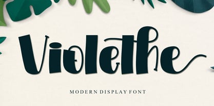 Violethe is a simple and unique-looking display font perfect for a wide variety of products. Use it on your Christmas decorations, Valentine’s Day cards, posters, wedding invitations, branding projects, social media posts, magazines, book covers, and whatever creative project you have in mind, and it will add a fun and friendly touch to your design! This font is PUA encoded, which means you can access all the glyphs and sweeps with ease!
 - The Poisoned Heart by Din Studio,
$29.00 The Poisoned Heart is a beautiful retro script. It's made with a naturally handwritten style. This font will make your design more beautiful and powerful, and is suitable for any design such as branding, quotes, wedding invitations, lettering projects and more. Features: - 76 Alternates - Accents (Multilingual Characters) - 10 Ligatures - PUA encoded - Numerals and Punctuation (OpenType Standard) I hope you enjoy it! Thanks for visiting and purchasing my font! Regards Donis M Din Studio
 - Big Hug Weeny by Mvmet,
$12.00 Big Hug Weeny is a playful contemporary handwritten font, inspired by fun good old days cartoon in the late 80s and 90s. It will elevate a wide range of design projects to the highest level. You can use this font for many design ideas such as stickers, t-shirt designs, amazing logo designs, magazine or book covers, comics, cartoon drawings, and many more. This font will add a super cool touch to your designs!
 - Pinatas Masters by Piñata,
$17.00 Original Foundry: TypeType Original name: TT Masters Pinatas Masters is a very emotional typeface. This typeface will add to your design sincerity and warmth. Pinatas Masters typeface consist of 4 different subfamilies: Pinatas Masters, Pinatas Masters Birds, Pinatas Masters Rough and Pinatas Masters Condensed. Each subfamily consists of 5 styles: Thin, Light, Regular, Bold and Black. Scope of typeface: DIY, handmade stuff, interior design, infographics, graphic design, logotypes, packaging, design of exhibitions, presentations.
 - Ad Words by Outside the Line,
$19.00 Just in time for the sale season. Ad Words is a font of words you would use if you did retail ads. Some words in script, some print, some bold, some not. Plus 2 starbursts. Enlarge the starbursts and then reverse one of the words out of it… like Now! Win! or Free! Other Outside the Line fonts work with this one, check out Architectural Lettering Regular and Bold, Plz Print or Plz Script.
 - Swing Era JNL by Jeff Levine,
$29.00 Hand lettered Art Deco lettering for the title on the cover of the 1930s-era song "And I Still Do" provided the inspiration for Swing Era JNL. A bold, casual and friendly typeface, it features an intersecting inline through some of the characters. One could almost picture the hottest big band of the day promoted on a lobby card with this alphabet, beckoning all to come on in and "cut a rug".
 - Hello Bride Script by 50Fox,
$19.00 Redefine elegance with Hello Bride! This lovely font "Hello Bride" comes with classy style of calligraphy. This fonts is one of the most elegant fonts for wedding or engagement ceremony. Especially if it's an luxury ceremony. Hello Bride Font has huge ligatures & alternative characters. This Font is great for logo, printed quotes, badge, insignia, packaging, headline, poster, t-shirt/apparel, greeting card, and wedding invitation, & etc. Thanks for looking and have a wonderful day
 - March by Din Studio,
$25.00 March is a modern and clean display (Serif) font create from our talented font designer. The design of March will make your design more beautiful and inspiring. This font will suitable for any project, like branding, print template, logo and etc. The font also available in a rough version. Features: Accents (Multilingual characters) 66 Alternates PUA encoded Numerals and Punctuation (OpenType Standard) Thanks for visiting and purchasing my font! Donis M Din Studio
 - Another Thing by Supfonts,
$10.00 Another Thing is a cute handwritten font perfect for headings, flyer, greeting cards, product packaging, book cover, printed quotes, logotype, apparel design, album covers, etc., or just adding a handwritten touch to any project! Font is an open type with clean shapes and precise kerning. It includes ligatures encoded by the PUA. Language support: All European languages Don't forget to subscribe so you don't miss out on the new awesome fonts Dima


