2,203 search results
(0.008 seconds)
- XXII DONT MESS WITH VIKINGS by Doubletwo Studios,
$-
- WildWords Lower by Comicraft,
$49.00 WILD WORDS! WILD WORDS! Buh-Buh-Buh-DUH-DUH! WILD WORDS! Wild Words never lose it! Wild Words never chose this way… Wild Words never close their eyes… Wild Words always sh-- I'm sorry? WILD WORDS is NOT a song by Duran Duran? Really? But I got myself the Simon Le Bon ’80s haircut and my MAD MAX outfit and everything… It’s a font from Comicraft? Now available in lower case? Well that’s good too, right? Comicraft fonts are created BY comic book letterers FOR lettering comic books. Accept no substitutes! See the family related to WildWords Lower: Wild Words
 - Galerie 2 by ArtyType,
$29.00 Galerie 2 has a narrower styling and less contrast than its sister family but incorporates the same unique characteristics as Galerie within its elegant proportions. The close genetic proximity to Galerie enables dual deployment in text and artwork, each family complimenting the other in combinations of headings and copy. Galerie 2, like the full width Galerie volume, comes in 4 weights from Thin to Bold.
 - Vtg Stencil Italy No. 2 by astype,
$29.00 The Vtg Stencil fonts from astype are based on real world stencils from several countries. The Italian stencils that I chose as a model for this font are roughly based on classic French stencil letters. Please compare the figures (numbers) with their French counterparts. However, the Italian stencils are made with a different production technique. The design of the letters is clearly not punch-cut into the plates, maybe they are drilled, milled or etched. Details such as the serifs look bold and clumsy, and when using the stencils as they are meant, with viscous sign paint, smaller details easily fade away. So I took my freedom to design a font close to the original design but adding several typographic tweaks to let it shine, hoping to get closer to the intended design idea of these Italian stencils. Enjoy the vintage!
 - Hybi11 Amigo by Hybi-Types,
$12.50 You can’t reinvent the wheel When it comes to designing a sans serif, many designers stick closely to existing models. How boring! Others try to demonstrate self-reliance by special stylistic elements – at the cost of readability or aesthetics, or both. I did chose a different way: My Font should just look pretty and friendly, being the good buddy for all days. This is how the name is explained.
 - Heltar by The Northern Block,
$19.30 A modern neo-grotesque typeface. Having grown up in Sheffield and been completely immersed in the work of The Designers Republic I became very drawn to their treatment of Helvetica, especially the close tracking of the letter space. This visual investigation led me to the study of the font Hass Unica, a so called improvement to Helvetica. In order not to replicate and become a clone of Unica I redrew all the characters from scratch improving optical appearance, developing subtle corrections and reshaping individual letterforms. The result is a remixed neo-grotesque font that has strong general optical balance with great rhythm under close tracking. Details include 10 weights, an extended European character set, true italic, manually edited kerning and Euro symbol.
 - Tsubame by Thirdin,
$30.00 "TSUBAME" means swallow in Japanese. These fonts are based on the shape of Tsubame. The relationship between humans and swallows is as deep-rooted. Japanese swallows have adapted to nesting in and around human habitation from ancient time. So in Japan, they prohibited people from catching or killing swallows because of their beneficial role as insect eaters. Since the relationship between humans and swallows is close, this font's letter spacing is designed to be very tight.
 - Kettering 205 by Talbot Type,
$12.99 Kettering 205 is a geometric slab-serif with Art Deco influences, such as lowered crossbars on many characters, and a crossed W. It includes old style non-aligning (lower case) numbers, both proportional and tabular as well as accented characters for Central European languages. It’s a highly individual looking font, but retains good legibility coupled with striking looks as a display font. The Kettering 205 family comprises of six weights and is closely related to Kettering 105, its less Deco flavoured cousin.
 - Gloss Drop by phospho,
$20.00 Gloss Drop is a wild hand lettered typeface, that passed the process of digitization without losing the spontaneous vibrancy of brush lettering. With the power of OpenType it gets real close to what you normally do with ink, brush and paper. Like in real handwriting, some, but not all, letters connect within a word. Automatic OpenType features handle the choice of inital and final forms neighbouring a gap and choose the adequate medial or isolated forms.
 - Sadness by Floodfonts,
$29.00 Sadness is based on some experiments during Felix Braden’s stay at the Trier College of Design: "I played around with Fontographer’s blendfonts-feature (a type design tool to interpolate fonts and to minimize effort and expenditure of large families) with some files from a close designer. Since the basic elements derived from extremely varied fonts without any similarities, the concluding shapes first turned out to be rather fragmentary. From those fragments I chose the most characteristic elements and drew a whole new font." For a detailed type specimen have a look at: http://on.be.net/1CdAZlC
 - Bong God by Loaded Fonts,
$7.50Following rules, perhaps too closely. The first full font created by Ray Mullin who strongly believes a font need not be pretty to be valid. Each capital shares similar angles, as does each lowercase, making for a typeface only a mother could love. The rounded style was the true inspiration for the original, but logically it had to come second. Based entirely around Bong God but losing the harsh edges to become a usable futuristic type. Legible, but not readable, recommended in small doses. - Off The Wall JNL by Jeff Levine,
$29.00Off the Wall JNL is a unique typeface that combines graffiti-style lettering with a brick wall background. special keystroke features give you a complete "wall of text": { (left bracket) places a smaller closed end cap on the left side of the text. } (right bracket) places a medium closed end cap on the right side of the text. [ (left brace) places a regular closed end cap on the left side of the text. ] (right brace places a regular closed end cap on the right side of the text. | (vertical bar key) adds a space between words. \ (backslash) adds a larger space between words. - Tanguera by Sudtipos,
$59.00 While Bellas Artes, Koziupa and Paul's "other" look at intertwined classicism in calligraphy, can be compared to the repeated patterns of standardized dance steps, Tanguera is more like dancers engaged in a free form of the classic Argentine dance. Whether the embrace is open or closed, the walk parallel or crossed, it is still classical tango, with leader and follower blending together, sometimes in relaxed softness, sometimes in alert sharpness, yet never losing the clearest of communication. Tanguera provides essential rhythm to any packaging design that calls for clean and classical personalization.
 - Vialog 1450 by Linotype,
$40.99Designed by Werner Schneider and Helmut Ness, the Vialog® 1450 typeface family has been drawn within the standards of the German DIN 1450 regulations. The typefaces conform to the DIN specifications for proportion and line thickness and also contain characters designed in accordance with its requirements. These include characters that can be easily confused, such as uppercase I and lowercase l, and the uppercase O and figure 0, with the corresponding accentuating graphemes and ligatures. In addition, letter pairs that can readily seem to merge together under less than ideal reading environments have also been redesigned. Characters like the g, J and R have also been redrawn to be more legible. Normal glyphs are available as alternatives. - MLE by Martin Wait Type,
$26.00This is a close spaced tagging style that needs to be auto kerned. - Disko - Personal use only

- Toxica - Unknown license

- FT Weapon Of Choice by Fenotype,
$19.00 A dingbat set with close combat weapons, guns, baseball bats, knives and other tools of violence.
 - Synthetique OT - Unknown license

- Belluga by Nicky Laatz,
$20.00 Slip into something a little more sophisticated with Belluga - A stylish, fresh new handwritten brush script. Oozing with Opentype Features, this script comes to life as if you are hand-brushing it yourself. Belluga Script was created to look as close to a natural handwritten script as possible by including over 80 natural-looking opentype ligatures, and a full set of lowercase alternates. From the Glyph Palette you’ll also find 11 swashes that can be used as underlines and for emphasis. Perfect for bold statements and sophisticated branding , Belluga helps set your designs apart by adding a custom-lettered look. A smooth , solid version of the font is also available for those who require a less textured look.
 - Neisya by Phoenix Group,
$13.00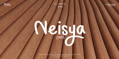 Neisya is a handwriting font with a relaxed and cozy theme, Neisya is closely related to calm and philosophy.
 - PR Ex Cathedra by PR Fonts,
$10.00 This font is closely based on classical proportions, with flared terminals. Small Capitals are 7/8 the size of the capitals
 - Ciutadella Rounded by Emtype Foundry,
$69.00 Ciutadella Rounded is not only a font with soft corners, it has a real rounded terminal across all the weights. It was a challenge to achieve a rounded effect in close counters characters, especially in the heaviest weights where there is less space available to accommodate the round ending. Suitable to be used across a wide range of applications, from identity systems to publications. It is available in Open Type format and includes Alternate Characters (‘a’, ‘t’ and ‘&’), Ligatures, Tabular Figures, Fractions, Numerators, Denominators, Superiors and Inferiors. It supports Central and Eastern European languages. The type family consists of 10 styles, 5 weights (Light, Regular, Medium, SemiBold and Bold) plus italics. For more details see the PDF. See also Ciutadella and Ciutadella Slab.
 - FF Bauer Grotesk by FontFont,
$50.99 FF Bauer Grotesk is a revival of the metal type Friedrich Bauer Grotesk, released between 1933 and 1934 by the foundry Trennert & Sohn in Hamburg Altona, Germany. The geometric construction of the typeface, infused with the art déco zeitgeist of that era, is closely related to such famous German designs as Futura, Erbar, Kabel and Super Grotesk that debuted a few years earlier. However, Bauer Grotesk stands out for not being so dogmatic with the geometry, lending the design a warmer, more homogenous feeling. The oval “O” is a good example of that, as well as characteristic shapes like the capital M or the unconventionally differing endings of “c” and “s” which make for a less constructed look. Watch the FF Bauer Grotesk introduction video on Vimeo
 - Gridder - Unknown license

- Gridder - Unknown license

- Gridder - Unknown license

- Levy by Lithographe,
$36.00 Good for typography, good for close paragraphs, good for titles logo, markers, use with numbers, Capitals and Cases. use Special symbols as design elements. One can be used for others. Good for closed groups. Limbos, good to go with Serif, Sans serif or old english. use it with variety and any design light or heavy. the weight is black, so it wont matter. hope you enjoy the font and use it.
 - Angro by Linotype,
$29.99 The sans serif Angro was designed in the weights light and bold by Erwin Koch. The figures are based on the form of a rectangle which along with the high xheight and short ascenders and descenders gives the forms a static character. Lines of text in Angro are very compact and close set. Due to the reserved ascenders and descenders Angro can be set with very close line spacing.
 - Peerless 131 Bold by Wooden Type Fonts,
$15.00 A revival of one of the popular wooden type fonts of the 19th century, suitable for display, or text, closely related to Latin.
 - Peerless by Wooden Type Fonts,
$15.00 A revival of one of the popular wooden type fonts of the 19th century, suitable for display, or text, closely related to Latin.
 - PaperCutAlmondDark by PineStreet,
$25.00 This is the 'dark' version of our font PaperCut Almond. It has all of its openings closed to enhance the effect of handcut lettering.
 - BLT Balfour by Black Lab Type,
$12.00 BLT Balfour : Art Deco Revival Font Balfour is a modern Art Deco typeface revival. Built from historic references in architecture during this time period, Balfour exudes class and elegance, yet still honors the style with unapologetic bold geometric forms. Pay close attention to the letterforms B and R, and how their extreme x-heights play off of the elongated strokes of C, D and G. Unique features throughout the character set make it less predictable and more unique than any Art Deco typeface before it. The geometry of this typeface plays from one letter to the next. Fill and Outline styles work well in headlines, logos and large type. The Line style is effective at all sizes and can be used in combination with other styles to achieve visual hierarchy.
 - und4 by URW Type Foundry,
$39.99 The rasterized square (clear, therefore 4 as part of the font name) was the constructive basis. The intention was to put all characters within this grid and produce a highly structured, yet lively, resting in itself, display font. Relaxed but exciting, just. An absolutely noteworthy detail are the classical construction principles (based on a typography book from the 50's for poster designers), the so-called optical weighting, derived and slightly exaggerated character elements: The characters are not purely symmetrical and the curve shapes do not close justified with the surrounding square. Loops and tongues slightly hang over; the upper bows are slightly less protruding than lower ones, etc. The kerning is tuned to fit these design details: the white space between the characters match the same filling space.
 - Solo Print by PizzaDude.dk,
$11.00 Solo Print mimics letters that had a close encounter with a slightly bad copy machine, The 5 different versions of each letter makes it even more realistic!
 - Ultinoid by PizzaDude.dk,
$20.00Slightly messed up... - North Blue by Aldedesign,
$18.00 North Blue is a new, stylish and quirky script. It was created to look as close to a readable script as possible, and includes great swash characters too.
 - Duonor JNL by Jeff Levine,
$29.00Take the tri-line font Trilium JNL, remove the middle lines, close off the openings and you now have Duonor JNL, and interesting sans with a sectional look. - Absinthe by Device,
$39.00 Absinthe explores forms based on a truncated ellipse and eschews straight lines to give an entirely modern take on some of the forms more closely associated with Art Nouveau.
 - VideoTech by The Northern Block,
$12.80 VideoTech is an 8 font family consisting of 4 weights open and 4 weights closed. A heavyweight typeface that draws inspiration from loading computer games onto the Commodore 64.


