10,000 search results
(0.038 seconds)
- M Kai 2 HK by Monotype HK,
$523.99 M Kai 2 HK is a handwritten style Traditional Chinese typeface. Handwritten font designs are derived directly from hand-drawn lettering or handwriting using analogue tools. Handwritten style Traditional Chinese fonts can include typefaces that reference or reinterpret traditional calligraphy, using classical exemplars by calligraphic masters.
 - Alinea Serif by Présence Typo,
$36.00Alinea is a typeface in 3 styles (Sans, Incise, and Serif) conceived for being mixed in the same document. The elegant one of the family, Alinea Serif, is a transitional, a style represented by Caslon and Times. It is a contrasted typeface, strong stems and thin hairlines. - Haldenweg by Graphicfresh,
$25.00 Introducing the new font in retro style. An adaptation of the life of the design industry in the 80s and 90s. We made this so you can reminisce in a classic style. This font looks classic, but a modern and elegant impression is still embedded in it.
 - Hey Baby Script by Bosstypestudio,
$13.00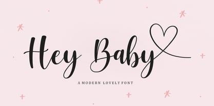 Hey Baby Script is a Chic and Lovely Calligraphy font, described by a Love touch with natural handwritten style, perfect for your favorite projects. Fall in love with its incredibly distinct and timeless style and use it to create spectacular designs! What's Include : Multilingual Support Thank You,
 - Korsel by Cocodesign,
$10.00 Korsel handwritten font script display. This font was designed by handwriting, and it has a modern and unique forms of calligraphy, the writing style is very natural. Belgia has a very unique style of calligraphy, it is very suitable for use in the work of modern design.
 - Cobra Hand by Kern Club,
$10.00 Cobra hand is a hand drawn display font. It has a graffiti tattoo style that fits many illustration styles well. It is has a playful cartoony side as well. It comes with upper case, lower case, numbers and punctuation marks. Have fun with this one! -Kern Club
 - M Kai 2 PRC by Monotype HK,
$523.99 M Kai 2 PRC is a handwritten style Simplified Chinese typeface. Handwritten font designs are derived directly from hand-drawn lettering or handwriting using analogue tools. Handwritten style Simplified Chinese fonts can include typefaces that reference or reinterpret traditional calligraphy, using classical exemplars by calligraphic masters.
 - Smena by ParaType,
$30.00 Smena was based on the lettering of the so called 'calligraphic style' that was very popular during the period 1940-1970. The style was used in logos, book and magazine headlines, posters, signage etc. For use in advertising and display typography. Licensed by ParaType in 2006.
 - Melusine by Scriptorium,
$18.00Melusine is based on an ornate style of gothic calligraphy used primarily in decorative signs and advertising in Germany around the turn of the century. It has many of the characteristics of a true medieval gothic hand, but is a more elaborate, extreme variaton on the style. - Callephane by Viswell,
$9.00 Callephane is our newest font. Its retro style is inspired by a unique design in the 60s. This fonts is perfect for any project, posters, clothing, labels, logos, badges, and many more, that would benefit from a retro look. Callephane has 3 styles: Light, Regular and Rough.
 - Madelisa Script by Bosstypestudio,
$14.00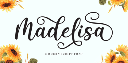 Madelisa Script is a Chic and Lovely Calligraphy font, described by a Love touch with natural handwritten style, perfect for your favorite projects. Fall in love with its incredibly distinct and timeless style and use it to create spectacular designs! What's Include : Multilingual Support Thank You,
 - Sapiens by Hemphill Type,
$25.99 Sapiens is a prehistoric font family characterised by simplicity & crudeness, as if carved out and assembled by our sapiens ancestors. The family is built with a rough edged style that evolves through various styles and becomes more legible while retaining the raw roots of its origins.
 - Swishine by Dumadi,
$18.00 Swishine is a modern, freestyle aesthetic handwritten font perfect for beauty branding, cosmetics, wedding invitations and other design branding. Swishine includes a full set of beautiful upper and lowercase letters, numbers, multiple punctuation marks, alternative styles, ending swsh, and ligatures. provides a very beautiful handwritten style.
 - Fonce Sans Pro by Ryan Ford,
$10.95 Fonce Sans Pro is a mono-weight, Swiss-style typeface with influences from great typefaces like Din, Helvetica, Interstate, and Trade Gothic. Its form is unique and sophisticated with an unmistakable Dutch style. It’s subtle and enjoyable, and works beautifully in both display and body copy.
 - Berfilem by Deeezy,
$14.00 Trendy, elegant, artistic, luxury & modern style serif font for your fancy projects. Elegant, fashion and editorial style on Berfilem font will be great for any branding project. Lot of alternates and ligatures will help you to create unique and original logo design or website header! Enjoy :)
 - Rockrace by Arterfak Project,
$10.00 Introducing our new item, "Rockrace". The font set which has 3 different styles that you can combine it as a headline, subheadline, and tagline. The techno style has a negative space in the middle letters, gives a modern touch. Suitable for sport, techno and minimalist theme.
 - Hypne Pop by Sitintahitam,
$9.00 Hypne Pop is inspiring by retro pop culture, groovy, and funky. Hypne Pop comes with 9 weight unique regular and unique slanted style. Hypne Pop have a different characters in every style. This font also suitable for making headlines, stickers, T-shirt design, logotypes, poster, magazine, etc.
 - Zimric by Ingrimayne Type,
$5.00 Zimric is a family with 28 styles. It has the look of neat hand printing. It is monoline and sans-serif, friendly and legible. The Zimric family has three widths, each width has four or five weights, and each weight comes in both upright and italic styles.
 - Coliseu by Hanoded,
$15.00 Coliseu is a gorgeous, all caps Art Deco style font. Clean lines, rounded edges and an appealing style make Coliseu a very useful font. It was named after the beautiful Coliseu do Porto - an art deco landmark in that Portuguese city. Coliseu font comes with all diacritics.
 - Sophia Honey by Bungletter,
$12.00 Sophia Honey is one of the modern calligraphy fonts that comes with a beautiful style that connects in the middle of the heart, designed with high details to present a luxurious style. Sophia Honey includes a complete set of beautiful upper and lower case letters, numbers, punctuation, ligatures and multilingual. All lowercase letters including the beginning and end of the swash, give it a luxurious handwriting style. Classic style is very suitable to be applied in various formal forms such as invitations, labels, restaurant menus, logos, fashion, make up, stationery, novels, magazines, books, greeting / wedding cards, packaging, labels or all kinds of your needs. . . Attention! -Has 6 styles of connecting hearts in the middle. -Has 8 start and end swash styles. To use beautiful applications, you need a program that supports OpenType features such as Adobe Illustrator CS, Adobe Photoshop CC, Adobe Indesign, and Corel Draw. How to access all alternative characters using Adobe Illustrator: https://www.youtube.com/watch?v=XzwjMkbB-wQ How to access all alternative characters, using the Windows Character Map with Photoshop: https://www.youtube.com/watch?v=Go9vacoYmBw If you need help or have any questions, let me know. I'm happy to help. Thanks & Happy Designing!
 - Robur by Canada Type,
$24.95 It shouldn't be a surprise to anyone that these letter shapes are familiar. They have the unmistakable color and weight of Cooper Black, Oswald Cooper's most famous typeface from 1921. What should be a surprise is that these letters are actually from George Auriol's Robur Noir (or Robur Black), published in France circa 1909 by the Peignot foundry as a bolder, solid counterpart to its popular Auriol typeface (1901). This face precedes Cooper Black by a dozen of years and a whole Great War. Cooper Black has always been a bit of a strange typographical apparition to anyone who tried to explain its original purpose, instant popularity in the 1920s, and major revival in the late 1960s. BB&S and Oswald Cooper PR aside, it is quite evident that the majority of Cooper Black's forms did not evolve from Cooper Old Style, as its originators claimed. And the claim that it collected various Art Nouveau elements is of course too ambiguous to be questioned. But when compared with Robur Noir, the "elements" in question can hardly be debated. The chronology of this "machine age" ad face in metal is amusing and stands as somewhat of a general index of post-Great War global industrial competition: - 1901: Peignot releases Auriol, based on the handwriting of George Auriol (the "quintessential Art Nouveau designer," according to Steven Heller and Louise Fili), and it becomes very popular. - 1909-1912: Peignot releases the Robur family of faces. The eight styles released are Robur Noir and its italic, a condensed version called Robur Noir Allongée (Elongated) and its italic, an outline version called Clair De Lune and its condensed/elongated, a lined/striped version called Robur Tigre, and its condensed/elongated counterpart. - 1914 to 1918: World War One uses up economies on both sides of the Atlantic, claims Georges Peignot with a bullet to the forehead, and non-war industry stalls for 4 years. - 1921: BB&S releases Cooper Black with a lot of hype to hungry publishing, manufacturing and advertising industries. - 1924: Robert Middleton releases Ludlow Black. - 1924: The Stevens Shanks foundry, the British successor to the Figgins legacy, releases its own exact copies of Robur Noir and Robur Noir Allongée, alongside a lined version called Royal Lining. - 1925: Oswald Cooper releases his Cooper Black Condensed, with similar math to Robur Noir Allongée (20% reduction in width and vectical stroke). - 1925: Monotype releases Frederick Goudy's Goudy Heavy, an "answer to Cooper Black". Type historians gravely note it as the "teacher steals from his student" scandal. Goudy Heavy Condensed follows a few years later. - 1928: Linotype releases Chauncey Griffith's Pabst Extra Bold. The condensed counterpart is released in 1931. When type production technologies changed and it was time to retool the old faces for the Typositor age, Cooper Black was a frontrunning candidate, while Robur Noir was all but erased from history. This was mostly due to its commercial revival by flourishing and media-driven music and advertising industries. By the late 1960s variations and spinoffs of Cooper Black were in every typesetting catalog. In the early- to mid-1970s, VGC, wanting to capitalize on the Art Nouveau onslaught, published an uncredited exact copy of Robur Black under the name Skylark. But that also went with the dust of history and PR when digital tech came around, and Cooper Black was once again a prime retooling candidate. The "old fellows stole all of our best ideas" indeed. So almost a hundred years after its initial fizz, Robur is here in digital form, to reclaim its rightful position as the inspiration for, and the best alternative to, Cooper Black. Given that its forms date back to the turn of the century, a time when foundry output had a closer relationship to calligraphic and humanist craft, its shapes are truer to brush strokes and much more idiosyncratic than Cooper Black in their totality's construct. Robur and Robur Italic come in all popular font formats. Language support includes Western, Central and Eastern European character sets, as well as Baltic, Esperanto, Maltese, Turkish, and Celtic/Welsh languages. A range of complementary f-ligatures and a few alternates letters are included within the fonts.
 - Budmo Jiggler - Unknown license

- Rosango - Unknown license

- Bad Seed - 100% free

- Silkscreen Expanded - Unknown license

- Sujeta - Unknown license

- Smart and Sexy - Unknown license

- SF Automaton - Unknown license

- SF Port McKenzie Extended - Unknown license

- Action Man Extended - Personal use only

- SF Chromium 24 SC - Unknown license

- SF Zero Gravity Condensed - Unknown license

- SF Espresso Shack Condensed - Unknown license

- SF Burlington Script SC - Unknown license

- Headline by Monotype,
$29.99 Headline Bold is a sans serif face in the nineteenth century English Grotesque tradition. The Headline Bold font is based on types from the Stephenson Blake type foundry called Grotesque no. 9. A bold and compact font, its name gives a strong indication of its primary use.
 - Bank Sans EF by Elsner+Flake,
$35.00 With its extended complement, this comprehensive redesign of Bank Gothic by Elsner+Flake offers a wide spectrum for usage. After 80 years, the typeface Bank Gothic, designed by Morris Fuller Benton in 1930, is still as desirable for all areas of graphic design as it has ever been. Its usage spans the design of headlines to exterior design. Game manufacturers adopt this spry typeface, so reminiscent of the Bauhaus and its geometric forms, as often as do architects and web designers. The creative path of the Bank Gothic from hot metal type via phototypesetting to digital variations created by desktop designers has by now taken on great breadth. The number of cuts has increased. The original Roman weight has been augmented by Oblique and Italic variants. The original versions came with just a complement of Small Caps. Now, they are, however, enlarged by often quite individualized lower case letters. In order to do justice to the form changes and in order to differentiate between the various versions, the Bank Gothic, since 2007 a US trademark of the Grosse Pointe Group (Trademark FontHaus, USA), is nowadays available under a variety of different names. Some of these variations remain close to the original concept, others strive for greater individualism in their designs. The typeface family which was cut by the American typefoundry ATF (American Type Founders) in the early 1930’s consisted of a normal and a narrow type family, each one in the weights Light, Medium and Bold. In addition to its basic ornamental structure which has its origin in square or rectangular geometric forms, there is another unique feature of the Bank Gothic: the normally round upper case letters such as B, C, G, O, P, Q, R and U are also rectangular. The one exception is the upper case letter D, which remains round, most likely for legibility reasons (there is the danger of mistaking it for the letter O.) Because of the huge success of this type design, which follows the design principles of the more square and the more contemporary adaption of the already existing Copperplate, it was soon adopted by all of the major type and typesetting manufacturers. Thus, the Bank Gothic appeared at Linotype; as Commerce Gothic it was brought out by Ludlow; and as Deluxe Gothic on Intertype typesetters. Among others, it was also available from Monotype and sold under the name Stationer’s Gothic. In 1936, Linotype introduced 6pt and 12pt weights of the condensed version as Card Gothic. Lateron, Linotype came out with Bank Gothic Medium Condensed in larger sizes and a more narrow set width and named it Poster Gothic. With the advent of photoypesetters and CRT technologies, the Bank Gothic experienced an even wider acceptance. The first digital versions, designed according to present computing technologies, was created by Bitstream whose PostScript fonts in Regular and Medium weights have been available through FontShop since 1991. These were followed by digital redesigns by FontHaus, USA, and, in 1996, by Elsner+Flake who were also the first company to add cursive cuts. In 2009, they extended the family to 16 weights in both Roman and Oblique designs. In addition, they created the long-awaited Cyrillic complement. In 2010, Elsner+Flake completed the set with lowercase letters and small caps. Since its redesign the type family has been available from Elsner+Flake under the name Bank Sans®. The character set of the Bank Sans® Caps and the Bank Sans® covers almost all latin-based languages (Europe Plus) as well as the Cyrillic character set MAC OS Cyrillic and MS Windows 1251. Both families are available in Normal, Condensed and Compressed weights in 4 stroke widths each (Light, Regular, Medium and Bold). The basic stroke widths of the different weights have been kept even which allows the mixing of, for instance, normal upper case letters and the more narrow small caps. This gives the family an even wider and more interactive range of use. There are, furthermore, extensive sets of numerals which can be accessed via OpenType-Features. The Bank Sans® type family, as opposed to the Bank Sans® Caps family, contains, instead of the optically reduced upper case letters, newly designed lower case letters and the matching small caps. Bank Sans® fonts are available in the formats OpenType and TrueType.
 - DS Kork - Unknown license

- Broadsheet by Three Islands Press,
$29.00 A full-featured typeface that simulates old newspaper text from the 1700s, Broadsheet gives you all the “long s” ligatures you could ever dream of. Wonderfully authentic in either display type or long blocks of body copy. Includes a couple of printer’s flourishes. (Based on antique publications from 1728 and 1776.)
 - Potamion by Beewest Studio,
$10.00 The Ugaritic alphabet is a script with ancient letters that was used around 1400 BC. Ugarit is an Old Southwest Semitic language and was found in Ugarit, a place in Syria. It has 30 letters. Other languages (especially Hurrian) are sometimes written in the Ugaritic script in the area around Ugarit
 - Corpo Sans by Borutta Group,
$19.00 Corpo Sans is REFRESHED version of my old font Korpo Sans. Corpo Sans is a sans type family with a friendly feel. This type contains 12 variants with 6 weights.The high contrast and high x height is perfect for headlines and display uses. Corpo Sans is great complement for Corpo Serif.


