10,000 search results
(0.018 seconds)
- The Auratype by Auratype Studio,
$9.00 Hai Folks! The Auratype is retro and classic typeface who inspired by the 60s - 80s designs with more unique explored style like swosh and alternate character. This font made from manual sketch with many many scratch then finished to font. Make your designs project with this font and extras illustration to give more superb. This font also suitable to design like logo, sticker, tees design, banner, poster, sign, display design, packaging and more superb designs! Enyoy with our product and feel free contact us for support! Features : Full set of Upper & Lowercase Character Number & Punctuation Swosh Alternate Extras Illustration Multilingual Language PUA encoded Opentype Features _________ ▼To using the feature OpenType Stylistic alternate (including swosh), you must use program that supports OpenType such as Adobe Illustrator CS, Adobe Indesign, Corel Draw X6-X7 and Microsoft Office 2010 or later versions. Additional way to access alternate/swoshes are using Character Map (Windows), Nexus Font (Windows), Font Book (Mac), or more program which has Pop Character. ▼For more information about accessing alternative, you can see on this link : http://adobe.ly/1m1fn4Y ✌ Get in touch with author https://www.instagram.com/wahyudwi.cc/ https://www.instagram.com/auratype/ https://www.behance.net/fontsfighters ❤ Thank you for purchasing our product and supporting us! We hope this font can be part of your designs project. If you have other queries, questions or issues, just feel free and have fun to contact us directly. We are glad if we can help you more! If you are happy with our product, please put your star into our design reviews, it was so fantastic moment for us. Thanks! :)
 - Pastrami on Rye by Typodermic,
$11.95 Introducing Pastrami on Rye—the comic-style font that is anything but conventional. With its rough-hewn appearance and constructed style, this font adds a unique edge to any design project. Unlike other comic-style fonts that are based on pen and ink, Pastrami on Rye is inspired by cut paper and fabric. The result is a bold, organic look that is both playful and professional. One of the standout features of this font is the serifed “I” in the capital position. This adds a touch of elegance to the font and is perfect for personal pronouns or acronyms. But that’s not all—if you’re using an OpenType savvy application, you can enjoy the benefit of automatic shuffling of letters and numerals. This means your designs will have a more natural, hand-drawn effect without any additional effort on your part. Pastrami on Rye is a font that works well in any application that supports OpenType standard ligatures. Whether you’re designing a logo, creating a comic book, or adding a unique touch to a marketing campaign, this font is sure to stand out. Why settle for a boring, generic font when you can add the organic, bold look of Pastrami on Rye to your designs? Try it today and see the difference for yourself! Most Latin-based European writing systems are supported, including the following languages. Afaan Oromo, Afar, Afrikaans, Albanian, Alsatian, Aromanian, Aymara, Bashkir (Latin), Basque, Belarusian (Latin), Bemba, Bikol, Bosnian, Breton, Cape Verdean, Creole, Catalan, Cebuano, Chamorro, Chavacano, Chichewa, Crimean Tatar (Latin), Croatian, Czech, Danish, Dawan, Dholuo, Dutch, English, Estonian, Faroese, Fijian, Filipino, Finnish, French, Frisian, Friulian, Gagauz (Latin), Galician, Ganda, Genoese, German, Greenlandic, Guadeloupean Creole, Haitian Creole, Hawaiian, Hiligaynon, Hungarian, Icelandic, Ilocano, Indonesian, Irish, Italian, Jamaican, Kaqchikel, Karakalpak (Latin), Kashubian, Kikongo, Kinyarwanda, Kirundi, Kurdish (Latin), Latvian, Lithuanian, Lombard, Low Saxon, Luxembourgish, Maasai, Makhuwa, Malay, Maltese, Māori, Moldovan, Montenegrin, Ndebele, Neapolitan, Norwegian, Novial, Occitan, Ossetian (Latin), Papiamento, Piedmontese, Polish, Portuguese, Quechua, Rarotongan, Romanian, Romansh, Sami, Sango, Saramaccan, Sardinian, Scottish Gaelic, Serbian (Latin), Shona, Sicilian, Silesian, Slovak, Slovenian, Somali, Sorbian, Sotho, Spanish, Swahili, Swazi, Swedish, Tagalog, Tahitian, Tetum, Tongan, Tshiluba, Tsonga, Tswana, Tumbuka, Turkish, Turkmen (Latin), Tuvaluan, Uzbek (Latin), Venetian, Vepsian, Võro, Walloon, Waray-Waray, Wayuu, Welsh, Wolof, Xhosa, Yapese, Zapotec Zulu and Zuni.
 - Dramaminex by Emboss,
$12.40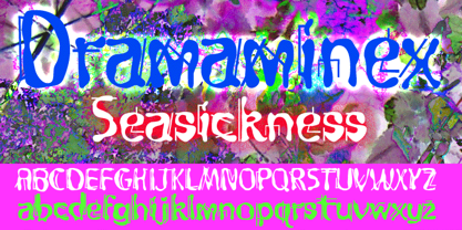 Designed after a bout with seasickness.
 - Beanstalker by Hanoded,
$15.00 I’m not particularly fond of beans. I do eat them, but they’re not my idea of a delicacy… But this font has ‘fairy tale’ feeling to it, and I liked the name Beanstalker. Beanstalker is a hand made font (I used a fineliner to draw the glyphs). It is quite neat and organized, but does come with some rough edges and a bit of texture.
 - TF Sadistic by Teenage Foundry,
$19.00 TF Sadistic is our display font, carefully crafted to bring a sharp and charming look to your designs. With its distinct style and versatile nature, our fonts are the perfect choice for creating attention-grabbing metallics, horror posters, and other impactful visual materials. Our sharp display fonts are designed to make a statement. Its sharp edges and unique letter shapes exude strength and power.
 - Shout by HiH,
$12.00 Shout is a “Hey, Look at ME” font. It is an attention-getting font for posters, flyers and ads. Its lineage includes the Haas Type Foundry’s 19th century advertising font, Kompakte Grotesk, which Jan Tschichold (1902-1974) dryly described as “extended sans serif” and which graphic designer Roland Holst (1868-1938) would have disapprovingly referred to as a “shout,” as opposed to the quiet presentation of information that he believed was the proper function of advertising. In 1963 Letraset released what appears to be an updated variation in multiple weights designed by Frederick Lambert called Compacta. Shout draws heavily on Compacta, as well as other similar fonts of the 50s and 60s like Eurostile Bold Condensed and Permanent Headline. In weight, it falls about halfway between Compacta Bold and Compacta Black, but with a relatively heavier lower case that is not so easily pushed around by the upper case. After all, one can shout while sitting down. Shout is the first font released with our new encoding, as noted in the All_customer_readme.txt. The Euro symbol has been moved to position 128 and the Zcaron/zcaron have been added at positions 142/158 respectively. Otherwise, Shout has our usual idiosyncratic glyph selection, with the German ch/ck instead of braces, a long s instead of the Greek mu and our usual Hand-in-Hand symbol. There are also left and right glyphs of a big mouth ]ing (135/137) and left and right glyphs of an angry man shouting (172/177). Please use Shout with discretion. Folks get tired of being yelled out. After awhile, they stop listening. Shout ML represents a major extension of the original release, with the following changes: 1. Added glyphs for the 1250 Central Europe, the 1252 Turkish and the 1257 Baltic Code Pages. Add glyphs to complete standard 1252 Western Europe Code Page. Special glyphs relocated and assigned Unicode codepoints, some in Private Use area. Total of 355 glyphs. 2. Added OpenType GSUB layout features: pnum, ornm, liga, hist & salt. 3. Added 266 kerning pairs. 4. Revised vertical metrics for improved cross-platform line spacing. 5. Revised hyphen, dashes & math operators. 6. Minor refinements to various glyph outlines. 7. Inclusion of both tabular & proportional numbers. Please note that some older applications may only be able to access the Western Europe character set (approximately 221 glyphs). The zip package includes two versions of the font at no extra charge. There is an OTF version which is in Open PS (Post Script Type 1) format and a TTF version which is in Open TT (True Type)format. Use whichever works best for your applications.
 - Neue Aachen by ITC,
$40.99 Impressed by the quality of the Aachen typeface that was originally designed for Letraset in 1969 and extended to include Aachen Medium in 1977, Jim Wasco of Monotype Imaging has extended this robust display design to create an entire family. Derived from the serif-accented Egyptienne fonts dating to the early 20th century, Aachen has serifs that are very solid but considerably shorter than those of its precursor. The incorporated geometrical elements, such as right angles and straight lines, provide the slender letters of Aachen with a slightly technological, stencil-like quality. Despite this, the effect of Aachen is by no means static; its dynamism means that this typeface, originally designed for use in headlines, has come to be used with particular frequency in sport- and fitness-related contexts. Jim Wasco, for many years a type designer at Monotype Imaging, recognized the potential of Aachen and decided to extend the typeface to create an entire typeface family. He appropriated the existing Aachen Bold in unchanged form and first created the less heavy cuts, Thin and Regular. Wasco admits that he found designing the forms for Thin a particular challenge. It took him several attempts before he was able to achieve consistency within the glyphs for Thin and, at the same time, retain sufficient affinity with the original Aachen Bold. But he finally managed to adapt the short serifs and the condensed and slightly geometrical quality of the letters to the needs of Thin. The weights Light, Book, Medium and Semibold were generated by means of interpolation. Supplemented by Extralight and Extrabold, the new Neue Aachen can now boast a total of nine different weights. Wasco initially relied on his predilection for genuine cursives in his designs for the Italic cuts. But it became apparent with these first trial runs that the soft curves of cursives did not suit Aachen and led to the loss of too much of its original character. Wasco thus decided to compromise by using both inclined and cursive letters. Neue Aachen Italic is somewhat narrower than its upright counterparts; the lower case 'a' has a closed form while the 'f' has been given a descender, but the letters have otherwise not been given additional adornments. The range of glyphs available for Neue Aachen has been significantly extended, so that the typeface can now be used to set texts not only in Western but also Central European languages. Wasco has also added a double-counter lowercase 'g' while relying on the availability of alternative letters in the format sets for the enhancement of the legibility of Neue Aachen when used to set texts. The seven new weights and completely new Italic variants have enormously increased the potential applications of Aachen and the range of creative options for the designer. While the Bold weights have proved their worth as display fonts, the new Book and Regular cuts are ideal for setting text. And the subtlety of Ultra Light will provide your projects with a quite unique flair. The new possibilities and opportunities in terms of design and applications that Neue Aachen offers you are not restricted to print production; you can also create internet pages thanks to its availability as a web font.
 - Ellida by Wiescher Design,
$49.50 Ellida is a very elaborate and elegant script in the tradition of the 18th-century English calligrapher George Bickham and the 19th-century American calligrapher Platt Rogers Spencer. I really enjoyed designing this script and maybe one day I will add starting and ending letters. Doing this script was extremely time- and brain-consuming, it is a huge challenge to make calligraphic letters work on computers so that they join perfectly. That's also the reason that this has become my most expensive font so far, but I think the price is fair for the incredible amount of work I put into the script. I really need a break from scripts now! Yours very exhausted Gert Wiescher.
 - Neuro X by Sawdust,
$35.00 Neuro X is a narrow sans serif typeface consisting of three weights with additional rounded versions and matching italics. It was first drawn as an exploration for a headline font and later expanded on to become a full typeface family. Neuro X explores the extremities of narrow proportions whilst also allowing for eccentric cuts. The typeface has been tightly monospaced and intended for use at larger sizes as a display but can also work at smaller scales for the more courageous among us. This 339 glyph font has language support for 26 languages: Afrikaans, Albanian, Catalan, Croatian, Czech, Danish, Dutch, English, Estonian, Finnish, French, German, Hungarian, Icelandic, Italian, Lithuanian, Maltese, Norwegian, Polish, Portuguese, Slovak, Slovenian, Spanish, Swedish, Turkish, Zulu.
 - Pascual Ferry by Comicraft,
$39.00 The slick and sexy letterforms of Ace ACTION COMICS artist, Pascual Ferry, are the latest to join our MASTERS OF COMIC BOOK ART font line. Pascual's work on the SUPERGIRLS storyline in ACTION made us want to lick each page -- but, y'know, not when anyone was looking... we know they're just comic book characters, they're not REAL and we don't fancy them or anything -- Uhhh... so we were delighted when Pascual invited us to create this stylin' sans souciant family of fonts for him. All we asked for in return was this smokin' alternate cover for the next issue of HIP FLASK... Hey, don't lick your monitor, you might get an electric shock...
 - Pidgeotto by Keristyper Studio,
$14.00 Pidgeotto is a script font with a nice, smooth flow. The basic letters are simple but modified with stylistics to make them look more attractive, there are many alternatives to make it happen. Great for logos, titles, t-shirts, packages, and anywhere else you need this kind of lined, legible script font. Pidgeotto Font multilingual support: Afrikaans, Albanian, Catalan, Danish, Dutch, English, Estonian, French, Finnish, German, Icelandic, Indonesian, Italian, Malay, Norwegian, Portuguese, Spanish, Swedish, Zulu, and many more. What’s Included : OTF/ TTF/ WOFF Web Fonts Standard & Multilingual glyphs Ligature Works on PC & Mac Simple installations Accessible in Adobe Illustrator, Adobe Photoshop, Adobe InDesign, and even work on Microsoft Word. Hope you enjoy our font!
 - Layfort by Identity Letters,
$29.00 What do you get when you cross Industrial Revolution with Art Déco? The raw force of steam-powered vessels with the panache of dashing streamliners? A sturdy industrial grotesque with a swanky stylized sans? We don't know, but our Layfort is a strong contender. It's a contrasted sans-serif typeface with old-style proportions: varying letter widths create a more vivid texture than your usual contemporary sans, and the true italics are narrower than the uprights. Layfort is elegant enough for fashion, art, and luxury; yet sufficiently sincere for serious business. And at 16 styles & 750 glyphs, it's ready for complex typographic demands (try the round dots at SS09). Let your designs fly!
 - Sante Pro by Stiggy & Sands,
$39.00 Our Sante Pro is a script of vintage origins with modern flair. This script embodies holiday and special event celebrations in its styling while exuding a confidence and carefree attitude. It makes a bold statement in any design. This script is loaded with extra features - truly giving Sante Pro lots to celebrate! Opentype features include: - Swash Capitals - Initial and Final forms of Lowercase letters via Contextual Swash Alternates. - Full set of Inferiors and Superiors for limitless fractions. - Oldstyle figures. - Ordinals. - Borders & Flourishing Ornaments. But there's still more! The Sante Initials font uses specially designed flourishes to follow the forms of Swash capitals to create a unique and fanciful look. See the PDF guidebook for Sante Initials for more information.
 - Love Duets by Ingrimayne Type,
$9.00 LoveDuets is a family of two novelty fonts that have letters on hearts. There are at least five other font families on myfonts that have have letters on hearts but LoveDuets differs from them because it uses the OpenType feature of Contextual Alternatives (calt) to put two letters on each heart, one on the left side and a second on the right side. The two styles in the family can be used in layers to increase color possibilities. The brace characters have empty half hearts that can be used to replace spaces or to complete hearts at ends of lines. LoveDuets can be used when hearts are appropriate such as for Valentines Day, anniversaries, and weddings.
 - Wedding Monograms by Kaer,
$19.00 Wedding monograms is a font family in elegant historical style. This family of two character monograms was inspired by “Course of women's needlework” published in 1887. You’ll get the set includes Wide and Narrow capitals, so you can make your own monogram, by combining letters you want. --- Please note, you should use graphic applications such as Adobe Illustrator or Photoshop, but not Microsoft Word. All you need is put Narrow initial on the top of Wide. You can use color fonts in PS CC 2017+, AI CC 2018+, ID CC 2019+, macOS 10.14 Mojave+ Please note that the Canva & Corel & Affinity doesn't support color fonts! --- Please feel free to request any help you need: kaer.pro@gmail.com Best, Roman.
 - Drillos by Hanzel Space,
$25.00 Introducing our new product "Drillos" Inspired by the shape of a balloon which has rounded curves so that the font looks elastic and feels soft. Which has a thick volume in each character of the letter. There are lots of script fonts that have character, but this time the font that I created this time is no less interesting and unique. The function of this font is very suitable for use as branding, posters, logos, packaging, labels and other design needs. So this font is one solution that is quite capable for the needs of designers to complete a project. Uppercase & Lowercase, Numeral, Punctuation, Miltilingual, Swash Thanks so much Happy creating! Cheers! Hanief - Hanzel Space
 - Btoxina by FSdesign-Salmina,
$39.00 Btoxina is a free interpretation of the theme pixel font. With its technological feeling, it reflects the spirit of our age. By designing the font Filippo Salmina, the author, has been inspired by the signage used in starships. Btoxina is grid-based but it differs from classical screen fonts by the use of diagonal lines. It is characterized by the renouncement of the use of capital letters in favor of using negative letters and by the automatic generation of ligatures. The typeface is available in two different styles: Atoxina (regular) and Btoxina (italic). Btoxina is especially suited for headlines in cool or experimental typography; be careful though, this font is toxic, we deny any responsibility for its use!
 - LTC Creepy Ornaments by Lanston Type Co.,
$24.95 In researching historic decorative material offered by Lanston Monotype as well as other metal foundries such as Barnhart Brothers and Spindler, there were occasionally ornaments that defied description. Perhaps it was a Victorian sense of humor or someone really thought these were a good idea or perhaps popular taste has just changed so much over the last hundred years, or our forbearers were completely insane. In any case, LTC is somewhat proud to present a collection of the most bizarre, disturbing and baffling printers ornaments we could find. Along with mutant fowl-children and frolicsome amphibians, there are also Masonic and other secret fraternal symbols that may not be creepy to everyone, but just enough to be moderately disturbing.
 - White Space by Din Studio,
$29.00 Hello, Everybody! Imagine a world filled with white matters? Are you trying to make an elegant, calm, but stylish projects? Then grab this font immediately. Introducing White Space- A Display Serif Font This gorgeous, stylish and modern font can be used for a host of different content needs and projects. Ideal for social media banners; posts, and ads, printed quotes, t-shirt designs, packaging, or even as a modern text overlay to any background image. Our font always includes Multilingual option to make your branding globally accepted. Features: Standard Ligatures Alternate Stylistic Set Swash Multilingual Support (91 languages) PUA Encoded Numerals and Punctuation Thank you for downloading premium fonts from Din Studio
 - Hendrix by Scriptorium,
$18.00I had a chat recently with a customer who is a big fan of lettering from the psychedelic poster era. The discussion got me thinking about poster lettering we hadn't yet made into fonts, and a particular sample from a Jimi Hendrix poster I had played around with but never finished making into a font. So I went back to the drawing board and the result is the new Hendrix font. Unlike many of our other Psychedelic fonts which are stripped down to their basic character forms, this font includes the outlines characteristic of a lot of poster lettering from that period. It also includes variant versions of a number of the characters - Sagan by Associated Typographics,
$29.00 Sagan was designed as an alternate to Ramsey ; you could call them brothers. It was drawn, redrawn, and expanded on, to put it lightly. It boasts 770 glyphs in each weight, covering all European languages, and also contains an extended Cyrillic. Sagan provides advanced typographical support with features such as case-sensitive forms, old style numerals, fractions, and many alternate glyphs. Like all of our typefaces, Sagan is fun to use. Sagan has 7 weights, with accompanying italics for each weight, ranging from Extra Light to Black. It is ideally suited for branding, editorials, advertising, packaging, posters, billboards and digital screen design. Sagan will work hard for your brand or project. Make a statement that demands notice.
 - Terra Ignota by Three Islands Press,
$39.00 The idea for Terra Ignota came to me years ago as I was admiring a reproduction of "Amerique Septentrionale," a 1650 map by French cartographer Nicolas Sanson, given to me by my parents. The handlettering has a sort of rakish character, evocative of pirates or adventurers at a time of unbridled world exploration. I ended up putting the project aside, but the idea to create this font tugged gently at my mind until I simply couldn't ignore it any longer. The resulting typeface has an italic slant and a deliberate feel, in keeping with its historical roots. Useful for simulating old hand-lettered documents. Has a full character set (and then some).
 - Algerian Rnd by FontMesa,
$29.00 It's finally here, Algerian Rnd is an all new version of our Algerian Mesa font with rounded soft corners and serifs. Imagine the impact Algerian Rnd will have on your product label and packaging. Algerian Rnd is a new timeless beauty that you'll find many uses for in your logos and advertising. Algerian Rnd is for every generation, put it to work in your next project, you're going to love this font. Algerian Rnd does include some alternate glyphs which you'll need an Opentype aware application to access the alternates in Algerian Rnd. Algerian Rnd is ideal for product logos, labels, packaging, t-shirt designs and other merch. Algerian Rnd is a trademark of FontMesa LLC
 - Angelik by Mysterylab,
$22.00 Graphic designers, meet Angelik: a stylish typeface that you can really put through its paces. This unique font can bring one of its multiple personalities to a wide variety of design challenges. It’s a louder and prouder version of a typical assertive editorial-style bold serif headline font. But it can also really shine as a great choice for logos and branding, spanning a variety of vibes and styles. Works superbly in a high-fashion context, as well as in lowbrow surf-skate-ski-snowboard gear branding, or perhaps as an understated – yet exotic – vacation travel poster font. With its finely-tuned contouring, extensive kerning, and a multilingual character set, Angelik will not let you down.
 - Ragazzi by Tour De Force,
$25.00 Ragazzi is well balanced serif with display impact. Contains 2 widths – Normal and Condensed and matching Italics for Normal in weight distribution from Light to Black. With gently rounded serifs, teardrop terminals, elegant hairline, equal ascender and descender heights, playful ear and smooth spur, Ragazzi represent distinctive serif family for respectable area of usage. Family's display elements are especially noticeable in headlines, but they handle longer paragraphs with same success, not effecting on legibility keeping right dose of display touch present. Ragazzi contains OpenType features: Small Caps, Initials, Standard Ligatures, Ordinals, Fractions, Superscript, Subscript, Oldstyle Figures, Tabular Figures and two decorative dingbats. Condensed and Italics font files don't contain Initials and dingbats. Ragazzi is our 104th release.
 - Brouwerij by Hanoded,
$15.00 Brouwerij means Brewery in Dutch. I just liked the name and it seemed to fit the font quite well. As for me, believe it or not, I’m not a beer drinker! I can’t understand why people go nuts when the word beer is mentioned. Like it is something special (after all, it is the third most consumed beverage after water and tea). Like you are not a man when you don’t drink beer! Brouwerij is a pleasant all caps font that comes with interesting swashes for the upper class letters. You can (obviously) use it to promote your home made brew, but any other drink can use a bit of Brouwerij as well.
 - Gertrud by T4 Foundry,
$21.00First place in a spelling-bee competition, a Harvard University diploma or the Nobel Peace Prize? You can't go wrong with this classic Swedish calligraphy font, created by veteran designer Bo Berndal. He named Gertrud after his better half, but was also inspired by old handwritten documents: "Gertrud is a calligraphic letter design from the 16th century. I used it when I engrossed diplomas with a flat-nibbed pen in the 1980's. When I got my Mac I generated the typeface in Fontographer." Gertrud (the typeface) comes in three weights, with roman and italic. It is an OpenType creation, for both PC and Mac. Swedish type foundry T4 premieres new fonts every month. Gertrud is our sixth introduction. - China Dragon JNL by Jeff Levine,
$29.00 China Dragon JNL was inspired by a vintage letterpress logo cut on sale in an online auction. The logo for The China Dragon restaurant (presumably from the 1950s or 1960s) had a wonderfully eclectic hand-lettered look. Some of the original characters were modified slightly to conform with the ones created for the remainder of the typeface, but the original styling remains intact. The unique design of this font allows it to adapt well to Art Nouveau or Mideastern project styles. In January of 2006, Jeff Levine Fonts started with just ten designs. A little more than seven years later, in April, 2013 the release of China Dragon is the 700th font added to this ever-growing library.
 - Bream by Hackberry Font Foundry,
$24.95 This is the display version of Librum. Librum means “book” in Latin, which I thought was appropriate. Bream is Latin for proclaim—appropriate for display work. The fonts are very close to Librum-Book and Librum-Italic, with the same OpenType features. The glyphs are modified a bit to make them a little more elegant, but that’s not very noticeable. Mainly, the letterspacing and kerning is tighter and more carefully fit to large point sizes. As for classification, I like oldstyle, Venetian, geralde, English oldstyle. There’s discrete modulation, slanted crossbars, full brackets serifs of medium thickness and sharp cut ends. For a great deal, see Librum Book Design Group, for a package containing all fifteen fonts!
 - Curwen Sans by K-Type,
$20.00 Curwen Sans is a monoline sans-serif dating from the early twentieth century. Though contemporary with Johnston’s Underground and Gill Sans, and emerging from the same artistic milieu, Curwen Sans was created solely for in-house use at the Curwen Press in London so never achieved a wide audience or recognition. The original face was cut only in a Medium weight, but the new digital family consists of four weights, each with an optically corrected Oblique, and all containing a full complement of Latin Extended-A characters. K-Type Curwen Sans comprises three packages: • Basic Family (Regular, Oblique, Bold, and Bold Oblique) • Light (Light and Light Oblique) • Medium (Medium and Medium Oblique)
 - WT Arthas by Wraith Types,
$50.00 Inspired by the « lettres bastardes », Arthas is a modern interpretation of ancient letterforms dating far back, before type even existed. It has been subtly adapted for better readability in 2020. The sharpness of the design creates an elegant contrast between old and new, ancient and futuristic, and will add an ominous, regal mood to your graphic design projects. This typeface is meant mostly for display use, but we can’t wait to receive a picture of someone using it for introductory text, at the start of a book…. Maybe that’s you? As all of our releases, it will be updated at time goes on. Those updates will always be free for people having already purchased the font(s).
 - Videomax by PizzaDude.dk,
$16.00 Videomax looks like something from the future - perhaps even something from a future where the world lies in ruins and is about to be taken over by hostile aliens. The worn letters represent the decades of war against the computers...or the aliens...or maybe the letters comes from a sign of a computer company from the eighties, which was recently found in an abandoned place. The speculations are many, but one thing is definitely true: Videomax got that grungy / computer / worldwar feeling! Write your text, and watch how the randomness of letters make your text look really good. I've put it 4 different versions of each letter, which makes it look really nice and worn!
 - Printers Lot JNL by Jeff Levine,
$29.00 Printers Lot JNL is another eclectic mix of cartoons, ornaments, catch words, decorations and embellishments re-drawn from vintage source material used in the days of letterpress printing. For those who like to assemble their own larger borders, a set of elements is on the 2-9 keystrokes, but it must be noted that some manual adjustment is necessary to line up all of the parts in a complete border pattern. From a Happy New Year greeting to whimsical cartoon characters; from singular ornamental design elements to beautiful brackets, this mix of subjects is a great overview of the kinds of cuts found in printers' job case drawers in years gone by.
 - Minimal Nahidha by Attype Studio,
$19.00 Minimal Nahidha is a minimalist sans serif typeface with a casual and trendy outlook. Minimal Nahidha was built to balance the geometric qualities of a san-serif typeface with all the benefits of traditional serif fonts, like readability and personality. Minimal Nahidha comes in Regular and Slant version, each with its own unique set of characters & it has ligatures and stylistic alternates that make it easy to customize your designs. The fonts works best as display typefaces or as beautiful headline fonts, but can also be used in other ways to create stunning designs. Features : - Minimal Nahidha Family Font - Ligatures - Stylistic Alternates - Multilingual, US Roman, Latin 1 Support Hope you enjoy with our font! Attype Studio
 - 112 Hours by Device,
$9.00 Rian Hughes’ 15th collection of fonts, “112 Hours”, is entirely dedicated to numbers. Culled from a myriad of sources – clock faces, tickets, watches house numbers – it is an eclectic and wide-ranging set. Each font contains only numerals and related punctuation – no letters. A new book has been designed by Hughes to show the collection, and includes sample settings, complete character sets, source material and an introduction. This is available print-to-order on Blurb in paperback and hardback: http://www.blurb.com/b/5539073-112-hours-hardback http://www.blurb.com/b/5539045-112-hours-paperback From the introduction: The idea for this, the fifteenth Device Fonts collection, began when I came across an online auction site dedicated to antique clocks. I was mesmerized by the inventive and bizarre numerals on their faces. Shorn of the need to extend the internal logic of a typeface through the entire alphabet, the designers of these treasures were free to explore interesting forms and shapes that would otherwise be denied them. Given this horological starting point, I decided to produce 12 fonts, each featuring just the numbers from 1 to 12 and, where appropriate, a small set of supporting characters — in most cases, the international currency symbols, a colon, full stop, hyphen, slash and the number sign. 10, 11 and 12 I opted to place in the capital A, B and C slots. Each font is shown in its entirety here. I soon passed 12, so the next logical finish line was 24. Like a typographic Jack Bauer, I soon passed that too -— the more I researched, the more I came across interesting and unique examples that insisted on digitization, or that inspired me to explore some new design direction. The sources broadened to include tickets, numbering machines, ecclesiastical brass plates and more. Though not derived from clock faces, I opted to keep the 1-12 conceit for consistency, which allowed me to design what are effectively numerical ligatures. I finally concluded one hundred fonts over my original estimate at 112. Even though it’s not strictly divisible by 12, the number has a certain symmetry, I reasoned, and was as good a place as any to round off the project. An overview reveals a broad range that nonetheless fall into several loose categories. There are fairly faithful revivals, only diverging from their source material to even out inconsistencies and regularize weighting or shape to make them more functional in a modern context; designs taken directly from the source material, preserving all the inky grit and character of the original; designs that are loosely based on a couple of numbers from the source material but diverge dramatically for reasons of improved aesthetics or mere whim; and entirely new designs with no historical precedent. As projects like this evolve (and, to be frank, get out of hand), they can take you in directions and to places you didn’t envisage when you first set out. Along the way, I corresponded with experts in railway livery, and now know about the history of cab side and smokebox plates; I travelled to the Musée de l’imprimerie in Nantes, France, to examine their numbering machines; I photographed house numbers in Paris, Florence, Venice, Amsterdam and here in the UK; I delved into my collection of tickets, passes and printed ephemera; I visited the Science Museum in London, the Royal Signals Museum in Dorset, and the Museum of London to source early adding machines, war-time telegraphs and post-war ration books. I photographed watches at Worthing Museum, weighing scales large enough to stand on in a Brick Lane pub, and digital station clocks at Baker Street tube station. I went to the London Under-ground archive at Acton Depot, where you can see all manner of vintage enamel signs and woodblock type; I photographed grocer’s stalls in East End street markets; I dug out old clocks I recalled from childhood at my parents’ place, examined old manual typewriters and cash tills, and crouched down with a torch to look at my electricity meter. I found out that Jane Fonda kicked a policeman, and unusually for someone with a lifelong aversion to sport, picked up some horse-racing jargon. I share some of that research here. In many cases I have not been slavish about staying close to the source material if I didn’t think it warranted it, so a close comparison will reveal differences. These changes could be made for aesthetic reasons, functional reasons (the originals didn’t need to be set in any combination, for example), or just reasons of personal taste. Where reference for the additional characters were not available — which was always the case with fonts derived from clock faces — I have endeavored to design them in a sympathetic style. I may even extend some of these to the full alphabet in the future. If I do, these number-only fonts could be considered as experimental design exercises: forays into form to probe interesting new graphic possibilities.
 - C-Nation by URW Type Foundry,
$39.99 Marit Otto about C-Nation: The building typeface. Although the 70ties were very liberating and progressive, still girls played mainly with dolls and sweet things and boys with all kinds of challenging stuff. They did all sorts of basic scientific experiments in mini labs and of course built cool things with Meccano building sets. As a girl I was perfectly happy with the toys I had access to. But at the same time I was very curious about all the adventure toys and discoveries my brother did. It also made me wonder why the grown up people thought that our world could be separated so easily by separating our toys in pink and blue sections. At this day of age Meccano is probably hopelessly old fashioned and far to manual. Children of today are fed by fast images and cool animations on screen, they learn, play, communicate and relax in the same space, the digital space. The special feature of Meccano was that even though it was very basic there was the promise you could create anything. It might even contribute to a logical mind. The typeface I designed refers to the Meccano feel. It is a creative typeface. A bit masculine and bold looking perhaps but after the first impression a subtle and refined female touch is revealed. It has links to architecture and associations with metal constructions like ‘The Eiffel Tower’ and (old railway) bridges. I am convinced that we all think of that as very charming man-made objects.
 - Glogalex by ZultypeFonter,
$21.00 We designed this Glogalex font inspired by today's rapid digital technology, where the art of typography is very much needed to support various digital needs, both for software and for other print media needs. Glogalex is a display font designed with the main focus aimed at the needs of various brands of digital products or other technology products, but not limited to the use of various kinds of printing, both mass media or for the needs of various titles of books, magazines, newspapers, and various other kinds of tabloids, the wealth of Glyph Alternate and Ligature can add to the creation of typography art, you can be creative in using various letters that we have designed by combining ordinary letters with alternative letters and also ligatures, we have combined several ligatures to make it easier for you to use, but if If you have difficulty using Alternate letters and ligatures, we recommend you to manually combine each Alternate and ligature you want to use. We highly recommend the use of this Glogalex font for the needs of displaying company brands, trademarks, logo designs, use in digital media, such as movie titles, online game names, and for various vehicle brands, if you can maximize its use it will be very interesting. for each display that has been designed, pleasing to the eye and easy to read. we are very happy if you are satisfied in using our products, and if there are problems in using our products you can tell us via email zulfikarzul80@yahoo.co.id, we will respond as soon as possible, thank you.
 - Longbranch by Solotype,
$19.95A modern cutting designed to give the appearance of an old wood type. The letters were cut as linoleum blocks about 2 inches high, then duplicated as copper electrotypes. Used for some Ringling Bros. circus work. - Jelly Ball by Yumna Type,
$15.00 Finding a perfect font for your project which always looks good in different display types can be a complicated task. Furthermore, the right font choice determines the success and the failure of your project. Unfortunately, if you fail to find the perfect one, you will waste your time, money and energy. Therefore, we would like to introduce you to Jelly Ball, a perfect font for any different display types without decreasing the legibility. Jelly Ball is a display font in round shapes on the letters’ edges to produce different effects on different applications. Generally, such a display font shows amazing, fresh, modern expressions to highlight important messages, to attract readers’ attention, and to beautify the display as well. The letters’ forms and proportions are relatively consistent enough to be legible. An extra bonus given is the clipart. You can also enjoy the available features here. Features: Multilingual Supports PUA Encoded Numerals and Punctuations Jelly Ball fits best for various design projects, such as brandings, posters, banners, headings, magazine covers, quotes, invitations, name cards, printed products, merchandise, social media, etc. Find out more ways to use this font by taking a look at the font preview. Thanks for purchasing our fonts. Hopefully, you have a great time using our font. Feel free to contact us anytime for further information or when you have trouble with the font. Thanks a lot and happy designing.
 - Termit by Ditatype,
$29.00 Termit is a striking display font designed with a game theme, featuring large letters with a fairly thick weight and a rectangular shape with sharp corners. This font shows large letters that demand attention and create a bold statement. The rectangular shape with sharp corners in Termit adds a sense of structure and stability to the font. The clean lines and defined angles create a visually bold and impactful appearance. This unique feature evokes a sense of strength and resilience, reflecting the competitive and strategic nature of the gaming world. Each character shares the same height and width, creating a cohesive and pleasing visual experience. With its low-contrast design, it offers a subtle and understated look. The minimal variation in stroke width adds a sense of uniformity and simplicity to the font, allowing the overall design to take center stage. This feature ensures that the focus remains on the content while still maintaining a strong visual impact. Enjoy the available features here. Features: Stylistic Sets Multilingual Supports PUA Encoded Numerals and Punctuations Termit fits in headlines, logos, posters, titles, branding materials, print media, editorial layouts, website headers, and any other game-themed projects. Find out more ways to use this font by taking a look at the font preview. Thanks for purchasing our fonts. Hopefully, you have a great time using our font. Feel free to contact us anytime for further information or when you have trouble with the font. Thanks a lot and happy designing.