10,000 search results
(0.034 seconds)
- Kinfolk Pro by Fontforecast,
$29.00 Kinfolk Pro is a font collection of six fonts. The main styles Rough and Smooth are extremely sturdy and bold brush fonts. As the name suggests the smooth style has clean, crisp contours and the rough version has the authentic strokes of a slightly dried out brush. Both versions have 606 glyphs and 4 alternate ornamented capital letters to play with, organized in stylistic sets. With Discretionary Ligatures and Contextual Alternates activated you can access elongated swashes by simply typing +1 (+2, +3, +4, +5) in front of any letter and =1 (=2, =3, =4, =5) at the back. On top of that Kinfolk Pro Rough and Smooth have some extra stand alone swashes that can be accessed via the glyphs panel or by typing _1, _2 ,_3 _4 _5. Kinfolk Pro Script is a fully connected script that goes together beautifully with the other styles. For the best connections, activate Discretionary Ligatures and Contextual Alternates. Additionally there is Kinfolk Pro Ornaments for extra swashes, ink blobs and interesting strokes. Kinfolk Pro Arrows and Kinfolk Pro Flowers both offer 230 glyphs to further juice up your designs. You'll need an Open Type savvy application to get the most out of Kinfolk Pro.
 - Pound by Typodermic,
$11.95 Are you ready to elevate your design game with the unique counterless 21st Century Art Deco typeface, Pound? Pound is not your average typeface. Its bold, beefy design is perfect for pounding out meaty phrases with confidence and vigor. With its counterless design, Pound stands out from other typefaces on the market, making it the perfect choice for designers looking to make a bold statement. One of the key features of Pound is its letter pair ligatures, which interlock and break up the monotony of plainly repeating characters. You can turn off your application’s “standard ligatures” function to disable this effect. In addition to its unique design, Pound is also available in a simpler Web style for situations where less detail is required. So what are you waiting for? Take your designs to the next level with Pound, the counterless Art Deco typeface that packs a punch. Get ready to make a statement and stand out from the crowd. Most Latin-based European writing systems are supported, including the following languages. Afaan Oromo, Afar, Afrikaans, Albanian, Alsatian, Aromanian, Aymara, Bashkir (Latin), Basque, Belarusian (Latin), Bemba, Bikol, Bosnian, Breton, Cape Verdean, Creole, Catalan, Cebuano, Chamorro, Chavacano, Chichewa, Crimean Tatar (Latin), Croatian, Czech, Danish, Dawan, Dholuo, Dutch, English, Estonian, Faroese, Fijian, Filipino, Finnish, French, Frisian, Friulian, Gagauz (Latin), Galician, Ganda, Genoese, German, Greenlandic, Guadeloupean Creole, Haitian Creole, Hawaiian, Hiligaynon, Hungarian, Icelandic, Ilocano, Indonesian, Irish, Italian, Jamaican, Kaqchikel, Karakalpak (Latin), Kashubian, Kikongo, Kinyarwanda, Kirundi, Kurdish (Latin), Latvian, Lithuanian, Lombard, Low Saxon, Luxembourgish, Maasai, Makhuwa, Malay, Maltese, Māori, Moldovan, Montenegrin, Ndebele, Neapolitan, Norwegian, Novial, Occitan, Ossetian (Latin), Papiamento, Piedmontese, Polish, Portuguese, Quechua, Rarotongan, Romanian, Romansh, Sami, Sango, Saramaccan, Sardinian, Scottish Gaelic, Serbian (Latin), Shona, Sicilian, Silesian, Slovak, Slovenian, Somali, Sorbian, Sotho, Spanish, Swahili, Swazi, Swedish, Tagalog, Tahitian, Tetum, Tongan, Tshiluba, Tsonga, Tswana, Tumbuka, Turkish, Turkmen (Latin), Tuvaluan, Uzbek (Latin), Venetian, Vepsian, Võro, Walloon, Waray-Waray, Wayuu, Welsh, Wolof, Xhosa, Yapese, Zapotec Zulu and Zuni.
 - Rahere Slab by ULGA Type,
$18.98 Part of the extended Rahere typeface family, Rahere Slab is a humanist slab serif (or Egyptian) in six weights from light to extra bold with corresponding italics. Rahere Slab – like its sibling Rahere Sans – features subtle detailing, giving the typeface a distinctive, warm appearance without distracting the reader. Legible at large and small sizes, Rahere Slab is a versatile, workhorse typeface that is suitable for a wide range of applications such as information signage, packaging, annual reports, advertising, brochures, catalogues, screen text and visual identities. Slab serifs are ideal for projects that need to convey a sense of authority tempered with diplomacy or messages that just need some serious oomph – and Rahere is a great slab for the job. The italic lowercase is more cursive and expressive than the roman and when they’re used together it displays enough character to create emphasis without looking out of place while harmonising admirably. Set on its own (for example, pull-out quotes), the italic exudes a charm that draws attention to the text. The character set covers most European languages plus Vietnamese. Each weight contains lining & non-aligning numerals in both proportional & tabular spacing. The tabular numerals share the same width across all weights and styles (matching Rahere Sans too) – indispensable for financial tables in annual reports. If a companion sans serif is needed, Rahere Sans is the perfect partner. They are both part of the extended Rahere typeface family and have been designed to complement each other beautifully. The typeface is named after Rahere, a 12th-century Anglo-Norman priest, who founded the Priory of the Hospital of St Bartholomew, London in 1123. In 2007 I was successfully treated at Barts for relapsed testicular cancer so I’m indebted to all the doctors, nurses and support staff who work there. A special shout out to Orchid Cancer – a UK charity that helps men affected by cancer – who funded the research for my treatment.
 - Spund - Unknown license

- New Horizons - Unknown license

- BN-Gangsters - Unknown license

- Speed Bowling - Unknown license

- Explosion by Suomi,
$25.00 This font is an experiment in building dynamics into a typeface. Explosion has two variants to be put on top of each other for more dimension.
 - Monotype Baskerville eText by Monotype,
$103.99The eText fonts from the Monotype Baskerville have been specially tuned by our type design experts for a better on screen readability for instance in PDFs. - vinceHand II by JOEBOB graphics,
$19.00 This is what my good friend and painter Vincent’s handwriting looks like. I have put in a couple of ligatures and I hope you like it.
 - Rosie by AVP,
$29.00 Rosie is a chunky but elegant pen script with useful OpenType features. In non OpenType-savvy applications it still works beautifully as a fully joined script.
 - Tourist by Solotype,
$19.95MacKeller, Smiths and Jordan had a font called Giraffe Wide which we liked, but like many Victorian display fonts it had no lowercase. We fixed that! - BrunoBook by JOEBOB graphics,
$9.00 Stop using Times new Roman in children's books! BrunoBook is here to stay. A complete character set with numbers and most (but not all) special signs.
 - Alquitran Family by RodrigoTypo,
$40.00 This is an extension of Alquitran, but now converted into a family from the Thin to the Black Line, it contains dingbat, inspired by the Pichação!
 - This Little Piggy by Hanoded,
$10.00 This Little Piggy is a cute, kiddy-style font. A little haphazard, a little messy, but funny and happy. Great for wishing-well cards or books.
 - Windlesham Pro by Red Rooster Collection,
$60.00 Windlesham is a more traditional sans serif version of our Guildford typeface. Windlesham contains all the high-end features expected in a quality OpenType Pro font.
 - Brassmark Stencil JNL by Jeff Levine,
$29.00 An antique hand-cut brass stencil of the phrase "No Hunting on These Premmises" (with the word "premises" misspelled) was the model for Brassmark Stencil JNL.
 - AZ Claire by Artist of Design,
$20.00 AZ Claire was inspired by hand scripts, but with the necessity for a bolder look. This font was designed for use as a fun bold headline.
 - Van Alt JNL by Jeff Levine,
$29.00Looking similar to a Deco-era classic typeface, Van Alt JNL has slightly different character shapes, but pays due respect to its inspiration by the original... - Gusto by Typesketchbook,
$25.00 Gusto is a mixture of San Serif and Humanist style fonts together. We put the craft into the character. It's a unique option available for you.
 - Kardust TS Condensed by ARToni,
$7.00 Kardust TS is a part of Kardust family, which is born from it skeleton to suit Transportation and Sport, but it will suitable for any purpose.
 - Dry Goods Stencil JNL by Jeff Levine,
$29.00 An antique Bradley stencil cutting machine’s letters and numbers were the basis for Dry Goods Stencil JNL, which is available in both regular and oblique versions.
 - Browny Joy by Attype Studio,
$16.00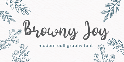 Browny Joy is lovely modern calligraphy font inspired by beauty natural handwriting What's included: - Browny Joy.otf - Multilingual Support --- Hope you enjoy with our font! Attype Studio
 - Shareholder JNL by Jeff Levine,
$29.00 Shareholder JNL could possibly be found on a stock certificate, but in truth, it's based on hand-lettering found on some old sheet music entitled "Sharing".
 - Empty Fridge by PizzaDude.dk,
$15.00 Empty Fridge is my crazy, wacky and totally unpredictable comic font. Forget about typographic rules, but play along with the goofiness in each and every letter!
 - Merry Bauble Letters by Greater Albion Typefounders,
$6.00 Merry Bauble Letters is designed to complement our 'Merry Baubles' fleuron typeface. Quite simply, it's a set of Christmas Tree ornaments with letters painted on them…
 - Blocksta by AVP,
$30.00 Based on the character shapes of Atria Bold, Blocksta is a bullish rough cut sans with extensive language support. Hopefully it won’t start another cold war.
 - Bulmer by Bitstream,
$29.99Morris Fuller Benton’s ATF version of Baskerville’s design cut by William Martin for the British printer and publisher William Bulmer. ATF released the design in 1928. - ATFAntique - Unknown license

- Holland Gothic by URW Type Foundry,
$39.99 Blackletter fonts are timelessly beautiful and still very popular. At some point, it seems that every type designer discovers the beauty of these forms and the great pleasure in creating blackletter characters. Like also Dutch designer Coen Hofmann who, after designing Caxtonian Gothic, has designed yet another Blackletter font: Holland Gothic. Holland Gothic reminds of the 18th century »Duytsch« typefaces of Joan Michael Fleischmann and Christoffel Van Dyck. But Hofmann was mainly inspired by the Dutch calligraphers from the 17th and 18th century. Holland Gothic develops its full charm and beauty at larger sizes because of the hairlines in the upper case characters. To enable users composing texts in the style of our ancestors, Coen Hofmann added a series of pre-composed ligatures, also in combination with the long s, plus an alternate form for the lower case r which was used in combination with letters b, d, g, o, p, v, and w.
 - Chicago Ornaments by HiH,
$6.00 Chicago Ornaments is a collection of decorative cuts cast by the Chicago Type Foundry of Marder, Luse & Co. of 139-141 Monroe Street in Chicago, Illinois. This collection was shown in their 1890 Price List. According to William E. Loy, at least some of them were designed by William F. Capitain. Chicago was one of the innovative Midwest type foundries, introducing the American Point System. These designs represent the late Victorian period. After 1890, with the posters of Jules Cheret taking Paris by storm, Art Nouveau gradually began to displace Victorian style. In type design, both styles competed against each other until about the end of the century. Designers may want to consider using these ornaments when using Victorian style typefaces, like our Cruickshank, Edison and Freak - as well as faces by others such as Karnac, Kismet and Quaint Gothic. Included in the font are a set of Dormer-inspired caps, numerals and a few other glyphs - also from the Victorian period.
 - Sublime Lettering by Redy Studio,
$17.00 Sublime Lettering Font is a handwritten font with a bold look that makes lovely text. It’s especially useful for making signatures or watermarks in photography studios. Everyone is looking for a luxury signature font with a handwritten texture. We’ve spent a lot of time creating this font. It is unique in uppercase letters that dominate the writing and is equipped with a swash in lowercase letters which makes it beautiful if combined into 1 word. We love to combine it into one word because it looks similar to the original handwriting but more professional and luxurious. Sublime Lettering features: A full set of upper & lowercase characters Numbers & punctuation Ligatures A full set of upper & lowercase characters (Alternates) Lowercase ending swashes Swashes PUA Encoded Characters – Fully accessible without additional design software. Feel free to give me a message if you have a problem or question. Thank you so much for taking the time to look at one of our products.
 - Kush by Our House Graphics,
$17.00 Kush is what happens when you let your fonts sit around watching cartoons and eating cake and ice-cream all day�When their vectors are freed from all constraints and allowed to follow their bliss. Kush has filled its insides to just the other side of contentment and comes to you on a sugar high and with a head full of Looney Tunes. And... It�s two ply! A two-layered display face from Our House Graphics with a plush, organic feel, Kush has 370 glyphs, over two dozen standard and discretionary ligatures, stylistic alternates and a few surprises. Kush Fat and Kush Shade work well independently but together they become a two colour, two layer font. Simply type some text in Kush Shade, copy it and paste it back on top of your original text. Then change the top layer to Kush Fat and adjust the colours to your liking. For best results, use default settings for kerning and tracking (letter spacing).
 - ITC Japanese Garden Ornaments by ITC,
$29.99ITC Japanese Garden Ornaments is a symbol font designed by Akira Kobayashi (before Kobayashi became Linotype's Type Director in 2001, he worked as an independent typeface designer in Tokyo). The images in Japanese Garden are, as the name suggests, mostly floral or herbaceous, derived from designs used in Japanese indigo stencil dyeing. In Japanese Garden," Kobayashi says, "I tried to create a set of type fleurons that are very familiar to a Japanese eye, but not too exotic to people in other countries." Several of the designs fit together seamlessly in repeating patterns; others work either together or as isolated ornaments, a flexibility that also characterizes traditional Western type fleurons. "The original illustrations," notes Kobayashi, "were mostly cut from white paper squares, about two by two inches in size, and were simply scanned and traced. That is why there are few smooth curves and perfectly straight lines in the illustrations. I simply liked the ragged textures of them."" - Larof by Twinletter,
$17.00 Introducing our newest font, the Larof Sports Font Family is an American sports graphic combination display font family inspired by classic and vintage styles, but with an eye for modernity. This font includes many shapes, perfect for logos, greeting cards, quotes, posters, branding, business cards, stationery, design titles, and so on. This font is also enriched with 6 styles of choice, which of course makes it easy for you to use it in various kinds of projects according to the theme you want. What are you waiting for, use this font and get an extraordinary visual project. What’s Included : - File font OTF, TTF, WOFF, WOFF2, CSS, HTML - All glyphs Iso Latin 1 - Alternate, Ligature - Simple installations - We highly recommend using a program that supports OpenType features and Glyphs panels like many Adobe apps and Corel Draw so that you can see and access all Glyph variations. - PUA Encoded Characters – Fully accessible without additional design software. - Fonts include Multilingual support
 - Mansheen by Dora Typefoundry,
$10.00 Mansheen is a simple and sweet display font. Authentic beautiful & delightful touches make it the perfect partner to present funny and childish feelings in any design. It's perfect for children's books, funny greeting cards, meal package designs, logos and many others, where simple abstract cartoons or graphics are used. But clearly, its use can be more extensive. I did a few design examples, so you can see how it works. WHAT YOU GET - Uppercase and lowercase letters are full - Numbers, Punctuation, Multilingual Accents - Alternates glyphs I highly recommend using a program that supports OpenType features and Glyphs panels such as Adobe Illustrator, Adobe Photoshop CC, Adobe InDesign, or CorelDraw, so you can see and access all Glyph variations. We really hope you enjoy and are interested in our offer. If you want to upgrade or need a license or ask questions, you can send me a message and you can immediately start your service doratypefoundry@gmail.com. Thank You
 - Home Education by Hanoded,
$15.00 Just before the end of 2020 all schools in Holland closed for the second time, because of an increase in the number of COVID 19 cases. This means that my wife and I have to educate our three kids at home. The kids are great and take their tasks seriously, but it is difficult, as all three of them require different educational levels. I am sure you parents understand. Trying to get some work done is virtually impossible, so my wife and I made a schedule and we live by ‘on duty’ and ‘off duty’ days. I was thinking of this when I created this font (obviously on an ‘off duty’ day). Home Education is a handwritten scribble font. It was made with a Sharpie pen (possibly used by one of my kids, because I noticed tiny ink stains on my wooden dining table…). It comes with all the diacritics you can hope for and lovely double letter ligatures for you to play with.
 - Vintage Round by Din Studio,
$20.00 Want to transport your audience to a world of gorgeous, versatile, but still have the retro touch? Looking for a font that makes your projects spark happiness? Then, you go on the right path. Introducing Vintage Round- A RetroScript Font This vintage font features thick and angular letters. With its strong outlines and fat strokes, this is the font you need when you want to create that classic bubble font look. This font becomes more special with extruding version option. This font can be used for a host of different content needs and projects. Create gorgeous printed quotes, standout packaging, or beautiful t-shirts! You can even use it to create amazing headings, logos, menus, and social media graphics. Our font always includes Multilingual Support to make your branding reach a global audience. Features: Stylistic Set Swashes Multilingual Support PUA Encoded Numerals and Punctuation Thank you for downloading premium fonts from Din Studio
 - Platinus Script Pro by Sudtipos,
$69.00 Platinus Script Pro is the latest example of what has now become a Sudtipos tradition: Adapting conventional calligraphic methods from the last two centuries to produce modern digital scripts for the current one. This time the resulting font explores the evolution of invitation scripts from the classic commercial lettering of the 1930s to the ideas clearly visible in the greeting cards of the 1980s and 1990s. Most base characters are made up of a single stroke, with some of the strokes driven from the top down, and some from the bottom up, putting the emphasis on the casual but precise fluidity of the hand, an emphasis magnified by the expert use of loops and swashes everywhere. The Platinus Script Pro family comes in two weights, each loaded with alternates and Latin-based langauge support, for more than 570 characters per font. Platinus Script Pro is great for product packaging, as well book covers, menus and greeting cards.
 - Core Escher by S-Core,
$30.00 Core Escher is an optical illusion type family which has two sub-families: Core Escher A and B. Core Escher A has impossible shapes inspired by the optical illusion works of artist M.C. Escher. The letterforms in this type family are structurally twisted and complicated but it looks simple because of its simple strokes. And for easy color variations, it split into two fonts, Core Escher A Left and Right. Core Escher B has a different kind of optical illusion. The letters of Core Escher B look like three dimentions by just putting thin lines on bold letters. Also B has two sub-families that have different viewpoints. Core Escher Family supports complete Basic Latin, Cyrillic, Central European, Turkish, Baltic character sets. Each font includes proportional figures, tabular figures, numerators, denominators, superscript, scientific inferiors, subscript, fractions and case features. This family is really nice for book titles, headlines, logotypes and any artworks.


