10,000 search results
(0.188 seconds)
- Verse Serif by Hubert Jocham Type,
$39.00 In 2006 the art director of Emotion, a women’s psychology magazine, asked me to design a copy typeface for them. Before I actually got the job I started to work on a serif. I wanted it to be feminine but still clear and modern. On one hand there are the floral round elements and on the other hand the angular serifs. In the composition I wanted the two extremes to work together. All the other elements had to be harmonized. The proportions needed to match the magazine’s requirements. The ascenders and descenders are short enough to work in narrow columns but long enough to work in small sizes. As you can imagine, the emotion-job never happened. Verse is now a serif and a san-serif with 7 weights with italics and smallcaps. In copy you should not get heavier than Heavy. Extrabold and Ultrabold work best in display.
 - Knoedel by PabType,
$12.00 Knoedel is a display typeface with three front-weights: light, regular and bold. Although a conjunction of different styles were a reference during the design process; the art deco style left a more noticeable influence in the final design. Knoedel, also has clear references to geometric and slab serif fonts. The design is intended to be applied on headlines or short text fragments. Knoedel offers full coverage for all languages using Latin alphabet: whole Europe, America, Oceania and on a big number of African and Asian countries. Besides the standard ligatures, Knoedel, additionally, has more than 200 discretionary ligatures and a generous number of borders and ornaments. Knödel (Knoedel) is a traditional dish from Austria and the southeast of Germany; made of dumplings of different ingredients usually boiled in salted water. It is not high-end cuisine but still, it accomplishes its aim of soothing hunger.
 - Thought by Scholtz Fonts,
$15.00 Thought, with its versatile five styles, is ideal for contemporary display work. It has style, flair, legibility, and interesting, flowing letter shapes. The Family: -- REGULAR - of medium weight - clear and legible; -- BLACK - for bolder statements and best readabilty; -- LINEAR 25 - light weight, mono width line -- LINEAR 45 - medium weight, mono width line -- ZEST - variable line, casual, exaggerated appearance Use a combination of styles for product branding, book covers, invitations, greeting cards. Thought has not been designed to be used in "ALL CAPS". The best effects for headings and subheads are obtained with an initial upper case letter followed by lower case characters. If you are using upper and lower case then it is not necessary to use kerning. Thought contains over 250 characters - (upper and lower case characters, punctuation, numerals, symbols and accented characters are present). It has all the accented characters used in most European languages.
 - Silent Seas by Dismantle Destroy,
$19.00 This font was inspired by music from the band Silverstein. The main characteristics are the incredibly thin, orgainic lines.
 - Death Angel by ryan creative,
$12.00 Death angel has a strong and aggressive look with crisp, sharp lines. This font has hard angles and leans slightly towards the vertical, giving it a sharp, scary feel. accompanied by additional ornaments that you can custom style yourself. can be applied like, t-shirt design, product design group name, quotation etc. Note: For how to use this font, you can visit Ryan creattive youtube, or the link below; https://youtu.be/8XxjuAcXlbk FEATURES; -Uppercase, -Support Foreign, Numbers and Punctuation. -Ornaments. -Works on PC. -Simple installation. -Accessible in Adobe Illustrator, Adobe Photoshop. Adobe InDesign, it even works in Microsoft Word. -Fully accessible without additional design software. Death angel is coded with Unicode PUA, which allows full access to all additional characters without having to design any special software. Mac users can use the Font book, and Windows users can use the Character map to view and copy any extra characters to paste into your favorite text editor/app. thank you for visiting ;)
 - FS Silas Slab by Fontsmith,
$80.00 Slab-like sibling Why stop at sans? Rather than leave FS Silas Sans as an only child, the team wanted to extend the family, and create a complete system for brands and editorial. Unsure what the result would be, the team started experimenting with a slab serif version. ‘We didn’t know how it would turn out, but we really liked it and wanted to take it further. A fresh angle ‘We stuck with the angular theme of the sans by drawing angled slab serifs,’ says Phil Garnham, ‘as opposed to the square serifs that slab fonts usually have. That created an inner dynamism in words and sentences on the page, and a very distinctive, crafted character, like a Victorian soul in a contemporary body.’ These crafted touches include details such as the angled ascenders on the ‘i’ and ‘l’, while characters such as the ‘y’, with its abruptly-ending descender, add a mark of distinction. A perfect pair Silas Slab, like its sibling, offers a clear-cut range of five weights, from the elegant Thin to the monumental ExtraBold. Put it together with Silas Sans and you have the full complement, capable of performing the full range of tasks, above the line and below, in headlines, body copy and logotypes, B2B and B2C. Keep them together; they don’t like it when they’re apart.
 - Basic Commercial Soft Rounded by Linotype,
$29.99 Basic Commercial is a font based on historical designs from the hot metal typeface era. It first appeared around 1900, and was created by type designers whose names have not been recorded but whose skills cannot be overlooked. This typeface's design has been popular among groups and movements as diverse as the Bauhaus, Dadaism, and the masters of Swiss/International-Style typography. It influenced for a variety of later grotesque fonts, such as Helvetica and Univers. Basic Commercial was distributed for many years in the United States under the name Standard Series. The typeface worked its way into many aspects of daily life and culture; for instance, it became the face chosen for use in the New York City subway system's signage. The Basic Commercial's font family members have a clear and objective design. Their forms exhibit almost nothing unusual, but remain both lively and legible nonetheless. Perhaps for this reason, Basic Commercial's design has been popular with graphic designers for decades. To read more about the history of typefaces like Basic Commercial, visit our font feature, The Sans Serif Typefaces. In addition several weights of this typefamily are available as soft rounded versions."
 - Tombo Brush by Ditatype,
$29.00 Tombo Brush is an interesting font that combines brush font’s artistic and organic characteristics with even line edges which are clear and firm. Furthermore, the capital letters express more modern, simple impressions by following the brush script font’s characteristics of the soft and smooth brush wipes, yet the even smooth lines on the edges show clearer, firmer nuances. Bright and contrast colors can show interesting, dynamic nuances on designs with this font. The even edge lines will ease the application of colors and show clearer visual effects separated from the background. You can apply this font for big text sizes for a legibility reason and also enjoy the available features here. Features: Multilingual Supports PUA Encoded Numerals and Punctuations Tombo Brush fits best for various design projects, such as brandings, quotes, printed products, merchandise, social media, etc. Find out more ways to use this font by taking a look at the font preview. Thanks for purchasing our fonts. Hopefully, you have a great time using our font. Feel free to contact us anytime for further information or when you have trouble with the font. Thanks a lot and happy designing.
 - SP Vincent by Studio Pulp,
$19.99 Discover the captivating charm of SP Vincent, a masterfully crafted display font developed in 2023 by Studio Pulp. Inspired by the iconic character Vincent Vega, the central figure in the film classic "Pulp Fiction" (1994), this typeface exudes a powerful and refined aesthetic, befitting a leading role. SP Vincent, with meticulous attention to detail and craftsmanship, showcases versatility that seamlessly complements a variety of design projects, especially excelling in the creation of impressive titles. The three well-balanced weights provide you with the flexibility to unleash your creativity, while the clear, open shapes optimize readability. Anchored in a sleek grid design, SP Vincent embodies modern minimalism and accessible elegance. Whether you are engaged in web design, graphic design, or print materials, this font adds a timeless class to your creations. Be inspired by the seamless blend of functionality and aesthetics in SP Vincent. Specifically designed to meet the demands of 2023, this font brings a contemporary flair to your projects while remaining faithful to Studio Pulp's commitment to quality and innovation. Transform your typographic landscape with SP Vincent and leave a lasting impression reminiscent of the unforgettable moments from "Pulp Fiction."
 - Links by HouseOfBurvo,
$36.00 Links was built adhering to a strict grid of 'linked' squares; and comes with special "Grid Glyphs" that line up perfectly with all characters. These Grid Glyphs can be used to create an invisible grid for your layout or as a background to enhance your design. Perfect for posters, logos and headlines, this font is available in four styles; Round and Square with accompanying obliques. This font was inspired by much of the lettering from the Dutch movement, or Functionalism which in turn was a descendant of the International Style pioneered by the Swiss. In keeping with these traditions, Links was build adhering to a strict grid of linked squares, taking a clear scientific approach to construct each character. One of the main features of International Style is the implementation of a Grid. This font has built in special characters that I call 'Grid Glyphs'; these Grid Glyphs line up perfectly with every character, enabling you to construct your own grid that echoes the form of the characters. These glyphs can also be used to create a background for your layout, as can be seen in the gallery pictures.
 - Fnord by Monotype,
$23.99 Fnord is a contemporary humanist serif typeface, it is ideally suited for display purposes, titling, headline copy and branding. The family has been designed to be highly versatile, containing a total of 23 fonts. Each font features discretionary ligatures, swash alternates and true small caps. The overall design is clean and simple with a little bit of rebelliousness thrown in for good measure – Fnord does not conform to the traditional serif blueprint. Fnord’s design has been strongly influenced by the complex, thought-provoking and mischievous works of authors Robert Anton Wilson and Robert Shea from the 1970s. I was re-reading their work while sketching the initial letterforms and realised that some of the proportions and angles were coinciding with some themes that run through the books – particularly the numbers 5, 17, 23, 40 and 93, which are key to this font family’s spacing and geometry. I found it both very interesting and enjoyable to play with a specific theme and purpose for creating this typeface. I am sure you will enjoy working with it in your own design projects. Key features: • 5 Weights in 4 Styles – Roman, Italic, Condensed and Extended • 3 Additional Display Styles in 1 Weight – Engraved, Inline and Woodcut • Small Caps, Alternates, Swashes and Discretionary Ligatures • Full European character set • 680 glyphs per font.
 - Le Havre Rough by insigne,
$19.00 Le Havre Rough. It’s high-resolution, hand-crafted letterpress to the core. Based on insigne’s popular Le Havre typeface, this new heat-treated, weathered face of all caps joins the realism and appeal of the top-quality Le Havre family. Rough’s eroded, printed look is extremely customizable, offering eleven distressed choices that appear fantastic even at large output sizes. Go ahead. Try it on, say, a billboard. Maybe even Times Square. The font includes hand-printed texture and distinctive shadow choices, too. Options include three inline versions, two shadow layers, and a clean primary version. Combine and match the options easily as you need, layering normal and shadow variations to alter appearance and texture. You can activate Art Deco alternates by using OpenType contextual alternates. Rough has an extra-large character set for many languages. Additionally, the typeface offers 62 extra ornaments like arrows, emblems, numbers & lines. Use its full texture and grit to capture the classic, genuine print feel that you need in your project. A few suggestions for use: - In Photoshop, jigger with various 'anti-aliasing' options for best outcomes. Smooth or strong is generally best. - In Illustrator, the shadow layer occasionally doesn't align when using the regular layer. To fix the alignment, open the type drop-down menu and choose Area Type Options > Em Box Height. Learn more about the using layered type styles on this informative video.
 - Allrounder Grotesk by Identity Letters,
$40.00 A true workhorse. The only Grotesk you’ll ever need. Allrounder Grotesk is a neutral, powerful Neogrotesk member of the Allrounder superfamily. An unobtrusive teamplayer as well as an excellent soloist, this hard-working sans-serif typeface is ready for any task you’ll throw it at. A workhorse that lives up to its name, Allrounder Grotesk consists of ten weights ranging from a delicate Air to a powerful Black with 900+ glyphs per font. Each weight is accompanied by carefully hand-corrected italics. Allrounder Grotesk supports more than 200 Latin-based languages, containing the complete “LatinPlus” glyph set developed by Underware. It also provides you with plenty of OpenType features and additional goodies: small capitals, ten sets of figures, case-sensitive forms, ligatures, superiors, fractions and arrows. Equipped like this, you’ll be ready for any kind of sophisticated typesetting scenario you might encounter. With Allrounder Grotesk, you’ve got a sans that works great for body text, yet looks crisp and clean in headlines and display sizes. Whether annual reports, magazine and editorial layouts, nonfiction books, branding and packaging work, large-scale advertising, forms and contracts, or contemporary posters: Allrounder Grotesk is up for it. This multitalented font family was developed in a 2-year process by Moritz Kleinsorge. It was the first release of the Allrounder superfamily, a series of typefaces sharing the same color and horizontal metrics (cap height, small cap height and x-height): a typesetting system whose components match each other perfectly. Any other part of this design kit, e. g., Allrounder Antiqua or Allrounder Monument, may be easily combined with Allrounder Grotesk. Perfect Pairing: Allrounder Antiqua + Allrounder Grotesk Allrounder Antiqua is the ideal complement to Allrounder Grotesk. They both share common vertical metrics and a common color. This allows you to pair both typefaces within the same layout—even within the same paragraph—without creating visual disruption. Head over to the Family Page of Allrounder Antiqua to get more information about this typeface. Design Trick: Bilingual Design With the Allrounder Superfamily Combining Allrounder Grotesk with Allrounder Antiqua is an ideal approach for bilingual designs, wherein both languages get the same emphasis yet are distinguished with two different typefaces. It's also best practice to set headlines in a different typeface than the body text if they harmonize with each other. Allrounder Grotesk and Allrounder Antiqua provide you with the perfect pair for this purpose. In any kind of design, in any type of medium, working with Allrounder fonts is effortless. That’s why Allrounder got its name.
 - Halla by Wilton Foundry,
$19.00 Creating Halla was a bit unusual for me since I started out creating the italic version first and that inspired the name Halla, meaning to tilt in Icelandic. It is also a fairly common female name in Iceland. “Halla” is derived from old Norse word “hallr” = 'flat stone, rock' or 'sloping, leaning to one side' Halla is a true italic inspired by handwriting and mechanical type. The combination of Light and Italic makes Halla ideal for advertising, branding, signage, packaging and editorial design.
 - Grafton Titling by Tetradtype,
$35.00 Grafton Titling was designed for dramatic impact. It contemporizes old style proportions, bracketed serifs and a left-leaning stress angle with striking contrast and modern angular joins. The solid style has a timeless feel, while a flared through-line variation provides textural interest. Small caps, a complement of OpenType features, and support for diacritics and accented characters make it a robust and distinctive choice for headlines that demand attention. Through-line characters are accessible using the Stylistic Set or Stylistic Alternate OpenType feature.
 - Jazz Age by Studio K,
$45.00 Jazz Age is inspired by the Golden Age of Jazz, the Twenties and Thirties. Think Scott and Zelda Fitzgerald, cocktails, flappers and the whole Art Deco thing. Oh, and don't forget the radios, by which I mean old Bakelite valve or tube radios with their grilles and fretwork. This font is a celebration of them too.
 - Segment B Type by Kobuzan,
$19.99 Segment B is a powerful display type family with 18 styles inspired by condensed European grotesques of 19th-century with a reference to the first grotesques, which differ in the contrast of strokes, but with clear geometric proportions. In Black weights, the letterforms are inspired by the aggressive industrial graphic design of the 1960s and 70s. Both have 3 axes and are adjustable in weight, width and 10? italic. It is a typeface with narrow proportions, distinctive character, high-quality outline and lots of details. Characters have oblique cuts, sharp tails and highly visible ink traps. All this makes the font more aggressive and edgy. The huge x-height with short ascenders and descenders allows this typeface to be used in blocks with minimal line spacing. Features: – Total glyph set: 631 glyphs; – 18 styles (3 weights x 3 widths + italic); – Support 210+ languages; – Latin Extended; – Cyrillic Basic + Bulgarian letters; OpenType features: – Proportional numerals, tabular numerals, superiors, fractions; – Punctuations and symbols; – Arrows; – Stylistic alternates (ss01-ss05); – Ligatures; – Case-sensitive forms.
 - Baedar by Craft Supply Co,
$20.00 Introducing Baedar – Bold Rounded Sans Serif Font Baedar – Bold Rounded Sans Serif, a font designed to captivate your attention, is both inviting and approachable. Its rounded corners create a warm and friendly vibe that instantly draws in readers. Eye-Catching Appeal Baedar’s boldness immediately grabs your eye, making it perfect for headlines and attention-grabbing text. Whether it’s a poster, website, or marketing material, this font ensures your message unequivocally stands out. Versatile Usage Furthermore, with its rounded edges, Baedar exudes friendliness. Consequently, it suits a wide range of projects, from branding to social media posts, adding a touch of approachability to your content. Readability and Impact Moreover, Baedar combines readability with visual impact, making it ideal for conveying important messages with flair. Its boldness ensures crystal-clear clarity, while the rounded corners gently soften the overall look. In Conclusion Baedar – Bold Rounded Sans Serif Font strikes the perfect balance between eye-catching design and friendliness, making it an excellent choice for various creative endeavors. Therefore, seize your audience’s attention and convey your message effectively with this versatile font.
 - Haboro Sans by insigne,
$- Quit trudging through the thick with encumbering fonts, and spring to the front of the pack with the cutting edge sans serif, Haboro Sans. With nothing to clutter up your work, your editorial designs, websites, and software will be sharp and clear. While this hyperfamily is simple in character, it (like Haboro Slab and Haboro as well) provides you with plenty of options. Haboro Sans features simple geometric shapes to help you achieve that perfect effect wherever you use it. Enjoy the comforting reassurance that this multi-tool of a typeface family can work on most anything, including packaging, branding, web copy, and more. Take the simplicity of Haboro Sans a step farther with OpenType features, too. Haboro Sans contains special glyphs like Titling, Small Caps and Oldstyle figures that give your work just enough of a distinct touch. For even more options, use the entire Haboro hyperfamily to expand your capabilities. Put some simple class into your projects with the traditional look of Haboro Sans. Your layouts, websites, iPhone apps, advertising, and newspapers (to name just a few) will thank you.
 - Authentica Bethany by Pen Culture,
$17.00 Introducing "Authentica Bethany Signature Font" This font was born with a sweet touch of hand lettering technique, with a unique and beautiful shape that makes this font very authentic. This font include uppercase and lowercase, number and punctuation, have more than 80 ligature, and beginning and ending swash in lowercase. I really hope you enjoy it – please do let me know what you think, comments & likes are always hugely welcomed and appreciated. More importantly, please don’t hesitate to drop me a message if you have any issues or queries. Thank you
 - Eirene Sans by Tomtype,
$4.90 Eirene Sans is a sans serif type family inspired by grotesque typefaces with some humanistic characteristics. Simple, modern, and functional are the principal features of this type family; the uppercase glyphs present a sophisticated personality. There are 5 weights available and matching italics. It is a bit more condensed than normal width and the difference between thin and thick stems and the unique terminals make the type family have this humanistic personality. It has rounded forms in some letterforms and special characters (i, j, ., :, etc.), humanistic terminals, and very thin ink traps. Eirene Sans is perfect for digital and non-digital designs; it can be used in magazine titles, logo designs, packaging designs, and web designs. Features: 5 weights and matching italics Opentype features Arrow set Stylistic alternates (ft) Stylistic changes in italics Fractions Subscripts Inferior and superior numbers Language support (Latin extended)
 - Juan Carlos by Homelessfonts,
$49.00 Homelessfonts is an initiative by the Arrels foundation to support, raise awareness and bring some dignity to the life of homeless people in Barcelona Spain. Each of the fonts was carefully digitized from the handwriting of different homeless people who agreed to participate in this initiative. A biography/story of each homeless person captures their story, to help raise awareness and bring some dignity to the life of homeless people. Monotype is pleased to donate all revenue from the sales of Homelessfonts to the Arrels foundation in support of their mission to provide the homeless people in Barcelona with a path to independence with accommodations, food, social and health care. Juan Carlos was born in Barcelona, Spain 46 years ago. Since the age of 17 – and during eleven years – he worked double shifts of eight hours every day in a factory. Excessive work and family problems debilitated his health and he lost his job. He then faced a dilemma: to spend unemployment benefits to pay for rent or for food. For a few years, he worked helping in the kitchens of different restaurants while he lived on a pension, until he was definitively left without work and ended up living in the street for 10 years. “In the street I tried to find rest in the ATMs of banks. I preferred to be alone, and if I ran into conflictive people, I looked for somewhere else” he explains. Living in the street he was the victim of an aggression. Since then, with the help of Arrels he moved into a pension. Today, Juan Carlos is a volunteer in the shower service of Arrels, the same showers he used during years. He also collaborates with the maintenance team, helps prepare hygienic and cleaning material, and participates in activities such as the theatre group and the football team.
 - Hempa Sans by Yukita Creative,
$9.00 Hempa Sans is a modern sans serif font family with a geometric touch. Consists of 16 Styles 8 upright and 8 inclined to match. Thin Weight - Black Designed with strong open-type features in mind. This font has alternate characters in Letters (G, M, R, g, k, r, t, u, y). Each weight includes extended language support for numbers, arrows, binders, and more. Great for graphic design and any display use. It can easily work for Web, Print, and more. This typeface comes with a standard 445 character set that supports more than 80 Latin-based languages.
 - Obvia Wide by Typefolio,
$29.00 'Obvia' appeared as a result of direct observation on typefaces classified as geometric and the plan to explore for the first time width axes Condensed, Narrow (soon), Normal and new Wide and Expanded. The idea behind 'Obvia's design was to create a distancing from geometrically pure shapes, in this case, square shapes. Then some details were added, such as subtle inktraps, concave endings of the stems and carefully drawn alternate characters, giving a 'geohumanist' tone to the font. This first family of 'Obvia' has 9 weights ranging from Thin to Black, delivering a strong typographic identity, from the paper to the pixel.
 - Obvia Expanded by Typefolio,
$29.00 'Obvia' appeared as a result of direct observation on typefaces classified as geometric and the plan to explore for the first time width axes Condensed, Narrow (soon), Normal and new Wide and Expanded. The idea behind 'Obvia's design was to create a distancing from geometrically pure shapes, in this case, square shapes. Then some details were added, such as subtle inktraps, concave endings of the stems and carefully drawn alternate characters, giving a 'geohumanist' tone to the font. This first family of 'Obvia' has 9 weights ranging from Thin to Black, delivering a strong typographic identity, from the paper to the pixel.
 - Berghan by Craft Supply Co,
$15.00 Berghan is a modern grotesk sans serif features thick and thin contrast details for contemporary nuances. It can be used to create almost all types of design projects like print materials. Just use your imagination and your project will become more alive and look great than ever with this typeface. You want to make a greeting card or a package design, or even a brand identity, craft design, any DIY project, book title, wedding font, pop vintage design, retro design or any purpose to make your art / design project look pretty and trendy? Feel free to play with this typeface!
 - Obvia Condensed by Typefolio,
$29.00 'Obvia' appeared as a result of direct observation on typefaces classified as geometric and the plan to explore for the first time width axes Expanded, Wide, Normal, Narrow and Condensed The idea behind 'Obvia's design was to create a distancing from geometrically pure shapes, in this case, square shapes. Then some details were added, such as subtle inktraps, concave endings of the stems and carefully drawn alternate characters, giving a 'geohumanist' tone to the font. This first family of 'Obvia' has 9 weights ranging from Thin to Black, delivering a strong typographic identity, from the paper to the pixel.
 - Handy Typewriter by Ana's Fonts,
$14.00 Handy Typewriter is a handwritten typewriter font in 4 handmade weights, with extras. Handy Typewriter has a more casual look than classic typewriter fonts, but can still be used in any designs that need a vintage touch. This font is very legible at a wide range of sizes and looks great in both long or short texts, in digital collages, branding and packaging, social media posts, logotypes, etc. Included in this font family: - Handy Typewriter font in 4 weights: Thin, Regular, Bold and Black, hand drawn from scratch - Handy Typewriter Extras is a set of 62 hand drawn doodles, to decorate your text
 - Obvia Narrow by Typefolio,
$29.00 'Obvia' appeared as a result of direct observation on typefaces classified as geometric and the plan to explore for the first time width axes Condensed, Narrow, Normal, Wide and Expanded. The idea behind 'Obvia's design was to create a distancing from geometrically pure shapes, in this case, square shapes. Then some details were added, such as subtle inktraps, concave endings of the stems and carefully drawn alternate characters, giving a 'geohumanist' tone to the font. This first family of 'Obvia' has 9 weights ranging from Thin to Black, delivering a strong typographic identity, from the paper to the pixel.
 - Lagniappe by Funk King,
$5.00 Lagniappe is a thin decorative font. Kerning is not the best on this one. You may want to adjust as needed.
 - Monden by Tour De Force,
$29.00 If you'd like to scream, but you have no self esteem, or you'd love to start a fight, but you're scared of the night, I made this font for you all, whether you're short or tall. Monden is wide, gentle and fun, but it wasn't born under the Sun, it was my intention to make it unique, I surely hope I didn't make some freak, it looks a bit classical, in moments maybe here and there radical, but it surely is really graphical with a dose of something magical. Want a logo, poster or any other design, but you'd rather cry and then run, even this description sounds lousy, at least it isn't so drowsy, so meet Monden family from our hood and keep your spirit in good mood, and do the things on any way you think they should.
 - Univers Next Cyrillic by Linotype,
$49.00 Linotype Univers is a completely reworked version of the original Univers typeface family designed by Adrian Frutiger in 1957. After a long process of painstakingly detailed revision, Frutiger and the design staff at Linotype completed this large joint project in 1997. The result: a brilliant and cohesive font family of 63 weights and styles including the 4 monospaced typewriter weights. All the existing weights were completely redrawn, with careful attention paid to making the proportions more consistent with each other and improving fine details such as curves and thick-to-thin stroke ratios. The family was expanded from 27 to 63 weights, providing a much larger framework to graphic designers for choosing just the right style. The bold and condensed weights were reworked for improved legibility and on-screen application. The stroke weights were revised for consistency within each face as well as in relationship to the other weights. By following Frutiger's original designs, the humanist character of the sans serif Univers now comes through more distinctly. The systemized numbering system has also been updated. With its sturdy, clean forms Univers can facilitate an expression of cool elegance and rational competence. In fact, the strong familial relationships between all the styles and weights make it a serviceable choice for large graphic design projects that require versatility with consistency. Frutiger was successful in staying true to his initial aims; the new Linotype Univers does indeed work in longer texts as well as for display settings. In 2010 the typeface family was extended and renamed into a more logical naming of "Univers Next" to fit better in the Platinum Collection naming.
 - Univers Next Paneuropean by Linotype,
$89.00 Linotype Univers is a completely reworked version of the original Univers Univers typeface family designed by Adrian Frutiger in 1957. After a long process of painstakingly detailed revision, Frutiger and the design staff at Linotype completed this large joint project in 1997. The result: a brilliant and cohesive font family of 63 weights and styles including the 4 monospaced typewriter weights. All the existing weights were completely redrawn, with careful attention paid to making the proportions more consistent with each other and improving fine details such as curves and thick-to-thin stroke ratios. The family was expanded from 27 to 63 weights, providing a much larger framework to graphic designers for choosing just the right style. The bold and condensed weights were reworked for improved legibility and on-screen application. The stroke weights were revised for consistency within each face as well as in relationship to the other weights. By following Frutiger's original designs, the humanist character of the sans serif Univers now comes through more distinctly. T he systemized numbering system has also been updated. With its sturdy, clean forms Univers can facilitate an expression of cool elegance and rational competence. In fact, the strong familial relationships between all the styles and weights make it a serviceable choice for large graphic design projects that require versatility with consistency. Frutiger was successful in staying true to his initial aims; the new Linotype Univers does indeed work in longer texts as well as for display settings. In 2010 the typeface family was extended and renamed into a more logical naming of "Univers Next" to fit better in the Platinum Collection naming.
 - Griggs by Seniors Studio,
$140.00 Griggs is a variable type family with six-axis. Available as both static and variable font built to maximize versatility. This is a single variable font that can morph between a wide range of stylistic variations with each of its axes: Weight, Serif, Grade, Stylistic Set 1, Stylistic Set 2 and Slant. Also offer a variable subtle grade axis for slight weight adjustments, to user different preferences. For slant axis will automatically apply stylistic set 2 or set custom values on each axes for more options. A multi-purpose sans serif and serif typeface with high contrast, inktraps, sharp form, clean cuts and playful details, to convey the impression of opulence, elegance with a distinctive look. It comes in 3 distinct individual cuts within the Sans, Flare, and Serif subfamilies. Allows for many variations across its subfamilies, weights and styles. Each typeface contains with a warm personality and contemporary look. With different stylistic sets, you can choose the best-desired result for your design. You can change the feel of your design from more delicate, to bold to its sharpest most style. Griggs family with various styles will be an handy tool for a wide variety of designs. Excellent for text large and small. It’s a brilliant choice for branding, identity design, editorial design, logo design, display and packaging design etc. Typeface Features: * 325 Glyphs * 3 Subfamilies: Sans, Flare, Serif ( Each 8 Styles + Slant ) * 6 Weight: Thin, Light, Regular, Semi Bold, Bold, Black * Complete Collection: 144 Styles + Variable Font * Opentype Features: Stylistic Set 1, Stylistic Set 2 * Latin Language support including * Kerning * Autohinted Thank You.
 - Refrankt by Groteskly Yours,
$35.00 Refrankt is a multifunctional sans-serif type family with 18 styles, ranging from Thin to Black with matching italic styles. The key visual feature of Refrankt is its wider characters and expanded proportions, which accentuate the character of the type family and extend its application. Refrankt works well as a display font but can also be used comfortably in headings and larger bodies of text. Refrankt offers a clean and thoughtful take on the functional grotesque sans-serif style and can be used in a wide variety of projects, from UI/UX design to packaging and branding. It can also be employed as a font for logos and word marks. Whether you're looking for bold, sturdy letterforms or dynamic flexibility, Refrankt readily adapts to any task. Refrankt would look at home in projects related to technology, athletics, industrial design and many more. The functionality of Refrankt is defined by its multilingual support (200+ languages) and its extensive OpenType features, such as Case-Sensitive Punctuation and Stylistic Alternates, among many others. In addition to a standard set of figures, Refrankt includes tabular figures, old-style figures, superiors, inferiors, and fractions. The entire character set comprises over 800 glyphs. Free trials available on our website: https://groteskly.xyz/ Refrankt Features: • 18 Fonts (9 Upright & 9 Italic) • Variable Font • 800+ characters/font • 200+ languages supported • Extensive OpenType Features • Versatile and Multifunctional
 - Qualion Text by ROHH,
$39.00 Qualion Text™ is a modern geometric sans serif typeface with humanist and calligraphic inspirations. It is a text family designed for excellent legibility. Qualion Text™ is a sibling of Qualion™ & Qualion Round™, geometric family with lots of swashes and ornaments. Letter shapes and proportions has been adjusted to fit paragraph text and small sizes: - typeface is narrower now in order to fit more text in the design space - larger stroke contrast - pronounced ink traps and tapering - elegant true italics made even more calligraphic - adjusted spacing and kerning - adjusted font weights The main purpose of the family is clean and legible paragraph text, however it is very attractive choice for branding, headlines and display use, too. The italic styles as well as thin, bold and black upright styles have very strong character and look great in display sizes. Italics are very fluent, calligraphic, subtle and elegant, from the other side bold and black uprigths are very modern, powerful and unique thanks to the pronounced ink traps. Qualion Text™ family consists of 20 styles - 10 weights with corresponding true italics. Both have extended language support, as well as broad number of OpenType features, such as small caps, case sensitive forms, standard and discretionary ligatures, swashes, stylistic sets, contextual alternates, lining, oldstyle, tabular and small cap figures, slashed zero, fractions, superscript and subscript, ordinals, currencies and symbols.
 - Hearthaliso by Maulana Creative,
$13.00 Hearthaliso is a fancy flourish script font. With thin high contrast stroke, fun character with a bit of ligatures and alternates. To give you an extra creative work. Hearthaliso font support multilingual more than 100+ language. This font is good for logo design, Social media, Movie Titles, Books Titles, a short text even a long text letter and good for your secondary text font with sans or serif. Make a stunning work with Hearthaliso font. Cheers, Maulana Creative
 - Dailytrust by Maulana Creative,
$14.00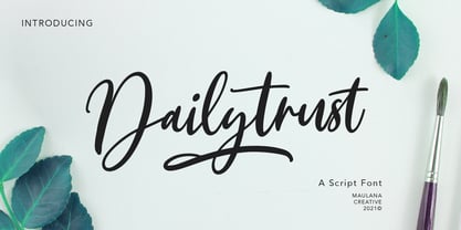 Dailytrust is casual signature font, with feminine thin stroke, super slanted and fun character. It has Opentype features ligatures of character, To give you an extra creative work. Dailytrust font support multilingual more than 100+ language. This font is good for logo design, Social media, Movie Titles, Books Titles, a short text even a long text letter and good for your secondary text font with sans or serif. Make a stunning work with Dailytrust font. Cheers, MaulanaCreative
 - Mc Havoks by Maulana Creative,
$14.00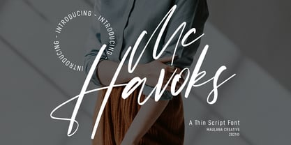 Mc Havoks is a super casual signature font. With thin stroke, slanted, unique and fun character with a bit of ligatures. To give you an extra creative work. Mc Havoks font support multilingual more than 100+ language. This font is good for logo design, Social media, Movie Titles, Books Titles, a short text even a long text letter and good for your secondary text font with sans or serif. Make a stunning work with Mc Havoks font. Cheers, MaulanaCreative
 - Konstanhigh by Maulana Creative,
$11.00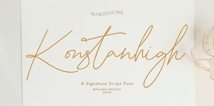 Konstanhigh is signature script font, with thin mono-line stroke, super slanted and fun character. It has Opentype features ligatures of character, To give you an extra creative work. Konstanhigh font support multilingual more than 100+ language. This font is good for logo design, Social media, Movie Titles, Books Titles, a short text even a long text letter and good for your secondary text font with sans or serif. Make a stunning work with Konstanhigh font.