10,000 search results
(0.047 seconds)
- Frogeur by Eotype,
$12.00 Frogeur is a stylish modern serif font characterized by extreme contrast between thick and thin lines. This font has half vertical tension and minimal design thin serifs. This font has alternate and ligature features that give you access to a unique collection of letters. You can use this font for brand projects, product labels, logos, posters and more.
 - DT Skiart Serif Mini by Dragon Tongue Foundry,
$9.00 ‘Skiart Serif Mini’ is now available online. Originally inspired by the san serif font ‘Skia’ by Mathew Carter for Apple. ‘Skiart’ was designed to feel more like a serifed font, but without any serifs. It took a step between sans serif and serif fonts. Next on the path towards a serif font comes Skiart Serif Mini, with tiny serifs added. This is a true serif font, all be it on the small side. It remains fully readable and feels as clean and normal as any of the best body copy serifs, and yet still has the strong solid bones of all the other Skiart font familys. If compared to one of the more commonly used serifs like ‘Times New Roman’, the ‘Skiart Serif Mini’ lowercase is more open with a taller x-height, increasing its readability and friendliness. The serifs are smaller and less distracting. They are not pretending to be ligatures. Where ‘Times’ makes its p q b d forms out of a barely touching oval and stem, the ‘Serif Mini’ forms are much more firmly attached, appearing clearly as single letters. The standard setting for the g’s are round single storied, (the italic a’s are also), feeling warmer and more inviting in the ‘Serif Mini’ font. Much more friendly than the stuffy double storied versions in fonts such as ‘Times’ etc.
 - Flintlock by CozyFonts,
$25.00 The Flintlock Font Family has a Bold personality. The 'Rough' version of the Flintlock Font has a hand-carved or hand-etched edge, carefully crafted for each of over 300 glyphs. Caps, lower case, all numbers, fractions, accents and European characters that work in over 70 languages. 'Classically Built with a Vintage Flair'. Vintage in the American West Tradition that might have been forged and implemented from the 1860s through the 1930s and consequently fresh again. Flintlock Rough can be envisioned on many things dated from 1860 to present day. The font is available in 3 basic weights as of this release date. There are other versions on the drawing board... Flintlock Rough works extremely well with Posters, Branding, Movie Titles, Invites, Stationary, Signage, Embroidery, Letterpress, Ads, Logos and anything that feels Industrial or Hand-Crafted, eg. Coffee, Breweries, Antiques, Woodcuts, Western Styles, Sports Styles, Holidays, Menus, and more. Flintlock Flat & Flintlock Flat Italic are the siblings to Flintlock Rough without the hand-carved edge but rather clean with slightly rounded corners and edges. Extremely Legible, Bold and best used in all the same application descriptions mentioned above and more, specifically contemporary uses and settings, eg. Sports, Titles, Branding, Headlines, Logos and more. Curiously the Flat & Italic versions of Flintlock work extremely well in 1960s and 1970s settings.
 - Secret Granola by Pen Culture,
$19.00 Introducing Granola. A modern calligrphy font with modern and lovely style of script font. This font comes with more than 50 ligatures and more than 20 alternates, so you will find it very easy to mix and match this font in your projects. This font will be very suitable for branding, logo design, magazines, posters, invitations and much more. I really hope you enjoy it – please do let me know what you think, comments & likes are always hugely welcomed and appreciated. More importantly, please don’t hesitate to drop me a message if you have any issues or queries. Thanks
 - DT Skiart Subtle by Dragon Tongue Foundry,
$9.00 ‘Skiart Serif Subtle’ is now available online. Originally inspired by the san serif font ‘Skia’ by Mathew Carter for Apple. ‘Skiart’ was designed to feel more like a serifed font, but without any serifs. It took a step between sans serif and serif fonts. Next on the path towards a serif font came Skiart Serif Mini, with tiny serifs added. This was a true serif font, all be it on the small side. Skiart Serif Subtle is less of a serif than Skiart Serif Mini, in that it doesn’t have actual 'serifs' as such. It has a subtle flare where a serif might normally be found. It remains fully readable and feels as clean and normal as any of the best body copy serifs, and yet still has the strong solid bones of all the other Skiart font families. If compared to one of the more commonly used serifs like ‘Times New Roman’, the ‘Skiart Serif Subtle’ lowercase is more open with a taller x-height, increasing its readability and friendliness. The serifs are smaller and less distracting. They are not pretending to be ligatures. Where ‘Times’ makes its p q b d forms out of a barely touching oval and stem, the ‘Serif Subtle’ forms are much more firmly attached, appearing clearly as single letters. The standard setting for the a’s and g’s are round single story, feeling warmer and more inviting in the ‘Serif Mini’ font. Much more friendly than the stuffy double-storied versions in fonts such as ‘Times’ etc.
 - Univers by Linotype,
$42.99 The font family Univers? is one of the greatest typographic achievements of the second half of the 20th century. The family has the advantage of having a variety of weights and styles, which, even when combined, give an impression of steadiness and homogeneity. The clear, objective forms of Univers make this a legible font suitable for almost any typographic need. In 1954 the French type foundry Deberny & Peignot wanted to add a linear sans serif type in several weights to the range of the Lumitype fonts. Adrian Frutiger, the foundry's art director, suggested refraining from adapting an existing alphabet. He wanted to instead make a new font that would, above all, be suitable for the typesetting of longer texts - quite an exciting challenge for a sans-serif font at that time. Starting with his old sketches from his student days at the School for the Applied Arts in Zurich, he created the Univers type family. In 1957, the family was released by Deberny & Piegnot, and afterwards, it was produced by Linotype. The Deberny & Peignot type library was acquired in 1972 by Haas, and the Haas'sche Schriftgiesserei (Haas Type Foundry) was folded into the D. Stempel AG/Linotype collection in 1985/1989. Adrian Frutiger continues to do design work with Linotype right up to the present day. In 1997, Frutiger and the design staff at Linotype completed a large joint project of completely re-designing and updating the Univers family. The result: Univers Next - available with 59 weights and 4 Linotype Univers Typewriter weights. With its sturdy, clean forms Univers can facilitate an expression of cool elegance and rational competence. Univers has the uncanny ability to combine well with fonts of many different styles and origins: Old style fonts such as: Janson Text, Meridien, Sabon, Wilke. Modern-stressed fonts such as: Linotype Centennial, Walbaum. Slab serif fonts such as Egyptienne F, Serifa. Script and brush fonts such as: Brush Script, Mistral, Ruling Script. Blackletter fonts such as: Duc De Berry, Grace, San Marco. Even fun fonts such as F2F OCRAlexczyk, Linotype Red Babe, Linotype Seven."
 - Verse Sans by Hubert Jocham Type,
$39.00 In 2006 the art director of Emotion, a women’s psychology magazine, asked me to design a copy typeface for them. Before I actually got the job I started to work on a serif. I wanted it to be feminine but still clear and modern. On one hand there are the floral round elements and on the other hand the angular serifs. In the composition I wanted the two extremes to work together. All the other elements had to be harmonized. The proportions needed to match the magazine’s requirements. The ascenders and descenders are short enough to work in narrow columns but long enough to work in small sizes. As you can imagine, the emotion-job never happened. In copy you should not get heavier than Heavy. Extrabold and Ultrabold work best in display.
 - Paradigm by Shinntype,
$9.00 Originally released in 1995 as a three font family, Paradigm forcefully addressed the emaciating effect that digitization was then exerting upon traditional serifed typography. Investigating the new media of a much previous era, Nick Shinn deconstructed the first roman type, designed by Sweynheym and Pannartz in 1467, and gleaned, from its minuscules, the low contrast and discreet serif treatment (portrayed by a novel convex effect), which he subsequently applied to both capitals and lower case of a classically proportioned Venetian invention. Now in 2008, the glyphs, metrics and hinting of the 1995 fonts have been refined, Extra Bold and Light weights added, a full range of OpenType features instituted, and the number of characters per style increased almost threefold. It is a major upgrade to a unique typeface.
 - Modesto Text by Parkinson,
$25.00 The Modesto Text Family is text in name only. It’s called Text because it has a Lower Case, and also to distinguish it from the rest of the Modesto clan. Modesto is a loose-knit family based on a signpainters lettering style popular in the late-19th and early-20th centuries. It evolved from the lettering I used for the Ringling Bros. and Barnum & Baily Circus Logo. The Modesto family was not planned. It just happened, a few fonts at a time over about fifteen years. In 2014 seven new Italic fonts and two Chromatic families were added. There is a downloadable MODESTO USER MANUAL PDF in the Gallery section for this family.
 - Buckwheat TC by Tom Chalky,
$12.00 Introducing the Buckwheat Font Collection; Each and every font within the Buckwheat Collection was carefully created to be timeless, super versatile, and effortlessly cohesive. An essential kit to come back to time and time again for any number of design projects; from clean and modern, to rough and organic. What's Inside? - Buckwheat TC Regular: A condensed heading/titling font boasting real small caps (along with numerals, currency glyphs and more to match the small caps). - Buckwheat TC Sans: A rounded sans-serif font with several stylistic alternatives for various capitals (A, B, G, H, J, K, P, and R). - Buckwheat TC Script: Tying everything together, a simple yet effective monoline script font designed to look great big or small. - Rough and Smooth Styles: All of the aforementioned fonts are available in both smooth and textured styles. The textures are consistent throughout the collection, improving the cohesion of the fonts and eliminating the need to texture them yourself. - All of the typefaces within this collection include multilingual support and a full western character glyph range.
 - Metrisch by Gumpita Rahayu,
$18.00 Metrisch is new sans serif typefamily of seven weights plus seven italics uprights in each weights. The typefaces designed based on traditional geometric construction that have been built with letter size wider, the x-heights taller and short descender that almost proportioned with the basic letter shape. With little details added like clean vertical cuts on the terminals and optimized sharp corners that makes this fonts smooth and refined looks. It was represents the flavor of the most common humanist typefaces style and grotesk feels. The weights comes from extra light to extra bold suitable to make display appearance, and the book and medium weights also works well as small/medium text sizes to accompany your design, such as editorial fashion magazine, solid headline, websites heading, poster, advertising, logo, signage, etc Also, Metrisch type-family fully loaded with OpenType features such as some stylistic alternates, case-sensitive forms, fractions, small capitals,and another most common numerals features such as super & subscript, tabular & oldstyle figures, numerator-denominator, and has more extended latin diacritics characters.
 - Mad Scientist by Comicraft,
$19.00 Working on The Lab late one night, evil comic book genius Scott Christian Sava realized there was something missing from his graphic experiment! No, not slugs and snails or puppydogs' tails, nor sugar, spice, everything nice and formula 'X'....No, what his nefarious scheme was missing were the actual numbers and letters with which he could complete his equation! BRILLIANT! What he needed was something antiseptically clean and readable, even at small sizes for megalomanical rambling as well as the 5 point type under the Bio-Hazard logo that nobody really reads, and yet also bouncy and energetic enough for the inevitable sound effects that might follow exclamations such as: "IT'S ALIVE!" or "IT JUST-MIGHT-WORK!" Thanks to those awfully nice chaps at Comicraft, MadScientist is now available to evil geniuses everywhere, and guaranteed Laboratory tested.* *On reanimated human beings reconstituted from bones and organic body parts and organs from local charnal houses. No animals or small children were hurt during the creation and use of this font. Well, not yet, anyway. Artwork by Lew Stringer
 - Mollinda Script by Tebaltipis Studio,
$15.00 Mollinda Script is a unique blend of classic and modern font. imperfect style ups and downs, like a dance letters, smooth, clean and simple. Perfect for wedding, event, invitation, escort card, table number, header menus, display, logos, slider blog, custom address, stamps, packaging, greeting card, etc. Mollinda Script including alternate glyph and beautiful swirl in a font including stylistic sets, Ligatures etc. The Open Type features can be accessed by using Open Type savvy programs such as Adobe Illustrator CS, Adobe Indesign & CorelDraw X6-X7 and Microsoft Word. And this Font has given PUA unicode (specially coded fonts). so that all the alternate characters can easily be accessed in full by a craftsman or designer. Features: Basic Latin A-Z and a-z Numbers Symbols Stylistic Set Ligatures Script 300+ Glyphs PUA Encode Multilingual Support If you don’t have a program that supports OpenType features such as Adobe Illustrator and CorelDraw X Versions, you can access all the alternate glyphs using Font Book (Mac) or Character Map (Windows).
 - Arilyam Script by Tebaltipis Studio,
$15.00 Introducing my new font Arilyam Script is a unique blend of classic and modern font. imperfect style ups and downs, like a dance letters, smooth, clean and simple. Perfect for wedding, event, invitation, escort card, table number, header menus, display, logos, slider blog, custom address, stamps, packaging, greeting card, etc. Arilyam Script including alternate glyph and beautiful swirl in a font including stylistic sets, Ligatures etc. The Open Type features can be accessed by using Open Type savvy programs such as Adobe Illustrator CS, Adobe Indesign & CorelDraw X6-X7 and Microsoft Word. And this Font has given PUA unicode (specially coded fonts). so that all the alternate characters can easily be accessed in full by a craftsman or designer. Features: Basic Latin A-Z and a-z Numbers Symbols Stylistic Set Ligatures Script 300+ Glyphs PUA Encode Multilingual Support If you don’t have a program that supports OpenType features such as Adobe Illustrator and CorelDraw X Versions, you can access all the alternate glyphs using Font Book (Mac) or Character Map (Windows).
 - Beret by Linotype,
$29.99Brazilian designer Eduardo Omine designed his Beret family of typefaces in an attempt to create a warm counterpart to the clean, minimalist sans serif of the 20th Century. The most individual characteristics of Beret are the terminals at the ends of its vertical strokes. They are slightly bent", simulating a subtle flare. Like many classic sans-serif typefaces (e.g., the original Syntax and Univers), this family does not include true (calligraphic) italics. Instead, a masterful set of obliques has been created. As Stanley Morison articulated in the early 1920s and 30s, these slanted versions of the regular "roman" faces may even work better when one wishes to emphasize certain words or passages within a text. The Beret family of typefaces is suitable for numerous applications, in both text and display sizes. The following nine fonts make up the family's design: Beret Light, Beret Light Italic, Beret Book, Beret Book Italic, Beret Regular, Beret Medium, Beret Medium Italic, Beret Bold, and Beret Bold Italic. Beret was awarded an Honorable Mention in the 2003 International Type Design Contest, sponsored by the Linotype GmbH." - Ateknov by Twinletter,
$17.00 Introducing Ateknov, a retro condensed font that embodies classic elegance. This font is perfect for designers looking for a touch of nostalgia in their work. Ateknov features a clean and polished design with sharp edges and a condensed appearance that makes it a great choice for headlines, logos, and branding. Ateknov comes equipped with alternate characters and ligatures, each with a unique and beautiful design that adds depth and character to your projects. The font also supports multilingual characters, making it accessible to a global audience. Whether you’re creating a vintage-inspired design or a modern twist on a classic aesthetic, Ateknov is a versatile font that will elevate your work to the next level. Download it today and start exploring the possibilities. What’s Included : - File font - All glyphs Iso Latin 1 - Alternate, Ligature - Simple installations - We highly recommend using a program that supports OpenType features and Glyphs panels like many Adobe apps and Corel Draw so that you can see and access all Glyph variations. - PUA Encoded Characters – Fully accessible without additional design software. - Fonts include Multilingual support
 - Serway by Hazztype,
$20.00 Serway is a captivating typeface that seamlessly blends elegance with a touch of playfulness. This font's defining characteristic is its wavy stems, which give each character a dynamic and fluid appearance. The wavy stems gracefully meander, creating a harmonious rhythm that adds a unique visual appeal to any design. The wavy stems in Serway mimic the graceful movement of gentle waves, the bending of tall grasses in the wind, or the meandering path of a flowing river. These organic shapes infuse each character with a sense of fluidity and harmony. The sans serif structure of Serway maintains a contemporary and modern aesthetic. The clean lines and smooth curves of the letterforms offer a sense of simplicity and sophistication, perfectly complementing the nature-inspired wavy stems. Serway is an ideal choice for various design projects, including editorial design, packaging, headlines, web design, logo creation, and branding. Its wavy stems add a distinct touch that sets it apart from traditional sans serif fonts, making it perfect for designs that seek to capture attention and create a memorable visual impact.
 - Westline Script by Tebaltipis Studio,
$15.00 Introducing my new font Westline Script is a unique blend of classic and modern font. imperfect style ups and downs, like a dance letters, smooth, clean and simple. Perfect for wedding, event, invitation, escort card, table number, header menus, display, logos, slider blog, custom address, stamps, packaging, greeting card, etc. Westline Script including alternate glyph and beautiful swirl in a font including stylistic sets, Ligatures etc. The Open Type features can be accessed by using Open Type savvy programs such as Adobe Illustrator CS, Adobe Indesign & CorelDraw X6-X7 and Microsoft Word. And this Font has given PUA unicode (specially coded fonts). so that all the alternate characters can easily be accessed in full by a craftsman or designer. Features: Basic Latin A-Z and a-z Numbers Symbols Stylistic Set Ligatures Script 300+ Glyphs PUA Encode Multilingual Support If you don’t have a program that supports OpenType features such as Adobe Illustrator and CorelDraw X Versions, you can access all the alternate glyphs using Font Book (Mac) or Character Map (Windows).
 - Aston Script Pro by TRF,
$25.00 Aston Script is a calligraphy script font that comes with very beautiful changing characters, a kind of classic decorative copper script with a modern touch, designed with high detail to bring stylish elegance. Aston Script is attractive as a typeface that is smooth, clean, feminine, sensual, glamorous, simple and very easy to read, because there are many fancy letter connections. I also offer a number of viable style alternatives for many letters. The classic style is perfect to be applied in various formal forms such as invitations, labels, restaurant menus, logos, fashion, make up, stationery, novels, magazines, books, greeting / wedding cards, packaging, labels or any type of advertising purpose. Aston Script has 1330+ glyphs and 1039 alternative characters, including various language support. With OpenType features with alternative styles and elegant ligatures. The OpenType feature does not work automatically, but you can access it manually and for the best results needed for your creativity in combining this Glyph variation. ? New Update, Now the Aston Script font has been updated or has two styles with the Aston Script Bold version.
 - Shaletta by Gloow Studio,
$16.00 We introduce our new product called Shaletta Font. Shaletta Font is a bold script font which has two styles, Clean and Textured. With those kind of styles, Shaletta Font will looks more vintage and classic. Shaletta Font is great for Logotype, Branding Design, Logo Design, Digital Lettering Arts, T-Shirt/Apparel, Poster, Magazine, Signs, Advertising Design, and any vintage design needs. What you get: Shaletta.otf Shaletta includes capital and lowercase letters, Alternates, and Ligatures Numbers + punctuation Foreign language support I highly recommend using a program that supports OpenType features and Glyphs panels such as Adobe Illustrator, Adobe Photoshop CC, Adobe InDesign, or CorelDraw, so you can see and access all Glyph variations. This font is encoded with Unicode PUA, which allows full access to all additional characters without having special design software. Mac users can use Font Book, and Windows users can use Character Map to view and copy one of the extra characters to paste into your favorite text editor/application. Thanks for purchasing and have fun!
 - Best Valentina by Romie Creative,
$10.00 Best Valentina is a calligraphy script font that comes with a lovely alternative character. mix of copper calligraphy in a handlettering style. Designed to convey an elegant style. Best Valentina is attractive as a typeface that is smooth, clean, feminine, sensual, glamorous, simple and very legible. Its classic style is very suitable to be applied to all types of formal pieces such as invitations, labels, menus, logos, fashion, make up, stationery, letterpress, romantic novels, magazines, books, greeting / wedding cards, packaging, labels. Best Valentina features 384+ glyphs and 183 alternative characters. includes multiple language support. With OpenType features with stylistic alternates, ligatures and swash characters, which allow you to mix and match pairs of letters to suit your design, and also a touch of ornament makes this font look elegant. To activate the OpenType Stylistic alternative, you need a program that supports OpenType features such as Adobe Illustrator CS, Adobe Indesign & CorelDraw X6-X7, Microsoft Word 2010 or a later version. (Windows), Font Book (Mac) or a software program such as PopChar (for Windows and Mac).
 - Seuchter Experimental by HiH,
$10.00 Seuchter Experimental is a product of the fertile Jugendstil period in Austria. Drawn by Bruno Seuchter, about whom little biographical information is available, the design first appeared in Seuchter’s publication, Die Fläche, in 1902. Die Fläche means “surface or expanse,” presumably a reference to a “tabula rasa” or clean slate. The implication is one of starting anew, rejecting the past and searching for fresh, different modes of visual expression — which is exactly what Art Nouveau attempted to do. Seuchter Experimental is a quirky and light-hearted font. Ligatures include AT, AV, CH, CK, FJ, LO and ST. Although basically an all-cap font, several of the accented letters in the lower case position represent the oft-seen desire to keep the accents below cap-height. The a-umlaut at 228 and u-umlaut at 252 reflect Seuchter’s original design. For a discussion of the difference between a diaresis and an umlaut, see Appendix B of Bringhurst’s The Elements of Typographical Style. In the meantime, give this font room to breathe.
 - Escalope by Antipixel,
$15.00 Escalope is a hand-drawn font with a quirky and unique personality: low midline, unicase, all-caps, matching icons, textures, and the playful Stylistic Sets. 'Escalope Soft' has smooth outlines and sharp terminals. 'Escalope Crust One' is relatively clean but rugged, with an ink stamp outcome. 'Escalope Crust Two' is harsh in texture, with large coarse grains in its jagged outlines. 'Escalope Crust Three' is rather heavy-built, stout, defined, and less grainy. This type family has three alternating alphabets that slightly differ from one another. Thanks to the Contextual Alternates, the alphabets are automatically replaced, in turn, repeatedly to avoid the same letterforms and textures appearing next to each other. Stylistic Sets are also available. SS01 has underlined characters, SS02 has double-underlined characters, and SS03 has a mixture of graphic ornaments. These Sets can be used separately or combined. If the Contextual Alternates are running, the Stylistic Sets will alternate automatically. Escalope includes a set of 150 icons consistent with the four styles of the typeface. They share weight, texture, and font characteristics for a perfect match.
 - Technical Rounded VP by VP Type,
$24.00 The initial inspiration for the typeface came from examining precisely machined labels on tools of various kinds, from cameras to cars, which need to be perfectly legible at all sizes. Such processes create a distinctly streamlined, clean look that feels both robust and stylish - universal and unique. Technical Rounded VP includes ten diverse styles, offering great versatility. All styles in this family include an extensive Latin character set, the Greek alphabet, multiple sets of numerals, a large set of punctuation marks, and other symbols. With 1120 glyphs in each style, it guarantees full support for all Latin languages. To make the family even more powerful, twenty OpenType features are included, such as multiple vertical positions, diagonal fractional forms, optional slashed zeros, separate old-style and lining figures, small capitals, and contextual alternates. If you are looking for similar typefaces, note that Technical Rounded VP is the soft counterpart of Technical Standard VP. A stenciled version is also available. They can be used either on their own or together seamlessly.
 - Brave Hunter by Jafar07,
$12.00 Brave Hunter is a meticulously designed modern serif font that aims to elevate the professional and luxurious look of your design projects. Its clean and elegant style makes it a perfect fit for headlines, logos, and branding. This font comes in both regular and italic variants, allowing you to mix and match them to create a consistent and coherent look. With its unique and memorable characters, Brave Hunter strengthens your brand identity and conveys a professional and trustworthy impression. With high quality and comprehensive OpenType features, Brave Hunter offers flexibility in design and ensures consistent quality output across various media. Whether you're looking for a font for web design, print, or social media, Brave Hunter is ready to help you enhance the quality of your design. With Brave Hunter font, you can create elegant, professional, and upscale designs that will enhance your brand image and make it more trustworthy. Don't hesitate to choose Brave Hunter for any of your design projects that require a modern and professional serif font.
 - Libertad by TipoType,
$24.00 Design can do without images, but not without typefaces. Libertad is a sans-serif typeface that mixes humanist and grotesk models. It’s most interesting feature is the combination of balanced regulars with dynamic italics, which makes it a very versatile font for different uses. This typeface follows the Luc(as) de Groot’s Interpolation Theory, that’s why it has seven specially-calculated weights plus their matching italics, from thin to extra-bold. This allows it to be useful in big headlines and also small texts. It has more than 800 characters per weight and support for more than 70 languages. WARNING: This does not work with most Office suites; you only have access to R/I/B/BI. Credits: Photos by Lu-Lee.com - Web template by EleganThemes.com
 - Press Gothic by Canada Type,
$24.95 Press Gothic is a revival of Aldo Novarese's Metropol typeface, released by Nebiolo in 1967 as a competitor to Stephenson Blake's Impact (designed by Goeffrey Lee). Though Metropol enjoyed a few short months of popularity and use in Italy, Germany and France, Impact won the technological outlasting battle by moving on to film type then to computer outlines bundled with mainstream software, while Metropol never made it past the metal state until now. Too bad really, since this is one of the few faces that could have played well with all the horrendous stretch'n'squeezing of the 1970s. Just like its inspiration, Press Gothic aims to be a fresh alternative to big economical poster fonts with clear sans serif forms and an urgent, strong, yet elegant design appeal. In the summer of 2008, Press Gothic underwent a major linguistic and aesthetic reworking for an international publishing company. The result of this on the retail side are new small capitals and biform/unicase additions to the main font, as well as expanded language support that includes Cyrillic, Greek, Turkish, Baltic, Central and Eastern European, Maltese, and Esperanto. Press Gothic Pro, the OpenType version, combines all three fonts into one, taking advantage of the small caps feature, and the stylistic alternate feature for the biform shapes.
 - Shentox by Emtype Foundry,
$69.00 During a visit to London in 2008 I fell in love with the square font used on the British car number plates. I was immediately inspired to start working on this font and have been developing it intermittently ever since. Several more trips to London and the project evolved before it finally took off and became Shentox. Despite the starting point being inspired by simple, everyday car plates, the font soon evolved into something fine and very rich in detail. Even though the square genre is very restrictive, Shentox is a highly legible contemporary font with a full range of weights, useable not only as a display family for headlines and posters, but as a distinct, clean font family for branding and general editorial use (Especially magazines). It has been carefully drawn paying extra attention to the details, high end finishes that makes Shentox a safe font for use in large scale work. For example, the curves of every individual corner have been adjusted character by character to avoid the common problems encountered with square fonts (Eg. darker corners between weights or a visually inconsistent radius between the Upper and Lowercases as a result of copy/paste). Shentox italic, which has a 12 degree slant, has been corrected to avoid distortion when slanted. The radius of the upper-right and lower-left corners are more pronounced, giving it a more fluid Italic feel. Shentox is available in Open Type format and includes ligatures, tabular figures, fractions, numerators, denominators, superiors and inferiors. It supports Central and Eastern European languages. This type family consists of 14 styles, 7 weights (Thin, UltraLight, Light, Regular, Medium, SemiBold and Bold) plus italics. Shentox PDF
 - Vamp by Burghal Design,
$29.00A quintet of remorseless homewreckers, each member of the Vamp family contains hypnotic dingbats to lure you into their web. The Vamp family consists of the bewitching Vamp, the bigger, brasher Vamp Bold, the dangerous, psychedelic Psycho Vamp, as well as the lean (but still mean!) Vamp Slim and Vamp Slim Oblique. The Vamp family's seductive art deco form and fiendishly geometric wiles will break your heart and steal your soul. - ITC Blaze by ITC,
$29.00ITC Blaze was designed by Patty King in 1995. It is a typeface which looks as though it were written by hand with a broad tipped pen on rough paper. The pointed ends of the characters and the leaning to the right give the font a dynamic, energetic feel. Blaze shows the influence of the late 1940s and is best suited for headlines and short to middle length texts. - Bradley Texting by Monotype,
$57.99Bradley Texting: a clear, friendly and easily legible calligraphy font, also suited to electronic devices With Bradley Texting, Richard Bradley has published another calligraphic typeface that recalls the style of Bradley Hand and Bradley Type. In this case, however, Bradley has advanced the style with clearer forms for display on electronic instruments and on other formats. Two other font families paved the way to the newly introduced Bradley Texting. In the mid-1990s, Bradley published Bradley Hand, with its rough contours. Since these coarse forms do not cut a good figure in the larger font sizes, Bradley Type followed, with smooth letters. During the development of Bradley Type, the idea for a further font came about ? one in the style of the two other calligraphic typefaces, but with simpler, easily legible forms and suited to electronic devices like mobile phones or tablets. The letters for Bradley Texting began with a marker on paper. Looking back, Bradley describes one of the biggest challenges as having the calm required to draw the relaxed-looking letters repeatedly while still making them fit the general style.The somewhat narrow and dynamically designed letters have round line ends, like those left by a felt-tipped pen. As a hand-written print font, the individual letters are not connected to one another. Nonetheless, they demonstrate the influence of a written font, such as the extended ends and the flowing transitions. Clear forms with open counters and a large x-height guarantee Bradley Texting good legibility in the smaller font sizes. Bradley Texting is also effective under more challenging conditions, such as on mobile phones, e-book readers or tablets; the fonts friendly and lively character comes through. With Regular, Semibold and Bold, Bradley Texting is adequately equipped for use as a headline or text font in various sizes. The selection of characters covers the Western European languages and German typographers will be happy to note the presence of the upper-case ß. Use the dynamic and clear forms of Bradley Texting anywhere you need a friendly character with a personal accent. Bradley Texting is persuasive in the print realm, in advertisements or on posters, as well as on electronic devices. - Corbert Compact by The Northern Block,
$- A compact geometric sans serif typeface influenced by Bauhaus and the early modernist era. Precise shapes are optically adjusted to create a clear, natural typeface with excellent legibility across various applications. Corbert compact is part of the popular Corbert type system; other widths include Normal, Condensed and Wide. Details include over 590 characters; OpenType features consist of five variations of numerals, including inferiors, superiors, fractions, alternative lowercase a, e and g, and language support covering Western, South, and Central Europe.
 - ALS Ekibastuz by Art. Lebedev Studio,
$63.00 ALS Ekibastuz is a contemporary urban-style typeface extremely suitable for periodicals and advertising. It has defined, open, clear-cut letterforms and modern proportions. Originally designed to work well for headings, Ekibastuz was developed further to give a distinct energetic feel when used at large sizes and be highly readable and neutral at small sizes. It consists of six font styles and offers a wide choice of weights, which is useful for creating contrast between boxes of text on a page.
 - Eldridge by Greater Albion Typefounders,
$10.95 Eldridge is reminiscent of the sort of clear functional slab serif that was often to be seen in the 19th century. It is the plainer cousin of our Bamberforth family and the two partner together very well—Bamberforth for the eye-catching headines and Eldridge for the essential support. It is another new face, which harks straight back to Victorian times and, as such, is ideal for giving anything a 19th century feel-especially posters, book headings, dust jackets and invitations.
 - Random Thoughts by PizzaDude.dk,
$20.00 Random Thoughts is a selection of of quite simple handmade capital letters. They are legible, almost mono-lined, handmade and they are a bit jumpy - but never the less, they suit a headline that needs a catchy look very fine! I've included 4 different versions of each letter. One lowercase, one uppercase and two contextual alternates. These 4 different versions automatically cycle as you type, leaving your text quite random - but still very clear and legible! And, of course, there is multilingual support!
 - Mohn by Ryan Keightley,
$19.00 Mohn is a sans serif font that draws inspiration from the Bauhaus movement, characterized by its geometric shapes and neo-grotesque elements. With its clear and legible forms, Mohn works as a body copy font, or blow it up larger for headlines to really see its gently rounded corner details which bring a personal and contemporary touch to any design project. Available in 7 weights with italics for each, a variety of accented glyphs, ligatures, and extra stylistic alts on select letters.
 - Orgon Slab by Hoftype,
$49.00 Orgon Slab complements the Orgon family with its clear, unexcited appearance. It offers high readability both for desktop and web applications. The Orgon Slab consists, as does the Orgon family, of 16 styles and is well suited for ambitious typography. It comes in OpenType format with extended language support. All weights contain ligatures, small caps, superior characters, proportional lining figures, tabular lining figures, proportional old style figures, lining old style figures, matching currency symbols, fraction- and scientific numerals and matching arrows.
 - Corbert Wide by The Northern Block,
$- A geometric sans serif typeface influenced by Bauhaus and the early modernist era. Precise shapes are optically adjusted to create a clear, natural typeface with excellent legibility. Corbert is a regular, self-evident design that works well across a wide range of applications. Details include nine weights with matching italics and over 540 characters per style. Opentype features consist of five variations of numerals, including inferiors, superiors, fractions, alternative lowercase a, e and g, and language support covering Western, South, and Central Europe.
 - Shervington by Greater Albion Typefounders,
$16.00 Shervington is a geometric, All capitals and Small capitals typeface with a range of opentype features ideal for banners, headlines, logo design and good clear signage. The letterforms are all geometrically inspired, and are just unusual enough to stand out without obviously striving to do so. It’s a design of bold horizontal and vertical strokes complimented with ‘tiny’ serifs and owes a certain amount of inspiration to traditional sign writing techniques. The family consists of three typefaces; Regular, Shadow and Weathered.
 - Khanza Script by Suamzu Art,
$12.00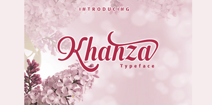 Khanza is a script font that is connected with clear style and dramatic movements. Khanza comes with uppercase, lowercase letters, numbers, punctuation, and so many variations on each character including alternative opentypes, common binders, and also additional cuts to allow you to customize your design. Perfect for use for Logotype, Letterhead, Posters, Clothing Designs, Labels and others. khanza font will help all the design projects that you are working on Khaza script features: Uppercase & lowercase Alternates & swashes Ligatures Standart international characters Punctuation & symbols