10,000 search results
(0.06 seconds)
- Rosenbaum by SIAS,
$34.90 The design of Rosenbaum started with the idea of an eclectic merger of didone stroke pattern and contrast, uncial letterforms and blackletter appearance. It was a destillation experiment. It happened around christmas in 2011. The result is a unique typeface which strongly evokes a peculiar pastiche mood without being any historical in the strict sense of the word. It’s all about the fun to mix ingredients and to freely create reminiscences in a new way. Rosenbaum is a typeface like a fairytale – one of a kind, strangely poetic and incredibly true at once… Use Rosenbaum for emotional typographics, for fairytale books and stories, for headings and invitations, for distinctive labels or menu cards, for Wave Gothic publishing … you will know best! Both Rosenbaum Eins and Rosenbaum Rose contain all characters needed for any European language. They both contain the same range of additional symbols and ornaments, some of them are zero-width calligraphic embellishments designed for direct combination with the letters, even inside of words.
 - PB Carolingian Xc by Paweł Burgiel,
$32.00 PB Carolingian Xc is a font face designed for imitate Carolingian minuscule (from the region of the German southeastern scribal schools) found in 10th century manuscripts. All characters are handwritten by use ink and quill pen, scanned, digitized and optimized for best quality without lost its handwritten visual appearance. Character set support codepages: 1250 Central (Eastern) European, 1252 Western (ANSI), 1254 Turkish, 1257 Baltic. Include also additional characters for Cornish, Danish, Dutch and Welsh language, spaces (M/1, M/2, M/3, M/4, M/6, thin, hair, zero width space etc.), historical characters (overlined uppercase Roman numerals, many mediaeval abbreviations, d-rotunda, r-rotunda, I-longa, e-caudata, historical ligatures for “nomina sacra”) and wide range of ancient punctuation. OpenType TrueType TTF (.ttf) font file include installed OpenType features: Access All Alternates, Localized Forms, Fractions, Ordinals, Superscript, Tabular Figures, Proportional Figures, Case-Sensitive Forms, Stylistic Alternates, Contextual Alternates, Stylistic Set 1-11, Historical Forms, Historical Ligatures, Standard Ligatures. Include also kerning as single ‘kern’ table for maximum possible backwards compatibility with older software. Historical ligatures for additional glyphs are mapped to Private Use Area codepoints. OpenType features automatically exchange some default glyphs by stylistic alternates and create ligatures for better historical appearance.
 - Bechamel by Andinistas,
$29.00 Hello! Do you need letters that look like they are drawn with a brush so that your creative work shines and stands out? We present Bechamel, a family of script fonts designed to be combinable with Bechamel Roman. BECHAMEL SCRIPT was hand drawn to design words and phrases in logos, packaging, posters, envelopes and greeting cards. BECHAMEL SCRIPT has high expressiveness because its energetic set of letters are meticulously drawn with calligraphy and lettering. In addition each of its incredible cursive letters give you the possibility to add a central vein to change the color, enhancing its impressive artisan splendor. These are the possibilities you receive by acquiring BECHAMEL: A) BECHAMEL-SCRIPT & VEIN: Cursive letters with carousel effect and OPENTYPE contained in: 26 Uppercase letters, 26 Small letters, 10 Numbers, 3 Fractions, 31 Punctuation marks, 77 Signs for languages belonging to Western Europe, 113 Signs for Central European languages. 20 Lowercase wipes, 13 uppercase alternatives for WORD START, 44 lowercase alternatives for HALF of word, 20 lowercase alternatives for WORD FINAL. NOTICE: Alternatives appear by clicking on glyph panel in Adobe Illustrator, Inkscape or Photoshop CC. B) BECHAMEL-WORDS: 57 words with capital letters underlined and combinable with BECHAMEL-SCRIPT 1, 2 and 3 ideal to connect and decorate your designs increasing expressiveness and authentic handwritten look of your ideas C) BECHAMEL-ORNAMENTS: 30 wonderful drawings made up of stars, borders, waves, hearts, dots, arrows, bow ties, etc., all specially coordinated to accompany your composite designs in BECHAMEL-SCRIPT and BECHAMEL-WORDS. Well, I hope that my work will be useful and above all that you have fun with it. If you have questions write to me that I will be happy to help you: • INTAGRAM: instagram.com/andinistas • BEHANCE: be.net/andinistas • FACEBOOK: fb.com/carlosfabiancamargoguerrero • TWITTER: twitter.com/andinistas
 - Sentzoff Coupon JNL by Jeff Levine,
$29.00The perfect font for coupon clippers has arrived with Sentzoff Coupon JNL by Jeff Levine. The dashed lines form letters in the same way a coupon is bordered. - Naturaling by Nadezda Gudeleva,
$10.00 Naturaling - it's display typeface font, aimed at defining healthy lifestyles and nutrition. Font perfect for use in organic foods, medication, cosmetics, packaging, prints design and also identity projects.
 - Victorian Triplets by Dingbatcave,
$15.00Elegant settings perfect for framing gems, words, quotes and pictures in groups of three. These were created to go well with Gingerbread Borders and Victorian Frames. 76 characters. - Marat by Ludwig Type,
$45.00 Although originally conceived as a magazine face – with strong serifs and open character shapes for good legibility in small sizes, and compact letter forms optimized for narrow columns and tight headlines – Marat evolved into a comprehensive family for general use. This specific construction and the round forms of the letters create an elegant, soft and friendly appearance. The typeface suits a wide range of typography, e.g. editorial, brochures, packaging and corporate design. In particular, in bold weights it works surprisingly well, which is not always the case with serif faces. Marat includes oldstyle and lining figures (both proportional and tabular), a wide range of language support and various OpenType features (e.g. ligatures, case-sensitive forms, fractions, superiors and inferiors). It is the perfect companion for Marat Sans, a clean and lively sans serif typeface. Marat has been selected by the Type Directors Club of New York to receive the Certificate of Excellence in Type Design 2008.
 - Ahra by Magpie Paper Works,
$58.00 Ahra from Magpie Paper Works is an upright, hand-lettered script full of fun calligraphy. This Opentype font was created with a pointed pen & ink, and features a host of special features. Within Ahra are three sets of capital letters, ranging from simple to quirky to traditional, as well as single-word characters for common titles (Mr., Miss, Dr., etc.) prepositions (to, the, for, etc.) and envelope addressing (blvd., st., etc.). You'll also find simple & automatic end-of-word swashes, old-style numerals and special double-letter ligatures for a true hand-drawn look. Ahra Hand features decorative word art, all lovingly drawn in a swirling traditional calligraphy style. There are 88 unique greetings, prompts, and phrases, plus an ornate set of numerals 0-9. Ahra Swash includes over fifty unique hand-inked flourishes, borders, corners, swashes and curls. Mix and match for a truly custom look! All were designed to coordniate with the Ahra alphabet, but can be used to enhance other faux-calligraphy fonts.
 - Vantagram by TEKNIKE,
$69.00 Vantagram is a modern display font. The typeface is made from basic square geometry. It is inspired by blackletter typefaces of the medieval period in Europe. The Vantagram name is a combination of two words derived from “vanta” French for boast and “gram” Greek for letter or that which is drawn. Vantagram is great for display work, quotes, titles, headings and posters.
 - Pocket Px by Letradora,
$18.00 Inspired by illustration lettering, Pocket has a contemporary, quirky feel. Its combination of narrow and round forms give it a humorous feel.It has support for most western and central European languages, and has alternates for most letterforms, allowing for variations that make it look authentically hand-drawn. Check out other fonts in the Pocket family: Pocket Serif and Pocket Swash
 - Blackmindlify by Allouse Studio,
$16.00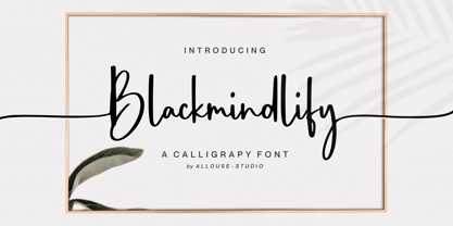 Proudly Presenting, Blackmindlify A Calligraphy Font. Blackmindlify is perfect for any titles, logo, product packaging, branding project, megazine, social media, wedding, or just used to express words above the background. Blackmindlify come with beginning swash for uppercase, beginning and ending swash for lowercase, also Multi-Lingual Support. Enjoy the font, feel free to comment or feedback, send me PM or email. Thank You!
 - Topographic Sans JNL by Jeff Levine,
$29.00 A 1940s-era book from the U.S. Army Corps of Engineers entitled "Topographic Drafting" features a page for "lettering construction and spacing" in the process of map making. The letters and numbers were formed on grids using that mechanical drafting process for uniformity in stroke width. This was the basis for Topographic Sans JNL, which is available in both regular and oblique versions.
 - Suilly La Tour by JBFoundry,
$30.00 Suilly la Tour is an elegant calligraphic and legible font. With his three character sets, Suilly la Tour uses OpenType features (liga, init, fina, isol) especially in second set. Suilly la Tour is available in two versions : -Ot with full OpenType features for OpenType friendly applications. -Office for usual word processors. In every case, use it for cards, invitations, menus, packaging, announcements, jackets...
 - Mangoli by Gatype,
$14.00 Hi all, there is a new modern and unique Mangoli sant font, please have it immediately for a quality project. It comes in many styles, including fasteners. OpenType features include style sets, character variants, start and end forms, and multilingual support. The Mangoli font is suitable for branding logos, poster designs, t-shirts, invitations, designs for children, and editorial designs. Hope you enjoy!
 - Conveyor Belt by DesignByLight,
$12.00 Conveyor Belt was designed for an environmental paper made from sugar cane waste called bagasse. The paper mill use conveyor belts to produce the paper from when the bagasse gets loaded to the finished paper product. This was the inspiration for this font. It has some alternatives to give options for different words linking different letters. This is a moving font and flowing.
 - Taurus by Fenotype,
$30.00 Save time and effort – choose your type wisely. Use Taurus and you’ll achieve impact without having to resort to cheap tricks. We have done the work for you: just type out words using Taurus and you’ll have a logo for a Wall Street law firm – or for that precious vintage Barolo. Refinement. Sophistication. Seriousness. Sex appeal. Taurus has it all.
 - Bali Script by Eclectotype,
$40.00 Inspired by the Indonesian island’s laid back feel and easy going culture, Bali Script is a tribute to the hand-lettered signage on beach bars, surf shacks and cafes. The swell of the stroke endings and the bolder-than-your-average gooey look convey a cool, contemporary take on baseball scripts. Overlay Bali Script Highlight for a cartoonish, glossy finish. Perfect for logos. This font is jam-packed with OpenType features that make smooth flowing text a doddle. Contextual alternates and ligatures are best left on by default. The alternates especially work a subtle magic that helps letters connect with an even rhythm, and automatically substitutes letters with the best fit alternatives based on their context, such as at the end of words, or adjacent to certain other letters. There are four stylistic sets (or all grouped together in the stylistic alternates feature for those without easy access to them) which do the following: SS01 - changes the r to a script form SS02 - makes certain caps more ‘scripty’ SS03 - capital I (and accented versions of it) get serifs SS04 - underline function. typing two or more underscores extends on underline beneath the previous word. Also included for your pleasure - oldstyle figures, automatic fractions, superior and inferior numbers, ordinals, some discretionary ligatures, swash alternates and extended language support.
 - Posterizer KG Rounded by Posterizer KG,
$40.00 Posterizer Kg Rounded, is basically rounded version of Egyptian, Slab Serif font Posterizer Kg. By adding rounded corners on serifs, the strict form disappears, in that way, the font gets softer form. Posterizer Kg Rounded is useful for sweet themes like cookies, puppies, love, joy, or some other similar things.
 - Blockocular by Rex Face,
$19.99 Blockocular is a playful, versatile display font. Its name describes the way sets of blocks form the characters, creating letter forms that are pleasing to the eye. Blockocular is great for headlines, signage, logos, packaging and more. It�s bold and fun and will inject interest into your design piece.
 - Schwung by Hubert Jocham Type,
$29.90 Schwung is a brush script headline typeface. It has round elegant swirls that get stronger in the alternate version. Ideal for food packaging and product branding, it is designed to be clear and self-confident. Schwung does not need very much space to make it work perfectly on food labels.
 - Linotype Renee Display by Linotype,
$29.00Linotype Renee is part of the Take Type Library, selected from contestants of Linotype’s International Digital Type Design Contests of 1994 and 1997. It was a prize-winning entry of American designer Renee Ramsey-Passmore. The letters of this font are strictly constructed with a grid, which is still visible in the weight Types + Lines. The figures are designed with only the basic forms of circle, rectangle and triangle, giving the font an individual and technical feel. Some letters are only recognizable in the context of a word, making Linotype Renee exclusively for short headlines in large point sizes. - M Zhi Hei HK by Monotype HK,
$523.99 M Zhi Hei's design concept comes from M Stiff Hei , where horizontal and vertical strokes (橫、豎) are direct, dots (點) are short but forceful, downstrokes(撇、捺) are straight and sharp - everything bold and straightforward. One big difference between M Zhi Hei and M Stiff Hei, is the similar thickness of horizontal strokes (橫) across all font styles, so that there would be a strong contrast formed by the thin horizontal and thick vertical strokes (橫、豎) in the bold face. Still, remains bright, neat and beautifully crafted, it is a multi-purpose typeface that convince audiences and cater for different needs.
 - M Zhi Hei PRC by Monotype HK,
$523.99 M Zhi Hei's design concept comes from M Stiff Hei , where horizontal and vertical strokes (橫、豎) are direct, dots (點) are short but forceful, downstrokes(撇、捺) are straight and sharp - everything bold and straightforward. One big difference between M Zhi Hei and M Stiff Hei, is the similar thickness of horizontal strokes (橫) across all font styles, so that there would be a strong contrast formed by the thin horizontal and thick vertical strokes (橫、豎) in the bold face. Still, remains bright, neat and beautifully crafted, it is a multi-purpose typeface that convince audiences and cater for different needs.
 - Narin by Ahmet Altun,
$19.00 Narin Font Family is a geometric sans design with rounded corners which seems much softer and eye-pleasing even though it still has geometric and straight borders. The family comes in six weights with regular and italic forms. Narin Font Family is legible from very small size to very large ones. It is suitable for letterpress and also long texts. With the small caps, all fonts can be used to create great and gorgeous works like logos, texts, presentations, t-shirts etc. and can be used to create the pressworks such as posters, magazines and books. The word "Narin" means "graceful" in Turkish.
 - Bomanda Signature by Febri Creative,
$12.00 Bomanda Signature is a handwritten signature font. This font has 2 stylistic forms, namely regular and italic. Also added is a bonus 1 font, a floral element font that can be used for: logos, writing ornaments, making frames, and much more. You can create the perfect signature or logo with this font. What's Included? - Bomanda Signature Regular OTF - Bomanda Signature Italic OTF - Bomanda Floral Elements OTF - More than 598 of glyphs - Works on PC & Mac Simple Installations Accessible in the Adobe Illustrator, Adobe Photoshop, Adobe InDesign, CorelDraw, even work on Microsoft Word. Multilingual Support Thanks and have a wonderful day.
 - Ganges Slab by ROHH,
$40.00 Ganges Slab is a condensed slab serif typeface inspired by Central European advertising typography from late XIX century. It is a perfect match for Ganges Sans. The font has condensed proportions and original letter shapes. Ganges is designed mainly for editorial design, especially for display use, as well as short paragraphs of text. Its narrow proportion makes it very practical to use for posters and magazine covers. Characteristic letter forms fit great for branding, logo and packaging design. It is also a very interesting choice for websites and e-book headlines. Ganges Slab family consist of 27 fonts - 9 weight, 9 italics and 9 obliques. It supports extended set of latin languages, as well as broad number of OpenType features, such as case sensitive forms, standard and dicretionary ligatures, stylistic alternates, contextual alternates, lining, oldstyle and tabular figures, slashed zero, fractions, superscript and subscript, ordinals, currencies and symbols.
 - OBO Star by Juri Zaech,
$19.00 OBO Star is a fat, subtly flared display typeface with a not so subtle groove factor. The letters are based on a square and do not have ascenders or descenders. This way the typeface can be used for horizontal and vertical settings, or mixed like crosswords. There are a few exceptions for certain punctuation and special characters that are half the width for better spacing; and the word space’s width can easily be adjusted through OpenType stylistic sets. Talking about spacing, for strictly horizontal typesetting there is the option to turn on kerning for a number of characters to create a more optimal texture across words and phrases. But that’s all just technical talk. The true character of OBO Star is the funky look, amplified by the wide 1x1 format that creates space for unconventional shapes, mostly pronounced in the letters R, K and G.
 - Trigot by Volcano Type,
$19.00 Trigot is a modular typeface. Every form and every character is constructed from the basic geometric form of the triangle. The simple construction trigot resembles strongly is a gothic blackletter font. The letters are inspired by the ductus and forms of medieval typefaces and have a similar complex expression. The main singularity of Trigot lies in the strong contrast between clear geometry and the complex expression of a blackletter typeface. The name, "Trigot", hints the gothic influence and the triangular modules. Trigot is a modern display font -- it can be used for posters, striking visuals and titles but also for longer phrases and quotes.
 - Hazelnut Pro by Eimantas Paškonis,
$- This small family can be counted as 4 fonts in 2. Because both weights contain small caps, 12 sets of stylistic alternates, and a decorative swashed form. That’s not counting dozens of ligatures in both multilingual latin and Cyrillic scripts. Plus ordinals, case-sensitive forms, and manual hinting. Due to its geometric nature, designers can manipulate vectors to change letters' dimensions for logotypes. They may seem modular, but every glyph was shaped individually to give handmade imperfections, reminiscent of wood type press. This allows for plenty of details at large sizes. Regular versions are multilingual but include only standard ligatures and case-sensitive forms.
 - Marlin by Komet & Flicker,
$15.00 NEW! Includes a set of 42 connecting word character glyphs along with 23 alternate lowercase glyphs. MARLIN is a condensed vintage style serif display font that works great for logos, packaging, branding, menus, advertising, and posters. The lowercase letter set has different letterforms allowing you to mix and match upper and lowercase for a variety of looks. In Illustrator, the custom connecting word set can easily be accessed in the "Type → Glyphs" panel and in Photoshop through "Type → Panels → Glyphs Panel".
 - Chalk Hand Lettering by Fontscafe,
$39.00 If you are into the vintage feel, you will love this one. This is as vintage as it probably gets. There are probably only a handful of places in the world where schools still use blackboards and chalk – they’ve given way to their white board and marker counterparts for decades now. White boards are definitely more practical and less messy when compared to chalk, but then if you are creatively inclined you will agree that a little bit of mess is worth it if you are going to get the effects that you desired! Well, we can give you the effects minus the mess with our chalk hand lettering fonts! As the name suggests, this font gives you that distinctly unique chalk on slate feel, and if you are wondering what’s distinct about it; writing on slate or blackboard was a slow process which required deliberated and concentrated efforts resulting in a handwriting which was usually quite different to a person’s handwriting on paper. Typography of chalk on slate was an everyday event in the classrooms of yesterday, and today we hardly ever get to see one of these if it all. Writing on a black board with chalk was quite an interesting achievement in its own right, if you ended up with anything legible and if your writing remained focused and ‘in-line’! But of course like everything else, his took time to master and when you did get it right, chalk hand lettering was quite an enjoyable experience! For semi-permanent designs, say for example an eventful day at school; students of the day would create beautiful typography on the boards, and add a solidarity to it sometimes by shading one side of the lettering – usual y the right side towards which the lettering leaned. This is the effect our chalk hands lettering shaded variation gives you. You could get this font individually, but we strongly advise you check out the “chalk hand lettering pack” font. It includes the simple “chalk hand lettering” (minus the shading effect) and also a “chalk hand elements” bag of tricks. The elements is a collection of graphic art which resemble shapes and designs that used to be added to chalk art, to beautify the typography. If you enjoyed seeing the effects of our Chalk Hands font, and the shaded variant – you are simply going to go gaga over Chalk Hand Elements! The chalk hand font of course enables you to make typographic art similar to the effect of chalks on slates and black boards. This was quite the art form in the days gone by! The shaded variation added a bit of solidarity and the technique was commonly used to make semi-permanent designs say for example a welcome note when somebody important was to visit. Classic chalk hand designs, especially the semi permanent ones often had little pieces of art to help beautify the creation as a whole. It could simply be symmetrical graphics appearing before and after the title and headings, maybe just an interesting shape to fill in an empty area on the board, and such…our Chalk Hand Elements offers you a ton of such graphics. The two chalk hand variations and the elements are all included in the Chalk Hand Family, and this is strongly recommended if you want to make designs that are truly reminiscent of the days of chalk on slate.
 - Toxigenesis by Typodermic,
$11.95 Inspired by the sleek lines of consumer electronics and the bold shapes of automobile design, Toxigenesis is the ultimate typeface for conveying a sense of scientific and industrial power. With its wide, plastic letterforms, Toxigenesis commands attention and exudes confidence, making it the perfect choice for any high-tech design project. Whether you’re designing the next generation of consumer electronics, presenting cutting-edge scientific research, or creating sleek industrial products, Toxigenesis is the font you need to make your message stand out. Available in five weights and italics, Toxigenesis gives you the flexibility to create powerful, attention-grabbing designs that convey your message with clarity and style. Most Latin-based European, Vietnamese, Greek, and most Cyrillic-based writing systems are supported, including the following languages. Afaan Oromo, Afar, Afrikaans, Albanian, Alsatian, Aromanian, Aymara, Azerbaijani, Bashkir, Bashkir (Latin), Basque, Belarusian, Belarusian (Latin), Bemba, Bikol, Bosnian, Breton, Bulgarian, Buryat, Cape Verdean, Creole, Catalan, Cebuano, Chamorro, Chavacano, Chichewa, Crimean Tatar (Latin), Croatian, Czech, Danish, Dawan, Dholuo, Dungan, Dutch, English, Estonian, Faroese, Fijian, Filipino, Finnish, French, Frisian, Friulian, Gagauz (Latin), Galician, Ganda, Genoese, German, Gikuyu, Greenlandic, Guadeloupean Creole, Haitian Creole, Hawaiian, Hiligaynon, Hungarian, Icelandic, Igbo, Ilocano, Indonesian, Irish, Italian, Jamaican, Kaingang, Khalkha, Kalmyk, Kanuri, Kaqchikel, Karakalpak (Latin), Kashubian, Kazakh, Kikongo, Kinyarwanda, Kirundi, Komi-Permyak, Kurdish, Kurdish (Latin), Kyrgyz, Latvian, Lithuanian, Lombard, Low Saxon, Luxembourgish, Maasai, Macedonian, Makhuwa, Malay, Maltese, Māori, Moldovan, Montenegrin, Nahuatl, Ndebele, Neapolitan, Norwegian, Novial, Occitan, Ossetian, Ossetian (Latin), Papiamento, Piedmontese, Polish, Portuguese, Quechua, Rarotongan, Romanian, Romansh, Russian, Rusyn, Sami, Sango, Saramaccan, Sardinian, Scottish Gaelic, Serbian, Serbian (Latin), Shona, Sicilian, Silesian, Slovak, Slovenian, Somali, Sorbian, Sotho, Spanish, Swahili, Swazi, Swedish, Tagalog, Tahitian, Tajik, Tatar, Tetum, Tongan, Tshiluba, Tsonga, Tswana, Tumbuka, Turkish, Turkmen (Latin), Tuvaluan, Ukrainian, Uzbek, Uzbek (Latin), Venda, Venetian, Vepsian, Vietnamese, Võro, Walloon, Waray-Waray, Wayuu, Welsh, Wolof, Xavante, Xhosa, Yapese, Zapotec, Zarma, Zazaki, Zulu and Zuni.
 - TT Ricordi by TypeType,
$49.00 TT Ricordi useful links: Specimen | Graphic presentation | Customization options The TT Ricordi font family is a collection of three display heading serifs designed to significantly diversify the traditional font palette. Each font from the TT Ricordi family was drawn by a separate designer and has its own story. With that, all three fonts are close in thickness and similar in their character compositions and are featured in the uppercase set and the small capitals set, which replaces lowercase characters. The fonts have the broad support of Latin languages and support basic Cyrillic. The project originates from the pre-coronavirus tourist trips to Italy, during which our art director Yulia Gonina has accumulated many photographs of historical inscriptions and tablets. Many of these inscriptions had interesting character or unusual character shapes. We wanted to work with them, to try to reinterpret them, and, if possible, make them ultramodern and accessible to the modern font user. The fonts from the TT Ricordi typeface turned out to be quite display and contemporary, but at the same time, they retained subtle references to historic inscriptions. The fonts fit perfectly both on the covers of book classics and in glossy magazine layouts. They can also be used in posters and packaging, or as the main expressive element of company branding. In addition, all three serifs from the TT Ricordi font family go well with functional sans-serifs such as TT Norms Pro or TT Commons. TT Ricordi Nobili is a display serif with a rich Roman ancestry and contemporary world views. It stands out from the crowd with its subtlety and elegance. The font was drawn by Anna Tikhonova and was inspired by an inscription carved into the stone floor of a cathedral in Florence. Because people walked over the inscription, some of the letters got thinner and worn out over time. It is this feeling of disappearing or flickering elements that we wanted to capture and implement in the project. The TT Ricordi Nobili has high contrast, even though the font itself is quite thin. The serifs in the font are not massive at all, but at the same time, they are display serifs. There is a certain tension in TT Ricordi Nobili, and the viewer perceives this tension. We can say that behind the external classic facade lies a rather modern plot. The font has a large set of discrete ligatures which allow to create interesting combinations and expand the capabilities of the font. There are 709 glyphs in the TT Ricordi Nobili font, and a whole set of useful features, such as: aalt, ccmp, locl, numr, ordn, tnum, pnum, case, dlig, ss01, ss02, ss06, ss07, ss08, ss09, ss10, calt. TT Ricordi Todi is a wide serif with a classic base and a contemporary nature. The font turned out to be refined yet sharp, and in places even pushy and aggressive. The font was drawn by Yulia Gonina, and the project was based on plaques with engraved street names from the small Italian town of Todi. The main challenge was to decipher the characteristic features of the signs and emphasize them in a modern way. In addition, it was necessary to draw a Cyrillic alphabet that would not be inferior to the Latin alphabet in its expressiveness. The TT Ricordi Todi has fairly wide character proportions, and there is practically no contrast in them. The main feature of the font is the combination of smooth round shapes with deliberately squared shapes. In addition, the font is characterized by crisp and sharp character details, exaggerated ascenders and descenders, and muted contrast. Among the interesting font peculiarities, you can choose between the characteristic long descenders and ascenders and their more tempered versions, you can find a stylistic set with triangular dots, alternative versions of the EF characters and two letter ? shapes, round and squared. There are 876 glyphs in the TT Ricordi Todi font, and a whole set of useful features, such as: aalt, ccmp, locl, numr, ordn, tnum, pnum, case, dlig, salt, ss01, ss02, ss03, ss04, ss05, ss06, ss07, ss08, ss09, ss10, calt. TT Ricordi Fulmini is a fashionable contemporary serif firmly holding on to its historic roots. The font turned out to be like a thistle flower: bright and catchy, but still subtle and delicate. TT Ricordi Fulmini was drawn by Marina Khodak, and the initial inspiration for the project was the inscription on the altar from the National Gallery of Umbria in Perugia. As the font was pulled into “contemporaneity”, it was completely transformed and revealed its new side. The main catchy detail in the TT Ricordi Fulmini is the aggressive and rather sharp diagonal serifs. In addition, in the process of working on the font, several graphic solutions emerged, for example, the mono-serifs and the very calligraphic connections of diagonal strokes with their historic spirit. We wanted to keep them, and thus 4 thematic stylistic sets appeared in the font, thanks to which we can greatly change the perception of TT Ricordi Fulmini. In addition, the font has a set of interesting discrete ligatures. There are 793 glyphs in the TT Ricordi Fulmini font, and a whole set of useful features, such as: aalt, ccmp, locl, numr, ordn, tnum, pnum, case, dlig, ss01, ss02, ss03, ss04, ss05, ss06, ss07, ss08, ss09, ss10, calt. TT Ricordi supports more than 180+ languages, such as: Acehnese, Afar, Albanian+, Aleut (lat), Alsatian, Aragonese, Arumanian+, Asu, Aymara, Azerbaijani +, Banjar, Basque +, Belarusian (lat), Bemba, Bena, Betawi, Bislama+, Boholano+, Chamorro+, Chichewa, Chiga, Colognian+, Cornish, Corsican +, Cree, Croatian, Czech+, Danish, Dutch+, Embu, English+, Esperanto, Estonian+, Faroese+, Fijian, Filipino+, Finnish, French, Frisian, Friulian+, Gaelic, Gagauz (lat), Galician+, Ganda, German+, Gusii, Haitianm, Creole, Hawaiian, Hiri Motu, Hungarian+, Icelandic+, Ilocano, Indonesian+, Innu-aimun, Interlingua, Irish, Italian+, Javanese, Jola-Fonyi, Judaeo-Spanish, Kabuverdianu, Kalenjin, Karachay-Balkar (lat), Karaim (lat), Karakalpak (lat), Karelian, Kashubian, Kazakh (lat), Khasi, Kinyarwanda, Kirundi, Kongo, Kurdish (lat), Ladin, Latvian, Leonese, Lithuanian, Livvi-Karelian, Luba-Kasai, Ludic, Luganda+, Luo, Luxembourgish+, Luyia, Machame, Makhuwa-Meetto, Makonde, Malagasy, Malay+, Maltese, Manx, Maori, Marshallese, Mauritian Creole, Minangkabau+, Moldavian (lat), Montenegrin (lat), Morisyen, Nahuatl, Nauruan, Ndebele, Nias, Norwegian, Nyankole, Occitan, Oromo, Palauan, Polish+, Portuguese+, Quechua+, Rheto-Romance, Rohingya, Romanian +, Romansh+, Rombo, Rundi, Rwa, Salar, Samburu, Samoan, Sango, Sangu, Sasak, Scots, Sena, Serbian (lat)+, Seychellois Creole, Shambala, Shona, Silesian, Slovak+, Slovenian+, Soga, Somali, Sorbian, Sotho+, Spanish+, Sundanese, Swahili, Swazi, Swedish+, Swiss German +, Tagalog+, Tahitian, Taita, Talysh (lat), Tatar+, Teso, Tetum, Tok Pisin, Tongan+, Tsakhur (Azerbaijan), Tsonga, Tswana +, Turkish+, Turkmen (lat), Uyghur, Valencian+, Vastese, Vepsian, Volapük, Võro, Vunjo, Walloon, Welsh+, Wolof, Xhosa, Zaza, Zulu+, Belarusian (cyr), Bosnian (cyr), Bulgarian (cyr), Erzya, Karachay-Balkar (cyr), Khvarshi, Kumyk, Macedonian+, Montenegrin (cyr), Mordvin-moksha, Nogai, Russian+, Rusyn, Serbian (cyr)+, Ukrainian.
 - ITC Tapioca by ITC,
$40.99ITC Tapioca was designed by Eric Stevens. He developed the typeface for a nightclub, yet its simple forms are reminiscent of childhood writing exercises. This effect is enhanced by rough edges, which in large sizes make the characters look as though they were composed of strings of dots...or tapioca. The basic style is printed handwriting, although some forms take cursive handwritten forms. The varying slants and irregular forms of the characters give ITC Tapioca a sense of energy and playfulness. - North by Trine Rask,
$40.00 North Family is a small type family designed for books and pages of text in smaller or bigger sizes. It has been designed with special care for the Scandinavian languages, their letter combinations and special characters, but contains accented characters for all european languages. North is a soft and warm typeface, legible and friendly, very suitable for setting text that you just want to be read as easy as possible. Also very usable for children books with its simple forms.
 - Scrapbooker by Sudtipos,
$29.00 After previously collaborating on the bestselling Distillery Set, Carolina Marando and Alejandro got together once again to create this Scrapbooker Set, a new series of fonts that multiply the possibilities. One reason scrapbookers became a kind of design demographic is the appeal of what they do. They make albums of memories, diaries composed of different elements that converge together to lead the viewer to a special moment in time. A paper, a photo, a letter, an event ticket, or a dry petal — everything ends up being part of a collage that tells a story. Words have a key role in such a collage. They use different shapes and forms and combinations to state what cannot otherwise be expressed. They make the collage stronger by clarifying a concept, defining an image, and solidifying a memory. These words for memory albums are the reason for this Scrapbooker Set, six different fonts with different impressions and different personalities — so each part of the memory can have its own identity. People tell you to write your own history. Now you can do that in style.
 - Backstroke by Eclectotype,
$50.00 Normal and upright italic script fonts line a well-trodden path; left-leaning fonts (or "rightalics" as they're confusingly called), on the other hand, are a rarity. Here at Eclectotype Fonts we don't like to do things too conventionally, so here's Backstroke, a laid back script with a unique voice. With contextual alternates for start and end forms of certain characters, swash versions of L, Q and Z (surely the most used initial caps!), and a handful of stylistic sets, Backstroke is a restrained script. Stylistic sets are: 1. the start forms of i, j, m, n, and p are used always instead of only at word starts. 2. lower case ascenders get a whole lot loopier. 3. alternate versions of G, N and Y. 4. swash L, Q and Z. 5. swaps the default Polish script lslash for a more familiar version While fonts that lean the wrong way may be a bit more difficult to fit into your layouts than boring old regular italics, they will reward you with their individuality. Why not give it a go?
 - Maestro by Canada Type,
$24.95 Out of a lifelong inner struggle, Philip Bouwsma unleashes a masterpiece that reconciles classic calligraphy with type in a way never before attempted. Maestro takes its cue from the Italian chancery cursive of the early sixteenth century. By this time type ruled the publishing world, but official court documents were still presented in calligraphy, in a new formal style of the high Renaissance that was integrated with Roman letters and matched the refined order of type. The copybooks of Arrighi and others, printed from engraved wood blocks, spread the Italian cancellaresca across Europe, but the medium was too clumsy and the size too small to show what was really happening in the stroke. Arrighi and others also made metal fonts that pushed type in the direction of calligraphy, but again the medium did not support the superb artistry of these masters or sustain the vitality in their work. As the elegant sensitive moving stroke of the broad pen was reduced to a static outline, the human quality, the variety and the excitement of a living act were lost. Because the high level of skill could not be reproduced, the broad pen was largely replaced by the pointed tool. The modern italic handwriting revival is based on a simplified model and does not approach the level of this formal calligraphy with its relationship to the Roman forms. Maestro is the font that Arrighi and his colleagues would have made if they had had digital technology. Like the calligraphic system of the papal chancery on which it is modelled, it was not drawn as a single finished alphabet, but evolved from a confluence of script and Roman; the script is formalized by the Roman to stand proudly in a world of type. Maestro came together on screen over the course of several years, through many versions ranging widely in style, formality, width, slant, weight and other parameters. On one end of the spectrum, looking back to tradition it embodies the formal harmony of the Roman capitals and the minuscule which became the lower case. On the other it is a flowing script letter drawing on the spirit of later pointed pen and engravers scripts. As its original designers intended, it works with simple Roman capitals and serifs or swash capitals and baroque flourishes. The broad pen supplies weight and substance to the stroke which carries energy through tension in balanced s-curves. Above all it is meant to convey the life and motion of formal calligraphy as a worthy counterbalance to the stolid gravity of metal type. The Maestro family consists of forty fonts distributed over two weights. The OpenType version compresses the family considerably down to two fonts, regular and bold, each containing the entire character set of twenty fonts, for a total of more than 3350 characters per font. These include a wide variety of stylistic alternates, ligatures, beginning and ending letters, flourishes, borders, rules, and other extras. The Pro version also includes extended linguistic support for Latin-based scripts (Western, Central and Eastern European, Baltic, Turkish, Welsh/Celtic, Maltese) as well as Greek. For more thoughts on Maestro, its background and character sets, please read the PDF accompanying the family.
 - Unovis by ParaType,
$30.00 PT Unovis™ was designed for ParaType in 2001 by Tagir Safayev. Inspired by the shapes of lettering of the Russian Avant Garde artists of Kazimir Malevich’s circle at the beginning of the 20th century. Based on simple geometric forms. Caps only. For use in advertising and display typography.
 - Outdoor Cafe JNL by Jeff Levine,
$29.00 The movie poster for the 1937 film “Cafe Metropole” served as the basis for Outdoor Cafe JNL, which is available in both regular and oblique versions. The extra bold, stylized letter forms with their rounded corners typify the wide variety of typographic styles the Art Deco period offered.