10,000 search results
(0.109 seconds)
- Alexiond by Canden Meutuah,
$15.00 Alexiond Serif is a modern serif font packaged in a modern and classy style, complete with access to your OpenType feature to access a large selection of alternative letters and ligatures, the choice of letters you like from various uppercase and lowercase letters for a luxurious impression and elegant appearance. A new elegant serif font that will add a touch of luxury and style to your projects. This is a very versatile font that works well in both large and small sizes. This font is Perfect for branding projects, logo design, clothing branding, packaging, magazine titles, advertisements, t-shirts, postcards, editorials, magazine headlines, product packaging, and displaying masculine and feminine qualities. Alexiond is equipped with full uppercase, lowercase, numbers and punctuation + Multi-language support
 - Brandy Keita by Canden Meutuah,
$25.00 Serif is a modern serif font packaged in a modern and classy style, complete with access to your OpenType feature to access a large selection of alternative letters and ligatures, the choice of letters you like from various uppercase and lowercase letters for a luxurious impression and elegant appearance. A new elegant serif font that will add a touch of luxury and style to your projects. This is a very versatile font that works well in both large and small sizes. This font is Perfect for branding projects, logo design, clothing branding, packaging, magazine titles, advertisements, t-shirts, postcards, editorials, magazine headlines, product packaging, and displaying masculine and feminine qualities. this is equipped with full uppercase, lowercase, numbers and punctuation + Multi-language support
 - Prangs by Sudtipos,
$59.00 The late-19th-century Prussian-American printer and publisher Louis Prang, the “father of the American Christmas card”, was well-known for his efforts to improve art education in the United States. He published many instructional books and even founded a training school for art teachers. One of the books he published included a series of alphabets for sign painters, lithographers, illuminators, architects and civil engineers. There was nothing truly original there — in the book’s preface, Prang says that the alphabets were “based on foreign forms and adapted for American taste”. The one alphabet that caught my attention in that book was one simply called “Italic”. It’s a high- contrast modern, a Didone really, but with an interesting little twist: the lowercase is almost entirely connected, which makes for an interesting mix of modern typography and classic calligraphy. That stuff is right up my alley now. Whenever my eyes happen on a modern, it’s easy, even almost impulsive for me to envision swashes coming out of serifs and terminals. The caps melt and the minuscules dance with them. And so I brought my vision to life. Prangs is an italic set of three weights, each containing more than 1400 glyphs with plenty of OpenType features and Latin language support. This set celebrates the convergence of three centuries of fancy display alphabets. These fonts should work wherever moderns are used to elevate and scripts are used to appeal — namely today’s branding, packaging and glossy publications.
 - Assemblage by Latinotype,
$36.00 Assemblage Designed by Daniel Hernández, Alfonso García, Bruno Jara Ahumada and Luciano Vergara. Thanks to Pedro González for his contribution in the initial stage of the design process. Assemblage is a typeface-inspired by Roman square capitals-that comes in 6 different weights and ranging from Thin to Black. The background of the typeface makes it well-suited for branding, short text, titles and complex compositions, thanks to its italic version. Contrary to some conservative fonts, Assemblage includes an italic version with a look based on Elzeverian and Dutch Barroque typefaces, what gives the font an extra dash of elegance, resulting in a very enjoyable design. The family was specially created for labelling wine bottles and general packaging. Assemblage is a font collection consisting of a Sans Serif plus an Italic version of classic features. The family comes in 6 weights and includes ligatures, caps and small caps plus 3 sets of smaller small caps for different kinds of composition. The Italic version-with strong decorative features-comes with swashes. Assemblage also includes a set of dingbats, especially designed for packaging as well as for publishing or branding. The Sans contains 979 characters and the Italic version 620 characters. Assemblage supports 212 different languages and its OpenType features include ligatures, semi oldstyle figures, 3 sets of ornamental small caps (in the Sans version), swashes, ending forms and alternates in the Italic version.
 - HWT American Chromatic by Hamilton Wood Type Collection,
$24.95The HWT American Chromatic set is a multilayered font set that will allow for thousands of possible color and pattern combinations. The original 19th Century Chromatic upon which this font set is based included two fonts. The HWT digital version includes eight. The alignment is configured to allow any combination of the eight fonts to all align when identical text is set and arranged, one on top of the other. Due to the highly decorative nature of this font set, the character set is limited to upper case only with basic punctuation. Five of the eight fonts in the set can be used individually as variations of the classic Tuscan style of wood type, which is defined by its concave stems and serifs. There are no accented characters due to the ornate nature of the design and because there were no accents originally intended for this design. This font is best used at sizes of 72 pt or larger and is ideal for a wide array of design uses. For webfont use, CSS with z-index and position will allow for easy online layering. - Billiers by Almeera Studio,
$19.00 Introducing the new Billiers Modern Ligature Typeface!!!Billiers is a luxury and glamour serif typeface. This font is both modern and nostalgic and works great for logos, magazine, social media. Already matched up and ready to be used together for your next design! For those of you who are needing a touch of elegant, stylish, classy, chic and modernity for your designs, this font was created for you! Perfect for editorial projects, Logo design, Clothing Branding, product packaging, magazine headers, or simply as a stylish text overlay to any background image. No special software is required to type out the standard characters of the Typeface. To access the Opentype Ligatures, you will need software that supports Opentype features in fonts. Current Language Support : Danish, English, Finnish, French, German, German (Switzerland), Norwegian Bokmål, Norwegian Nynorsk, Portuguese, Spanish, Swedish, Swiss German. Feel free to follow, like and share. Thanks so much for checking out my shop
 - Old Tijuana JNL by Jeff Levine,
$29.00 Old Tijuana JNL was modeled from the hand lettered title on the cover of the 1939 sheet music for "Class Will Tell" and is available in both regular and oblique versions. Casual, playful and reminiscent of the "serape" style of pseudo-Mexican lettering found on ad designs of the 1930s and 1940s, the type face isn't just for South of the Border themes. Use it for any festive occasion and the design will blend in well.
 - Qellia by Valentino Vergan,
$17.00 Qellia is a modern variable font family with lots of style and creativity. Qellia is designed with beautiful ligatures and unique alternate characters. The tall and slim nature of the Qellia characters gives the font an elegant and classy look. The font family contains 10 fonts and 1 variable font, there are 5 weights, and each weight has an oblique. The variable version makes it easy to manually adjust the weight and slant. The Qellia font family has multilingual support for languages such as: Danish, English, Finnish, French, German, German (Switzerland), Norwegian Bokmål, Norwegian Nynorsk, Portuguese, Spanish, Swedish, Swiss German. Qellia is designed with unique letters, this makes it perfect for a wide range of projects such as: branding, magazines, logos, wedding invitations, editorials, product packaging, advertisements and much more. If you a looking for something modern, nostalgic and chic for you next project, Qellia is the font for you.
 - CAL Bodoni Ferrara by California Type Foundry,
$47.00 Bodoni Ferrara™ Fashionable, Luxury Heritage: The Original Bodoni Ferrara Sculpted from hi-res photos and scans of Bodoni's original Ferrara Font—his 1818 Manuale Tipografico and 1768 specimens. It has never before been available. This cut of Bodoni specially selected by Dave Lawrence from rare book specimens. Part of the California Type Foundry Origin Series. 3 Display Fonts in One!! And 6+ style mixes. Bodoni's 1st Draft - Transitional Serif Bodoni was often inspired by French type designs. His first draft of Ferrara was inspired by Pierre Simon Fournier. But Bodoni added his own Italian sensibilities. Bododni’s first, transitional style can pair with humanist sans, and transitional fonts. Bodoni's Rework - Modern Serif Later, Bodoni reworked Ferrara to match the later neo-classic style or modern serif of Firmin Didot¹. Bodoni’s modern style can pair with geometric sans, grotesque sans, neo-grotesque sans, gothic sans, copperplate script, . Informal On™ - Informal Mode by CAL Type Foundry This can pair with “infant” fonts. Geometric sans, and other sans or serifs with one-storied a’s. + Bodoni’s Tivoli a for another option! Works great with Fournier¹ fonts and grotesques, since the terminals will match. Font Pairing Guide This font includes a 78 page Ferrara Pairing Guide. This book shows you 131 pairings with text fonts. 47 pairings with subheader fonts! We want to help you get more out of your font collection. Design Features • Subtle forward angle (0.5-1.5°) makes Ferrara more lively and engaging than most Bodoni or Didot fonts. • Round curves make this font feel letter-pressed. • Bodoni's original tall x-height and slightly condensed proportions: great for headlines, where space is at a premium. • Better uppercase. Uppercase punctuation for design apps. • Proportional oldstyle and lining figures, both modern style and transitional numbers. Every pair of numbers is kerned for display sizes: no unsightly gaps! • Multiple special symbols for whenever you need a design to pop, including 3 of Bodoni’s amazing ampersands. Language Features Latin standard for western European and other languages. +Advanced support for: German, French, Spanish, Portuguese, Italian, and French. Special, uppercase umlauts for titles! Compare to metal Bauer¹ Bodoni! Special context kerning for French, Spanish, Portuguese, Italian, and French, to allow better better words like L'Angelique & “¿Nosotros?”. This kerning gets rid of unsightly gaps between “¿ and other combinations. Can’t Find the Pairing Guide? Can't find the pairing guide? Google “California Type Foundry” and grab the pairing guide. Get another free pro font while you’re there! Ferrara: many sizes, styles, moods and situations. It's a classic, fashionable font for display, headlines, and titles. Grab Ferrara today! ----------- ¹Trademarks of their respective owners. Ferrara™ is a trademark of the California Type Foundry.
 - The Dagoda by Hrz Studio,
$17.00 The Dagoda is a calligraphy script font that comes with beautiful alternate characters. copper plate calligraphy alloy with handlettering style. Designed to convey stylish elegance. The Dagoda is attractive because it is subtle, clean, feminine, sensual, glamorous, simple and very easy to read. Classic style is very suitable to be applied in all types of formal work such as invitations, labels, menus, logos, fashion, make up, stationery, letterpress, romantic novels, magazines, books, greeting/wedding cards, packaging, labels. Dagoda features a glyph and alternate characters. including multiple language support. It features OpenType with character styling, binding, and stroke, allowing you to mix and match letter pairs to match your design. Files include: To enable the OpenType Stylistic alternative, you need a program that supports OpenType features such as Adobe Illustrator CS, Adobe Indesign & CorelDraw X6-X7, Microsoft Word 2010 or later. (Windows), Font Book (Mac) or a software program such as PopChar (for Windows and Mac). How to access all alternative characters using Adobe Illustrator: https://www.youtube.com/watch?v=XzwjMkbB-wQ How to use the font style set in Microsoft Word 2010 or later: https://www.youtube.com/watch?v=NVJlZQ3EZU0 There are additional ways to access alternatives/swashes, using Character Maps (Windows), Nexus Fonts (Windows) Font Book (Mac) or software programs such as PopChar (for Windows and Mac). How to access all alternative characters, using Windows Character Map with Photoshop: https://www.youtube.com/watch?v=Go9vacoYmBw If you need help or advice, please contact me. Thank you for your purchase!
 - Galak Round by Luhop Creative,
$27.00 Galak Pro is a modern geometric sans serif family characterized by its simplicity and extensive functionality.consisting of 9 weights ranging from Hairline to Heavy with matching italics. It supports Extended Latin, Cyrillic and Greek. This blend produce a typeface of modern, clean and contemporary appearance that has implicit on its core a classic vibe, nourishing the text with a timeless elegance.In use, the form and function balance of its design allow it freely travel through a diverse range of fields and possibilities like short text settings, brands, headlines or signage systems with grace and naturality. Galak Pro is available in variable font format and in 18 different individual styles (9 weights), with a set of supports over 200 latin languages and including an extensive repertoire of opentype features like small caps, ligatures, stylistic alternates, proportional and tabular figures,and many other resources to please your typographic urges.
 - Galak Pro by Luhop Creative,
$99.99 Galak Pro is a modern geometric sans serif family characterized by its simplicity and extensive functionality.consisting of 9 weights ranging from Hairline to Heavy with matching italics. It supports Extended Latin, Cyrillic and Greek. This blend produce a typeface of modern, clean and contemporary appearance that has implicit on its core a classic vibe, nourishing the text with a timeless elegance.In use, the form and function balance of its design allow it freely travel through a diverse range of fields and possibilities like short text settings, brands, headlines or signage systems with grace and naturality. Galak Pro is available in variable font format and in 18 different individual styles (9 weights), with a set of supports over 200 latin languages and including an extensive repertoire of opentype features like small caps, ligatures, stylistic alternates, proportional and tabular figures,and many other resources to please your typographic urges.
 - Kinsley by Nissa Nana,
$22.00 Kinsley Script is a beautifully light script font with a silky smooth feel. It will add plenty of class and character to any design project!
 - Resting by Nathatype,
$29.00 Font is the most important design element to increase your branding. However, it may be tricky and take quite a while to figure out the perfect font for your design. Resting is a perfect display serif font for any of your design projects. Serif font is a font type with sticky small lines on the letters’ edges expressing formal, classic nuances and more aesthetic, creative touches due to the display font combinations. This display font has thick, high contrast lines perfect for catching attention and creating firm impressions. In addition, use this font for big text sizes for a legibility reason and make use of the other interesting features to beautify your designs. Features: Stylistic Sets Ligatures Multilingual Supports PUA Encoded Numerals and Punctuations Resting fits best for various design projects, such as brandings, posters, banners, logos, magazine covers, quotes, headings, printed products, invitations, name cards, merchandise, social media, etc. Find out more ways to use this font by taking a look at the font preview. Thanks for purchasing our fonts. Hopefully, you have a great time using our font. Feel free to contact us anytime for further information or when you have trouble with the font. Thanks a lot and happy designing.
 - Tecna Dark Up Triangle BNF by Descarflex,
$30.00 The Tecn@ Dark&Light Triangle Background Nomenclature Font family is differentiated by the direction of the triangle tip in the 4 cardinal points. The family were designed to head, enumerate, indicate or highlight writings or design plans, for this reason, the characters are available only in capital letters and some signs or symbols that can serve such purposes. A triangle or empty character is included so that the user can use it overlaying any character of his choice or to be used alone. What is Lorem Ipsum? Lorem Ipsum is simply dummy text of the printing and typesetting industry. Lorem Ipsum has been the industry's standard dummy text ever since the 1500s, when an unknown printer took a galley of type and scrambled it to make a type specimen book. It has survived not only five centuries, but also the leap into electronic typesetting, remaining essentially unchanged. It was popularised in the 1960s with the release of Letraset sheets containing Lorem Ipsum passages, and more recently with desktop publishing software like Aldus PageMaker including versions of Lorem Ipsum. Why do we use it? It is a long established fact that a reader will be distracted by the readable content of a page when looking at its layout. The point of using Lorem Ipsum is that it has a more-or-less normal distribution of letters, as opposed to using 'Content here, content here', making it look like readable English. Many desktop publishing packages and web page editors now use Lorem Ipsum as their default model text, and a search for 'lorem ipsum' will uncover many web sites still in their infancy. Various versions have evolved over the years, sometimes by accident, sometimes on purpose (injected humour and the like). Where does it come from? Contrary to popular belief, Lorem Ipsum is not simply random text. It has roots in a piece of classical Latin literature from 45 BC, making it over 2000 years old. Richard McClintock, a Latin professor at Hampden-Sydney College in Virginia, looked up one of the more obscure Latin words, consectetur, from a Lorem Ipsum passage, and going through the cites of the word in classical literature, discovered the undoubtable source. Lorem Ipsum comes from sections 1.10.32 and 1.10.33 of "de Finibus Bonorum et Malorum" (The Extremes of Good and Evil) by Cicero, written in 45 BC. This book is a treatise on the theory of ethics, very popular during the Renaissance. The first line of Lorem Ipsum, "Lorem ipsum dolor sit amet..", comes from a line in section 1.10.32. The standard chunk of Lorem Ipsum used since the 1500s is reproduced below for those interested. Sections 1.10.32 and 1.10.33 from "de Finibus Bonorum et Malorum" by Cicero are also reproduced in their exact original form, accompanied by English versions from the 1914 translation by H. Rackham. Where can I get some? There are many variations of passages of Lorem Ipsum available, but the majority have suffered alteration in some form, by injected humour, or randomised words which don't look even slightly believable. If you are going to use a passage of Lorem Ipsum, you need to be sure there isn't anything embarrassing hidden in the middle of text. All the Lorem Ipsum generators on the Internet tend to repeat predefined chunks as necessary, making this the first true generator on the Internet. It uses a dictionary of over 200 Latin words, combined with a handful of model sentence structures, to generate Lorem Ipsum which looks reasonable. The generated Lorem Ipsum is therefore always free from repetition, injected humour, or non-characteristic words etc.
 - Baskerville by Linotype,
$40.99John Baskerville (1706-1775) was an accomplished writing master and printer from Birmingham, England. He was the designer of several types, punchcut by John Handy, which are the basis for the fonts that bear the name Baskerville today. The excellent quality of his printing influenced such famous printers as Didot in France and Bodoni in Italy. Though he was known internationally as an innovator of technique and style, his high standards for paper and ink quality made it difficult for him to compete with local commercial printers. However, his fellow Englishmen imitated his types, and in 1768, Isaac Moore punchcut a version of Baskerville's letterforms for the Fry Foundry. Baskerville produced a masterpiece folio Bible for Cambridge University, and today, his types are considered to be fine representations of eighteenth century rationalism and neoclassicism. Legible and eminently dignified, Baskerville makes an excellent text typeface; and its sharp, high-contrast forms make it suitable for elegant advertising pieces as well. The Linotype portfolio offers many versions of this design: ITC New Baskerville® was designed by John Quaranda in 1978. Baskerville Cyrillic was designed by the Linotype Design Studio. Baskerville Greek was designed by Matthew Carter in 1978. Baskerville™ Classico was designed by Franko Luin in 1995." - Baskerville LT by Linotype,
$40.99 John Baskerville (1706-1775) was an accomplished writing master and printer from Birmingham, England. He was the designer of several types, punchcut by John Handy, which are the basis for the fonts that bear the name Baskerville today. The excellent quality of his printing influenced such famous printers as Didot in France and Bodoni in Italy. Though he was known internationally as an innovator of technique and style, his high standards for paper and ink quality made it difficult for him to compete with local commercial printers. However, his fellow Englishmen imitated his types, and in 1768, Isaac Moore punchcut a version of Baskerville's letterforms for the Fry Foundry. Baskerville produced a masterpiece folio Bible for Cambridge University, and today, his types are considered to be fine representations of eighteenth century rationalism and neoclassicism. Legible and eminently dignified, Baskerville makes an excellent text typeface; and its sharp, high-contrast forms make it suitable for elegant advertising pieces as well. The Linotype portfolio offers many versions of this design: ITC New Baskerville® was designed by John Quaranda in 1978. Baskerville Cyrillic was designed by the Linotype Design Studio. Baskerville Greek was designed by Matthew Carter in 1978. Baskerville™ Classico was designed by Franko Luin in 1995."
 - Monotype Baskerville by Monotype,
$29.99 John Baskerville (1706-1775) was an accomplished writing master and printer from Birmingham, England. He was the designer of several types, punchcut by John Handy, which are the basis for the fonts that bear the name Baskerville today. The excellent quality of his printing influenced such famous printers as Didot in France and Bodoni in Italy. Though he was known internationally as an innovator of technique and style, his high standards for paper and ink quality made it difficult for him to compete with local commercial printers. However, his fellow Englishmen imitated his types, and in 1768, Isaac Moore punchcut a version of Baskerville's letterforms for the Fry Foundry. Baskerville produced a masterpiece folio Bible for Cambridge University, and today, his types are considered to be fine representations of eighteenth century rationalism and neoclassicism. Legible and eminently dignified, Baskerville makes an excellent text typeface; and its sharp, high-contrast forms make it suitable for elegant advertising pieces as well. The Linotype portfolio offers many versions of this design: ITC New Baskerville® was designed by John Quaranda in 1978. Baskerville Cyrillic was designed by the Linotype Design Studio. Baskerville Greek was designed by Matthew Carter in 1978. Baskerville™ Classico was designed by Franko Luin in 1995."
 - Baskerville LT Cyrilic by Linotype,
$29.99John Baskerville (1706-1775) was an accomplished writing master and printer from Birmingham, England. He was the designer of several types, punchcut by John Handy, which are the basis for the fonts that bear the name Baskerville today. The excellent quality of his printing influenced such famous printers as Didot in France and Bodoni in Italy. Though he was known internationally as an innovator of technique and style, his high standards for paper and ink quality made it difficult for him to compete with local commercial printers. However, his fellow Englishmen imitated his types, and in 1768, Isaac Moore punchcut a version of Baskerville's letterforms for the Fry Foundry. Baskerville produced a masterpiece folio Bible for Cambridge University, and today, his types are considered to be fine representations of eighteenth century rationalism and neoclassicism. Legible and eminently dignified, Baskerville makes an excellent text typeface; and its sharp, high-contrast forms make it suitable for elegant advertising pieces as well. The Linotype portfolio offers many versions of this design: ITC New Baskerville® was designed by John Quaranda in 1978. Baskerville Cyrillic was designed by the Linotype Design Studio. Baskerville Greek was designed by Matthew Carter in 1978. Baskerville™ Classico was designed by Franko Luin in 1995." - Talent Stencil by Jeff Levine,
$29.00 Stencils have played a number of roles over the years, from decorative patterns to military markings; from labeling shipping containers to a student’s school project. One unusual application of a stencil alphabet was some metal letters spotted for sale at an online auction site. These antique letters were used for promoting the current show on a theater marquee just as plastic ones are used nowadays. Following the auction images as a guide, the Roman stencil font from those marquee letters is now preserved digitally as Talent Stencil JNL; which is available in both regular and oblique versions.
 - StudioSans by BrightHead Studio,
$20.00 StudioSans — is a modern representative of the class of sans-serif fonts inspired by the traditional Swiss design and typography of the mid 20th century. This is a minimal, clean and open font family with friendly forms. Focuses on functionality, has a high x-height and short ascender and descender elements. This is combined with soft circles and high legibility of characters contributing to comfortable reading. The family contains six weights from ExtraLight to ExtraBold. Each of them has in its arsenal more than 450 glyphs and knows more than 50 languages. Support for OpenType Features focused on the Oldstyle Figures (including signs of currencies and interest), Case-Sensitive Forms, Standarts and Discretionary Ligatures, Slashed Zero and Etc.
 - Materia Pro by Elsner+Flake,
$79.00 Minimal, modular, modern—at first glance, Materia shows a contemporary flair, combining pure, strong geometrical form with a subtle, distinct appearance. Actually, the design was inspired by lettering from the turn of the 19th to the 20th century that still can be found in the East of France. While its formal origins date back as far as this, revived e. g. by the constructivists into the nineteen twenties and later on by Dutch information designer Wim Crouwel in the nineteen-sixties, the visual language of Materia still speaks of the »future«. Following a minimalistic concept the font is formally built on a grid. Wherever optical curves are needed for a smoother, more comfortable shape of letters than a simple rectangular block, diagonals cut off the egdes – like a diamond is cut to achieve more beauty. Thus headlines and texts set in Materia are given a certain »egdy« feeling, whereas their tonality is still kept well-balanced, keeping concentation all on information in a nonconfomist way. Materia comes in eight styles, from elegant Thin to attention-forcing Ultra. Even a regular Italic is available, following the classic type-set-principle. Two of the styles are explicitly designed for display use, Shadow and Code. Both are ready for combinations with Bold or each other respectively, the layering of Shadow and Code e. g. allows astonishing effects or highlighting within the letters. For OpenType-users Materia is a real Pro, containing accented Latin letters for over 70 languages, small caps, old style, tabular and lining figures and special condensed titling all caps for cases in which space is all that counts. How useful all of the above mentioned is may be seen in the book David Lynch – Lithos, designed by Koma Amok, published in 2010 by item éditions, Paris, and Hatje Cantz, Germany, which was typeset completely in Materia.
 - Saint Bartogenia by Mans Greback,
$79.00 Saint Bartogenia is a handscript font that elegantly bridges the gap between handwriting and formality. Exuding a beautiful and lovely aura, this font is a perfect choice for wedding invitations and other elegant stationery. Its script form is both classy and fine, mirroring the artistry of traditional calligraphy with a modern twist. The thin, delicate lines of Saint Bartogenia create a sense of sophistication and grace, making each character swirl across the page like a light wind. Use underscore _ anywhere in a word to make a swash. Example: Ele_gant Use multiple underscores to make longer underlines. Example: Wonder___world The font is built with advanced OpenType functionality and guaranteed top-notch quality, containing stylistic and contextual alternates, ligatures and more automatic and manual features; all to give you full control and customizability. It has extensive lingual support, covering all Latin-based languages, from North Europa to South Africa, from America to South-East Asia. It contains all characters and symbols you'll ever need, including all punctuation and numbers. Saint Bartogenia is a manifestation of Mans Greback's commitment to combining aesthetic beauty with practical usability, making it a go-to choice for designers seeking to infuse their projects with a touch of finesse.
 - Raylig by Khaiuns,
$16.00 Raylig is a graceful serif but full of energy, Raylig is an experimental project full of selfishness in it, this project was designed by khaiuns in May 2021, he made it himself so it took about 4 months. Raylig is a desire to present the perfect font for your wide variety of projects so that this type of font can be selected for branding, especially in the UI / UX industry, also suitable for typographic layout for magazines, posters, books, etc. With hard work and spending a lot of time, comes the Raylig Serif font that has interesting things, such as: 10 styles: 5 Original, 5 Alternative 650 glyphs in each style Support for more than 190+ languages: Expanded Latin, and many other languages Each style has 33 really cool alternatives, and find something interesting Raylig also has classic characters, but it is also perfect for your modern design, you can see it on display, such as in thin body size (light), Raylig makes a neutral impression, but when the size is getting bigger (Bold), users are taken on a fun search to find interesting movements, graphic peculiarities, and unusual solutions. All letter patterns are perfectly adjusted. I hope you have a blast using Raylig. Thanks for use this font ~ Khaiuns X zelowtype
 - Peach Lotus by Nathatype,
$29.00 It can be a tough challenge to present the best display for your projects, especially in limited options of fonts. For that reason, let us introduce you to our display serif font to amaze your audience with your projects. Peach Lotus is a display serif font we created by mixing the classical serif elements with big, bold-sized letters for you to impress and attract your audience. On top of that, it gives you more artistic, creative touches as a result of the display font combinations. A display font with thickly-lined and high contrast capital letters will produce a prominent display to strengthen the impressions delivered. In addition, you can apply this font for big-sized texts to be legible. Also, you can enjoy the available features here. Features: Multilingual support PUA encoded Numerals and punctuations Peach Lotus fits best for various design projects, such as brandings, posters, banners, headings, magazine covers, quotes, printed products, merchandise, social media, etc. Find out more ways to use this font by taking a look at the font preview. Thanks for purchasing our fonts. Hopefully, you have a great time using our font. Feel free to contact us anytime for further information or when you have trouble with the font. Thanks a lot and happy designing.
 - Artisinal by Stiggy & Sands,
$24.00 Artisinal, not to be confused with the term artisanal, is our revival of the Art Deco typeface known as Cubist Bold, by John W. Zimmerman for Barnhardt Bros. & Spindler in 1929, breathes new life into a classic. The original metal cast typeface was designed without a lowercase, as well as some wedge serif capitals made for not always perfect pairings. We've created a lowercase that blends well with the original design to give the typeface more usability. We've also created a fully sans version of the capitals as the default set, and moved the original wedge serif capital styles to a contextual alternates feature. And we created a few stylistic alternates for lowercase characters like the u and y and their accented styles. See the 5th graphic for a comprehensive character map preview. Opentype features include: - Full set of Inferiors and Superiors for limitless fractions. - A Standard lining figure set. - A collection of basic f Ligatures. - Stylistic Alternates for variations of several characters such as u and y. - Contextual Alternates for the original wedge variations of capitals that will mix in where appropriate. Approx. 450 Character Glyph Set: Artisinal comes with a glyph set that includes standard & punctuation, international language support, and additional features
 - La Graziela by Letterhend,
$19.00 Please welcome our newest script typeface, La Graziela. A Beautiful and classy script that has many swashes that allows you to create beautiful lettering instantly. it has many stylistic set alternates that you can choose from. This font perfectly made to be applied especially in logo, and the other various formal forms such as invitations, labels, logos, magazines, books, greeting / wedding cards, packaging, fashion, make up, stationery, novels, labels or any type of advertising purpose. Features : uppercase & lowercase numbers and punctuation multilingual ligatures alternates swashes PUA encoded We highly recommend using a program that supports OpenType features and Glyphs panels like many of Adobe apps and Corel Draw, so you can see and access all Glyph variations.
 - The Randi by Letterhend,
$19.00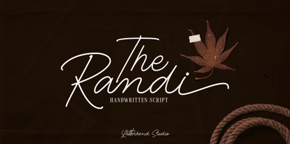 Introducing, The Randi - A monoline handwritten script with classy look. This type of font perfectly made to be applied especially in logo, and the other various formal forms such as invitations, labels, logos, magazines, books, greeting / wedding cards, packaging, fashion, make up, stationery, novels, labels or any type of advertising purpose. Features : uppercase & lowercase numbers and punctuation multilingual swash and ligature alternates PUA encoded We highly recommend using a program that supports OpenType features and Glyphs panels like many of Adobe apps and Corel Draw, so you can see and access all Glyph variations. How to access opentype feature : letterhend.com/tutorials/using-opentype-feature-in-any-software/ Email us to letterhend@gmail.com if you need something! Happy Designing!
 - Rare Bird Specimen VI by Rare Bird Font Foundry,
$200.00 Specimen VI is a refined hand by artist Aileen Fretz of Plume Calligraphy: thoroughly modern yet absolutely timeless. We have our sights set on this one becoming an instant classic. OBSERVATIONS Specimen VI takes its inspiration from the old world, while remaining thoroughly contemporary. It is unique while maintaining legibility. DEFINING CHARACTERISTICS At 2,580 characters, we dare say it is one of the most robust script fonts on the market today. The font includes extensive Opentype programming that authentically replicates Aileen’s unique handwriting pattern. As you type, watch the letters automatically adjust between connected and disconnected forms. Specimen VI also features formal titles, prepositions, social media wordart, and web navigation wordart, serif and sans serif Roman numerals, in and out-stroked letterforms at beginning and end of words, multiple alternate lowercase t cross-strokes, realistic double-letter ligatures, seamlessly connecting calligraphic letters, multiple styles of alternate capital letters, including swashes, and basic Latin encoding. Specimen VI is a typesetters’ dream. POTENTIAL SIGHTINGS In the pages of your favorite wedding tome; the signage, robe embroidery, and dinner menus of that coveted boutique hotel on the Italian Riviera, the labels of an artisanal hand-poured candle line, your new favorite Rosé, hand-crafted Belgium chocolate truffles, the indie cosmetic line fit for royalty, in any instance that you may be in need of a refined modern script.
 - Parisi by Eurotypo,
$34.00 The Parisii was a small Gallic people settled in the current Paris region, which gave its name to the city of Paris. According to Caesar (53 BC.), their main town (oppidum) was Lutetia (Paris). Parisii was born of inspiration to be leafing through some old magazines on the terrace of a cafe in the beautiful city that is Paris. Parisi is like the city: casual, youth, romantic, free spirited and, at the same time, sophisticated, elegant and classic. The Parisi family font is a lovely and casual handlettering script, which is based on gestual calligraphy. Parisi has a slight bounce and intentional irregularity giving your words a wonderful flow. Fat and thin stroke in this font impresses the harmony. Parisi consists of 3 subfamilies: Regular, Italic and Condensed. This font includes Parisi font has OpenType features such as Stylistics and Contextual alternates, swashes, Standard and Discretional Ligatures, stylistic sets and ornaments that allow you to mix and match pairs of letters to fit your design. This will help your creativity and make it easier to make the impressive and elegant typographic work. This OpenType features may only be accessible via OpenType-aware applications, a Central European language support. Parisi looks lovely on wedding invitations, greeting cards, logos, business-cards and is perfect for using in ink or watercolour based designs, fashion, magazines, food packaging and menus, book covers and more!
 - Nexa Slab by Fontfabric,
$35.00 Nexa Slab is a geometric slab serif font whose design is based on the already popular best-seller Nexa . The font family contains 3 basic forms: italics, obliques and uprights, each of which has 8 different weights. This visual richness makes it the ideal slab serif font family for the web as well as for print, for motion graphics, logos, t-shirts and so on. It is also great for headings, fitting nicely with both small and large typesetting text blocks. Nexa Slab draws from the rich traditions of the classic Neo-Grotesque slab serif fonts such as Lubalin Graph, Rockwell and Memphis, which conceal the richness of typesetting text in its crucial advertising function. Just like these fonts, it’s design is subject to rational, carefully thought-out, thick and thin bars with a low contrast between them. The letters are characterized by the strict geometry and square proportions of the original, extra-fortified by suitably balanced slab serifs. Nexa Slab is serious without being rigid and inflexible, finished and lacking in nothing, systematic without being monotonous, and though it may seem at first glance to be more suitable for short, direct messages; in the hands of a master designer... it can build and create exquisite and harmonic designs. Open Type Features: Lining figures (proportional and tabular) The “f” ligature set Alternate characters (a, g, y) Automatic fractions Automatic numerators Automatic denomerators Automatic subscript and superscript Automatic ordinals Extended language support (most Latin-based scripts supported)*
 - Patihan Variable by Jehoo Creative,
$119.00 Introducing Patihan Variable, a variant that makes it easy for you to access fonts with sharp, strong, bold characters. Patihan Variable is a combination of three different styles – Sans, Slab, and Serif – which are united into 2 Axes weight axes and serif axes, where weight axes have instances: Thin, Extra Light, Light, Regular, Medium, Semibold, Bold , Extrabold, and Black. This font has beautiful Ligature and Stylistic Alternate settings, Patihan font is also equipped with the Smallcaps feature which gives more control over typography, allowing you to create elegant and unique typography. The sans version of this typeface is versatile and easy to read, with a minimalist but impactful aesthetic. The Slab version is characterized by its solid and powerful strokes, while the Serif style has that extra classic flair with elegant curves and a stark contrast to the look. Patihan Variable is optimized to make it easier to access each variation, all you have to do is slide the slide in the software, and then you can access the style you want. Without sacrificing easy readability, this makes it a great choice for headlines, titles, and any long-form content. Ligature settings and discretionary styling add an extra layer of sophistication, making this font a great choice for magazines, branding and advertising. Overall, this font is a great choice for those looking to make a lasting impression. Its versatility, readability and unique features make it an excellent choice for any project.
 - Charpentier Sans Pro by Ingo,
$41.00 A humanistic sans serif The first version of this font was created in 1994 within the framework of the bid placed by the city of Graz to become the location for the Winter Olympics in 2006. Appropriately, its original name was ”Olympia.“ The font is intended to embody classic ideals as well as to meet modern demands. The proportions of Charpentier Sans are directly derived from Roman capitals and the humanistic book-face. The contrast between strokes and thin strokes is based on medieval uncial script. And thus, a modern serif sans was created emphasizing thick and thin strokes together. Thanks to its traditional form language, Charpentier Sans is very legible, adapts to various forms of content and expresses a kind of calmness and certainty. Details resulting from writing with the quill guarantee that the font doesn’t appear too rough and unemotional. Even the tiny, pointed mini serifs contribute to the unmistakable appearance of the font. They create an exciting contrast to the soft flowing forms of the letters and are, to a great extent, conducive to the legibility. Consequently Charpentier Sans always appears with an extremely sharp and clear outline. Charpentier Sans Italique has an even more distinct ductus derived from writing. Especially the rounded forms from a, e, f, g and y reflect the handwritten humanistic cursive. Charpentier Sans is comprised of many ligatures, including discretional ones, plus proportional medieval and capital figures for the normal type as well as disproportional tabular figures with a consistent width. Above and beyond the ”normal“ Latin typeface system, small caps are available as an especially elegant form of distinction.
 - Generic by More Etc,
$15.00 The Generic Typeface Collection is a series of sans-serif typefaces inspired by the craftsmanship of graphic design, typesetting, and printing in the analogue era – before Adobe, Macintosh computers and desktop publishing – when dinosaurs ruled the earth. With the use of various typesetting apparatuses or dry transfer type, photo copiers, and shooting layouts and paste-ups to film, the printed results was not as exact, precise and predictable as it is today. When examining old prints, it is difficult not to like the way that characters in over- or underexposed film have a special type of vibe to them that is often sadly lost in today’s pursuit of total perfection. Encouraged by this, I saw a need for a collection of typefaces that are non-clinical and non-conformist, and some that are coarse, rough and distorted – errors that might come from poor exposure when put on film, enlargements from small point texts, or maybe quality loss from successive generations of photocopies. Or all of the above. This is an attempt to incorporate spirit and personality into a set of typefaces without losing distinction. You might call it a homage to non-perfection. I call it human. The Generic Typeface Collection consists of 11 fonts divided into four series. The three standard series – the Formal Release series, the Coarse Copy series, and the Rough Display series – all contain three fonts each. The Extra Splendor series contains a couple of shadow fonts for that little extra sparkle. Formal Release – Handcrafted & Clean The Formal Release series features sans-serif typefaces for everyday use. They are handcrafted and clean, human and uncomplicated. The Formal Release series contains three typefaces that add tons of personality to any text. G10 FR ‘Slim’ – a slightly under-exposed and clean typeface in a regular weight (228 glyphs - 1 alternate) G20 FR ‘Classic’ – a properly exposed clean typeface in a bold weight (228 glyphs - 1 alternate) G30 FR ‘Bulky’ – a heavily over-exposed clean typeface in an ultra weight (228 glyphs - 1 alternate) Coarse Copy – Dirty & Rough The Coarse Copy series features non-conformist typefaces that are worn and rough, maybe after going through that bad copier a few times too much. The Coarse Copy series contains three sans-serif typefaces that add tons of spirit to any text without compromising too much on legibility. Try them on in poster-sizes and everyone will know that you mean business. G40 CC ‘Slender’ – an under-exposed coarse typeface in a regular weight (228 glyphs - 1 alternate) G50 CC ‘Typic’ – a properly exposed coarse typeface in a bold weight (228 glyphs - 1 alternate) G60 CC ‘Huge’ – a heavily over-exposed coarse typeface in an ultra weight (228 glyphs - 1 alternate) Rough Display – Faded & Decorative The Rough Display series features attention-seeking decorative typefaces in three feature-packed fonts. Faded and gritty like the image distortion and degradation from successive generations of photocopies, they are eye-catching typefaces intended to stand out in bigger point sizes. Use these typefaces for signage, headlines and similar situations were a strong typographic statement is desired. We have packed no less than 1,334 alternate characters and 212 discretionary ligatures into this series for a greater chance of not having characters that look exactly the same more than once. G70 RD ‘Slinky’ – an under-exposed rough and decorative typeface in a regular weight (741 glyphs – 448 alternates – 66 discretionary ligatures) G80 RD ‘Standard’ – a properly-exposed rough and decorative typeface in a bold weight (748 glyphs – 448 alternates – 73 discretionary ligatures) G90 RD ‘Swollen’ – a heavily over-exposed rough and decorative typeface in an ultra weight (748 glyphs – 448 alternates – 73 discretionary ligatures) Extra Splendor – Sparkling & Extraordinary The Extra Splendor series features two shadow typefaces for that little extra sparkle. One clean shadow to be used with G20 FR ‘Classic’, and one rough shadow to be used with G80 RD ‘Standard’. Having the shadows separate from the main typeface adds another layer of expressiveness in that you can try out color combinations for that extra splendor. Tips for matching (applies to both the base font and the shadow font): Set the kerning to Metric, not optical. Increase tracking to accommodate for the shadows extra width. G25 ES ‘Classic Shadow’ – a clean shadow to be used with G20 FR ‘Classic’ (228 glyphs – 1 alternate) G85 ES ‘Standard Shadow’ – a rough shadow to be used with 80 RD ‘Standard’ (227 glyphs) OpenType features – alternate characters and discretionary ligatures – can be accessed by using OpenType friendly professional design applications, such as Adobe Illustrator, Adobe InDesign, and Adobe Photoshop.
 - Axios Pro by TipoType,
$24.00 In Axios Pro the rational language of the early XX century geometric sanserifs is complemented with an structure deeply attached to the renaissance typefaces; the uppercase proportions proceed form the roman canon while its lowercase was constructed following the humanist ductus. This blend produce a typeface of modern, clean and contemporary appearance that has implicit on its core a classic vibe, nourishing the text with a timeless elegance.In use, the form and function balance of its design allow it freely travel through a diverse range of fields and possibilities like short text settings, brands, headlines or signage systems with grace and naturality. Axios Pro is available in variable font format and in 20 different individual styles (10 weights), with a set of more than 1000 glyphs per style, supports over 200 latin languages and including an extensive repertoire of opentype features like small caps, ligatures, stylistic alternates, proportional and tabular figures, swashes, borders and many other resources to please your typographic urges. Designed by Rodrigo López Fuentes & Sergio Leiva Whittle
 - Sivana by Muflihin Nurhabib,
$18.00 Introducing Sivana: An elegant and modern serif typeface. With its modern and minimalist appearance, CAKELAN brings a luxurious and clean style to your projects such as websites, modern logos, branding identities, social media quotes, wedding stationery, and various other needs! Sivana displays the capital letters A to Z which are unique and classy, of course because they are made with great care so that they become beautiful fonts and can be adapted to various large projects that you want.
 - Millesa by Muflihin Nurhabib,
$18.00 Introducing Millesa: An elegant and modern serif typeface. With its modern and elegant appearance, Millesa brings a luxurious and clean style to your projects such as websites, modern logos, branding identities, social media quotes, wedding stationery and various other needs! Millesa displays capital letters A to Z which are unique and classy, of course because they are made with great care so that they become beautiful fonts and can be adapted to various large projects that you want.
 - Glastone by Craft Supply Co,
$15.00 Glastone is a modern serif typeface that seamlessly blends beauty and a feminine touch, infusing a sense of class and contemporary sophistication. Its graceful lines and modern aesthetic make it the perfect choice for projects seeking a balance of elegance and modernity. This typeface is ideal for greeting card, packaging, brand identity, poster, or any purpose to make your design project look eye catching and trendy. Feel free to play with this typeface!
 - Gamilia by Craft Supply Co,
$15.00 Presenting Gamilia: A stylish serif font that exudes elegance and sophistication. With its refined lines and contemporary charm, Gamilia adds a touch of class to your projects. Elevate your designs with Gamilia's timeless style, perfect for capturing attention with a dash of refinement. This typeface is ideal for greeting card, packaging, brand identity, poster, or any purpose to make your design project look eye catching and trendy. Feel free to play with this typeface!
 - Avengars by Mevstory Studio,
$20.00 Avengars is a modern and chic typeface, best used as a display for headings, logos, branding, magazines, product packaging and invitations. Avengarscome with clean lines and smooth curves give any project an extra touch of class. If there's anything else you are unsure of feel free to pop me a message :) That's it! Have fun using Avengars Typeface!!! Feel free to follow, like and share. Thanks so much for checking out my shop!