10,000 search results
(0.026 seconds)
- Glyphic Neue by Typeco,
$29.00Glyphic Neue was inspired by the Op Art style of lettering in the United States that ran rampant in many photo type houses in the 1960's and 1970's. The Glyphic Series from the Franklin Photolettering group was an influence and spring board for this family of fonts, hence it's name. But Glyphic Neue departs from its unicase Franklin influence in several ways. Firstly the designer created both upper and lower case forms. The lowercase has been designed with barley protruding ascenders and descenders and with an x-height equivalent to the cap height, so that upper and lower can be exchanged indiscriminately for a quirky effect. Some of the letters take a cue from the original Glyphic series but many have been redesigned entirely to fit the designers vision. The italic forms differ enough from the upright version making it almost an entirely different display alphabet. Glyphic Neue is a versatile family of 6 fonts -- 3 widths, each with an accompanying italic that look equally at home when used on a party flier or a sports team visual identity. - Precious Sans Two by G-Type,
$60.00 Precious Sans Two is a complete reworking of the 2002 design which was only ever available in PostScript format. Over a decade later G-Type’s Nick Cooke decided to re-appraise the typeface, scrutinise the old letterforms and overhaul the family. Make no mistake though, Precious Sans Two is no rudimentary re-release; nearly every character has been redrawn, re-proportioned, respaced and improved. Precious Sans Two is now in cross-platform compatible OpenType format with extended Latin language support for Western & Central Europe, the Baltics & Turkey. The original quirkier glyphs (f, g, I) have been retained as an OT style set feature and the typeface now contains small caps and an extensive set of discretionary ligatures as well as both proportional & tabular figures. The character set is further enhanced with the addition of 20 directional single and double arrows in each of the six weights which range from Thin through to Black, all with accompanying italics. Precious Sans Two is a distinctively modern typeface, well equipped for advanced typographic use in print, web and digital publishing environments.
 - Pacific Clipper SG by Spiece Graphics,
$39.00 Pacific Clipper has its roots in an old 1930s showcard lettering style. An extra bold version of this sign painter’s relic is shown in Carl Holmes' wonderful book on lettering. It may be described as what happens when Rudolf Koch's Kabel Heavy meets ATF's Novel Gothic. Also known as Sam’s Tune, Pacific Clipper’s noteworthy features include wedged crossbars in the capital A, E, F, and H. Overcurving is present in the capital B, D, P, and R while vertical strokes in the lowercase b, d, h, k, l, and t are chopped off obliquely. Figures in Pacific Clipper are also refreshingly different, particularly the number 4. This lettering favorite turned retro typeface has been extended to include a variety of weights. Pacific Clipper is now available in the OpenType format. Some new characters have been added to this OpenType version as Stylistic Alternates and Historical Forms. These advanced features work in current versions of Adobe Creative Suite InDesign, Creative Suite Illustrator, and Quark XPress. Check for OpenType advanced feature support in other applications as it gradually becomes available with upgrades.
 - Rodley by Fettle Foundry,
$10.00 Rodley is a geometric sans-serif typeface and a ground-up redrawing of Bairne – the first ever typeface from Fettle Foundry – with a completely new character set that closer resembles the original vision for the typeface. The changes are so substantial that Rodley has taken on a life of its own, becoming a brand new typeface. Inspired by low-contrast Swiss and Modernist grotesque typefaces, with the addition of characterful geometric shapes, Rodley aims to be a more disruptive choice for brands, while retaining the appeal of those popular styles. Based upon a Latin S character set with additional glyphs, Rodley supports many latin-based languages, with a focus on pan-European and South American languages. Thorough kerning has been applied to uppercase/lowercase, uppercase/uppercase, lowercase/lowercase and CamelCase character combinations, with thorough attention paid to an incredibly large number of diacritical combinations. Available in 5 weights, from thin to bold, with matching italics, Rodley has been designed with a wide range of uses and sizes in mind.
 - Ronnia by TypeTogether,
$45.00 One of the most remarkable characteristic of this humanistic sans serif is its versatility. Ronnia’s personality performs admirably in headlines, but is diffident enough for continuous text and small text alike. The heavier weights deliver very cohesive shapes, and they have been successfully used for branding and newspaper headlines. Its ten styles grant the designer a broad range of coherent color and texture variations in text blocks, necessary tools to solve complex information and editorial design problems. Ronnia has been mainly engineered for newspaper and magazine applications manifested in its properties: economic in use, highly legible, and approaching the reader with some friendliness and charm. Ronnia features about 800 characters per weight, including small caps, fractions, old style and lining numbers, scientific superior/inferior figures, and a set of symbols and arrows. It supports over 40 languages that use the Latin extended alphabet. Ronnia Basic is a reduced version of Ronnia. It is still an OT-font but without any particular features except of a set of ligatures, class-kerning and language support including CE and Baltic.
 - Ongunkan Sweden Dalecarlian Run by Runic World Tamgacı,
$50.00 The Dalecarlian runes, or dalrunes, was a late version of the runic script that was in use in the Swedish province of Dalarna until the 20th century.The province has consequently been called the "last stronghold of the Germanic script. When Carl Linnaeus visited Älvdalen in Dalarna in 1734, he made the following note in his diary: The peasants in the community here, apart from using rune staves, still today write their names and ownership marks with runic letters, as is seen on walls, corner stones, bowls, etc. Which one does not know to be still continued anywhere else in Sweden. The Dalecarlian runes were derived from the medieval runes, but the runic letters were combined with Latin ones, and Latin letters would progressively replace the runes. At the end of the 16th century, the Dalecarlian runic inventory was almost exclusively runic, but during the following centuries more and more individual runes were replaced with Latin characters. In its last stage almost every rune had been replaced with a Latin letter, or with special versions that were influenced by Latin characters.
 - PF Isotext Pro by Parachute,
$79.00 This typeface is based on ISO 3098, a technical documentation issued in 1974 by ISO (International Organization for Standardization), which proposed a set of characters for use on technical drawings and associated documents. Isotext is based on the original standards but is completely redesigned to fit typographic requirements. This new ‘Pro’ version is further improved and now comes with a complete set of redesigned true-italics. Furthermore, the width of the glyphs has increased in order to establish a more balanced and readable text. The result is a contemporary font which works well in small sentences as well as long texts. Isotext Pro is loaded with all the good stuff a designer needs to create documents with attitude. It supports 19 special OpenType features like small caps, fractions, ordinals, etc. and offers multilingual support for all European languages including Greek and Cyrillic. Finally, every font in this family has been completed with 270 copyright-free symbols, some of which have been proposed by several international organizations for packaging, public areas, environment, transportation, computers, fabric care and urban life.
 - Bebas Neue Pro by Dharma Type,
$14.99 Thank you for waiting. Finally, Bebas Neue has got lowercases! Bebas Neue is a world wide, the most popular font family with all caps released in 2010. Bebas Neue has been used from by big companies to by startup designers for many projects. In spite of the fact that Bebas Neue has only Uppercases, it became very popular font for these 10 years. At the same time, we received many requests for adding lowercases. To be honest, we had been developing whole new Bebas Neue with lowercases secretly for long time. Thinner Uppercase from thin to regular weights were redesigned for Pro. New lowercases were designed to match the Uppercases very carefully. You can access Tabular figures by using OpenType tnum features. Almost all European languages are supported by Pro. One more big thing is... Bebas Neue Pro has Italics! Please don't use sloped Bebas Neue. Pro has proper Italics! Bebas Neue “Pro” can extend your possibilities. Be the first to use this professional and premium Bebas Neue!
 - Stack by James Todd,
$40.00 Stack brings the spirit of industrial chimney lettering from the early twentieth century to the digital age. The typeface is designed to work both horizontally and vertically. Additionally, the fonts can work together in myriad chromatic expressions—providing limitless design possibilities. The family is true to the spirit of masonry lettering without being a direct lift of any specific lettering style from the industrial age. Like some of its masonry predecessors Stack is built as a typeface of 15 courses (horizontal rows) of ‘bricks.’ Based on several years of research a collection of 150+ photographs and roughly two dozen archival engineering drawings were amassed. The value of the historical references is a type family that is a legitimate reflection of masonry lettering styles of the period. In updating Stack for the digital age, the proportions of the base-unit ‘bricks’ and the thickness of ‘mortar’ joints have been optically adjusted to work in both screen-based and print media. Stack would not have been possible without the research and design input from Craig Welsh and Jenna Flickinger of GoWelsh.
 - FF Kaytek Headline by FontFont,
$50.99 Kaytek™ Headline completes the Kaytek typeface family with seven weights optimized for display purposes. Like the Kaytek Sans it is a fresh take on the correspondence typefaces of the 90s - which were originally designed for the demands of office environments. Just like its predecessors, this text typeface is robust and hard-working - meaning it works well in challenging design or printing environments - but it’s not without personality. Look closer at the lowercase g and a, especially in the italic, and you can see some unexpected elements of subversiveness within the design Every style of the typeface takes up exactly the same amount of space, thanks to the careful creation by Radek Lukasiewicz. This means designers can switch between styles without the text being reflowed, making it particularly useful in magazines, where space might be limited, and also on the internet, where hover links appear in a different style Kaytek Headline comes in seven weights, from Thin to ExtraBlack. Kaytek Sans, Kaytek Slab, and Kaytek Rounded, are also available.
 - Hinnual by Jipatype,
$27.00 Hinnual เป็นฟอนต์ที่ผสมผสานระหว่างรูปทรงสี่เหลี่ยมและทรงกลมเพื่อสร้างสไตล์ที่ไม่เหมือนใคร ชื่อมาจากคำไทย 2 คำ คือ Hin แปลว่า หิน และ Nual แปลว่า อ่อน ผสมผสานองค์ประกอบที่แข็งและอ่อนนี้สะท้อนให้เห็นในแบบอักษร ซึ่งมีเส้นที่สะอาดตาและเส้นคมซึ่งถูกทำให้อ่อนลงด้วยมุมโค้งมน ฟอนต์มีให้เลือกถึง 18 แบบ มีตัวเลือกหลากหลายให้คุณได้เลือกใช้ Hinnual เหมาะอย่างยิ่งสำหรับใช้ในพาดหัวและพาดหัวย่อย ซึ่งลักษณะที่โดดเด่นสามารถช่วยดึงดูดความสนใจของผู้อ่านได้ เส้นสายที่สะอาดตาและสไตล์ที่เป็นเอกลักษณ์ยังทำให้เป็นตัวเลือกที่ยอดเยี่ยมสำหรับแบรนด์ โลโก้ และงานออกแบบอื่นๆ ที่ต้องการภาพลักษณ์ที่น่าจดจำ โดยรวมแล้ว Hinnual เป็นฟอนต์อเนกประสงค์และสะดุดตาที่ผสมผสานองค์ประกอบทั้งความแข็งแกร่งและความนุ่มนวล การออกแบบที่เป็นเอกลักษณ์ทำให้เป็นตัวเลือกที่ยอดเยี่ยมสำหรับนักออกแบบที่ต้องการสร้างผลงานที่น่าจดจำ Hinnual is a font that combines the square and rounded shapes to create a unique visual style. Its name comes from two Thai words - Hin, which means stone, and Nual, which means soft. This juxtaposition of hard and soft elements is reflected in the font's design, which features clean, sharp lines softened by rounded corners. The font comes in 18 styles, providing a range of options for designers to choose from. Hinnual is particularly well-suited for use in headlines and sub-headlines, where its bold and distinctive appearance can help to grab the reader's attention. Its clean lines and unique style also make it a great choice for branding projects, logos, and other design elements that require a memorable. Overall, Hinnual is a versatile and eye-catching font that combines elements of both strength and softness. Its unique design make it an excellent choice for designers looking to create impactful visual content.
 - Love Story by Latinotype,
$29.00 Love story is a display hairline typeface for use in big sizes and short texts. It’s inspired by different kinds of love and specially designed for Valentine’s day. Its soft curves and sweet style give it a lovely personality. Designed by Luciano Vergara and his wife Guisela Mendoza who has been studying ornaments since 2007 and has done her best for each project. You can see in her dingbats specially Printa and Abel designed for generate patterns. Now she integrated her passion to the ornament in a clean set which includes dingbats, ornaments and patterns. Luciano Vergara has designed very strong fonts with a particular work in the lines study and close to the geometry since 2005, getting a structure style, you can see in his fonts specially Regia and Kahlo. Now he integrated his study of lines, in a hairline font delicate, continuous and beautiful. In this story both designers have been merged their worlds creating a gorgeous product. This is a romantic type story, a love story.
 - Mingo Gothic SG by Spiece Graphics,
$39.00 This typeface appears to be straight out of a science fiction movie thriller. Mingo is a slightly condensed, somewhat vain gothic with thick vertical strokes proudly tapering downward. Capitals which are normally completely round are now square inside with curving outside corners. Lowercase letters carry the same design traits. And, in the capital A and H, crossbars extend on both sides helping give the face a pronounced retro look. Mingo Gothic is a close cousin to Raleigh Gothic and is an excellent choice for book covers and large display settings. Small caps, fractions, and alternate characters have also been developed for greater layout versatility. Mingo Gothic Bold is now available in the OpenType format. Some new characters have been added to this OpenType version as stylistic alternates, historical forms, small caps, oldstyle figures, ornaments, and f-ligatures. These advanced features work in current versions of Adobe Creative Suite InDesign, Creative Suite Illustrator, and Quark XPress. Check for OpenType advanced feature support in other applications as it gradually becomes available with upgrades.
 - Backstroke by Eclectotype,
$50.00 Normal and upright italic script fonts line a well-trodden path; left-leaning fonts (or "rightalics" as they're confusingly called), on the other hand, are a rarity. Here at Eclectotype Fonts we don't like to do things too conventionally, so here's Backstroke, a laid back script with a unique voice. With contextual alternates for start and end forms of certain characters, swash versions of L, Q and Z (surely the most used initial caps!), and a handful of stylistic sets, Backstroke is a restrained script. Stylistic sets are: 1. the start forms of i, j, m, n, and p are used always instead of only at word starts. 2. lower case ascenders get a whole lot loopier. 3. alternate versions of G, N and Y. 4. swash L, Q and Z. 5. swaps the default Polish script lslash for a more familiar version While fonts that lean the wrong way may be a bit more difficult to fit into your layouts than boring old regular italics, they will reward you with their individuality. Why not give it a go?
 - Garota Sans SC - Personal use only

- Swissa Piccola by Jeremia Adatte,
$30.00 The Swiss typewriters were famous for their unique precision. As complex digitalizations and macro shots were a start for the inspiration and studies, each character has been carefully re-crafted from the ultra high def scans of the printouts made on a special bleed-proof paper. Today’s characters such as @, euro sign and most of accents have been crafted according the original alphabet design. The idea was to digitize and keep a saving of the original typewriter including all its functions (e.g. underlining key) . It’s surprisingly very legible at small sizes. Thanks to an x-height tighter and more spaced, a glyph design less detailed and more neutral/simple than other fonts found on american or italian typewriters. The final artwork can be set at very large sizes due to the highly detailed glyph design. Swissa Piccola Regular is loaded with more than 150 glyphs created with the typewriter to avoid letter repetition in a word. This OpenType feature can be accessed through the 'discretionary ligatures' option. Plus it comes with two stylistic sets : one with an original underlining feature, another with a slashed-x feature. In which all characters are unique and also have been originally typed with the typewriter. It contains more 600 glyphs in total. The two features are separated in another two fonts (Swissa Piccola Slashed x and Underlined) in case a non OT-savvy app is used. If you wish to obtain exactly the same prints as the original Swissa Piccola typewriter, you should set your font at 11.3 pt and 19.5 pt of line spacing. The Swissa Piccola font was originally offered in a dedicated limited edition packaging.
 - Bridle Path by Cititype,
$19.00 ‘Bridle Path’ is a captivating font that embodies the graceful beauty of natural ink strokes. With its unique blend of thick and light strokes, it exudes a tranquil and soulful writing style that is both relaxed and inviting. The font's distinctive character makes it an excellent choice for various applications, including brands, logos, photography logo watermarks, headers, titles, weddings, cards, and website banners. The fluidity of Bridle Path’s design creates an enchanting visual experience, as if each letter was crafted by an artist's brush. The thick strokes provide a sense of boldness and strength, while the light strokes add delicacy and elegance to the overall appearance. This combination results in a font that captures attention and leaves a lasting impression. Bridle Path’s versatility extends beyond its aesthetic appeal. It has been meticulously crafted to support multilanguage usage, ensuring that it can seamlessly adapt to various linguistic needs. Whether your content is in English, Spanish, French, German, or any other language, Bridle Path will faithfully represent your words with clarity and beauty. Whether you're seeking a font that embodies a serene atmosphere or one that adds a touch of sophistication, Bridle Path is the perfect choice. Its soothing and expressive nature elevates any design, making it a valuable asset for both professional and personal projects. Embrace the allure of ‘Bridle Path’ and bring a sense of natural elegance to your creations.
 - In Love With Rome by SilverStag,
$19.00 I am so happy to introduce my brand new handwritten font that exudes chic elegance like no other - meet In Love With Rome Script. Every single letter has been lovingly crafted by hand, resulting in a stunningly unique typeface that's perfect for anyone looking to add a touch of sophistication to their designs. With 274 alternate letters and ligatures, you'll have all the tools you need to create truly one-of-a-kind pieces. But what sets this font apart isn't just its beauty - it's also incredibly versatile. Whether you're working on a wedding invitation, a branding project, or simply adding some flair to your social media posts, this font is the perfect choice. It's feminine, cool, and it strikes the perfect balance between modern and classic. So if you're looking for a font that's as beautiful as it is functional, look no further! In Love With Rome Script Font Includes: Over 274 Ligatures and Alternates Full Language Support Lowercase and Uppercase letters Numerals & Punctuation Web Font Kit is Included as Well NOTE: Ligatures are supported in most desktop programs including Photoshop, Illustrator, InDesign, Word, Pages & Keynote. Most of them will have this option automatically switched on. If you're using Canva, ligatures are not supported out of the box, however, I have included detailed instructions on how you can use them for your designs as well! Happy creating everyone!
 - Tolyer by Typesketchbook,
$25.00 Tolyer font is an extra large super family of 50 fonts! In many cases quantity doesn’t mean quality but here we have such a big abundance of contrast, styles, weights and special effects in one place that it actually doesn’t pay attention to the fact this is an all caps family. When it comes to strong headlines, titles, posters, masculine brand names Tolyer type family is probably one of the best choices in sans serif typography. You could easily pick from low to high contrast outlines, uprights and obliques, 3D effects or different artistic textured styles to make your work diverse, expressive and attractive. Tolyer font offers you maximum readability even in poor display conditions like low quality printing or low resolution monitors. In some cases poor print quality could even add more value to the final result, because Tolyer has a lot of potential to be used in difficult conditions. Letterpress and high embossing are one of those print effects that really suit Tolyer best. Use it in high contrast with background environment, higher ink flow, don’t think about the dot gain and you should definitely use a textured paper – this is what Tolyer really likes and deserves. It will thank you for this with authentic look, classic vintage style and strong but attractive presence.
 - Elanor by Dirtyline Studio,
$25.00 Elanor is a serif typeface inspired by Retro ’70s fonts mixed with Experimental touches. Its main features are a diagonal stress and soft curved teardrop shape terminals. It has ligatures that make it more elegant and grotesque elements that give it a modern look and make it more versatile.This typeface both impressive at display sizes and easily readable in text size, while the sharp shapes of the triangular serifs and the distinctive letter shapes show their strength in logo design and impressive editorial use. Elanor come with elegant style, Retro and contrasts, with features an extended latin character set of 555 glyphs covering over 94 languages, Latin & Cyrillic. Elanor is ready to making your projects looking classic but contemporary, finely tuned but assertive, and elegant as the best retro design. 94 languages : Afrikaans, Albanian, Asu, Basque, Belarusian, Bemba, Bena, Bosnian, Bulgarian, Catalan, Chiga, Colognian, Cornish, Croatian, Czech, Danish, Embu, English, Esperanto, Estonian, Filipino, Finnish, French, Friulian, Galician, German, Gusii, Hungarian, Indonesian, Irish, Italian, Kabuverdianu, Kalaallisut, Kalenjin, Kamba, Kikuyu, Kinyarwanda, Latvian, Lithuanian, Low German, Lower Sorbian, Luo, Luxembourgish, Luyia, Macedonian, Machame, Makhuwa-Meetto, Makonde, Malagasy, Malay, Maltese, Manx, Meru, Morisyen, North Ndebele, Norwegian Bokmål, Norwegian Nynorsk, Nyankole, Oromo, Polish, Portuguese, Romanian, Romansh, Rombo, Rundi, Russian, Rwa, Samburu, Sango, Sangu, Scottish Gaelic, Sena, Serbian, Shambala, Shona, Slovak, Slovenian, Soga, Somali, Spanish, Swahili, Swedish, Swiss German, Taita, Teso, Turkmen, Upper Sorbian, Vunjo, Walser, Zulu
 - Times Europa Office by Linotype,
$50.99The Times Europa Office family is designed after the model of the original serif family produced by Walter Tracy and the Linotype Design Studio in 1974. A redesign of the classic Times New Roman typeface, Times Europa was created as its replacement for The Times of London newspaper. In contrast to Times New Roman, Times Europa has sturdier characters and more open counter spaces, which help maintain readability in rougher printing conditions. Times Europa drastically improved on the legibility of the bold and italic styles of Times New Roman. Overall, text set in Times Europa is easier to read, and quicker to digest. Akira Kobayashi, Linotype’s Type Director, brought Times Europa up to speed for the new millennium in 2006. Now optimized for office communication instead of newspaper design, Times Europa Office offers a familiar yet refreshingly new appearance for serif text. Because of The Times of London’s specific printing conditions in the early 1970s, Times Europa originally had some intentional errors built into its letterform design. These inconsistencies created an even image in newspaper text in the long run. However, these design elements bear no role on modern office communication and its needs. Kobayashi redrew these problem forms, eliminating them completely. Now Times Europa’s font weights appear clearer and easier to read than ever before. - Cyan by Wilton Foundry,
$29.00The design of Cyan was inspired by features found in classic Roman and styles like Trajan and Bodebeck. It shows the designer's personal preference for geometric Roman proportions while incorporating open centers (B,P,R) and compact serifs. Unlike Trajan, Cyan has lowercase characters in the regular version. The characters stay true to the same features as the capitals, resulting in an unusually distinctive style. The Regular Capitals version contains Roman numerals. Cyan's weight is similar to Trajan's but the horizontal strokes are slightly bolder resulting in better legibility for small sizes, especially for lowercase characters. There are many subtle details in Cyan that become more interesting in larger sizes, for instance the subtle curves in the serifs and the overall smoothness as a result of the mostly rounded angles. Cyan is a robust font that will exceed expectations in areas never explored before. The name is inspired by the Greek word cyan, meaning "blue". The color cyan can have many different variations. One definition is a color made by mixing equal amounts of green and blue light (it also is a pure spectral color). As such, cyan is the complement of red: cyan pigments absorb red light. Cyan is sometimes called blue-green or turquoise and often goes undistinguished from light blue. Obviously the Cyan family is a perfect companion to the Cyan Sans family. - Flintlock by CozyFonts,
$25.00 The Flintlock Font Family has a Bold personality. The 'Rough' version of the Flintlock Font has a hand-carved or hand-etched edge, carefully crafted for each of over 300 glyphs. Caps, lower case, all numbers, fractions, accents and European characters that work in over 70 languages. 'Classically Built with a Vintage Flair'. Vintage in the American West Tradition that might have been forged and implemented from the 1860s through the 1930s and consequently fresh again. Flintlock Rough can be envisioned on many things dated from 1860 to present day. The font is available in 3 basic weights as of this release date. There are other versions on the drawing board... Flintlock Rough works extremely well with Posters, Branding, Movie Titles, Invites, Stationary, Signage, Embroidery, Letterpress, Ads, Logos and anything that feels Industrial or Hand-Crafted, eg. Coffee, Breweries, Antiques, Woodcuts, Western Styles, Sports Styles, Holidays, Menus, and more. Flintlock Flat & Flintlock Flat Italic are the siblings to Flintlock Rough without the hand-carved edge but rather clean with slightly rounded corners and edges. Extremely Legible, Bold and best used in all the same application descriptions mentioned above and more, specifically contemporary uses and settings, eg. Sports, Titles, Branding, Headlines, Logos and more. Curiously the Flat & Italic versions of Flintlock work extremely well in 1960s and 1970s settings.
 - Beautiful Moonlight by Fargun Studio,
$14.00 Beautiful Moonlight is handwritten stylish copperplate calligraphy fonts, combines from copperplate to contemporary typeface with a dancing baseline, classic and elegant touch. Can be used for various purposes. such as headings, signature, logos, wedding invitation, t-shirt, letterhead, signage, lable, news, posters, badges etc.
 - Dusky Pub by Gleb Guralnyk,
$14.00 Introducing a vintage typeface named Dusky Pub. It's a layered font set made in classic western style. Bold shape with slab serifs makes it perfect for various labels and product designs. Wide range of languages support is available, including west european and cyrillic characters.
 - Savour Pro by profonts,
$51.99 Savour Pro's elegant, classic form has a calligraphic touch, almost a hand-written feel. The individual creation of the characters provide additional dynamics and vitality. Savour Pro comes with a complete set of upper case swashes as well as lining and old style figures.
 - M Dynasty PRC by Monotype HK,
$523.99 M Dynasty PRC is a handwritten style Simplified Chinese typeface. Handwritten font designs are derived directly from hand-drawn lettering or handwriting using analogue tools. Handwritten style Simplified Chinese fonts can include typefaces that reference or reinterpret traditional calligraphy, using classical exemplars by calligraphic masters.
 - Naori by Eotype,
$16.00 Naori is a stylish serif font characterized by contrast between thick and thin lines. This font has a serif style that features a modern-classic blend design. This font has alternate and ligature features that give you access to a unique collection of letters.
 - Celliqath by Letterena Studios,
$10.00 Proudly present Celliqath Typeface , created by Storytype, A serif modern and classic typeface that has own unique style & modern look. This typeface is perfect for an elegant & luxury logo, book or movie title design, fashion brand, magazine, clothes, lettering, quotes, and so much more.
 - Marisco by estudioCrop,
$19.90 Marisco is Portuguese for shellfish. The font arose from the forms of classic tattoo types, especially those of mid-twentieth-century sailors, but it also has something of a nineteenth-century poster type flavor to it. Its main application is display type and poster design.
 - Design Or Die by Type-Ø-Tones,
$40.00 Many people asked why we removed Design or Die of our collection. After years of hibernation in our vault, one of the sexiest italics of the Classic Type-Ø-Tones is back. New subtle changes for a definitive version of this Luis Mendo type.
 - Stockville JNL by Jeff Levine,
$29.00 Stockville JNL is a total rebuild of the wood type design originally found in Arvada JNL. All angular lines were straightened to give the lettering a more classic look. Bold, brash and block style, this headline typeface is available in both regular and oblique styles.
 - Rengkox by Twinletter,
$15.00 Introducing our newest Rengkox Blackletter font. This font can be used in a variety of projects to create a vintage and elegant style. Use to elevate visual projects, titles, or banners, packaging with a bold, classic look that exudes style, elegance, and strong personality.
 - Pen Moderne JNL by Jeff Levine,
$29.00 A classic example of Art Deco lettering made with a round nib ink pen was found within the pages of “Lettering” by Harry B. Wright (circa 1950). Now available as a digital type font, Pen Moderne JNL is available in both regular and oblique versions.
 - Mustafa Script by Fargun Studio,
$12.00 Mustafa Script is handwritten stylish copperplate calligraphy fonts, combines from copperplate to contemporary typeface with a dancing baseline, classic and elegant touch. Can be used for various purposes. such as headings, signature, logos, wedding invitation, t-shirt, letterhead, signage, lable, news, posters, badges etc.
 - Foria by Chromatype Studio,
$20.00 foria is a Neo-classic serif inspired by a combination of Baskerville and Bodoni with round corners to give a soft impression, looks feminine and classy so it is perfect for fashion, branding, menus, cooking, and female inspiration and is also suitable for neutral typography
 - MBF Typerisme by Moonbandit,
$16.00 Moonbandit proudly presents, Typerisme. The modern take on the typewriter font. This typeface is perfect for your old, retro, vintage distressed look without going overboard. Huge kerning to boost clarity. Use it for body text, headline, title, one liner, anything! this typeface is versatile.
 - Freshtea Healthy by ahweproject,
$14.00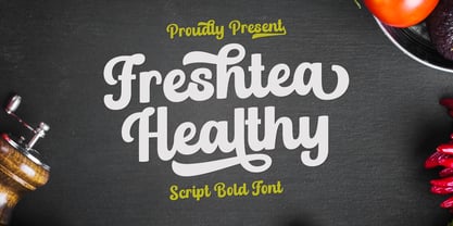 Freshtea Healthy feels equally charming and elegant. This stunning script font is a stylish homage to classic calligraphy. It will elevate a wide range of design projects to the highest level, be it branding, headings, wedding designs, invitations, signatures, logos, labels, and much more!
 - M Li HK by Monotype HK,
$523.99 M Li HK is a handwritten style Traditional Chinese typeface. Handwritten font designs are derived directly from hand-drawn lettering or handwriting using analogue tools. Handwritten style Traditional Chinese fonts can include typefaces that reference or reinterpret traditional calligraphy, using classical exemplars by calligraphic masters.
 - M Cute HK by Monotype HK,
$523.99 M Cute HK is a handwritten style Traditional Chinese typeface. Handwritten font designs are derived directly from hand-drawn lettering or handwriting using analogue tools. Handwritten style Traditional Chinese fonts can include typefaces that reference or reinterpret traditional calligraphy, using classical exemplars by calligraphic masters.
