3,118 search results
(0.027 seconds)
- Clarendon BT by Bitstream,
$50.99 The new Clarendon BT Pro typeface family features 450 glyphs in each font with expanded support for Central and Eastern European languages, and enhanced OpenType features including ligatures, diagonal fractions, superscript/subscripts and Case-Sensitive Forms. Clarendon BT is an updated revival of the square serif (also called Ionic or Egyptienne styles) with bracketed serifs, ball terminals and high xheights. These attributes give Clarendon BT a timeless appearance for a wide range of contemporary uses from websites, ads, publications and signage.
 - Engravers' Roman BT by Bitstream,
$29.99A set of capitals popular with American engravers and typefounders through the last third of the nineteenth century, shown under this name by ATF in 1903. - Clarendon by Linotype,
$29.99 The first slab serif fonts appeared at the beginning of industrialization in Great Britain in 1820. Clarendon and Ionic became the names for this new development in England, known as English Egyptienne elsewhere in Europe. Clarendon is also the name of a particular font of this style, which, thanks to its clear, objective and timeless forms, never lost its contemporary feel. In small point sizes Clarendon is still a legible font and in larger print, its individual style attracts attention.
 - Clarendon by URW Type Foundry,
$89.99 - Romance Roman JNL by Jeff Levine,
$29.00 The antique sheet music for the 1915 song "A Girl in Your Arms is Worth Two in Your Dreams" had its title hand lettered in a Roman typeface that reflected ever so slightly the Art Nouveau influences of the time. This design is now available as Romance Roman JNL, in both regular and oblique versions.
 - Roman by MacCampus,
$30.00Linotype Banjoman was designed by Paul Veres. Most of its basic forms are constructed although some characters, like the a, g, or p, are more freely designed. This font is available in a variety of weights and styles. The bold weights are best for headlines or emphasis in text and the balanced Text styles were designed specifically for running text. Linotype Banjoman is an independent yet well-mannered font suitable for a variety of purposes. - Monotype Clarendon by Monotype,
$40.99The first Clarendon was introduced in 1845 by R. Besley & Co, The Fan Street Foundry, as a general purpose bold for use in conjunction with other faces in works such as dictionaries. In some respects, Clarendon can be regarded as a refined version of the Egyptian style and as such can be used for text settings, although headline and display work is more usual. - Besley Clarendon by HiH,
$12.00 Besley Clarendon ML is our version of the Clarendon registered by Robert Besley and the Fann Street Foundry in 1845. Besley Clarendon ML represents a significant change from the slab-serif Antiques & Egyptians that had become so popular in the prior three decades. Like Caslon’s Ionic of 1844, it brackets the serifs and strongly differentiates between the thick and thin strokes. Besley Clarendon is also what today is considered a condensed face, as a comparison to the various contemporary Clarendons will show. Robert Besley’s Clarendon was so popular that many foundries quickly copied it, a fact that caused him to complain vigorously. The reason it was so widely copied is simple ó it was extremely useful. It provided the attention-getting boldness to highlight a word or phrase, yet at the same time was compact and easier to read than the fat faces and antiques of the period. It wasn't until sixty years later that the concept of a typeface family of different weights was developed with DeVinne and Cheltenham. Until then, Clarendon served as everyone’s all-purpose bold face. It can be used for ads, flyers, headers or even short text. Don't leave home without it. Besley Clarendon ML includes the following features: 1. Glyphs for the 1250 Central Europe, the 1252 Turkish and the 1257 Baltic Code Pages. Added glyphs to complete standard 1252 Western Europe Code Page. Special glyphs relocated and assigned Unicode codepoints, some in Private Use area. Total of 353 glyphs. 158 kerning pairs. 2. OpenType GSUB layout features: pnum, salt, liga, dlig, hist and ornm. 3. Inclusion of tabular (std) and proportional (opt) numbers. 4. Kreska-accented letters.
 - Craw Clarendon by Wooden Type Fonts,
$15.00 One of the many Clarendon font designs, this one based in part on the Craw Clarendon design.
 - Shenandoah Clarendon by Megami Studios,
$7.50 With a hint of flair and some nice update touches, Shenandoah Clarendon is a beautiful and modernized revival of the traditional Clarendon font. Adding new glyphs and measurements into the mix, it's sure to add a distinctive touch to your works!
 - Clarendon 617 by Wooden Type Fonts,
$20.00 One of the classic display types of the 19th century, an Egyptian with bracketed serifs. There are many variants of this face and its uses are many.
 - Clarendon Condensed by Wooden Type Fonts,
$15.00A revival of one of the popular wooden type fonts of the 19th century; suitable for text. - Clarendon SB by Scangraphic Digital Type Collection,
$26.00 Since the release of these fonts most typefaces in the Scangraphic Type Collection appear in two versions. One is designed specifically for headline typesetting (SH: Scangraphic Headline Types) and one specifically for text typesetting (SB Scangraphic Bodytypes). The most obvious differentiation can be found in the spacing. That of the Bodytypes is adjusted for readability. That of the Headline Types is decidedly more narrow in order to do justice to the requirements of headline typesetting. The kerning tables, as well, have been individualized for each of these type varieties. In addition to the adjustment of spacing, there are also adjustments in the design. For the Bodytypes, fine spaces were created which prevented the smear effect on acute angles in small typesizes. For a number of Bodytypes, hairlines and serifs were thickened or the whole typeface was adjusted to meet the optical requirements for setting type in small sizes. For the German lower-case diacritical marks, all Headline Types complements contain alternative integrated accents which allow the compact setting of lower-case headlines.
 - Clarendon SH by Scangraphic Digital Type Collection,
$26.00 Since the release of these fonts most typefaces in the Scangraphic Type Collection appear in two versions. One is designed specifically for headline typesetting (SH: Scangraphic Headline Types) and one specifically for text typesetting (SB Scangraphic Bodytypes). The most obvious differentiation can be found in the spacing. That of the Bodytypes is adjusted for readability. That of the Headline Types is decidedly more narrow in order to do justice to the requirements of headline typesetting. The kerning tables, as well, have been individualized for each of these type varieties. In addition to the adjustment of spacing, there are also adjustments in the design. For the Bodytypes, fine spaces were created which prevented the smear effect on acute angles in small typesizes. For a number of Bodytypes, hairlines and serifs were thickened or the whole typeface was adjusted to meet the optical requirements for setting type in small sizes. For the German lower-case diacritical marks, all Headline Types complements contain alternative integrated accents which allow the compact setting of lower-case headlines.
 - Clarendon Jordan by Wooden Type Fonts,
$25.00 Clarendon is the name of a slab-serif typeface that was released in 1845 by Thorowgood and Co. (or Thorowgood and Besley) of London, a letter foundry often known as the Fann Street Foundry. This current design is a somewhat condensed version of the font.
 - Clarendon LT by Linotype,
$40.99The first slab serif fonts appeared at the beginning of industrialization in Great Britain in 1820. Clarendon and Ionic became the names for this new development in England, known as English Egyptienne elsewhere in Europe. Clarendon is also the name of a particular font of this style, which, thanks to its clear, objective and timeless forms, never lost its contemporary feel. In small point sizes Clarendon is still a legible font and in larger print, its individual style attracts attention. - Clarendon 618 by Wooden Type Fonts,
$20.00 One of the classic Clarendon fonts, always useful, originally created in the 19th century.
 - French Clarendon by Wooden Type Fonts,
$20.00 French Clarendon Bold, a display text type.
 - Clarendon Heavy by Wooden Type Fonts,
$15.00A revival of one of the popular wooden type fonts of the 19th century, suitable for display. - Clarendon Extended by Wooden Type Fonts,
$15.00 A revival of one of the popular American Clarendon wooden types of the 19th century.
 - Clarendon Rough by Jeff Kahn,
$29.00 Clarendon Rough is suitable for display and text. Its large x-height provides excellent legibility at small point sizes. Clarendon Rough is extended, aged to perfection, iconic, rugged, distressed, direct, and suitable for packaging, restaurant use, websites, magazines, lively headlines.
 - Vernacular Clarendon by jpFonts,
$19.95 The Vernacular trilogy was designed by Swiss designer Hans-Jürg Hunziker, who had worked for Adrian Frutiger in Paris for many years. Based on the concept of a transitional Linear Antiqua, he has developed a colorful bouquet of typefaces that contain the entire spectrum of typefaces for book design and corporate identity. Thanks to his "Swiss school" and his outstanding skills, he has succeeded in giving the typefaces a particularly noble and sympathetic expression. In addition to the Sans family, there is a Serif family and a Clarendon family, each of which, including the separately drawn italics, is equipped with 12 font weights that are finely tuned to one another. Each of the 3 font styles develops its own character, but thanks to a concept that brings the different font styles closer together, they also work well together and complement each other perfectly. Sans and Clarendon have a vertical axis and similar endings in contrast to the Serif, which has a traditional diagonal axis and horizontal endings. The straight stems and the proportions are used as an element to stress the closeness of the typeface-trilogy. They thus share a comon feature. All fonts contain tabular and proportional figures as well as old style figures. Small caps and small cap figures are also available in all fonts. In addition, some fonts have alternative characters available via style set, such as «g», which can be used to further vary the typeface. Vernacular offers all the options for well-kept typesetting for print and web - for small and large orders.
 - Clarendon Semi by Wooden Type Fonts,
$15.00 One of the classic display types of the 19th century, an Egyptian with bracketed serifs. There are many variants of this face and its uses are many, this a modified version lacking the teardrop or ball terminals on a, c, f, g, j, r, f, y.
 - Clarendon Wide by Canada Type,
$24.95 By overwhelming popular demand, this is the wide display companion to Canada Type's Clarendon Text family. It comes in ten styles: regular, medium, bold, with small caps and oldstyle Figures counterparts, as well as stencil and sketch versions of the regular and the bold. All the fonts come equipped with superscripts/numerators, denominators, and scientific inferiors. The OpenType fonts also contain automatic fractions and class-based kerning. The Clarendon Wide fonts are available in all popular formats. Language support includes Western, Central and Eastern European character sets, as well as Baltic, Esperanto, Maltese, Turkish, and Celtic/Welsh languages.
 - CG Clarendon by Monotype,
$29.99The first Clarendon was introduced in 1845 by R. Besley & Co, The Fan Street Foundry, as a general purpose bold for use in conjunction with other faces in works such as dictionaries. In some respects, Clarendon can be regarded as a refined version of the Egyptian style and as such can be used for text settings, although headline and display work is more usual. - Clarendon Serial by SoftMaker,
$15.99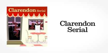
- Clarendon Paint by Open Window,
$19.95 Clarendon Paint offers a gritty twist on a classic font style (Clarendon). It was completely hand painted which makes the font an organic centerpiece to any of your grungy design applications.
 - CloisterBlack BT - Unknown license

- AmericanText BT - Unknown license

- Sloboda BT by Bitstream,
$50.99A calligrapher, graphic designer and teacher, Duško Trifunović of Belgrade created this handsome calligraphic typeface called Sloboda. It has an open design, an outline of sorts, and though the lowercase is small and compact, it sets beautifully in text. The generously sized uppercase has a swash flavor to it yet works harmoniously with itself. This OpenType font has extra ligatures and the extended character set supports Central Europe. - Covent BT by Bitstream,
$50.99Designed by Jochen Hasinger of Frankfurt, Germany, Covent BT is an unconventional geometric sans serif typeface, featuring rounded terminal ends and a stencil-like break of the contour in some glyphs. At first glance you might think of it as a display typeface, but the generous x-height and openness of the lowercase makes Covent BT very legible at text sizes. Central Europe and Cyrillic is supported in the extended glyph set. Each weight contains 485 glyphs and includes some alternate figures, some upper and lowercase alternates, as well as others, all accessible via OpenType features. Covent BT Symbols is a stylized geometric symbol font, intended to stand alone or used as a companion to the Covent BT typefaces. The array of glyphs covers many of the more popular icons of the day including symbols for web use, numbers, sports, travel and astrology, to name a few, each with its own unique stylized interpretation. - Roundhand BT by ParaType,
$30.00 Roundhand was created by Matthew Carter in 1966 on the basis of handwriting by Charles Snell, an English calligrapher of XVII-XVIII known in particular by his "The Pen-man's Treasury Open'd" written in 1694. The typeface has continuous cursive shapes with oval aspect, high contrast emphasized by abrupt transitions from thin to thick and regularity of slope. Its capitals are often used as initials in combinations with other typefaces. The current digital version of the typeface has 3 styles of different weights. Roundhand is clear and easy to read and is well-suited for medium size texts and headlines. It will work well in invitations, menus, packaging, and advertising accentuating elegance and the subtle nature of the content. The Cyrillic version was developed by Vladimir Yefimov and Isabella Chaeva. Released by ParaType in 2013.
 - Kloi BT by Bitstream,
$50.99Boris Mahovac has adapted a friend’s handwriting in this new font called Kloi (pronounced Chlo – ee). It has a very casual feel and includes alternative swash glyphs of some key characters as well as some extra ligatures. Taking advantage of the ligature and contextual swash features in OpenType, the alternate glyphs automatically replace the standard glyphs when appropriate, creating a very unique look. Available in PostScript OpenType format, Kloi’s extended glyph set covers the Western and Central European, Baltic and Turkish languages. - Roelandt BT by Bitstream,
$50.99Roelandt BT is another beautiful script font drawn by calligrapher Rob Leuschke. Perfect for informal invitations and documents, the standard semi-connecting glyphs are simple, yet elegant. An OpenType font, Roelandt also contains a set of Swash characters. Using the OT Swash feature to access these alternate glyphs, you can quickly transform your text into a stylish and more formal presentation complete with generously sized uppercase swashes. Basic and alternative glyphs in the font support Central Europe. - Missy BT by Bitstream,
$50.99 - Nevia BT by Bitstream,
$50.99Nevia BT is a four weight text family loaded with subtle design nuances. These OpenType Pro fonts support many OT features including smallcaps, oldstyle figures, contextual swashes, ornaments, discretionary ligatures, fractions and much more. The extended character set supports both Western European and Central European languages. - Stuyvesant BT by Bitstream,
$29.99Based on an engravers’ pattern plate, this outline form deriving from an English roundhand was fitted to linecasting matrices by Intertype about 1940. - Indoo BT by Bitstream,
$50.99Indoo is a modular geometric design that owes much to the typeface designs of Theo van Doesburg (1883-1931) and the De Stijl principles of abstraction, simplicity, clarity and harmony. That inspiration, combined with the lettering of signage often found in the Indian quarter of Paris, led to the connecting block letter motif of Indoo. The text fonts are joined by a common horizontal stroke positioned at the baseline. There is an accompanying Ornament font for building borders that includes various stylized fleurons and the like. Each font has a drop shadow companion that allows you to build three-dimensional and multi-colored lettering. - Carmina BT by Bitstream,
$29.99A personal calligraphic series commissioned by Bitstream from Gudrun Zapf von Hesse. Although Carmina BT is a neutral design, optimized for use in digital publishing, Zapf von Hesse’s unique calligraphic spirit is still quite visible in the family’s letterforms. This is not surprising, as all of Zapf von Hesse’s typefaces are calligraphic in nature. Yet Carmina BT is suitable for almost any conceivable digital text application, from book design up through signage use. - Maritime BT by Bitstream,
$29.99


Page 1 of 78Next page