10,000 search results
(0.026 seconds)
- SF New Republic SC - Unknown license

- SF Atarian System Extended - Unknown license

- SF Movie Poster Condensed - Unknown license

- SF Tattle Tales Condensed - Unknown license

- Piranesi by Bitstream,
$29.99An informal script designed for ATF as an italic for his Piranesi by W.T. Sniffin. - Kresson Black by BA Graphics,
$45.00A beautiful very bold serfi face, formal legible design, with matching Italic, Powerful yet elegant. - Varius by Linotype,
$29.99The shapes of the f-holes on a violin reminded German designer André Maaßen of an italic letter "f". Maaßen used these captivating contours as the theme for his type family, Varius. The name "Varius" is an homage to the manufacturer of the violin that inspired Maaßen's project, Antonio Stradivarius, the most famous manufacturer of violins in music history. Varius has three separate styles. Varius 1 and its italic are the base style of the family, and are typefaces in the baroque serif manner. Varius 2 and its italic are slab serif egyptiennes, slightly heavier than Varius 1's more classical forms. Varius 3 and its italic are semi serif faces; their characters are serifed, but some of the serifs have been cut off. The family is rounded out with two pi faces: an ornaments font (which can be used in conjunction with the text fonts, or on its own to create beautiful borders or individual decorative elements), and a font of musical symbols and notations. Each of the six text fonts has dozens of supplemental ligatures included in their character sets. When these fonts are used in an OpenType-supporting application, such as Adobe InDesign, these ligatures automatically appear in text when the "Discretionary Ligatures" feature is activated. Additionally, the character sets include added alternate glyphs, such as a swash "m" or "n" to finish off a line of text. These can be inserted manually in applications that include glyph palettes (e.g., Adobe InDesign or Illustrator CS). All of the Varius family's letterforms appear slightly narrow, and traces of the wide-nibbed pen can be seen within their forms. Additionally, the shape of a violin's f-hole is a reminiscent element within all of the family's curves. Varius is particularly suited for use many applications, such as body text, newspaper text, display text, headlines, posters, books, screen design, and corporate identity. Use in sizes ranging from body copy text to display and poster format allow the different facets of the typeface to effectively present themselves. The effects can be as versatile as the possibilities! Due to its special character, the typeface could be used in the design of a logo, or within an appropriate corporate design context, to particularly stress individuality. - Siseriff by Linotype,
$29.99 The Siseriff family of types contains nine different styles, which were developed by the master Swedish typographer Bo Berndal in 2002. Siseriff is a contemporary slab serif face. Except for the Siseriff Black weight, all of the letters display a slightly condensed appearance that is coupled with a relatively uniform width throughout the alphabet. Siseriff's nine styles are distributed across five weights (Light, Regular, Semi Bold, Bold and Black). The Italic companions for these styles (Siseriff Black does not have an italic companion) are true italics. These redrawn italics add a higher degree of differentiation from the Roman weights than could be achieved with obliques alone. Many common Slab Serif families (e.g., Serifa) do not offer this degree of differentiation. This variety makes Siseriff the perfect choice for journalistic and editorial work, where a good hierarchy may be achieved solely by relying on the various weights available, and their italics. All nine styles of the Siseriff family are part of the Take Type 5 collection from Linotype GmbH."
 - Urge Text by Eclectotype,
$30.00 It started with an italic, or to be more precise, half an italic. The slanted styles of Urge Text exhibit a certain bipolarity, the tops of glyphs having a standard italic form, the bottoms of glyphs being more Roman in their construction. This sturdy footing really locks the italics to the baseline, making them very legible while still being distinct from the uprights. The same bipolar approach didn't work very well in upright styles, so the Romans are more toned down. Ranging from the almost monoline, Egyptian style light weights to higher contrast ‘Modern’ bolds, there is much potential for use in typographically demanding scenarios. The family consists of six weights, normal and condensed widths, all with italics, making a total of 24 fonts; it’s a highly usable text typeface with an array of OpenType features. All styles include small caps, multiple figure styles (proportional- and tabular-, oldstyle and lining, small cap proportional figures, numerators, denominators, superscript and subscript), standard ligatures, alternate forms (stylistic sets), automatic fractions, case sensitive forms, and a handy (perhaps!) ‘percent off’ ligature in the discretionary ligatures feature.
 - Absalon by Michael Nordstrom Kjaer,
$39.00 Absalon has square letter shapes. It has some characteristics semi-sharp and semi-rounded corners and it has a relatively tall x-height for legible text. To create the perfect typesetting the spaces between individual letter forms has been precisely adjusted. The Absalon font family is perfect for the web as well as for print, for display as well as longer text, for motion graphics, on the side of a van, t-shirts, logotypes and so on. The font family consist of 5 weights or 10 styles and it has 410 glyphs. A total of more than 4000 glyphs. The styles are: Light, Light Italic, Regular, Italic, Medium, Medium Italic, Bold, Bold Italic, Extra Bold & Extra Bold Italic. It has OpenType features such as automatic fractions, subscript, superscript, numerators, denomerators, ordinals and the “f” ligature set. Absalon has extended language support (most Latin-based scripts are supported). The name of the font family is Absalon and it is a reference to a Danish bishop in the middle ages. He was a key figure in the founding of Copenhagen, the Capital of Denmark.
 - PF DIN Text Arabic by Parachute,
$145.00 This Arabic typeface is one of Parachute’s most involved text typefaces. For the first time -back in 2010- a contemporary Arabic equivalent to a comprehensive DIN series of fonts was available. In fact, this set of fonts contains the most complete and powerful array of Arabic features commercially today. It comes in eight weights and includes Latin. Based on the DIN Text Pro superfamily, Parachute® released -in collaboration with designer Hasan Abu Afash- 2 new versions. DIN Text Arabic is the basic Arabic version which includes Latin and supports all variations of the Arabic script such as Persian, Urdu and Pashto. The second version DIN Text Universal is the most advanced DIN superfamily ever. It combines the powerful DIN Text Pro with DIN Text Arabic bringing the number of glyphs to 3320 per font. It is also enhanced with 30 advanced opentype features and kerning for all languages. Altogether it supports hundreds of languages, proving to be an essential tool for corporations which operate internationally. The whole family consists of eight weights from extra black to hairline. DIN Text Arabic is featured in the recent book Arabesque 2 by Gestalten.
 - Klik by Fenotype,
$25.00 Klik is a universal sans serif family – clean and timeless. Both iconic and legible, Klik is suited to cover many needs from brand identities to editorial design, advertising, logos and beyond. Cyrillic characters are featured and a wide range of languages is supported. OpenType features are abundant – from built-in small capitals to various numeral styles (linear and old style; tabular and proportional, subscript and superscript). Klik comes in three widths – each featuring eight weights and corresponding italics.
 - Mesveda by Agny Hasya Studio,
$9.00 Mesveda is a Clean Modern Typeface Sans Font Family, Simple Aesthetic yet Minimalist. Mesveda is Versatile and Variable and comes in 14 styles in weights from thin to bold including italics. Featured with Uppercase and Lowercase, Numeral and Punctuation, Multilingual Support, and Opentype Features. Suitable for your design projects Web design, UI design, Logos, Branding, Advertising, Product designs, Stationery, Magazine designs, Book/cover title designs, Photography, Art Quotes, Wedding designs, Fashion designs, Special events, Labels, Product packaging, and more.
 - FF Atma Serif by FontFont,
$72.99 American type designer Alan Dague-Greene created this serif FontFont in 2001. The family has 8 weights, ranging from Book to Black (including italics) and is ideally suited for book text and editorial and publishing. FF Atma Serif provides advanced typographical support with features such as ligatures, small capitals, petite capitals, alternate characters, case-sensitive forms, and fractions. It comes with a complete range of figure set options – oldstyle and lining figures, each in tabular and proportional widths.
 - Keymer by Talbot Type,
$19.50 Talbot Type Keymer is inspired by Margaret Calvert's Transport typeface, designed for the British road sign system in the early 1960s. Keymer mixes geometric and humanist traits to achieve a modern, clean, elegant appearance. It is a legible and versatile text and display face available in seven weights. Keymer features an extended character set to include old style numerals, accented characters for Central European languages and bespoke characters in the italic for a more flowing look.
 - Moula by 38-lineart,
$16.00 Moula is a modern sans serif with a geometric touch. Containing of 18 font, 9 uprights and its matching italics. It's shown a clean, minimalist, elegant, warmth, quirky, yet still purposed to be versatile and easy to read. Fit for various design or creative project. Support extended language (+ Cyrillic), fractions, tabular figures, ligatures and more. Perfectly suited for graphic design and any display use. It could easily work for web, signage, corporate as well as for editorial design.
 - Artigua by Picador,
$29.00 High contrast, sharp endings and geometrical shapes – these are the main features of Artigua. The relation of vertical and horizontal lines reduces with weight – this makes regular weight appropriate for longer texts and black ideal weight for headings. Whole family contains small caps, subscript, superscript, italics, fractions old style and tabular figures. Over 1100 glyphs and 18 fonts makes a perfect match for clean and minimal projects. With Artigua it’s super easy to prepare adverts, books or web headings.
 - Florin Sans by Fonts With Love,
$15.00 A clean, symmetrical and modern typeface. The font (previously named "Heimat Grotesk") was developed by Florian Klauer for display and body copy application. What stands out about this font is it's large x-height and constant line-weight. Nearly all letters bend with a continuous unfaltering style, giving the impression all letters are cast from the same mold. Florin Sans comes with two weights plus matching italics with 268 glyphs each, and is available as TrueType and OpenType font.
 - Argent CF by Connary Fagen,
$35.00 Argent is dashing and expressive, with a pronounced x-height and evocative, flowing letterforms. Featuring charming italics, a special superbold weight, and wide language support, Argent excels in display settings like headlines, titles, and logos. As an expressive and detailed typeface, Argent pairs nicely with clean typefaces that provide contrast, such as a sans serif like Greycliff CF, Artifex Hand CF, and Articulat CF. All typefaces from Connary Fagen include free updates, including new features, and free technical support.
 - Polate by Typesketchbook,
$55.00 Polate font is an extra large super family of 60 fonts! Polate has such a big abundance of contrast, styles, weights, X-Hight. Typesketchbook consists of a very usable, clean and modern sans typeface . The complete Polate type family includes 6 weights with italic and 5 X-Hights versions for each of them all in all 60 fonts for a multifunctional usage, especially for cooperative work, such as website, magazine, editorial, publishing , as well as packaging.
 - Code Saver by Dharma Type,
$9.99 Code Saver — Next-generation monospaced font — 1. Code Saver is a monospaced font family for coding and tabular layout. 2. Code Saver is a clean, natural and simple monospaced font family. 3. Code Saver consists of 6 style, Regular, Medium, Bold and their 11° Italic. 4. Code Saver has 93.33% condensed width for more usable space. 5. Code Saver has good distinguishability and legibility especially numerals. 6. Code Saver brings a fresh sensitivity to boring old existing monospaced fonts.
 - Classy Brune by Typetemp Studio,
$18.00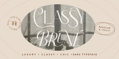 Classy Brune a display sans serif with luxury, clean, chic, and visual elegance with two styles Regular and Italic and alternatives, ligatures, multilingual suport. Perfect for editorial projects, Logo design, Clothing Branding, product packaging, magazine headers, or simply as a stylish text overlay to any background image. Features : Uppercase and Lowercase Stylistic Alternates & Ligatures Numerals & Punctuation Multilanguange PUA Encoded Web Font Included Contact me with an inbox message If you have any question. Thank you! Happy Creating
 - Laftale by Midvel,
$12.00 Fresh script font, Laftale. Laftale help you to make brush font easily. Laftale is casual script typeface with clean characters. This font comes in three style, regular, Italic, and bold. This font is perfect to design especially poster, logo, apparel, book cover, greeting card, birthday card, quotes, advertising poster, and anymore. Explore Opentype features to get unique combination. Feature : · Uppercase · Lowercase · Number · Punctuation · Multilingual (Accented Letters) · Ligature · Swash · Contextual Alternate · Style set (01-03) · PUA Encoded Characters
 - Funyard by Anomali Creative,
$19.99 The idea behind the creation of the Funyärd font is that there is an increasing need for fonts that are simple, funny and can be used in children's learning books, storytelling book, especially for pre-school children, kindergartens or toddlers, who due to this pandemic have not been able to enjoy the atmosphere of school learning, but must still feel a cheerful atmosphere while studying at home. Funyärd can be used as display text or as body text, so that for a story book or textbook for children, this one font family can complete all the typeface needs in it. Funyärd can also be created in typography works, merchandise or any product intended for children. What you will get is Funyärd Regular Funyärd Bold Funyärd Thin Funyärd College Funyärd Shadow
 - FarHat-Acordes - Unknown license

- Montaigne by Fenotype,
$20.00 Delve into the world of timelessness with Montaigne. With its blend of classic elements and contemporary design, this serif family offers a comprehensive selection of eight styles and their corresponding italics. Explore Montaigne's OpenType features, including Small Caps, OldStyle numerals, and a delightful array of Swash initials and Discretionary ligatures in the Italic styles.
 - Greater Neue Condensed by NicolassFonts,
$40.00 The Greater Neue font family is a modern collection consisting of 32 weights, 16 uprights, and matching italics. Condensed width consisting of 16 weights, 8 uprights, and matching italics. It is perfect for packaging, advertisements, headlines, and corporate identities. This font family is well-suited for graphic design and any type of display use.
 - ataxia by Justi,
$25.00 Ataxia was designed to be used in long texts such as books and magazines. The font has the weights regular, bold, italic and bold italic as well as ligatures, small caps, oldstyle numbers and support for many languages (unfortunately not German: ß is missing, lower quotes ‚wrong‘ and „missing“), with more than 500 glyphs.
 - Neue Helvetica Arabic by Linotype,
$149.00Neue Helvetica® is a melding of aesthetic and technical refinements that result in superior design proportions, improved legibility and an expanded range of uses beyond the original Helvetica typefaces Neue Helvetica World fonts enable the setting of pan-European languages, in addition to Arabic, Armenian, Cyrillic, Georgian, Greek, Hebrew, Thai and Vietnamese. The Cyrillic fonts include full support of the Unicode block, including characters for Bulgarian, Mazedonian, Serbian and Ukrainian. Other Monotype global fonts can be paired with Neue Helvetica World to create a more comprehensive global typographic solution. A few examples follow: Devanagari: Saral Devanagari Japanese: Tazugane Gothic or Yu Gothic Korean: YD Gothic 100 or YD Gothic 700 Simplified Chinese: M Ying Hei PRC or M Hei PRC Traditional Chinese: M Ying HK or M Hei HK Click here to download a brochure with more information on Neue Helvetica World. - Neue Helvetica Thai by Linotype,
$149.00Neue Helvetica® is a melding of aesthetic and technical refinements that result in superior design proportions, improved legibility and an expanded range of uses beyond the original Helvetica typefaces Neue Helvetica World fonts enable the setting of pan-European languages, in addition to Arabic, Armenian, Cyrillic, Georgian, Greek, Hebrew, Thai and Vietnamese. The Cyrillic fonts include full support of the Unicode block, including characters for Bulgarian, Mazedonian, Serbian and Ukrainian. Other Monotype global fonts can be paired with Neue Helvetica World to create a more comprehensive global typographic solution. A few examples follow: Devanagari: Saral Devanagari Japanese: Tazugane Gothic or Yu Gothic Korean: YD Gothic 100 or YD Gothic 700 Simplified Chinese: M Ying Hei PRC or M Hei PRC Traditional Chinese: M Ying HK or M Hei HK Click here to download a brochure with more information on Neue Helvetica World. - Neue Helvetica Paneuropean by Linotype,
$89.00Neue Helvetica® is a melding of aesthetic and technical refinements that result in superior design proportions, improved legibility and an expanded range of uses beyond the original Helvetica typefaces Neue Helvetica World fonts enable the setting of pan-European languages, in addition to Arabic, Armenian, Cyrillic, Georgian, Greek, Hebrew, Thai and Vietnamese. The Cyrillic fonts include full support of the Unicode block, including characters for Bulgarian, Mazedonian, Serbian and Ukrainian. Other Monotype global fonts can be paired with Neue Helvetica World to create a more comprehensive global typographic solution. A few examples follow: Devanagari: Saral Devanagari Japanese: Tazugane Gothic or Yu Gothic Korean: YD Gothic 100 or YD Gothic 700 Simplified Chinese: M Ying Hei PRC or M Hei PRC Traditional Chinese: M Ying HK or M Hei HK Click here to download a brochure with more information on Neue Helvetica World. - Neue Helvetica by Linotype,
$42.99 Neue Helvetica® is a melding of aesthetic and technical refinements that result in superior design proportions, improved legibility and an expanded range of uses beyond the original Helvetica typefaces. Neue Helvetica World fonts enable the setting of pan-European languages, in addition to Arabic, Armenian, Cyrillic, Georgian, Greek, Hebrew, Thai and Vietnamese. The Cyrillic fonts include full support of the Unicode block, including characters for Bulgarian, Mazedonian, Serbian and Ukrainian. Other Monotype global fonts can be paired with Neue Helvetica World to create a more comprehensive global typographic solution. A few examples follow: Devanagari: Saral Devanagari Japanese: Tazugane Gothic or Yu Gothic Korean: YD Gothic 100 or YD Gothic 700 Simplified Chinese: M Ying Hei PRC or M Hei PRC Traditional Chinese: M Ying HK or M Hei HK Click here to download a brochure with more information on Neue Helvetica World.
 - Neue Helvetica Georgian by Linotype,
$65.00Neue Helvetica® is a melding of aesthetic and technical refinements that result in superior design proportions, improved legibility and an expanded range of uses beyond the original Helvetica typefaces Neue Helvetica World fonts enable the setting of pan-European languages, in addition to Arabic, Armenian, Cyrillic, Georgian, Greek, Hebrew, Thai and Vietnamese. The Cyrillic fonts include full support of the Unicode block, including characters for Bulgarian, Mazedonian, Serbian and Ukrainian. Other Monotype global fonts can be paired with Neue Helvetica World to create a more comprehensive global typographic solution. A few examples follow: Devanagari: Saral Devanagari Japanese: Tazugane Gothic or Yu Gothic Korean: YD Gothic 100 or YD Gothic 700 Simplified Chinese: M Ying Hei PRC or M Hei PRC Traditional Chinese: M Ying HK or M Hei HK Click here to download a brochure with more information on Neue Helvetica World. - Aracne Ultra Condensed Regular - Personal use only

- Palatino Nova Paneuropean by Linotype,
$67.99Palatino® Nova is Prof. Hermann Zapf's redesign of his own masterpiece, Palatino. The original Palatino was cut in metal by August Rosenberger at D. Stempel AG typefoundry in Frankfurt, and released in 1950. Palatino was later adapted for mechanical composition on the Linotype machine, and became one of the most-used typefaces of the 20th Century. Palatino was designed for legibility, and has open counters and carefully weighted strokes. The type was named after Giambattista Palatino, a master of calligraphy from the time of Leonardo da Vinci. Palatino is a typeface based on classical Italian Renaissance forms. A modern classic in its own right, Palatino is popular among professional graphic designers and amateurs alike, working well for both text and display typography. Hermann Zapf and Akira Kobayashi redeveloped Palatino for the 21st Century, creating Palatino Nova. Released by Linotype in 2005, the Palatino Nova family is part of Linotype's Platinum Collection. Palatino Nova includes several weights (Light, Regular, Medium, and Bold), each with companion italics. Four styles (Regular, Italic, Bold, and Bold Italic) have Greek and Cyrillic glyphs built into their character sets. The Palatino Nova family also includes revised versions of Aldus (now called Aldus Nova), as well as two titling weights. The first titling weight, Palatino Nova Titling, is based on Hermann Zapf's metal typeface Michelangelo, including Greek glyphs from Phidias Greek. The heavier titling weight, Palatino Nova Imperial, is based on Sistina. The fonts in the Palatino Nova family support all 48 Western, Central, and Eastern European languages. Additional features: ligatures and historical ligatures, Small Caps, ornaments, and a range of numerals (proportional & tabular width lining and Old style Figures, fractions, inferiors, and superiors)." - Caslon #540 by ITC,
$29.00The Englishman William Caslon punchcut many roman, italic, and non-Latin typefaces from 1720 until his death in 1766. At that time most types were being imported to England from Dutch sources, so Caslon was influenced by the characteristics of Dutch types. He did, however, achieve a level of craft that enabled his recognition as the first great English punchcutter. Caslon's roman became so popular that it was known as the script of kings, although on the other side of the political spectrum (and the ocean), the Americans used it for their Declaration of Independence in 1776. The original Caslon specimen sheets and punches have long provided a fertile source for the range of types bearing his name. Identifying characteristics of most Caslons include a cap A with a scooped-out apex; a cap C with two full serifs; and in the italic, a swashed lowercase v and w. Caslon's types have achieved legendary status among printers and typographers, and are considered safe, solid, and dependable. A few of the many interpretations from the early twentieth century were true to the source, as well as strong enough to last into the digital era. These include two from the American Type Founders Company, Caslon 540 and the slightly heavier Caslon #3. Both fonts are relatively wide, and come complete with small caps, Old style Figures, and italics. Caslon Open Face first appeared in 1915 from the Barnhart Bros & Spindler Foundry, and is not anything like the true Caslon types despite the name. It is intended exclusively for titles, headlines and initials, and looks elegant whether used with the more authentic Caslon types or by itself. - Palatino Nova by Linotype,
$50.99 Palatino® Nova is Prof. Hermann Zapf's redesign of his own masterpiece, Palatino. The original Palatino was cut in metal by August Rosenberger at D. Stempel AG typefoundry in Frankfurt, and released in 1950. Palatino was later adapted for mechanical composition on the Linotype machine, and became one of the most-used typefaces of the 20th Century. Palatino was designed for legibility, and has open counters and carefully weighted strokes. The type was named after Giambattista Palatino, a master of calligraphy from the time of Leonardo da Vinci. Palatino is a typeface based on classical Italian Renaissance forms. A modern classic in its own right, Palatino is popular among professional graphic designers and amateurs alike, working well for both text and display typography. Hermann Zapf and Akira Kobayashi redeveloped Palatino for the 21st Century, creating Palatino Nova. Released by Linotype in 2005, the Palatino Nova family is part of Linotype's Platinum Collection. Palatino Nova includes several weights (Light, Regular, Medium, and Bold), each with companion italics. Four styles (Regular, Italic, Bold, and Bold Italic) have Greek and Cyrillic glyphs built into their character sets. The Palatino Nova family also includes revised versions of Aldus (now called Aldus Nova), as well as two titling weights. The first titling weight, Palatino Nova Titling, is based on Hermann Zapf's metal typeface Michelangelo, including Greek glyphs from Phidias Greek. The heavier titling weight, Palatino Nova Imperial, is based on Sistina. The fonts in the Palatino Nova family support all 48 Western, Central, and Eastern European languages. Additional features: ligatures and historical ligatures, Small Caps, ornaments, and a range of numerals (proportional & tabular width lining and Old style Figures, fractions, inferiors, and superiors)."
 - Dash To School by Comicraft,
$15.00 One of the more popular pupils in the Comicraft Academy of Lettering Arts, Dash Decent, has been working on his penmanship, thanks to a grant from those lovely learning specialists at Brainzy and Education.com. Developing learning games for Pre K, K and 1st grade, Brainzy requested a font that was fun and clean to help children learn to print. Dash to School is an all new revision and expansion of the Dash Decent family and features fun bold/heavy/outline and drop shadow weights for display, guidelines and dashed lines to assist learning and understanding and a healthy dose of decency! Dash Decent has graduated 1st Grade and with Dash to School’s help, so can you! See the families related to Dash To School: Dash Decent Features: Nine fonts (Regular, Bold, Heavy, Outline, Shadow, Guides, GuidesDashed & GuidesSolid) with upper and lowercase alphabets.
 - PR8 Charade is a distinctive and versatile font that stands out for its unique character and playful yet refined style. This typeface, designed with attention to detail and creativity, captures the e...
- BlamDude BB - Personal use only


