10,000 search results
(0.031 seconds)
- Narapati by Dotzeem,
$15.00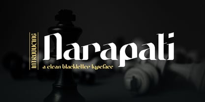 Introducing, Narapati is a clean Blackletter Typeface for your Design Narapati is a clean Blackletter Typeface for your Design that is fit for your next creative project such as logos, product packaging, Logotype, Letterhead, Poster, Apparel Design, Label, and etc. This Narapati Typeface includes also support a Multilingual Characters.
 - Groundage by Mofr24,
$11.00 Groundage is a Gothic Blackletter font that offers three styles: Outline, Regular, and Shadow. With its bold and clean calligraphic strokes, this typeface boasts a modern-vintage look that exudes elegance and masculinity. Its Y2K-inspired design makes it perfect for stylish posters, marketing materials, logotypes, and headlines. Additionally, it is great for art and craft projects, y2k-streetwear designs, and much more. What sets Groundage apart from other Gothic Blackletter fonts is its unique combination of traditional and modern design elements. Its clean lines and bold strokes give it a contemporary feel while its Blackletter roots pay homage to its historical origins. Groundage also includes both Latin and Cyrillic character sets, making it a versatile option for a range of projects. This font pairs well with other modern-vintage fonts and looks great alongside sans-serif fonts for contrast. Its three styles allow for versatility in design and can be used for a variety of creative projects. Groundage was designed with the intention of creating a stylish, masculine font that could be used in a variety of contexts. Its Y2K-inspired design concept was chosen to evoke nostalgia while still feeling fresh and modern. The combination of traditional Blackletter elements with a contemporary twist creates a unique aesthetic that stands out from other fonts in its category. Groundage is not based on any historical design, but its Blackletter roots pay homage to centuries of typographical tradition. Its modern twist on the classic Gothic style creates a unique and versatile font that can be used in a range of creative projects.
 - Nutmeg by W Type Foundry,
$25.00 Nutmeg is a geometric typeface with a slight flavored touch. Although its structure is stick to the traditional forms, its details transform this typeface in a boldly project that separates it from other geometric fonts. Nutmeg’s texture can be perceived as a clean typeface that is comfortable to the human eye, furthermore, if you use it in big sizes Nutmeg’s details can be seen as a display font. Under these two ways of perceiving this typefamily, we took the decision of split this type project in two families: a cleaner and more rational Nutmeg versus a Headline version that has more flavored details at the end of the characters. Designed with powerful OpenType features in mind, each weight includes alternate characters, ligatures, fractions, special numbers, arrows, extended language support and many more… Perfectly suited for graphic design and any display/text use. The 36 fonts are the first part of a larger Nutmeg family. We’re proud to introduce: Nutmeg. Learn about upcoming releases, work in progress and get to know us better! On Instagram W Foundry On facebook W Foundry wtypefoundry.com
 - Averica by Letteralle,
$23.00 Introducing my latest creation, Averica! a playful and friendly display font that is sure to add a touch of personality to any project. Averica is handmade with love and attention to detail, ensuring that each character is unique and full of charm. Whether you're looking to create eye-catching headlines, playful graphics, or fun social media posts, title, branding, merchandise, ads, poster, Averica is the perfect choice. With its bold and distinctive style, it will help your message stand out and capture the attention of your audience. Crafted with precision and care, Averica boasts smooth curves, clean lines, and just the right amount of quirkiness. It's playful and approachable, yet still maintains a professional feel, making it ideal for a variety of projects. So why settle for a bland and boring font, when you can add a touch of fun and personality to your work with carefully fashioned display font? Try it out today and see the difference it can make! Any Questions? Just Ask! I hope you enjoy! Thank You. Letteralle Studios
 - Cherry by Fenotype,
$19.00 Cherry is a bold and smooth display family with connecting script “Brush” and supporting thin marker caps “Sans”. In addition there is “Extras” which is a set of strokes and ornaments designed to go with the fonts. Cherry Print is the same set with rugged outlines and eroded print texture. Cherry Brush has clear and smooth letter shapes with lot’s of character. It’s great for Logo, Poster, Headlines, Packaging or any Display use. Cherry Brush is equipped with plenty of contextual alternates and ligatures that keep the connections smooth. This feature is set in Standard Ligatures and it’s on by default. Cherry Brush is designed so that you can also use it to writ ALL CAPS. For more flashy initials try Swash feature. Cherry Brush is PUA encoded so you can access extra characters in most graphic design softwares. Cherry Sans is an all caps thin marker font with two size of letters (uppercase & lowercase). Cherry Sans is clean and legible. It’s designed to work with Cherry Brush but works just fine on its own too.
 - TMBFont - Unknown license

- Aeterna by Dawnland,
$13.00 Hand drawn, sketchy antiqua that come in two font variants: Regular, Small caps with old style figures. Æterna was revised 2012 and now hold a full character set of basic english/latin letters and west european diacritics!
 - Chorine by The Flying Type,
$24.00 Chorine is a retro face, impacting and comfy, available in two cuts. It's great for vintage, nostalgic and psychedelic pieces yet also for creative contemporary designs. Chorine sounds sixties, sounds seventies and sounds perfectly now. Play it!
 - FT Digital Kauno by Fenotype,
$19.95 Digital Kauno is a soft geometric script type. It is recommended for headlines and display use. Digital Kauno was originally designed in 2002 and it has now been redesigned with full character set and more distinctive letters.
 - Overtime LCD Pro by Red Rooster Collection,
$60.00 Steve Jackaman & Ashley Muir. Our collection was missing a small piece of the jigsaw puzzle until now; a quartz digital LCD font! Overtime LCD contains all the high-end features expected in a quality OpenType Pro font.
 - Toy Letters JNL by Jeff Levine,
$29.00 A vintage set of die-cut letters and number by Village Toys (circa 1930s or 1940s) featured a playful, bold serif typeface. This is now available digitally as Toy Letters JNL, in both regular and oblique versions.
 - Roman Wells by Wooden Type Fonts,
$15.00 A revival of one of the popular wooden type fonts of the 19th century, suitable for display, heavy stems, very thin serifs, short descenders. Heavily revised, very much improved, extensive kerning. Now in otf and ttf formats.
 - Textile Stencil JNL by Jeff Levine,
$29.00 An ad from the 1930s for a Spanish company called Intex Textiles featured some hand lettering in a bold and unique stencil design. This is now available as Textile Stencil JNL, in both regular and oblique versions.
 - Tifinagh One by GrafikarFonts,
$42.00 Tifinagh One est une police qui prend en charge les scripts latin et Tifinagh (Basic-IRCAM, Extended, Neo-Tifinagh, Touareg) avec ligatures, chiffres, et symboles de base. Tifinagh One offre la possibilité d'écriture Tifinagh LTR ou RTL.
 - The font Chizzler Thin, crafted by GemFonts | Graham Meade, stands out in the realm of typography for its distinctive character and elegance. This particular variant of the Chizzler family leans towa...
- Zygo by Zang-O-Fonts,
$25.00A wide, square font, ZygoSE fits perfectly into a clean, dynamic design piece. - Graffiti Drips by m u r,
$15.00 Capitals are messy. Lowercase letters are clean. A drippy, runny, messy graffiti font.
 - KG Change This Heart by Kimberly Geswein,
$5.00 Short, wide thin-stroked writing. Although handwritten, it is a very clean style.
 - Aire by Lián Types,
$37.00 Aire is what Sproviero would call a < big display family >. We recommend seeing its user’s guide. After his success with Reina, Sproviero comes out with this big family of 7 members: Each of them loaded with lots of sophisticated ligatures, alternates and the entire cyrillic alphabet. The overall impression that the font gives is lightness and delicateness; that’s the reason the designer chose to call it Aire, or Air, in English. "Aire was somehow having a rest from my fat face Reina [...] It started as a really thin style of Reina, but it rapidly migrated from it and grew up alone. And how it grew..." The inspiration came from his own past creations: “The heavy strokes of Reina were shouting for a more delicate thing. Something more feminine. More fragile. Something which had a lot of elegance and fresh air inside”. Aire responds to this: Sproviero found that many of the typefaces of nowadays which are used for headlines (best known as display fonts) have almost always just one, maybe two weight styles. This was his opportunity to try something new. Aire makes it easier for the user to generate different levels/layers of communication thanks to its variety of styles. With this font you can solve entire decorative pieces of design with just one font, and that was the aim of it. Aire was designed to be playful yet formal: While none of its alternates are activated it can be useful for short to medium length texts; and when the user chooses to make use of its open-type decorative glyphs, it can be useful for headlines with dazzling results. On March of 2012, Aire was chosen to be part of the most important exhibition of typography in Latinoamerica: Tipos Latinos 2012. TECHNICAL Aire is a family with many members. In total, the user can choose between almost 6,000 (!) glyphs (1,000 per style). Each member has variants inside, which are open-type programmed: The user decides which glyph to alternate, equalizing the amount of decoration wanted. Every decorative glyph has its weight adjusted to the style it belongs to. Exclusively for decoration, Aire Fleurons Pro is an open-type programmed set of ornaments. And last but not least, remember Aire is delicate. What’s my point? It is not recommended to activate all the alternates at the same time. It is typo-scientifically proved: A maximum of 3 or 4 alternates per word would be more than enough.
 - Generic by More Etc,
$15.00 The Generic Typeface Collection is a series of sans-serif typefaces inspired by the craftsmanship of graphic design, typesetting, and printing in the analogue era – before Adobe, Macintosh computers and desktop publishing – when dinosaurs ruled the earth. With the use of various typesetting apparatuses or dry transfer type, photo copiers, and shooting layouts and paste-ups to film, the printed results was not as exact, precise and predictable as it is today. When examining old prints, it is difficult not to like the way that characters in over- or underexposed film have a special type of vibe to them that is often sadly lost in today’s pursuit of total perfection. Encouraged by this, I saw a need for a collection of typefaces that are non-clinical and non-conformist, and some that are coarse, rough and distorted – errors that might come from poor exposure when put on film, enlargements from small point texts, or maybe quality loss from successive generations of photocopies. Or all of the above. This is an attempt to incorporate spirit and personality into a set of typefaces without losing distinction. You might call it a homage to non-perfection. I call it human. The Generic Typeface Collection consists of 11 fonts divided into four series. The three standard series – the Formal Release series, the Coarse Copy series, and the Rough Display series – all contain three fonts each. The Extra Splendor series contains a couple of shadow fonts for that little extra sparkle. Formal Release – Handcrafted & Clean The Formal Release series features sans-serif typefaces for everyday use. They are handcrafted and clean, human and uncomplicated. The Formal Release series contains three typefaces that add tons of personality to any text. G10 FR ‘Slim’ – a slightly under-exposed and clean typeface in a regular weight (228 glyphs - 1 alternate) G20 FR ‘Classic’ – a properly exposed clean typeface in a bold weight (228 glyphs - 1 alternate) G30 FR ‘Bulky’ – a heavily over-exposed clean typeface in an ultra weight (228 glyphs - 1 alternate) Coarse Copy – Dirty & Rough The Coarse Copy series features non-conformist typefaces that are worn and rough, maybe after going through that bad copier a few times too much. The Coarse Copy series contains three sans-serif typefaces that add tons of spirit to any text without compromising too much on legibility. Try them on in poster-sizes and everyone will know that you mean business. G40 CC ‘Slender’ – an under-exposed coarse typeface in a regular weight (228 glyphs - 1 alternate) G50 CC ‘Typic’ – a properly exposed coarse typeface in a bold weight (228 glyphs - 1 alternate) G60 CC ‘Huge’ – a heavily over-exposed coarse typeface in an ultra weight (228 glyphs - 1 alternate) Rough Display – Faded & Decorative The Rough Display series features attention-seeking decorative typefaces in three feature-packed fonts. Faded and gritty like the image distortion and degradation from successive generations of photocopies, they are eye-catching typefaces intended to stand out in bigger point sizes. Use these typefaces for signage, headlines and similar situations were a strong typographic statement is desired. We have packed no less than 1,334 alternate characters and 212 discretionary ligatures into this series for a greater chance of not having characters that look exactly the same more than once. G70 RD ‘Slinky’ – an under-exposed rough and decorative typeface in a regular weight (741 glyphs – 448 alternates – 66 discretionary ligatures) G80 RD ‘Standard’ – a properly-exposed rough and decorative typeface in a bold weight (748 glyphs – 448 alternates – 73 discretionary ligatures) G90 RD ‘Swollen’ – a heavily over-exposed rough and decorative typeface in an ultra weight (748 glyphs – 448 alternates – 73 discretionary ligatures) Extra Splendor – Sparkling & Extraordinary The Extra Splendor series features two shadow typefaces for that little extra sparkle. One clean shadow to be used with G20 FR ‘Classic’, and one rough shadow to be used with G80 RD ‘Standard’. Having the shadows separate from the main typeface adds another layer of expressiveness in that you can try out color combinations for that extra splendor. Tips for matching (applies to both the base font and the shadow font): Set the kerning to Metric, not optical. Increase tracking to accommodate for the shadows extra width. G25 ES ‘Classic Shadow’ – a clean shadow to be used with G20 FR ‘Classic’ (228 glyphs – 1 alternate) G85 ES ‘Standard Shadow’ – a rough shadow to be used with 80 RD ‘Standard’ (227 glyphs) OpenType features – alternate characters and discretionary ligatures – can be accessed by using OpenType friendly professional design applications, such as Adobe Illustrator, Adobe InDesign, and Adobe Photoshop.
 - Deconumbers Pi by Linotype,
$40.99This is a set of decorative numeric characters, which can stand alone with one another to create ordinal displays. Several of the shape sets can be used to create two digit numbers, up to 99. The triangle version can even be used as arrows pointing in specific directions. - Sullya by MonoLIne Calligraphy,
$19.00 Sullya is interesting because the typeface is pleasing to the eye, clean, feminine, sensual, glamorous, simple and very easy to read, because there are many fancy letter connections. I also offer a number of decent stylistic alternatives for multiple letters. Classic styles are very suitable to be applied in various formal forms such as invitations, labels, restaurant menus, logos, fashion, make up, stationery, novels, magazines, books, greeting / wedding cards, packaging, labels or all kinds of advertising purposes. . . Sullya has alternative characters, including support for multiple languages. With OpenType features with an alternative style and elegant binding. The OpenType feature does not work automatically, but you can access it manually and for the best results required for your creativity in combining these Glyph / Character variations. Font Features : * Lowercase beginning and ending swash * Uppercase beginning swash * Initials * International Language I heavily use programs that support OpenType features and the Glyphs panel such as Adobe Illustrator, Adobe Photoshop CC, Adobe InDesign, or CorelDraw, so that you can view and access all the variations of the Glyph. Sullya is coded with Unicode PUA, which allows full access to all additional characters without having any special design software. Mac users Mac users, and Windows users can use Character Map to view and copy any of the additional characters to paste into your favorite editor / application.
 - Refrankt by Groteskly Yours,
$35.00 Refrankt is a multifunctional sans-serif type family with 18 styles, ranging from Thin to Black with matching italic styles. The key visual feature of Refrankt is its wider characters and expanded proportions, which accentuate the character of the type family and extend its application. Refrankt works well as a display font but can also be used comfortably in headings and larger bodies of text. Refrankt offers a clean and thoughtful take on the functional grotesque sans-serif style and can be used in a wide variety of projects, from UI/UX design to packaging and branding. It can also be employed as a font for logos and word marks. Whether you're looking for bold, sturdy letterforms or dynamic flexibility, Refrankt readily adapts to any task. Refrankt would look at home in projects related to technology, athletics, industrial design and many more. The functionality of Refrankt is defined by its multilingual support (200+ languages) and its extensive OpenType features, such as Case-Sensitive Punctuation and Stylistic Alternates, among many others. In addition to a standard set of figures, Refrankt includes tabular figures, old-style figures, superiors, inferiors, and fractions. The entire character set comprises over 800 glyphs. Free trials available on our website: https://groteskly.xyz/ Refrankt Features: • 18 Fonts (9 Upright & 9 Italic) • Variable Font • 800+ characters/font • 200+ languages supported • Extensive OpenType Features • Versatile and Multifunctional
 - Santhiya by MonoLIne Calligraphy,
$21.00 Santhiya is interesting because the typeface is pleasing to the eye, clean, feminine, sensual, glamorous, simple and very easy to read, because there are many fancy letter connections. I also offer a number of decent stylistic alternatives for multiple letters. Classic styles are very suitable to be applied in various formal forms such as invitations, labels, restaurant menus, logos, fashion, make up, stationery, novels, magazines, books, greeting / wedding cards, packaging, labels or all kinds of advertising purposes. . . Santhiya has alternative characters, including support for multiple languages. With OpenType features with an alternative style and elegant binding. The OpenType feature does not work automatically, but you can access it manually and for the best results required for your creativity in combining these Glyph / Character variations. Font Features : * Lowercase beginning and ending swash * Uppercase beginning swash * Initials * Intenational Language Support I heavily use programs that support OpenType features and the Glyphs panel such as Adobe Illustrator, Adobe Photoshop CC, Adobe InDesign, or CorelDraw, so that you can view and access all the variations of the Glyph. Santhiya is coded with Unicode PUA, which allows full access to all additional characters without having any special design software. Mac users Mac users, and Windows users can use Character Map to view and copy any of the additional characters to paste into your favorite editor / application.
 - Bettrisia Script by Great Studio,
$18.00 Bettrisia Script is a modern and elegant calligraphy script font that comes with very beautiful character changes, a kind of classic decorative copper script with a modern touch, designed with high detail to bring stylish elegance. Bettrisia Script Interesting scripts as smooth, clean, feminine, sensual, glamorous, simple and very easy to read, because there are many fancy and simple letter connections. I also offer a number of alternative styles that are appropriate for many letters. This font style is perfect for various designs of your work, such as invitations, labels, restaurant menus, logos, fashion, makeup, stationery, novels, magazines, books, greeting cards / wedding, packaging, labels and others. Bettrisia Script has 680+ glyphs and 487 alternative characters, including various language support. With the OpenType feature with alternative styles and elegant ties. The OpenType feature does not function automatically, but you can access it manually and for the best results needed for your creativity in combining this Glyph variation. The OpenType features can be accessed using OpenType savvy programs such as Adobe Illustrator, Adobe In Design, Adobe Photoshop versions of Corel Draw X, and Microsoft Word. And this font has given PUA unicode (special code font) so that all alternative characters can be easily accessed in full by craftsmen or designers. Need help? If you need help or advice, please contact me by e-mail at greatstudio92@gmail.com Thank you for your purchase!
 - Matteya by MonoLIne Calligraphy,
$22.00 Matteya is interesting because the typeface is pleasing to the eye, clean, feminine, sensual, glamorous, simple and very easy to read, because there are many fancy letter connections. I also offer a number of decent stylistic alternatives for multiple letters. Classic styles are very suitable to be applied in various formal forms such as invitations, labels, restaurant menus, logos, fashion, make up, stationery, novels, magazines, books, greeting / wedding cards, packaging, labels or all kinds of advertising purposes. . . Matteya has alternative characters, including support for multiple languages. With OpenType features with an alternative style and elegant binding. The OpenType feature does not work automatically, but you can access it manually and for the best results required for your creativity in combining these Glyph / Character variations. Font Features : * Lowercase beginning and ending swash * Uppercase beginning swash * Initials * Intenational Language Support I heavily use programs that support OpenType features and the Glyphs panel such as Adobe Illustrator, Adobe Photoshop CC, Adobe InDesign, or CorelDraw, so that you can view and access all the variations of the Glyph. Matteya Font is coded with Unicode PUA, which allows full access to all additional characters without having any special design software. Mac users Mac users, and Windows users can use Character Map to view and copy any of the additional characters to paste into your favorite editor / application.
 - Rastilya by MonoLIne Calligraphy,
$17.00 Rastilya is interesting because the typeface is pleasing to the eye, clean, feminine, sensual, glamorous, simple and very easy to read, because there are many fancy letter connections. I also offer a number of decent stylistic alternatives for multiple letters. Classic styles are very suitable to be applied in various formal forms such as invitations, labels, restaurant menus, logos, fashion, make up, stationery, novels, magazines, books, greeting / wedding cards, packaging, labels or all kinds of advertising purposes. . . Rastilya has alternative characters, including support for multiple languages. With OpenType features with an alternative style and elegant binding. The OpenType feature does not work automatically, but you can access it manually and for the best results required for your creativity in combining these Glyph / Character variations. Font Features : * Lowercase beginning and ending swash * Uppercase beginning swash * Initials * Intenational Language Support I heavily use programs that support OpenType features and the Glyphs panel such as Adobe Illustrator, Adobe Photoshop CC, Adobe InDesign, or CorelDraw, so that you can view and access all the variations of the Glyph. Rastilya is coded with Unicode PUA, which allows full access to all additional characters without having any special design software. Mac users Mac users, and Windows users can use Character Map to view and copy any of the additional characters to paste into your favorite editor / application.
 - Mellisthya by MonoLIne Calligraphy,
$21.00 Mellisthya is interesting because the typeface is pleasing to the eye, clean, feminine, sensual, glamorous, simple and very easy to read, because there are many fancy letter connections. I also offer a number of decent stylistic alternatives for multiple letters. Classic styles are very suitable to be applied in various formal forms such as invitations, labels, restaurant menus, logos, fashion, make up, stationery, novels, magazines, books, greeting / wedding cards, packaging, labels or all kinds of advertising purposes. . . Mellisthya has alternative characters, including support for multiple languages. With OpenType features with an alternative style and elegant binding. The OpenType feature does not work automatically, but you can access it manually and for the best results required for your creativity in combining these Glyph / Character variations. Font Features : * Lowercase beginning and ending swash * Uppercase beginning swash * Initials * Intenational Language I heavily use programs that support OpenType features and the Glyphs panel such as Adobe Illustrator, Adobe Photoshop CC, Adobe InDesign, or CorelDraw, so that you can view and access all the variations of the Glyph. Mellisthya Font is coded with Unicode PUA, which allows full access to all additional characters without having any special design software. Mac users Mac users, and Windows users can use Character Map to view and copy any of the additional characters to paste into your favorite editor / application.
 - Vinyle by Lián Types,
$37.00 Bold, rounded and super cool. Those are the attributes of my latest font “Vinyle”, french for vinyl. In this epoque where all fields of Design are giving a lot of importance and attention to Typography and Lettering, I felt it was my duty to contribute with something that could really stand alone and ‘say something else’ that just words to be read. I've found that lately in the world, regarding a finished piece of design, the role of Typography (and of letters in general) went from being secondary, (like a minor player or a supporting actor) to the most important one. People are starting to understand the beauty of a well-done letter: they want their storefronts with unique scripts, they want to drink coffee surrounded by lettered blackboards, they want to buy books with astonishing covers with swashes ‘por doquier’. I'm more than happy to be alive in a present where even the most unimaginable friends of mine, (who couldn't spot differences between comic sans and helvetica before) are now conscious of the importance of a letter, or let’s say: Of the ‘voice’ of Typography. With Vinyle I tried to make a font with power. Following the nowadays trend of, let me say, “the vintage sans renaissance”. This time I put my brushes and nibs aside and experimented with something new. It wasn't easy, if you will pardon, for me to see swashes all over the place withouth the classic calligraphic ‘thick and thins’, but with after some weeks of work I started to love them. Like I already showed you in other creations (1) let me finish with the phrase: GEOMETRY IS SEXY! TIPS Vinyle has a lot of attitude, it shouts “here I am!” it really can ‘design an entire piece’ for you with just a word or two: It was designed with a 10 degree slant on purpose so the user may rotate it (like on the posters) that amount of degrees in order to see better results. Use Vinyle with the ‘fi’ standard ligatures activates for better kerning and ligatures! NOTES (1) See my font Selfie , the ‘little sister’ of Vinyle.
 - Sinzano by Typodermic,
$11.95 Hey there, cats and kittens. Have you heard the news about the grooviest typeface in town? That’s right, I’m talkin’ about Sinzano—the typeface that’s cool, collected, and interlocking! Now, you might be asking yourself, “What’s so special about Sinzano?” Well, let me tell you, this typeface is a real wild one. It’s got some serious style, with letterforms that interlock like a bunch of jazz cats jammin’ on stage. And don’t even get me started on the ligatures—they’re fascinating, man! Sinzano comes in three different styles, so you can choose the one that’s right for you. Sinzano Regular is a slender, slightly flared headliner, perfect for making a statement. Sinzano Sans is a similar concept, but with straight, flat ends, for a more modern vibe. And if you’re looking for something a little more modest, Sinzano Display is a companion typeface that’s broader and rounder, with just a touch of interlocking. So, if you’re ready to add some serious style to your designs, head on over to Sinzano, baby! This typeface is the real deal, and it’s gonna knock your socks off. Most Latin-based European writing systems are supported, including the following languages. Afaan Oromo, Afar, Afrikaans, Albanian, Alsatian, Aromanian, Aymara, Bashkir (Latin), Basque, Belarusian (Latin), Bemba, Bikol, Bosnian, Breton, Cape Verdean, Creole, Catalan, Cebuano, Chamorro, Chavacano, Chichewa, Crimean Tatar (Latin), Croatian, Czech, Danish, Dawan, Dholuo, Dutch, English, Estonian, Faroese, Fijian, Filipino, Finnish, French, Frisian, Friulian, Gagauz (Latin), Galician, Ganda, Genoese, German, Greenlandic, Guadeloupean Creole, Haitian Creole, Hawaiian, Hiligaynon, Hungarian, Icelandic, Ilocano, Indonesian, Irish, Italian, Jamaican, Kaqchikel, Karakalpak (Latin), Kashubian, Kikongo, Kinyarwanda, Kirundi, Kurdish (Latin), Latvian, Lithuanian, Lombard, Low Saxon, Luxembourgish, Maasai, Makhuwa, Malay, Maltese, Māori, Moldovan, Montenegrin, Ndebele, Neapolitan, Norwegian, Novial, Occitan, Ossetian (Latin), Papiamento, Piedmontese, Polish, Portuguese, Quechua, Rarotongan, Romanian, Romansh, Sami, Sango, Saramaccan, Sardinian, Scottish Gaelic, Serbian (Latin), Shona, Sicilian, Silesian, Slovak, Slovenian, Somali, Sorbian, Sotho, Spanish, Swahili, Swazi, Swedish, Tagalog, Tahitian, Tetum, Tongan, Tshiluba, Tsonga, Tswana, Tumbuka, Turkish, Turkmen (Latin), Tuvaluan, Uzbek (Latin), Venetian, Vepsian, Võro, Walloon, Waray-Waray, Wayuu, Welsh, Wolof, Xhosa, Yapese, Zapotec Zulu and Zuni.
 - As of my last update, there isn't a commercially recognized or widely distributed font specifically known as "Jonny Quest Classic" within standard typographic repositories or among the major font fou...
- Alright, picture this: Zekton Free, a font that looks like it moonlights as a futuristic secret agent. Designed by the font wizard Ray Larabie, this typeface isn't just another font in the crowd. Oh ...
- Willson by Din Studio,
$29.00 Say hello to Willson - Clean Serif Font, Willson designed with a modern and clean style. It's suitable for branding, logo, printing and many other designs. Included: Willson (otf) Features: Accents (Multilingual characters) 6 Alternates 11 Ligatures PUA encoded Numerals and Punctuation (OpenType Standard) Thanks for visiting and purchasing my font!
 - Aguero Serif by Craft Supply Co,
$15.00 Aguero Serif – Clean & Elegant Serif Font is a modern serif font family whose design refers us to the style of transitional serifs. The distinctive features of Aguero Serif – Clean & Elegant Serif Font are the relatively low contrast of strokes, the slightly squarish shapes of round characters and the emphasized businesslike nature.
 - VNI-Thufap3 - Unknown license

- Ongunkan Runic Unicode by Runic World Tamgacı,
$50.00 It is the unicode version of the runic script. Can be used with virtual keyboards. You can download the keyboards here. https://www.babelstone.co.uk/Keyboards/Runic.html
 - skeemat - Unknown license

- Film Title JNL by Jeff Levine,
$29.00 A World War II training film had its opening title card “First Aid” hand lettered in a casual, Art Deco sans serif design. This is now available digitally as Film Title JNL, in both regular and oblique versions.
 - Asian Railway JNL by Jeff Levine,
$29.00 A poster for the 1932 film “Shanghai Express” starring Marlene Dietrich has the films name is a semi-Asian lettering style. This bold poster font is now available as Asian Railway JNL in both regular and oblique versions.
 - Mystery Story JNL by Jeff Levine,
$29.00 The opening title card for “Grand Central Murder” (1942) is hand lettered in a stylized, condensed serif type style with strong but elegant appeal. This is now available as Mystery Story JNL in both regular and oblique versions.


