10,000 search results
(0.139 seconds)
- Clans by T-26,
$19.00 - Shoguns Clan - Personal use only

- Shoguns Clan - Unknown license

- FF Clan by FontFont,
$68.99 Polish type designer Lukasz Dziedzic created this sans FontFont between 2006 and 2008. The family has 84 weights, ranging from Thin to Ultra in Compressed, Condensed, Narrow, Medium, Wide, and Extended (including italics) and is ideally suited for advertising and packaging, editorial and publishing, logo, branding and creative industries, poster and billboards, small text, wayfinding and signage as well as web and screen design. FF Clan provides advanced typographical support with features such as ligatures, small capitals, case-sensitive forms, fractions, super- and subscript characters, and stylistic alternates. It comes with a complete range of figure set options – oldstyle and lining figures, each in tabular and proportional widths.
 - Southern Clan by IKIIKOWRK,
$17.00 Proudly present Southern Clan - Retrotype, created by ikiiko. A expressive handwriting type with a 80's street graffiti shape. This type is very suitable for making a poster, t-shirt design, magazine header, brand logo, sleeve cover, party flyer, quotes, or simply as a stylish text overlay to any background image. What's Included? Uppercase & Lowercase Numbers & Punctuation Alternates & Stylistic Multilingual Support Enjoy our font and if you have any questions, you can contact us by email : ikiikowrk@gmail.com
 - Calan - Unknown license

- Plans by Graphicxell,
$19.00 inspired by the famous minimalist logo perfect for the purposes of designing templates, brochures, videos, advertising branding, logos, invitation, layout design, elegant crafting, beauty design and other
 - Plan by Characters Font Foundry,
$17.50 Plan is a corporate typeface made for 'Plan A Ontwerp', a graphic design studio based in Eindhoven, The Netherlands. Based on the rough sketches of the founder of Plan A Ontwerp, Frank Vogt, Characters constructed, mastered and finetuned the complete Plan Family. Plan comes in three versions; Plan A, Plan B and Plan C. All versions can be mixed because they share the same metrics, spacing and kerning. Where Plan A is a strong display type, Plan B has more details and is therefore better suited for longer and smaller texts. Plan C is a decorative stencil version with an own personality and dynamic.
 - Cyan by Wilton Foundry,
$29.00The design of Cyan was inspired by features found in classic Roman and styles like Trajan and Bodebeck. It shows the designer's personal preference for geometric Roman proportions while incorporating open centers (B,P,R) and compact serifs. Unlike Trajan, Cyan has lowercase characters in the regular version. The characters stay true to the same features as the capitals, resulting in an unusually distinctive style. The Regular Capitals version contains Roman numerals. Cyan's weight is similar to Trajan's but the horizontal strokes are slightly bolder resulting in better legibility for small sizes, especially for lowercase characters. There are many subtle details in Cyan that become more interesting in larger sizes, for instance the subtle curves in the serifs and the overall smoothness as a result of the mostly rounded angles. Cyan is a robust font that will exceed expectations in areas never explored before. The name is inspired by the Greek word cyan, meaning "blue". The color cyan can have many different variations. One definition is a color made by mixing equal amounts of green and blue light (it also is a pure spectral color). As such, cyan is the complement of red: cyan pigments absorb red light. Cyan is sometimes called blue-green or turquoise and often goes undistinguished from light blue. Obviously the Cyan family is a perfect companion to the Cyan Sans family. - Celan by Craft Supply Co,
$20.00 Introduction to Celan Bold Serif Font The Celan – Bold Serif font stands out with its robust and masculine appearance. It features thick, strong lines and minimal white space. This design choice gives it a dominant presence, making it ideal for impactful titles. Characteristics of the Font Celan is characterized by its bold, assertive strokes. The limited white space between letters enhances its solidity. This quality makes the font appear more masculine and forceful. Its serif design adds a touch of classic elegance. Ideal Uses of Celan – Bold Serif This font is perfect for powerful titles that need to command attention. Its boldness makes it suitable for headers in various mediums like posters, websites, and magazines. The strong character of the font conveys confidence and authority.
 - Clab by Eko Bimantara,
$19.00 Clab is meant for branding. The initial characters were build in bold and chunky personality, yet the thin strokes and flowy italics gives it a versatile and unique set of family. The glyphs crafted in low contrast strokes, short ascenders and descenders and low caps. Clab consist of 9 weight from Hairline to Black with each matching italics. Contain more than 400 glyphs with some OpenType features e.g, standard and discretionary ligature, fraction, e.t.c.
 - Off - Unknown license

- Officer Domenic - Unknown license

- Office Squeeze by Hanoded,
$15.00 Office Squeeze was made with a Japanese brush pen. I kind of like the fact that, despite its roughness, Office Squeeze still maintains a very neat appearance. Office Squeeze can be used for just about anything, but product packaging, logos and posters spring to mind. Comes with a generous square footage of diacritics.
 - Office Doodles by Outside the Line,
$19.00 Fun, little illustrations in line and reverse of what one finds in an office-- or at least my office. See Food Doodles for more matching little drawings.
 - Office PI by Katatrad,
$22.00
- Box Office by Device,
$29.00 Designed originally for the BBC's listings magazine "Radio Times", this dingbat font has been extended to include the US rating as well as the UK ones and a selection of symbols for use on DVD film packaging and satellite listings. The font used is Paralucent, and an ideal accompaniment. Note: the icon for sexual content comes in two versions, one with genitalia and one without.
 - Darwin Office by Los Andes,
$16.00 We have adapted the version of our Darwin font for use in Microsoft Office. It only has 4 variants: regular, italic, bold and bold italic. Font weights have been named in a way that can be clearly shown up in the font list in Office programs for the sake of a good hierarchy (the bold variant is quite bold and does not look the same as the original font).
 - Metro Office by Linotype,
$50.99The Metro Office family is designed after the model of the original sans serif family – Metro No.1 – produced by W.A. Dwiggins and Mergenthaler Linotype’s design studio during the late 1920s and 1930s. A distinctly new interpretation of the sans serif idea, Metro was a thoroughly “American” sans serif when it was released. However, over the ensuing decades, it became a favorite the world over. Moreover, it is one of the first “humanist” sans serif typefaces designed. While redesigning Metro in 2006, Linotype’s Type Director Akira Kobayashi drew from his own knowledge of humanistic letterforms. The result is a redefined Metro; a typeface that is finally ready for heavy text setting. The original Linotype Metro No.1 never had italic variants. Kobayashi has created oblique variants, extending its use in document setting. A double-storey a and g, as well as a wider w were features of Dwiggins’ original Metro design that were filtered out by Mergenthaler Linotype in the 1930s. Kobayashi remedied this historical slight, retooling Dwiggins’ original forms and optimizing their legibility. Kobayashi has additionally retooled some of Metro’s more troublesome letters, which has black elements that became too dense. By opening up the troublesome joins (like that on the Q), Kobayashi has given his new Metro a more even color in text, improving its legibility while retaining its original spirit. - Arquitecta Office by Latinotype,
$16.00 We have adapted the version of our Arquitecta font for use in Microsoft Office™. It only has 4 variants: regular, italic, bold and bold italic. Font weights have been named in a way that can be clearly shown up in the font list in Office™ programs for the sake of a good hierarchy (the bold variant is quite bold and does not look the same as the original font). Arquitecta Office update: Improvements of proportions and drawing. The set was extended to the current one of Latinotype.
 - Office Typewriter by Ana's Fonts,
$16.00 Office Typewriter SVG font is a monospaced typewriter font in two styles: Regular and Underlined, and two weights: Regular and Bold. It is a SVG font in which each glyph is an image (instead of a vector). This means the typewriter texture could be captured in an extremely realistic way. In addition, each glyph has 3 variations that appear "randomly" via contextual alternates. This makes it versatile and fun to use in modern and vintage designs alike. This font is also very legible at a wide range of sizes (although it looks better at small and medium sizes, as the image can become blurry at larger font sizes), and looks great in both long or short texts, in digital collages, branding and packaging, social media posts, logotypes, etc. The Office Typewriter SVG font family includes: Office Typewriter font, in Regular and Bold weights Office Typewriter Underline, in Regular and Bold Office Typewriter Misprints, with assorted misprints, doodles, circles and underlines Software requirements for the SVG font: Photoshop CC2017+ // Illustrator CC2018+
 - Neuzeit Office by Linotype,
$50.99 The Neuzeit Office family is designed after the model of the original sans serif family Neuzeit S™ , which was produced by D. Stempel AG and the Linotype Design Studio in 1966. Neuzeit S itself was a redesign of D. Stempel AG’s DIN Neuzeit, created by Wilhelm Pischner between 1928 and 1939. Intended to represent its own time, DIN Neuzeit must have struck a harmonious chord. DIN Neuzeit is a constructed, geometric sans serif. It was born during the 1920s, a time of design experimentation and standardization, whose ethos has been made famous by the Bauhaus and De Stijl movements in art, architecture, and design. Upon its redesign as Neuzeit S in the 1960s, other developments in sans serif letter design were taken into account. Neuzeit S looks less geometric, and more gothic, or industrial. Separating it from typefaces like Futura, it has a double-storey a, instead of a less legible, single-storey variant. Unlike more popular grotesque sans serifs like Helvetica, Neuzeit S and especially the redesigned Neuzeit Office contain more open, legible letterforms. Neuzeit Office preserves the characteristic number forms that have been associated with its design for years. After four decades, Neuzeit has been retooled once again, and it is more a child of its age than ever before. Akira Kobayashi, Linotype’s Type Director, created the revised and updated Neuzeit Office in 2006. His greatest change was to retool the design to make its performance in text far more optimal. Additionally, he created companion oblique to help emphasize text.
 - Roskrift Clean - Personal use only

- VTKS clean - 100% free

- Alan Den - Unknown license

- Clam Dip - Unknown license

- Donree's Claws - Unknown license

- Festivo Clean by Ahmet Altun,
$19.00 Festivo Clean is the clean version of the popular fonts Festivo Letters and Festivo lowercase Font Families. Festivo fonts are easy to use. After copying the text layer you created with Ctrl + C, the layers overlap with Ctrl + F or Ctrl + B paste command. You can achieve infinite color options by applying the desired color to the layers. The Festivo Clean family also includes three-dimensional fonts. In this version, the language support is increased. Festivo Clean would be a great choice for packaging designs, banners, posters and all other graphic designs.
 - Asterism Clean by Great Lakes Lettering,
$30.00 Asterism Clean is the smooth lined version of Asterism. It is a calligraphy style font with a moving baseline and lots of shining personality. Also contains a bold and a monoline version. This hand written style font is based on one of Molly’s signature calligraphy styles and pairs beautifully with Frosted, Icing, Saint Agnes.
 - Santa Claus by Mans Greback,
$59.00 Santa Claus is a traditional Christmas typeface. Being decorative and based on antique, Middle Ages letter forms, it aims to be a traditional type for Holiday contexts. The lettering was drawn by Måns Grebäck and put together into a font during 2019. The font is of high quality, and comes with an additional Christmas symbol typeface. You can also use the numbers to access symbols. Example: Santa6Claus It contains all necessary characters and supports a very wide range of international languages.
 - Palomino Clean by My Creative Land,
$40.00 Please welcome Palomino Clean - a carefully digitized brother (or sister?) of Palomino calligraphy font family created using amazing Palomino Blackwing 602 pencils. Palomino clean can be safely used on the web - no need to worry about file size! - as well as in all desktop applications. All features are identical to Palomino Original - the script font is loaded with initial, medial and terminal alternates and swashes. Along with a help of three other fonts - condensed sans, simple sans and design elements font - you’ll be able to create stunning designs with a click of a mouse. This versatile font family will work perfectly for fashion, e-commerce brands, wedding boutiques, photography, quotes design and a lot more. It has extensive language support and fully unicode mapped.
 - Feathergraphy Clean by Mans Greback,
$59.00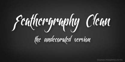
- PRONK Clean by wearecolt,
$9.00 Introducing PRONK. By Wearecolt. This is a tall, bold and round display font designed for retro-modern designs. This font is perfect for your next logo design or magazine titles. Taking inspiration from many tall fonts and American number plates i created a display font that would be my 'go to' for a neat tall, bold font. I also wanted something which would be able to take a good amount of treatment like stamp effects and grunge. The PRONK pack includes: .otf and standard webfont file types
 - Jacky Chan by Asd Studio,
$15.00 Introducing, Jacky Chan - Brush Font Jacky Chan font preserves all the high definition detail of the original handwritten letters. This font it truly looks realistic. Take your design to the up level with a hyper-realistic font that truly looks hand painted. Jacky Chan uses feature Bitmap Trace in Inkscape that makes way for more authentic looking fonts and is sure to grab the attention of customers and designers alike. Jacky Chan installs like any other font, and can be used in any color, on any background. What's Included? :: Uppercase & Lowercase (Regular and Italic Version) :: Numbers & Punctuation : Swashes Ligature :: Multilingual Support Enjoy our font, thank you.
 - ITC Elan by ITC,
$29.99 ITC Élan combines a gothic simplicity with elegance in a distinctive yet subtle typeface design. There is also a feeling of architectural strength which is derived primarily from an optically even line-weight and a sense of vertical stress. The small, almost Latin, serifs add distinction at both display and text sizes. The large x-height, minimum stroke variance, and open counters are ideal design traits for typeface legibility. Additional characteristics which distinguish ITC Élan are the splayed M" and bowls which do not quite close in the "a," "b" and several other letters. In contrast to the roman, there is almost a calligraphic playfulness to the italic. ITC Élan is the second ITC typeface from Albert Boton of France, who also designed ITC Eras. ITC Élan comes in four weights, book, medium, bold, and black, each with a corresponding italic."
 - Cyan Sans by Wilton Foundry,
$29.00The design of Cyan was inspired by features found in classic Roman and styles like Trajan and Bodebeck. The characters stay true to the same features as the capitals, resulting in an unusually distinctive style. The Capitals version contains Roman numerals. Cyan's weight is similar to Trajan's but the horizontal strokes are slightly bolder resulting in better legibility for small sizes, especially for lowercase characters. Cyan Sans evolved out of the hugely successful Cyan Serif family. Cyan Sans retains the same geometric Roman proportions with open centers in B,P,R b, d, p . This helps create a thick and thin stroke illusion since the actual strokes don't vary much. There are many subtle details in Cyan Sans that become more interesting in larger sizes. The beauty of Cyan Sans is that it has no features that "jar" the eye. The result is a very pleasing and distinctive sans that scales well. Cyan Sans is a robust font that will exceed expectations in areas never explored before. The name is inspired by the Greek word cyan, meaning "blue". Blue as a primary color that has many hues and uses. Cyan the font, we hope will be seen in a similar light. Obviously Cyan Sans is a perfect companion to the Cyan Serif family. - Milk & Clay by loryn ipsum,
$15.00 Milk & Clay | handwritten sans serif font Meet Milk & Clay, the font that started it all. This font was inspired by a friend who is a ceramists. The smooth and soft bumpy edges of this font is influenced by the texture and shape of clay as you’re working with it - almost perfect letter or shapes but not quite there. The letters are unique and feel soft and handmade. Perfect for; handmade products, ceramics, branding, logos, instagram quote text.
 - Alan Walker by Goodigital13,
$20.00 Perfectly suited to signature, stationery, logo, typography quotes, magazine or book cover, website header, clothing, branding, packaging design and more.perfectly suited to signature, stationery, logo, typography quotes, magazine or book cover, website header, flyer, clothing, branding, packaging design and more.
 - Bear Claw by Ira Natasha,
$10.00 Bear Claw is a handwritten script font. A new fresh handmade font with rough edges. This font is support multi language and available in OTF file. This font will perfect for many different project ex: quotes, logo, blog header, poster, branding, fashion, apparel, letter, invitation, stationery, etc….
 - Mortal Claws by Krakenbox Studio,
$27.00 Corogh Gorge is a Blackletter Font. It has gothic, mysterious, brave, classic. It’s a great font for fashion, apparel projects, signature, album cover, logo, branding, magazine, social media, & advertisements, but also works great for other projects.


Page 1 of 250Next page