10,000 search results
(0.019 seconds)
- Plants by Artisan Studio,
$15.00 Plants Clean & Rough is 2-style family. The brush script is beautiful and unique; it is a model of modern calligraphy typefaces, in combination with a calligraphy writing style. Can be used for various purposes.such as headings, logos, wedding invitation, t-shirt, letterhead, labels, news, posters, badges etc. This font's features are: - Contextual Alternates - Standard ligatures - Discretionary ligatures - Stylistic Alternates - Stylistic sets OpenType features can be accessed by using OpenType smart programs such as Adobe Illustrator and Adobe InDesign, Adobe Illustrator CS, CorelDraw X6-X7.
 - Tipo Movin CDMX by Ixipcalli,
$- La versión propuesta por la SEMOVI (Secretaria de Movilidad) es un estilo más angosto y ortográfico, creadó con la finalidad de aligerar las aplicaciones tipográficas del sistema. Se emplea oficialmente en todas las aplicaciones del sistema de Movilidad Integrada de la Ciudad de México. El creador de la tipografía es Lance Wyman. En esta edición, los tipos minúsculas son una adaptación “no oficial” para el Tipo Movin CDMX, enriqueciendo la tipografía a un estilo visual de altas y bajas, por lo que se prescinde del diseño base como trabajo propio para enfatizar los tipos minúsculas exclusivamente, además de que se han añadido algunos caracteres de acentuación extendiendo su uso a otros lenguajes. Los tipos son una nueva propuesta por Ixipcalli en el presente año 2023. The version proposed by SEMOVI (Secretary of Mobility) is a narrower and more orthographic style, created with the purpose of lightening the typographic applications of the system. It is officially used in all the applications of the Integrated Mobility system of Mexico City. The creator of the typeface is Lance Wyman. In this edition, the lowercase types are an “unofficial” adaptation for the Tipo Movin CDMX, enriching the typography to a visual style of highs and lows, so the base design is dispensed with as my own work to emphasize the lowercase types exclusively, In addition, some accentuation characters have been added, extending their use to other languages. The types are a new proposal by Ixipcalli in the current year 2023.
 - Berenjena by PampaType,
$40.00 Berenjena is a captivating font family designed by type designer Javier Quintana Godoy in Santiago de Chile. Berenjena has the right combination of comfort in reading and a lyric spirit. This helps keep readers in the delicate atmosphere in which novels and tales can display all their charm. Most typefaces created for books cannot reach this. Either they are too expressive so they tire the eyes of the reader, or they are dull and reading becomes a tedious task. Berenjena was designed for text use bearing in mind this concept of subtle balance. Berenjena (Spanish for aubergine or eggplant) gives your text that spicy environment in which words shapes are easy to read while letterforms maintain their capricious feeling. It comes in roman and cursive declined in four weights: Blanca, Fina, Gris, Negra. All Berenjena character sets include extensive diacritics coverage for more than 200 languages plus the usual contextual features. The Berenjena Pro fonts (available at PampaType.com) include smalls caps, elegant ligatures, cute swashes, every kind of figures, and all contextual sorts. Berenjena will give your design a very individual character. It wears captivating details of calligraphic poetry which link subtlety to vernacular sign painting from Santiago de Chile. See a pdf of Berenjena here http://origin.myfonts.net/s/aw/original/306/0/156716.pdf or visit PampaType.com for more information.
 - ThreeDee by URW Type Foundry,
$99.99The idea for this completely new font design with overlapping characters came when Axel Stoltenberg, longtime IKARUS program developer at URW + +, visited a restaurant. As it can be seen quite often , the daily specials were offered handwritten with chalk on a blackboard applying a writing technique never been available before for digital fonts: each character is partly covered by its predecessor creating a three-dimensional effect. The implementation of this unusual notation for digital setting required a lot of programming and testing until all necessary character variants were produced and set properly always using the correct form. In order to achieve this, the OpenType Pro font ThreeDee contains about 12,400 characters and all the necessary OpenType features (GSUB ) for the automatic setting in OTF savvy application programs. The slightly playful basic design for ThreeDee was created by Anna Stoltenberg , the daughter of Axel, specially devised for the innovative representation and support of its special nature. The shadow generated with IKARUS even intensifies the 3D effect. As is well-known, making use of the embedded OTF features, i.e. the automatic access to all the 12,400 character variants , a corresponding text / layout program ( InDesign, Quark Xpress, current Open / LibreOffice or MS Word etc. ) is required. ThreeDee is a headline font that will unveil all its charisma and exceptional quality at appropriate, larger sizes. - Spiderman - Unknown license

- Siren Script by Canada Type,
$49.95 Siren Script takes its cue from BB&S's Stationers Semiscript (metal, 1899) and its countless imitations/inspirations from throughout the 20th century, particularly a variety of uncredited film faces from the 1960s. What makes this kind of script stand out in the genre is its mixing of flourished majuscules with mostly subdued, traditional minuscules. The result is a balance between formal and informal lettering, as if the letterer is applying his or her learned art without going into full-throttle calligraphy. The message is clearly and gracefully delivered, and the artistic endeavor is fully appreciated without causing coronaries. The Siren Script family comes in four full fonts, and a fifth one that contains alternates, ending letters, and some ligatures. Siren Script Pro combines all five fonts into a single one of over 880 characters, which includes programming for push-button stylistic alternates, class-based kerning, and other glyph palette conveniences.
 - Brioso by Adobe,
$35.00Brioso Pro is a new typeface family designed in the calligraphic tradition of the Latin alphabet. Brioso displays the look of a finely-penned roman and italic script, retaining the immediacy of hand lettering while having the scope and functionality of a contemporary composition family. Brioso blends the humanity of written forms with the clarity of digital design, allowing designers to set pages of refined elegance. Designed by Robert Slimbach, this energetic type family is modeled on his formal roman and italic script. In the modern calligrapher?s repertoire of lettering styles, roman script is the hand that most closely mirrors the oldstyle types that we commonly use today; it is also among the most challenging styles to master. Named after the Italian word for ?lively,? Brioso moves rhythmically across the page with an energy that is tempered by an ordered structure and lucidity of form. - FF Nort Headline by FontFont,
$50.99 The FF Nort™Headline is the ideal companion to the already released FF Nort typeface family. It is open, inviting, highly legible, strikingly handsome and a comfortable performer on screen and in print. As a powerful display type tool, it is perfect for headlines, navigational links and banners. OpenType® Pro fonts of FF Nort Headline, have extended character sets that support most Central European and several Eastern European languages – including Greek and Cyrillic. Graphic communicators will also benefit from the additional ligatures, and suite of symbols and signs. FF Nort’s designer Jörg Hemker has a background in corporate and governmental design and has received a variety of awards for his work – including the prestigious German Red Dot Design Award. He works as a freelance graphic and branding designer and is a lecturer in type and typography at the University of Applied Science in Hamburg
 - 1785 GLC Baskerville by GLC,
$42.00 This family was created/inspired from the well-known Baskerville Roman and Italic typefaces created by John Baskerville, the English font designer. We were inspired by the original family sent by Baskerville’s wife after his death. The full Baskerville collection was bought by the French editor and author Pierre-Augustin Caron de Beaumarchais who used it to print - in Switzerland - for the first time the complete works of Voltaire (known as the “Kehl edition” from the "Imprimerie de la société littéraire typographique"). We have used this edition, with copies from 1785, to reconstruct these two genuine historical styles. The font faces, kerning, and spacing are scrupulously identical to the original. This Pro font includes characters for Western, Eastern and Central European languages (including Celtic) and Turkish, with a complete set of small caps, standard and “long s” ligatures in each of the two styles.
 - Opal by Linotype,
$29.99 Opal Pro is a text family designed by Hannes von Döhren in 2008. It gives every text a noble character. The typeface has long ascenders that clearly rise above the capital letters and a low x-height. Opal’s letters sport inktraps at stroke junctions, which on one hand create a cutout feeling and on the other hand strengthens the image in larger point sizes. In total, the letterforms have clear emphasis on their verticals and horizontals; they do not fear the weight on their curves. In addition to the Italic and Bold, the Opal type family includes a Script face, whose letterforms include connections, similar to handwriting. On top of that, the typeface possesses swash letters for italic and script, small caps, many ligatures and borders & ornaments. With a little bit of care, designers will be able to create the finest of traditional, elegant work with this family.
 - Waypointer by Tarallo Design,
$18.99 Waypointer is a font of arrows. These can be used to indicate direction or emphasis in documents, signage, or websites. The arrow sizes match the standard cap height of most fonts making it simple to use within text. The arrows are accessed with the standard keyboard keys. Make your own arrow of any length with the 1 to 9 keys. Use uppercase (A to Z) and lowercase (a to z) for pre-made arrows that point right, left, up, or down. Those who use OpenType will find useful features, such as stylistic sets for changing arrow directions in 360 degree angles and stylistic alternates for quick changes between pointing right and left. It has a few extras such as a map pin, anchor, and lightning bolt. These are included and accessed with the comma, period, and zero key.
 - Piano Keybuild by Type Minds,
$5.00 Piano Keybuild is a small font designed for creating piano keyboard layouts. It was inspired by my Yamaha CLP-840, a wonderful digital piano. The face consists entirely of keyboard keys that can be combined to form realistic keyboards. These keys come in four styles: basic outlined keys, filler keys (for adding a second color inside the outlines), keys with note names, and pre-made sets of keys. Keys of a given kind will kern with one another, but only in the order that they would naturally occur on a keyboard. (This makes it easier to spot incorrect key sequences.) It also includes digits 0 through 9 inspired by numerals used in traditional music notation. The user guide (PDF under Gallery tab) demonstrates the locations of all the glyphs as well as how to use them together effectively.
 - Sidestroke by Ramen,
$9.00 The typeface is inspired by our love of old hand-painted signs in butchers, and based on some very quick sketches using a brush pen to find what shapes worked. There is quite a quirky element to the type, as we tried to create the original sketches by rotating the brush pen to reflect the strokes of a paint brush. This lead to a horizontal stressing, which is most noticeable in letters like C, G, S and J. Sidestroke comes in 2 styles, both a standard solid version, and a pre-shadowed outline version. This can be outlined and divided in Illustrator to quickly create an alternate coloured fill for your letters. The lowercase letters have been designed to automatically horizontally align with any uppercase letters, which is a great shortcut when creating logos or other unique type layouts.
 - Masqualero by Monotype,
$50.99 The Masqualero™ family is a versatile solution for a deep and broad range of applications. In large sizes, the heavier designs are dark and handsome, while the lighter weights are charming and friendly in text copy. Thanks to its many variations and distinctive demeanor, both print and interactive designers will find that Masqualero expands their creative options, while setting the perfect tone to catch and hold readers’ attention. It’s About the Design Like the legendary jazz song of the same name, Masqualero is haunting and sophisticated. Drawn as a tribute to Miles Davis, its letterforms are as beautiful as his “Masqualero” composition. “I approached drawing the letters as if they were marble sculptures,” Says Jim Ford about his typeface. “Many sharp, black, modern sculptures filling a large park. All of them created with the same qualities – the flair of Miles' electric funk and rock sounds, the sparkly smooth finish and serifs like trumpet bells, the sweet lyricism and the tone and clarity of Miles’ horn.” What’s Available With six weights and italics, in addition to Stencil and Groove display designs, Masqualero is available as a suite of OpenType Pro fonts, providing for the automatic insertion of small caps, ligatures and alternate characters. Pro fonts also offer an extended character set supporting most Central European and many Eastern European languages. Thoughts About Use A book or album cover set in the Masqualero design sends a message: what’s inside is of value. Like jazz, the Masqualero typeface takes ordinary basic concepts and slips them into something special. Readers take notice and immediately recognize that what they’re viewing is a cut above – and radiates quality. “I see Masqualero as a luxurious typeface for exquisite typography,” says Ford. “I wouldn’t use it to sell toys or hot dogs. Masqualero sells diamonds, boats, real estate and champagne.” Perfect Pairings Antique Olive™ Neue Kabel® Neue Frutiger® Quire Sans™ Trade Gothic®
 - Code Next by Fontfabric,
$39.00 10 years later, one of the first geometric typefaces in our portfolio and a popular favorite of yours is rising to a whole new level! We’re revealing the stand-alone type family Code Next—a staggering evolution from Code Pro in functionality, versatility, and application. The transformation includes 6 new weights, 10 new Italics, full support of Extended Cyrillic and Greek, full redesign and glyphs refinement, 2 variable fonts, to name but a few. Going back to 2011, the grotesque-inspired Code Pro was designed to complement memorable pieces that make a statement. Balancing between stylization and simplification, it was encoded with the distinct voice of basic organic shapes to stand the test of time. Little did we know, it would expand and live up to the potential of a “font from the future” as the new Code Next. Today, a type family of 22 styles, this geometric sans solidifies its relevance and carries a strong constructive aesthetic through simplified forms with a twist. These fit any modern design in print, web, and display visualization. Developed to go above and beyond, Code Next comes prepared for multi-script projects with Extended Latin, Extended Cyrillic, and Greek. Explore Code Next’s versatility and switch things up with the help of 2 variable fonts, more than 1280 glyphs, and an extensive OpenType features set including small caps, standard and discretionary ligatures, contextual and stylistic alternates, stylistic sets, case sensitive forms, and much more. Overview: • Font family of 22 fonts • 10 weights • Languages - Full support of Extended Latin; Extended Cyrillic; Greek • Entirely refined design and metrics • Glyph count - 1288 • Variable fonts - 2 fonts OpenType features: • Small Caps • Standard Ligatures • Discretionary Ligatures • Contextual Alternates • Stylistic Alternates • Stylistic Sets • Case-Sensitive Forms • Ordinals • Localized Forms • Lining Figures • Proportional Figures • Tabular Figures • Oldstyle Figures • Subscripts • Scientific Inferiors • Superscripts • Numerators and Denominators • Fractions • Roman figures • Extensive mathematical support • Navigation symbols
 - Archive Garamond by Archive Type,
$59.99Archive Garamond is a typeface roughly based on the designs of Claude Garamond (ca. 1480 – 1561), a French publisher and a leading typeface designer of that period. Garamond’s influence on type design is reflected in many typefaces that are today known under different commercial names. While the majority of contemporary digital interpretations of the “Garamond types” are cleaner and more polished versions of that genre, Archive Garamond tries to keep the rough nature which was typical in the early days of printing. Archive Garamond has a rather unique, distinctive temperament which is even more emphasised with the preserved non-uniformity, such as irregular glyph shapes or a variable baseline. Although Archive Garamond was clearly made to be used for display sizes it works surprisingly well in text. Archive Garamond is availale in three versions, each containing approximately 600 glyphs (in Pro versions). Archive Garamond Pro A Professional version of the typeface contains all glyphs, including the advanced typographic forms, such as different sets of figures, small caps, swashes, historical forms, etc. The font also enables full use of the OpenType features. It fully supports the languages listed in the language list. Archive Garamond Std A Standard version of the typeface is meant to be used for the basic typographic work. It typically contains the most common glyphs. The standard figures are proportional lining. Besides kerning this version does not contain any advanced OpenType features. A Standard file type fully supports the languages listed in the Language list. Archive Garamond Exp An Expert version contains glyphs that are supposed to be used in advanced typographic works. This type of file contains uppercase and small cap glyphs with the proportional oldstyle figures as the default set. Besides kerning this version does not contain any advanced OpenType features (all OTF features have to be replaced manually). An Expert file type fully supports the languages listed in the Language list. - Rival Sans by Mostardesign,
$25.00 A sans serif with a dynamic look for complex typographic work. Rival Sans is a sans serif font family possessing many strengths. Its 32 fonts and 2 styles, make Rival Sans a very versatile family and suitable for many graphic design projects such as branding, signage, editorial creation, advertising, packaging, broadcasting or logo creation. With the endings cut at 10 degrees and sharp cuts on the top of the stems of certain characters (like the l, b or the d) Rival Sans gives dynamism and readability to the lengthiest of editorial content. This beveled font design also gives rhythm to a text's sentences as well as a very functional look. All these design details give this new font family a modern, energetic and humanistic look. Rival Sans also has many powerful OpenType features such as case sensitivite forms, small capitals, old style and tabular figures, slashed zero, ligatures, fractions,and alternative characters to give personality to graphic design projects. Designed also for complex editorial content, this typeface has a powerful home kerning system called "Pro Kerning". With more than 2500 pairs of glyphs and many languages, Pro Kerning optimizes headlines, subtitles, texts as well as long paragraphs in real time. In addition to these extended features, the italic styles of this fonts family have been drawn as fully-fledged styles with different designs from their regular version so that the italic texts look like calligraphic phrases. Rival Sans has an extended character set with over 930 glyphs. This family covers over 130 languages from Western Europe, Eastern Europe and Central Europe. In addition to all the features of its kind, Rival Sans is part of a very complete "type system" with style variants such as the serif version Rival Serif or the slab version Rival Slab. With all these typefaces, you have 62 styles to make your own vibrant and professional graphics or web creations while maintaining consistency in your creations.
 - Bright Lady by Sulthan Studio,
$12.00 Bright Lady is a natural handwriting that is beautifully written as a form of love for modern calligraphy. I cleaned some of the stains to make it look smoother and neater, so you can use it for the job you want. Bright Lady - including many alternative characters. Coded with Unicode PUA, which allows full access to all additional characters without having special design software. Mac users can use Font Book. Windows users can use the Character Map to view and copy one of the additional characters to paste into your favorite text editor. For people who have software capable of using OpenType: Alternatives can be accessed by turning on the "Alternative Style" and "Ligature" buttons on the Photoshop Characters panel, or through any software with glyph panels, such as Adobe Illustrator, Photoshop CC, Inkscape.
 - Redpine by Taznix Creative,
$15.00 Redpine is an unique and simple sans serif font. Use it to add that special retro touch to any design idea you can think of! There are 2 types of fonts in Redpine, namely clean and textured. If you need a clean and aesthetic design, you can use the regular redpine or you want to use as a rough design or some scratch effect, you can use textured Redpine. Redpine is perfect for branding projects, logo, social media posts, advertisements, product packaging, product designs, label, photography, watermark, invitation, stationery and any projects that need retro taste. What's Included : Standard glyphs Ligature Works on PC & Mac Simple installations Accessible in the Adobe Illustrator, Adobe Photoshop, Adobe InDesign, even work on Microsoft Word. PUA Encoded Characters - Fully accessible without additional design software. Fonts include multilingual support for; ä ö ü Ä Ö Ü ß ¿ ¡ Image used : All photographs/pictures/vector used in the preview are not included, they are intended for illustration purpose only. Hope you enjoy with our font! Taznix
 - Wafterby by Paramajan,
$8.00 Wafterby is a handsome sans serif typeface family. It comes in eight weights which have a minimal and clean feel. Its design is based on circle and line geometric shapes. It can be used as a cute minimal-style header display or as a stylish text for magazine, blog, corporate branding, packaging, wedding invitation project, etc.
 - Davina by Nirmalagraphics,
$14.00 I made Davina for display purposes and it can be used for logos with a vintage style, for flyers, brochures, leaflets and more. If you like a logo with a semi-vintage style, thick, unique and clean, it means you have to buy and use Davina! This font also has Multi-Lingual support and more than 15 Ligatures.
 - Forwardback LL by Leftover Lasagne,
$25.00 Forwardback is a clean and friendly typeface with a large compliment of European characters. Its round & bouncing letters impart a smooth handwritten feel. The font features auto-ligatures for duplicate letters, plus a hefty set of graphical elements & shapes which can be accessed by convenient keyboard shortcuts (a lowercase letter directly followed by a number from 0-9).
 - Columnist JNL by Jeff Levine,
$29.00 “News Gothic” has been a reliable workhorse of a font since it was created by Morris Fuller Benton and first offered for sale in 1908 by American Type Founders. A clean, legible design used for text copy, it can also double as a light headline face. This reinterpretation (named Columnist JNL) is available in both regular and oblique versions.
 - Fashion by ITC,
$29.99Fashion Compressed and Engraved are the works of British designer Alan Meeks. Fashion Compressed is an elegant modern roman typeface suitable for a variety of advertising styles. The capitals can be used as initials or combined with the lower case letters. Fashion Engraved was produced when Meeks reworked Fashion Compressed, resulting in a beautiful, engraved typeface. - Amike by Letradora,
$15.00 Amike is a natural handwritten font, simulating a very neat, clean handwriting. It works well both as mixed case and all caps. It includes alternates for most characters, that can be used for a random mix using the Contextual Alternates Opentype feature to create a natural written look. It supports a wide character set, including most European languages & Vietnamese.
 - Easter West by Sipanji21,
$17.00 "Easter West" is a display font with straight and sharp character shapes. Fonts like this are often chosen for designs that require a clean, modern, and bold appearance. This type of font can work well in a variety of design projects, including logos, headlines, posters, and other creative applications where a sharp and straightforward typography style is desired.
 - Antartida by Latinotype,
$26.00 Antartida is a sans serif typeface, while it is monolinear simple structure give it a kind of neutral feeling, is functional, clean and minimal. Is a family of 8 fonts, 4 weights and italics. This typeface contains alternate glyphs that help to emphasize text or headlines. You can also see AntartidaEssential, a simpler and less expensive version.
 - White Risolles by pentagonistudio,
$19.00 White Risolles Is Clean Script Font Inspired By Handwritting Characters. Font Features : White Risolles OTF ( Open Type ) White Risolles WOFF ( Web Font ) SOFTWARE REQUIREMENTS : Fonts and alternate : No special software required they may be used in any basic program /website apps that allows standard fonts That's it folks! You can go ahead and get cracking :) Have a Good Day !
 - Monzane by Salamahtype,
$19.00 MONZANE is a visually strong and impactful font style consisting only of capital letters. It is characterized by its bold and eye-catching appearance and can be used in a variety of design applications, including advertising, branding, news headlines, and graphic design projects. Features : All caps with 6 styles (clean, rough, outline, and slant) Punctuation and symbols Multilingual support
 - Lansonia by Bosstypestudio,
$12.00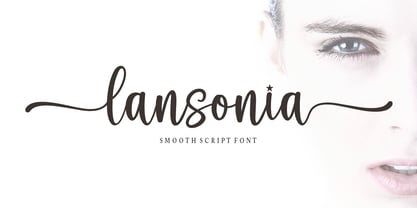 Lansonia is a modern calligraphy font with a dancing baseline and a clean, classic and elegant touch. It can be used for various purposes such as headings, signature, logos, wedding invitations, t-shirt, letterhead, signage, lable, news, posters, badges etc.Hello Bella Script features 300 total glyphs with 100 alternate characters including OpenType Stylistic alternates, ligatures and international language suppor
 - Bellis by Nine Font,
$25.00 Bellis is a hand painted brush font. Painted on absorbent paper with a chinese brush to make the ink spreading texture. The original texture was a little bit messy but we translated into a more clean textured font. Bellis is a very easy to read brush font and it can be used for posters, magazines or graphic artworks.
 - Sweet Vanity by Prestige Artsy Studio,
$20.00 Sweet Vanity is a remarkable modern and rich serif that comes with its beautiful outline. It works beautifully for branding projects, headlines, magazines, product packaging, quotes, posters and more. Sweet Vanity can be easily read thanks to its sophisticated and clean curves. WHAT’S INCLUDED: • Sweet Vanity – Regular • Sweet Vanity – Outline Follow me on Instagram for future updates : www.instagram.com/zak.mansouri/
 - Zero Master by Rockboys Studio,
$29.00 Zero Master is a modern and clean technology, Hi Tech font style. This font looks modern, sci-fi, futuristic, future, readable, stylish, catchy and easy to use. This font is PUA encoded which means you can access all of the glyphs and swashes with ease! It features a varying baseline, smooth lines, gorgeous glyphs and stunning alternates.
 - Claude Sans by ITC,
$40.99Claude Sans is the work of British designer Alan Meeks. The conservative roman weight is complemented by a more extravagant italic. The proportions are based on those of the original Garamond typeface of Claude Garamond, from whom this type gets its name. Claude Sans can be used alone or combined with Claude Sans italic and bold weights. - Sintonia by Bosstypestudio,
$14.00 Sintonia is a modern calligraphy font with a dancing baseline and a clean, classic and elegant touch. It can be used for various purposes such as headings, signature, logos, wedding invitations, t-shirt, letterhead, signage, lable, news, posters, badges etc.Hello Bella Script features 350 total glyphs with 100 alternate characters including OpenType Stylistic alternates, ligatures and international language support.
 - Marking Stencil JNL by Jeff Levine,
$29.00 With electronics taking over virtually every aspect of manufacturing, packaging and shipping, it's almost difficult to envision a time when wooden crates were marked for identification by using brass stencils. Many of these stencils were hand-cut or manufactured with special punches that perforated the brass sheets with pre-formed letters and numbers. One such stencil was the design model for Marking Stencil JNL.
 - Caslon Antique by Linotype,
$40.99 Caslon Antique was designed by Berne Nadall and brought out by the American type foundry Barnhart Bros & Spindler in 1896 to 1898. It doesn’t bear any resemblance to Caslon, but has the quaint crudeness of what people imagine type looked like in the eighteenth century. Use Caslon Antique for that “old-timey” effect in graphic designs. It looks best in large sizes for titles or initials.
 - Old Union by Mysterylab,
$18.00 Old Union is a unique and creative modern font that is eye-catching and versatile. Elements of the design strongly reference Cyrillic typefaces of the early Soviet era, but with a distinctly modern look. Excellent for many uses including posters, banners, and logos. This design straddles the line between Didone-style elegance and vintage agit-prop. There are two variations in this package: Regular and Oblique.
 - Maccaroni by URW Type Foundry,
$39.99 David Kowalski’s typeface Maccaroni is based on a logo type and has been designed to a complete typeface in Prof. Veljovic’s Type Design course at HAW Hamburg. Maccaroni breaks the traditional brush scripts and offers a unique design. Each letter is present in triplicate in order to achieve the illusion of a hand-written typeface. The OpenType programming ensures that two identical letters won’t follow each other.
 - Apres by Font Bureau,
$40.00 David Berlow and staff drew Apres as part of a series designed originally for the Palm Pre smart phone, for use both on the device and in print marketing. Simple, open letterforms and generous proportions provide a clear, comfortable, and inviting experience for navigation and readability. The plain-spoken geometry is regular and balanced, without being static or mechanical, for a friendly and forthright familiarity; FB 2008
