10,000 search results
(0.188 seconds)
- SF Quartzite Outline - Unknown license

- twenty four - Unknown license

- ArtificeSSK - Unknown license

- RoboKoz - Unknown license

- White Rabbit - Unknown license

- Tech Angels - Unknown license

- M+ 2c - Unknown license

- Chlorix - Unknown license

- Lady Ice - Condensed - Unknown license

- Prismatic Spirals by MMC-TypEngine,
$93.00 PRISMATIC SPIRALS FONT! The Prismatic Spirals Font is a decorative type-system and ‘Assembling Game’, itself. Settled in squared pieces modules or tiles, embedded by unprecedented Intertwined Prismatic Structures Design, or intricate interlaced bars that may seem quite “impossible” to shape. Although it originated from the ‘Penrose Square’, it may not look totally as an Impossible Figures Type of Optical Illusions. More an “improbable” Effect in its intertwined Design, that even static can seem like a source of Kinetical Sculptures, or drive eyes into a kind of hypnosis. Prismatic Spirals has two related families, its “bold” braided version Prismatic Interlaces and the Pro version. While the default is simpler or easier to use, as all piece’s spin in same way, PRO provides a more complex intricate Design which requires typing alternating caps. Instructions: Use the Map Font Reference PDF as a guide to learn the 'tiles' position on the keyboard, then easily type and compose puzzle designs with this font! All alphanumeric keys are intuitive or easy to induce, you may easily memorize it all! Plus, often also need to consult it! *Find the Prismatic Spirals Font Map Reference Interactive PDF Here! (!) Is recommended to Print it to have the Reference in handy or just open the PDF while composing a design with this typeface to also copy and paste, when consulting is required or when it may be difficult to access, depending on the keyboard script or language. As a Tiles Type-System, the line gap space value is 0, this means that tiles line gaps are invisibly grouted, so the user can compose designs, row by row, descending to each following row by clicking Enter, same as line break, while advances on assembling characters. Background History: The first sketches of my Prismatic Knots or Spirals Designs dates back then from 2010, while started developing hand-drawn Celtic Knots and Geometric Drawings in grid paper, while engage to Typography, Sacred Geometry and the “Impossible Figures” genre… I started doing modulation tests from 2013, until around 2018, I got to unravel it in square modules or tiles from the grid, then idealized it as fonts, along with other Type projects. This took 13 years to come out since the first sketches and 6 months in edition. During the production process some additional tiles or missing pieces were thought of and added to the basic set, which firstly had only the borders, corners, crossings, nets, Trivets connectors or T parts and ends, then added with nets and borders integrations. Usage Suggestions: This type-system enables the user to ornate and generate endless decorative patterns, borders, labyrinthine designs, Mosaics, motifs, etc. It can seem just like a puzzle, but a much greater tool instead for higher purposes as to compose Enigmas and use seriously. As like also to write Real Text by assembling the key characters or pieces, this way you can literarily reproduce any Pixel Design or font to its Prismatic Spirals correspondent form, as Kufic Arabic script and further languages and compose messages easily… This Typeface was made to be contemplated, applied, and manufactured on Infinite Decorative Designs as Pavements, Tapestry, Frames, Prints, Fabrics, Bookplates, Coloring Books, Cards, covers or architectonic frontispieces, storefronts, and Jewelry, for example. Usage Tips: Notice that the line-height must be fixed to 100% or 1,0. In some cases, as on Microsoft Word for example, the line-height default is set to 1,15. So you’ll need to change to 1,0 plus remove space after paragraph, in the same dropdown menu on Paragraph section. Considering Word files too, since the text used for mapping the Designs, won't make any literal orthographical sense, the user must select to ignore the Spellcheck underlined in red, by clicking over each misspelled error or in revision, so it can be better appreciated. Also unfolding environments as Adobe Software’s, the Designer will use the character menu to set body size and line gap to same value, as a calculator to fit a layout for example of 1,000 pts high with 9 tiles high, both body size and line gap will be 111.1111 pts. Further Tips: Whenever an architect picks this decorative system to design pavements floor or walls, a printed instruction version of the layout using the ‘map’ font may be helpful and required to the masons that will lay the tiles, to place the pieces and its directions in the right way. Regarding to export PNGs images in Software’s for layered Typesetting as Adobe Illustrator a final procedure may be required, once the designs are done and can be backup it, expanding and applying merge filter, will remove a few possible line glitches and be perfected. Technical Specifications: With 8 styles and 4 subfamilies with 2 complementary weights each (Regular and Bold) therefore, Original Contour, Filled, Decor, with reticle’s decorations and 2 Map fonts with key captions. *All fonts match perfectly when central pasted for layered typesetting. All fonts have 106 glyphs, in which 48 are different keys repeated twice in both caps and shift, plus few more that were repeated for facilitating. It was settled this way in order for exchanging with Prismatic Spirals Pro font which has 96 different keys or 2 versions of each. Concerning tiles manufacturing and Printed Products as stickers or Stencils, any of its repeated pieces was measured and just rotated in different directions in each key, so when sided by other pieces in any direction will fit perfectly without mispatching errors. Copyright Disclaimer: The Font Software’s are protected by Copyright and its licenses grant the user the right to design, apply contours, plus print and manufacture in flat 2D planes only. In case of the advent of the same structures and set of pieces built in 3D Solid form, Font licenses will not be valid or authorized for casting it. © 2023 André T. A. Corrêa “Dr. Andréground” & MMC-TypEngine.
 - Deco Revival JNL by Jeff Levine,
$29.00 Some time back, a few basic characters were drawn out (possibly inspired by some vintage sheet music) and set aside for a future font project. Despite being incomplete for a few years, this once-forgotten design is now available as Deco Revival JNL, in both regular and oblique versions.
 - Speechless by Gassstype,
$23.00 Hello Everyone, introduce our new product Speechless is a Playful Handwritten Font with a natural handwritten feel. This handmade font will make your design has a beautiful natural touch for each details. It is perfect for any design project as Invitation,logo, book cover, craft or any design purposes. That is why Speechless has authentic and strong characteristic more natural look. You can activate Ligatures OpenType panel.
 - Matryoshka by Volcano Type,
$19.00 Matryoshka is a display layering type family which is inspired by the Russian wooden doll. The family contains eight different weights from XXS (thin) to XXL (fat) + Pregnant (all in one). The design is based on an elaborate and complex grid, so each font fits perfectly into the other. With the Matryoshka family the typographer can create millions of new solutions. Play with it!
 - Billguva by Zealab Fonts Division,
$14.00 Billguva is a new beautiful & unique typeface from Bagerich Type Foundry, designed by Reza Rasenda & Riska Candra Dewi. The capitals have a set of unique alternates that can be used to give more personality when needed. Create unique & beautiful logotype, use it as an elegant solution for your next magazine layout, or choose Billguva for any graphics that require a sleek look with a elegant flair.
 - Breakable by Gassstype,
$23.00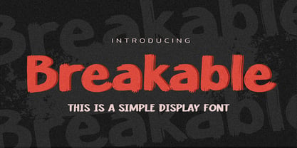 Hello Everyone, introduce our new product Breakable This Is a Simple Display Font with a natural feel. This handmade font will make your design has a beautiful natural touch for each details. It is perfect for any design project as Invitation,logo, book cover, craft or any design purposes. This font is PUA encoded which means you can access all of the magical glyphs with ease!
 - Afjat Trends by Siwox Studios,
$65.00 Afjat Trends - Elegant & Humanist Display Font by Siwox Studios Introducing our new typeface project, Afjat Trends Light. High contrast with Modern Style this is perfect for branding, logos, invitation, sub-titles, phrases, text, and more. The narrow matrix can make it easy to customize and tracking space on long text use. Multi-Language Support Very Complete With Extended Latin, Cyrillic, and Greek glyphs, Symbols, Figures, Ligatures & Alternates.
 - Wall Street Gothic by BA Graphics,
$45.00A new gothic with the great new look for today. Universal, works for all applications. - Chill Script by Eclectotype,
$40.00 Looking for a break from modern calligraphy? Tired of skinny scripts? Here's something seriously relaxed. Chill Script is a totally new typeface, it eschews any brush influence, but maintains a warmth that comes from not being rigidly constructed. It's a sans serif script, with a nice top-heaviness that makes it friendly. As you expect from fonts today, it's loaded (but not pointlessly overloaded) with OpenType features.
 - Cullion by Greater Albion Typefounders,
$9.95 Cullion is a new departure for Greater Albion, being a modern Fraktur, embodying future trends sch as highly stylised glyphs, a single case of lettering and highly evolved letterforms. At the same time it can trace its inspiration back to blackletter traditions, and is inspired by the sort of ironwork to be found in a medieval portcullis. The resulting typeface can sit happily in traditional, modern or futuristic design work. As the gallery images suggest, it does rather lend itself to work with a 'horror' theme, but it could have many other uses too-even in religious work. Cullion is particularly effective in poster headings.
 - Local Groceries by Invasi Studio,
$15.00 Inspired by the hand-painted paper signs typically seen in grocery stores during the 1920s to 1970s. This is now available in a digital format that still has the appearance and feel of hand-painted letters. Take a look at a few samples in the thumbnails to see what you can do with them. Local Groceries comes with a combination pairing font. It combines both regular and script fonts. Local Groceries is suitable for vintage and contemporary marketing, branding, merchandise, and packaging designs. Features: Uppercase & Lowercase Numerals & Punctuation Alternates and Ligatures Multilanguage Supports 60+ Latin based languages
 - Goudy by Ascender,
$40.99 Goudy Forum is a revival and dramatic expansion by Tom Rickner, type designer at Ascender Corporation, of Frederic W. Goudy’s 20th typeface design, "Forum Title". The Pro font began twenty years ago while Tom Rickner was a student at the Rochester Institute of Technology (RIT). Tom printed a type specimen using the Forum Title foundry hot metal types. Then in 1993 Tom began to digitize the font from that specimen while working as an independent type designer. Fifteen years passed before Tom dusted off the digital data and began working in earnest on font with a full Latin 1 character set. Steve Matteson, type director at Ascender, encouraged Tom to take this font further still, and soon the glyph repertoire and feature set blossomed to a robust Pro font with a myriad of advanced typographic OpenType features.
 - Bellagia Display by Attract Studio,
$22.00 Bellagia Display is a blend of two hand calligraphy typefaces and vintage serifs with a natural bond consisting of 7 weights from Thin to Black. All the wildcards and binders are specially designed to bring out the letters that are unique, and interesting. This makes it a very versatile font that works in both large and small sizes. Perfectly supports your creativity in making various design projects such as logo designs, branding, posters, magazines, labels, merchandise, invitations, long and short texts, and many of your other needs. Bellagia Display Features: - 7 Weights (from Thin to Black) - 1 Variable font - Alternates & Ligatures - OpenType support - Multilingual - PUA Encoded.
 - Mistral by URW Type Foundry,
$89.99 Named after the strong cold winds on Southern France, the Mistral font family is another original creation displaying the panache of the French graphic artist Roger Excoffon. Mistral is an informal script in which all letters link up in vigorous strokes. First issued in 1953, its brush-like stems look spontaneous and fresh. The descenders are fairly long and the whole alphabet has a distinctive and unforgettable effect on the page. Mistral is a good complement to sans serif typefaces. Mistral is a trademark of Heidelberger Druckmaschinen AG, which may be registered in certain jurisdictions, exclusively licensed through Linotype Library GmbH, a wholly owned subsidiary of Heidelberger Druckmaschinen AG.
 - Anthropology by Arendxstudio,
$17.00 Introducing my new font Anthropology, wrapped elegantly and has distinctive characteristics making this font beautiful. Anthropology is perfect for branding projects, logos, wedding designs, media posts, advertisements, product packaging, product designs, labels, photography, watermarks, invitations, stationery, and any project who need a handwritten style. Features: • Character Set A-Z • Numerals & Punctuations (OpenType Standard) • Accents (Multilingual characters) • Ligature • Alternate There it is! I really hope you enjoy it - comments & likes are always welcome and accepted. More importantly, don't hesitate to send a message if you have a problem or question. Now just read this, go there and make it happen :)
 - Xagetif by Twinletter,
$18.00 Grab our new font, Xagetif Groovy font, and start creating your own custom project. Use it to add a little flair to your editorial work or use it for branding or product packaging with a bold and fun character. Time to add some oomph to your next project with this font. This retro-inspired typeface features a psychedelic, bold and fun character ideal for branding and product packaging. This elegant typography is simple and contemporary but with a touch of simplicity that gives it a modern feel. To create your own custom project, start using this font now!
 - Brush Crush by Hanoded,
$20.00 I bought a few new pencils and I tried them out using Chinese ink and quality French watercolor paper. The result is Brush Crush - a very nice brush font. Brush Crush would look perfect on packaging, book covers, posters and headlines and comes with alternates for all lower case letters. Needless to say, Brush Crush speaks most Latin-based languages.
 - Somn by Mix Fonts,
$13.00 Mix Somn is the perfect font for adding charm to your children’s products. Its thin, tall, and dainty style is both stylish and legible, making it perfect for labeling baby clothes, toys, and other items. The digitally handwritten sans serif font was created with an iPad Pro and Apple Pencil, using the Poppy Brush from my Procreate Brush Bundle. Its delicate strokes and sweet, soft appearance make it the perfect choice for any project you might find in your little bundle of joy’s nursery. Mix Somn includes the following characters: ABCDEFGHIJKLMNOPQRSTUVWXYZ abcdefghijklmnopqrstuvwxyz 0123456789 !@$#%^&*() `~♥M• ÷+=[]:;’”,.\|/?{}<>“”‘’-–—_…©®™«»°¡¿₱¢€£¥ ÁÀÂÄÃÅĂĄÆĆČÇÐÉÈÊËĘÍÌÎÏŁŃÑÓÒÔÖÕØŐŒŚŠȘȚÚÙÛÜŰÝŸŹŽŻÞ áàâäãåăąæćčçðéèêëęíìîïłńñóòôöõøőœśšșțúùûüűýÿźžżþ
 - Prismatic Interlaces by MMC-TypEngine,
$93.00 PRISMATIC INTERLACES TYPEFACE! Prismatic Interlaces is a decorative system and ‘Assembling Game’, itself. Settled in squared pieces modules or tiles, embedded by unprecedented Intertwined Prismatic Structures Design, or intricate interlaced bars that may seem quite “impossible” to shape. Although it originated from the ‘Penrose Square’, it may not look totally as an Impossible Figures Type of Optical Illusions. More an “improbable” Effect in its intertwined Design, that even static can seem like a source of Kinetical Sculptures, or drive eyes into a kind of hypnosis. Prismatic Interlaces has two related families, both as a kind of lighter weight versions Prismatic Spirals Default & Pro. While Default is simpler or easier to use, same way as Prismatic Interlaces, Pro provides a more complex intricate Design that requires typing alternating caps. Instructions: Use the Map Font Reference PDF as a guide to learn the 'tiles' position on the keyboard, then easily type and compose puzzle designs with this font! All alphanumeric keys are intuitive or easy to induce, you may easily memorize it all! Plus, often also need to consult it! *Find the Prismatic Interlaces Font Map Reference Interactive PDF Here! (!) Is recommended to Print it to have the Reference in handy or just open the PDF while composing a design with this typeface to also copy and paste, when consulting is required or when it may be difficult to access, depending on the keyboard script or language. As a Tiles Type-System, the line gap space value is 0, this means that tiles line gaps are invisibly grouted, so the user can compose designs, row by row, descending to each following row by clicking Enter, same as line break, while advances on assembling characters. Background History: The first sketches of my Prismatic Knots or Spirals Designs dates back then from 2010, while started developing hand-drawn Celtic Knots and Geometric Drawings in grid paper, while engage to Typography, Sacred Geometry and the “Impossible Figures” genre… I started doing modulation tests from 2013, until around 2018, I got to unravel it in square modules or tiles from the grid, then idealized it as fonts, along with other Type projects. This took 13 years to come out since the first sketches and 6 months in edition. During the production process some additional tiles or missing pieces were thought of and added to the basic set, which firstly had only the borders, corners, crossings, nets, Trivets connectors or T parts and ends, then added with nets and borders integrations. Usage Suggestions: This type-system enables the user to ornate and generate endless decorative patterns, borders, labyrinthine designs, Mosaics, motifs, etc. It can seem just like a puzzle, but a much greater tool instead for higher purposes as to compose Enigmas and use seriously. As like also to write Real Text by assembling the key characters or pieces, this way you can literarily reproduce any Pixel Design or font to its Prismatic Spirals correspondent form, as Kufic Arabic script and further languages and compose messages easily… This Typeface was made to be contemplated, applied, and manufactured on Infinite Decorative Designs as Pavements, Tapestry, Frames, Prints, Fabrics, Bookplates, Coloring Books, Cards, covers or architectonic frontispieces, storefronts, and Jewelry, for example. Usage Tips: Notice that the line-height must be fixed to 100% or 1,0. In some cases, as on Microsoft Word for example, the line-height default is set to 1,15. So you’ll need to change to 1,0 plus remove space after paragraph, in the same dropdown menu on Paragraph section. Considering Word files too, since the text used for mapping the Designs, won't make any literal orthographical sense, the user must select to ignore the Spellcheck underlined in red, by clicking over each misspelled error or in revision, so it can be better appreciated. Also unfolding environments as Adobe Software’s, the Designer will use the character menu to set body size and line gap to same value, as a calculator to fit a layout for example of 1,000 pts high with 9 tiles high, both body size and line gap will be 111.1111 pts. Further Tips: Whenever an architect picks this decorative system to design pavements floor or walls, a printed instruction version of the layout using the ‘map’ font may be helpful and required to the masons that will lay the tiles, to place the pieces and its directions in the right way. Regarding to export PNGs images in Software’s for layered Typesetting as Adobe Illustrator a final procedure may be required, once the designs are done and can be backup it, expanding and applying merge filter, will remove a few possible line glitches and be perfected. Technical Specifications: With 8 styles and 4 subfamilies with 2 complementary weights each (Regular and Bold) therefore, Original Contour, Filled, Decor, with reticle’s decorations and 2 Map fonts with key captions. *All fonts match perfectly when central pasted for layered typesetting. All fonts have 106 glyphs, in which 49 are different keys repeated twice in both caps and shift, plus few more that were repeated for facilitating. It was settled this way in order for exchanging with Prismatic Spirals Pro font which has 96 different keys or 2 versions of each. Concerning tiles manufacturing and Printed Products as stickers or Stencils, any of its repeated pieces was measured and just rotated in different directions in each key, so when sided by other pieces in any direction will fit perfectly without mispatching errors. Copyright Disclaimer: The Font Software’s are protected by Copyright and its licenses grant the user the right to design, apply contours, plus print and manufacture in flat 2D planes only. In case of the advent of the same structures and set of pieces built in 3D Solid form, Font licenses will not be valid or authorized for casting it. © 2023 André T. A. Corrêa “Dr. Andréground” & MMC-TypEngine.
 - JAF Facit by Just Another Foundry,
$42.00 Facit is a contemporary sans serif text face. It is designed to be a highly legible and flexible font that does not draw the attention to itself. Instead of being original by itself it is the result of a careful examination of ancient as well as modern formal concepts. “It is by definition impossible to design an un-conventional typeface. Type is pure convention, this is why we can read each other’s written words”, says its designer Tim Ahrens. However, rather than generating an average, existing principles were consciously combined into a unique design solution: The word ‘Facit’, in its German version, means ‘conclusion’. The fonts are provided in OpenType format. Each font contains 720 glyphs. Technically, they follow the Adobe Pro fonts and provide the same glyph set and OpenType functionality. OpenType features include ligatures, true small capitals, superiors, inferiors, numerators and denominators. Every font contains old style and lining figures, both in a proportional and a tabular design. For some letters there alternate characters.
 - PM Doorbuster Casual by Paper Moon Type & Graphic Supply,
$17.00 The PM Doorbuster Collection is based on retro hand-painted paper signs primarily seen in grocery stores from the 1940s through today. We meticulously hand-drew each font, modeling the spacing and uneven baseline found in vintage sign painting. The purposely organic ascenders and descenders, along with a huge set of ligatures/contextual alternates to avoid the same letters repeating when paired, give it a real hand-lettered look. PM Doorbuster Casual is perfect for both vintage-inspired and contemporary marketing, branding, and packaging designs. It's a classic uppercase sign painter font that has been used from the 1950s thru today. You've probably seen hand-lettered versions used in tattoo studios, workshops, and chalkboard menus. Now it's available in a digital format with all of the authentic look and feel of actual hand-painted letters. Check out a few of the samples included in the thumbnails to see what can be done with it.
 - Sweeper by Gustav & Brun,
$12.00 Sweeper is a font with several personalities; it’s friendly and scary at the same time, almost like Santa Claus, but nicer. Sweeper has got a handy touch with a lot of different possibilities. You can use it in several occasions. Sweeper is suitable in any environment: the business district in London or the shores of Oxelösund. It’s hella wide and hella fun!
 - Bird Script by Lián Types,
$24.95 Characterized by quickness, lightness, and ease of movement, Bird Script is a font which challenges many aspects of type-design: every single stroke, comes directly from the author’s hand and tries to reflect not only the tool used, but also his feelings at the moment of writing. Bird Script is a font filled up with the energic gestures of what it’s called gestural calligraphy, a not very explored field in typography, where hardly ever a letter comes the same way two times: When manipulating the pen, the letterer seeks for the beauty of the differences and the grace of a confident execution. Originally done with a flat speedball pen nib nº5 and retouched with pencil for the bolder elements, it turned into a very pleasant to the eyes font which dances between the formal rules of typography and the artistic look of calligraphy. Bird Script Pro and Bird Script Light Pro come with many ligatures, alternates and ornaments. Into the standard ligatures we find lots of pairs of two and three ligated letters so when they are activated the font seems alive. However if none of them are activated, the font gives a really particular text pattern, specially in smaller sizes. Get Bird Script, add rhythm to your work.
 - Ardina Title by DSType,
$50.00 Ardina was designed for the Portuguese newspaper Jornal de Notícias. Right after the exclusivity period, we decided it was a wonderful addition to our type library, therefore we redesigned it and included an extended set of characters. Ardina is a soft and warm news typeface, with five weights and matching italics, three grades (Display, Title, and Text), and slightly narrow proportions but with a very nice x-height. It’s the right typeface for a serious newspaper that intends to achieve a very contemporary feeling.
 - Ardina Display by DSType,
$50.00 Ardina was designed for the Portuguese newspaper Jornal de Notícias. Right after the exclusivity period, we decided it was a wonderful addition to our type library, therefore we redesigned it and included an extended set of characters. Ardina is a soft and warm news typeface, with five weights and matching italics, three grades (Display, Title, and Text), and slightly narrow proportions but with a very nice x-height. It’s the right typeface for a serious newspaper that intends to achieve a very contemporary feeling.
 - Ardina Text by DSType,
$50.00 Ardina was designed for the Portuguese newspaper Jornal de Notícias. Right after the exclusivity period, we decided it was a wonderful addition to our type library, therefore we redesigned it and included an extended set of characters. Ardina is a soft and warm news typeface, with five weights and matching italics, three grades (Display, Title, and Text), and slightly narrow proportions but with a very nice x-height. It’s the right typeface for a serious newspaper that intends to achieve a very contemporary feeling.
 - Benchmark2 by Alphabet Agency,
$30.00 Benchmark2 is a super cool serif font developed from the popular original Benchmark font. This version has been remastered in the latest font developing software and now the new version includes a lot of additional characters that are not available in the original. The original font has been used worldwide, used in Hollywood films and in products in popular clothing lines. The font works well in a variety of themes including tattoo, rebellious, street, western and vintage, to name some. The font was initially designed for use on Baseball jerseys in an effort to developed ways of creating new looks in the field of sports related graphic design.
 - CA Spy Royal by Cape Arcona Type Foundry,
$19.00 Spy Royal is a junctionless script typeface and comes in 6 styles. It’s a hybrid between script and so called streamline fonts. The origins are based on an advertising by Japan Airlines, dated around 1954, offering flights to San Francisco, Honolulu and Okinawa in the new DC-6B “Pacific Courier” airplane. Only the letters for the words “JAPAN AIR LINES” were used, so that the creative part was to reimagine a full font out of just a handful of uppercase letters. Originally released in 2004, Spy Royal was now undergoing a major rework and is now republished with additional styles like shadow-lines and 3D-shadow. Its charm is manifold, we think everything related to cars, racing, hot rod, vintage, cocktails, retro, restaurants, gasoline and of course airlines will look great in Spy Royal. Spy Royal includes alternate characters, ligatures and West European diacritics.
 - Racon by Ahmet Altun,
$17.00 Racon Font Family comes in two weights as regular and bold with seven styles. You can create unique and great designs with its classy, legible, elegant look and most preferred texture and clean styles. You can enrich your designs by using Racon Fonts with its clean and old styled extra figures. You can reach the keyboard codes of the extras as a pdf file from the "Gallery". It would be a perfect choice for designing posters, affiches, logos, invitation cards, t-shirt and magazine prints, eye-pleasing typographic designs and more. Enjoy!
 - FS Emeric by Fontsmith,
$60.00 Right now! FS Emeric reconciles a pair of seemingly opposing approaches: the systematic but chilly functionalism of early modernist typography, trapped in time, and a warmer, more emotional, more optimistic spirit. What Fontsmith created was something that marries precision with expression, geometry with movement, functionality with humanity. FS Emeric has a sharp, kinetic edge that cuts across design disciplines – graphic, fashion, product, automotive. It’s about what’s happening right now. Contemporary, optimistic, distinctive – a classic working sans serif. Appetite Discussions with some of Fontsmith’s design studio clients had revealed an appetite for a new kind of typeface that could express mid-century modernist principles in a fresh, contemporary voice. As he crafted the letterforms that would form FS Emeric, Phil Garnham was guided by two central ideas. First, there was Jan Tschichold’s contention that a good letter is “one that expresses itself, speaking with the utmost distinctiveness and clarity”. Second was a belief that a font can be personally expressive without compromising its functionality. These provided the fuel that drove the project to its conclusion. Posters To mark the launch of FS Emeric, Fontsmith asked 11 eminent design studios from around the world – the likes of Pentagram, Studio Dumbar, Bibliotheque, Non-Format and Build – to create a limited edition A1 poster. Each poster celebrated a different weight of FS Emeric, and just 50 of each were screen-printed by Dan Mather onto 175gsm Colorplan stock. “We gave away a randomly selected poster every time two or more weights of the FS Emeric were purchased,” says Phil Garnham. “They’ve now become somewhat of a collector’s item in their own right.” Superfamily In the spirit of Univers, the original font superfamily, FS Emeric now comprises 22 Roman and italic typefaces overall, making it one of the most versatile and functional modern fonts across all kinds of media, as well as one of the most distinctive.
 - Captain Tall Ship by Alphabet Agency,
$20.00 Captain Tall Ship is the clean version of Captain Tall Shipwreck. The font can be used in many project themes, from birthday party invitations to beer labels. The font could be potentially used is a number of design themes including bars, pubs, pirate, navy, seafarer, alcohol products, western/cowboy, card game/gambling, biker gang, tattoos, emblems and crests, old military & hunting to name a few.


