1,515 search results
(0.03 seconds)
- Arida by Latinotype,
$39.00 Árida pays homage to the Argentinian city of San Juan, located in the semi-desert Cuyo region, where cacti are abundant; a characteristic feature of arid habitats. Árida, inspired by the vegetation of the place, looks sharp and aggressive at large sizes but it also feels friendly at a smaller scale—portraying the dichotomy between humans and nature. Árida comes in 5 weights, ranging from Regular (with a matching italic) to Black. The Regular variant contains 773 glyphs and its Italic counterpart is composed of 939 glyphs. The font also includes small caps, different styles of figures, ligatures, and stylistic and contextual alternates, among other OpenType features.
 - Southwark by Hanoded,
$15.00 London is one of my favourite cities, so it was about time I named a font after it. Well, technically, I named a font after one of London’s districts. Southwark comes from the Anglo-Saxon word Suthriganaweorc, which means ‘Fort of the men of Surrey’. The font Southwork is a handmade Clarendon. I used a Japanese brush pen to create the outlines. I gave the glyphs texture by filling them in with a brush and Chinese ink. Southwark, therefore, has an uneven look and a brushy texture. It looks good on just about anything, but posters, greeting cards and product packaging come to mind.
 - Shock & Awe by Barnbrook Fonts,
$30.00 Shock and Awe is a family of two display typefaces drawn up from lettering that has been at the centre of major historical events. Enola Gay is based upon nose art from the B-29 Superfortress bomber that dropped the first atomic bomb, on the Japanese city of Hiroshima, in 1945. Tomahawk is based upon the fuselage lettering of the original (then) General Dynamics manufactured Tomahawk cruise missile. Tomahawk missiles were introduced into military service in the 1970s and have been deployed by US and UK 'coalition' forces in a number of conflicts, including both the 1991 Gulf War and the 2003 invasion of Iraq. Aesthetic production by Marcus McCallion.
 - Cooper Black by Linotype,
$40.99 Oswald Bruce Cooper designed Cooper Black, an extra bold roman face, based on the forms of his earlier typeface Cooper Old Style, which appeared with Barnhart Brothers & Spindler Type Founders in Chicago. Copper Black was produced by Barnhart in 1922 and acquired in 1924 by the Schriftguß AG in Dresden, where it was later completed with a matching italic. Although Cooper Black appeared in the first third of the 20th century, it still looks contemporary and it can be found on storefronts in almost any city scene. The flowing outer contours create forms that are both strong and soft, making Cooper Black an extremely flexible font.
 - Kathmandu by Volcano Type,
$19.00Kathmandu, the Nepalese capital in the foothills of the Himalayas, is not like any other city. That's why Kathmandu Bold is not like any other font going by the name of a town, either: This font is not as digital as Chicago but not as solid as Aachen. Kathmandu Bold's capital letters are slightly irregular, giving the font its unique character, which is extended and more black than bold. Everyone who has hitherto regarded "naïve" and "cool" as being an oppositional pair should check out this font by Ingo Juergens. For special needs, such as foreign languages, there is a host of special characters. - Notes from Paris by PeachCreme,
$18.00 "Notes from Paris" will make your letters look très chic while still maintaining its functionality with easy-to-read letterforms. Furthermore, the comforting vibe of this font brings a touch of relaxation to your typography. The words flow with ease and grace, like a gentle breeze on a summer day in the city of love. So, whether you're crafting a logo design or wedding invite, "Notes from Paris" is a font that you must have for a chic and legible typographic journey. With 59 Opentype ligatures, this font blurs the line between script and handwriting, allowing for a seamless transition between letters and creating a truly genuine sensation.
 - Syracuse by Woodside Graphics,
$19.95Syracuse is a font inspired by the typefaces of the "Arts & Crafts" designers of the early 20th Century. As such, it has a distinct "hand" look. In "Syracuse" you will find hints of Dard Hunter's work at the Roycrofters in East Aurora, New York, a little of the Art Nouveau style of 1900 Vienna, even a touch of Charles Rennie Mackintosh's design ideas in Glasgow, Scotland. The font was named for the city in New York where Gustav Stickley produced his Craftsman furniture. Syracuse owes a debt to all of these sources yet is original and different from any other "Arts & Crafts" font available. - Norwolk by Struvictory.art,
$14.00 We would like to introduce our new product: Norwolk - Thin Line Decorative Font. Norwolk is a linear font in folk style, uppercase is decorated with geometric elements. The typeface includes Regular and Symbol versions. Letters and symbols are perfectly combined with each other. The font is easy to use in various design programs or without any program. Norwolk is suitable for lettering posters, music albums, tattoos and photo overlays in hipster style. The font is also suitable for sports and tourist design and city identity. The font works great both for printing clothes and craft products branding and packaging. Also use individual letters and symbols to create logos and monograms.
 - Brownstone Slab by Sudtipos,
$59.00 Alejandro Paul’s Brownstone Slab is based on his own popular, award-winning, Brownstone Sans typeface. Like the original Sans, Brownstone Slab is a 21st-century design, influenced by the Victorian decorative motifs of the ironwork and carved decorations of New York City row houses. Brownstone Slab’s sturdy serifs make it slightly more masculine and solid than its predecessor. As with Brownstone Sans, Brownstone Slab includes character sets for Latin-based languages, including Western and Eastern European, Baltic, Turkish, Maltese, Celtic and Welsh. It includes over 1500 glyphs, including small capitals, swash characters, alternates, and ligatures, in both Light and Thin weights. Ornamental frames are provided in all weights.
 - Theater Lobby JNL by Jeff Levine,
$29.00 A vintage photo (circa 1950s) taken outside one of the movie houses owned at the time by Miami-based Wometco Theaters showed a small hand lettered sign with the word “Wometco” painted in a stylized Art Deco alphabet. This inspired Theater Lobby JNL, which is available in both regular and oblique versions.
 - Flirtation Walk JNL by Jeff Levine,
$29.00 Flirtation Walk JNL was inspired by the lettering on the covers of sheet music for songs taken from the 1934 Dick Powell-Ruby Keeler movie "Flirtation Walk". The typeface features some stylized characters as well as the more familiar Art Deco character designs, and is available in both regular and oblique versions.
 - Growling by Alexandr Galuzin,
$26.00 The font is well suited for stencils. Can be successfully used in outdoor advertising, a poster and any large inscription. In small size, font details may be lost. The characteristic stylization of the font makes it possible to use it in a variety of works. There is a regular and oblique outline.
 - Archaic Penpoint Pro by Hackberry Font Foundry,
$24.95 This is a stylized blackletter font with many OpenType features and 403 characters -- many of which are presently unknown for blackletter fonts: Caps, lower case, small caps, old style figures, numerators, denominators, accents characters and so on. The idea is a modern blackletter that is readable and usable for the American eye.
 - Sign Studio by Jeff Levine,
$29.00 The French lettering book Album de Lettres Arti (1949) displayed a number of examples of unique, stylized typefaces. One in particular features a multi-line sans serif in a classic Art Deco style with open-ended characters. This design is now available as Sign Studio JNL in both regular and oblique versions.
 - Art Materials JNL by Jeff Levine,
$29.00 The cover of the 1930s-era “Catalog of Artists’ Materials” from Ernst H. Friedrichs, Inc. (New York) has the words “Artists’ Materials” hand lettered in a stylized Art Deco sans serif type style. This unique design is now the digital font Art Materials JNL, which is available in both regular and oblique versions.
 - P22 Phantasmagoria by IHOF,
$39.95 P22 Phantasmagoria is a stylized Celtic-meets-Futurist font has multiple variations as a geometric majuscule. The heads of beasts that cap each large Uppercase letter complement the thinner, lowercase letters that can function on their own as an effective and flexible titling font. The Pro version features all basic variations plus more.
 - Casual Tune JNL by Jeff Levine,
$29.00 Brush-style lettering has been a perennial favorite for designers and sign painters because it brings to mind casual, relaxed or friendly themes. A vintage piece of sheet music called “Pretty Butterfly” by Sunny Skylar features the titled hand lettered in a simple, informal design which became the inspiration for Casual Tune JNL.
 - Electrasonic by Device,
$29.00 Electrasonic is a neon linking script in fine, X fine and XX fine weights that whispers slyly of louche backstreet glamour and medicinally strong day-glo cocktails. Use with a cosmopolitan to hand and Suede on the ipod.
 - Fine Dining JNL by Jeff Levine,
$29.00 The lettering for Fine Dining JNL was inspired by the opening titles for the 1940 Barbara Stanwyck-Fred MacMurray film "Remember the Night". A stylized Art Deco sans, the typeface conjures up images of elegant dining, being out on the town and all we warmly associate with the night life of the 1930s and 1940s.
 - Dining Out JNL by Jeff Levine,
$29.00 A 1940s ad flier for the Los Angeles restaurant “Lucca Paris Inn” had its name hand lettered at the top of the page in a condensed Art Deco slab serif with some stylized characters. Given a more uniform look, the end result became Dining Out JNL and is available in both regular and oblique versions.
 - Modular Deco JNL by Jeff Levine,
$29.00 The 1939 French publication “Modèles de lettres modernes par Georges Léculier” ( “Models of Modern Letters by Léculier”) presented some unique and stylized type designs with Art Deco influence. One such example is an abstract modular alphabet constructed of rectangles and circles. This is now available as Modular Deco JNL, in both regular and oblique versions.
 - Klute by Alias Collection,
$60.00 Klute references stylised forms of writing; historic Germanic, blackletter letterforms and graffiti and tagging. Its references are based on a personal idea of lettering - the action of writing is more personal and human than the craft of calligraphy or the mechanics of typing. These references suggest the idea of saying something particular and personal.
 - Griffiths by Attract Studio,
$20.00 Griffiths is a clean italic serif designed to be stylized and combined with a dynamic calligraphic font that is angled at twenty-three degrees. Griffiths is equipped with multilingual support and a set of OpenType features such as alternates and ligatures. Font Pairings : Bethany Elingston Including : 2 Weights Alternatives & Ligatures OpenType support Multilingual PUA encoded.
 - Radio Actor JNL by Jeff Levine,
$29.00 Bold and squared with rounded corners, the hand lettering found within the November, 1936 issue of Radio Mirror magazine really stands out. This stylized sans serif design, when used in poster displays or headline lettering, is attention-getting and drives the point home. Radio Actor JNL, is available in both regular and oblique versions.
 - ITC Isbell by ITC,
$29.99ITC Isbell font is the work of Dick Isbell and Jerry Campbell of Detroit, Michigan, a highly stylized roman typeface which retains an exceptional legibility. The unusual arches and curves of several lowercase characters give the typeface its individuality. ITC Isbell font is ideal for advertising, brochures, menus, and a variety of other applications. - Fontazia Stiletto by Deniart Systems,
$20.00 The Fontazia Stiletto font was inspired by my personal obsession with shoes. This is a stylized version of some of the lovely footwear found in my personal closet as well as some of my equally obsessed friends. You'll find 52 assorted shoe illustrations ranging from sandals to boots, some a little strange, but all in good fun.
 - Hybrid Deco JNL by Jeff Levine,
$29.00 Squared letters with rounded corners – Deco stylized letter forms – some characters with ‘hook’ semi-serifs – such is the mixed styles that comprise the hand lettered title “United We Stand” on a 1940s-era piece of sheet music. This unusual conglomeration of character shapes inspired the aptly named Hybrid Deco JNL, which is available in both regular and oblique versions.
 - Medieval Pixel VP by VP Type,
$11.00 Medieval Pixel VP is a highly stylized family of three fonts that combine familiar pixelfont forms with unique sharp details - evocative of a fantasy and historical aesthetic, retro video games, and horror movies. All styles include an extensive character set and numerous advanced OpenType features. Over 800 glyphs in each font ensure full support for over 200 languages.
 - Now Showing JNL by Jeff Levine,
$29.00 Inside the pages of the April, 1937 issue of the fan magazine “Hollywood Now” is an unusual bit of hand lettering used for the titles in a number of featured articles. A narrow thick-and-thin Art Deco alphabet with many stylized characters, this type design is now available as Now Showing JNL in both regular and oblique versions.
 - Neue George Rounded by Kaligra.co,
$29.00 Neue George Rounded is new geometric contemporary sans serif font family of 8 fonts with Soft edges. Designed with clean and stylized modern European geometry with harmonious appearance for both texts and headlines. Perfect companion for branding, editorial and signage, also works great for bigger applications. This typeface covers all kind of graphic and web design projects.
 - Cheraty by Skypia,
$18.00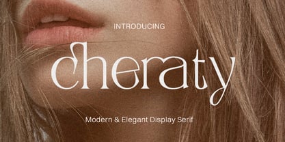 Cheraty - a sophisticated, charming serif with a fashionable touch. Specially designed for luxury, elegant, feminine projects, Cheraty is perfectly suitable for creating modern, chic design such as logos, packaging, editorial, and more. What is included: Cheraty Regular Cheraty Outline Cheraty Italic Features All Uppercase and Lowercase Number & Symbol Supported Languages Alternates and Ligatures PUA Encoded Thank you, Skypia
 - Roney JNL by Jeff Levine,
$29.00If it's at all possible to "Deco-ize" an Art Deco font even more, it's been done with Roney JNL. Named for one of the classic hotels built during the heyday of Miami Beach, this font is a stylized version of Jeff Levine's Metalet Modern; a design derived from an actual 1940s home movie titling set. - Magic Branch by GuseType,
$15.00 Magic Branch is a beautiful display fancy elegant font. This font can be used in a various of designs such as headlines, branding, cover, poster, logo, product tag and many more. Magic branch have a special character/alternate and ligature features that can be stylize your word and other font features like uppercase, lowercase, numeral, punctuation marks, multilingual support.
 - Road Work JNL by Jeff Levine,
$29.00 The October 5, 1935 issue of “Universal Weekly” (a publication detailing current film releases from Universal) was promoting the film “Remember Last Night”. Hand lettering used for this advertisement was an ultra-bold sans serif design with chamfered corners and some stylized characters. This is now available digitally as Road Work JNL in both regular and oblique versions.
 - Aprex Mono by S6 Foundry,
$10.00 Aprex Mono is a Mono spaced stylized industrial version of the Aprex Sans typeface, with multilingual support. The font is inspired by a basic sans serif glyphs structure, concerning the balance and optimization that bring a clean typeface, versatile for both display and body text use ideal for adding a touch of style to your creations and layouts!
 - Stadiona by Hurufatfont,
$29.00 Stadiona; it is a modern display font inspired by the functional and simple solutions of the 1920s design collective Bauhaus and blended with contemporary sans serif fonts. All letters are based on the stylized stadium of geometric form. To respond different and creative usage needs; it is presented in four different versions as Basic, Alternates, Inktrap and Shadow.
 - Calzone by Studio 85 Design,
$12.99 The Calzone Family is display typeface inspired by the many neighborhood pizza and local eateries with hand painted menus. The font is cozy and fun, like your favorite comfort food. All of the typefaces include standard ligatures, currencies, ampersands and footnotes consistent with the design. Calzone regular includes upper and lower case type, great for body copy. Calzone Caps is a heavy, stylized uppercase. Calzone Lower is a light, stylized lowercase. Included with Calzone Caps and Calzone Lower are a full set of alternate letters for variation to enhance your design and give it an informal feel. The Calzone Family is well suited for an informal look and feel. Alternate characters offer many opportunities to be creative with your designs. The Calzone Family is great is for menus (of course), apps, games, video, animation, packaging, child oriented design, presentations and anything fun.
 - Fast Food by Breauhare,
$35.00 Fast Food is a font based on the former (and now revived) logo of a hamburger chain. It has that look of the 1970s & 1980s, yet also has a futuristic, alienesque, sci-fi look about it. It can be used for projects aimed at consumers waxing nostalgic for their good old days, or for movie posters or books about the great final frontier, and much more. There’s an alternate uppercase E & F, both of which are really stylin'! You may even develop such an appetite that you'll want to supersize your order! Digitized by John Bomparte.
 - Garrigos by Underground,
$- Set of ornaments based on the decorative motifs used by the first typographic workshop in Buenos Aires: “Imprenta de Niños Expósitos”, between 1780 and 1824. This set is the product of an extensive historical research that aims to identify the type that came from Europe to the City during colonial times, and during the first years of Argentina’s independence. This group has a lot of diversity, which fluctuates between organic baroque forms and geometric neoclassical. Its characters can be used in editorial design along with Roman typefaces, they work individually or grouped to form different figures, guards or frames. It was baptized in honor to the first printer who worked in the workshop: the Spanish Agustín Garrigós.
 - Mene One Mexicali by Handselecta,
$38.00This style mimics the flare or upward fade that comes with the use of a spray paint can, as the tops of the letters flare, and become wider. An original font style, named after the border town of Mexicali, this font style falls under the larger umbrella of what is called Cholo-graffiti style. Originally from New Jersey, MENE has made his home in, New York City. He had a brief albeit satisfying career of street bombing in the late 90s that saw its end with a brief encounter with the Vandal Squad. Now a family man, Mene has dedicated himself to the preservation and education of style in its many forms.