8,724 search results
(0.015 seconds)
- Launsela by Prioritype,
$15.00 This elegant, minimalist and beautiful handwritten font can be applied in various print or digital media such as creative posts, business cards, wedding invitations, crafts, photographer watermarks, logos and much more. For reference, see preview. Features: -Uppercase -Lowercase -Numeral -Punctuation -Multilingual Thanks.
 - Trade Printer JNL by Jeff Levine,
$29.00Trade Printer JNL is another font design inspired by an old rubber stamp sign printing set. In this case, the lettering has a classic "wood type" look, reminiscent of the letterheads, billheads and fliers made by local printers of the 1880s-1920s. - Bomerch by Authentype,
$12.00 Bomerch Modern Display Font is a modern display font that includes Regular and Italic. This font is suitable for vibrant, energetic and bold designs such as sports poster designs, music posters, branding, t-shirts, prints, business cards, logos, posters, t-shirts, photography.
 - Kotes by Gassstype,
$22.00 Kotes - Natural Handwritten Allcaps Font with a natural style and dramatic movement. Crafted manually with love and passion, This font is great for your next creative project such as logos, printed quotes, invitations, cards, product packaging, headers, Logotype, Letterhead, Poster, Label, and etc.
 - Gaby Pro by RMU,
$35.00 Inspired by the 1947 Weber font Gabriele, Gaby Pro is a freshly designed versatile and everyday cursive font that can be used for a wide range of printed products and for web design as well. The font was carefully extended for multilingual use.
 - Absolute Kiddos by Krakenbox Studio,
$15.00 Absolute Kiddos is a cute and playful display font. Use this font to add that special cool touch to any design idea you can think of! It is perfect for any branding project such as logos, t-shirt printing, creative products, and more
 - Astrab by Yoga Letter,
$18.00 "Astrab" is a very elegant modern brush font. This font is equipped with uppercase, lowercase, numerals, punctuation, and multilingual support. It is suitable for logos, banners, posters, prints, branding, stickers, business branding, svg, kdp, Christmas, graduation, the 4th of July, and others.
 - Polias by Esintype,
$23.00 Polias is an all-caps uniwidth typeface inspired by an ancient inscription carved on a monoblock stone in hybrid characters — between no-contrast linear sans to low-contrast flared serif. The inspiring inscription is the dedication by Alexander the Great, discovered in the Temple of Athena Polias in the ancient Ionian city of Priene. Stanley Morison mentioned this inscription in one of his lectures: “The distinctive feature of this inscription consists of a consistent thickening towards the ends of perpendiculars and horizontals.” … “We have not the right to say that the serif was invented for Alexander the Great's inscription, only that this is its first datable appearance.” The letter proportions are almost identical to the original, but the stroke features have been reinterpreted and characterized. Serif-like nodes at the end of the strokes are subtle extensions that serve to accentuate rather than break its monoline elegance. With an analogy, they are not flowers, but like blooming buds. Polias is a flared sans typeface which is closer to sans-serif forms on the spectrum between sans and serif. It’s especially light looking by design to convey rather thin and white typographic color of its original monumental look. It comes in eight weights and a variable font, scaled from Thin to Bold. It is multiplexed, so the weights do not affect text lengths. Light weights are closely based on the actual carving of the inscription. Thicker weights can be used on smaller typesettings to compensate for the weight difference of larger letters’ strokes, and to keeping the monoline appearance of the entire text block intact. This method can be used for any purpose, such as setting a hierarchy between the lines or to justify their lengths. Some of the original letterforms have been preserved and stylistic alternatives such as Ionic four-bar Sigma, dotted Theta, palm Y are provided as open type feature. Some of the other ancient forms, such as the three-bar Sigma (S), the pointed U, were also added for both the Greek and Latin scripts. Polias is preferable for big type settings such as logos and headlines as a modern representation of perennial classical forms. Its a fine fit for product branding, movie posters, book covers, packaging materials, and more, which require an epic look to attracting attention with a distinctive elegance. Polias can be considered for distinctiveness wherever Roman Capitals work. As a noun, Polias is one of the epithets of Athena / Minerva, and in this case referring to her role as the protector of the city of Priene. Polias is one of the seven typeface designs in Esintype's ancient scripts of Anatolia project, Tituli Anatolian series.
 - Polias Varia by Esintype,
$140.00 Polias Varia is an all-caps uniwidth variable weight typeface inspired by an ancient inscription carved on a monoblock stone in hybrid characters — between no-contrast linear sans to low-contrast flared serif. The inspiring inscription is the dedication by Alexander the Great, discovered in the Temple of Athena Polias in the ancient Ionian city of Priene. Stanley Morison mentioned this inscription in one of his lectures: “The distinctive feature of this inscription consists of a consistent thickening towards the ends of perpendiculars and horizontals.” … “We have not the right to say that the serif was invented for Alexander the Great’s inscription, only that this is its first datable appearance.” In Polias Varia, the letter proportions are almost identical to the original, but the stroke features have been reinterpreted and characterized. Serif-like nodes at the end of the strokes are subtle extensions that serve to accentuate rather than break its monoline elegance. With an analogy, they are not flowers, but like blooming buds. Polias Varia is a flared sans typeface which is closer to sans-serif forms on the spectrum between sans and serif. It’s especially light looking by design to convey rather thin and white typographic color of its original monumental look. It comes in eight weights and a variable font, scaled from Thin to Bold. It is multiplexed, so the weights do not affect text lengths. Light weights are closely based on the actual carving of the inscription. Thicker weights can be used on smaller typesettings to compensate for the weight difference of larger letters’ strokes, and to keeping the monoline appearance of the entire text block intact. This method can be used for any purpose, such as setting a hierarchy between the lines or to justify their lengths. Some of the original letterforms have been preserved and stylistic alternatives such as Ionic four-bar Sigma, dotted Theta, palm Y are provided as open type feature. Some of the other ancient forms, such as the three-bar Sigma (S), the pointed U, were also added for both the Greek and Latin scripts. Polias Varia is preferable for big type settings such as logos and headlines as a modern representation of perennial classical forms. Its a fine fit for product branding, movie posters, book covers, packaging materials, and more, which require an epic look to attracting attention with a distinctive elegance. Polias Varia can be considered for distinctiveness wherever Roman Capitals work. As a noun, Polias is one of the epithets of Athena / Minerva, and in this case referring to her role as the protector of the city of Priene. Polias (family) is one of the seven typeface designs in Esintype’s ancient scripts of Anatolia project, Tituli Anatolian series.
 - Linotype Sunburst by Linotype,
$29.99Linotype Sunburst is part of the Take Type Library, chosen from the contestants of Linotype’s International Digital Type Design Contests of 1994 and 1997. Designed by British artist Ed Bugg, Linotype Sunburst is a font which consistently avoids all that is round. The forms are angular and pointed with triangular serifs which seem almost like flags waving from the paper. This playful font could easily be associated with sun, sand and vacation. Linotype Sunburst is intended for headlines in large point sizes or short texts with medium point sizes, if used carefully. - Bargain by Arkalandara,
$115.00 Handwriting is a unique and personal expression of language created by individuals using a pen, pencil, or other writing instrument. It encompasses various styles, characteristics, and nuances that make each person's writing distinctive. Pointed shapes and characters refer to the specific forms and angles of the letters and symbols in a written script. Pointed shapes in handwriting typically involve the presence of sharp angles or well-defined points in the formation of letters. This can contribute to a more angular and edgy appearance in the overall writing style.
 - Altemus Stars by Altemus Creative,
$11.00 Stars contains 174 characters; a variety of solid and dimensional star designs with from three to twelve points, pentagrams, sheriff stars, stars of david, outline stars, burst stars and airforce stars. Stars Two contains 174 characters; a variety of five pointed outline stars with centers, star designs composed from various geometric shapes with from three to eight points, jagged stars, quilt stars, outline stars, starfish, arrow stars, burst stars, drop shadow stars, ragged starbursts, double stars and air force stars. Stars Three is a collection of 174 star designs.
 - Long Underwear by Comicraft,
$29.00 Boy, they're everywhere. One of your neighbors is probably one of them, Freaking super-heroes (TM, ©, ®, SM blah blah blah) are more ubiquitous in cities these days than Simon Cowell is on talent shows. Notice how that guy on the subway -- the one with the boy scout haircut? -- see how he keeps his shirt buttoned all the way up? He's not sweating either... that's 'cause he's probably from some dead planet that exploded twenty years ago. His REAL parents wrapped him in blankets and, when he turned 18, his Ma on Earth turned those same blankets into Long Underwear for her foster son. He's probably wearing his long underwear right now. That's why he's smiling at you through his horn rimmed glasses. He thinks you don't know. Thinks he's special. Thinks he's a super-hero (TM, ©, ®, SM blah blah blah). Ain't that Super?
 - Gineso Soft by insigne,
$29.99 Handcrafted signs line the stoned walkways of old Italy. Some a century old, these often forgotten works of unknown artists remain etched across cities and villages. But now, they make their inviting impressions once again as the inspiration for insigne design’s Gineso Soft typeface. Gineso Soft absorbs the personality of northern Italian posters, headlines and logotypes, providing a type especially nice for signs and titling with its condensed qualities. The font contains matching italics for the the eight weights and three widths. We’ve also included small features along with fractions and superior / inferior characters to broaden your options. Even more, Gineso Soft is ready for all applications and features a large character set for the languages and literature of Europe. So add a soft touch the next time you’re in a tight spot. Add Gineso Soft and make your project a work to be remembered.
 - Pauline Didone Variable by insigne,
$99.99 Introducing Pauline Didone Variable, a flawless blend of Art Deco elegance and contemporary script. Inheriting a splash of femininity from its lineage, Pauline, it’s the perfect choice for eye-catching logos, standout headings, and memorable snippets of copy. Dive into a 10-font family arsenal, complete with 5 distinct weights, italics, and a treasure trove of OpenType alternates. Reflecting the allure of retro scripts, its geometric silhouette, paired with bold brush contrasts, commands attention. Pauline Didone’s contemporary high-contrast design ensures your artwork isn’t just in Kansas anymore but in the vibrant world of modern design. Enhance your projects with over 150 alternate characters, including a set of whimsical ball terminals reminiscent of Toto's playful spirit. Access these Oz-inspired elements with advanced software like the Adobe Suite or Quark. Step into a realm of enchantment with Pauline Didone and let your designs shine like the Emerald City.
 - Bigticy by Présence Typo,
$36.00Bigticy is a typeface with a "new-retro" feeling. Its square outline is tempered by rounded angles. This makes it suitable for a large range of applications in the domains of magazine headlines and posters. The Narrow version has been drawn from a title found in an example (dated from the 50's) of the French newspaper "Le Dauphiné Libéré". For the Maxi style, I have tried to reduce to their minimum the inner white spaces. I had in mind those amazing stone walls that one can see in the antique Inca cities in Peru. The stones are so tightly joined that it is impossible to slip a sheet of paper between them. The Plain version is an interpolation of the two other ones. It is a very useful style since I keeps the main quality of each parent: the weight of the Maxi and the narrowness of the Narrow. - Braga Huis by Juru Rancang Studio,
$15.00 Braga Huis typeface is a font family that is inspired by the famous street in Bandung that was made to embodies the atmosphere and the environment of Netherland-Indie city at its golden time, whereby all the elements were designed to give the impression of structural, artistic, and advance. Braga Huis typeface has a strong Art Deco character, where the impression is depicted from the strong lines, curvy passion so it is very appropriate to describing the future atmosphere from the perspective of the 19th century. Braga Huis typeface has 3 font styles consisting of uppercase, lowercase and various alternative options that can be customize to your taste, poster is one of the media form of presentation that we believe is very appropriate for this type of font. But whatever the medium is, honestly we say; using Braga Huis typeface will make your artwork will never be cracked by time.
 - Informative by Latinotype,
$39.00 Informative is a typeface consisting of a whole family of sans fonts and a collection of thematic pictograms. This combination of two different types of communication reflects the current need for using text and images as means of conveying information in a complementary way. The family comes with a text version of 7 weights (with matching italics)—Thin, Light, Regular, Medium, SemiBold, Bold and Black, and includes 7 thematic icons sets which allude to elements related to alimentation, city, energy, people, politics, sports and work. Each set contains 88 glyphs and includes both outline and black versions. The text font contains a set of 423 glyphs that support 207 different languages. Informative is a clean, simple and versatile typeface well-suited for a wide range of graphic design and visual communication projects. This font has especially been designed for infographics, maps and digital applications.
 - Cairo by Viswell,
$19.00 CAIRO is a modern and sleek font that exudes simplicity and sophistication. This minimalist sans-serif font features clean, crisp lines with subtle contrasting strokes, adding just the right amount of edge to its overall design. The font's simple and unassuming style makes it a versatile choice for a wide range of design projects, from branding and advertising to editorial layouts and web design. The font comes in two styles: Regular and Oblique. The Regular style is perfect for headlines and titles, while the Oblique style adds a touch of elegance. The Oblique style is also ideal for creating emphasis and drawing attention to key elements within a design. CAIRO's design is inspired by the contemporary architecture. Its clean, minimalist look reflects the modern and forward-thinking nature of the city, making it a perfect choice for designers who want to create a bold, sophisticated look for their projects.
 - Aeolus Pro by DBSV,
$50.00 Aeolus Pro is a second attempt at writing a monoline style. Completed after many design transformations. And here (as in KhamaiPro) attempted to provide a different visual design with style as Staccato: (dashed line) Rail: (double line) Tribe: (triple line) and finally a New style Shadow. Also (Bold, BoldItalic) has the advantage of involving between styles… (Rail, RailItalic, Tribe, TribeItalic, Shadow and ShadowItalic) for example: …you have a text frame with some text or one word or one letter with Bold or BoldItalic style with e.g. (color blue), if you duplicate the text frame or duplicate the Layer (as is, without shifting position - text) and you make changes ONLY (the Style* and color of text) in second text frame, would have the effect of filling the gap at the following styles... *(Rail, RailItalic, Tribe, TribeItalic, Shadow and ShadowItalic) you can see the presentation of the photo “Multiplex”. This series of 20 fonts with 624 glyphs each is composed and includes true italics and supports Latin, Greek and Cyrillic.
 - Poliphili by Flanker,
$19.99 Hypnerotomachia Poliphili, which can be translated in English as “Dreaming Love Fighting of Poliphilus”, is a romance about a mysterious arcane allegory in which the main protagonist, Poliphilo, pursues his love, Polia, through a dreamlike landscape. In the end, he is reconciled with her by the “Fountain of Venus”. The author of the book is anonymous, however, an acrostic formed by the first, elaborately decorated letter in each chapter in the original Italian reads “POLIAM FRATER FRANCISCVS COLVMNA PERAMAVIT”, which means “Brother Francesco Colonna has dearly loved Polia”. Despite this clue, the book has also been attributed to many other authors. The identity of the illustrator is less certain than that of the author. It was first published in Venice, in December 1499, by Aldo Manutio. This first edition presents an elegant and unique page layout, with refined woodcut illustrations in an Early Renaissance style and a refined Roman font, cut by Francesco da Bologna, which is a revised version of the type used in 1496 for the De Aetna of Pietro Bembo. The print quality is very high for the time, but nevertheless it presents many inconsistencies and imperfections due to the non-ideal inking and adherence of the matrix to the paper. For that reason numerous samples of the original have been used to create every single glyph which will result in an appropriate reconstruction and not a mere and humble reproduction. Some letters like \J, \U and \W were extrapolated, because they are not part of the original alphabet of the period. Some letters like \Q, \X, \Y, \Z and \h have been updated to more modern variants, but the original shape is accessible by Stylistic Alternates Opentype Feature, which also changes the shape of the \V and the \v. The original numerals \zero, \one, \tree, \four and \six have been accompanied by reconstructions of the missing numbers and extended by modern figures. Finally, swashed lower cases and original scribal abbreviations were also included. The font has joined by a matching Italic variant, closely inspired from Aldo Manuzio's 1501 "Vergilius", the first book printed entirely in Italic type by Francesco da Bologna.
 - Fleur by Lián Types,
$39.00 La vie est une fleur dont l'amour est le miel Fleur is the French for flower and I've chosen this language for a good reason. Over the past 5 years, I've had the opportunity to travel a lot to Paris and I've always tried to catch every moment and detail of this delightful city through the eyes of the designer inside me. Paris is full of surprises, mainly for us, artists. In fact, I believe the city is a museum itself. Every corner of any street has something inspiring. But, there’s something I particularly love and I want to address here: The Palais Garnier. Built between 1861 and 1875, this opera house is a dream made true for many of us, who love somptuosité. Garnier, the architect of this magnificent building, said that the style he proposed was not Grecian nor Roman/baroque, he created something new and called it Napoleonic: Luxurious at its best. Fleur is inspired in this palace which, in fact, has some similar letters inside. Garnier put his name at the ceiling of the Rotonde des Abonnés: Letters are interlacing each other with nicely done art nouveau curves. I thought I could take this idea and achieve something very delicate and imposing at the same time if the font consisted entirely of caps with the logic of a didone and a bit of art-nouveau. This mix of elegance and flamboyance gave birth to Fleur which has a wide range of uses but was mainly intended for perfumes, fashion magazines, storefronts, book covers or logos. Not only you'll find many decorative glyphs, but also a vast amount of unique ligatures will make you really adore this font. Get Fleur and profite de la vie TECHNICAL As suggested above, the font has many open-type coded alternates and a vast amount of unique ligatures. Install the font in applications that support them, like Adobe Illustrator or Photoshop.
 - Modern Love by Resistenza,
$39.00 Breaking from our catalog of typefaces to create a new handwritten font family, Modern Love was born out of our desire to see what would happen if we took a step back from the norm. We weren’t looking for the perfection of the many calligraphy techniques, but more of a natural way of writing with the same tools. Our escapist experiment into casual lettering culminated into 4 fonts: Modern Love Regular, Grunge, Rough and Caps. Modern Love Regular is a hand-painted script, each glyph individually designed with a pointed brush and walnut ink. The aim was to create an effortless hand-drawn feel while keeping the contrast high density. Playful, yet polished, this font works very well when accentuated with the family’s two distinctive styles: Modern Love Grunge, simulating a washed-out effect, perfect to add a vintage look to your projects; and Modern Love Rough, with its crunchy borders, makes letters visibly rough-around-the edges and gives large letters an unmistakeable pop. All three fonts include a hand-painted set of ornaments, swashes and alternates to limitlessly customize and decorate your texts, accessible through Opentype features. Modern Love Caps is the fourth font, a handwritten Sans Serif that ties the family together with its simplicity and readability. Designed with a pointed nib and Indian ink, this font boasts a different style that perfectly complements Modern Love Regular, Grunge and Rough. The result is a fresh font family perfect to create headlines, posters, DIY hand-lettered artwork, books, holiday cards, wrapping paper, invitations, T-shirts, labels, packaging for cosmetics, fashion supplies, food products, artisanal goods, and an endless array of options for your projects. Modern Love…when brush meets passion. Check out also ‘Modern Love Slanted’ Turquoise Nautica
 - Summer Fling by Comicraft,
$19.00 Summer Fling is a breezy brush script lettering font in the style of classic sign painting, complete with custom letter pairs and word ends to create authentic hand-painted feel. Consider this the perfect headline font for the Summer Blockbuster Romance you’re sure to pen in the warm, wine-soaked evenings ahead.
 - HU Masking Tape by Heummdesign,
$15.00 Masking tape, also known as painter's tape, is a type of pressure-sensitive tape made of a thin and easy-to-tear paper, and an easily released pressure-sensitive adhesive. It is available in a variety of widths. It is used mainly in painting, to mask off areas that should not be painted.
 - Twentieth Century by Pelavin Fonts,
$20.00 Twentieth Century was designed for the cover of 20th Century French Poetry and was drawn with pure geometric shapes. It is the distillation of a broad variety of styles loosely known as Art Deco but, also categorized under such terms as Moderne, Streamline, Machine Age, Futurist, 70s Art Deco, Memphis among others. If there were a source in particular that I would cite as my inspiration, however, it would definitely be the work of Frank Lloyd Wright. I mean, look at the "W" for cryin' out loud!
 - Figgins Antique by HiH,
$12.00 “Hey, look at me!” cried the new advertising typefaces. With the nineteenth century and the industrial revolution came an esthetic revolution in type design. Brash, loud, fat display faces elbowed their way into the crowd of book faces, demanding attention. Those who admired traditional book types harumphed and complained. Robert Thorne had fired the opening round with his Fatface. With the cutting of Figgins Antique, the battle was well and truly joined. Job printing came into its own and it seemed like everything changed. The world of printing had been turned upside down and the gentile book-type aficionados recoiled in horror much as the rural landed gentry recoiled at the upstart middle class shopkeepers and manufacturers. William Savage, approvingly quoted by Daniel Berkeley Updike over a hundred years later, described the new display faces as “a barbarous extreme.” These were exciting times. According to Geoffrey Dowding in his An Introduction To The History Of Printing Types, “The types which we know by the name of Egyptian were first shown by Vincent Figgins in his specimen book of 1815, under the name Antique.” Of course, dating the design is not quite as simple as that. Nicolete Gray points out that Figgins used the same “1815” title page on his specimen books from 1815 to 1821, adding pages as needed without regard to archival issues. As a result, there are different versions of the 1815 specimen book. In those copies that include the new Antique, that specific specimen is printed on paper with an 1817 watermark. The design is dated by the 1817 watermark rather than the 1815 title page. Figgins Antique ML is an all-cap font. This typeface is for bold statements. Don't waste it on wimpy whispers of hesitant whimsies. And please don't use it for extended text -- it will only give someone a headache. Think boldly. Use it boldly. Set it tight. Go ahead and run the serifs together. Solid and stolid, this face is very, very English. FIGGINS ANTIQIE ML represents a major extension of the original release, with the following changes: 1. Added glyphs for the 1250 Central Europe, the 1252 Turkish and the 1257 Baltic Code Pages. Added glyphs to complete standard 1252 Western Europe Code Page. Special glyphs relocated and assigned Unicode codepoints, some in Private Use area. Total of 331 glyphs. 2. Added OpenType GSUB layout features: liga and pnum. 3. Added 86 kerning pairs. 4. Revised vertical metrics for improved cross-platform line spacing. 5. Redesigned mathamatical operators. 6. Included of both tabular (standard) & proportional numbers (optional). 7. Refined various glyph outlines.
 - SysFlash by FSD,
$6.15 SysFlash is the version of Sys to use in Macromedia Flash at 10 point size.
 - Tara by Haiku Monkey,
$10.00Tara is a bold, fun handwriting font that scales really well to large point sizes. - Nightbird by Hanoded,
$15.00 A very detailed and scary brush font, made with ink, paint and stiff bristle brushes.
 - TOMO Joseph by TOMO Fonts,
$12.00 Joseph is a slab-serif face designed by TOMO. With a wood type look - letterpress print, this fatty comes in handy when is time to design an informal —yet strong—looking communication piece. Imagine this typeface on a T-shirt, even a mug! Sweet.
 - Grufy by Stefani Letter,
$12.00 Grufy is an awesome bold and fun display font that will look stunning on any poster flyer or print. It will put a modern twist on any design project with its urban charm. Use this font for your designs and explore its endless possibilities.
 - Arupala Grotesk by Jetsmax Studio,
$15.00 Arupala Grotesk is a Grotesk font this versatile typeface will grab readers’ Attention. This font was inspired by a character named H. Aroepala. This font is suitable for both formal and informal events and is also suitable for various types of print and digital media.
 - Imprint by Monotype,
$29.99 In 1912 Gerard Meynell, with J.H. Mason, Ernest Jackson and Edward Johnston, commissioned this large x-height typeface modelled on Caslon’s designs from Pierpont and the Monotype Corporation as the text face for The Imprint, a short-lived magazine about fine printing and typography.
 - Marketing Stencil by Jeff Levine,
$29.00 Vintage (circa 1960s) packaging for Parker Cartridge Pen Erasers had the product description printed in bold stencil lettering featuring a squared look with rounded corners. This design has been recreated digitally as Marketing Stencil JNL, which is available in both regular and oblique versions.
 - AS Nerd by Ten Waffle Studio,
$6.00 AS Nerd is a contemporary brush script. AS Nerd is a beautiful typeface that mimics true handwriting closely. Use AS Nerd, and your documents will look stunningly beautiful from now on. Perfect for printing your personal thoughts be they silly, pensive or absolutely nonsense!
 - Simply Happy by Seemly Fonts,
$14.00 For stationery, logos, t-shirts, print design, website headers, photo frames, flyers, music album covers, posters, image sliders, and much more, Simply Happy is a handwritten typeface that works beautifully. Your favorite creative ideas will come to life when you add this typeface to them.
 - Kerad by Lemonthe,
$12.00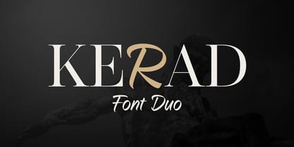 Kerad Font Duo is a captivating combination of modern serif and handwritten font, both seamlessly mixable to create a unique and appealing impression. It is suitable for various design projects such as logos, branding, packaging design, web design, titles, posters, printing, advertising, and much more.
 - Pheonies by Yumna Type,
$16.00 Pheonies is a handwritten font with a natural and unique design will make your project more beautiful. The font is suitable for your branding project, printing, logos dan wedding. Included: Pheonies (OTF) Features: Beautiful Ligatures Alternates Multilingual Support PUA encoded Numeral and Punctuation by Yumnatype
 - Stonehouse by Scriptorium,
$12.00Stonehouse is based on samples of Art Nouveau title lettering, adapted and expanded into a complete titling font. It has a nice intermediate weight ideal for titles on the web or in print, especially for section or topical headers within a body of text.